Design for Financial Brochure
Estefanía Lima
Brochure Design
Solo Designer
About the Project
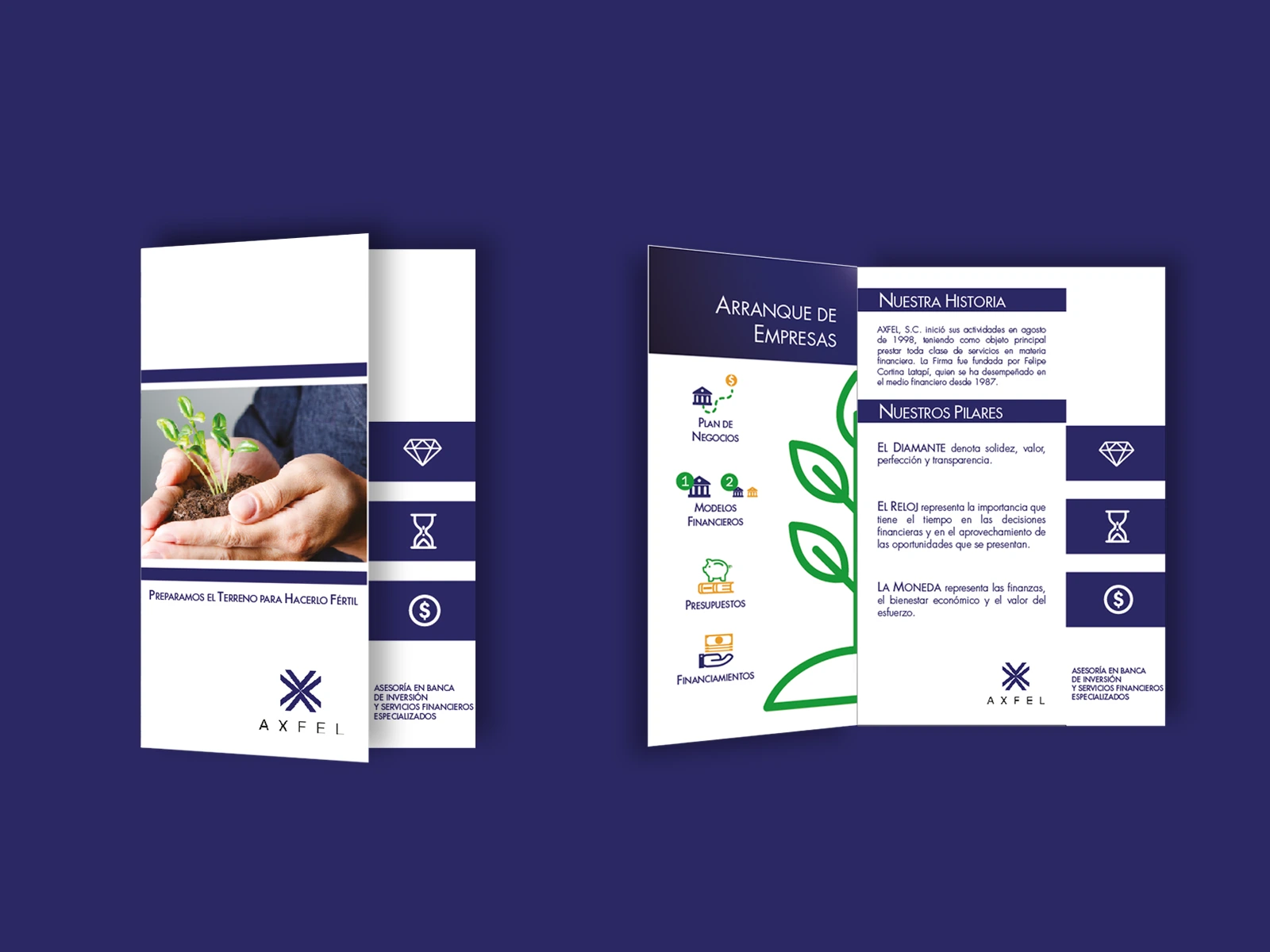
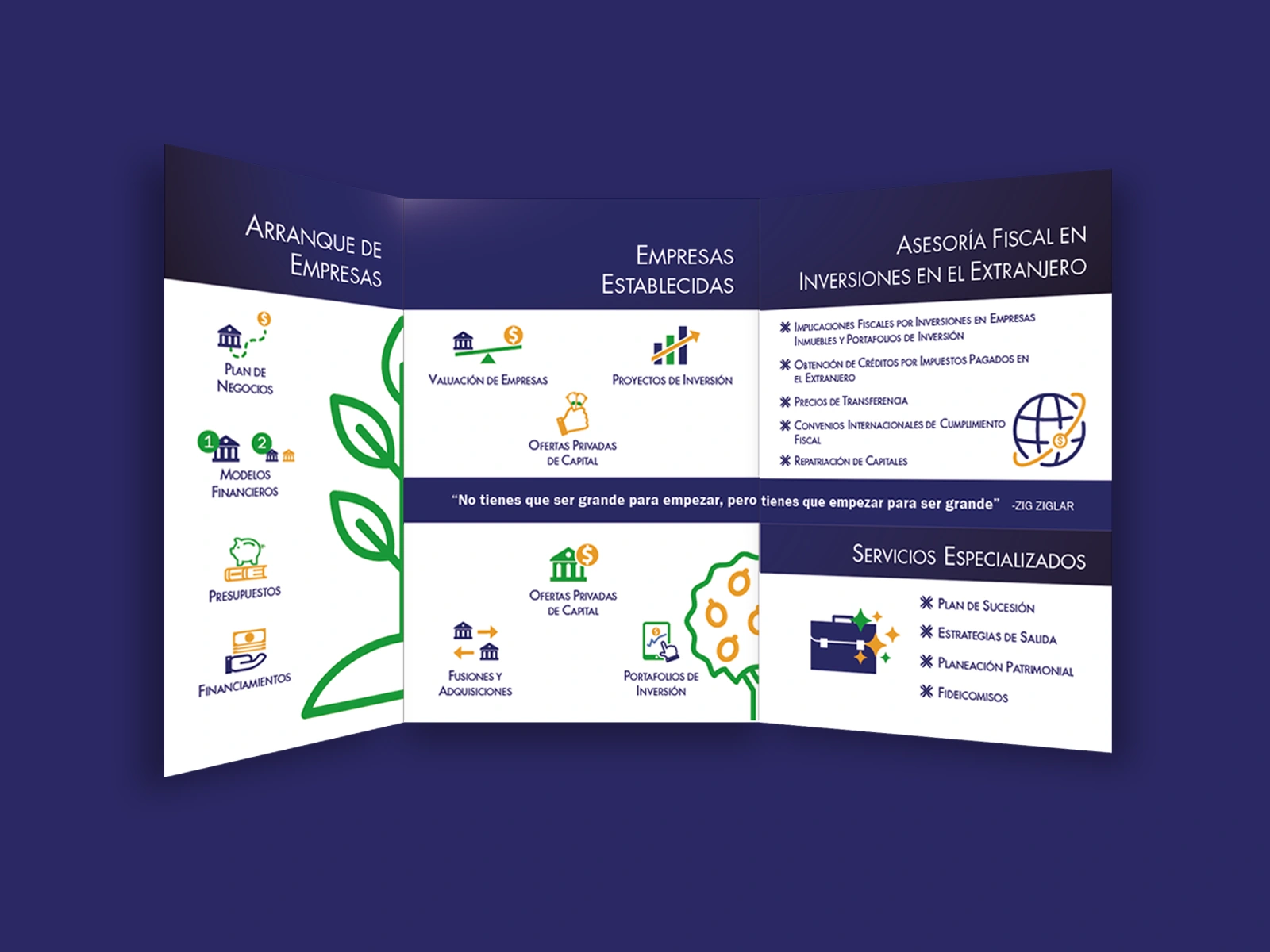
AXFEL is a consulting company focused on investment, finances and planning for a diverse range of businesses. They have a very solid experience in the financial field since 1987, and they have only developed the logo for the company, so I had plenty of freedom to show and discover a fresh side for the brand, allowing it to remain solid and stable.
The Solution
The freshness of the brand could pop through two accent colors: green and yellow. The stability and reliability remained with the main color of the palette, a dark blue.
The texts are carefully chosen and they are the essence of the brand, while a twist of modernity is shown thanks to the asymmetry of the brochure - the cover is 1/3 less wide than the rest of the sections -.
The final print included UV varnish, because AXFEL focuses on premium financial services.
Like this project
Posted May 15, 2025
Explore more of the branding with total freedom, giving a modern twist to it while remaining trustworthy and on a premium level.
Likes
0
Views
5
Timeline
Nov 7, 2023 - Nov 29, 2023