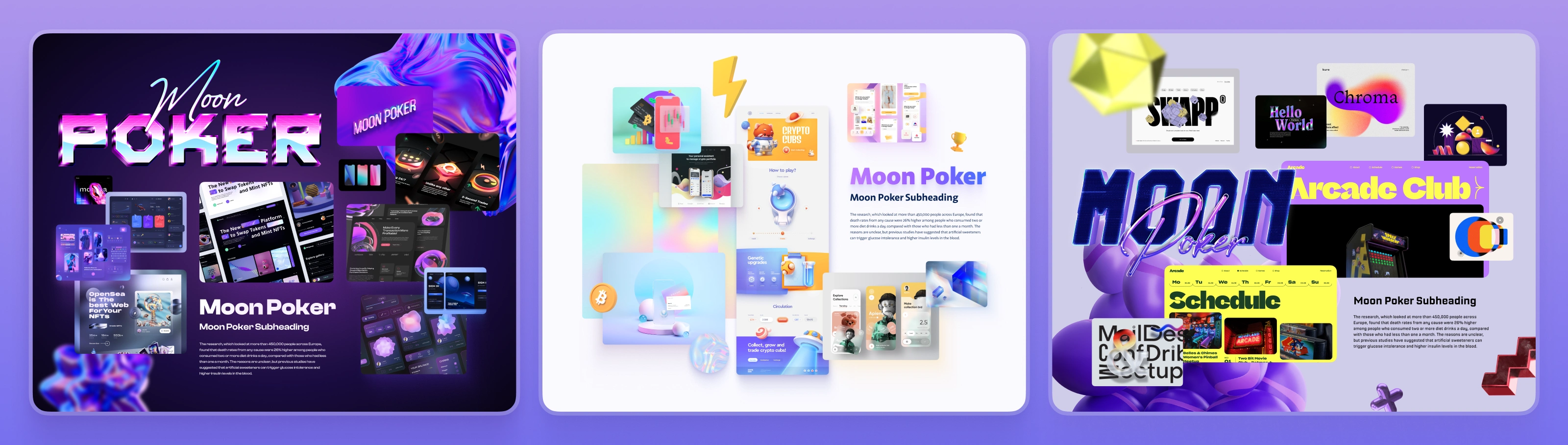
Web3 Poker UX/UI | PokerDAO 40-Screen MVP
Ivan Kalkaev
I led the design for PokerDAO’s decentralized poker platform — where the challenge wasn’t cards, but hiding the crypto. From 40+ screens to full on-chain UX logic, we crafted a gameplay experience that feels like an app, not a protocol.
At a Glance
40+ screens designed for full gameplay flow
3 UX directions explored before final system
100% on-chain logic supported via instant feedback layer
3-click room creation for frictionless play
Custom UI for multi-token betting & Web3 onboarding
Context & Challenge
PokerDAO wanted to create a poker platform that could break out of the Web3 bubble. Most blockchain-based poker apps either feel like dated casinos or confusing dashboards. Our challenge: create a modern, fun, and crypto-light experience — one that felt intuitive to a casual player but respected the depth of poker strategy.
Solution & Strategy
Reframed onboarding to feel like joining a game, not connecting to DeFi
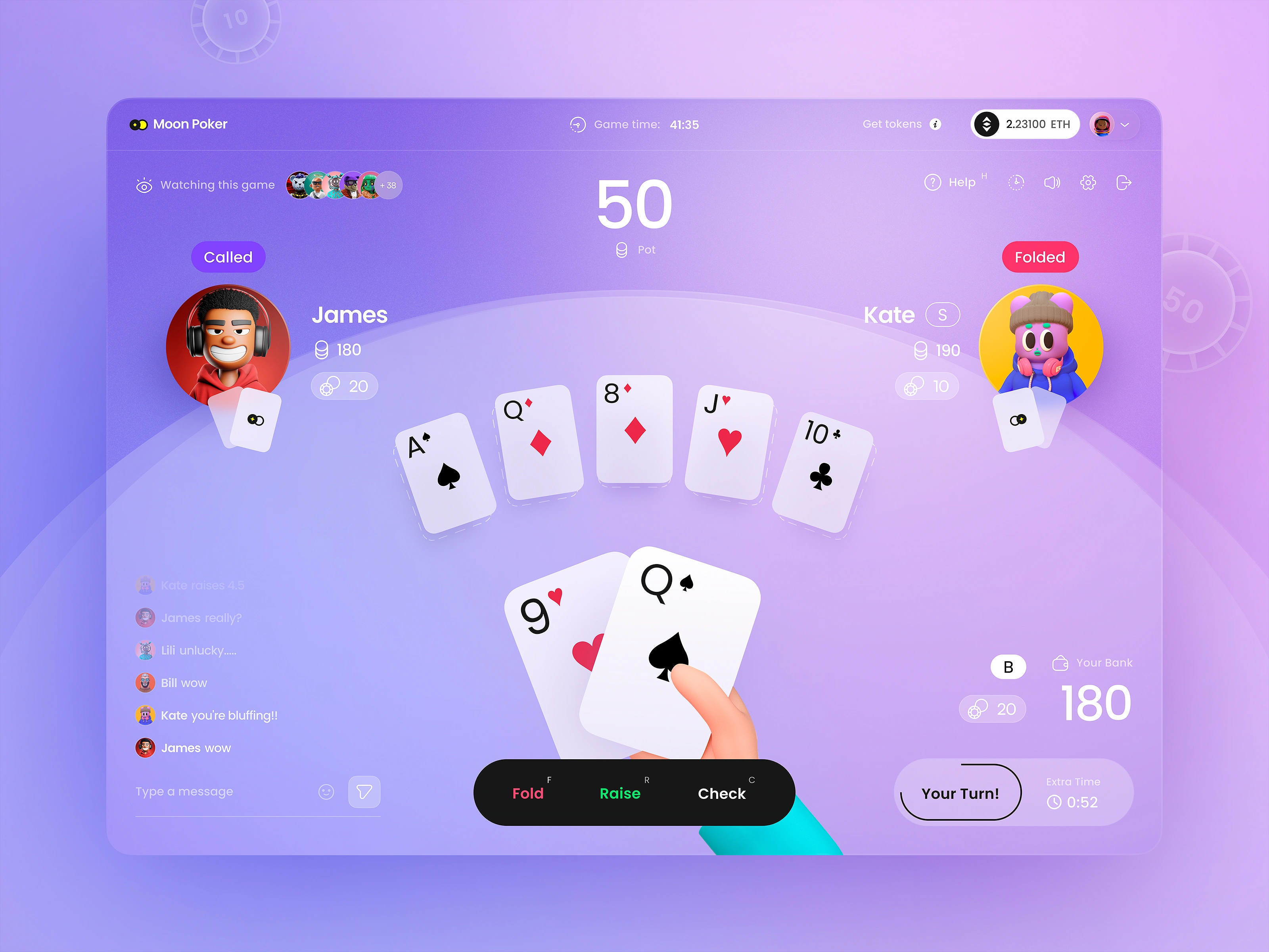
Built UI logic where wallet connections happen invisibly during game flow
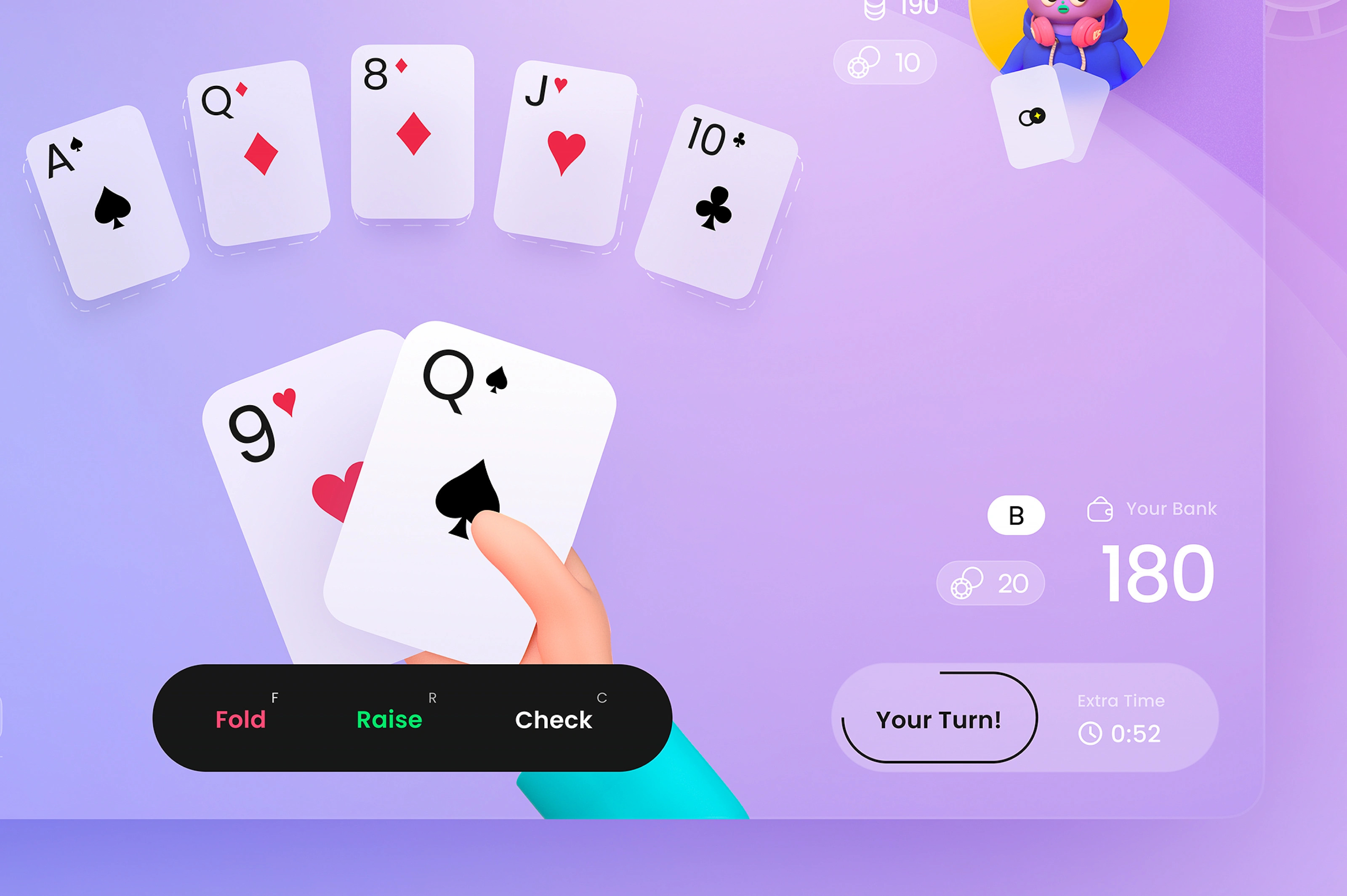
Designed multi-token bet interface using size, color, and fiat cues — no conversions needed
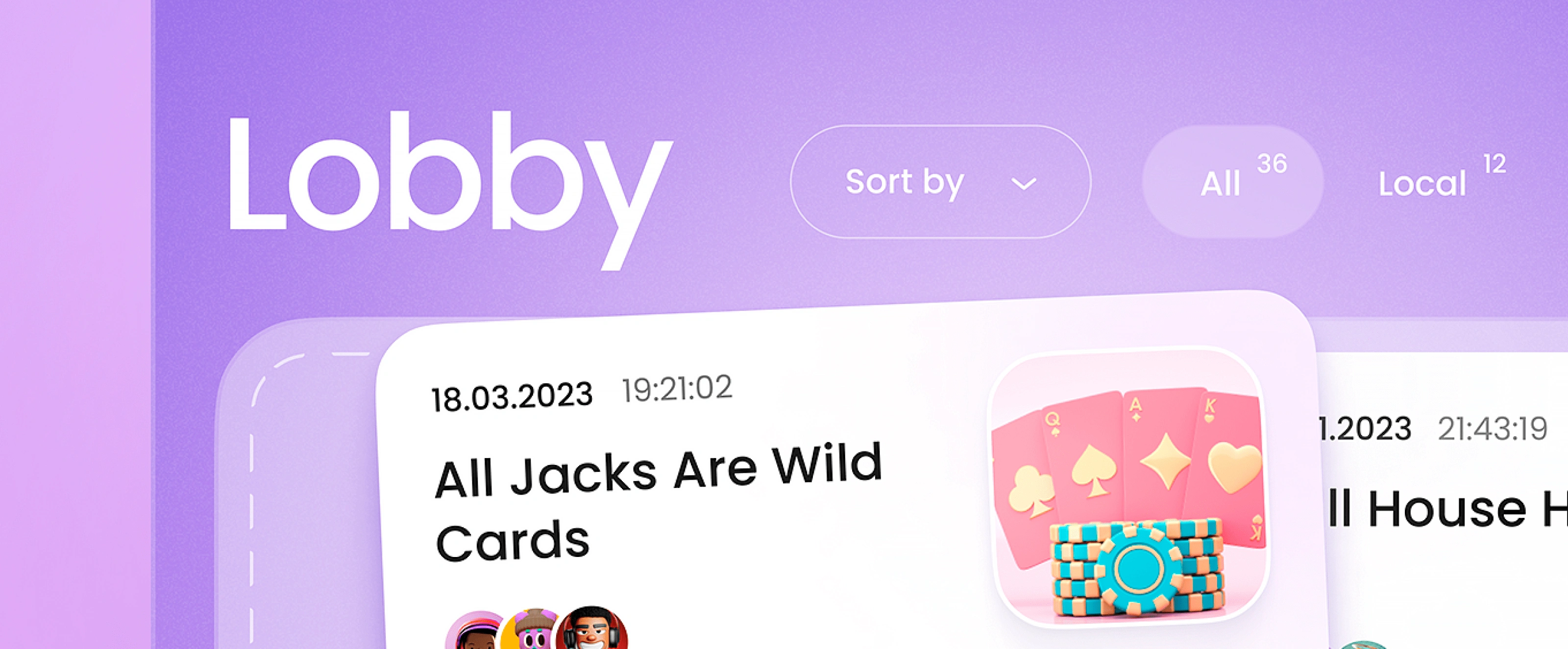
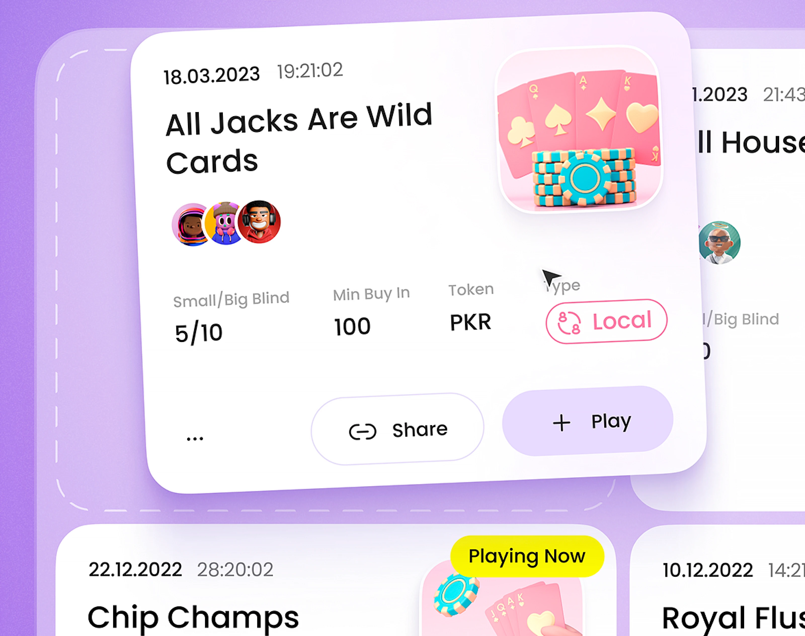
Reduced custom room creation to 3 clicks with smart defaults
Built custom illustrated empty states to replace spinners and explain tech transitions visually
Applied game-like feedback to mask blockchain delay (UX signals appear before confirmation)
By fostering a welcoming, inclusive environment, we aimed to attract a wider audience to the platform. A design that feels approachable and friendly is more likely to convert curious visitors into engaged players, ultimately driving growth and retention for Poker DAO.
By using a color palette that's inviting and easy to interpret, we reduce the learning curve for new players. This ease of use can lead to higher engagement and retention rates, as players feel more confident and comfortable within the platform.
Clear, readable typography is crucial for any digital product. By using Poppins, we ensure that players can easily read and understand all the information they need, from game rules to betting amounts. This clarity reduces frustration and enhances the overall user experience, leading to longer session times and higher satisfaction rates.
A modular design system makes the platform more scalable and easier to update over time.
A minimalist design approach not only enhances the user experience but also improves the platform's performance. With fewer elements to load and render, the interface becomes faster and more responsive, leading to shorter load times and smoother gameplay.
The Dark Theme: Elevating the Experience
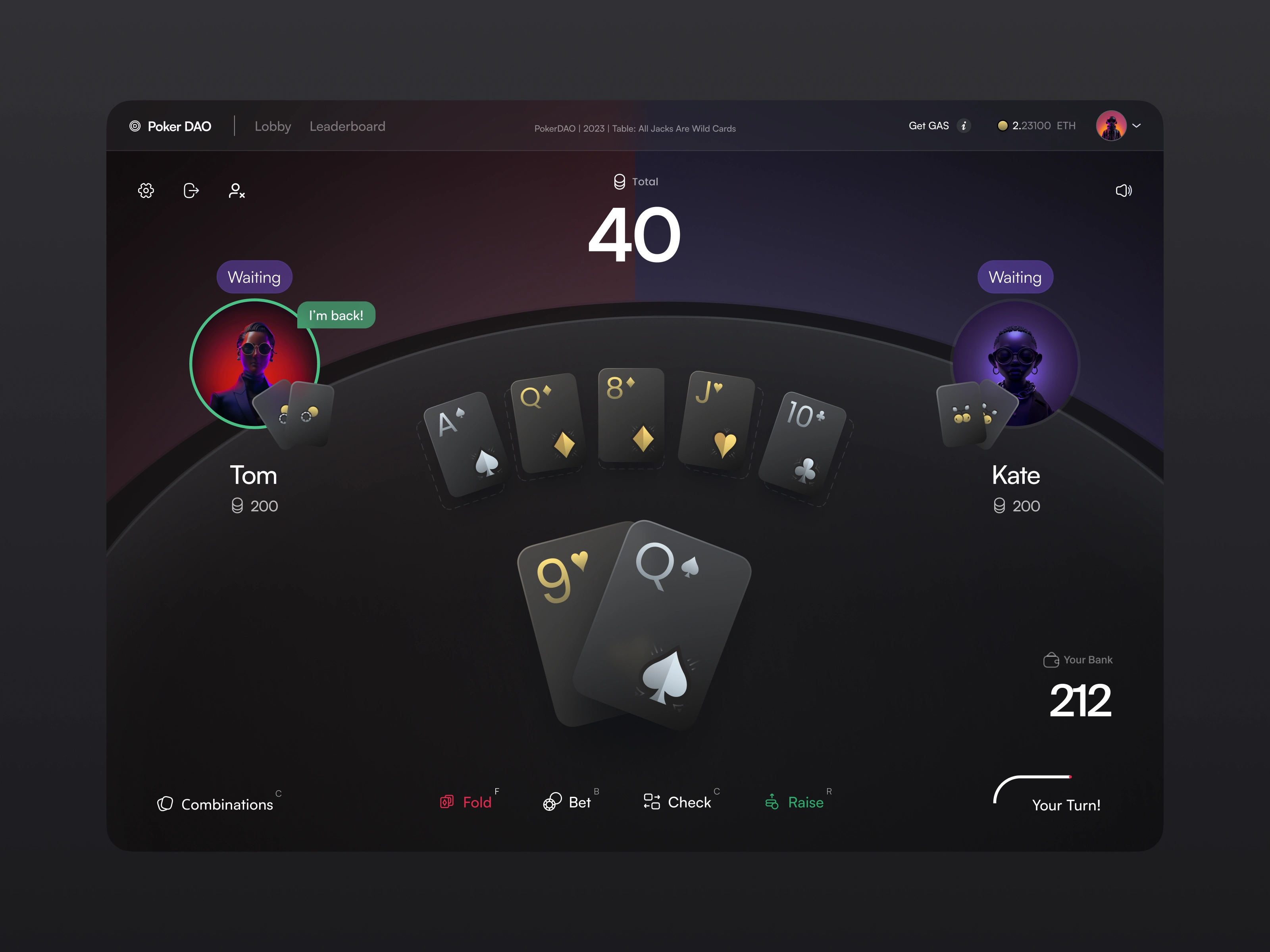
Offering a dark theme variant doesn't just provide visual variety; it caters to a wider range of user preferences. Some players may find the dark theme easier on the eyes, especially during longer gaming sessions. Others may simply prefer the more sophisticated, premium feel. By providing this choice, Poker DAO demonstrates a commitment to user satisfaction and inclusivity, fostering a deeper sense of loyalty and community.
A technically sound design is essential for any digital product, but it's especially crucial for an online gaming platform. By ensuring that the design is performant and accessible, we minimize the risk of user frustration and churn due to technical issues
By balancing aesthetic appeal with technical performance, and by prioritizing user needs at every step, we've created a platform that doesn't just attract players but keeps them coming back for more.
Results & Impact
Delivered complete 40-screen design system ready for implementation
Interface supports verifiable randomness & on-chain action timing
Room creation time reduced to <30 seconds
MVP validated by poker pros and crypto founders alike
Design system reusable across future Web3 card games
What I Did With Their Budget (Plain English)
Designed poker UX that hides crypto friction without dumbing things down
Turned raw gameplay logic into a scalable design system
Delivered game-ready assets + dev-ready Figma flows
Crafted UI that works for normies but scales for power users
Why It Worked
People don’t show up for “decentralized.” They show up to play. We made blockchain-based poker feel like a normal app — familiar, fast, and fair. By focusing on behavior, not features, we created an interface that does the hard work quietly in the background.
♠️ Launching a Web3 game? Let’s make it feel like play — not paperwork.
Like this project
Posted May 2, 2024
Lead Product & UX Designer for PokerDAO — 40-screen Web3 poker MVP with wallet-light onboarding, multi-token bets & 3-click room setup.
Likes
2
Views
92