Community Space Brand Identity & Logo Design | Csikágó

Tamás Kurucz


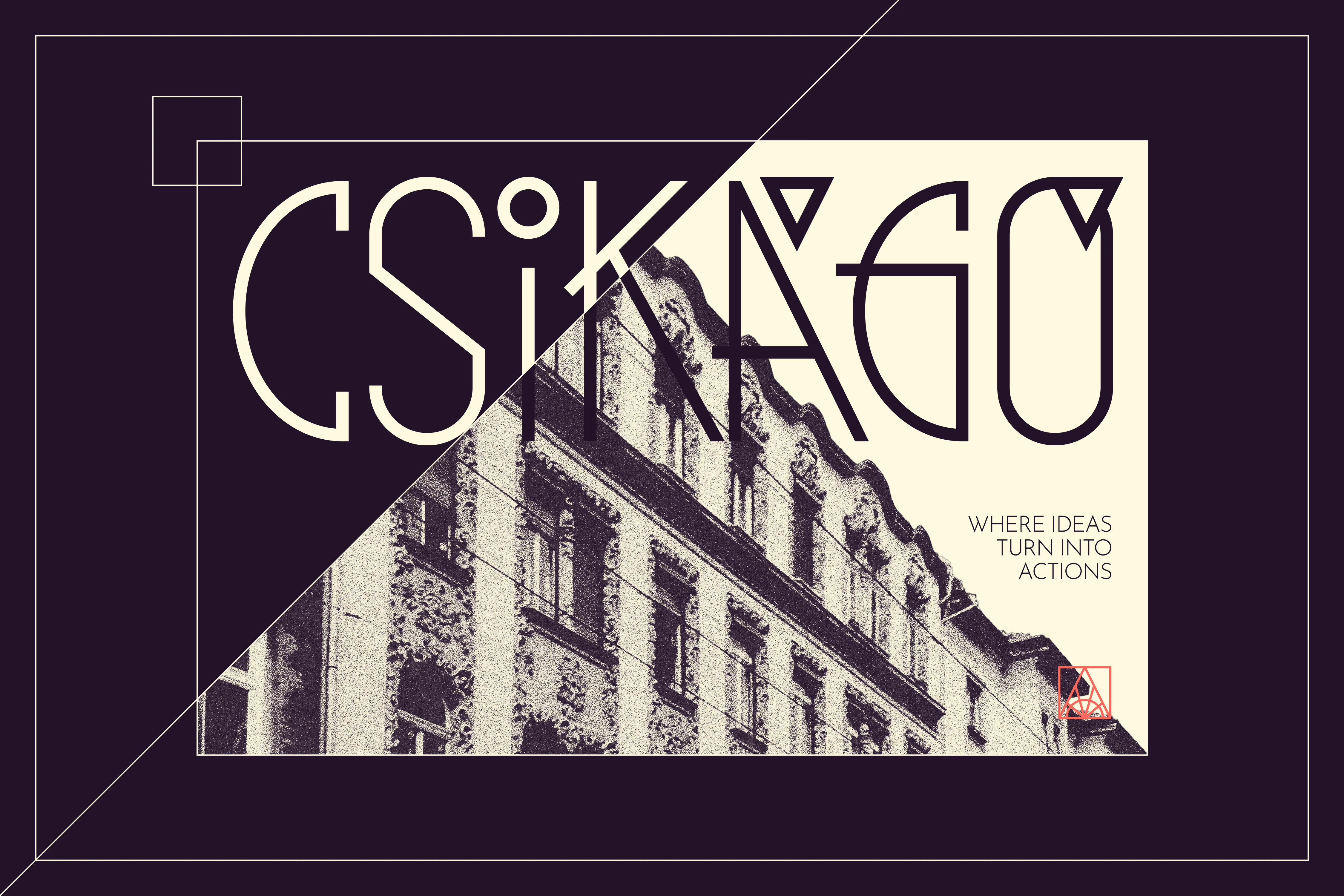
Csikágó
Community Space Brand Identity & Logo Design
Case study of a community space brand identity and logo design for Csikágó, blending Modern Art Deco aesthetics, architectural geometry, and a functional color system into an active urban workshop in Budapest.
CLIENT: Csikágó
YEAR: 2026
INDUSTRY: Community Space; Arts & Culture
Project Overview
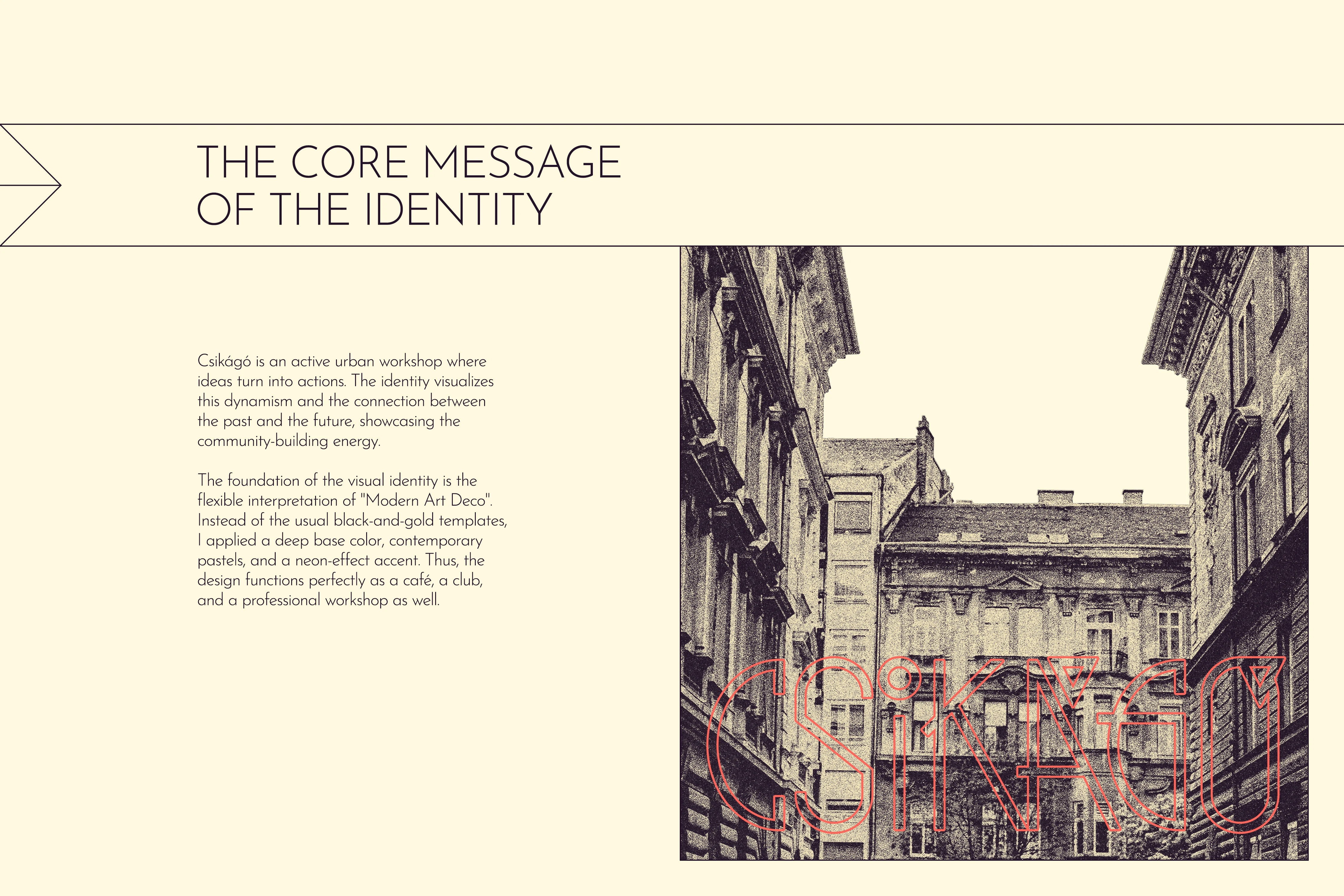
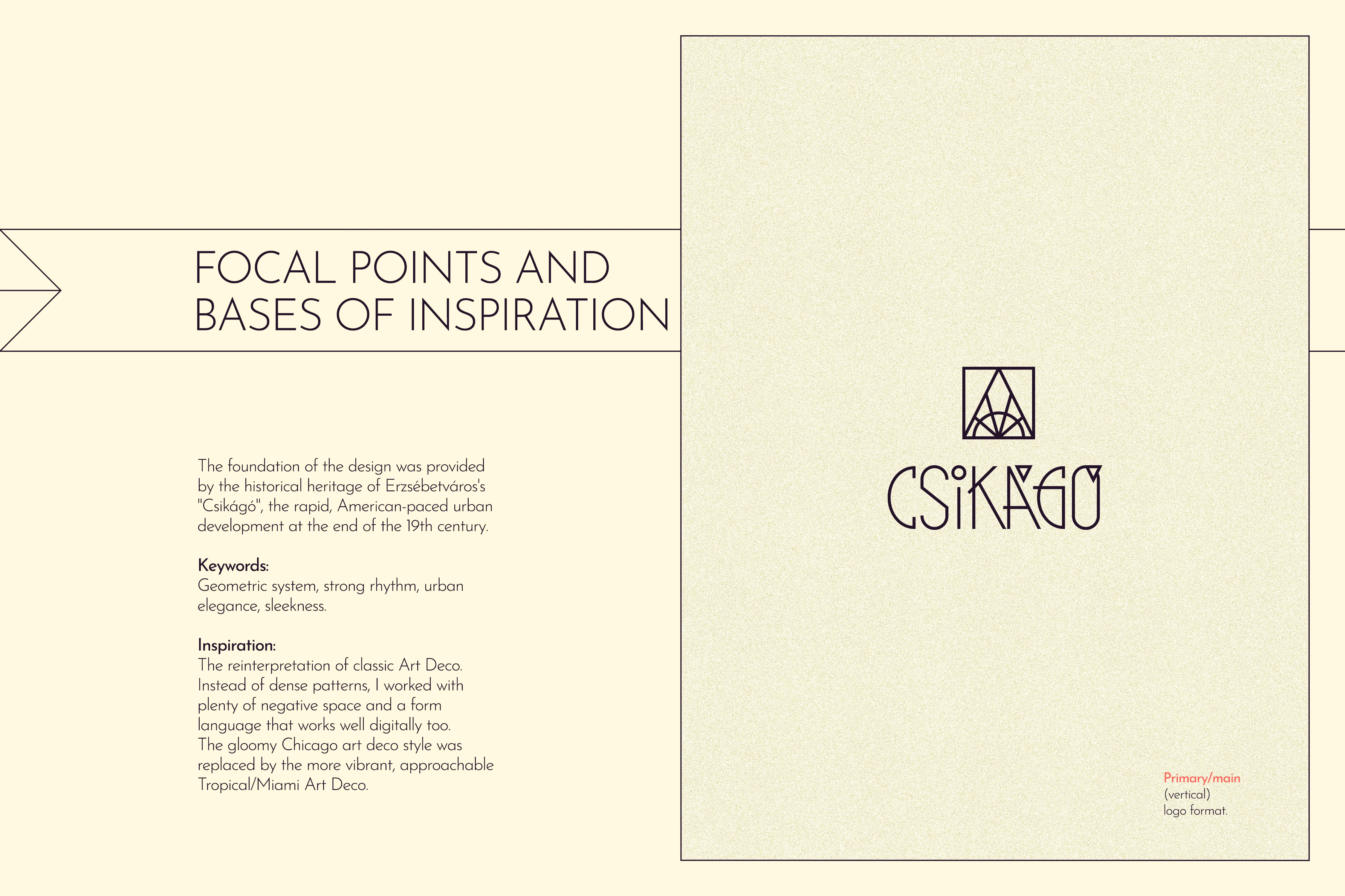
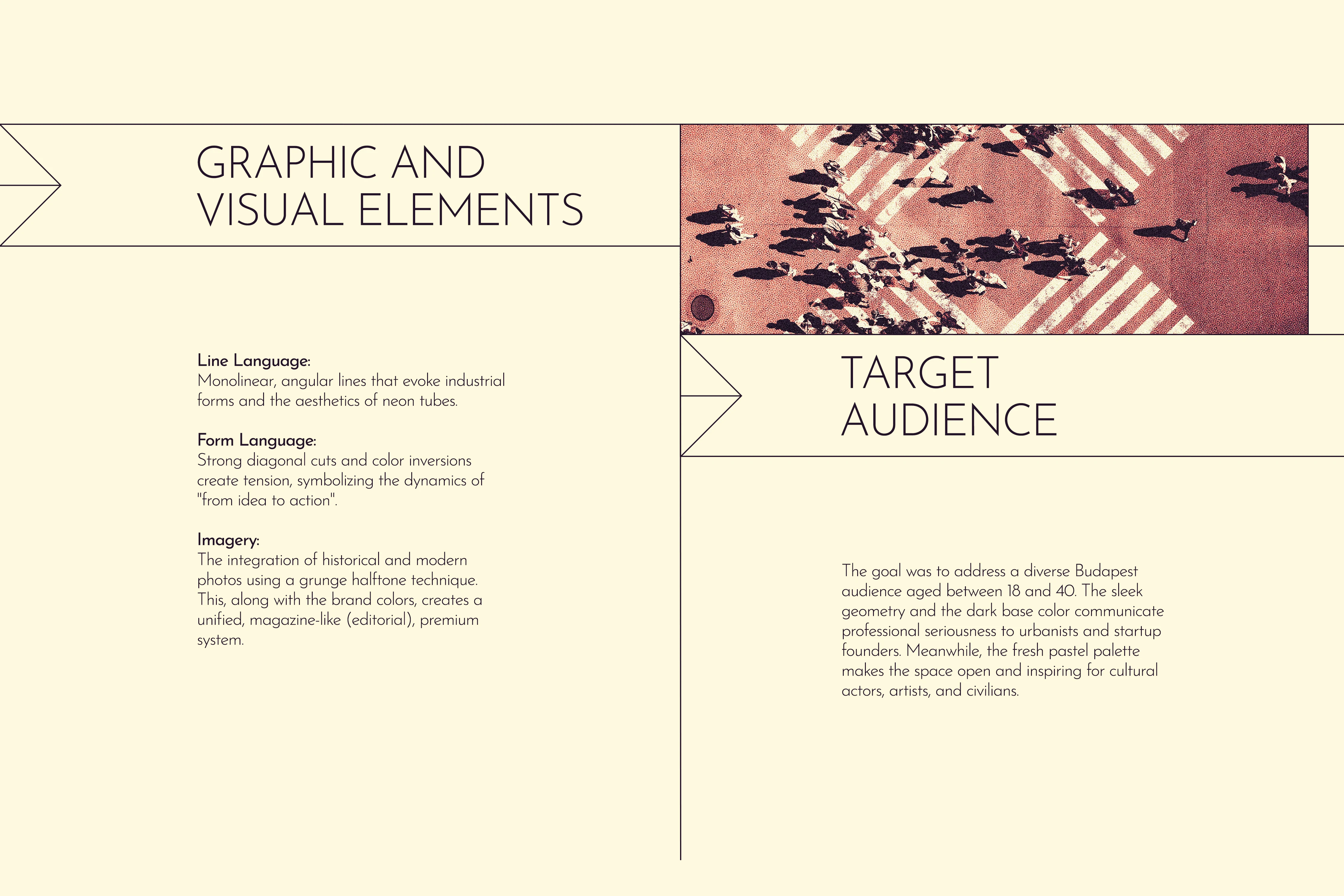
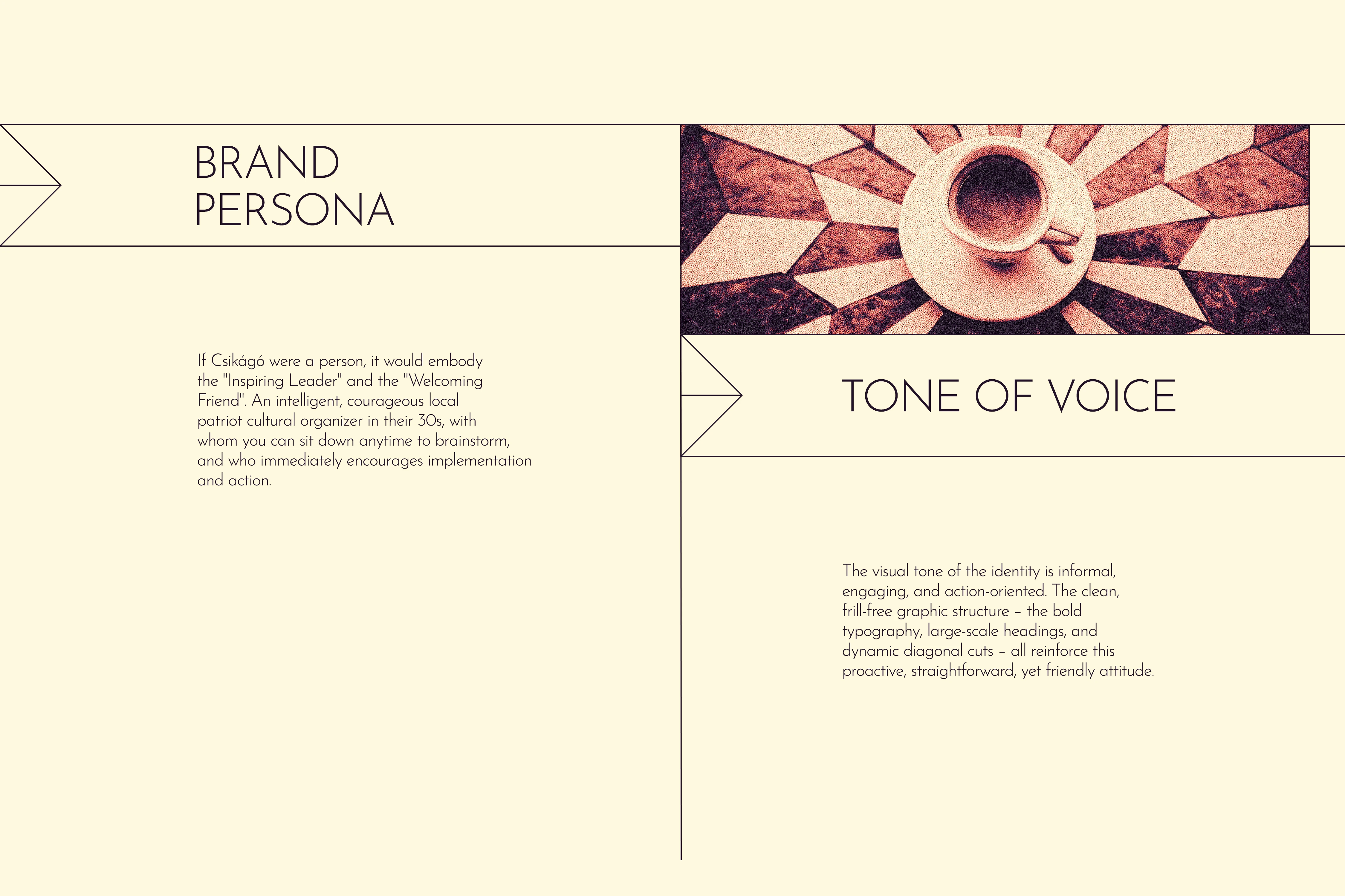
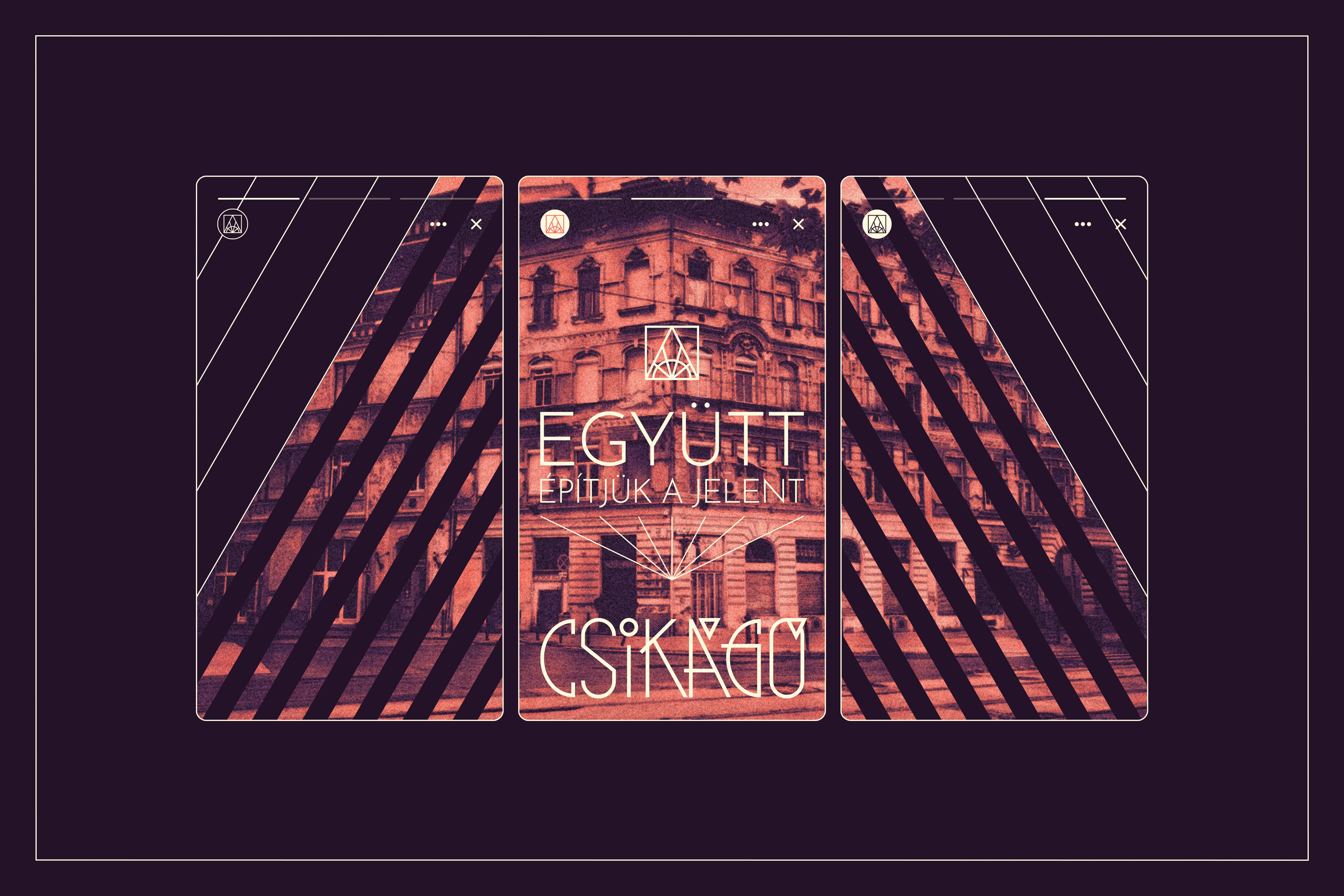
The Csikágó community space required a brand identity that could do more than just represent a coffee shop; it needed to serve as an active urban workshop and an intellectual base where thoughts are transformed into actions. Built around the core philosophy—"Where ideas turn into actions"—the visual system bridges the historical heritage of Budapest's 7th district (nicknamed "Csikágó" due to its rapid, American-paced urban development in the late 19th century) with a modern, forward-thinking mindset. The branding is meticulously designed to resonate with a highly diverse audience, from urbanists and startup founders to cultural actors and civil activists, maintaining a tone that is professional, premium, and deeply community-oriented.
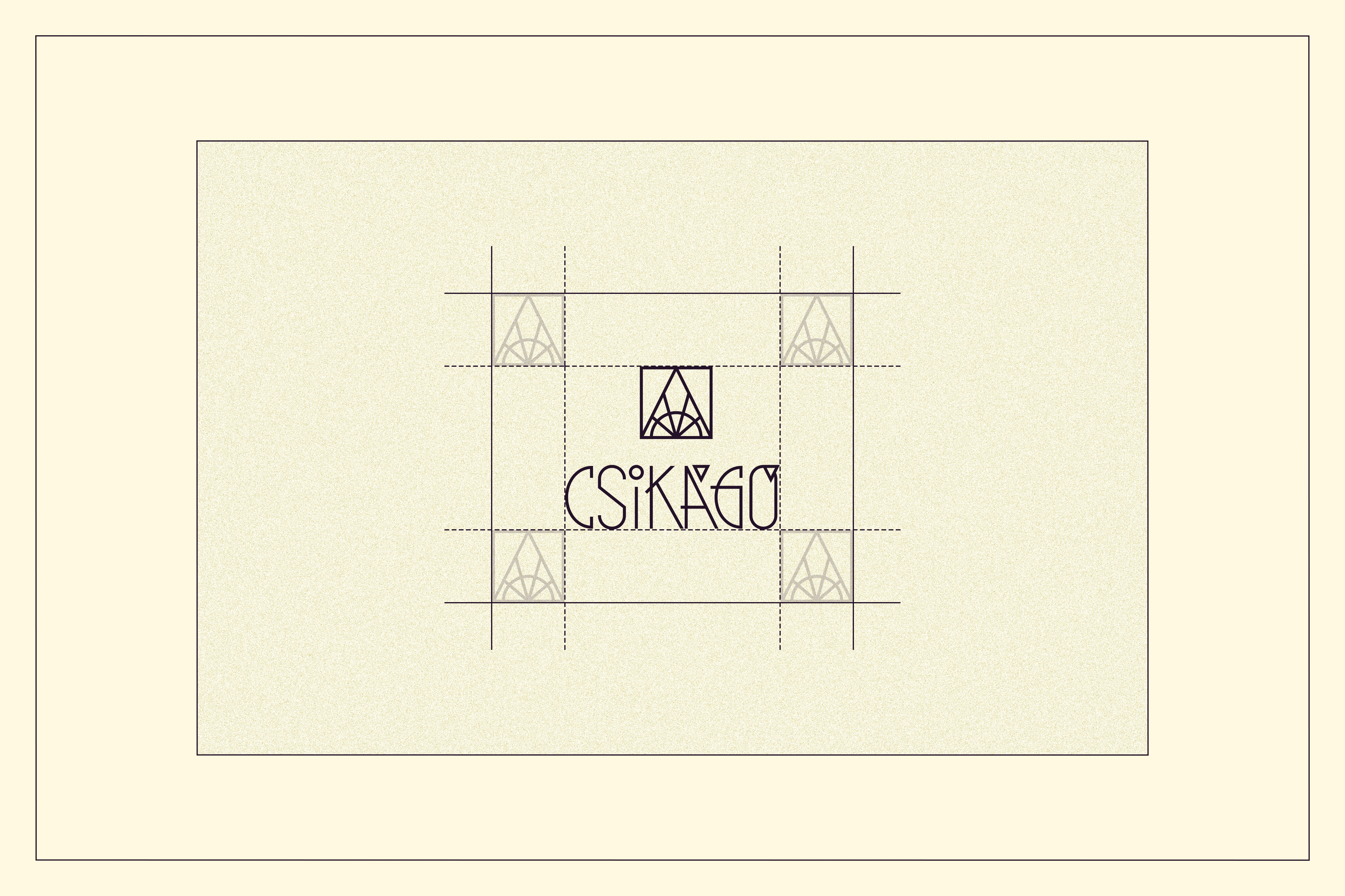
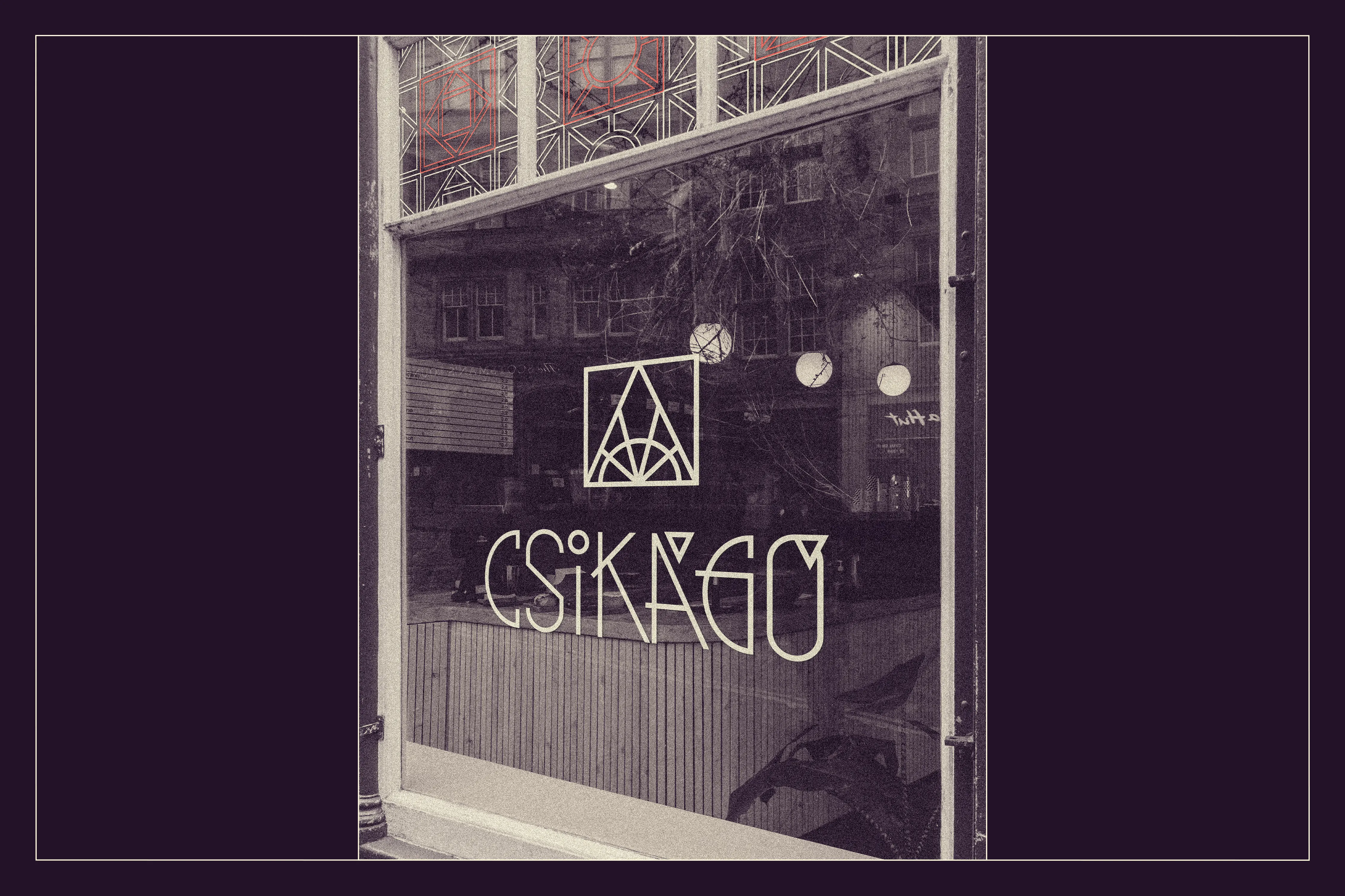
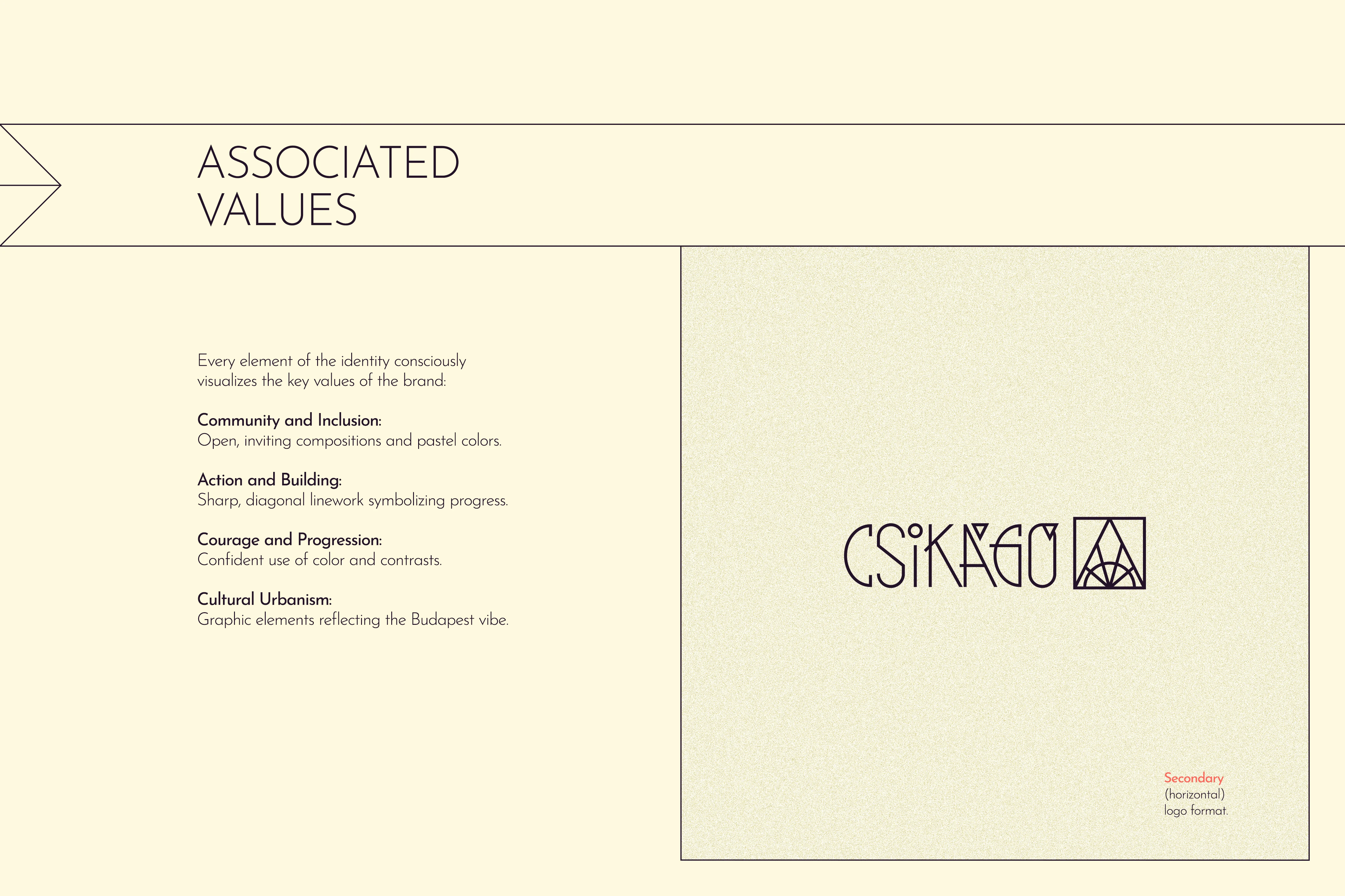
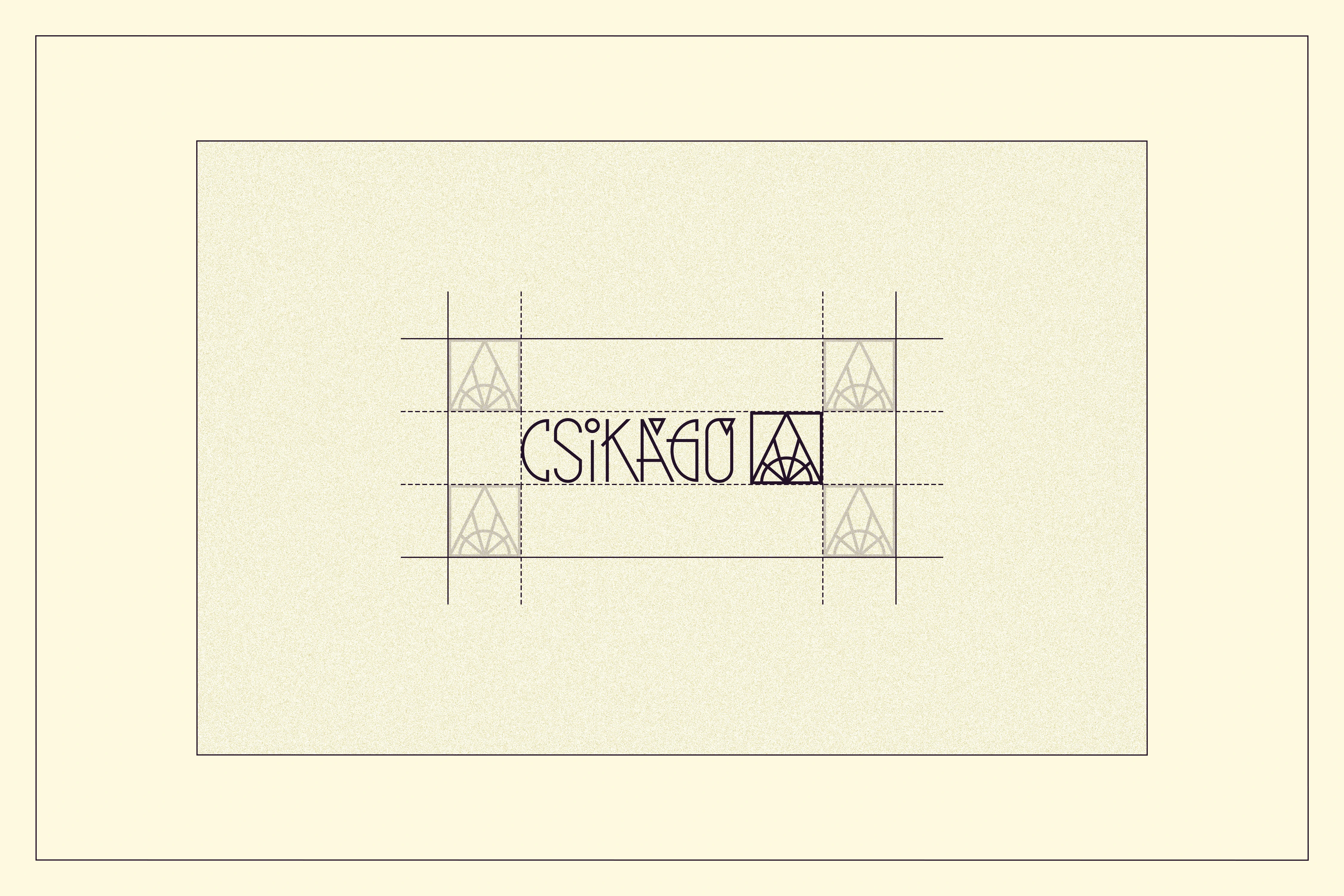
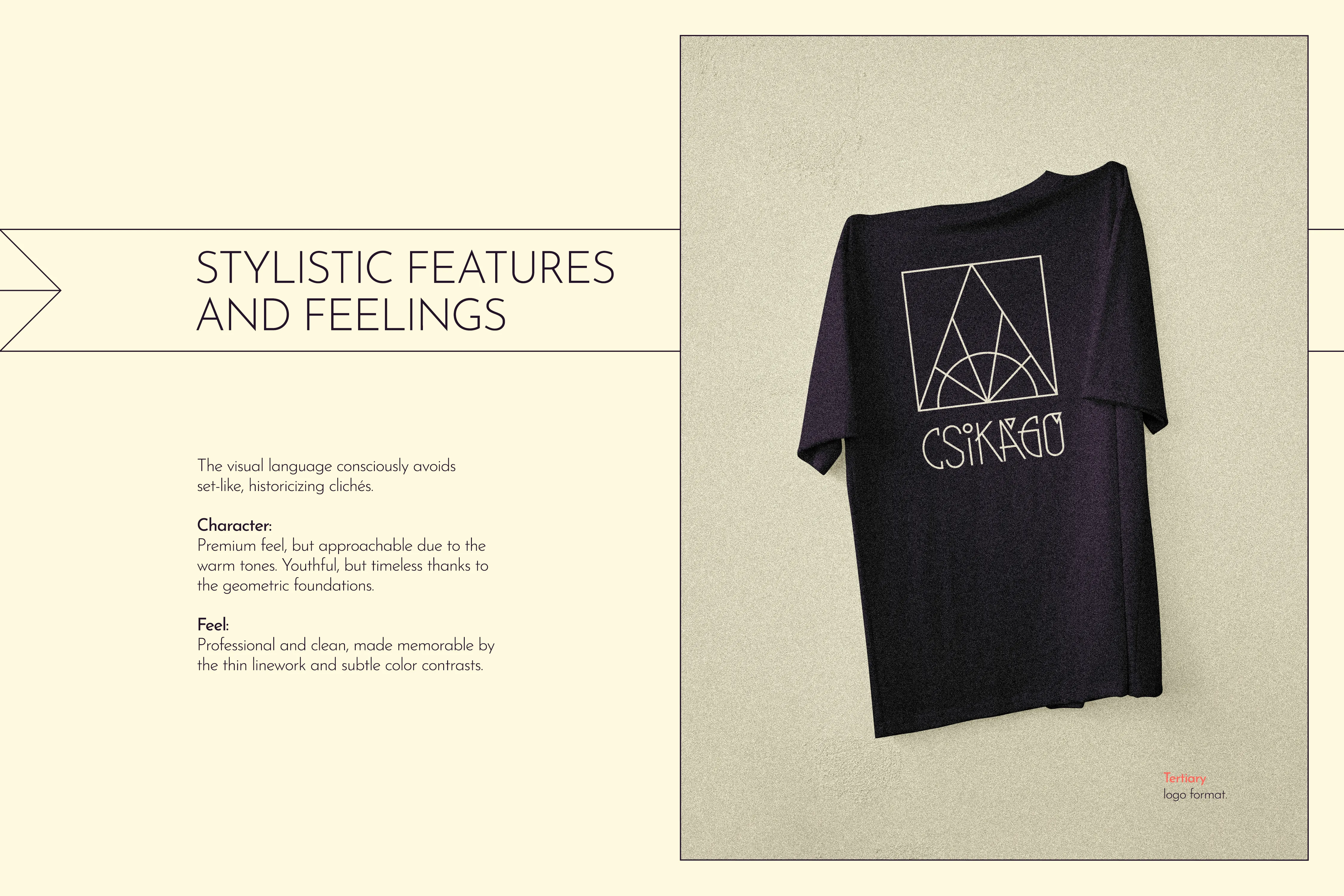
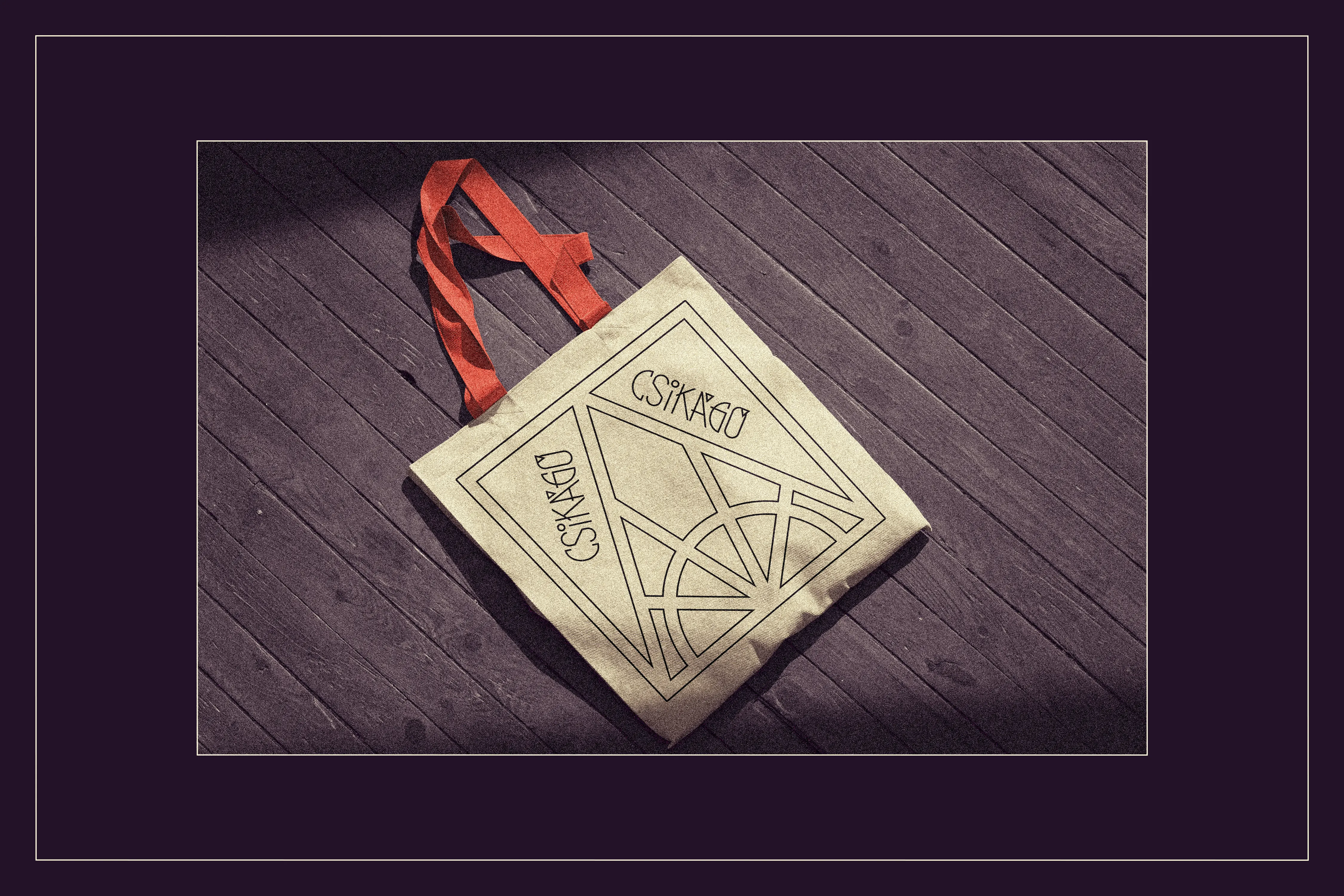
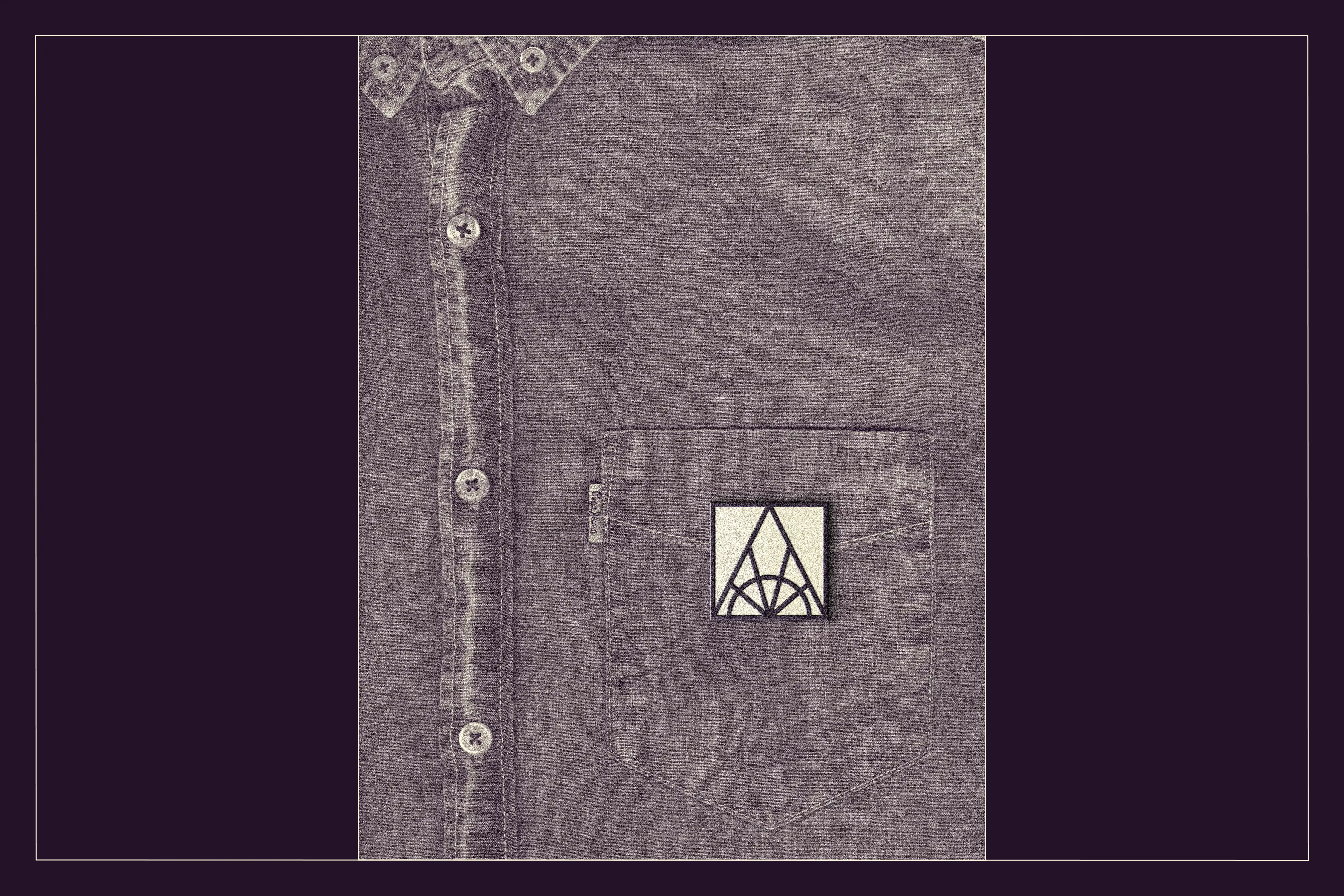
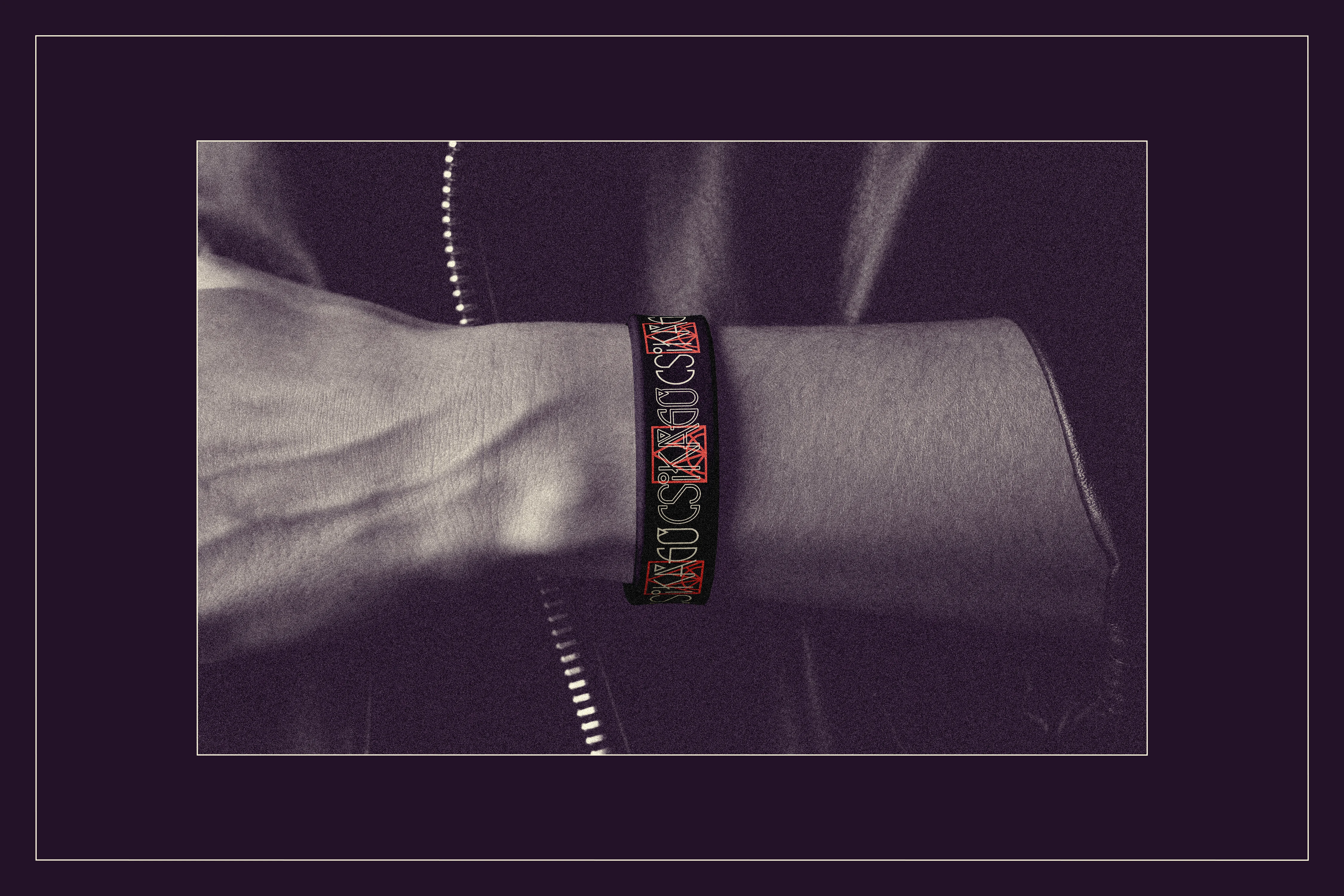
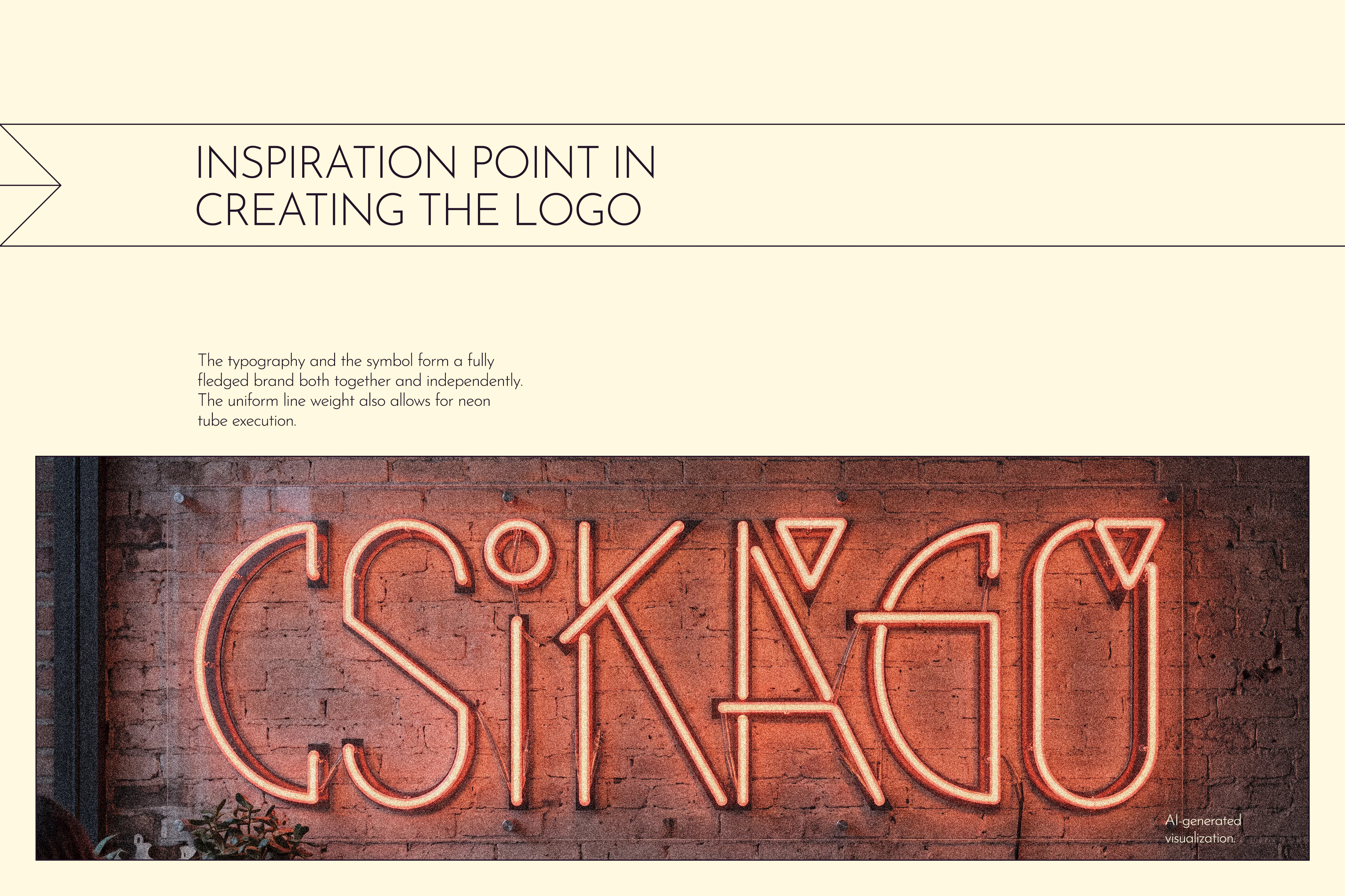
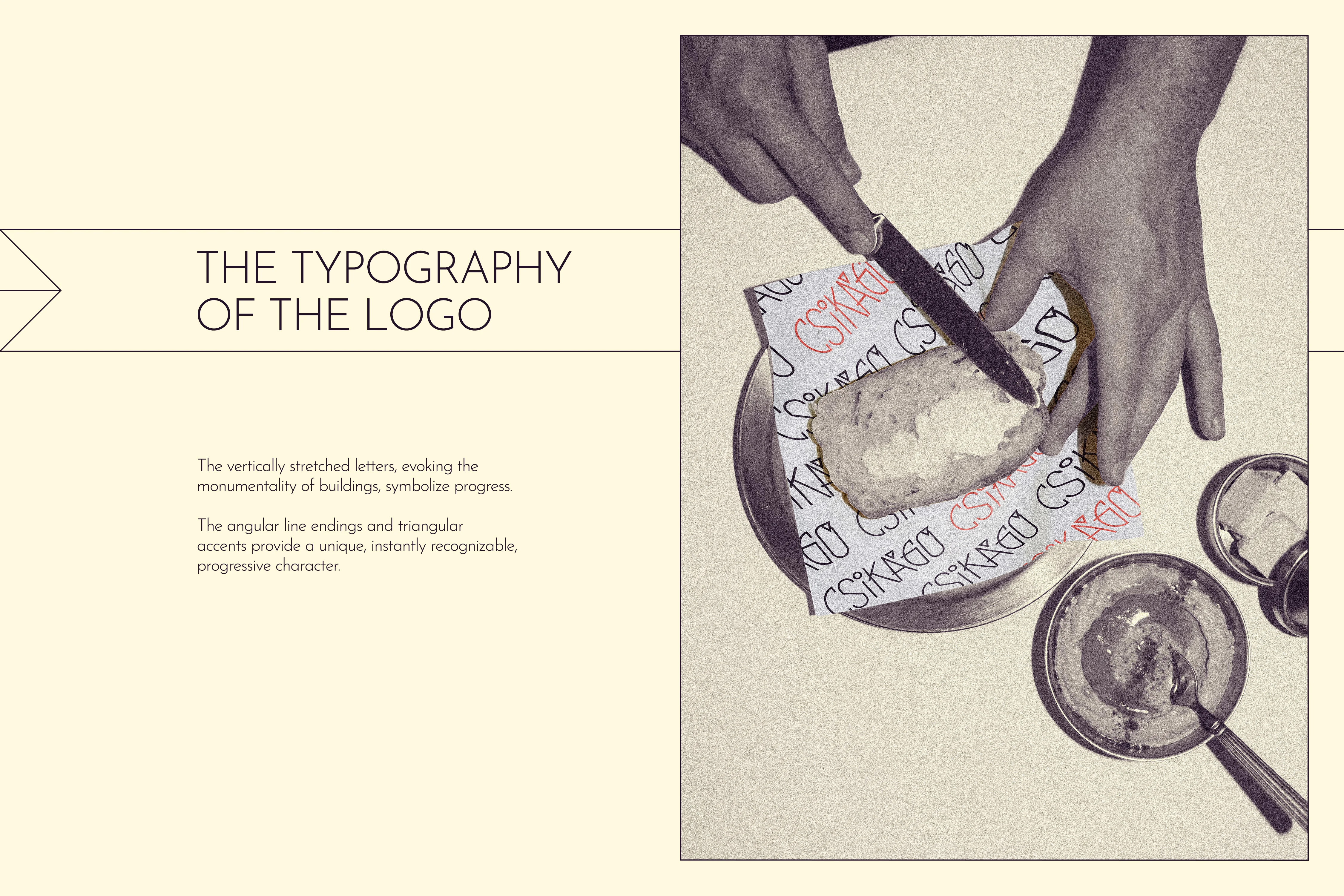
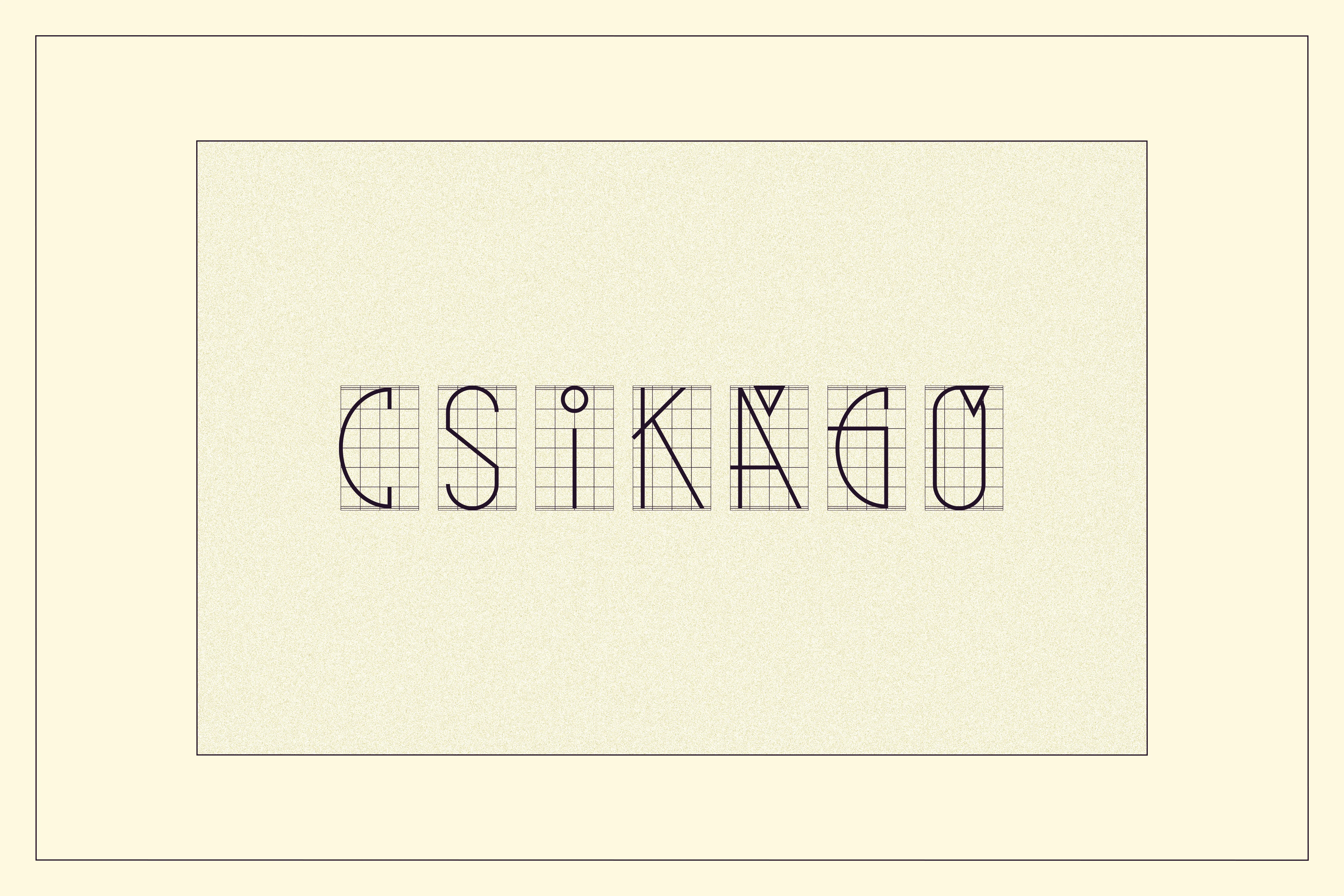
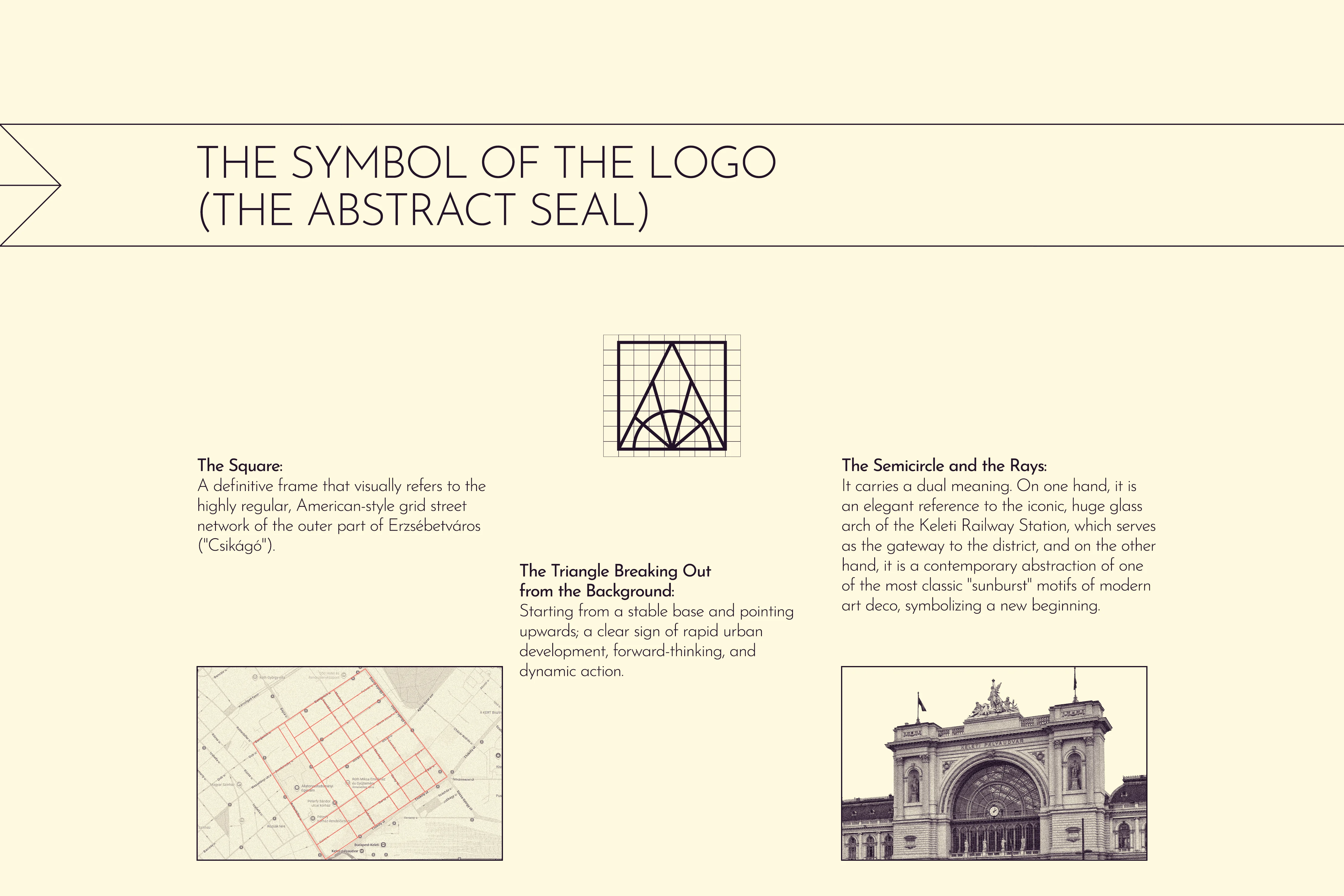
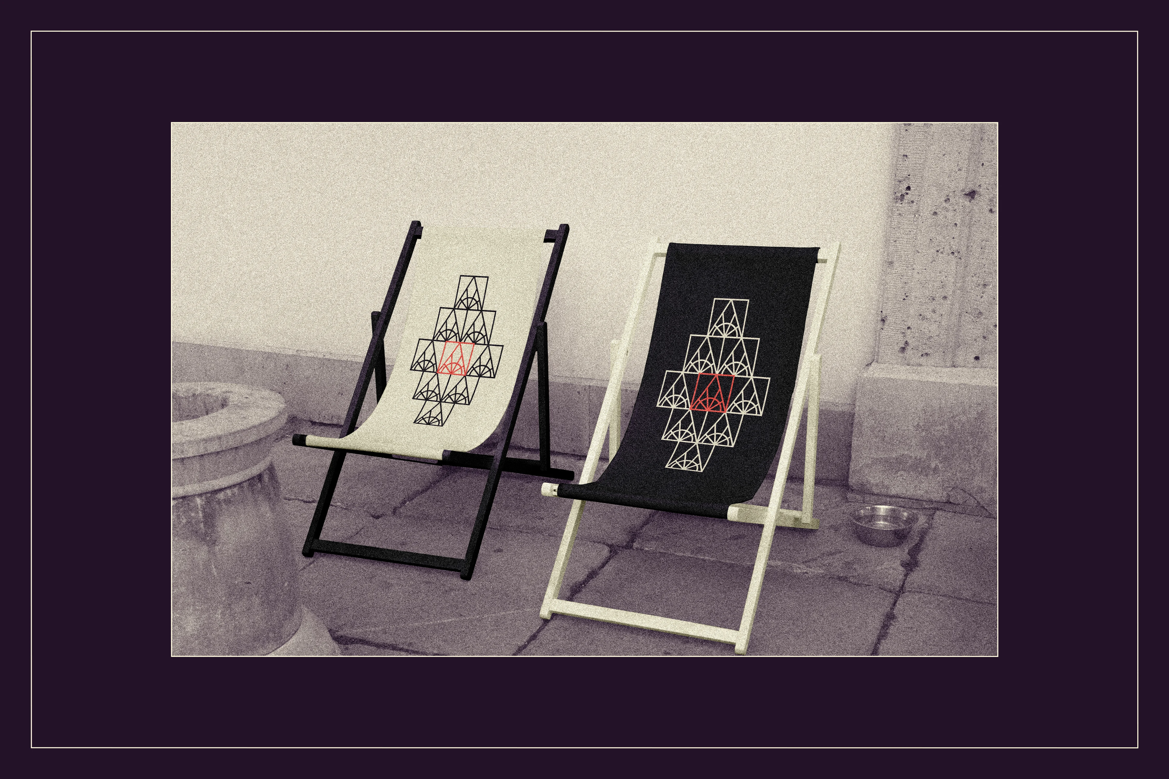
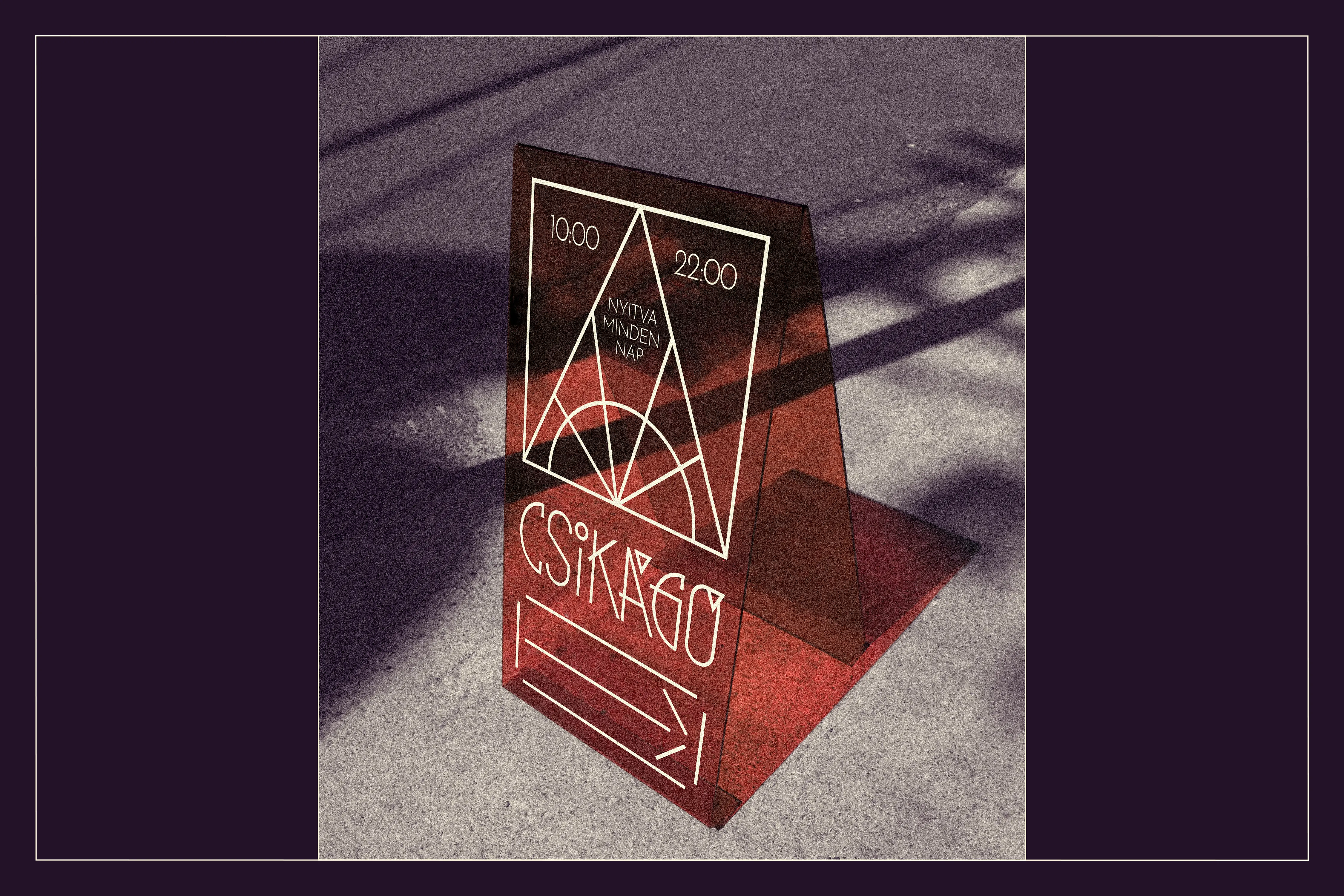
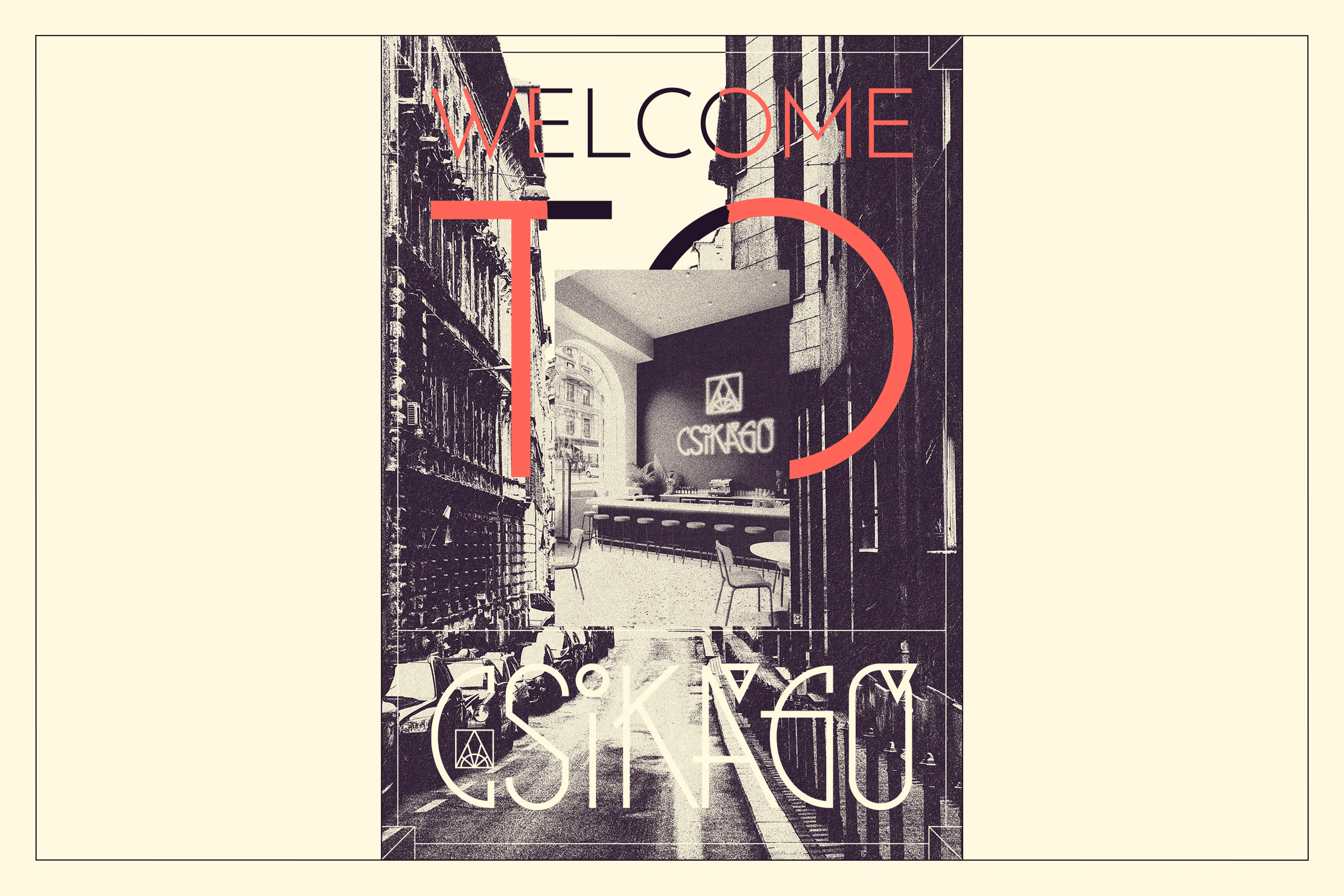
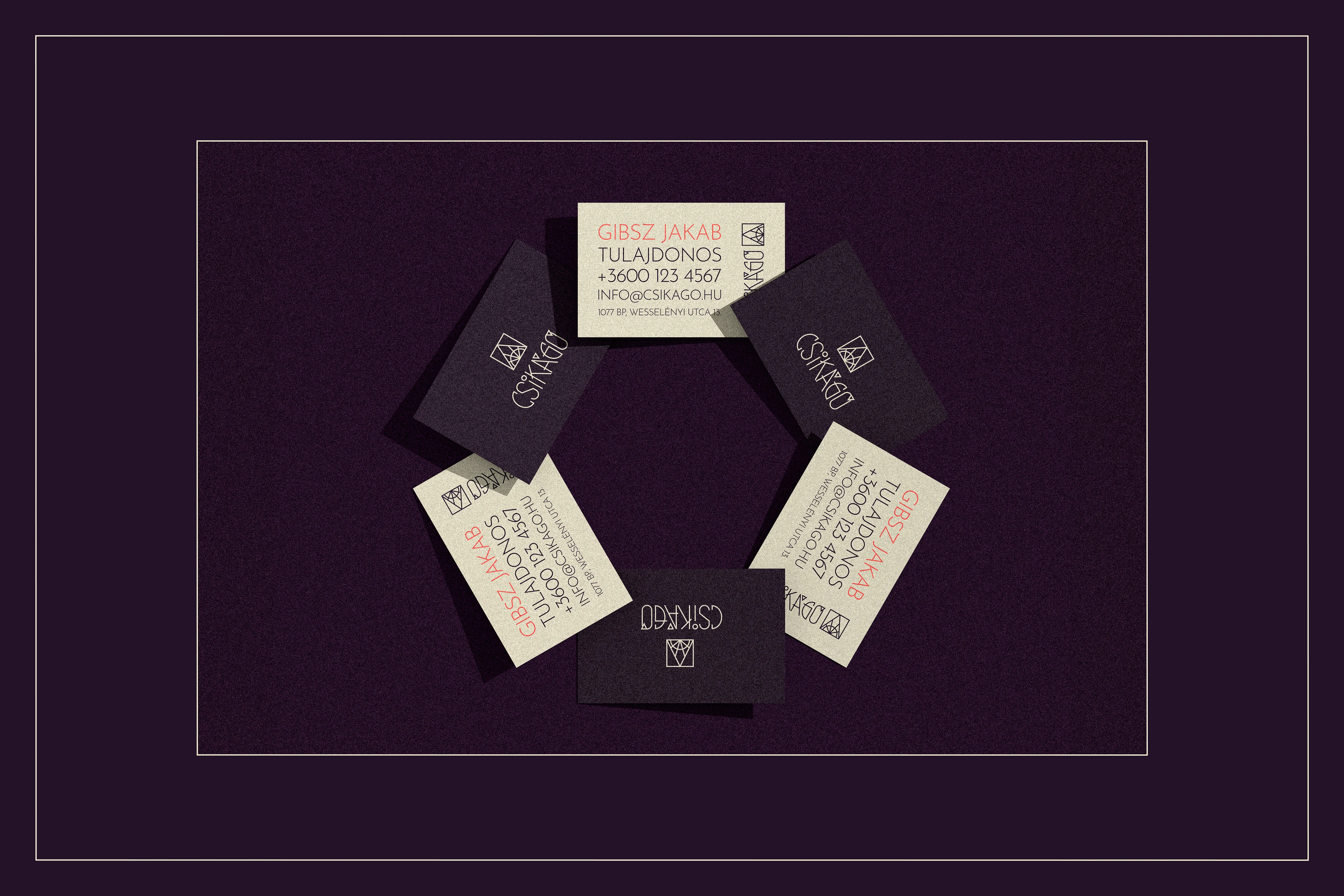
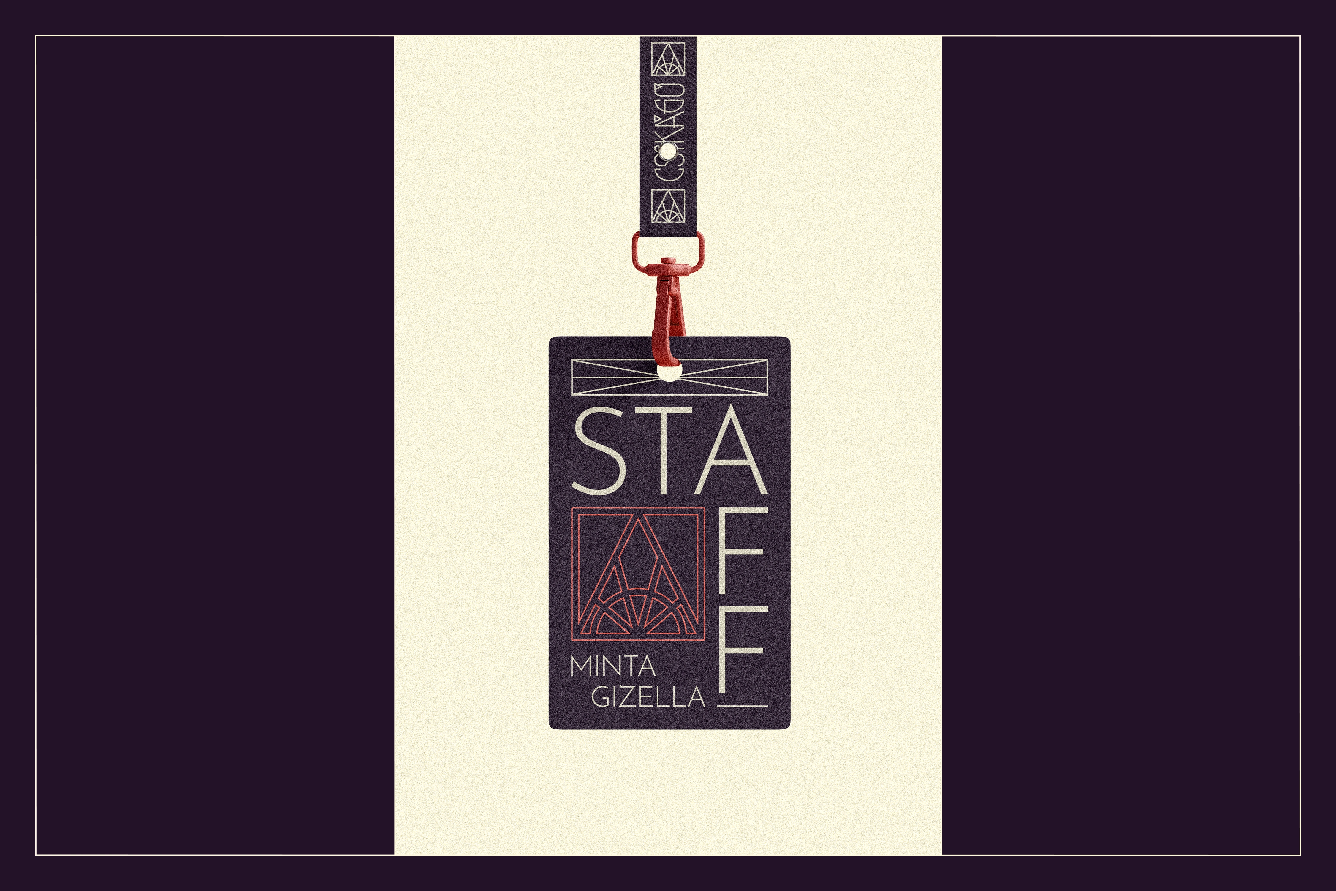
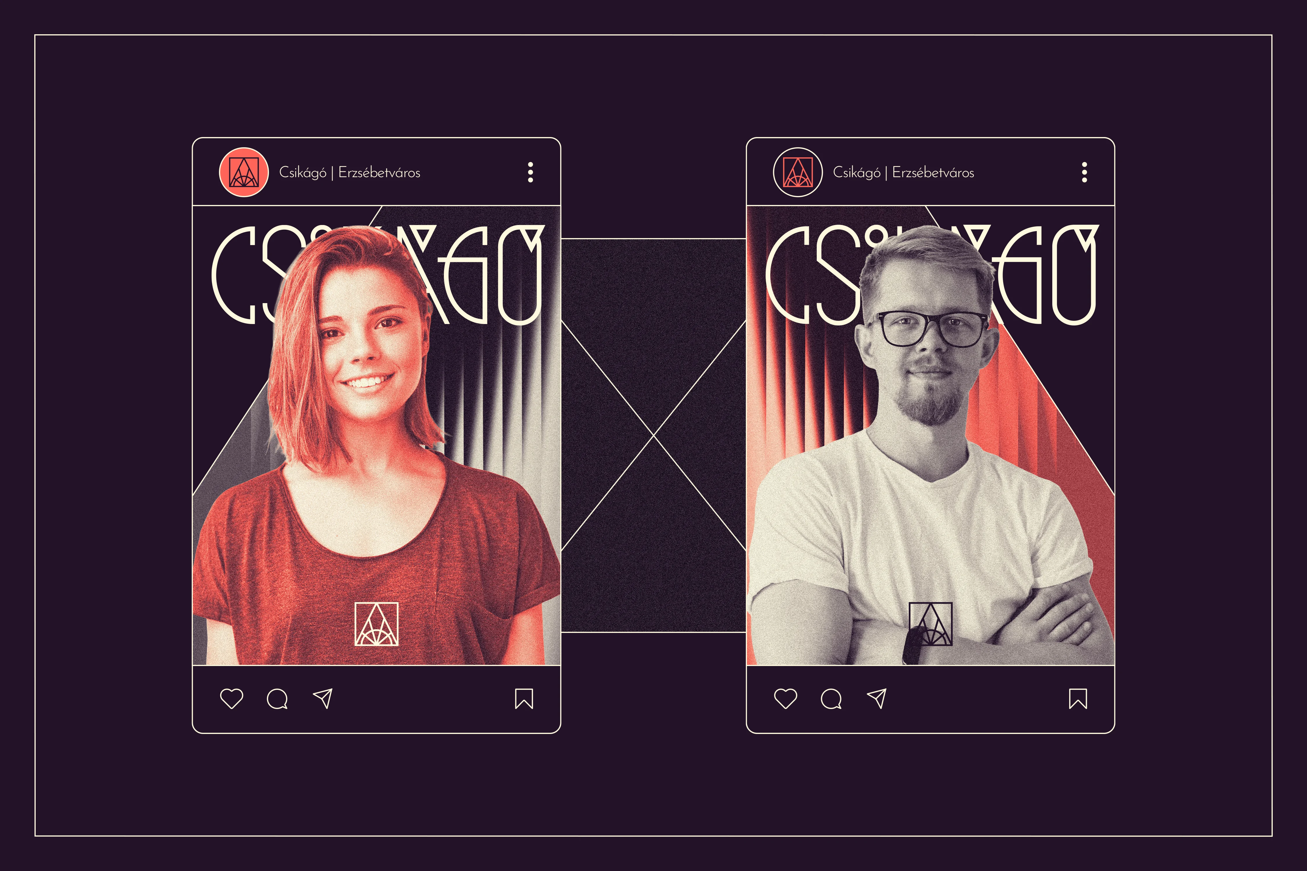
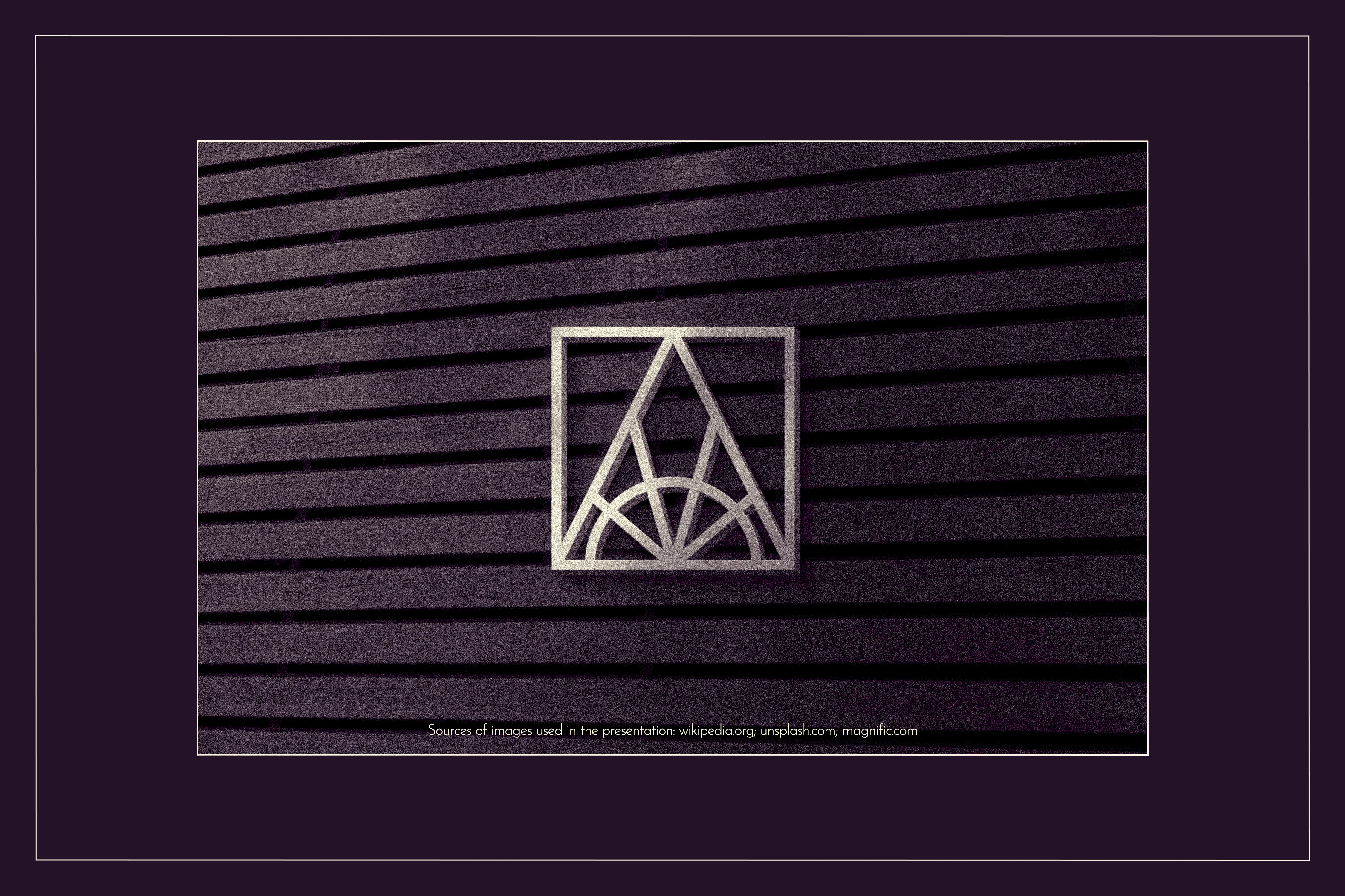
At the heart of this comprehensive identity is a central logo system that merges architectural geometry with dynamic symbolism. The independent symbol acts as an abstract seal: a square referencing the neighborhood's strict American-style street grid, a breakthrough triangle symbolizing rapid urban development and forward momentum, and a sunburst motif that simultaneously nods to the iconic glass arch of the nearby Keleti Railway Station and the classic Art Deco "new dawn". Paired with vertically elongated, skyscraper-inspired typography featuring sharp, geometric accents, the monolinear logo is perfectly optimized for physical neon signs and modern digital platforms alike.
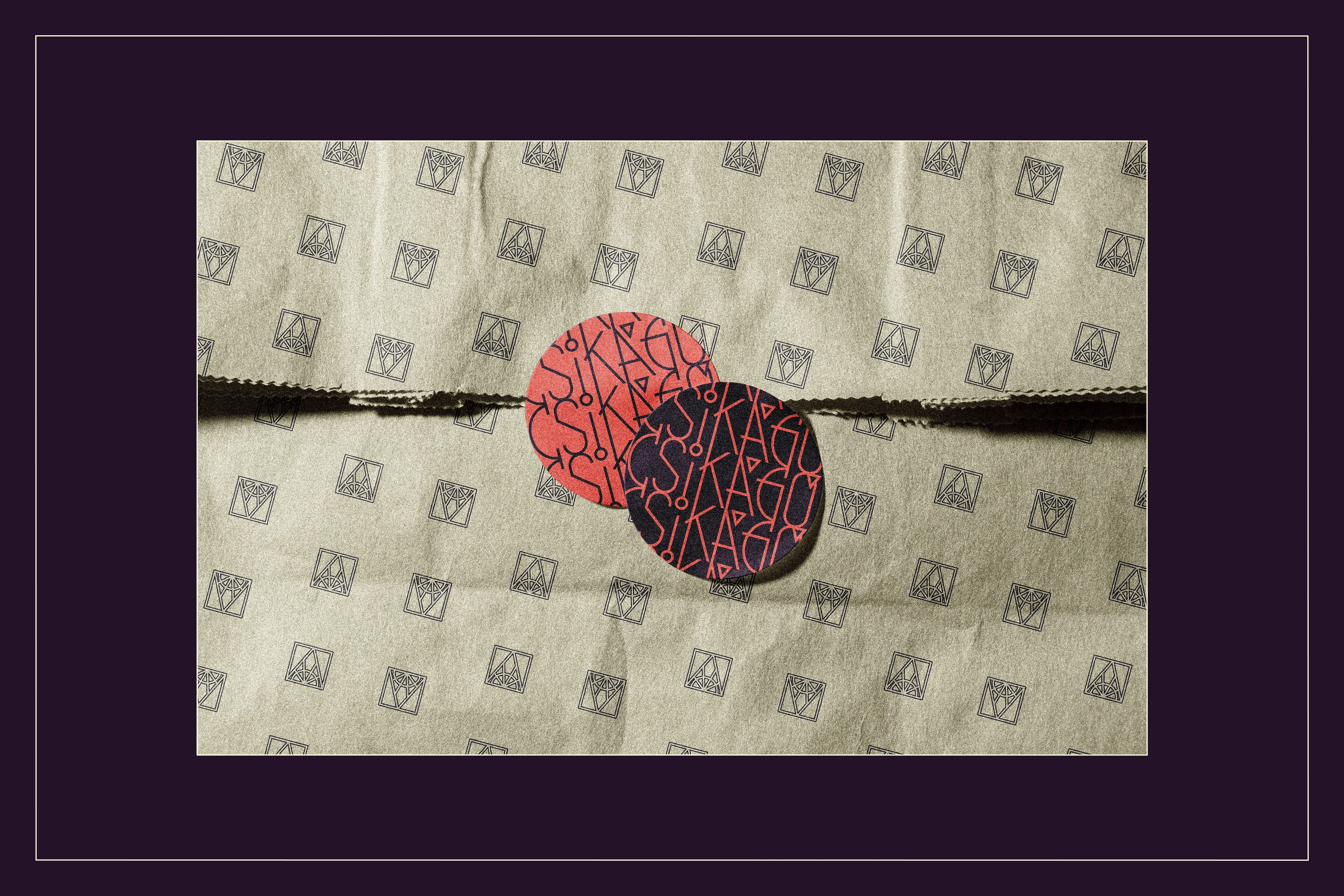
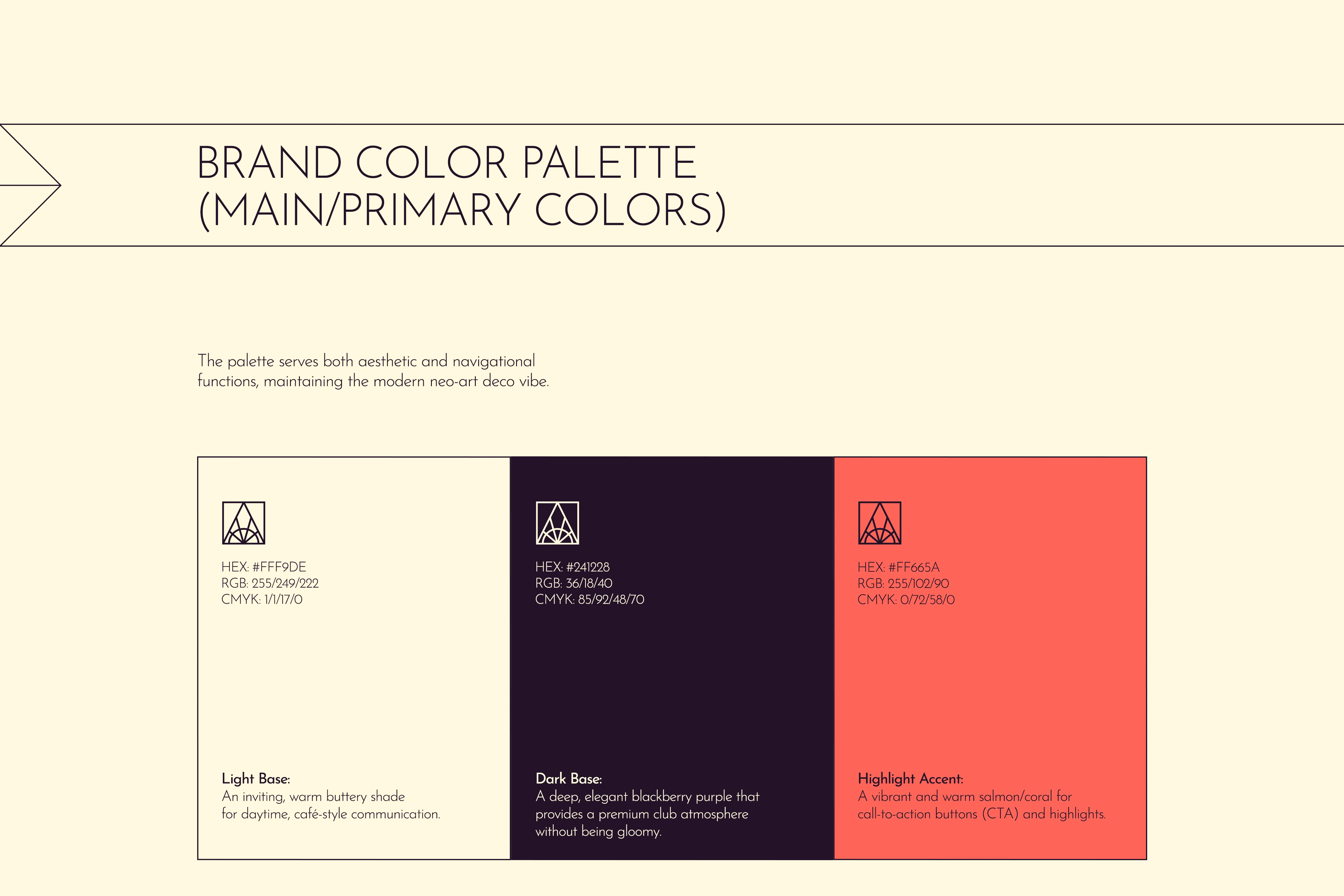
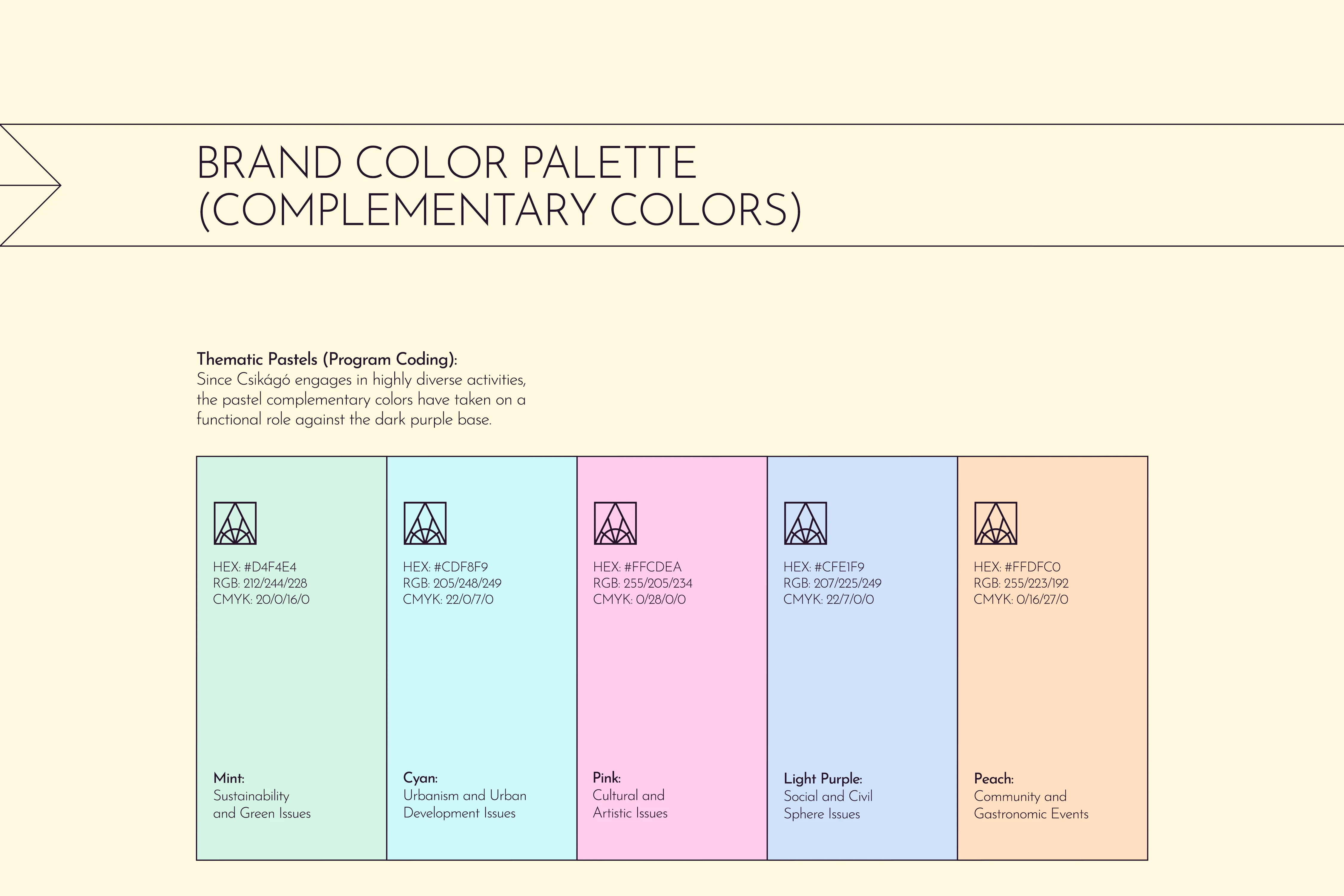
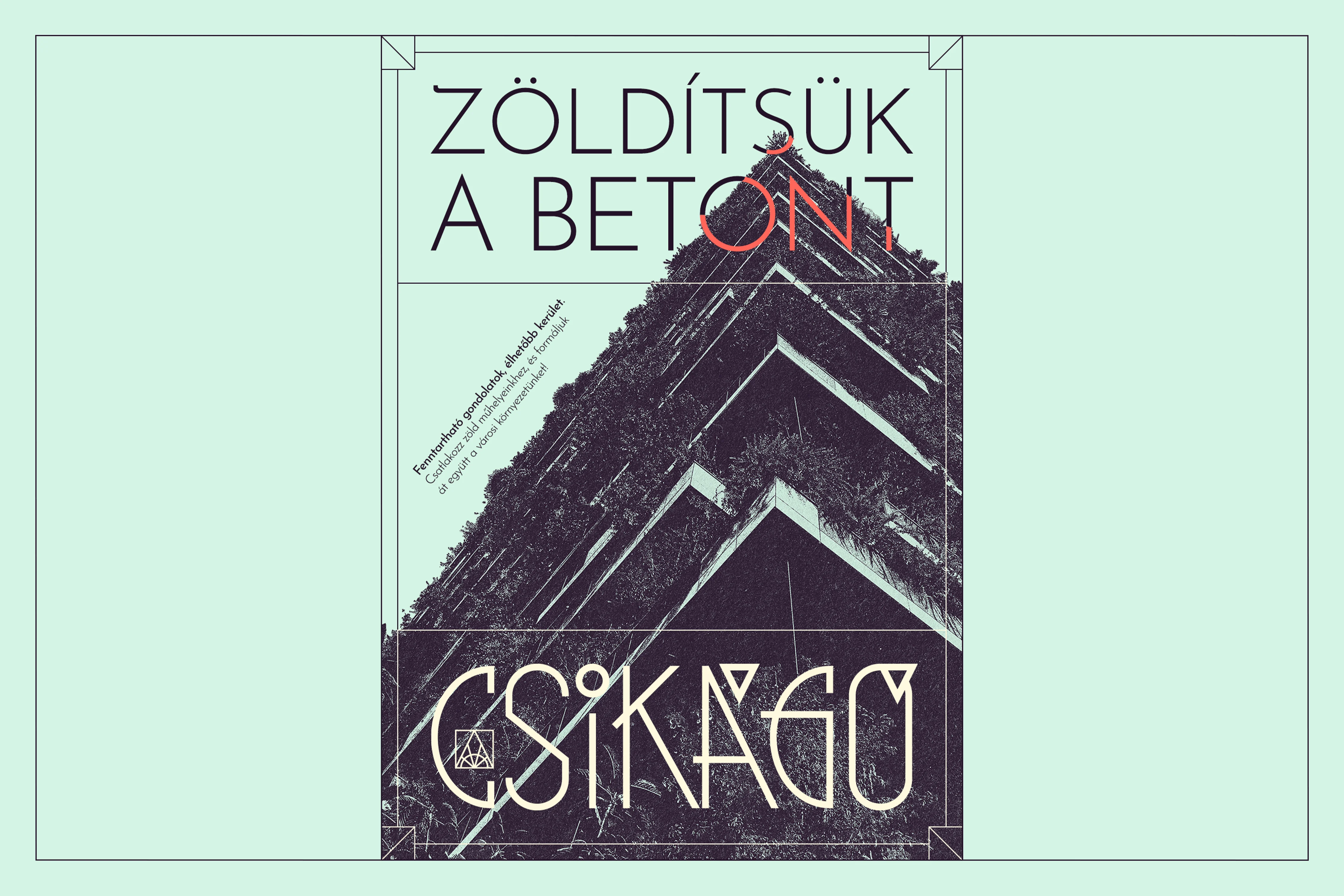
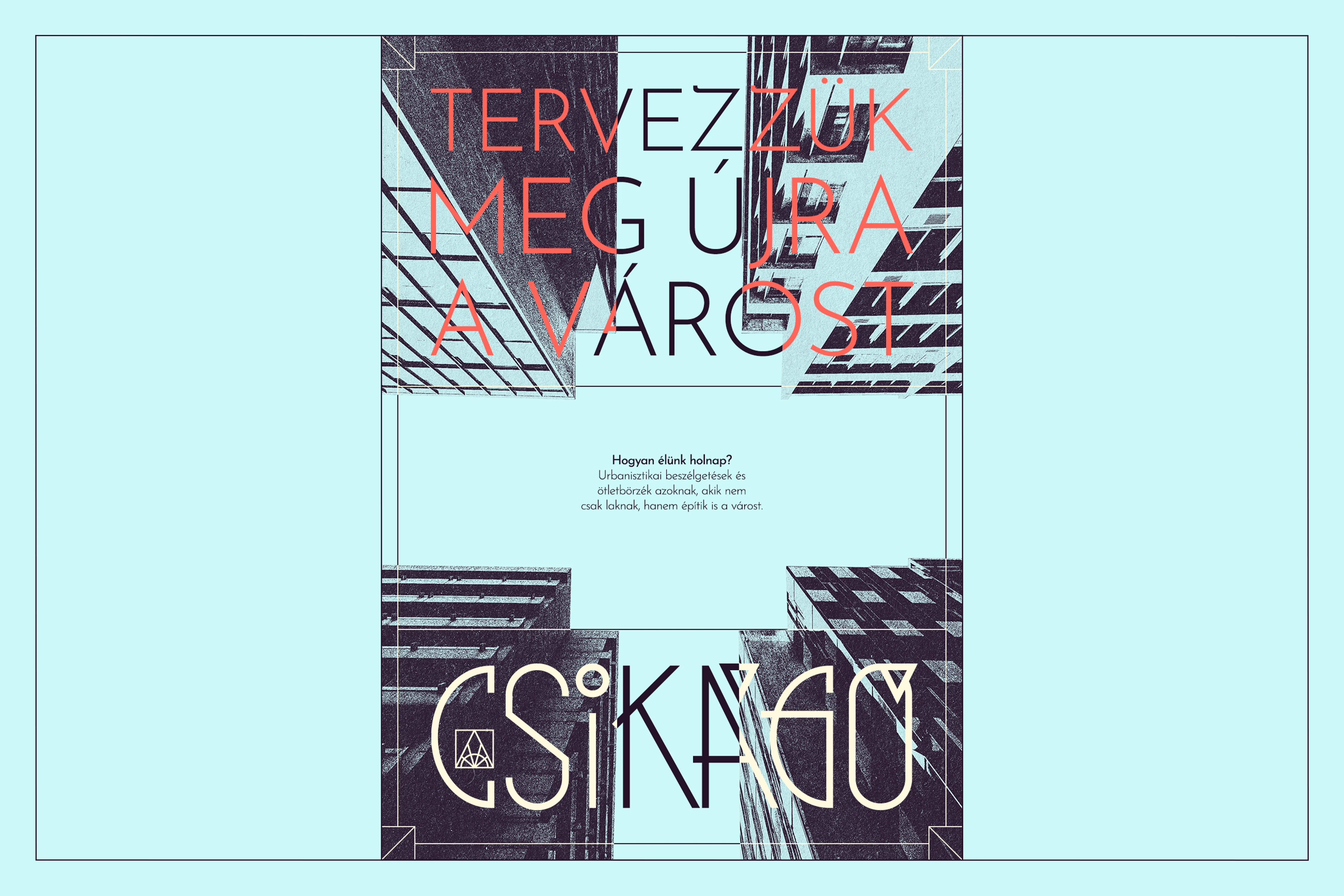
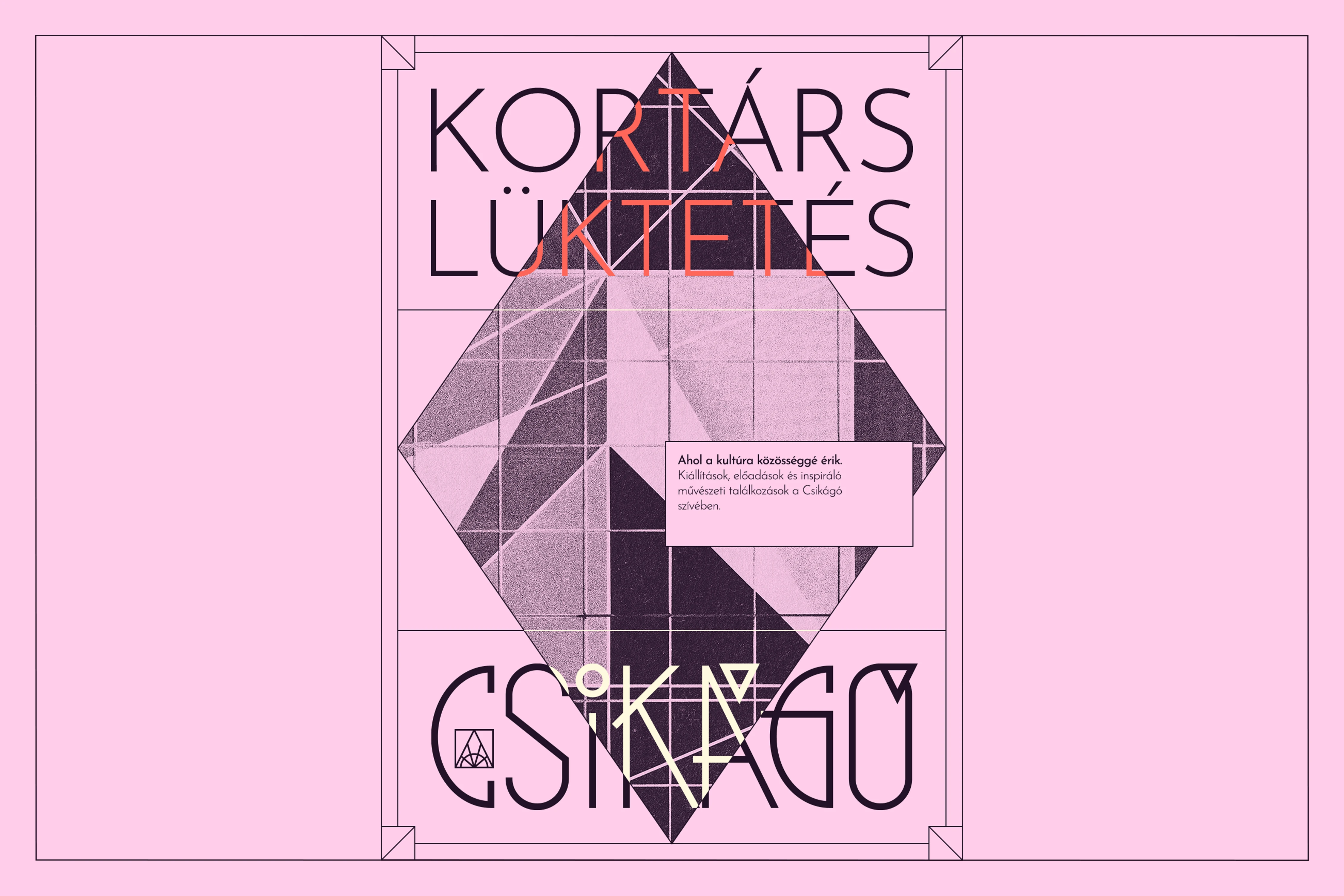
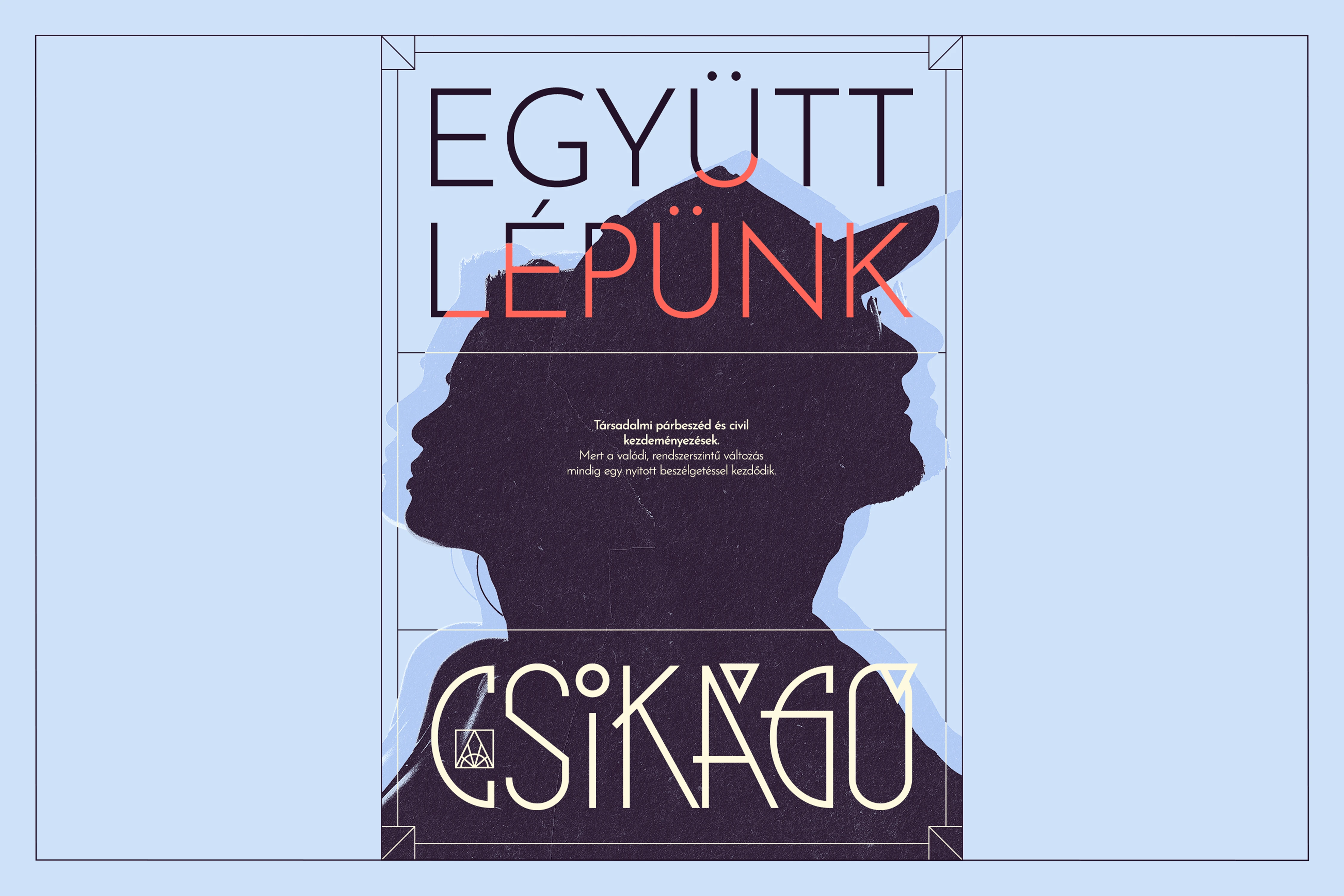
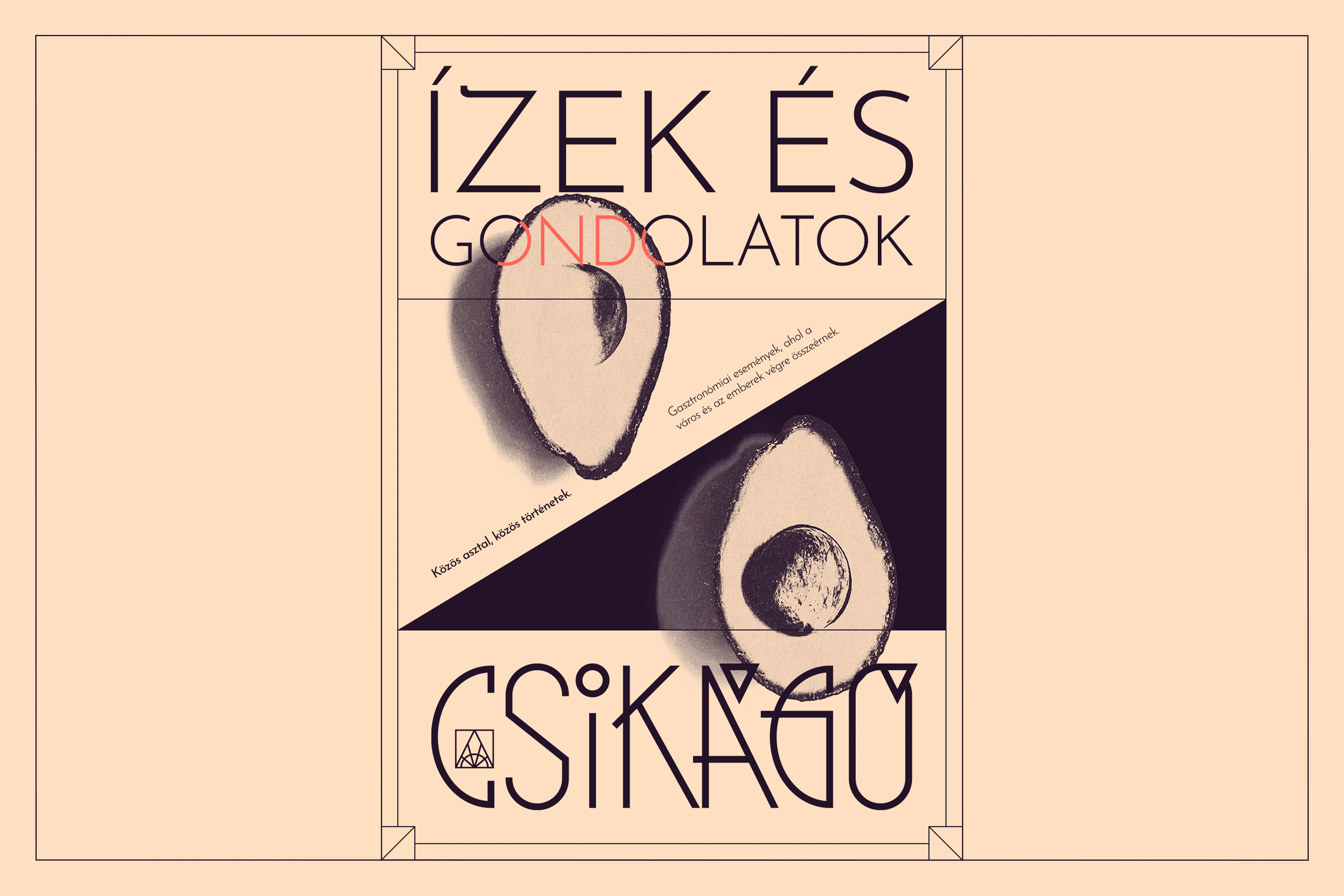
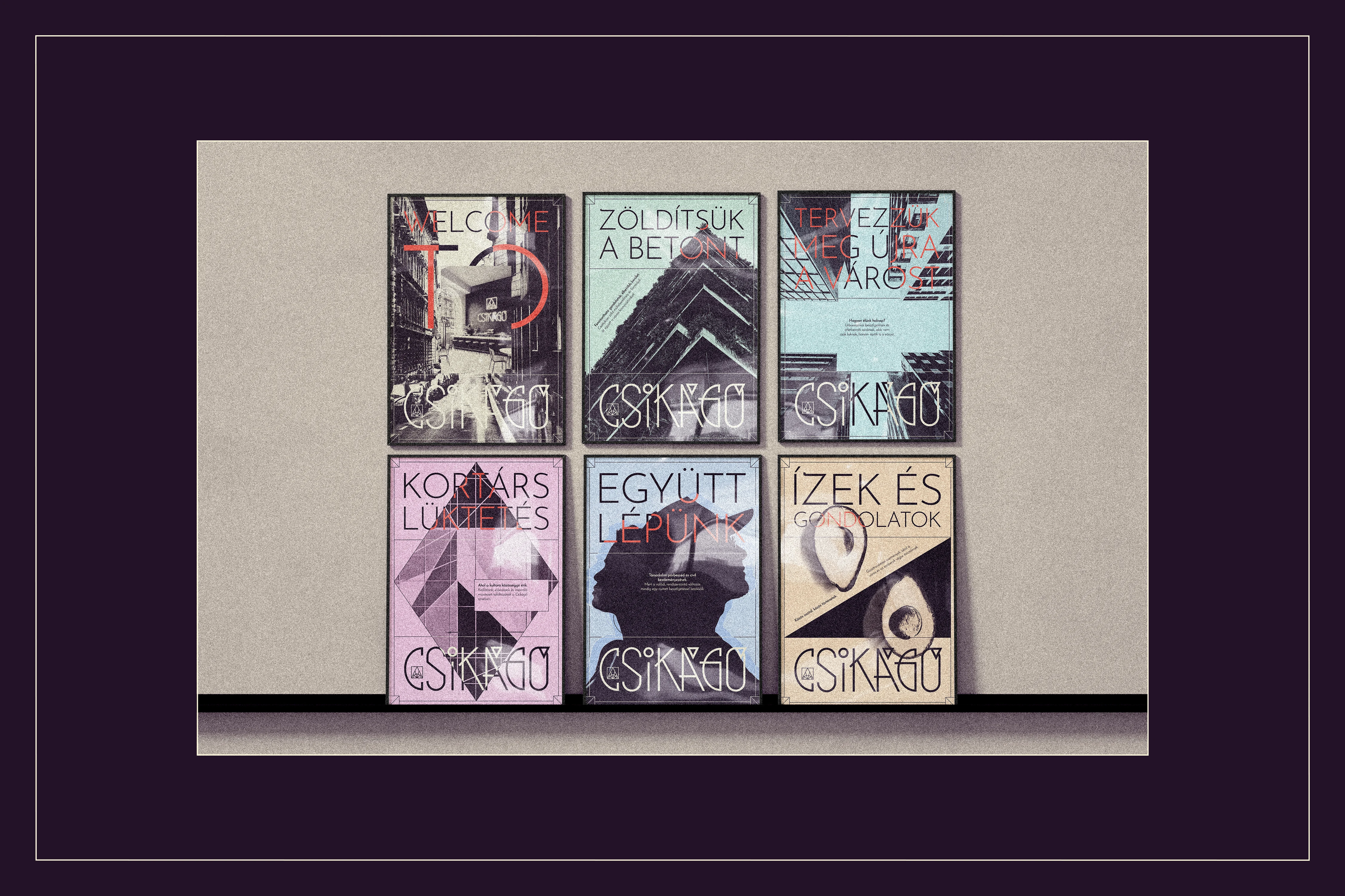
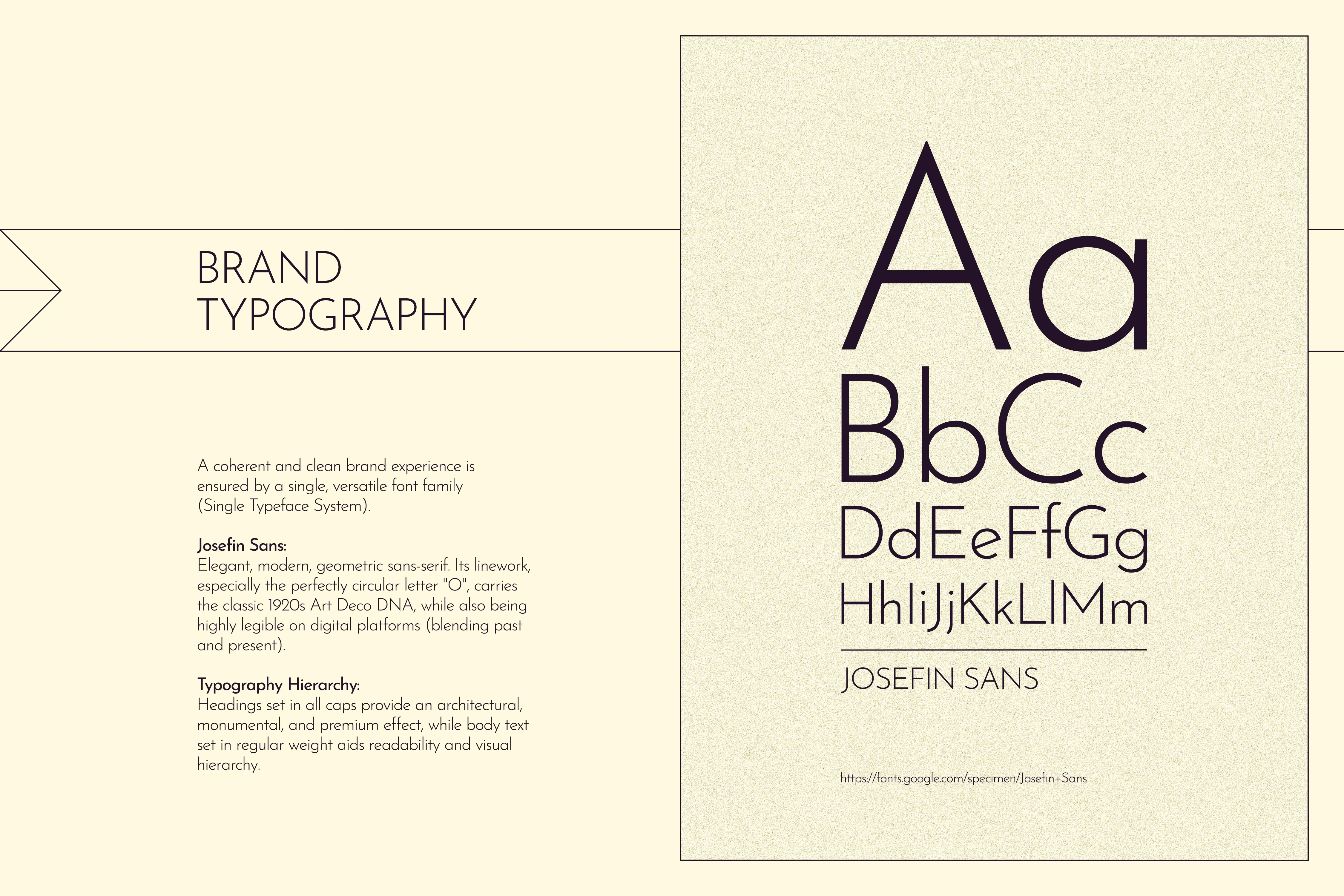
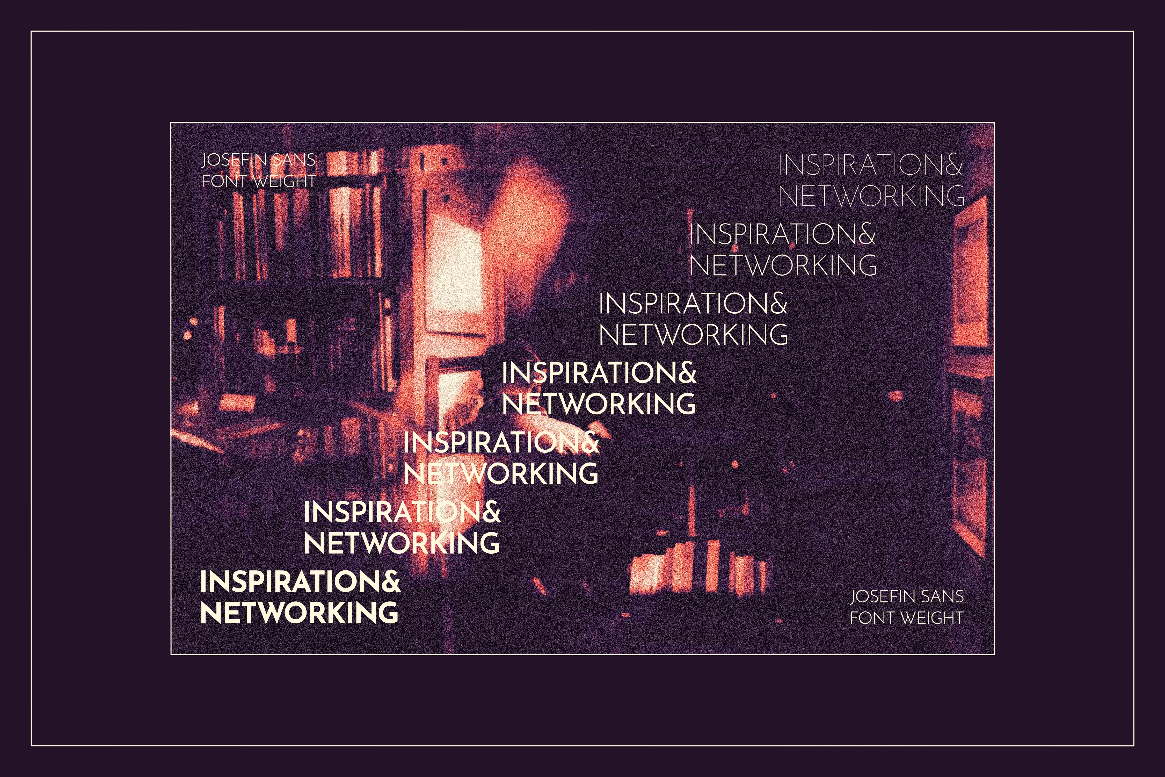
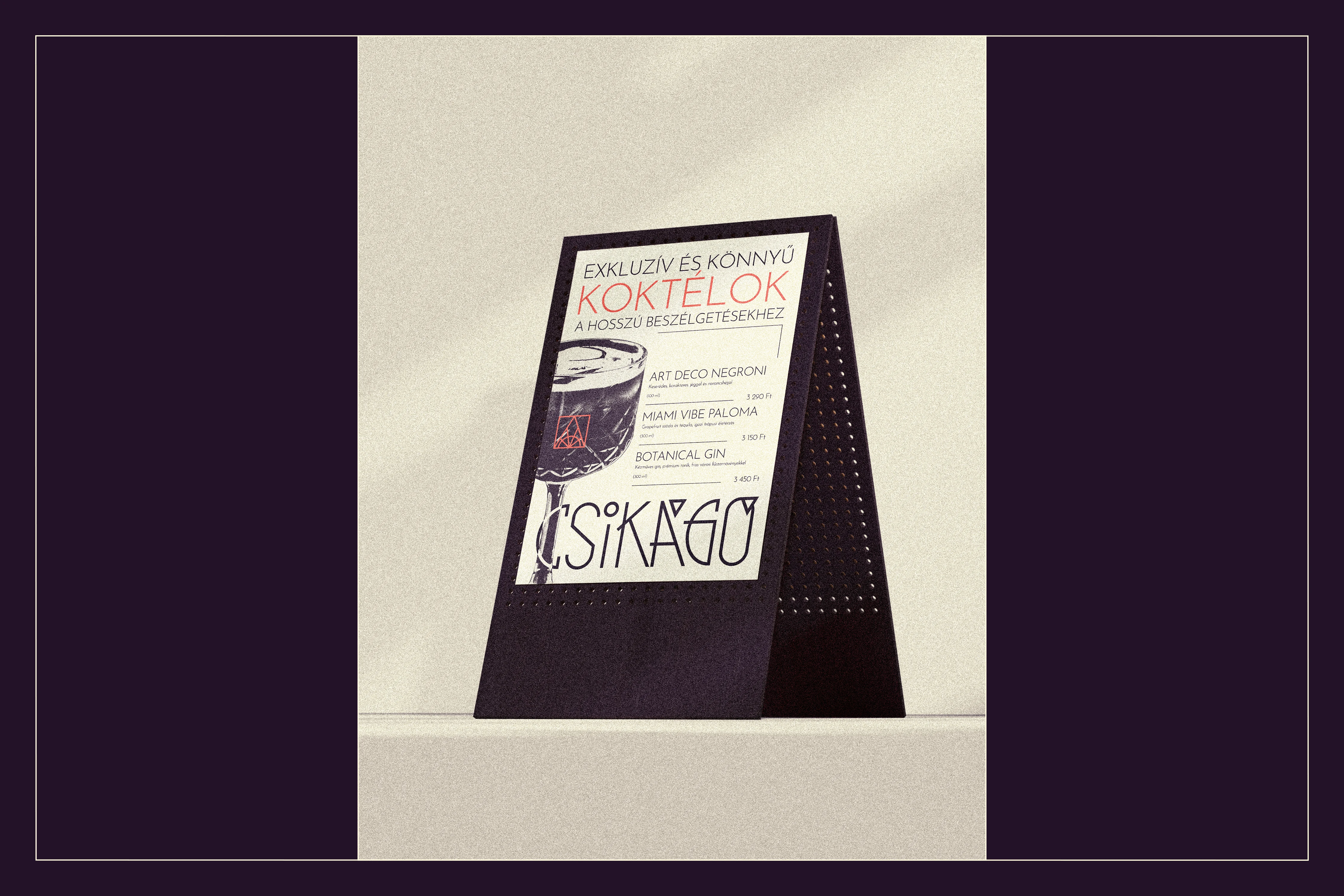
To further distance the brand from rigid, historical "Great Gatsby" clichés, the color palette embraces the vibrant and dynamic energy of Tropical/Miami Art Deco. A deep, premium blackberry base replaces the expected, somber black, allowing a functional system of pastel thematic colors to code the space's diverse programs. A vibrant coral accent drives action and attention. This balance of heritage and contemporary functionality is perfectly echoed in the typography. The geometric elegance and 1920s DNA of Josefin Sans are utilized in a strict Single Typeface System, using all-caps for monumental, poster-like headings and standard casing for highly legible body text.
Ultimately, this branding successfully transforms the community's mission into a tangible, emotionally resonant visual experience. By weaving together Modern Art Deco aesthetics, architectural geometry, and a functionally vibrant color system, the result is a highly adaptable design that honors Budapest's historical roots while confidently inviting the modern urbanite to actively shape the city's future.


Like this project
Posted Sep 21, 2026
Community space brand identity, blending Modern Art Deco aesthetics, architectural geometry, and a functional color system into an active urban workshop.