

Visual identity for Fitosal, built around a simple typographic idea.
A fragment taken from the medical “+” symbol is used to complete selected letters in the Fitosal wordmark, creating a recognisable graphic element that extends throughout the wider visual identity and retail...
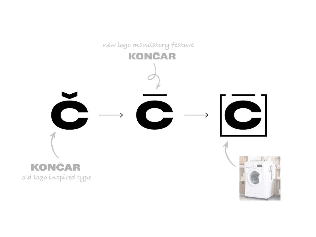
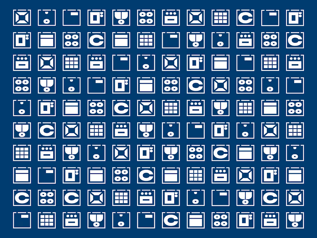
The icon system for Končar House Appliances was developed directly from the logotype itself.
Starting from the letter “Č”, we used its form to create a washing machine icon, which became the conceptual starting point for the wider system. From there, the same visual logic was...