Fitosal — Brand Identity & Visual System

Miran M. Bašić


The Challenge
Fitosal is a company specializing in phytotherapy products, supplements, and a wide range of health-focused brands. The challenge was to create a distinctive umbrella identity capable of bringing these different products and brands together under one recognizable visual system.

The Idea
The concept comes from the role phytotherapy often plays in health: not necessarily as a replacement for conventional medicine, but as something that complements it.
We translated this idea of completion and supplementation into a simple visual metaphor: the missing piece that completes the whole.
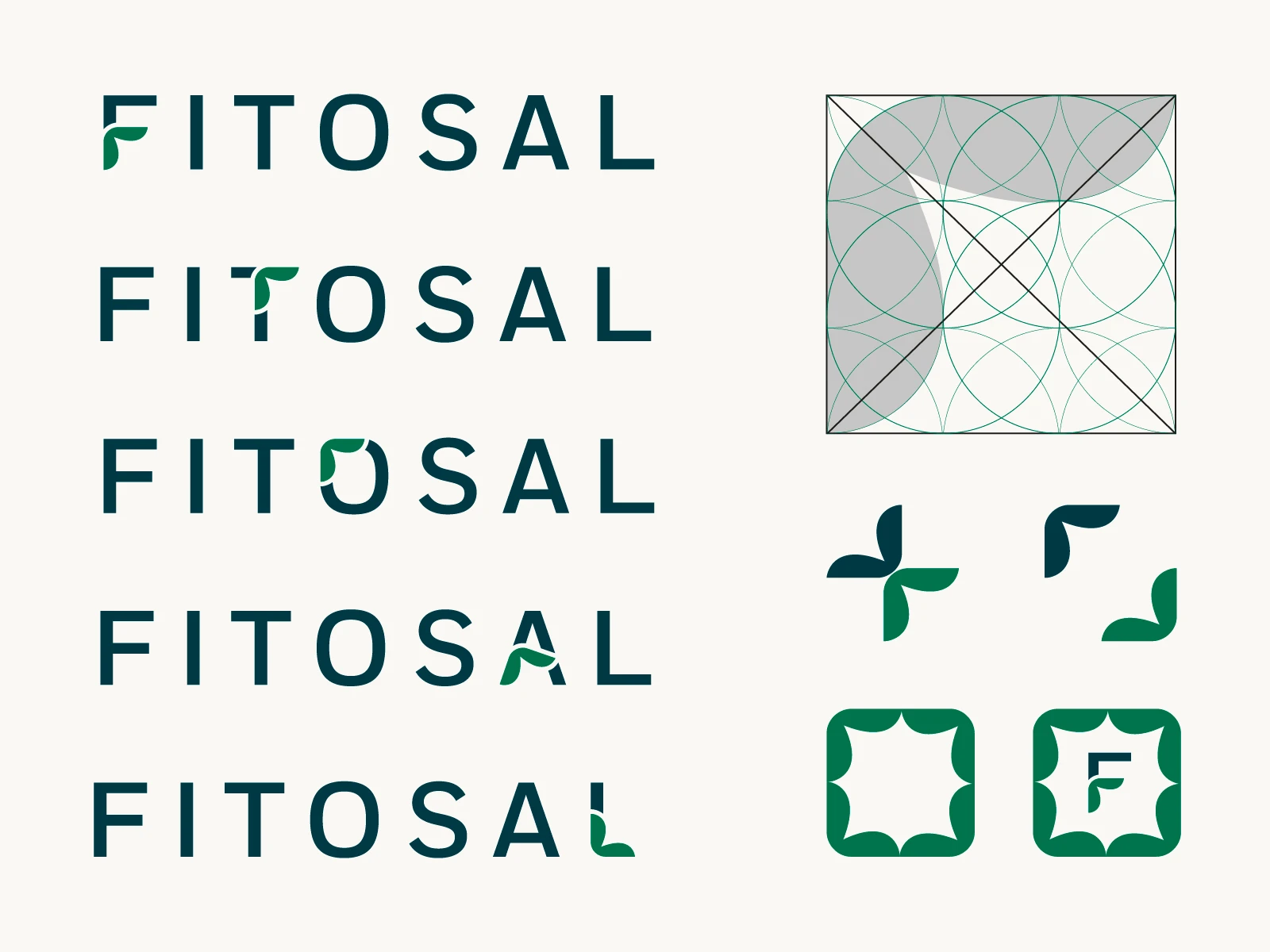
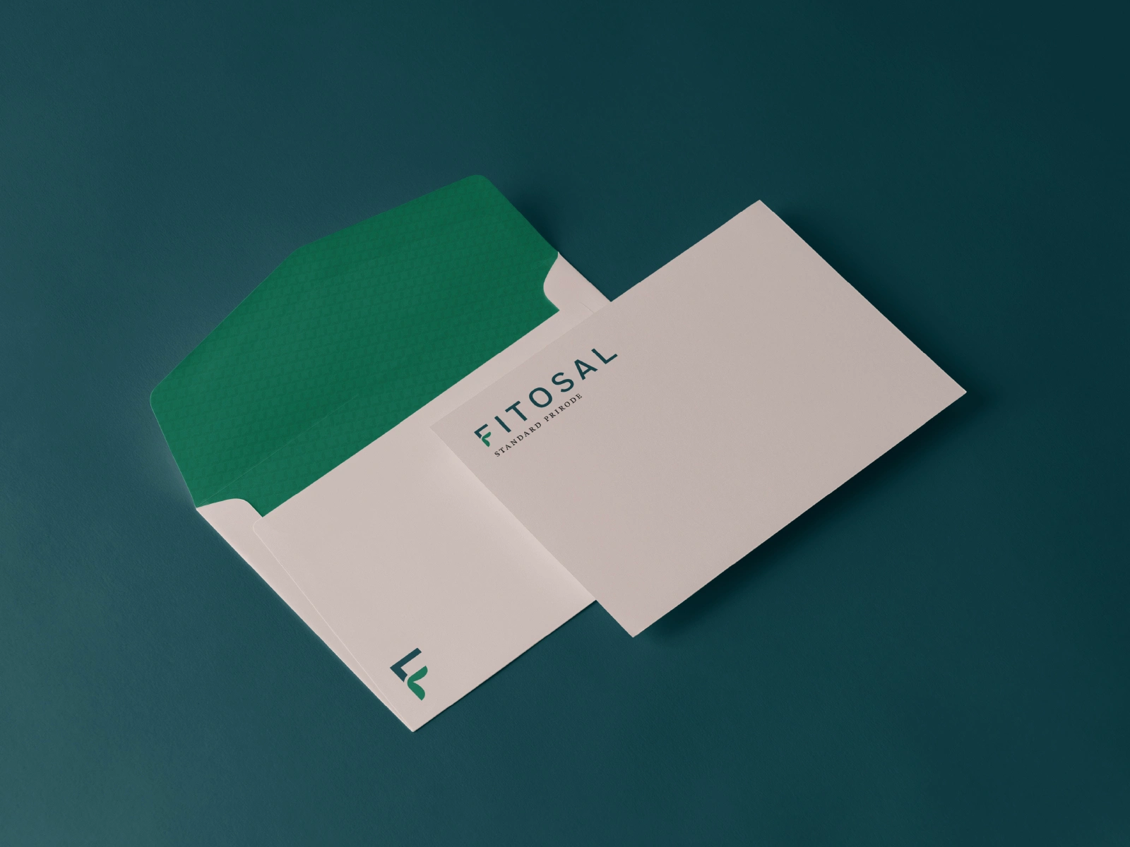
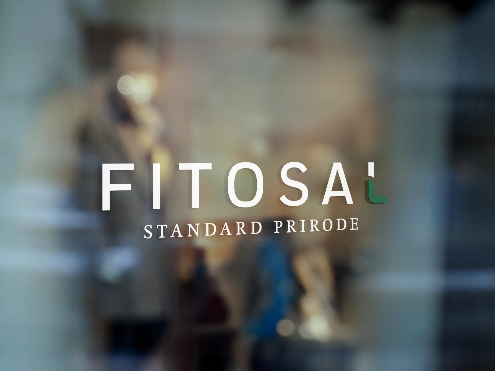
The symbol combines two familiar forms associated with health and phytotherapy: the medical cross and a stylized leaf. A part of the cross was reshaped into a leaf-like element, creating a modular graphic form that can work independently or integrate directly into the Fitosal wordmark, most prominently within the letter F.

The Visual System
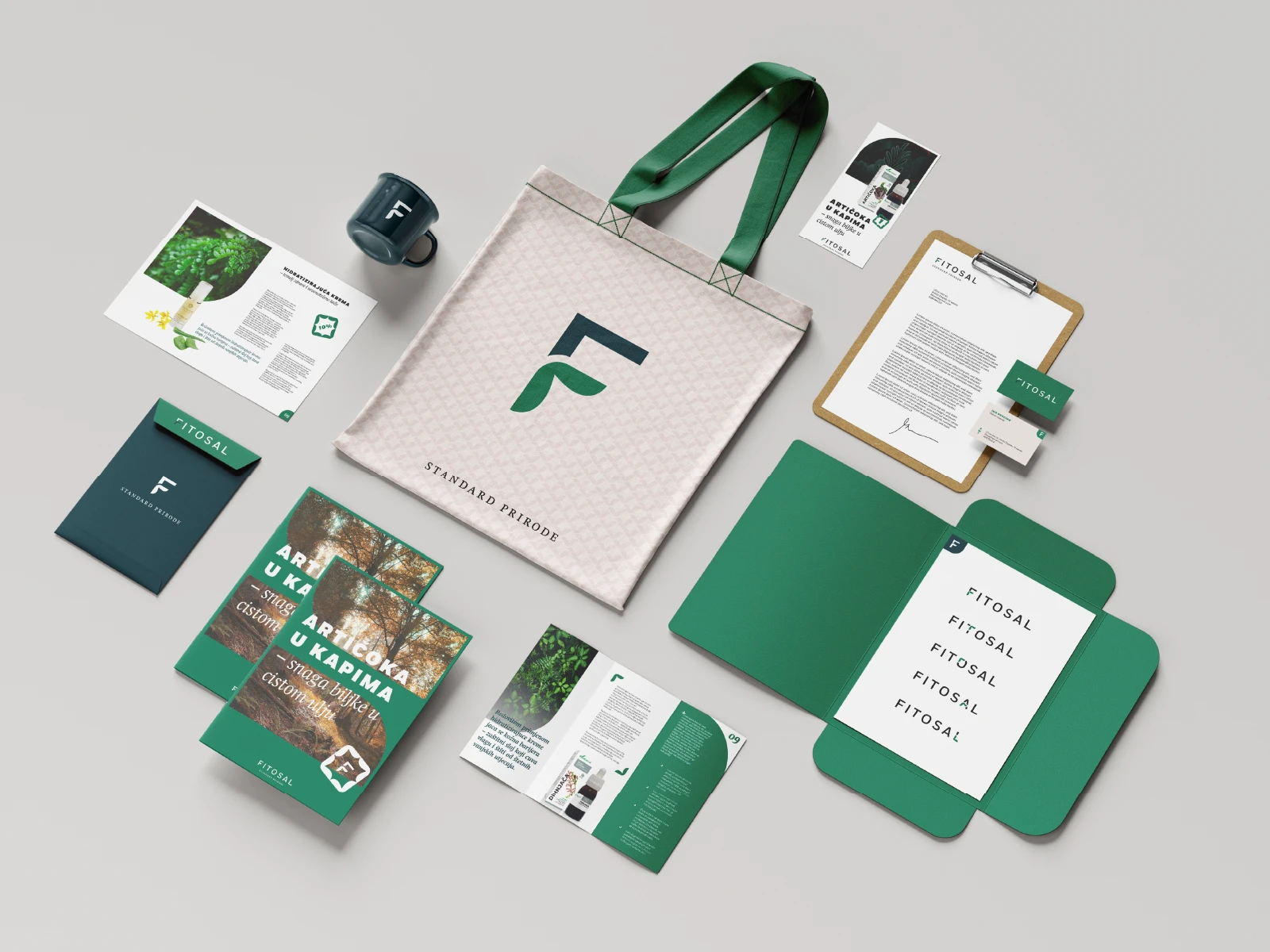
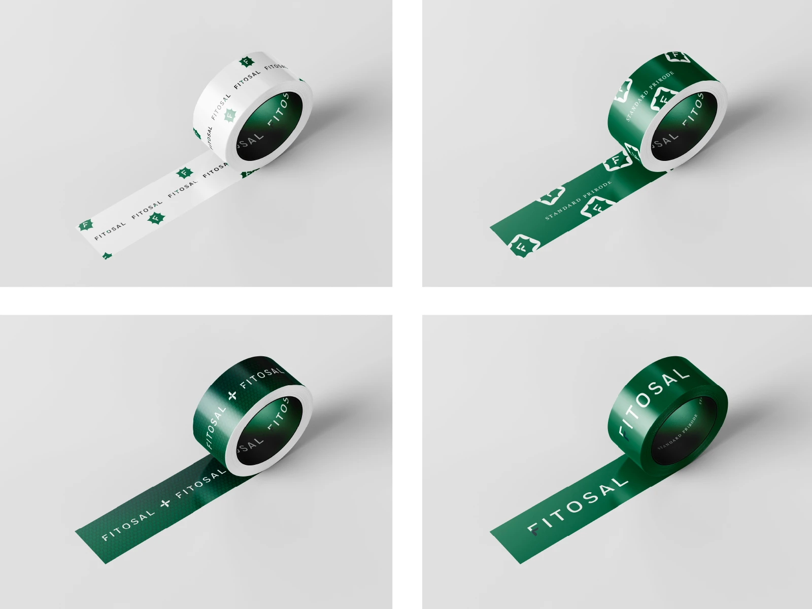
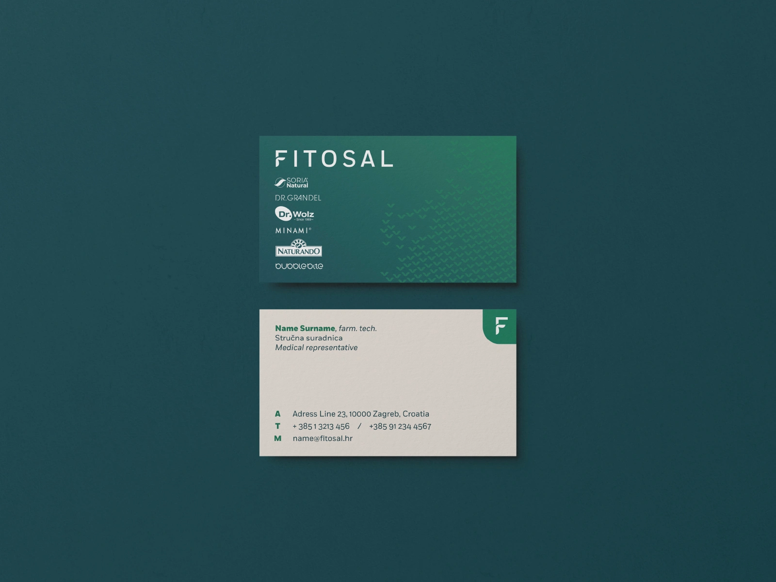
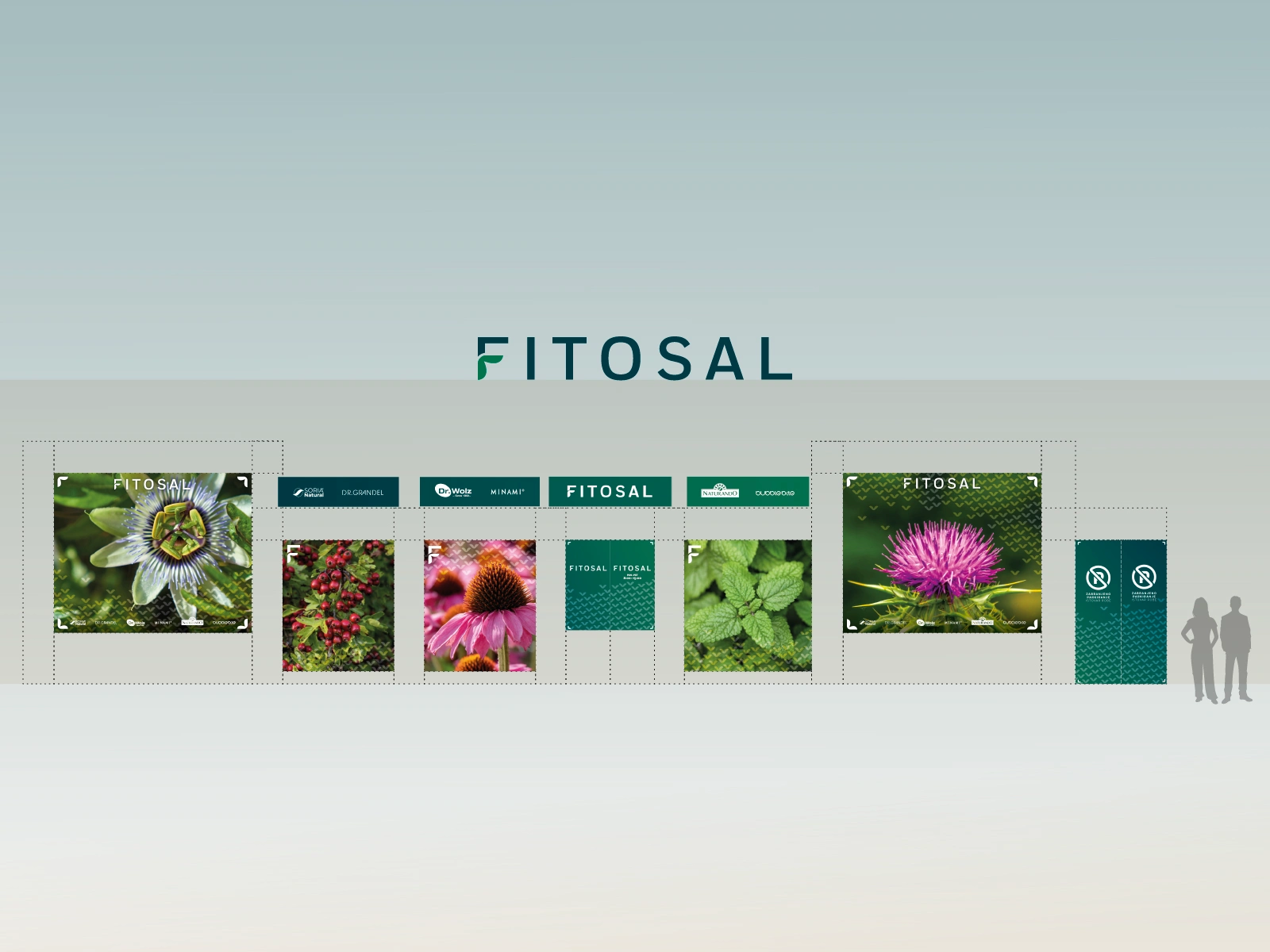
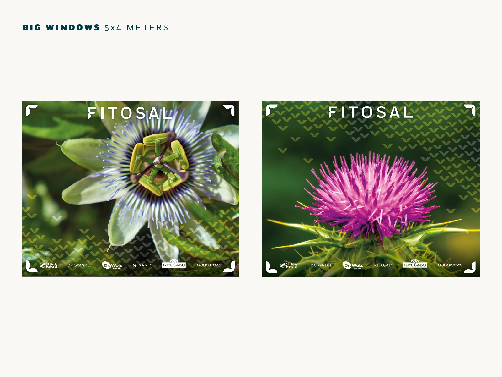
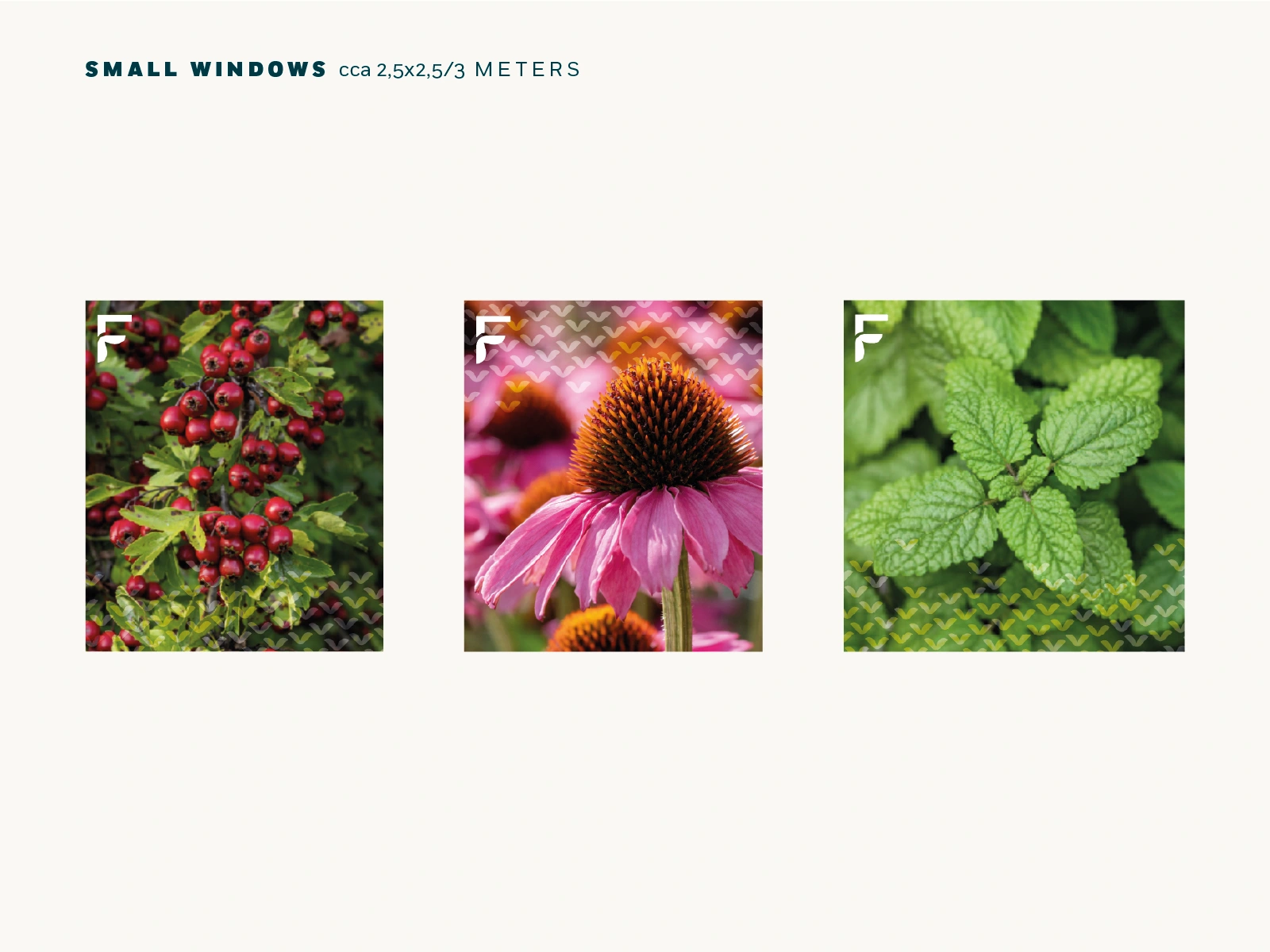
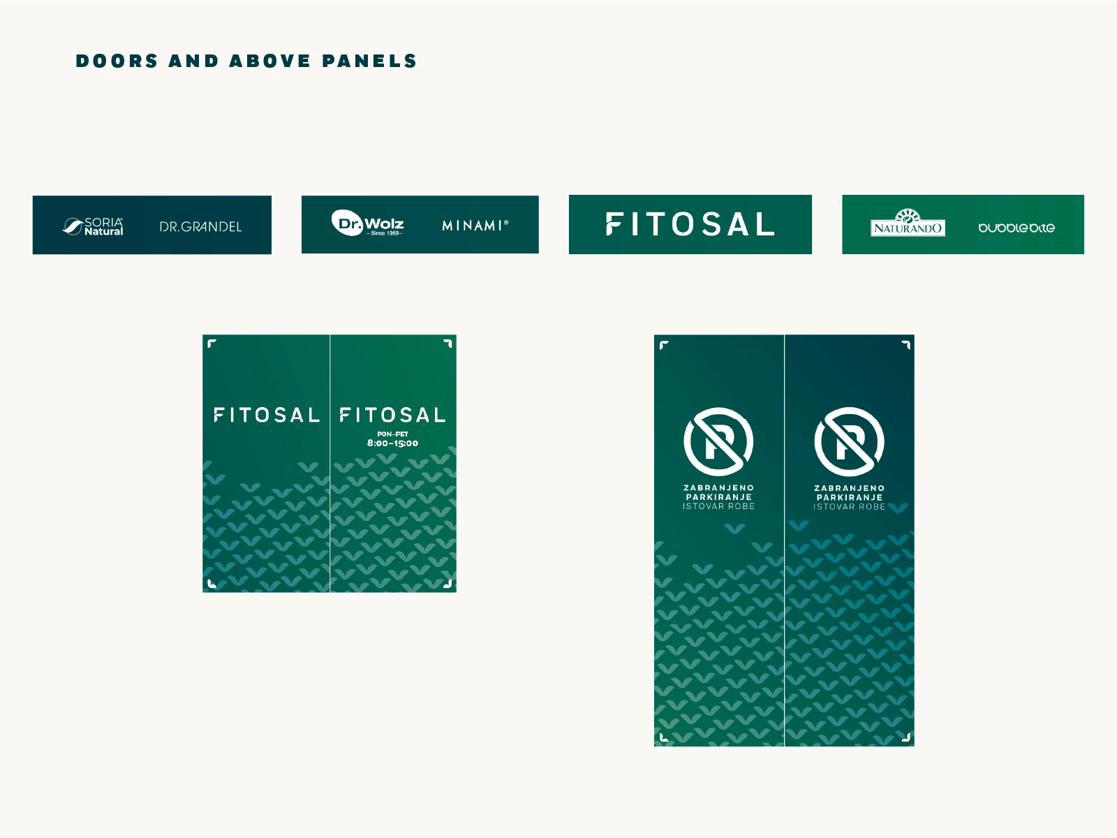
This element became the foundation of the wider identity. It was expanded into patterns, graphic compositions and flexible applications that could work consistently across stationery, promotional materials, retail windows, signage and the exterior of the company’s premises.
Because Fitosal represents and distributes a variety of individual brands, the identity was designed to function as a strong but adaptable parent brand; recognizable enough to create cohesion, while flexible enough to coexist with many different products and visual identities.
The Result
The result is a visual system built around the same idea as the brand itself: different elements coming together to complete the picture.
Like this project
Posted Aug 28, 2026
Brand identity and visual system for Fitosal, built around the idea of phytotherapy as a complementary element that helps complete the picture of health.