Prime Tech Brand Identity

Miran M. Bašić


The Challenge
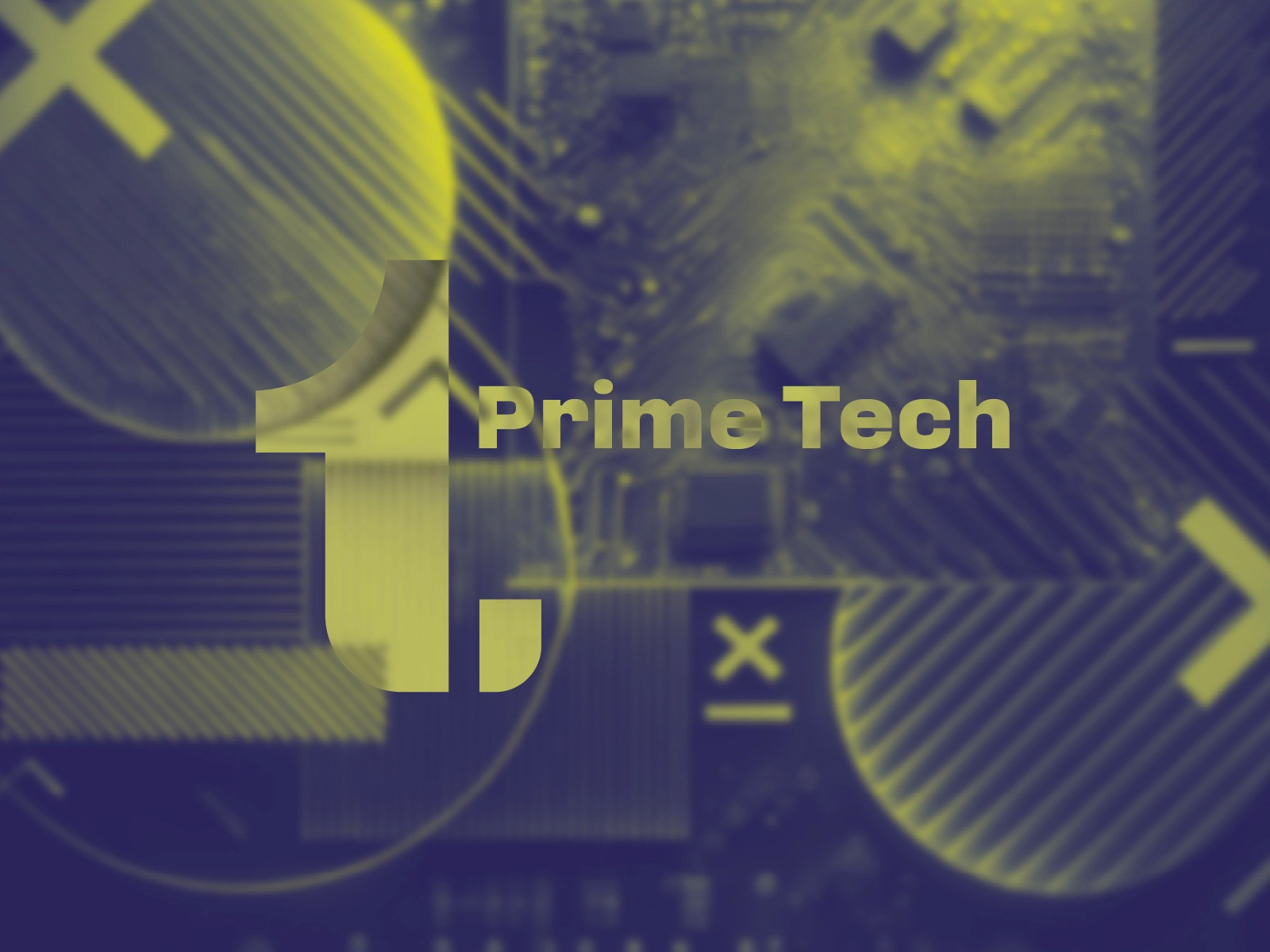
Prime Tech works in network infrastructure, cable installation, and related technical services. The identity needed to feel current and technical, but still practical enough to work on vans, workwear, and everyday company materials — not just on a screen.
The Idea
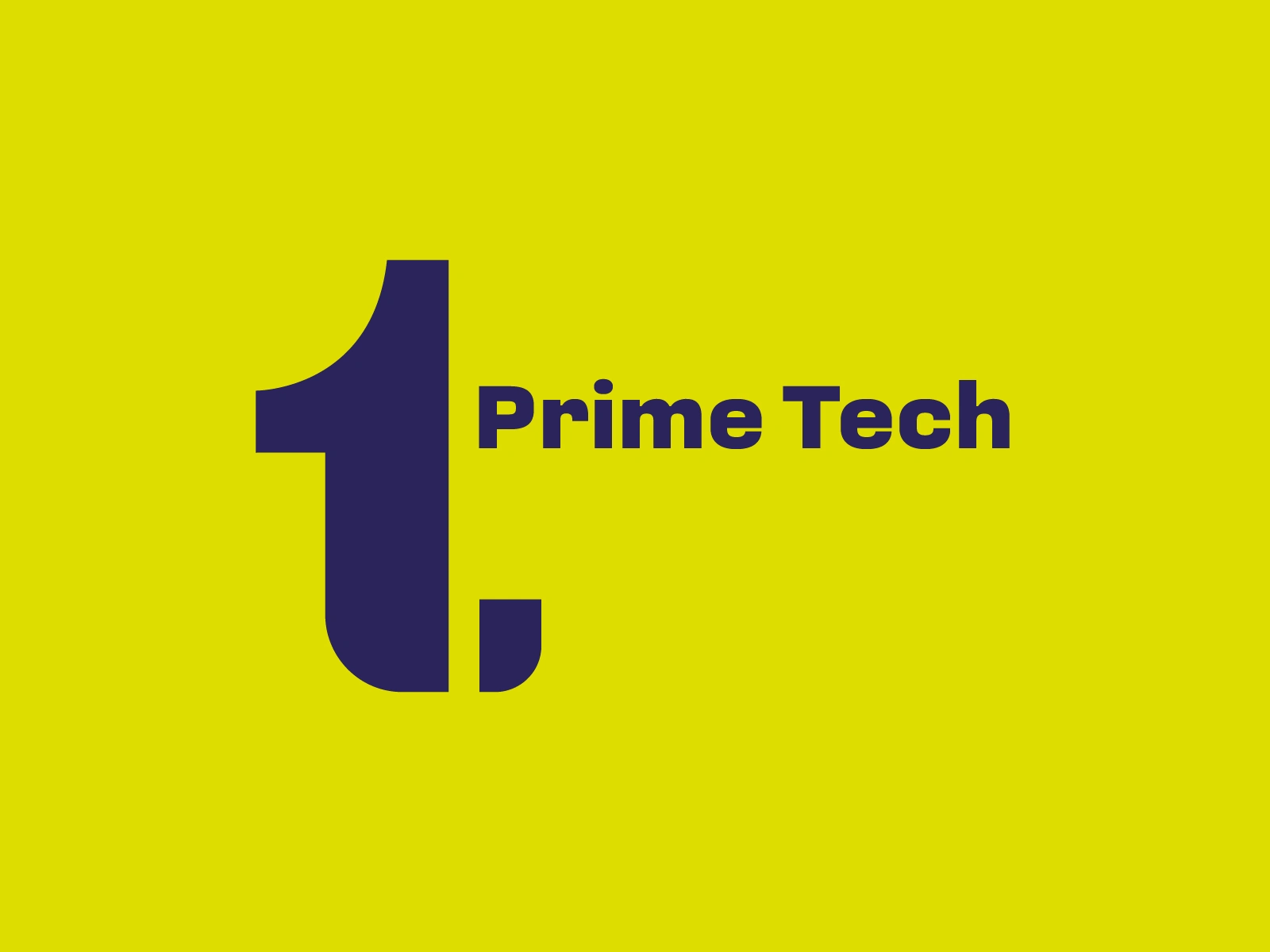
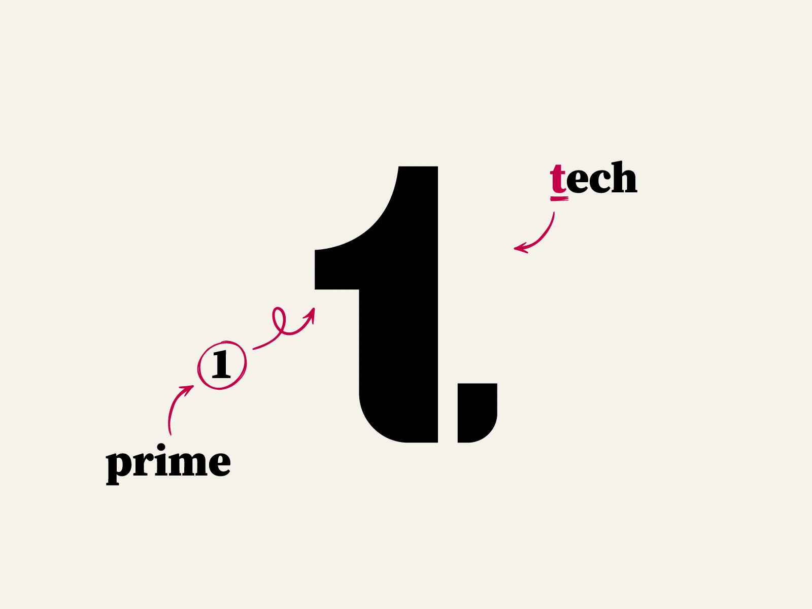
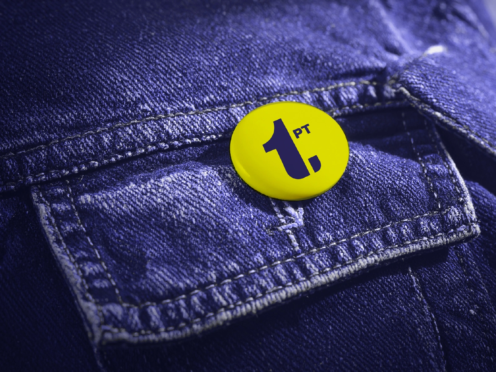
The concept is built around connection. The symbol combines two ideas into one form: Prime, read as the number 1, and a lowercase t for Tech. The two shapes are drawn so they lean into and complete each other creating an implied link between them.
That relationship works as a simple metaphor for what the company actually does: connect systems, networks, infrastructure.
The Visual System
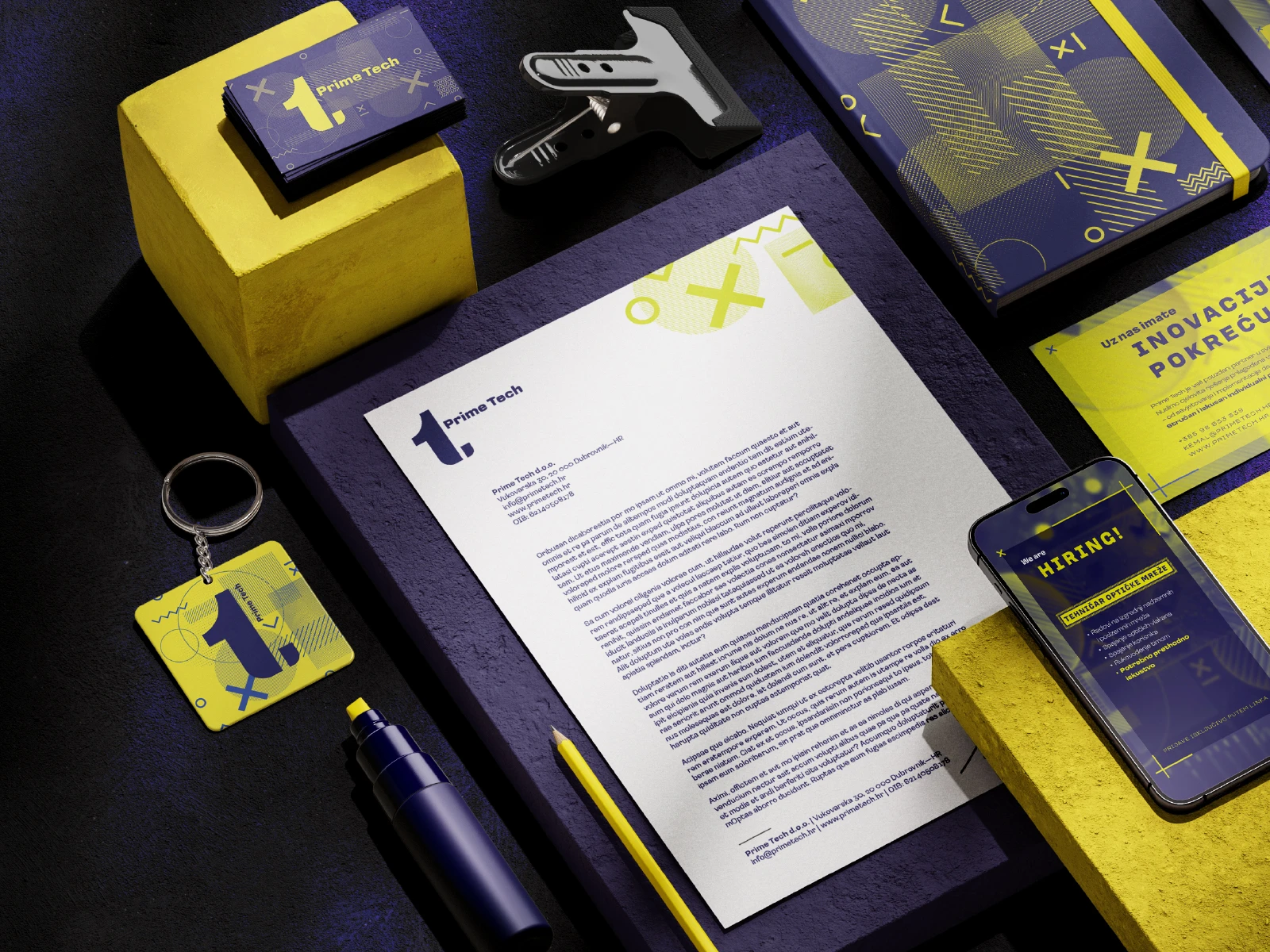
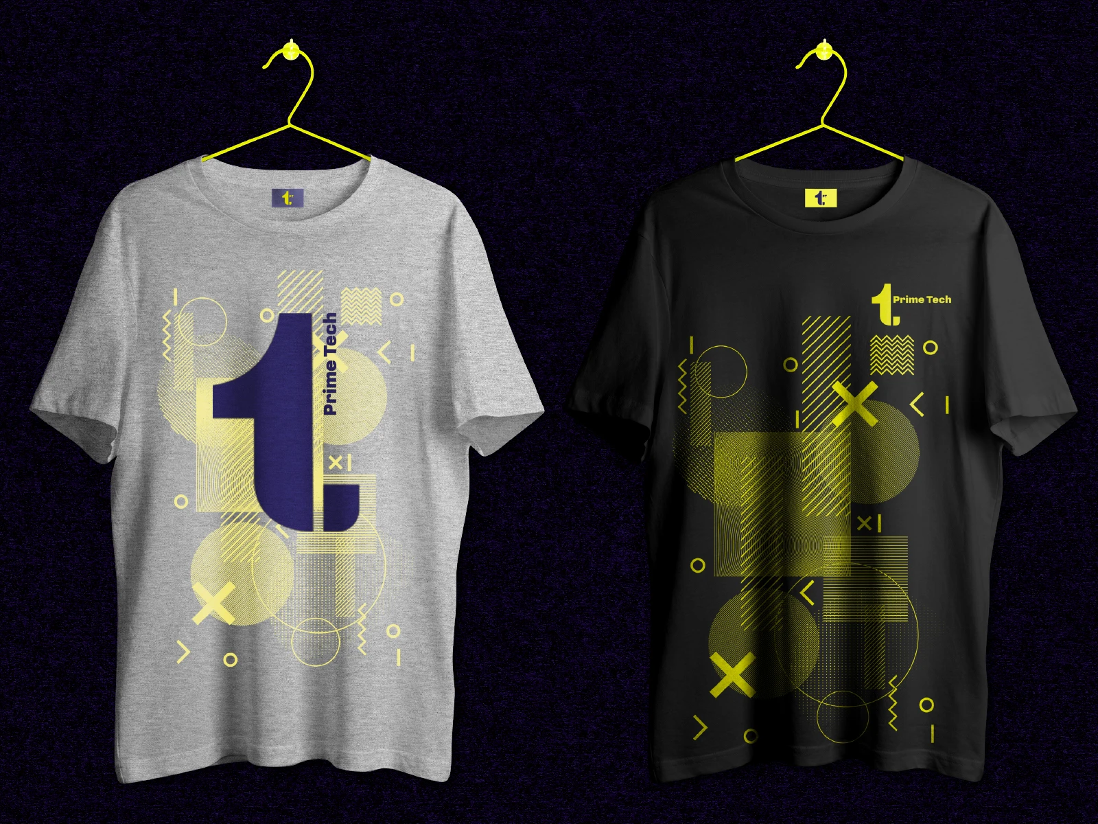
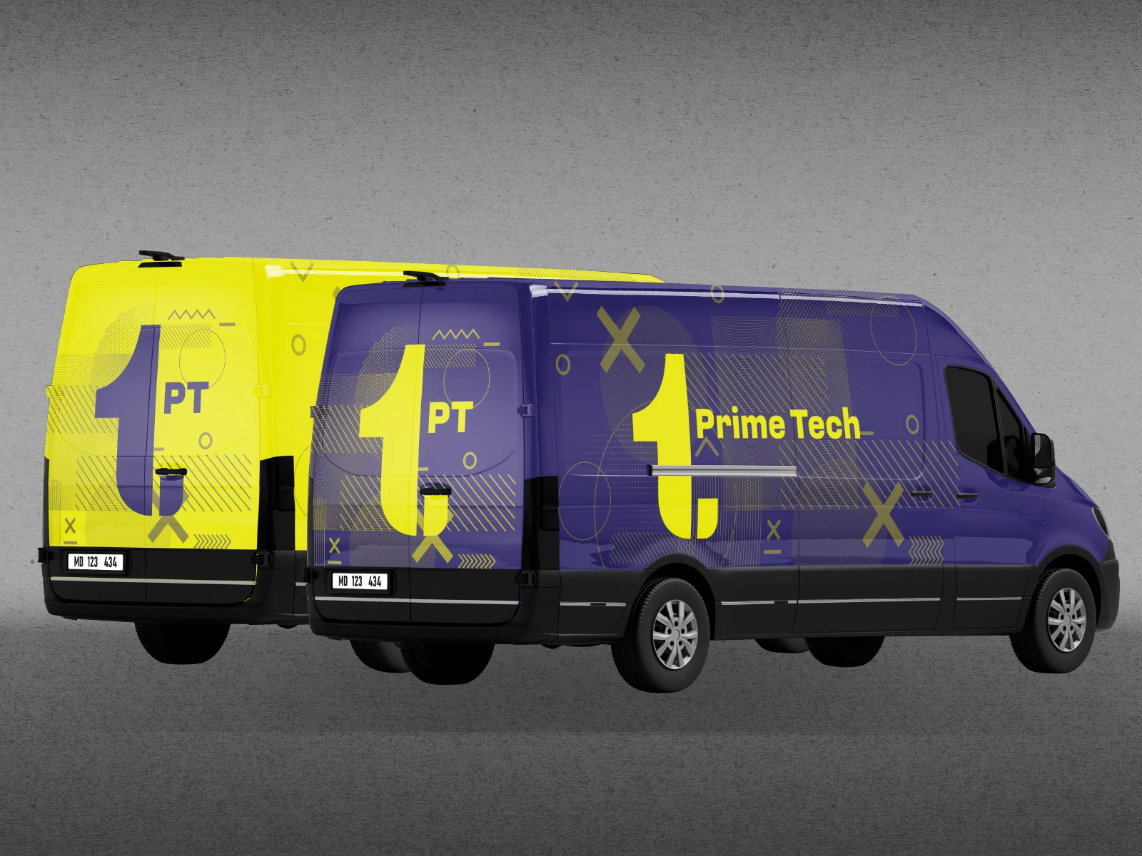
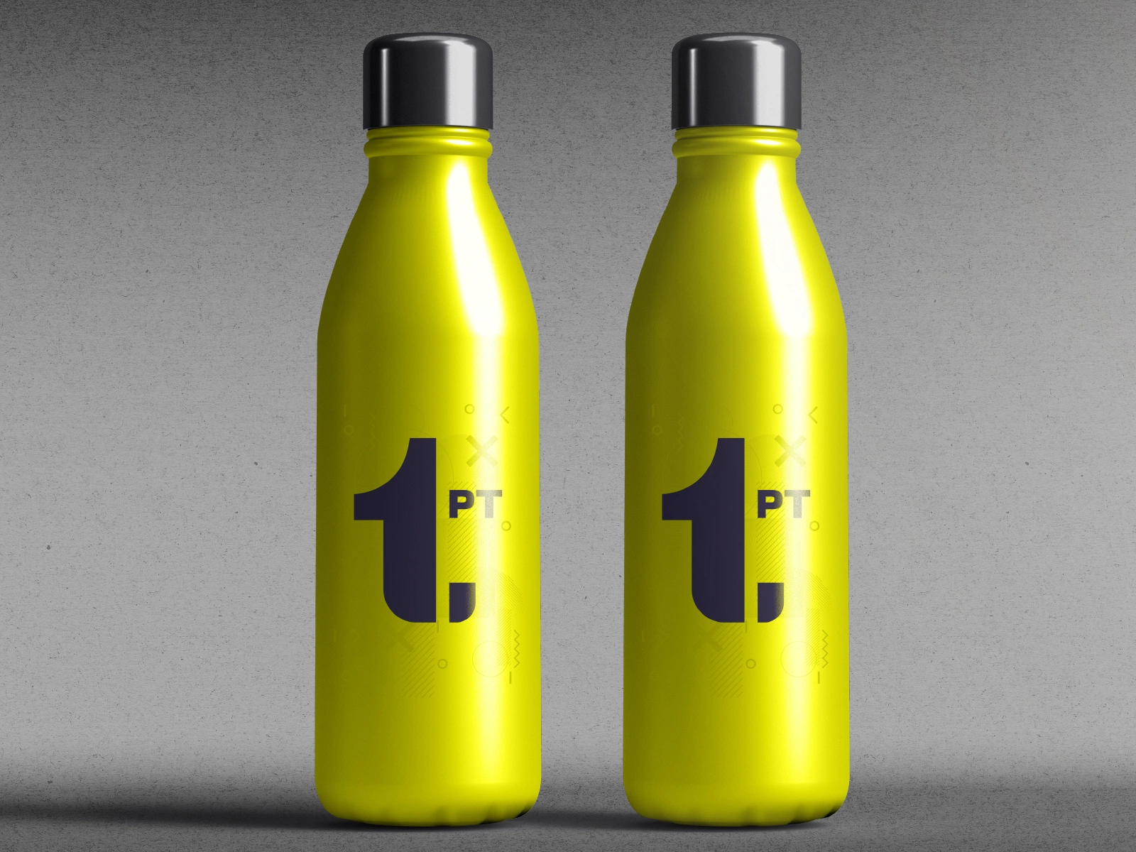
From the symbol, we built out a full visual language: bold typography, a high-contrast palette, and graphic elements pulled from network diagrams and technical systems. It was designed to hold up across a wide range of real applications: stationery, uniforms, T-shirts, promotional materials, company vans.
The Result
The result is an identity that's consistent wherever it shows up — on-site and in everyday communication — and one that actually looks like what Prime Tech does.
Like this project
Posted Aug 29, 2026
Brand identity for a network infrastructure company, built around connectivity and applied across vehicles, workwear and company materials.
Likes
0
Views
1
Clients
Prime Tech