Ivan Haiman — Architect Visual Identity

Miran M. Bašić


The Idea
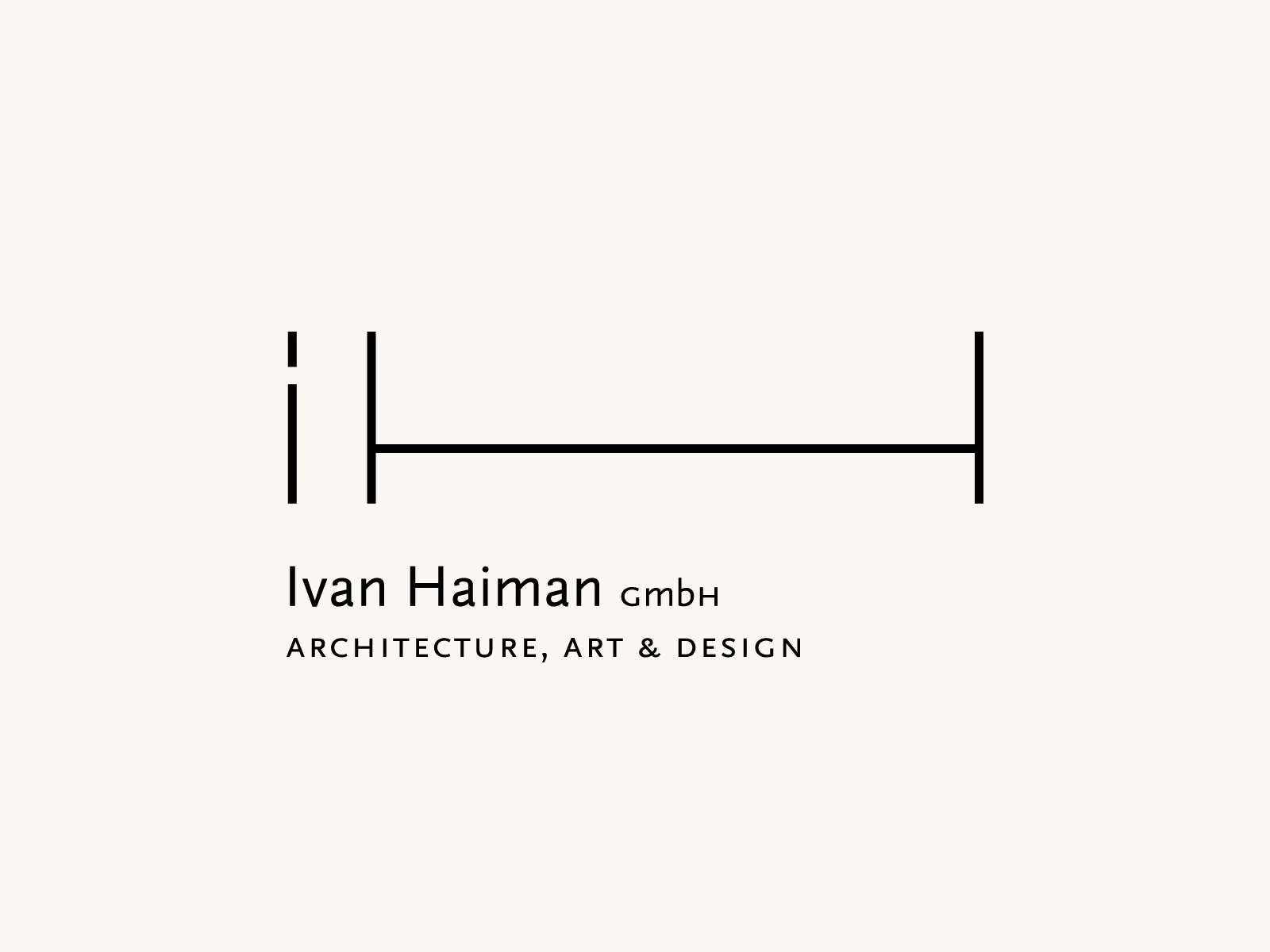
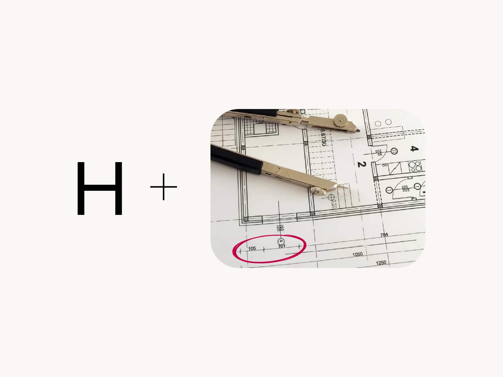
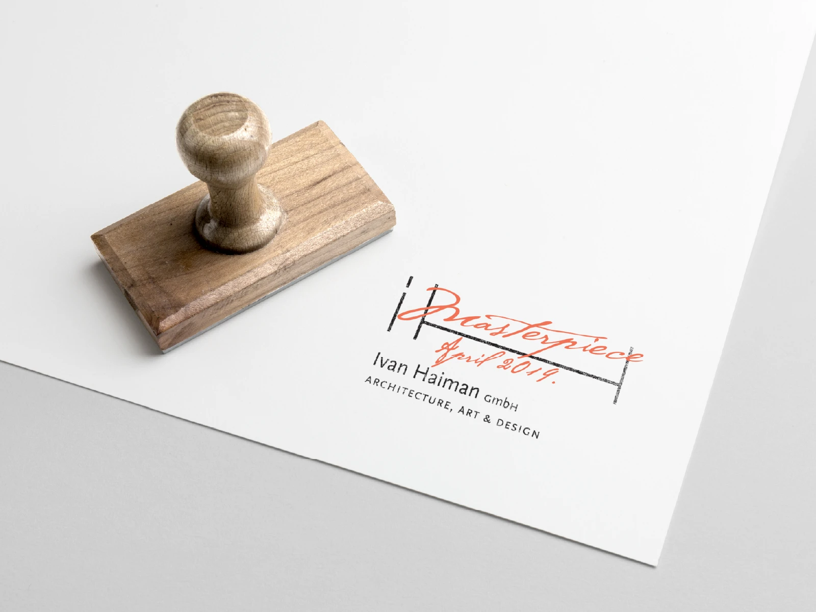
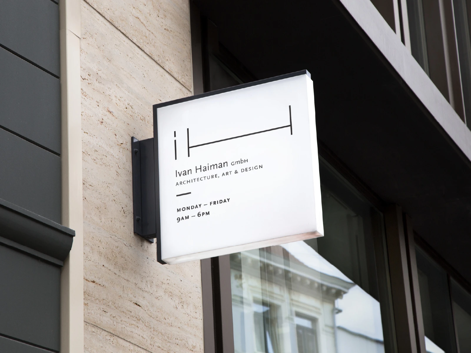
The mark comes from the architect's initials, built around the dimension symbol you see in technical drawings. The H was the easy part, it read clearly through that reference. The I turned out to be the harder problem: a plain uppercase I felt too generic on its own, and didn't carry enough presence to read as the first letter of the name.
Switching to a lowercase i solved it. It's not the usual choice for a monogram, but the dot gives the letter enough weight of its own, and the relationship between i and h suddenly clicks.
The result stays minimal and architectural, but still reads clearly as initials, it doesn't disappear into abstraction.
The Visual System
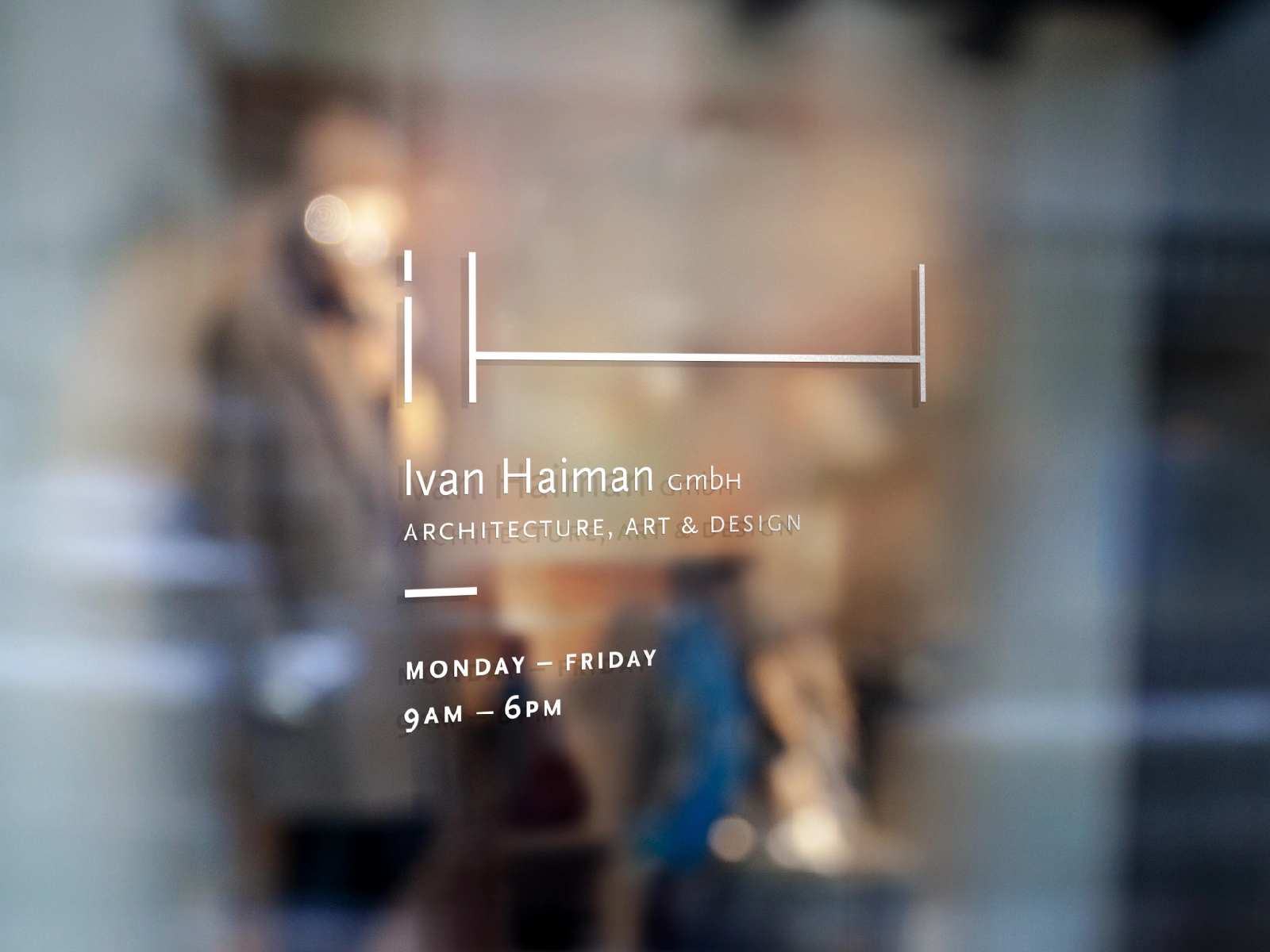
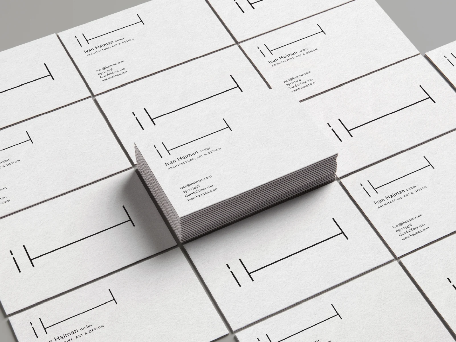
The same logic runs through everything else: clear structure, strong geometry, a restrained palette. It gives the work a calm frame to sit inside.
There's a Bauhaus influence in there, but we didn't want to lean on it too hard. The system stays quiet on purpose — the architecture itself is meant to stand out, not the branding around it.
The Result
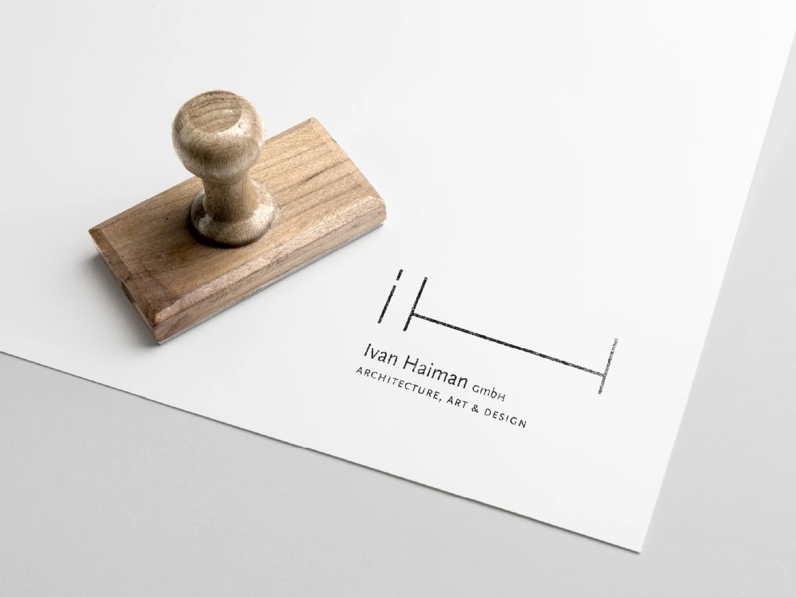
What we ended up with is a minimal, precise signature, one that works just as well on project documents, in a presentation, or across a portfolio.
Like this project
Posted Aug 29, 2026
Minimal visual identity for an architect, built around a custom monogram inspired by technical drawing dimensions and architectural precision.