The network for creativity
Join 1.25M professional creatives like you
Connect with clients, get discovered, and run your business 100% commission-free
Creatives on Contra have earned over $150M and we are just getting started
Back to feedPost

Visual identity for Fitosal, built around a simple typographic idea.
A fragment taken from the medical “+” symbol is used to complete selected letters in the Fitosal wordmark, creating a recognisable graphic element that extends throughout the wider visual identity and retail applications.bra

Branding 😍

the elegance in this is top-tier, well done!
The network for creativity
Join 1.25M professional creatives like you
Connect with clients, get discovered, and run your business 100% commission-free
Creatives on Contra have earned over $150M and we are just getting started



Related posts


Really nice one, Max!

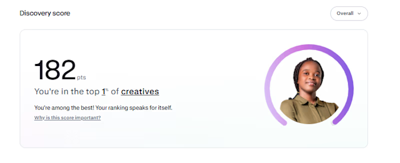
My Contra discovery score is now 182, putting me in the top 1% of creatives.
Funnily enough, I haven't gotten a job on Contra yet. 😂 I'm just here, posting my work, building my portfolio, and hoping the right clients find me
One thing I've learned is that you have to keep showing up, even when the results aren't coming yet.
Hopefully, something good comes out of it...

Congrats buddy

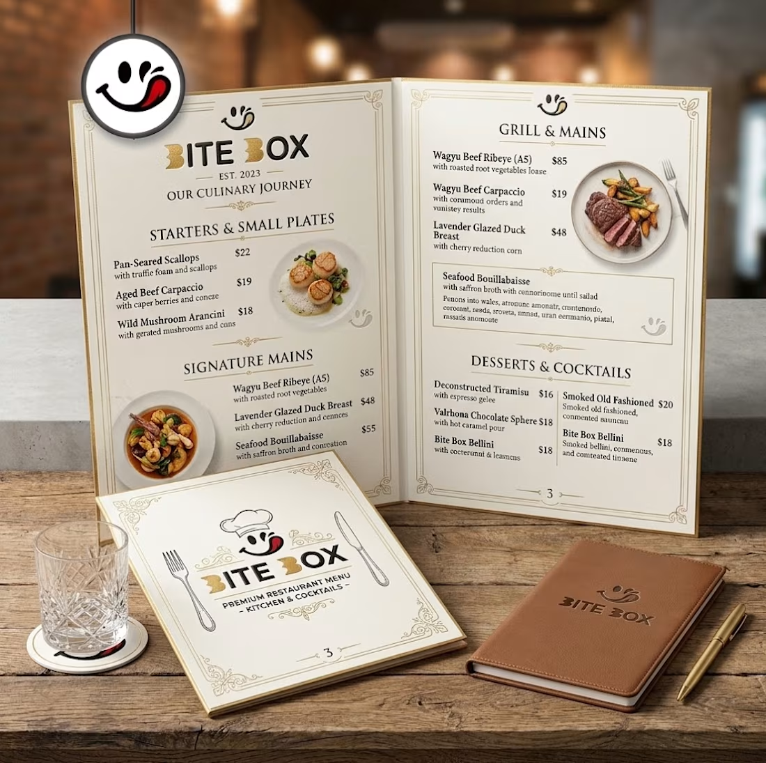
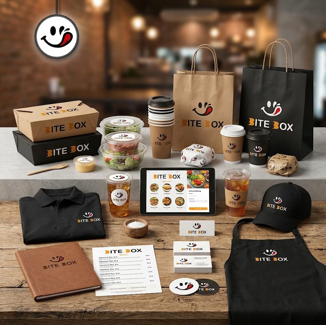
🍔 BITE BOX — Where Every Bite Brings a Smile! 🧡
A fun, fresh, and memorable logo concept designed for a modern fast-food brand. The smile icon represents happiness, while the bold typography creates a friendly and recognizable identity. 🍟✨
#LogoDesign #FoodBranding #GraphicDesign #BrandIdentity #LogoDesigner


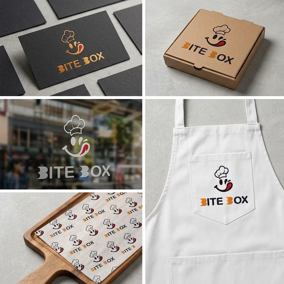



the little chef smile on the box is doing a lot of the work here


