Mike Shocking
Landing pages people explore, not just scroll past
- 35
- Followers



Every web guide says get visitors to the point faster.
For some brands, that's how you lose them.
A delivery app should get you to checkout in two taps. Some brands sell patience, though. A bespoke tailor needs at least two fittings for one suit, and a good architect walks the...

Most homepages describe the product.
The good ones let you try it before you've read a word.
A visitor gives your first screen a few seconds. A headline like "Fonts that move" asks them to take your word for it. If they can try it right there, they find out for themselves.
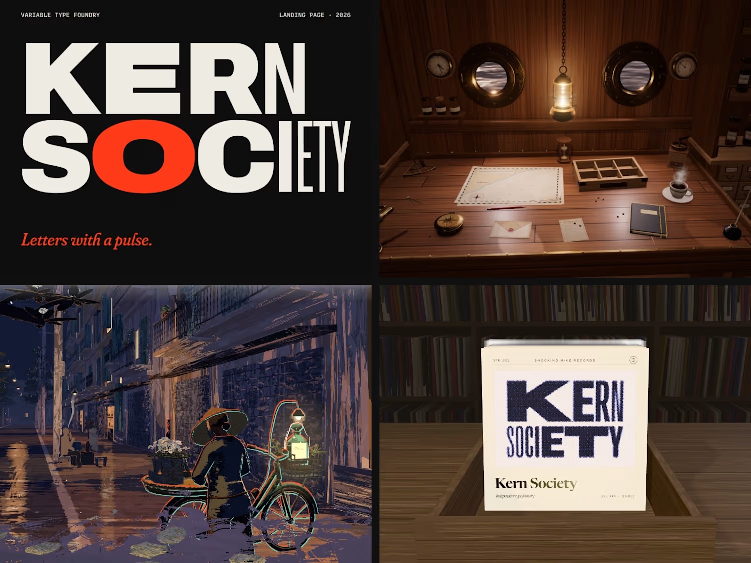
Kern...
Most customers can't name what makes a website feel cheap.
They just feel it.
Ask them why a site felt cheap and you'll hear "I don't know, it just did." What they felt was the page stuttering when they moved the mouse, or a photo arriving a beat after its caption.
It's not...
A client isn't buying your finished work. They're buying how you'll treat theirs.
Yet most studio sites sell themselves with a grid of polished results.
A finished frame hides what a client actually worries about: what happens between the brief and the result. Will they see it...
An architecture studio's website with no photos at all. Three decisions behind it.
1. No photo grid. Every architecture site has the same grid of polished photos. I wanted this one to show how the studio thinks, so the page opens on a 400-year-old castle wall laid without mortar,...