
pro
Marto Mads
Design partner for growth-stage B2B tech companies.
- $10k+
- Earned
- 5x
- Hired
- 5.00
- Rating
- 142
- Followers

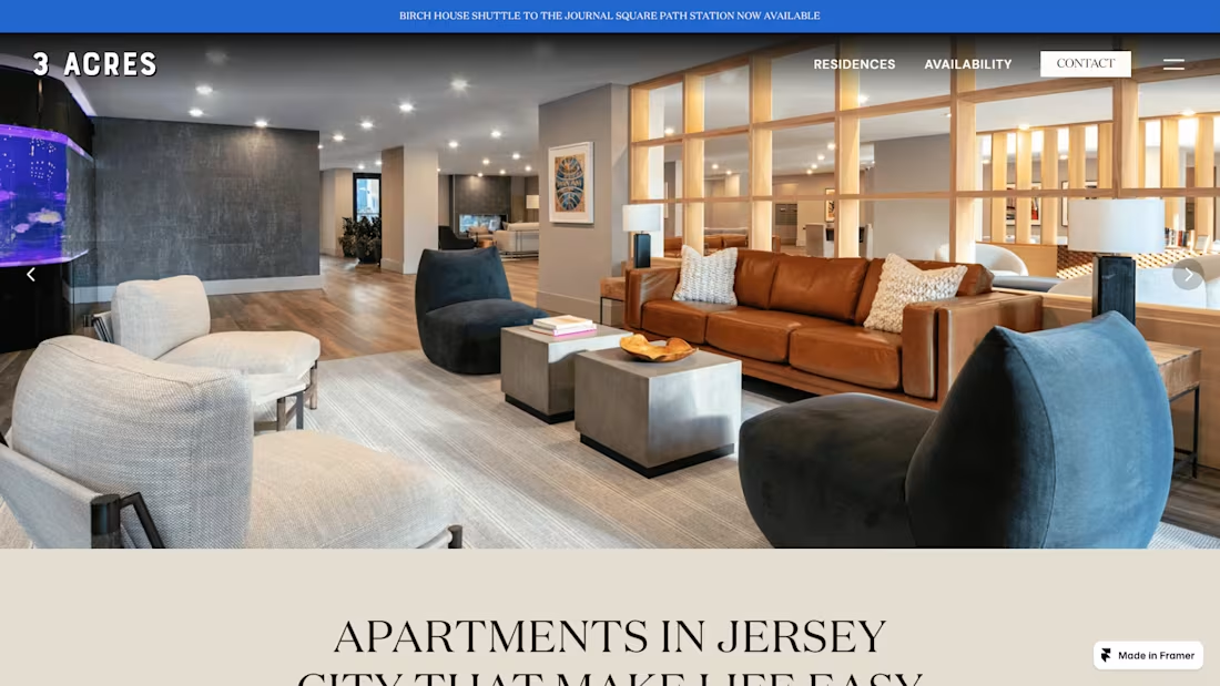
3 Acres (Real Estate) — Web Design & Development
0
43
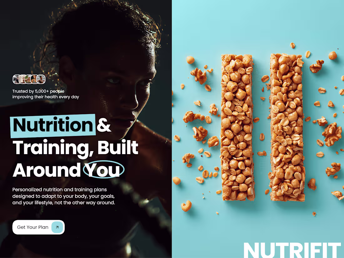
Nutrition & Fitness Platform Website Design
1
101
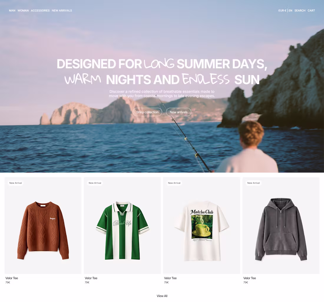
WearFlash — Cycling Apparel Brand Ecommerce Website
2
72

Vaer — High End Fashion eCommerce Template in Framer
3
70
april’s template style is settled
1
6
558
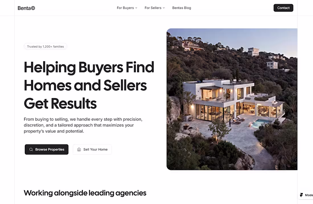
Benta — Real Estate Website
1
41
Most online stores lose sales for a dumb reason:
They turn buying into an exam.
Long forms, pop-ups, unnecessary steps, hidden buttons…
Every extra click between the visitor and "pay" is money walking out the door.
That's why I built my new template obsessed with one single metric: the conversion rate of whoever uses it.
One-click add-to-cart. Frictionless checkout. No distractions.
You don't sell more with more design. You sell more by removing obstacles.
2
9
375
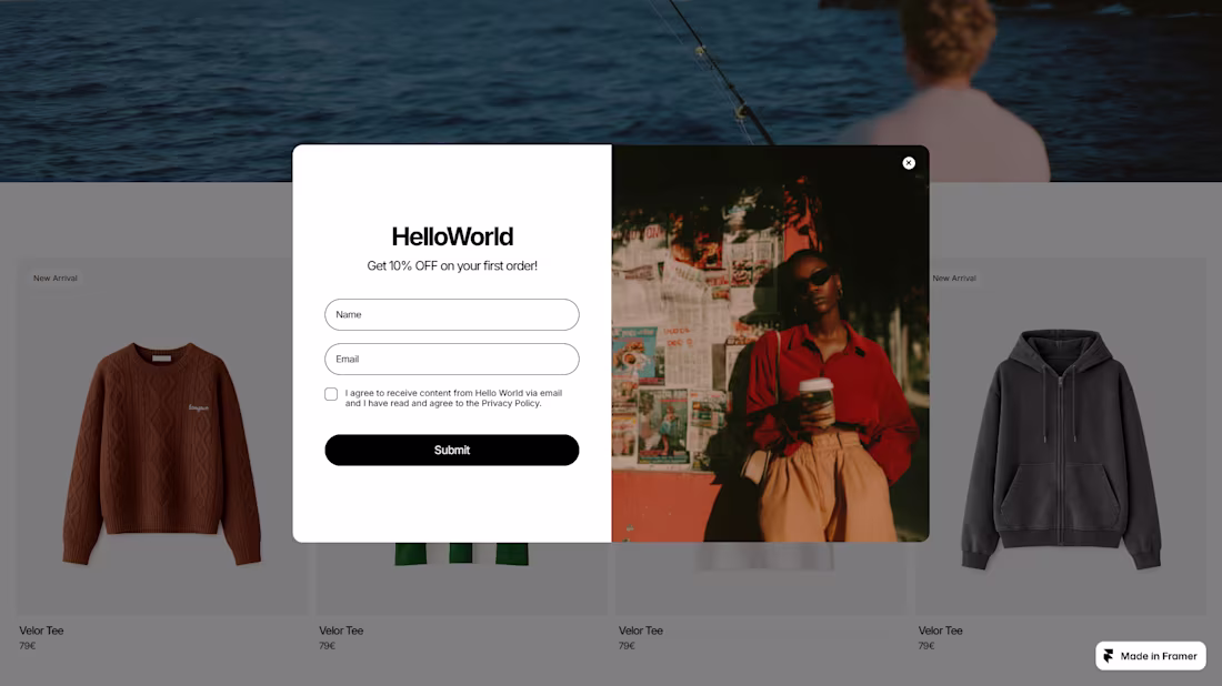
ecom website popup design
4
11
632
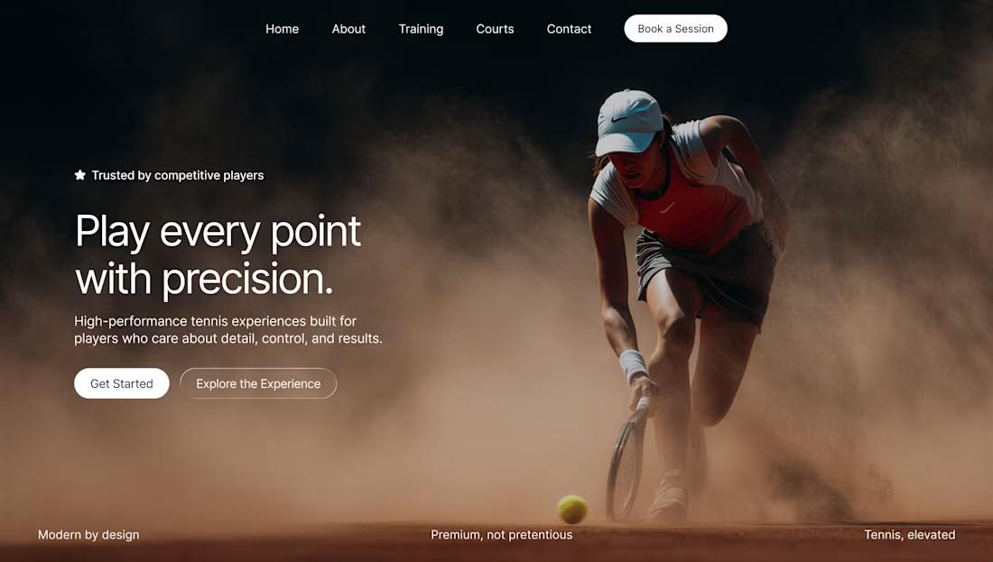
Hero section for a performance-driven tennis training platform, which one is better?
1
4
1K
Esclat — Building a Clean, Modern Portfolio Template in Framer
4
55