
Marang Garcia
Graphic Designer & Creative Director — Brand Identity · Prin
New to Contra
Marang is ready for their next project!

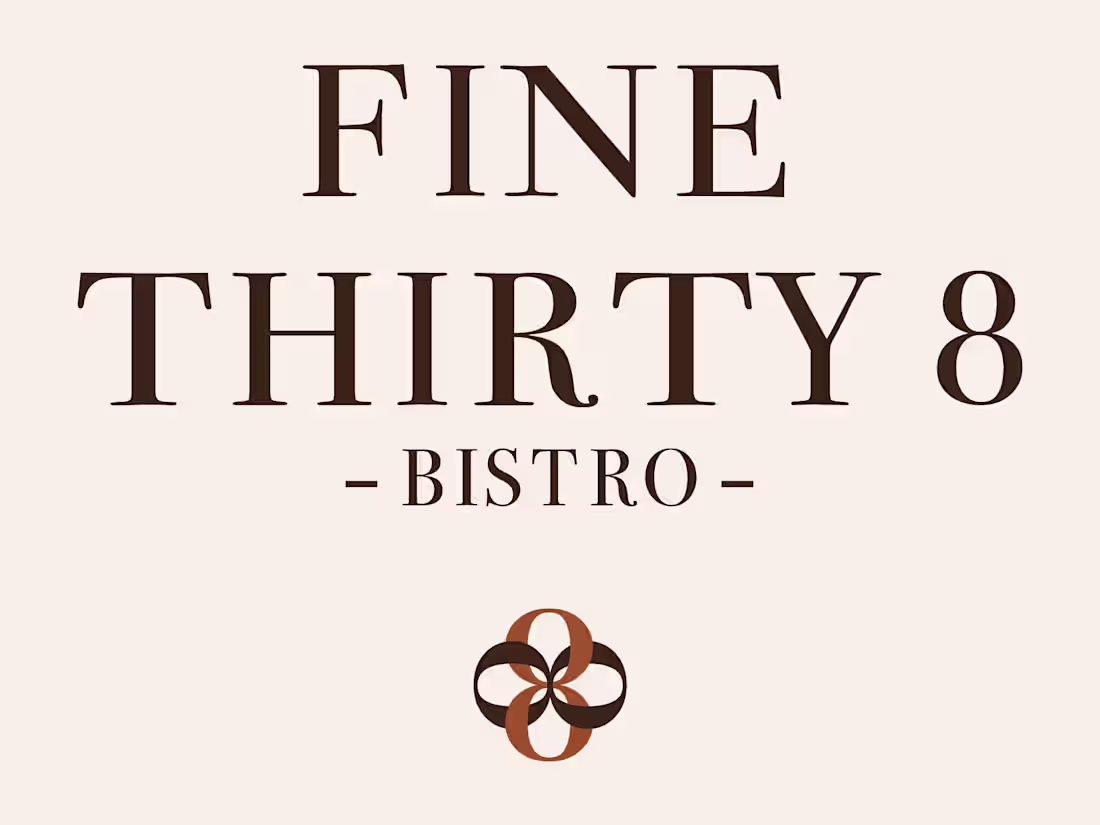
Fine Thirty-8 Wine & Grill,
Full Restaurant Rebrand
When Fine Thirty-8 came to me, they had a great restaurant but a brand that wasn't telling their story. My job was to change that.
The challenge: build a complete visual identity that could flex across three completely different dining experiences, casual breakfast, bistro dining and fine dining, while staying coherent and on-brand throughout.
Here's how it came together:
Breakfast Menu — Warm, playful and inviting. Script typography, coral and teal colour play, a feel-good Sunday morning energy that makes you want to sit down and stay a while.
À La Carte Menu — Fresh, elegant and bistro-cool. Deep forest green, gold accents, the oversized 8 as a bold graphic element. Sophisticated without being intimidating.
Tasting Menu — Pure luxury. Rich chocolate brown, linen texture, gold typography. The kind of menu you hold and immediately feel like the evening is going to be special.
Three distinct moods. One coherent brand family.
Every design decision was built around Fine Thirty-8's vision, location and budget, not my preferences. That's the approach I bring to every project.
1
41
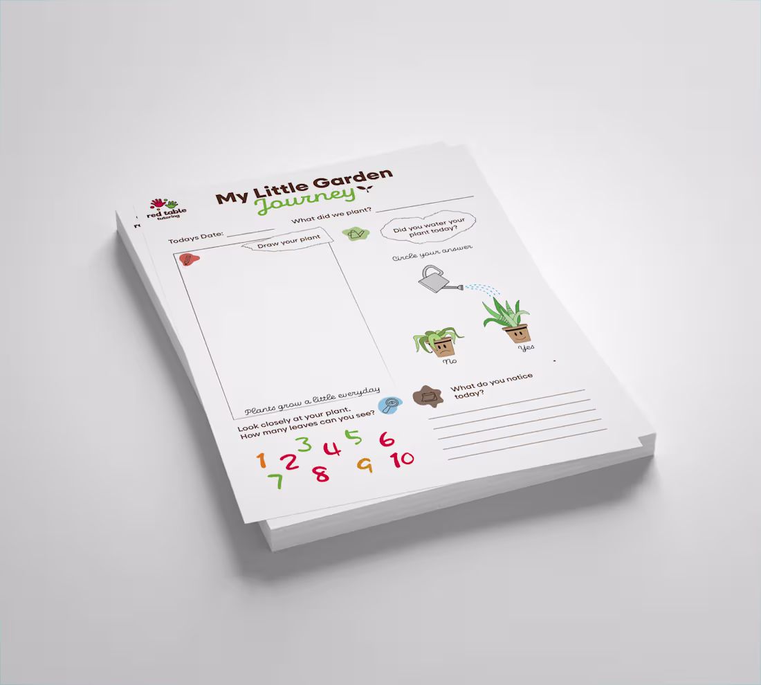
My Little Garden Journey 🌱
This activity sheet was designed for Red Table Tutoring, a hands-on learning school based in Gaborone, Botswana, that uses gardening as a core part of their curriculum.
The brief was simple but meaningful: take their real gardening activity and turn it into something Montessori-friendly for primary children.
Here's the thinking behind the design:
1) Draw your plant — observation through creation. Children record what they actually see, not what they're told to draw.
2) Did you water your plant today? — A simple yes/no interaction using plant visuals instead of words, making it accessible for pre-readers.
3) What do you notice today? — Encouraging curiosity and independent thinking, the heart of Montessori learning.
4) Count the leaves — Numeracy woven naturally into the activity, never forced.
Every element was designed around Red Table Tutoring's colours and visual identity, keeping it on-brand while making it feel warm, playful and age-appropriate.
This is what I love about instructional design, when learning feels like play, children don't even realise they're learning.
Looking for educational or learning experience design? Let's talk.
1
58
ACC Onboarding Design
0
1
ArchiveTextile
0
1
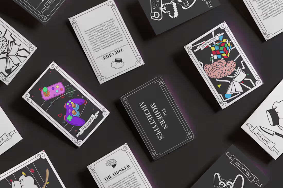
Modern Archetypes
0
0
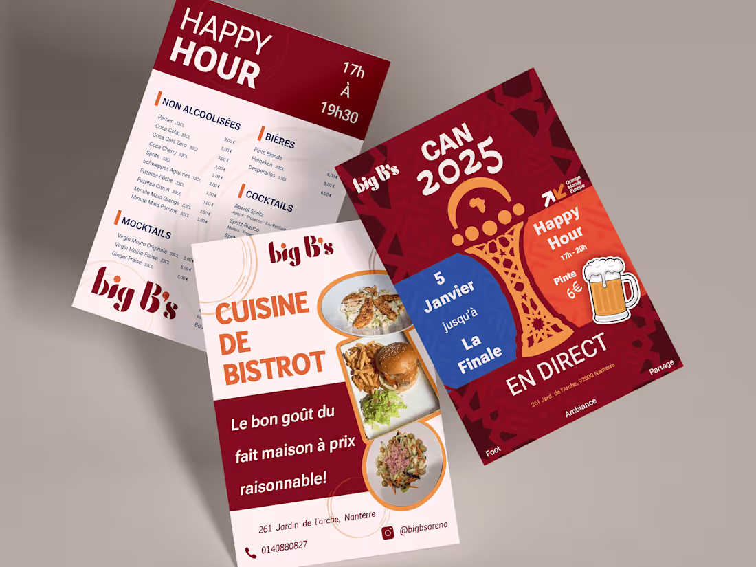
BigB's Restaurant Branding
0
0
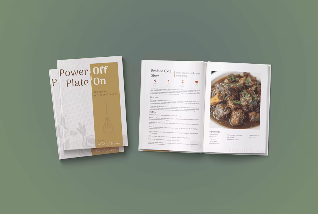
Fat Cousins
0
2