The network for creativity
Join 1.25M professional creatives like you
Connect with clients, get discovered, and run your business 100% commission-free
Creatives on Contra have earned over $150M and we are just getting started
Back to feedPost

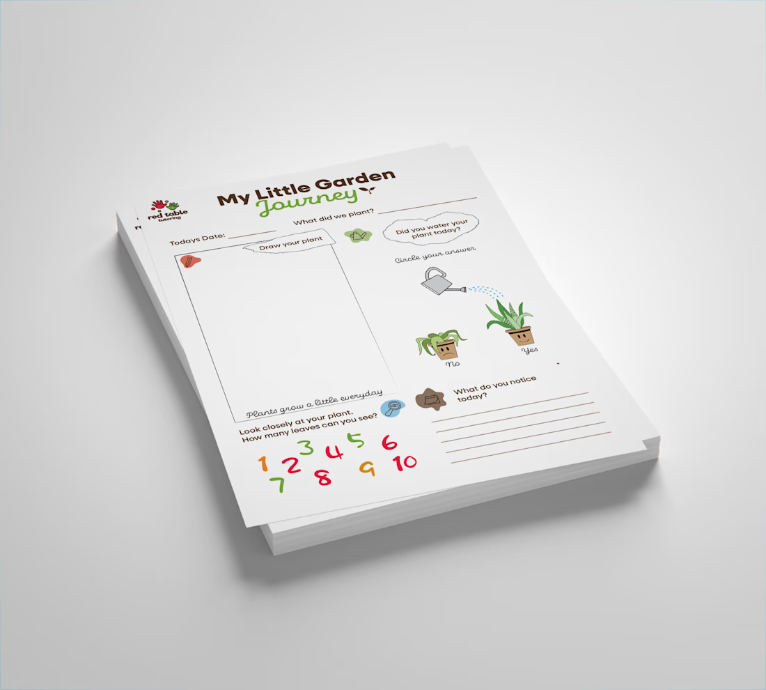
My Little Garden Journey 🌱
This activity sheet was designed for Red Table Tutoring, a hands-on learning school based in Gaborone, Botswana, that uses gardening as a core part of their curriculum.
The brief was simple but meaningful: take their real gardening activity and turn it into something Montessori-friendly for primary children.
Here's the thinking behind the design:
1) Draw your plant — observation through creation. Children record what they actually see, not what they're told to draw.
2) Did you water your plant today? — A simple yes/no interaction using plant visuals instead of words, making it accessible for pre-readers.
3) What do you notice today? — Encouraging curiosity and independent thinking, the heart of Montessori learning.
4) Count the leaves — Numeracy woven naturally into the activity, never forced.
Every element was designed around Red Table Tutoring's colours and visual identity, keeping it on-brand while making it feel warm, playful and age-appropriate.
This is what I love about instructional design, when learning feels like play, children don't even realise they're learning.
Looking for educational or learning experience design? Let's talk.

The network for creativity
Join 1.25M professional creatives like you
Connect with clients, get discovered, and run your business 100% commission-free
Creatives on Contra have earned over $150M and we are just getting started

Challenges
View all


Related posts

Designed a dashboard concept for tracking net worth across every asset type — stocks, crypto, property, pensions, funds, cash, and liabilities — all in one place.
Instead of the usual pie chart or bar graph, the centerpiece is a dial: a single, glanceable gauge showing where your wealth actually sits. Behind it, a quiet grid of every asset category fades in and out of visibility, reinforcing that everything's accounted for even when it's not the focus.
Dark UI, a single confident green accent, and a lot of negative space — built to make a genuinely overwhelming task (seeing your entire financial picture at once) feel calm instead of cluttered.


wow the animation feels super smooth, what is this animation for?

Brand identity design for Adventum Fitness, a fitness and personal development brand built around physical performance, mental fitness, and personal growth.
The challenge was to create a visual identity that could bring strength, movement, discipline, and personal development together without falling into the usual fitness branding clichés.
The identity was developed as a cohesive visual system across logo design, typography, color, graphic elements, and supporting brand assets, giving Adventum a distinctive and consistent presence across digital and marketing applications.
Full case study available on my Contra profile.
#BrandIdentity #BrandDesign #FitnessBranding #VisualIdentity #LogoDesign #BrandStrategy #GraphicDesign #BrandDesigner #FitnessBrand #PersonalDevelopment


HerbalLine Women’s Day — Treatment Menu Design
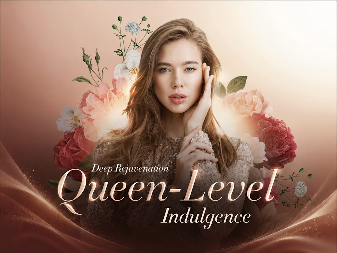
Feminine & Luxurious Soft blush tones, floral elements, and elegant portrait photography create a sophisticated feminine aesthetic that complements the Women’s Day campaign.
Premium Visual Direction The combination of warm gradients, deep burgundy accents, and refined serif typography enhances the sense of indulgence and positions the treatment as a premium spa experience.
Strong Visual Hierarchy The campaign headline, treatment name, promotional price, and key benefits are clearly structured, allowing customers to quickly understand the offer and treatment highlights.
Floral Art Direction Layered botanical illustrations frame the model and create visual depth, reinforcing themes of beauty, rejuvenation, and self-care without overpowering the promotional message.
Clear Benefit Communication Key treatment benefits — Deep Hydration, Improved Elasticity, and Smoother Fine Lines — are presented in a concise and accessible format to support quick decision-making.
Overall Concept A promotional treatment menu that combines feminine elegance, premium beauty aesthetics, and clear commercial communication, designed to make the Women’s Day offer feel both exclusive and inviting.
Credit: HWG
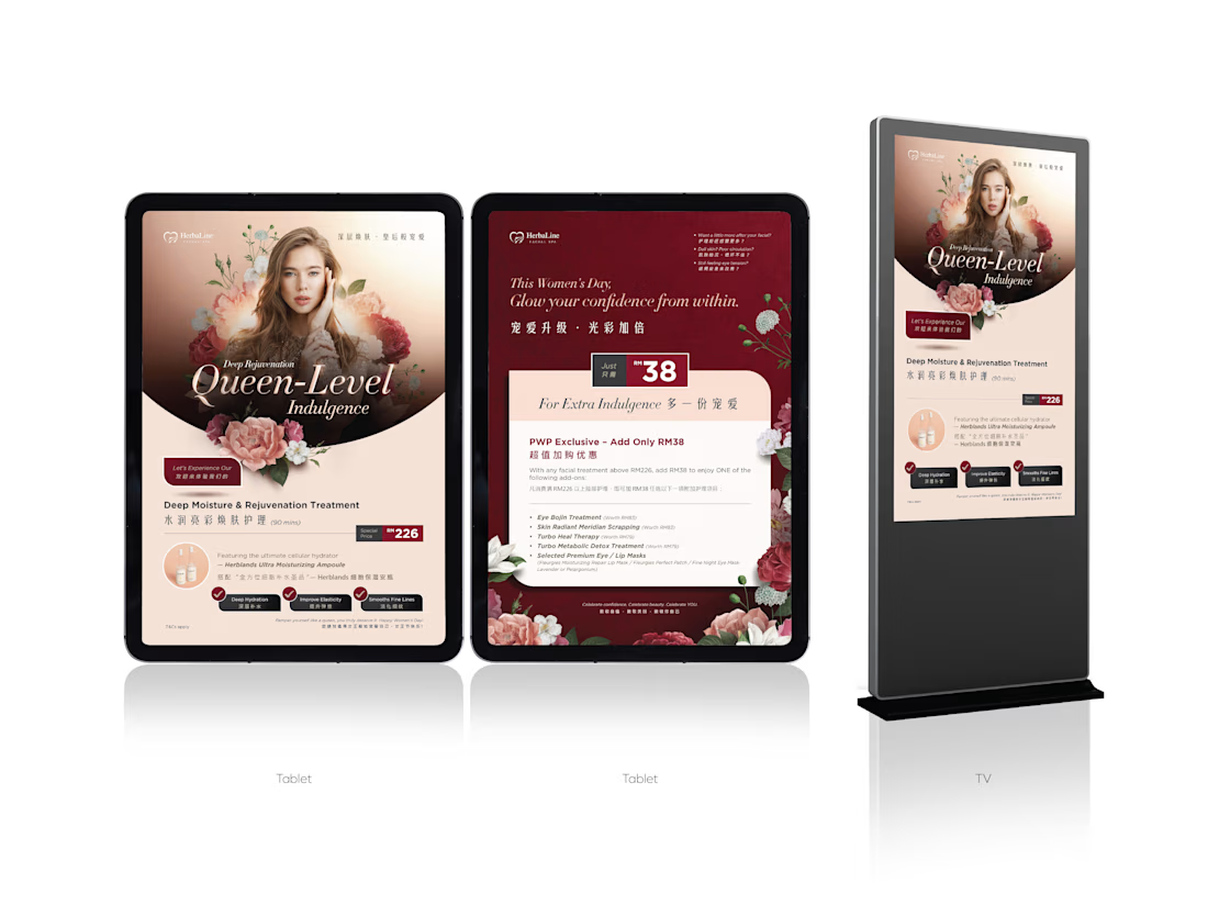

The soft blush, burgundy, and botanical direction creates a strong premium spa mood without losing clarity. I especially like how the treatment benefits are structured for quick scanning.