


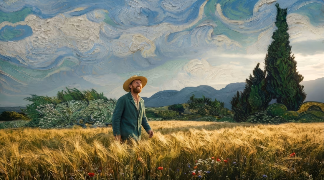
“A splash of life in a summer landscape.”
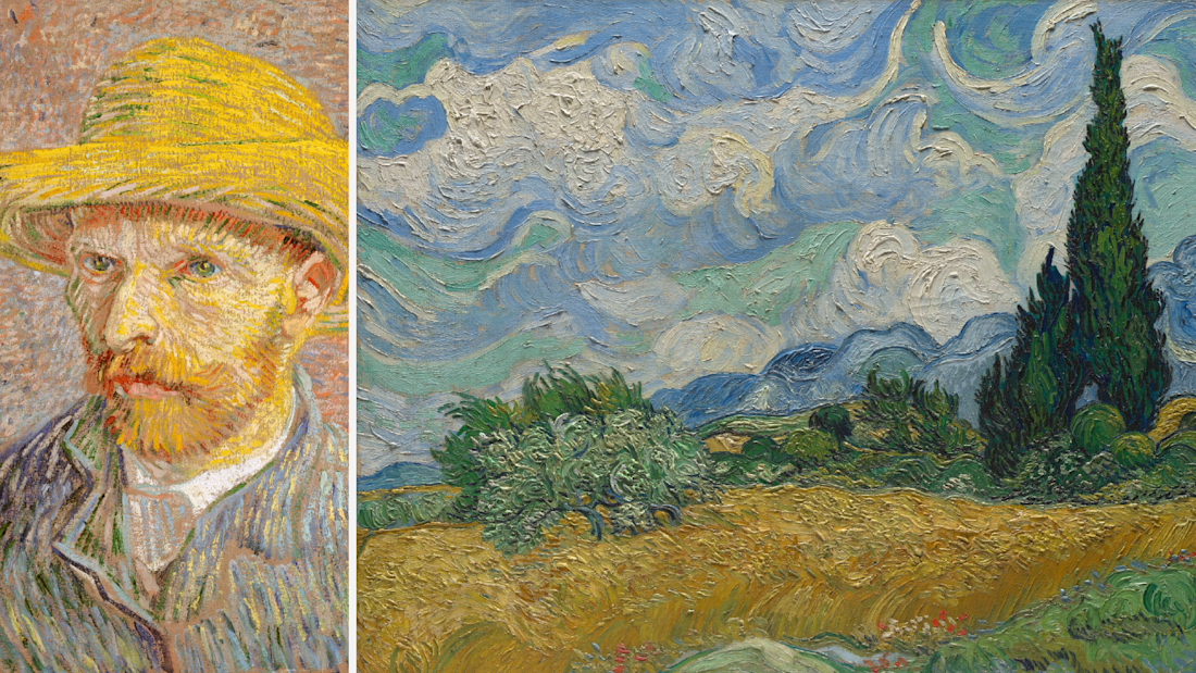
For the #FLORAMuseumChallenge, I brought together two Vincent van Gogh paintings from The Met’s public domain collection: Self-Portrait with a Straw Hat and Wheat Field with Cypresses.

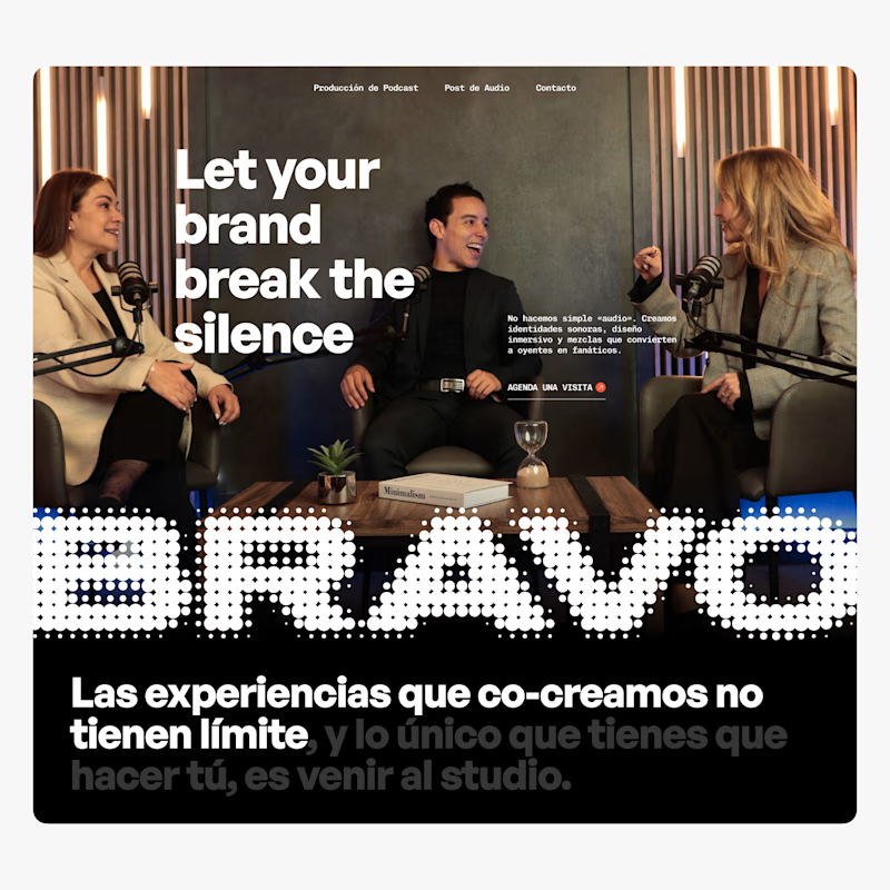
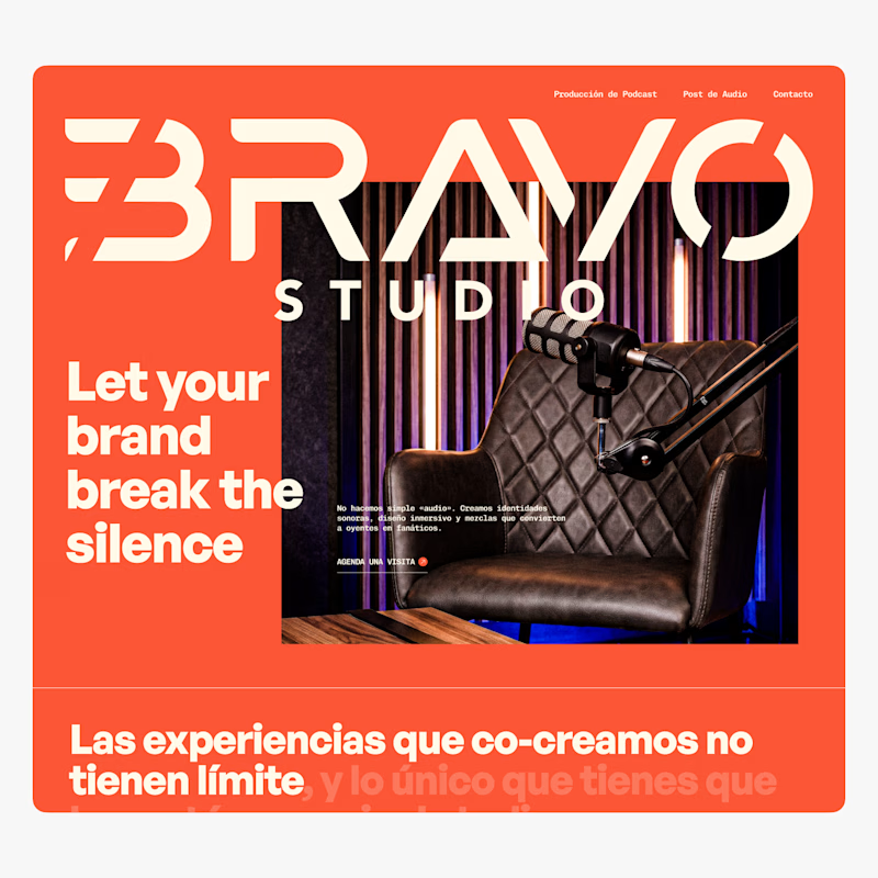
Taste test for an audio studio in Bogotá.
We explored two hero directions for a team producing podcasts and handling audio post-production. Both push the brand differently, so I’d love your take: which one feels stronger, Dark Option or Colorful Option?

9 voted
82%
2 voted
18%
11 votes
Closed
Redesigning Senses started with one question:
How can a wellness brand feel trustworthy without feeling clinical?
The answer became a system built around contrast: precise typography and packaging, paired with tactile photography, natural textures, and motion.
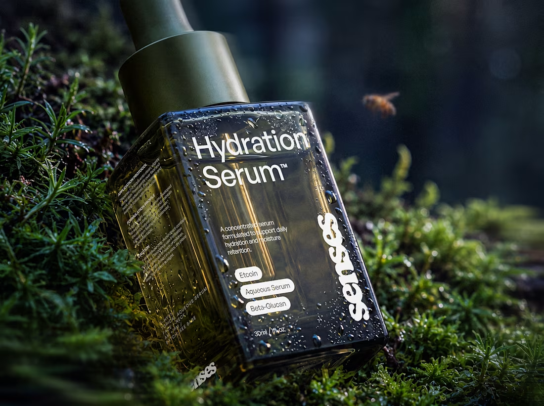
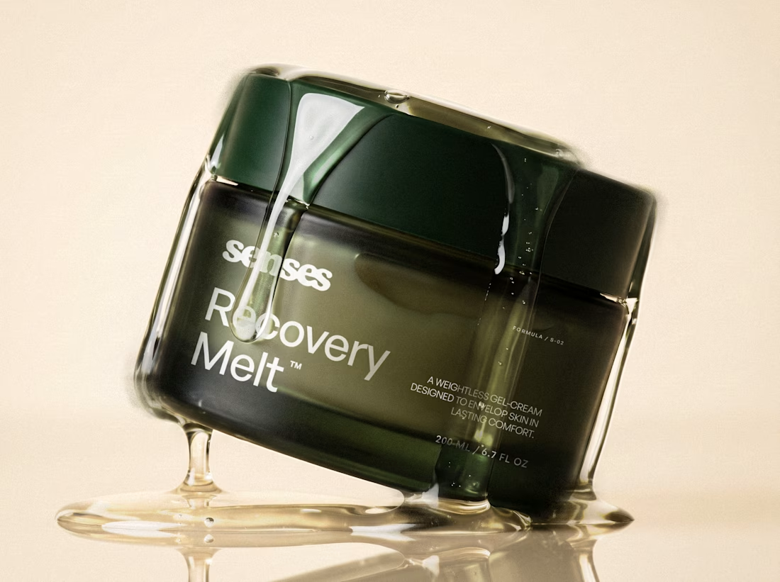
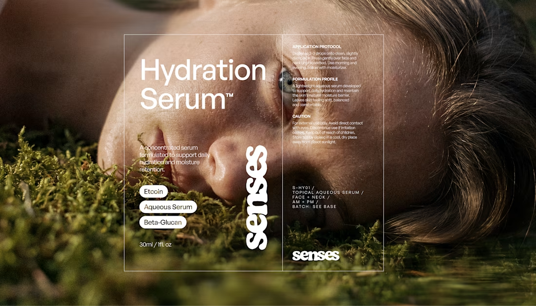
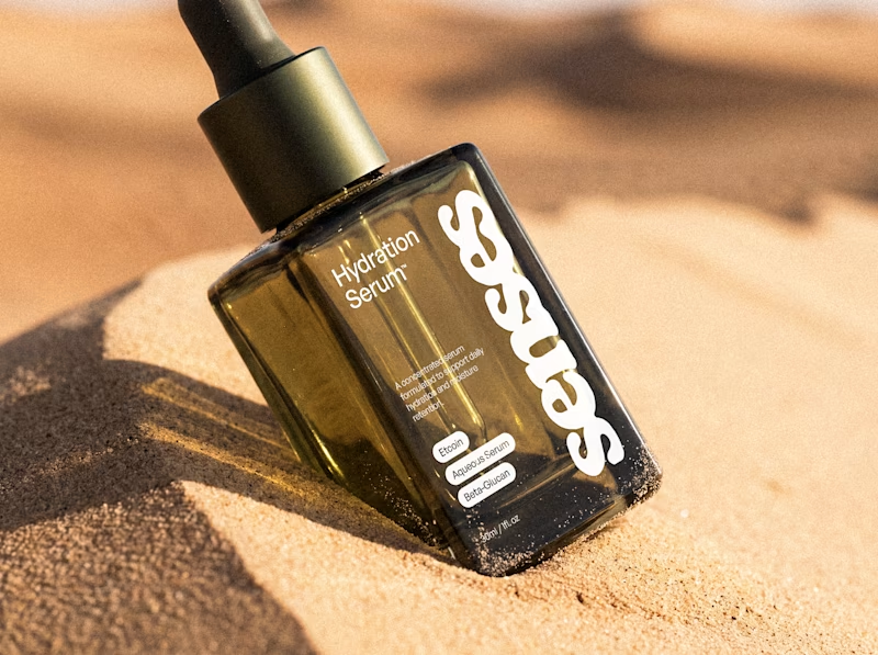
A first glimpse of Senses, a skincare rebrand I’ve been working on. Here's a few highlights from the identity, packaging and art direction.
There’s still more to reveal. Full project coming soon.
packagingbrandingbrandingdesignPackaging DesignBrand DesignGraphic DesignAdobe PhotoshopFigmaHiggsfield AI


An early taste of Senses, a skincare identity built around the shift from overstimulation to comfort. The system pairs a fluid wordmark with clinical typography and an olive-glass form designed to feel precise, tactile, and quietly luxurious.
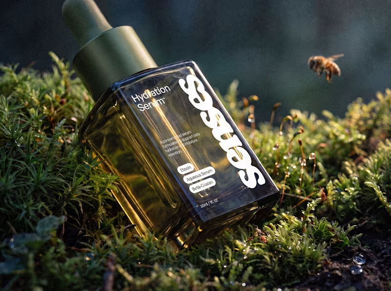
For this Hydration Serum study, I...
63 voted
59%
44 voted
41%
107 votes
Closed