The network for creativity
Join 1.25M professional creatives like you
Connect with clients, get discovered, and run your business 100% commission-free
Creatives on Contra have earned over $150M and we are just getting started
Back to feedPost

Redesigning Senses started with one question:
How can a wellness brand feel trustworthy without feeling clinical?
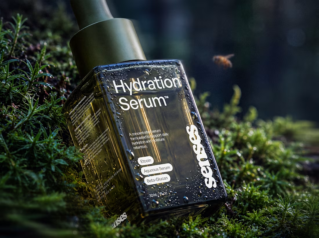
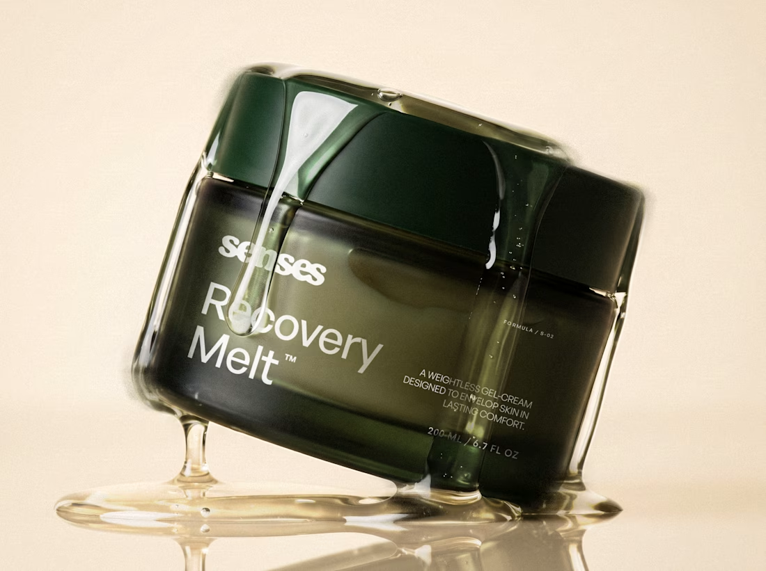
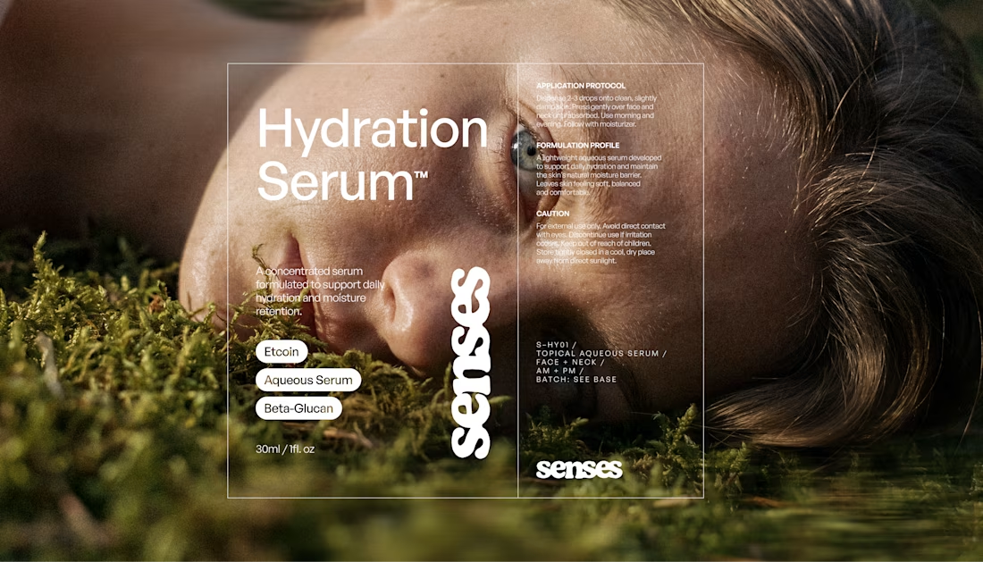
The answer became a system built around contrast: precise typography and packaging, paired with tactile photography, natural textures, and motion.

Beautiful work 😍
Thank you so much!

absolutely gorgeous design. the webpage's preview of minimalism is understated in what may be the most thoughtful way i've ever seen. it serves such a purpose & speaks truth to the brand values your designs exhibit.

The tactile photography really carries the 'not clinical' part. Was that the hardest piece to land, or did the typography system actually come together faster once the contrast idea clicked?
It was definitely a tricky part of the process! The typographic system wasn't too hard, as you said, the idea was already kind of alive!


packaging shots are great

Wonderfull 🙌


Beautiful work

The moss and skin textures against that dark green glass really sell trustworthy without going sterile. Smart way to answer the clinical question without a single clinical cue.


That balance between precision and warmth is what makes wellness branding feel credible.

The contrast between the organic textures (moss/skin) and the sleek dark glass packaging is brilliant! It captures that premium, natural feel perfectly without feeling over-designed

Awesome work.
The network for creativity
Join 1.25M professional creatives like you
Connect with clients, get discovered, and run your business 100% commission-free
Creatives on Contra have earned over $150M and we are just getting started

Related posts

One brand, very different variety products. 👀
BASYX is one of my favorite projects because the packaging had to work across categories, from skincare to food, while still feeling like one cohesive brand.
That’s the fun challenge of multi-product brands: creating a visual system flexible enough to grow without losing its identity.

wow amazing


Another exciting project wrapped up! ✨
This time, we worked on Olympian by Design – a premium one-on-one coaching brand focused on personal transformation and high performance.
Our goal was to create more than just a beautiful website. We wanted the entire client journey to feel connected – from the first landing page visit to purchasing the program and going through the coaching experience.
We designed three custom pages from scratch, built them in Kajabi, created a branded member area, set up the coaching program, and refreshed the app with new onboarding screens.
All wrapped in a bold, dark, luxury-inspired design.
Because great design shouldn't stop at checkout. It should follow the client through the entire experience.


Great project


GoTeacher found our Sunbeam template and asked us to make it theirs.
GoTeacher is backed by Harvard Innovation Labs and helps 100+ K-12 school districts see every app they pay for and whether it's safe for student data.
We kept Sunbeam's structure and animations and built the rest: GoBot the 3D mascot, shader clouds, real product dashboards and five product pages. Live in one week.
Full case study on my profile. Want one of our templates turned into your own site? Message me.


The work is interesting


Challenges
View all


