Jaesoft Graphics
Growth Spark Creative designer | Delivering Globally 🌎
Profile in progress
Jaesoft is building their profile!
PULSE is a 100% natural, zero-sugar beverage designed for everyone. No age limits, no health barriers—just 6 distinct fruit-based flavors built to help you find your natural rhythm.
From a blank page to a full cinematic ad in 48 hrs, here is how I built the world of Pulse:
...
I discovered the kittl challenge just 3 days before the deadline. It wasn't funny rushing to meet up, but it was the perfect test of what's possible when you combine strategy with the right creative tools.
The Concept:
PULSE is a 100% natural, zero-sugar beverage designed for...
PULSE is a 100% natural beverage brand designed for everyone — no age limits.
I built the identity around 6 fruit variants, each tied to a specific benefit:
Pulse Revive (Watermelon)
Pulse Recover (Grape)
Pulse Refresh (Apple)
Pulse Ignite (Orange)
Pulse Inspire...
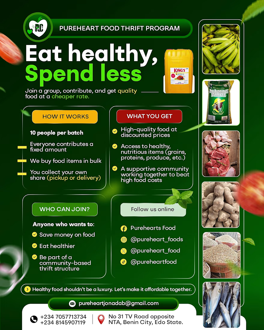
A lot of brands lose money because their visuals look unorganized—and if the design looks messy, people assume the business is too.
For Pureheart Food Thrift, I turned a complex 'how-to' into a clean, structured layout that builds immediate trust.
The Logic:
Clear Hierarchy:...
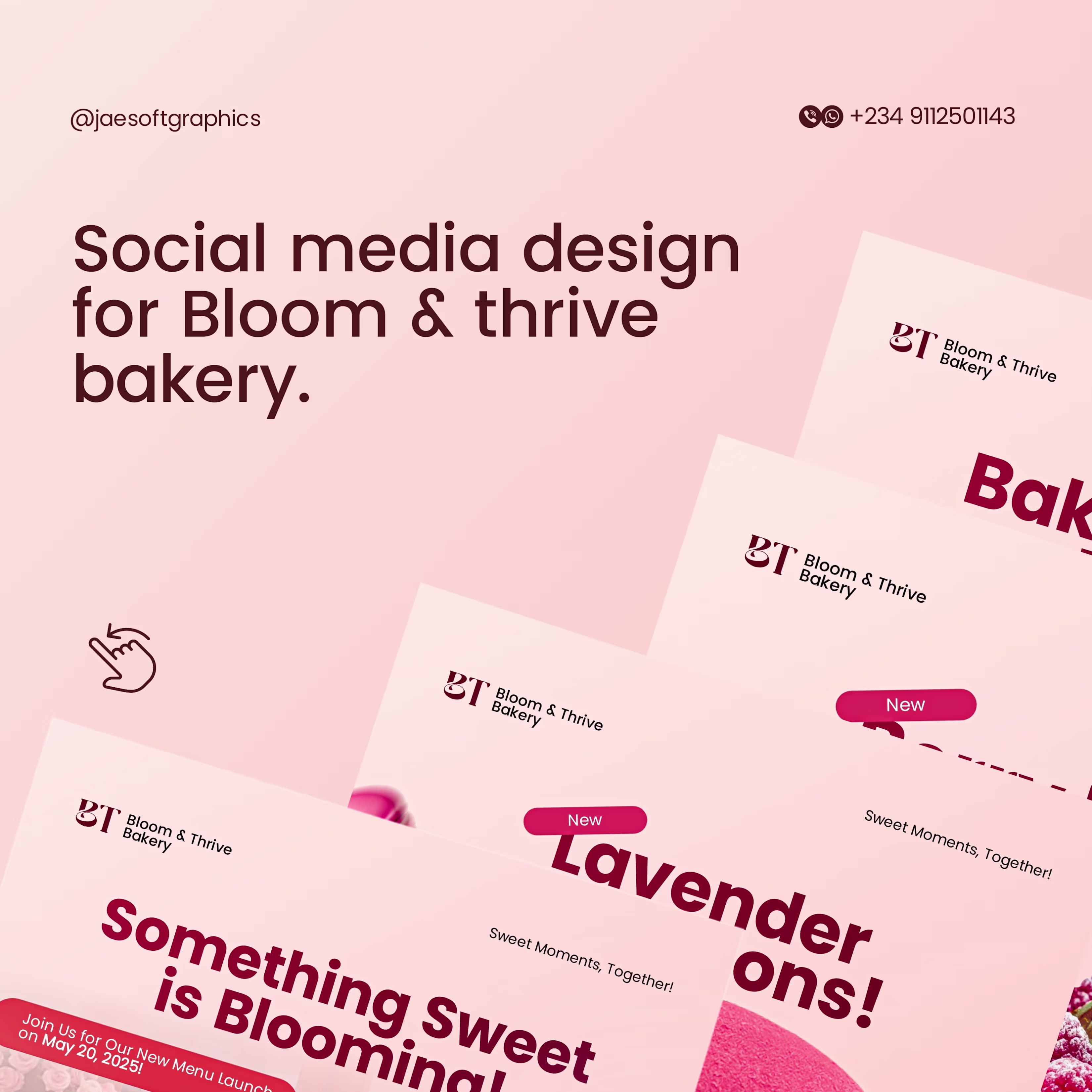
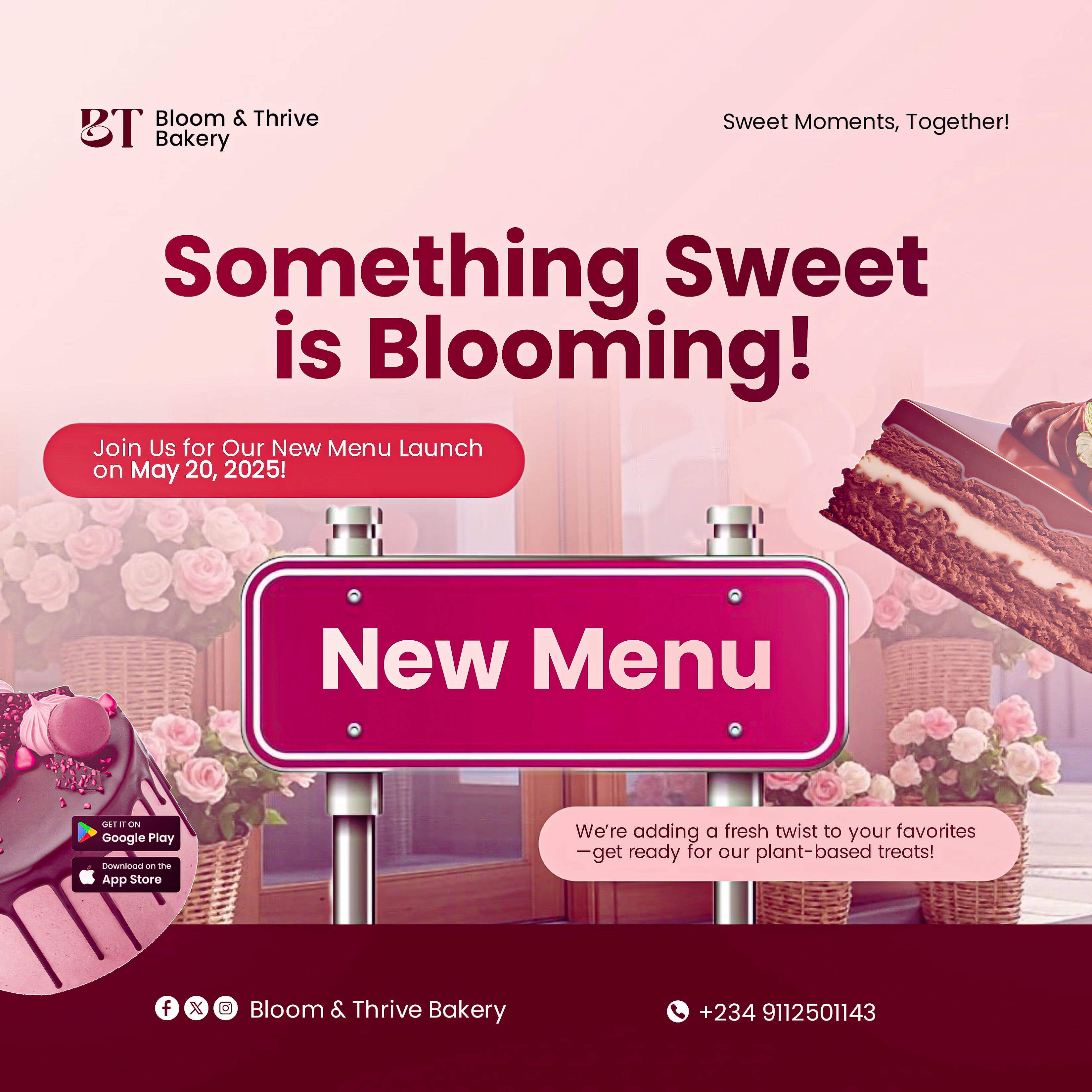
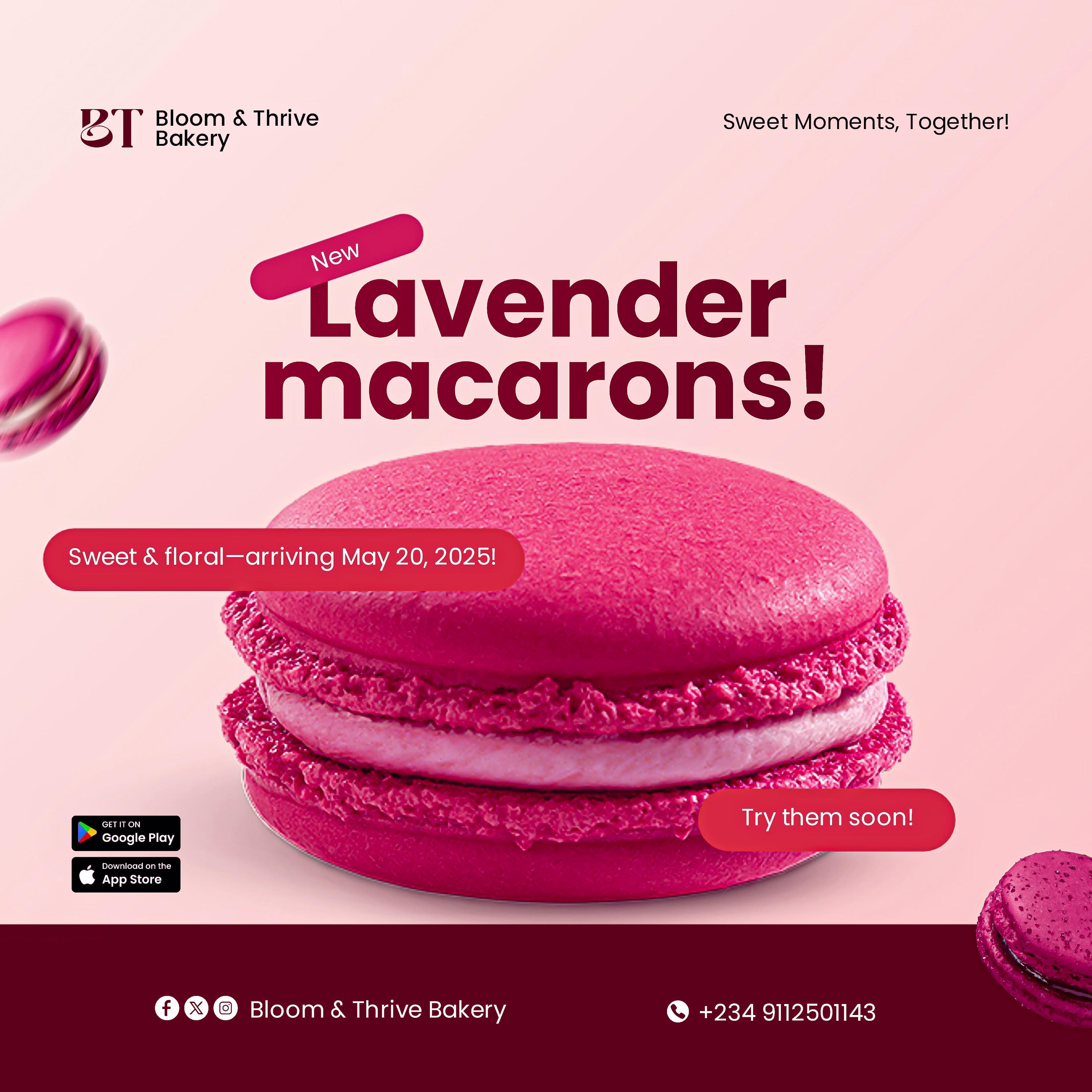
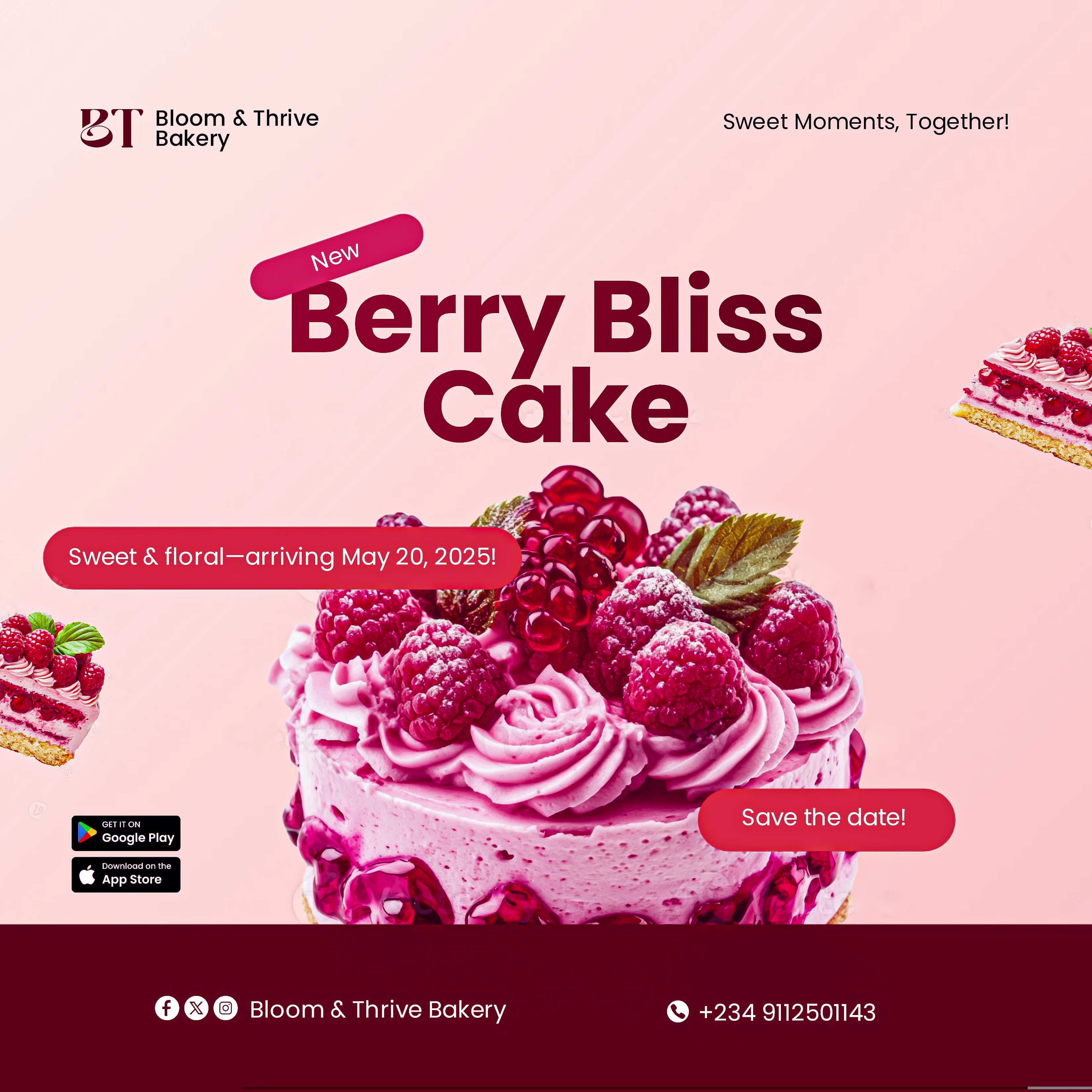
I’m wrapping up my first wave of Contra uploads with a shift into the world of artisanal baking. 😊
For Bloom & Thrive Bakery, the goal was to sell a 'feeling'—warmth, sweetness, and sophistication. I used a soft, lavender-toned palette and airy typography to ensure the brand...