Jaesoft Graphics
Growth Spark Creative designer | Delivering Globally 🌎
Profile in progress
Jaesoft is building their profile!
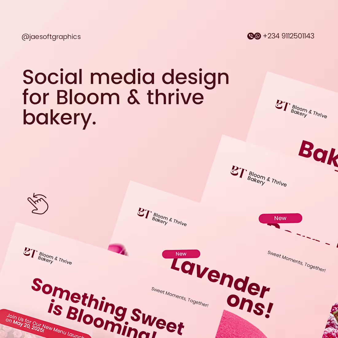
I’m wrapping up my first wave of Contra uploads with a shift into the world of artisanal baking. 😊
For Bloom & Thrive Bakery, the goal was to sell a 'feeling'—warmth, sweetness, and sophistication. I used a soft, lavender-toned palette and airy typography to ensure the brand feels as fresh as their oven-baked goods.
Key Focus Areas:
Visual Consistency: Creating a modular design system that works across various social media formats.
Minimalist Layout: Letting the product and the typography breathe to maintain a 'premium' boutique feel.
This completes my initial portfolio archive here. The Jaesoft Graphics store is now officially open, and my featured projects show the full varieties of what I do—from energetic designs to simple, elegant branding.
What’s your brand’s personality? Let’s bring it to life. 💚⚡️
1
59
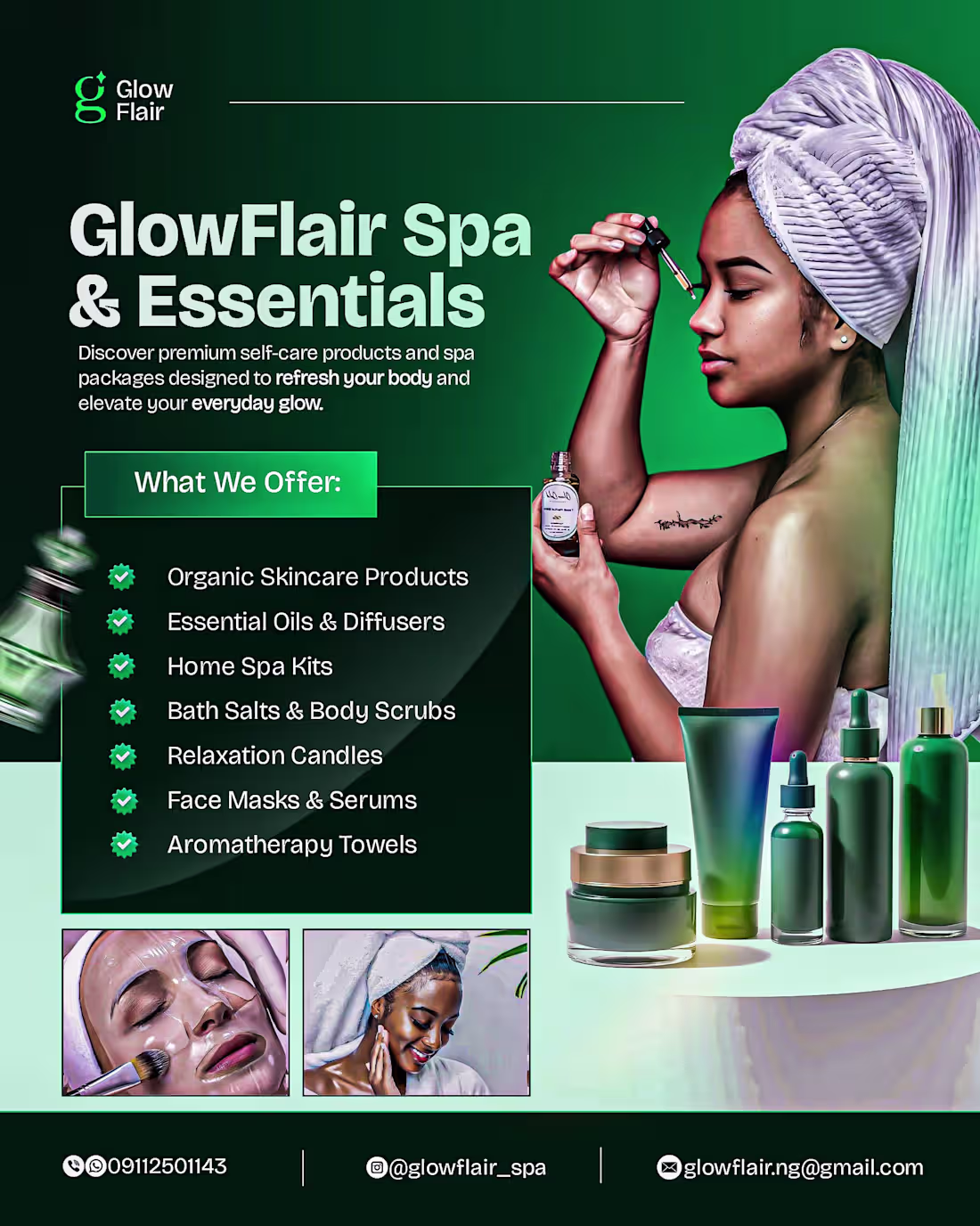
Post #3 of my Contra launch, and this time, it's all about range. 😉
I believe a great designer should be a chameleon—able to adapt to the energy of any brand while maintaining a standard of excellence. Today’s gallery features four distinct industries, each with a unique visual language:
Hospitality (Kpokish Bar): High-energy, rich tones designed to make the experience feel tangible and inviting.
Wellness (GlowFlair Spa): A clean, premium aesthetic.
Beauty (EI Makeover): Elegant, professional styling that highlights artistry and glamor.
Artisanal (Wise Hands Crochet): Friendly and accessible
I don’t just 'make flyers.' I build visual systems that help businesses in any niche command attention and scale. 📌
One final showcase is coming up next to wrap up the archive. The Jaesoft shop is almost fully open for business! 🚀
1
56
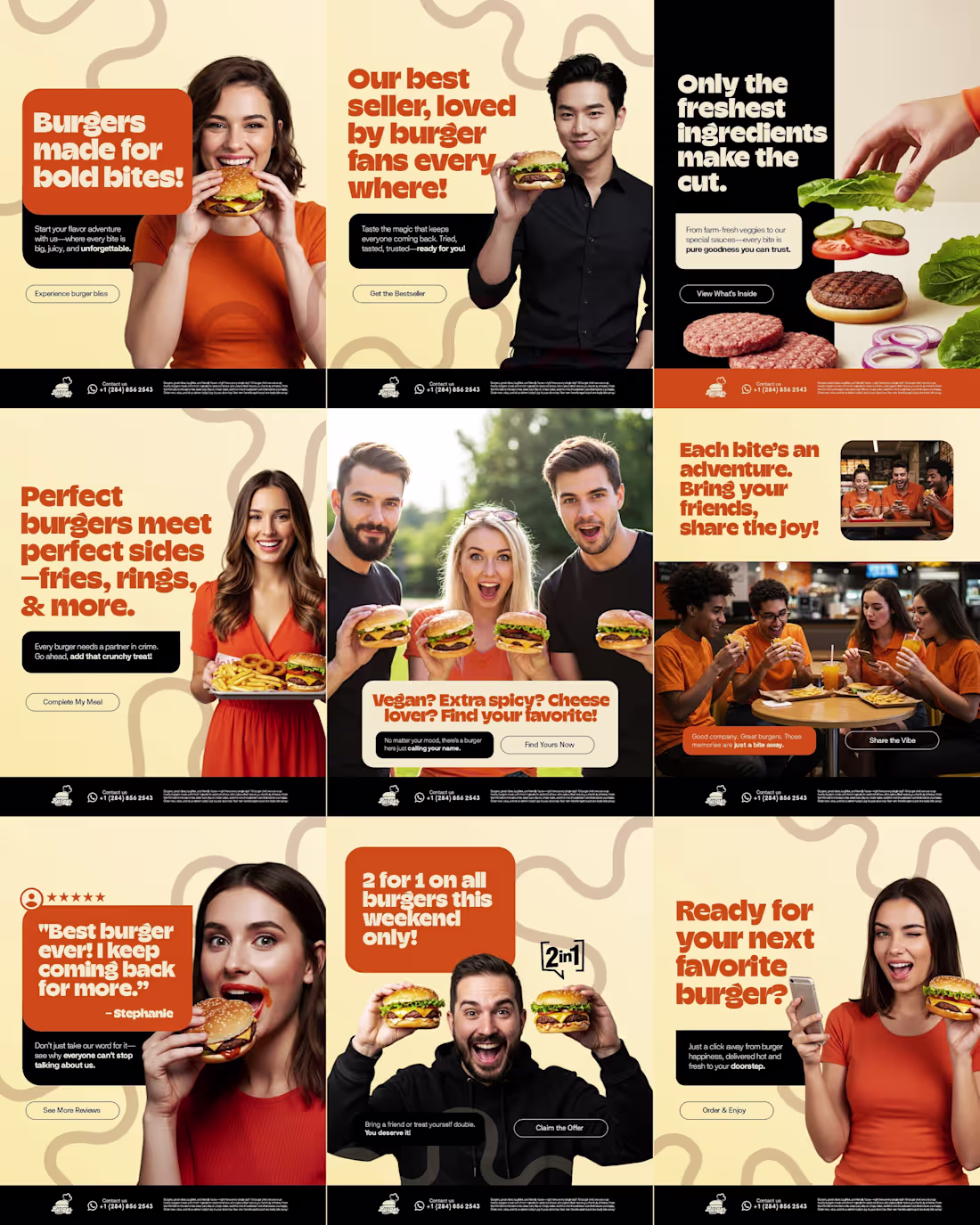
I’m still moving the archive, but I had to showcase the commercial side of Jaesoft Graphics. 😉
While I love cinematic 3D work, I also build systems for conversion. This 9-grid social media collage wasn't just about 'looking good'—it was designed to take a customer from hunger to 'Order Now.'
The Strategy:
Grid Cohesion: A layout that works as a story and as individual posts.
Color Psychology: Warm, appetite-inducing tones paired with high-energy lifestyle shots.
Direct CTA: Clear hierarchy to drive sales.
If you’re looking to turn your brand’s feed into a conversion machine, I’m officially open for commercial projects here on Contra. 💚⚡️
Check out more projects in my Featured selection!
1
50
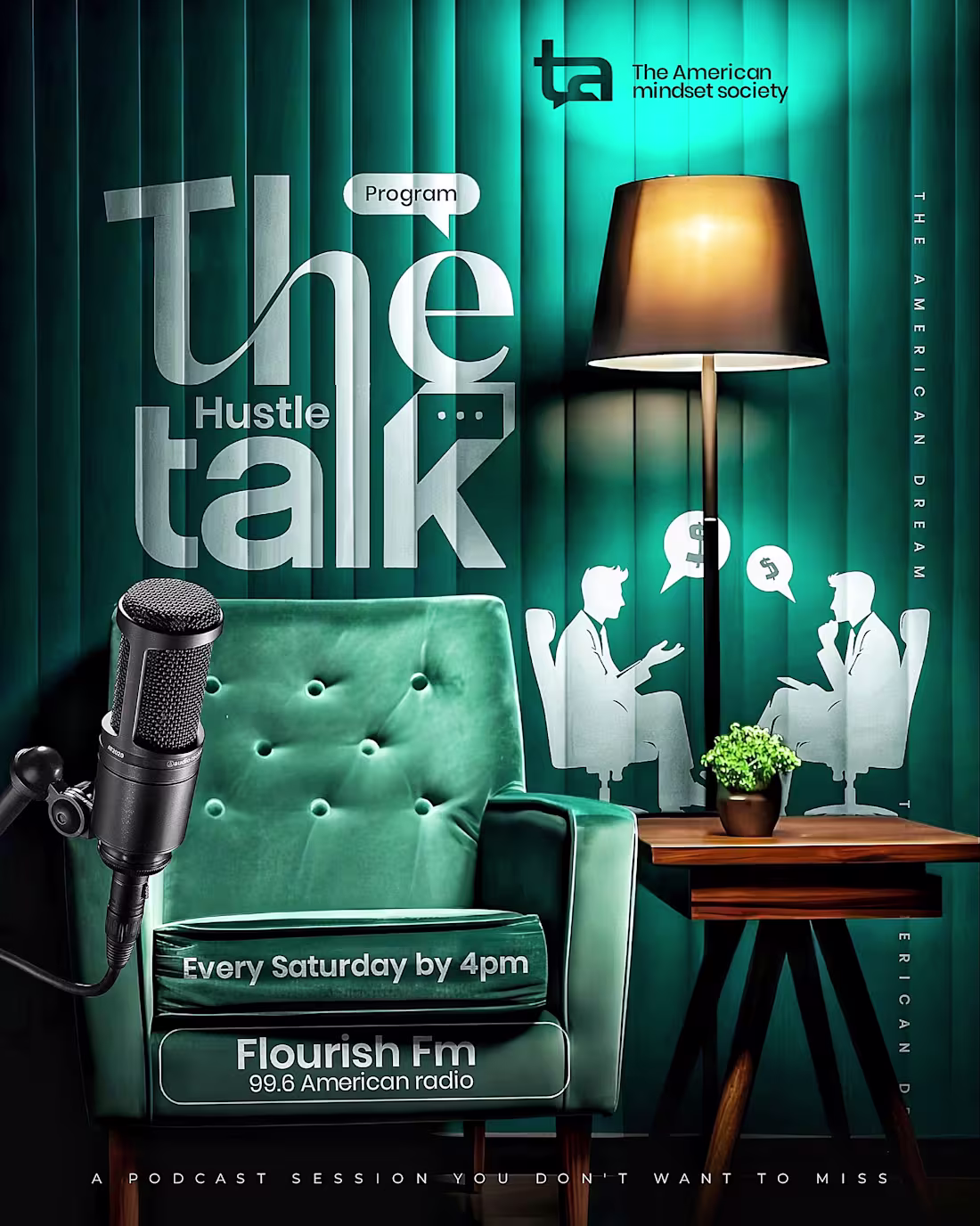
Still moving the furniture in and setting up the shop here on Contra, but the work doesn't wait. 😌🔥🔥🔥
This is a piece from the Jaesoft vault: 'The Hustle Talk.' I’m obsessed with environmental lighting—the way a digital design can feel like a physical space. For this one, I wanted the typography to feel like it’s actually sitting in that velvet chair under the lamp's glow.
What I'm bringing to Contra:
Cinematic depth and 3D textures.
Visuals that stop the scroll (literally, the FB bots thought it was too much).
Premium energy for brands that refuse to be 'mid.'
I’m still building out my full Project list, but if you need this level of energy for your next podcast or event, my DM is open. Let’s grow. 💚⚡️
1
57