The network for creativity
Join 1.25M professional creatives like you
Connect with clients, get discovered, and run your business 100% commission-free
Creatives on Contra have earned over $150M and we are just getting started
Back to feedPost

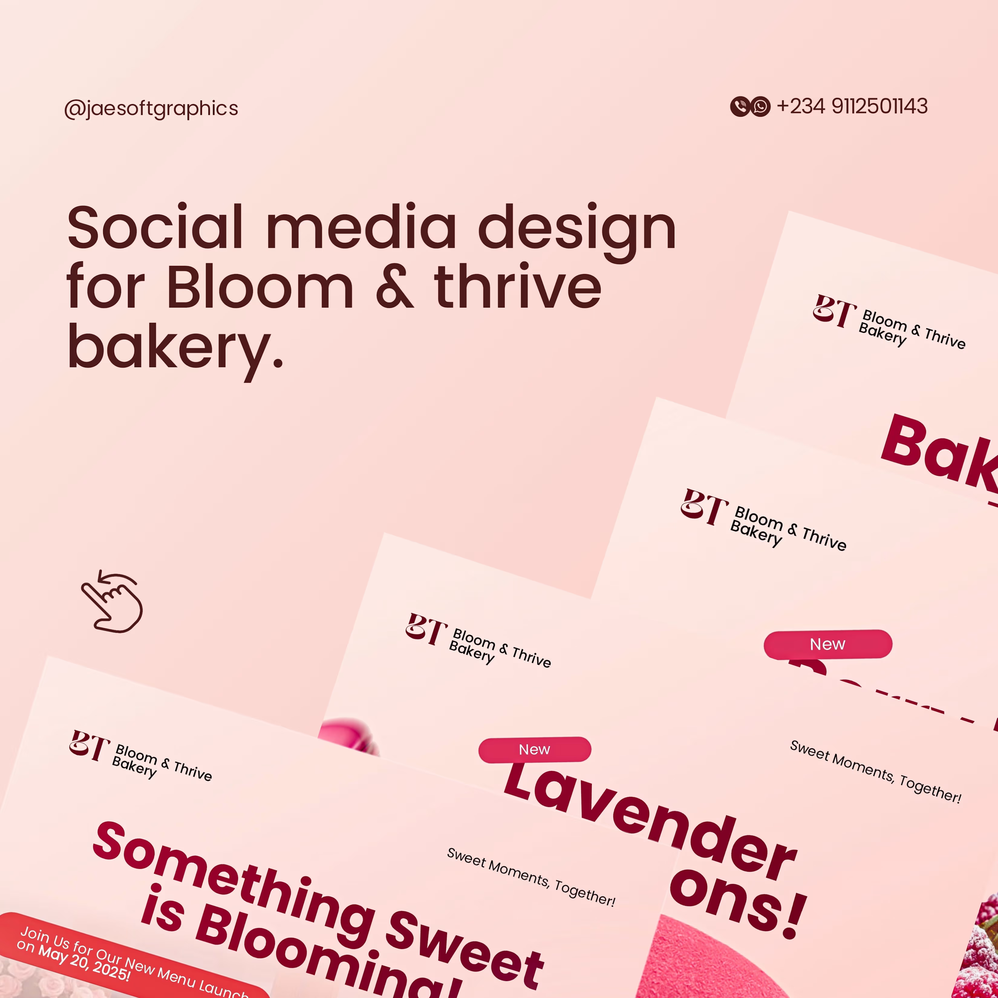
I’m wrapping up my first wave of Contra uploads with a shift into the world of artisanal baking. 😊
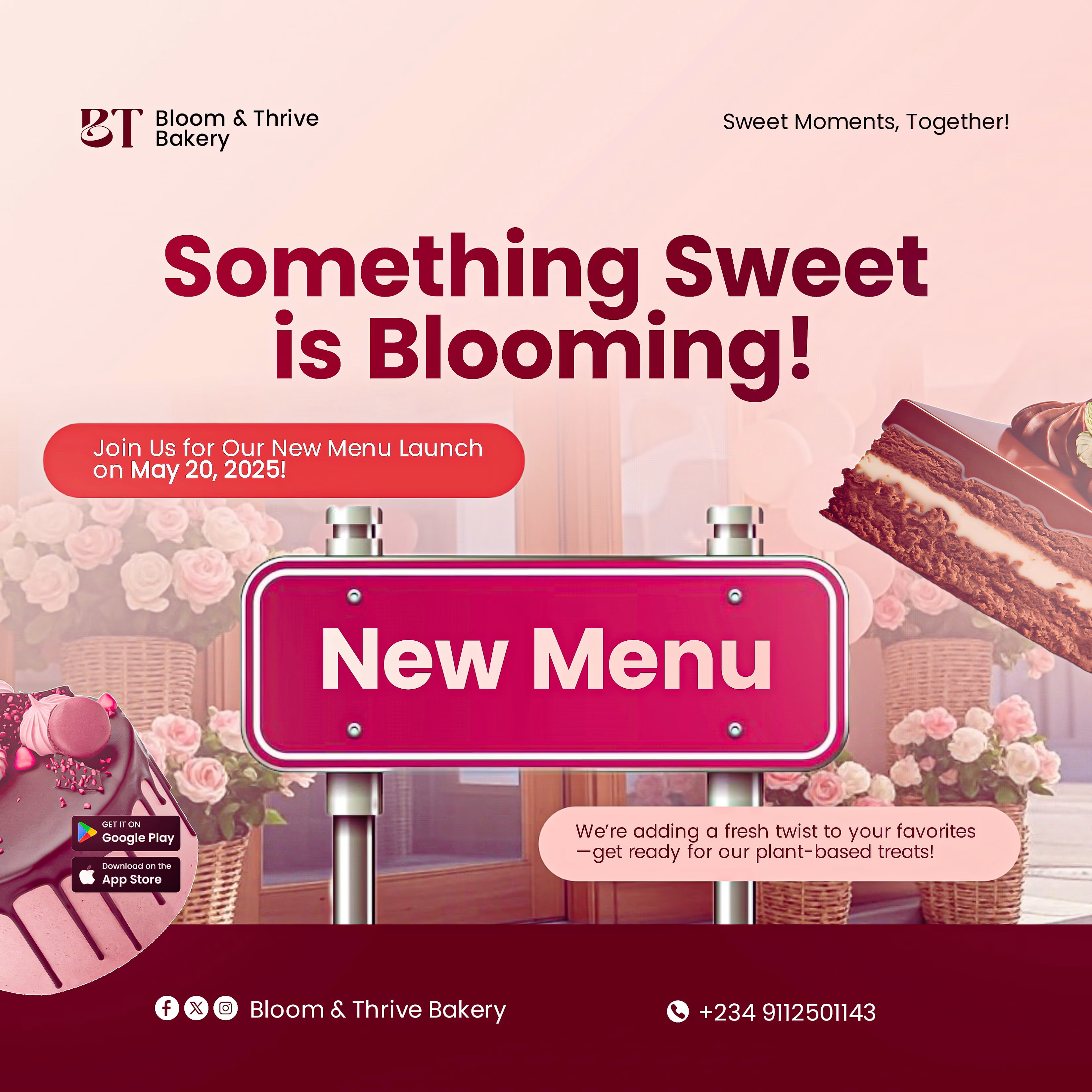
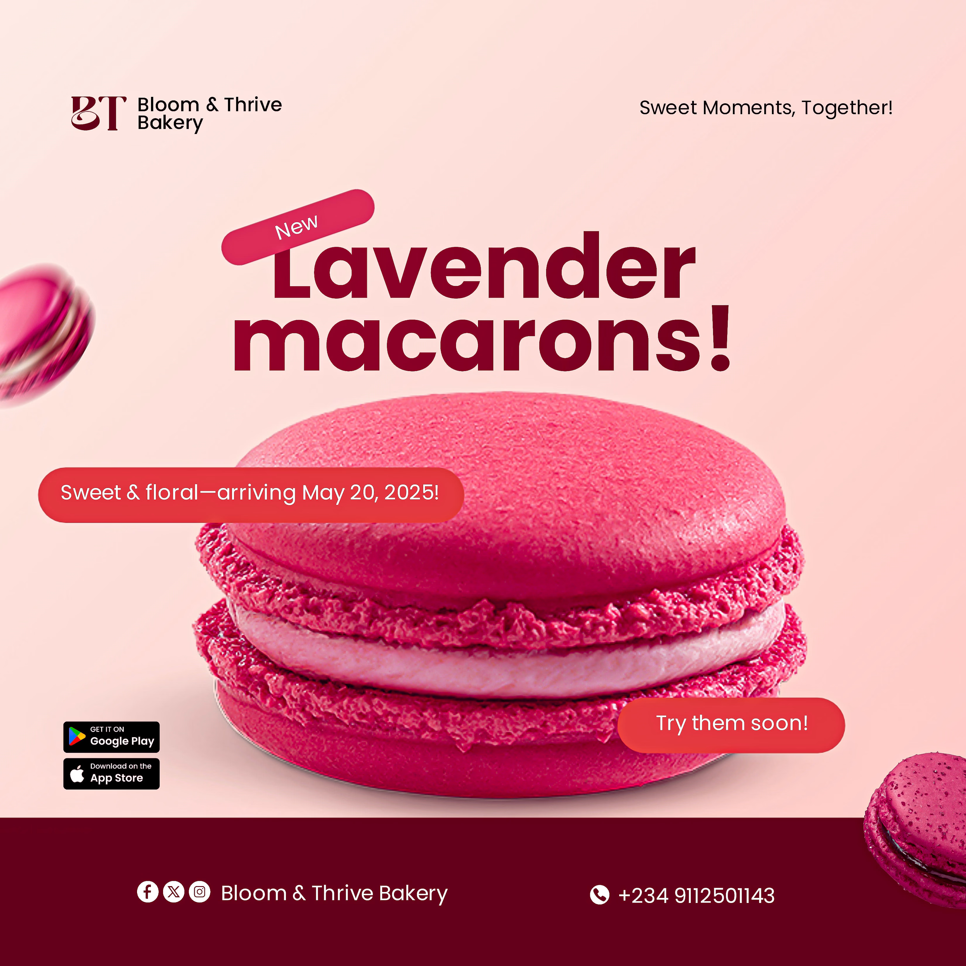
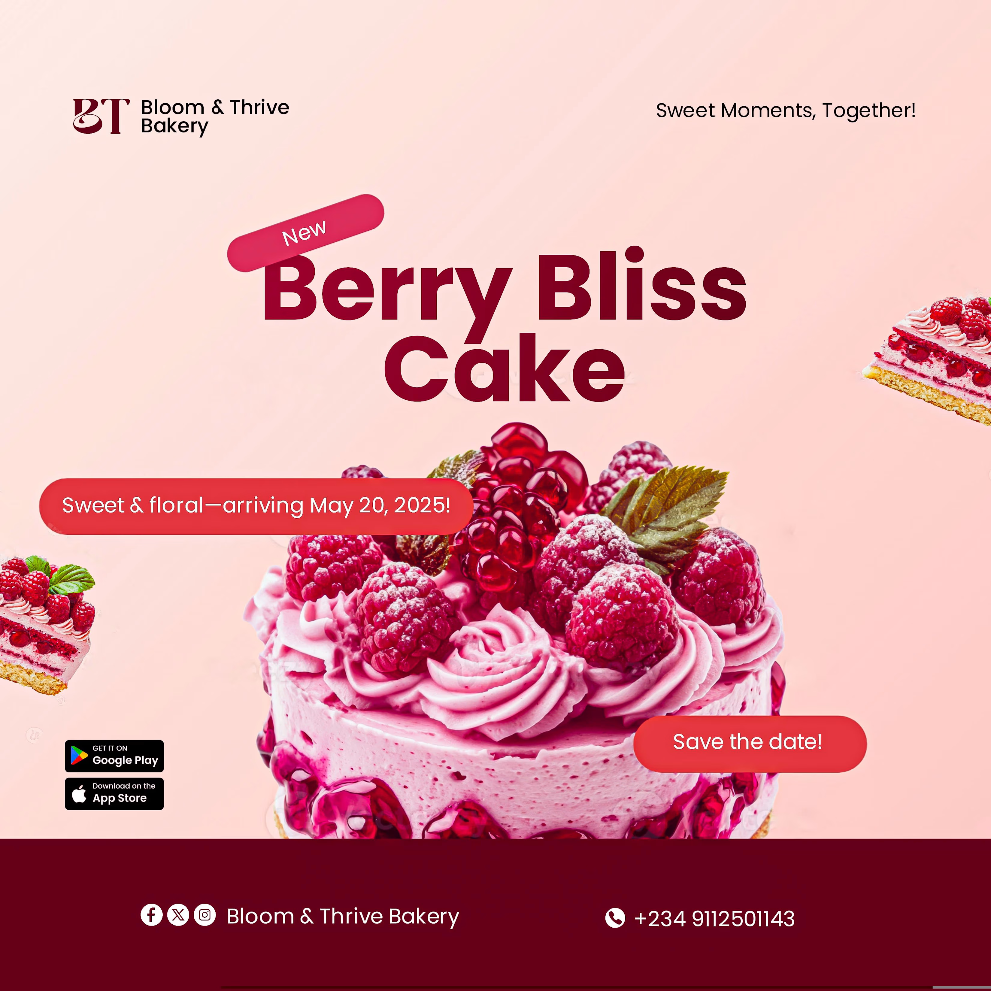
For Bloom & Thrive Bakery, the goal was to sell a 'feeling'—warmth, sweetness, and sophistication. I used a soft, lavender-toned palette and airy typography to ensure the brand feels as fresh as their oven-baked goods.
Key Focus Areas:
Visual Consistency: Creating a modular design system that works across various social media formats.
Minimalist Layout: Letting the product and the typography breathe to maintain a 'premium' boutique feel.
This completes my initial portfolio archive here. The Jaesoft Graphics store is now officially open, and my featured projects show the full varieties of what I do—from energetic designs to simple, elegant branding.
What’s your brand’s personality? Let’s bring it to life. 💚⚡️


The network for creativity
Join 1.25M professional creatives like you
Connect with clients, get discovered, and run your business 100% commission-free
Creatives on Contra have earned over $150M and we are just getting started

Challenges
View all


Related posts

My Top Featured Projects on @Contra Labs 🔥
⚡| NEXVOLU
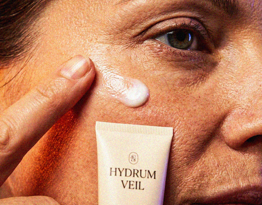
⚡| HYDRUM VEIL
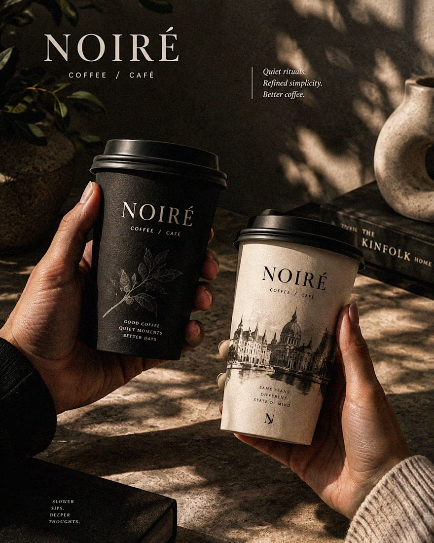
⚡| NOIRÉ
Each project explores a different direction, but the goal stays the same: build brands that stand out.
Which project is your favorite?
Drop the name below 👇



These are 🔥 Mine are all fav 🙌
Congo for Featured on @Contra HQ & @Contra Labs ... 😍


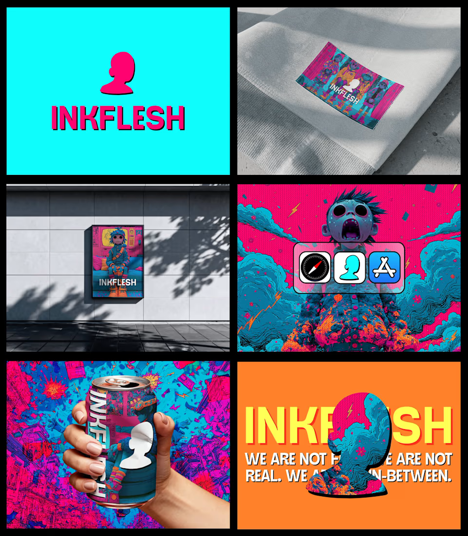
In my INKFLESH identity work, the wordmark runs off the can's curve and gets partly hidden behind artwork on posters. That crop asks the rest of the identity to carry more recognition. The mark has a job when the name is only partly there.


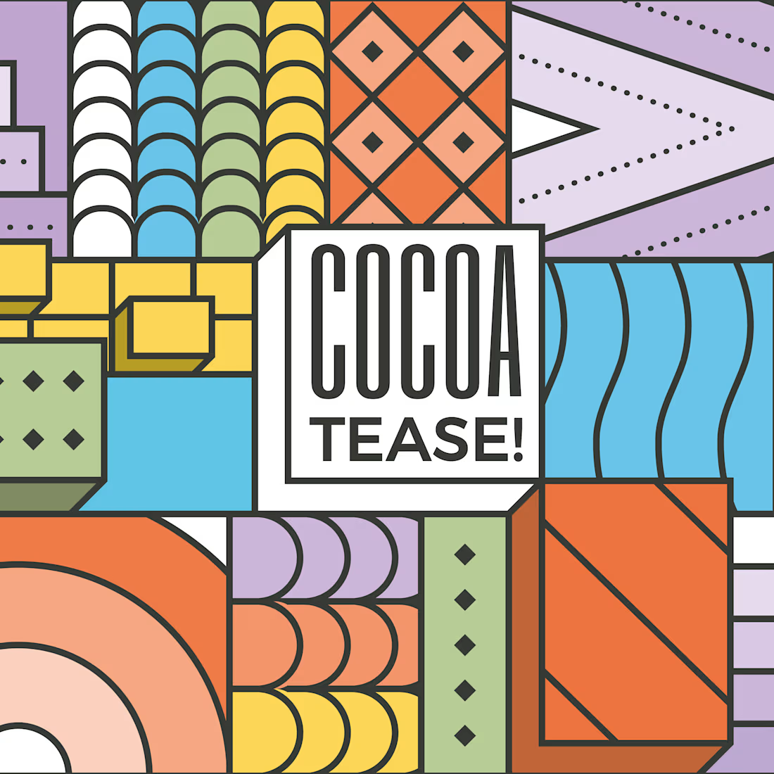
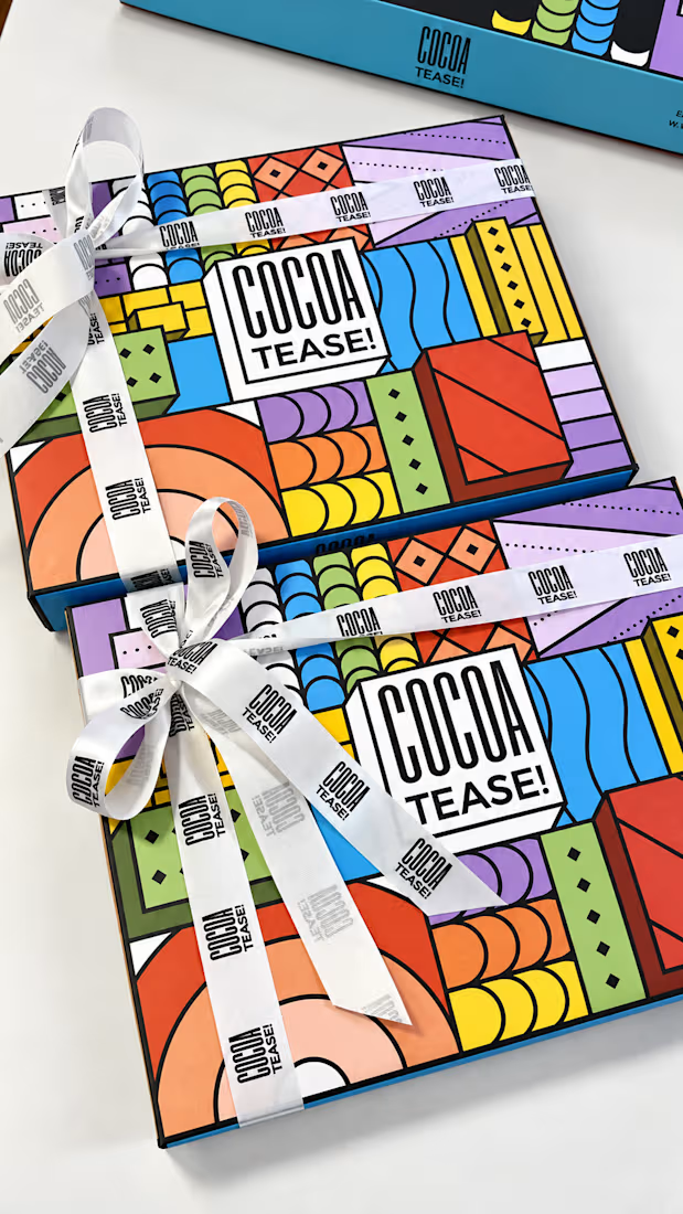
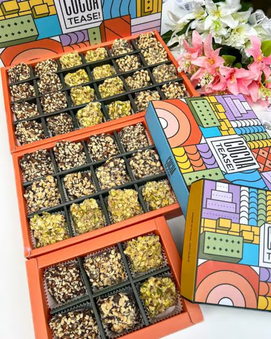
Brand & packaging design for Cocoatease! 🍫
•
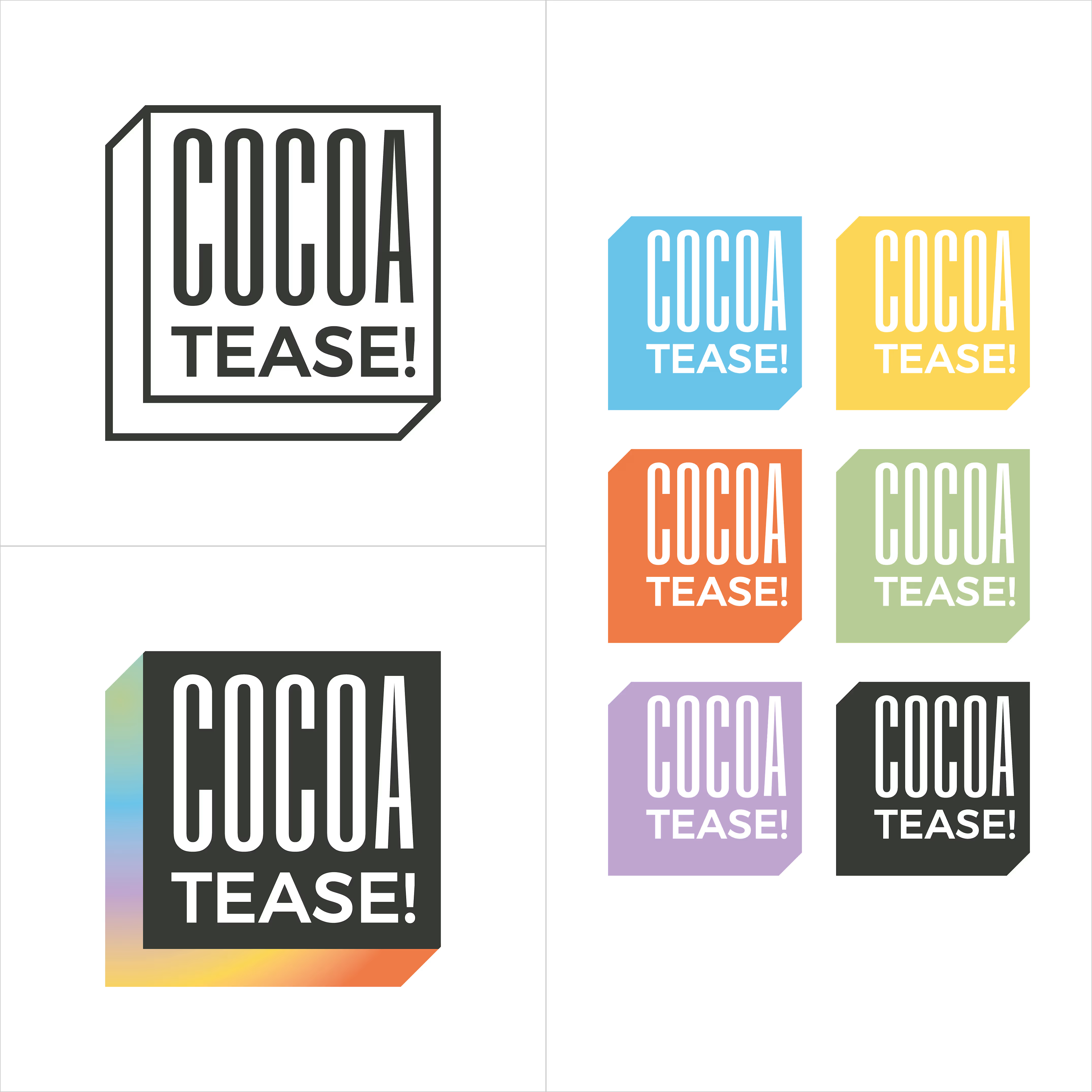
A chocolate company at heart, Cocoatease! is a dessert brand that aims to “tease your palette”. This unofficial tagline prompted the idea of a button for the logo…a visual way of saying “push for a treat”.
•
While a logo is usually designed first, the packaging was conceptualised first to meet growing demand. That pushed us (wink wink) to create a bunch of colour variations to match it.
•
Logo design, logo symbol, branding, brand design, visual identity design, packaging, packaging design, colour palette, typography