Freelancers using Tableau
Sign Up
Post a job
Sign Up
Log In
Filters
1
Projects
People
Lucinda Beeson
pro
United Kingdom
Data Engineering and Automation
$25k+
Earned
1x
Hired
31
Followers
Follow
Message
Data Engineering and Automation

3
E-commerce Demographic Analytic
3
151
3
LLM Risk Assessment & Content Analysis for UK Tabloid
3
45
1
Data Modelling in Python
1
33
1
Financial Analysis with NLP - Investigating soft influence
1
32
Tableau
(1)
Follow
Message
Jonathan Martinez
pro
Brooklyn, USA
Design systems that preserve human judgment.
$1k+
Earned
3x
Hired
5.0
Rating
27
Followers
Top
Follow
Message
Design systems that preserve human judgment.
0
HelpfulHand AI
0
13
0
Orient UI
0
5
0
Design For Impact
0
10
View more →
Tableau
(1)
Follow
Message
Istiak Ahmed Khan
Dhaka, Bangladesh
Power BI Data Analyst + ML AI Automation Expert
5.0
Rating
103
Followers
Follow
Message
Power BI Data Analyst + ML AI Automation Expert
1
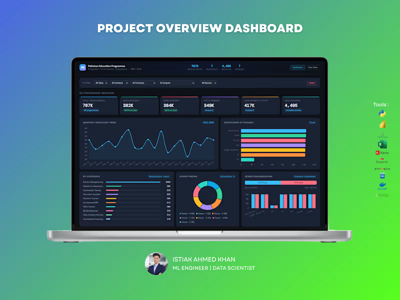
Education Program Analytics Dashboard – Data Analytics Solution Handling large-scale program data without clear visibility can make impact measurement difficult. This dashboard is designed to give organizations a complete, real-time view of program performance, reach, and funding — all in one place. What You Get : A powerful, interactive dashboard that helps track beneficiaries, program outputs, regional performance, and donor contributions with clarity and precision. Key Capabilities: Monitor total beneficiaries and gender distribution Track program reach across provinces and sectors Analyze quarterly trends and growth patterns Evaluate donor funding allocation and impact Identify top-performing program categories and outputs Explore education level distribution and engagement For NGOs and large programs, data is critical for decision-making and reporting. This dashboard helps you measure impact, improve transparency, and optimize resource allocation — making your data meaningful and actionable. Perfect For : NGOs and non-profit organizations Government programs International development agencies Research and policy teams If you want a professional, insight-driven dashboard that clearly communicates impact and performance, I can create a customized solution tailored to your organization.
1
265
10
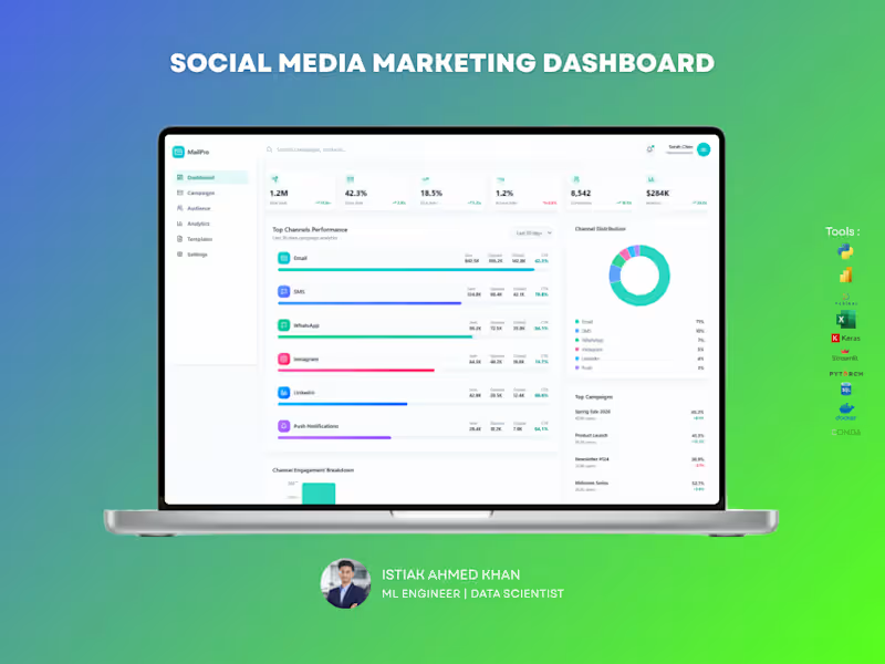
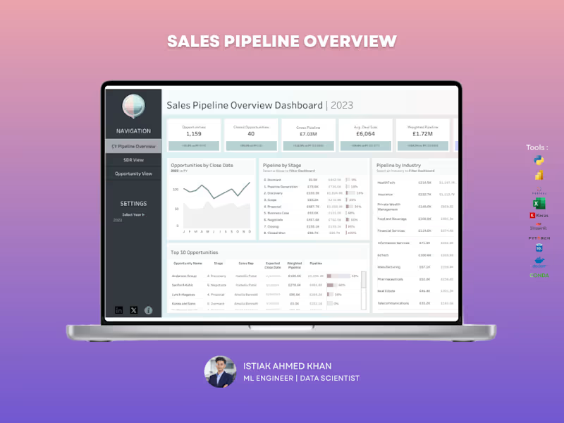
Sales Pipeline Dashboard – Tableau Struggling to track your sales pipeline and forecast revenue accurately? This dashboard gives you a clear, real-time view of your entire sales funnel, helping you stay on top of opportunities and close deals faster. What You Get A centralized Tableau dashboard that brings together pipeline value, deal stages, and performance metrics into one intuitive view. No more scattered reports — everything you need is in one place. Key Capabilities Track total opportunities and closed deals Monitor gross pipeline and weighted pipeline value Analyze pipeline by sales stage to identify bottlenecks Compare pipeline performance across industries View top opportunities and deal progress Understand average deal size and close trends Why It Matters Without visibility into your pipeline, it’s easy to miss opportunities and misjudge forecasts. This dashboard helps you identify stuck deals, improve conversion rates, and predict revenue more accurately. Perfect For Sales teams and managers B2B companies Startups scaling their sales process Agencies managing multiple clients Let’s Build Yours If you want a high-impact Tableau dashboard that turns your sales data into actionable insights, I can create a custom solution tailored to your business.
4
10
378
11
CarePoint Medical Dashboard The CarePoint Medical Dashboard is a modern, user-friendly healthcare interface designed to streamline patient management and hospital operations. The UI focuses on clarity, accessibility, and real-time data visibility for medical professionals. The dashboard features a clean layout with intuitive navigation, allowing users to quickly access key modules such as patients, appointments, doctors, and reports. A soft green color palette enhances readability while aligning with healthcare aesthetics. Real-time KPI cards for patients, appointments, and revenue Patient status tracking with visual indicators (Critical, Stable, Moderate) Monthly admissions trend analysis Upcoming appointments and recent patient records Department-wise distribution insights The interface is designed for efficiency, reducing cognitive load through organized sections and clear visual hierarchy. Interactive elements and minimalistic design ensure smooth navigation and quick decision-making. This dashboard improves operational efficiency, enhances patient monitoring, and supports healthcare professionals in delivering timely and data-driven care.
3
11
775
5
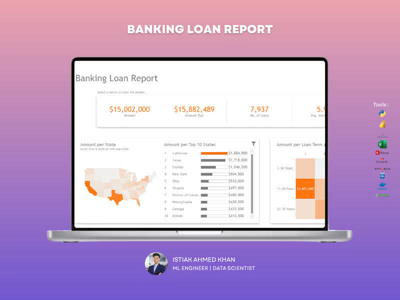
The Banking Loan Performance Report provides a comprehensive analysis of loan distribution, risk levels, and repayment status across different regions and loan terms. Built using Tableau, this dashboard helps financial institutions monitor lending performance, evaluate credit risk, and track outstanding balances efficiently. Key KPIs Tracked: ✔ Total Loan Amount – Overall value of loans issued by the institution ✔ Total Loans – Number of loans approved and disbursed ✔ Average Interest Rate – Average interest applied across all loans ✔ Total Due Amount – Outstanding loan balance pending repayment Check it out (https://contra.com/p/WmYQ3ABX-tableau-banking-loan-report)
5
664
Tableau
(6)
Follow
Message
USMAN AKINTOBI
Nigeria
Making Sense of Data to Drive Decisions
5.0
Rating
6
Followers
Follow
Message
Making Sense of Data to Drive Decisions
1
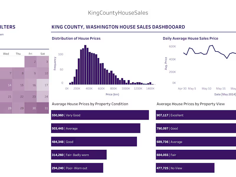
Housing Dashboard
1
6
1
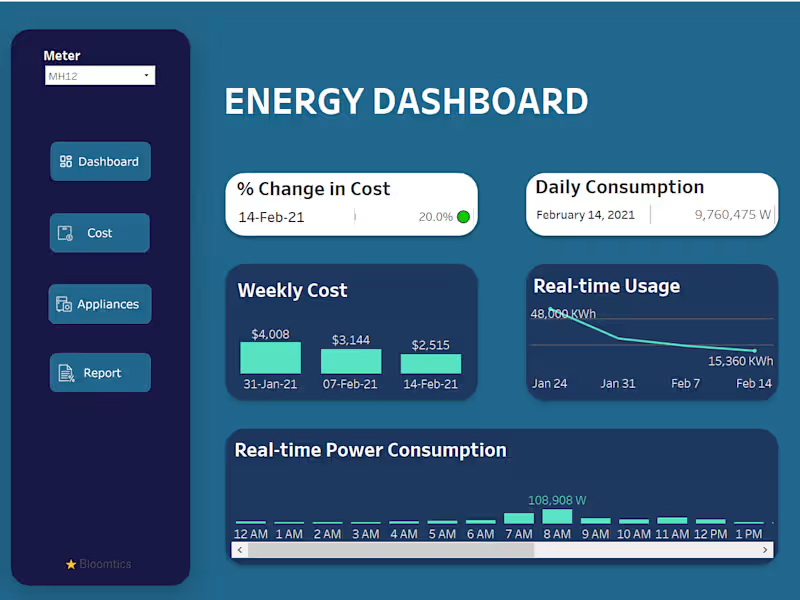
Energy Dashboard
1
10
2
DSP Asset Managers
2
27
1
Context-Aware Fintech User Feedback Classification & Urgency Detection Most feedback tools stop at sentiment; positive or negative. This project goes further by building a decision-driven NLP system that classifies fintech user feedback by issue type and detects operational urgency, enabling smarter triage and escalation. What was built: Two machine learning models trained on manually collected and annotated app store reviews from real fintech platforms like Revolut, Wise, and Monzo: Issue Classifier: categorizes feedback into 9 classes including transaction issues, account security, KYC, refunds, app performance, and fraud Urgency Detector: binary classifier that flags high-risk feedback requiring immediate attention, optimized for recall to minimize missed critical cases
1
47
Tableau
(3)
Follow
Message
Johnson Wairimu
Nairobi, Kenya
Delivering Strategic Growth Through Data, Finance & Tech.
8
Followers
Follow
Message
Delivering Strategic Growth Through Data, Finance & Tech.
0
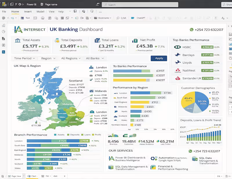
🚀 UK Banking Dashboard | Advanced Financial Analytics by Intersect Analytics Unlock the full potential of your financial data with our Power BI–driven UK Banking Dashboard, designed to deliver real-time insights, performance tracking, and data-driven decision-making for financial institutions and analysts. 📊 Comprehensive Banking Performance Insights Our dashboard provides a 360° view of the UK financial sector, covering: ✔ Total Assets, Deposits, Loans & Profitability ✔ Top Bank Performance (HSBC, Barclays, Lloyds, NatWest, Santander) ✔ Regional Performance Analysis (London, Midlands, Scotland & more) ✔ Customer Demographics & Behavior Insights ✔ Branch-Level Performance Tracking ✔ Trends in Deposits, Loans & Profit Growth With interactive filters (Time Period, Region, Bank), users can drill down into specific insights instantly. ⚙️ Built with Industry-Leading Tools This solution is powered by: 📊 Power BI – Interactive dashboards & advanced visual analytics 🗄️ SQL – Data extraction, transformation & modeling 🐍 Python – Automation & advanced data processing 📈 Excel – Financial modeling & reporting 💼 Our Core Services At Intersect Analytics, we deliver end-to-end data solutions: 🔹 Business Intelligence Dashboards (Power BI & Tableau) 🔹 Data Cleaning, Transformation & Modeling 🔹 Automation (Excel, Python, Google Apps Script) 🔹 SQL Database Management & Optimization 🔹 Financial & Operational Reporting 🎯 Why Choose Intersect Analytics? ✔ Data-first approach – Clean, structured, and reliable data foundation ✔ Custom-built solutions – Tailored to your business needs ✔ Advanced analytics expertise – Finance + Data combined ✔ Actionable insights – Not just dashboards, but real business value ✔ Professional, scalable delivery 📈 Business Impact 🚀 Improve financial visibility and reporting accuracy 📊 Make faster, data-driven decisions 💰 Identify growth opportunities and optimize profitability 🔍 Gain deeper insights into customers and regional performance 📩 Get Started Today Ready to transform your financial data into powerful insights? 📞 +254 723 632207 (WhatsApp Available) 📍 Intersect Analytics 💡 Intersect Analytics — Turning complex data into clear financial intelligence.
0
28
0
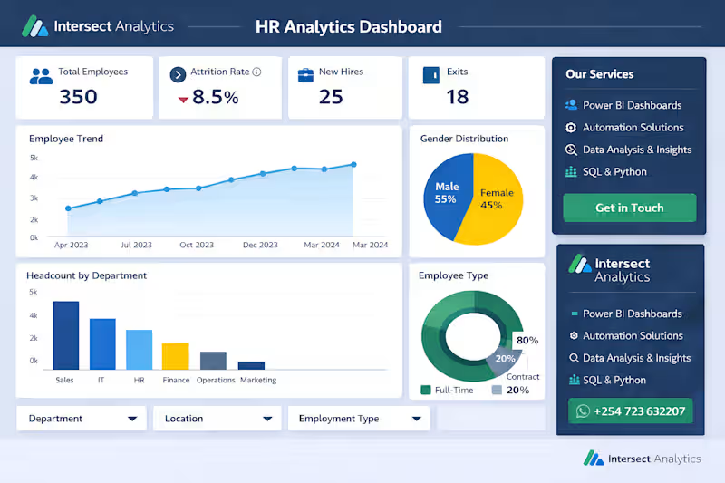
🚀 HR Analytics Dashboard – Case Study by Intersect Analytics We recently developed a professional HR Analytics Dashboard designed to help organizations gain full visibility into their workforce and make smarter, data-driven HR decisions. 🔍 The Challenge Many organizations struggle with scattered HR data, manual reporting, and limited insights into employee performance, attrition, and hiring trends. 💡 Our Solution At Intersect Analytics, we built a centralized Power BI dashboard that delivers: • Real-time visibility into employee headcount, attrition, and hiring • Clear insights on department performance and workforce distribution • Actionable analytics on salary, gender balance, and employee types • Interactive filters for deeper, customized analysis 🛠️ Our Core Services 📊 Power BI Dashboards & Business Intelligence ⚙️ Automation (Excel, Python, Google Apps Script) 🧠 Data Analysis & Business Insights 🗄️ SQL Data Management & Transformation 📈 Financial & Operational Reporting 🎯 Impact Delivered ✔ Reduced manual HR reporting time ✔ Improved visibility into workforce trends ✔ Enabled faster, data-driven HR decisions ✔ Identified key areas for retention and optimization 🌟 Why Choose Intersect Analytics? ✔ We focus on data quality first (clean, structured, reliable data) ✔ We deliver end-to-end solutions (from data cleaning to dashboards) ✔ We combine business understanding with technical expertise ✔ We build solutions tailored to your organization—not templates 📩 Let’s transform your HR data into actionable insights 📞 +254 723 632207 (WhatsApp Available) 💡 Intersect Analytics — Turning data into decisions.
0
12
0
🚀 Turn Your Data Into Profit with Intersect Analytics Are you sitting on data but struggling to turn it into real business value? At Intersect Analytics, we help you unlock insights, automate workflows, and make smarter decisions—faster. 💼 What We Do We provide end-to-end data and automation solutions tailored to your business: 📊 Power BI Dashboards – Interactive, real-time dashboards for sales, finance & operations ⚙️ Automation Solutions – Using Google Apps Script, Python & Excel to eliminate repetitive work 🧠 Data Analysis & Insights – Turn raw data into clear, actionable strategies 🗄️ SQL & Data Management – Clean, structure, and optimize your data systems 📈 Financial Modeling & Reporting – Forecasting, budgeting, and performance tracking 🎯 Problems We Solve ❌ Manual reporting taking hours (or days) ❌ Scattered, unstructured data ❌ Lack of clear business insights ❌ Poor decision-making due to limited visibility ✅ We replace all that with automated, intelligent systems 🔍 Our Approach At Intersect Analytics, we don’t just build dashboards—we solve problems: Understand your business goals Clean and structure your data Build powerful, automated systems Deliver clear dashboards & insights Support data-driven decision making 🌟 Why Choose Us? ✔ Save 10+ hours weekly through automation ✔ Reduce errors and improve accuracy ✔ Get real-time visibility into your business ✔ Tailored solutions—not one-size-fits-all ✔ Strong expertise in finance, analytics & business strategy 📣 Who We Work With Businesses • Startups • Accountants • Analysts • Retailers • SMEs 📩 Let’s Work Together Ready to transform your data into a competitive advantage? 📞 +254 723 632207 📍 Intersect Analytics 💡 Work smarter. Automate faster. Grow stronger.
0
28
0
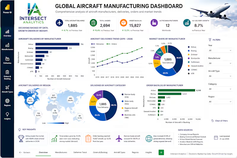
🚗 Executive Automotive Industry Intelligence — Powered by Power BI How do the world's leading automotive manufacturers compare when it comes to revenue, profitability, production, and market performance? At Intersect Analytics, we developed this executive Power BI dashboard to transform complex automotive industry data into a single source of truth for strategic decision-making. 📊 Executive Insights Our analysis revealed several key industry trends: 🏆 Toyota Motor Corporation continues to lead the global automotive market, generating the highest revenue while maintaining exceptional profitability and vehicle production volumes. 📈 Volkswagen Group remains one of the strongest global competitors, demonstrating consistent revenue growth and a diversified international market presence. ⚡ BYD has emerged as one of the fastest-growing manufacturers, driven by rapid expansion in electric vehicle production and increasing global demand. 💰 While several manufacturers generate significant revenue, profit margins vary considerably, highlighting differences in operational efficiency, manufacturing costs, and pricing strategies. 🌍 Asian manufacturers continue to dominate the global automotive industry, contributing the largest share of revenue and vehicle production compared to Europe and North America. 🚘 The transition toward electric and hybrid vehicles is reshaping the competitive landscape, with manufacturers investing heavily in next-generation mobility technologies. 📉 Comparing Revenue against Cost of Sales reveals that companies with stronger cost control consistently deliver higher profitability despite operating in the same competitive environment. 📊 Revenue per vehicle varies significantly across manufacturers, reflecting differences in brand positioning, product mix, and premium versus mass-market strategies. What This Dashboard Delivers ✔ Executive KPI Scorecards ✔ Revenue & Profitability Benchmarking ✔ Global Vehicle Sales Analysis ✔ Regional Performance Comparison ✔ Revenue vs Cost Analysis ✔ Net Profit Margin Analysis ✔ EV, Hybrid & ICE Market Breakdown ✔ Interactive Geographic Performance Mapping ✔ Executive-ready Multi-page Reporting Our Services At Intersect Analytics, we help organizations transform raw business data into executive intelligence through: ✅ Power BI Dashboard Development ✅ Financial Analytics & Executive Reporting ✅ Business Intelligence Solutions ✅ Excel & Google Sheets Automation ✅ SQL Data Modeling & ETL ✅ Power Query & DAX Optimization ✅ KPI Scorecards & Performance Monitoring ✅ Predictive Analytics & Decision Support Every dashboard we build is designed to help leaders move beyond reporting—to uncover trends, optimize performance, and make confident, data-driven decisions. 📊 Decisions Backed by Data. Growth Driven by Insight. If your organization is ready to unlock the full potential of its data, let's build a solution tailored to your business.
0
7
Tableau
(3)
Follow
Message
Ciro
Buenos Aires, Argentina
Go to sleep, may your sweet dreams come true...
267
Followers
Follow
Message
Go to sleep, may your sweet dreams come true...
1
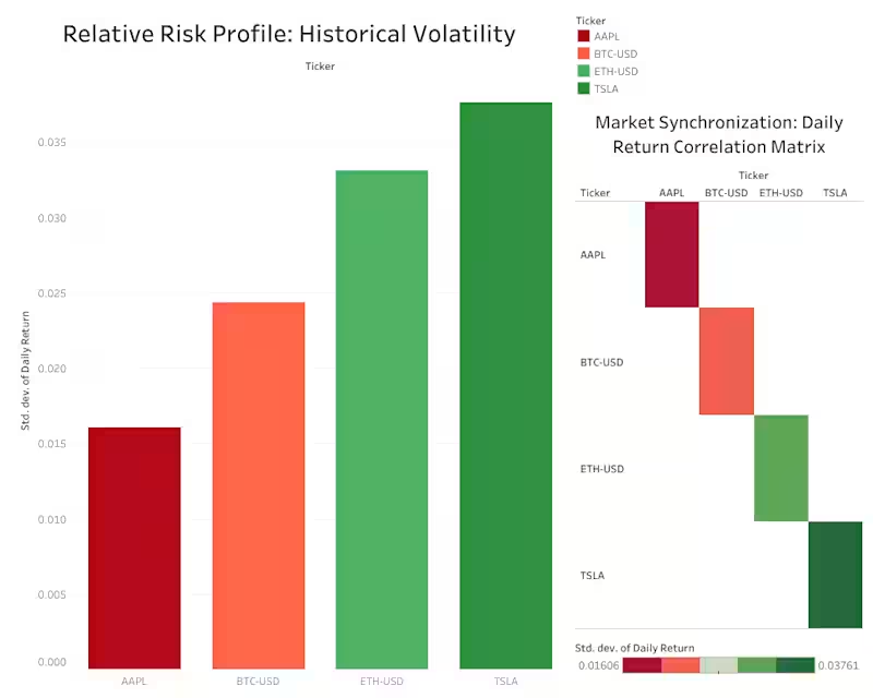
Financial Market Analysis: Stocks & Crypto Volatility
1
3
17
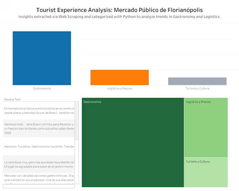
It’s summer in the Southern Hemisphere, and families in this area are heading to the beach. One of the most amazing places to visit is Florianópolis, known for its vibrant culture and seaside charm. To understand what makes the city’s Mercado Público so special, I built an end‑to‑end data pipeline: scraping Google Maps reviews with Python and Selenium, storing them in PostgreSQL, and categorizing them with Pandas. The insights are visualized in an interactive Tableau dashboard. It's also the first time I used another tool: Beekeeper! This project blends data engineering, sentiment analysis, and business intelligence to highlight how people experience one of Brazil’s most beloved destinations. You can explore my GitHub repo (https://github.com/ciroduro01/floripa_tourism_analysis) for more information. Have a nice week! ♥️
2
17
837
37
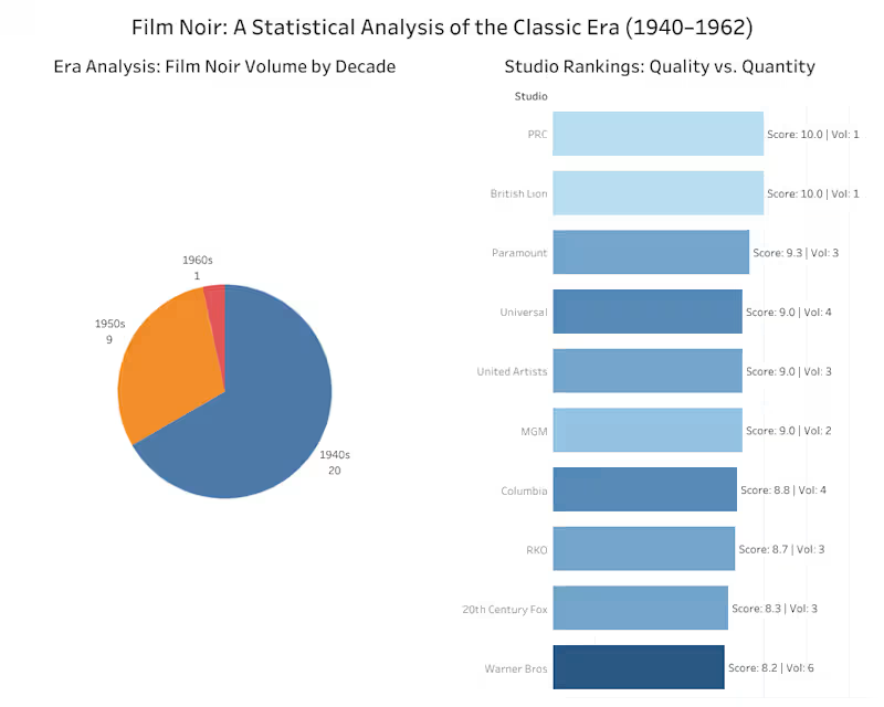
For this week’s #contraquest, I want to share the project that means the most to me. A Data Analysis of the Film Noir Era (1940–1962) On the surface, it’s a data pipeline: raw Excel, Python ETL, Tableau dashboard... The minor reason it’s special is that I stepped outside my comfort zone and used Tableau instead of my usual Power BI. But the major reason is personal. This topic, American Film Noir, takes me back to my last year of high school, when I wrote a monograph on the genre’s Golden Age. Revisiting it now, through the lens of data analysis, felt like reconnecting with a piece of my past. Check it out on my GitHub repo (https://github.com/ciroduro01/Film_Noir_Movies/tree/main), or read the Medium article (https://medium.com/@ciroduro01/shadows-cinema-a-data-analysis-of-the-film-noir-era-1940-1962-b2dd80cde76c).
6
37
1.9K
5
Heritage Soil Station: A NZ Website
5
12
Tableau
(3)
Follow
Message
Mikita Drozd
Warsaw, Poland
Certified Senior Tableau Developer, Designer, Consultant
Follow
Message
Certified Senior Tableau Developer, Designer, Consultant
0
World Health Organisation | Sustainable Development Goals
0
7
0
Marketing Campaign KPI Dashboard
0
4
0
KPI Dashboard: Operations
0
2
View more →
Tableau
(3)
Follow
Message
Drashti Patel
New Jersey, USA
The DataSavvy Analyst
Follow
Message
The DataSavvy Analyst
2
Case Study Analysis: Exploring India's COVID-19 Journey
2
63
1
Predictive Analytics: Gun Violence in Tristate Cities
1
27
0
Exploratory Visual Data Analysis: The Opioid Epidemic
0
37
0
Analyzing Spotify and YouTube Songs Using Python & MySQL
0
182
Tableau
(3)
Follow
Message
Explore people