E-commerce Demographic Analytic
This project involved explorative and descriptive analytics of sales data in order to inform business strategy and marketing. The project was completed entirely by myself in Python, Tableau and Excel.
Problem Statement: The client are an in-store and E-commerce company wishing to gain better understanding of their customer purchasing behaviour. This will allow them to better tailor their advertising towards different demographics of their customer base. This report details insight into which advertising channels work best for different demographics, and the distribution of products sales within these demographics.
Project Aims
After working collaboratively with the client to discuss whats possible, we decided on the following project aims:
Which customer demographic sectors are key sources of revenue?
How do these demographics respond to advertising?
Which advertising channels generate the most revenue?
How do product sales perform within different demographic sectors?
Initial Analysis
Pivot tables and charts were leveraged in excel to give initial insights and allow a better understanding of the data. SQL was leveraged to provide further exploratory analysis. The ad data was left joined onto the marketing data to find relationships between social media advertisement and various demographic groups.
Tableau was used for most of the exploratory analysis. The key demographic sectors were defined as:
Age
Income
Number of Children
Marital Status
Country
Education
Below are the attributes within the data selected for analysis.
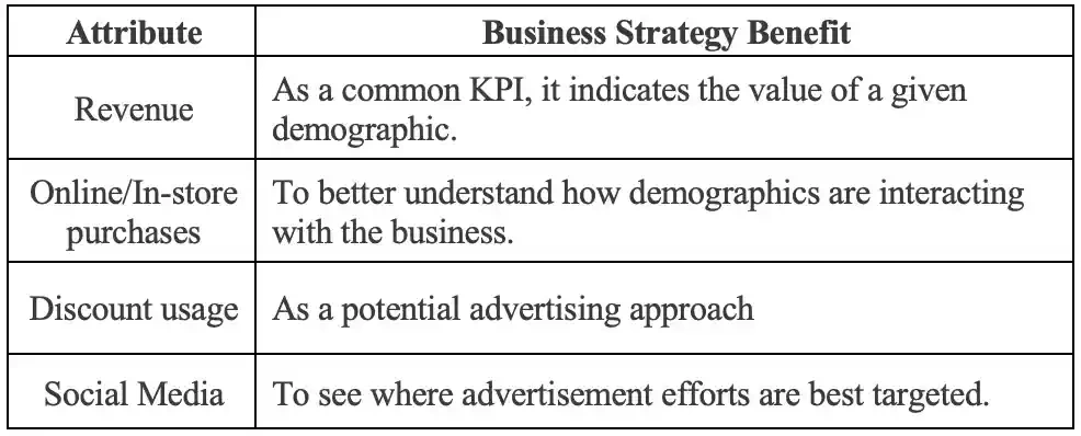
Each of these attributes was explored in relation to the demographic sectors and examined for any business insights. Histograms were created for Age and Income; bar charts were used for the remaining descriptive demographic sectors. Filters were applied to follow lines of inquiry as they presented themselves. The decision to use revenue instead of the count of customers was taken based on the assumption that the company are looking to increase their turnover. This assumption is something I brought to the clients attention.
The revenue generated by each advertising channel was calculated using the following formula:

Where TotalRevenue is the revenue a customer has generated across products, AllAdvertising is the sum of advertising methods recorded for the customer, and the specific advertising method is the advertising channel of interest. In this way the revenue a customer generates is evenly attributed to each marketing method that they engaged with. If a given advertising channel did not result in a purchase for that customer, then no revenue is attributed to that channel. This large assumption that the revenue is evenly distributed across advertisements severely limits the accuracy of the advertising-revenue relationship but is necessary given that the data was already aggregated into sum figures rather than individual transactions. This accuracy could be improved given the unaggregated data, which would require a more data driven business practice.
Dashboard Design & Development
The dashboards focus is to answer the four questions set out in the aims of the project. The decision was made to use a high-level overview dashboard to easily present the key metrics to non-technical stakeholders, which could then be interrogated further though filters to satisfy technical stakeholders.
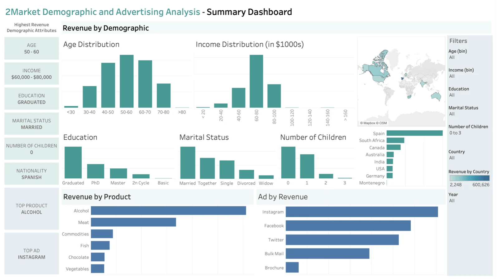
Bar charts were used to easily communicate distributions without explanation. Age and income were the most significant factors, so these were placed at the top. The three less pivotal attributes were placed beneath, with smaller spacing to convey less priority, whilst also making sure that all labels were easily visible and not truncated. The country data was conveyed using two chart types. The map to breaks up the dashboard by adding some variation and preventing boredom; the bar chart more accurately depicts the disparity between different countries. This is placed below the map as it is designed to be used as a secondary display to further drill down into the specifics.
The product and advertising charts were colour coordinated to show they are not part of the demographic description charts. By applying filters these two charts are a simple way of interrogating the data to answer advertising and product specific questions. These charts were made horizontal again to differentiate them from the demographic charts and to ensure their text labels were not truncated. There large sizing was chosen to emphasize their importance and counterbalance the fact they are placed at the ‘less-important’ bottom of the page.
The summary statistics for each demographic sector are highlighted at the side of the dashboard so that stakeholders can see immediately the top demographics of their customers. These are ordered and colour coded according to their charts. All of this helps to make the dashboard as intuitive as possible so that stakeholders may digest information with minimal effort. The colour scheme was chosen to allow distinction whilst remaining consistent enough to not be overwhelming. They are chosen with red-green colour-blindness considered.
Which customer demographic sectors are key sources of revenue?
Income
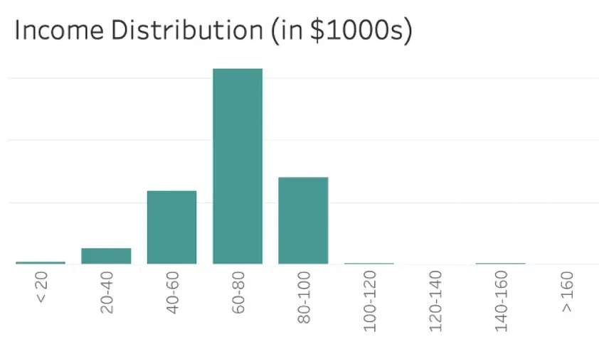
The analysis shows a marked majority in revenue from the income range of $60,000-$80,000. This makes the company a luxury goods provider in economic terms [1]. It is the strong recommendation of this report that the company focus marketing and general business decisions around this insight. This is the strongest demographic factor contributing to customer revenue, and as such it should be the top consideration in decision making.
Age
A gaussian distribution of age is observed, centralised at the 50–60 age category [2]. The variation is small between ages 40–70. Therefore, it is the recommendation of this report that the company target customers in between the ages of 40–70, as this is the demographic responsible for the bulk of their revenue.
Education, Marital Status, Income and Country
The remaining demographic analysis shows that customers of most value to the company tend to have a graduate level education, they are married, and they do not have children. Finally, the analysis concludes that Spain is responsible for the largest proportion of the company’s revenue.
How do these demographics respond to advertising?
Amongst the key demographic sectors, the top grossing advertisement is as follows:

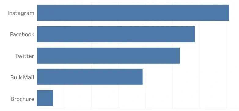
Although social media performance has small variance across platforms. As such it is suggested that focus is given to each in proportionality to the distribution of the charts.
Which advertising channels generate the most revenue?
Overall Instagram is the advertising channel responsible for the most revenue, despite Twitter resulting in more (lower value) purchases.
How do product sales perform within different demographic sectors?
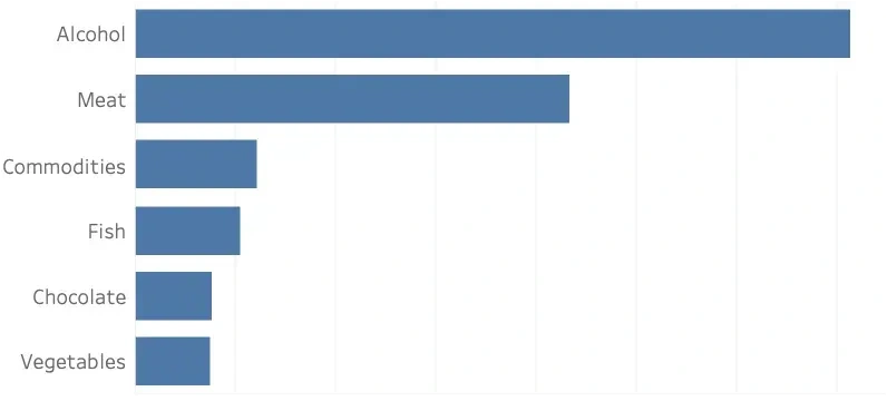
Overall Alcohol is the top selling product by a considerable margin. There is slight variation amongst the fringe demographics; however owing to the small size of these sectors the recommendation is that these variances be disregarded, and the focus of business be placed on the sale of alcohol with meat as a supplementary good.
Appendix
TotalRevenue = AmtLiq + AmtVege + AmtNonVeg + AmtPes +AmtChocolates + AmtComm
SumAdvertising = Bulkmail_ad + Twitter_ad + Instagram_ad + Facebook_ad + Brochure_ad
SpecificAdvertisingMethod is for example Twitter_ad if twitter sales is of interest.
References
[1] Salvatore, D. (2003) Microeconomics: Theory and applications. New York: Oxford University Press.
[2] McClave, J.T., Benson, P.G. and Sincich, T. (2018) Statistics for Business and Economics. Harlow: Pearson.
For more on me, visit my website at:
Like this project
Posted Jul 24, 2024
I performed demographic and product analysis for an eCommerce company, delivering actionable insights and dashboards for insight visability.
Likes
2
Views
121

