Creative Tech & Design Partner | Brands via UX/Dev • Framer
- 52
- Followers
Creative Tech & Design Partner | Brands via UX/Dev • Framer
Graphic Designer, Al-Assisted Web Developer & UI/UX Designer
New to Contra
Graphic Designer, Al-Assisted Web Developer & UI/UX Designer
4x Founder. I design products people really want.

View more →
Software & AI Engineer + Design Path
Software & AI Engineer + Design Path
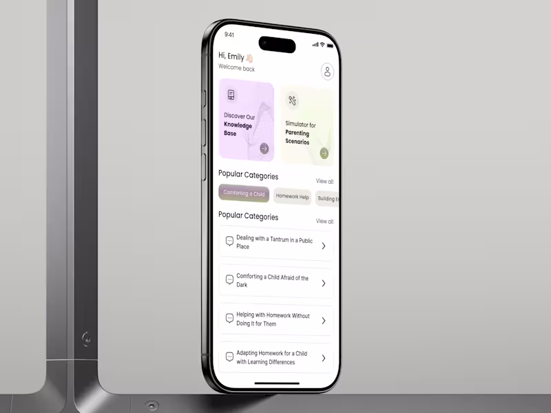
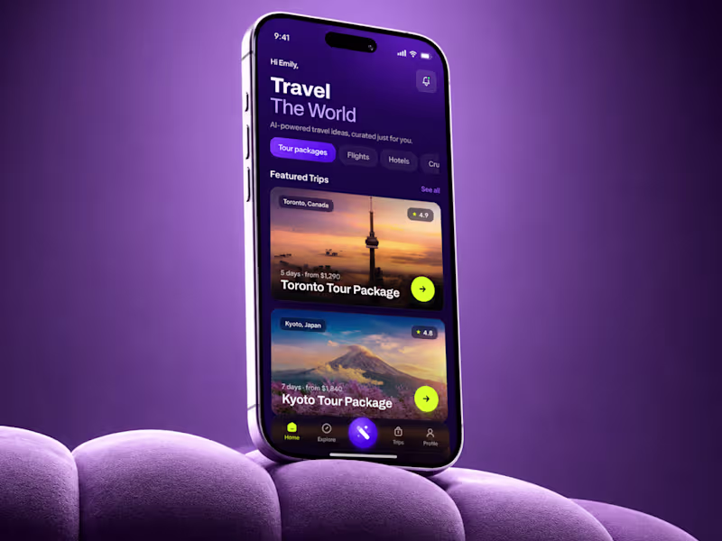
Want a Mobile App UI/UX Design that scales and converts?🚀
- $10k+
- Earned
- 4x
- Hired
- 4.7
- Rating
- 174
- Followers
Want a Mobile App UI/UX Design that scales and converts?🚀
Web Designer & Framer Developer | Conversion-Focused Sites
Web Designer & Framer Developer | Conversion-Focused Sites
AI Image & Video Producer | AI Ads | AI UGC
AI Image & Video Producer | AI Ads | AI UGC
Top-Rated Independent Design. Develop. Deliver Results
- $1k+
- Earned
- 3x
- Hired
- 5.0
- Rating
- 56
- Followers
Top-Rated Independent Design. Develop. Deliver Results