The network for creativity
Join 1.25M professional creatives like you
Connect with clients, get discovered, and run your business 100% commission-free
Creatives on Contra have earned over $150M and we are just getting started
Back to feedPost
Workflow Quest - An Instrument for Independents.
The Problem
Independent creators and freelancers are overwhelmed by Tool Sprawl, Dashboard Fatigue, and AI Anxiety. Late-night questions like “Am I using the right stack?” or “Is my workflow future-proof?” go unanswered because traditional audits feel like soul-crushing admin work.
The Solution
Workflow Quest transforms dry workflow auditing into a ritualistic, joyful performance — like playing a synthesizer with your operational DNA.
I designed and prototyped a fully interactive, skeuomorphic instrument inside Figma that mimics a high-end Roland JD-Xi hardware unit: desaturated dark wood chassis, physical button depth, glowing indicator LEDs, CRT screen with authentic scanlines, and Web Audio feedback.
How it works
BOOT - Power on with the big red ENGAGE button.
ROLE - Choose your primary operating profile (Designer, Developer, Founder, Marketer, Creator, Hybrid).
SEQUENCE - Build your stack by tapping up to 16 tools from categorized grids with live search. Real-time strand counter and cap enforcement.
CALC - Hit launch and watch the kernel processing sequence with a 140 BPM audio build-up.
RESULTS - Receive your Human Workflow Index (HWI), matched archetype (e.g. Digital Craftsman, Velocity Operator), estimated hourly rate (realistic & capped), and full verified tool stack.
Action Bento - Export/Share, post directly to Discord community, view Leaderboard, get personalized “Missing Strand” suggestions, market-demand insights, AI prompt copy, and leveling tips.
Standout Details Built in Figma
Complete 6-state machine with smooth transitions
Responsive mobile-first layout with locked rows for neurodivergent clarity
Interactive tool sequencer with synergy potential and hard 16-strand limit
Real-time terminal readouts and compiler-style processing log
Beautiful shareable Datacard output (example attached)
Integrated Discord community button for instant sharing & connection
Insight panels that teach optimization and combat AI anxiety
Why this matters
It turns your tool collection from a chaotic list into a visible extension of your craft and identity. It rewards intentional stacks, proves human + AI leverage, and gives creators a prestigious badge they actually want to share.
Live Prototype: https://workflow-quest.figma.site
Figma Community: https://www.figma.com/community/file/1649685026382544146/workflow-quest-an-instrument-for-independents
X Post: https://x.com/mdrafat007/status/2067863323270684849?s=20
Linkedin: https://www.linkedin.com/posts/mdrafat_mohammad-rafat-mdrafat007-on-x-activity-7473629527621939201-W8jM?utm_source=share&utm_medium=member_desktop&rcm=ACoAAA2IV08BNAmBNxKdKo9nZ14s-Y0ftTR1gYs
This project is a love letter to independent builders - blending hardware nostalgia, gamification, digital wellness, and career leverage into one addictive instrument. It’s production-ready in spirit and deeply fun to use.
Extremely open to feedback from the judges and Figma community. If it resonates, I’d be thrilled to see it out in the wild helping other independents.
Built For Independents, Built For You 🔥
#ConfigMakeathon #Figma #Skeuomorphism #WorkflowDesign #CreatorEconomy #IndieHacking


It feels like a game but not a game!
Check it out here: https://workflow-quest.figma.site/

Excellent work brother. 😍
Thanks brother!

Turning a workflow audit into a synthesizer is a genuinely creative framing. The skeuomorphic Roland JD-Xi reference makes it feel tangible in a way that a dashboard never would. Curious how you handled the Web Audio feedback in Figma.
Appreciate the words, Rafee!
Audio runs completely on the native browser Web Audio API directly in the code, zero external files or MP3 CDNs needed.
I also hooked up physical haptics vibrate pulse that fires a complex vibration pattern that feel more real alongside the rhythm loop.
That’s actually really interesting. I haven’t tried handling Web Audio that way yet, but now I definitely want to test it later. The haptic pulse detail is a smart touch too, it probably makes the whole interaction feel much more alive.
I'm glad that you found it productive. Let me know, whenever you build something interesting too. I would love to explore and share my feedback.
The network for creativity
Join 1.25M professional creatives like you
Connect with clients, get discovered, and run your business 100% commission-free
Creatives on Contra have earned over $150M and we are just getting started


Related posts


When you forget that it's not 2005 and you don't work for 2Advanced... 😅
Designed and animated in Figma.
(it's about time to finally discover these new animation features).

That looks like an underwater design😊 Great Work!

Same product, same button, two ways to say "added to cart". Which one makes you buy?
Burst: springy, the bottle flies into the cart. Calm: a quick spinner, then a tick.
Vote, and tell me what you'd change. Both built from scratch in code.
4 voted
57%
3 voted
43%
7 votes
Closed

Burst — the flying bottle makes adding feel fun.

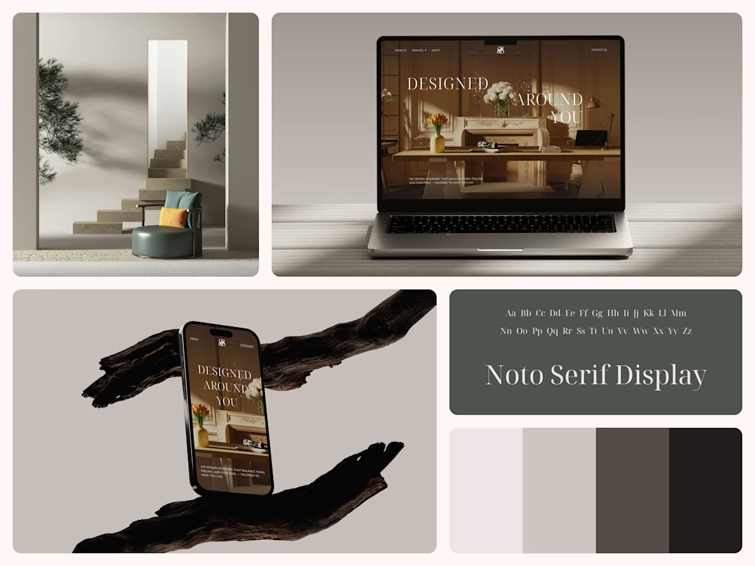
Interior Design Website
The white flowers on the mantel overlap the headline.
Thin Noto Serif Display capitals step down across one warm photo of a paneled room, so the space stays in view between the words. On the phone, the three words stack in a centered column, with Menu and Contact on either side of the monogram.
The palette runs from soft white to near black, which leaves the color to the photo: orange tulips and warm light on the walls.
The headline reads "Designed Around You", and the hero takes it literally, with the wall behind the type and the flowers in front of it.
Designed by the Hue & Machine team.
#InteriorDesign #InteriorStudio #WebsiteDesign #HomepageDesign #WebDesign #ResponsiveDesign #Typography #EditorialDesign #UIDesign #FigmaDesign


Nice!