Freelancers using OmmaFreelancers using Omma
Modern web developer helping brands grow online.
$1k+
Earned
1x
Hired
161
Followers
Modern web developer helping brands grow online.
Multidisciplinary designer and problem solver.
$50k+
Earned
12x
Hired
5.0
Rating
309
Followers
Multidisciplinary designer and problem solver.
I turn social strategy + UGC into *actual* revenue
$10k+
Earned
16x
Hired
5.0
Rating
327
Followers
I turn social strategy + UGC into *actual* revenue
Cover image for Meet Petlancer: The Ultimate Freelancer
Meet Petlancer: The Ultimate Freelancer Sidekick 🐾 As a freelancer, staying motivated through intense deep-work blocks can be hard at times, so I wanted to marry that 90s nostalgia and fun of Tamagotchis with a practical productivity hub to create the ultimate focus companion. Fun fact: In real life, my core motivation to work is providing the best possible life for my 9 pets (3 cats, 1 dog, and 5 goats!). So, I built an interactive app where your actual freelance output directly translates into taking care of your virtual pixel pet. Key Features: ⭐ The "Choose Your Starter" Onboarding: a setup screen where you choose and name your companion - whether that's a cute cat, a happy dog or a silly goat ⭐ The "Productivity-Meets-Fun" Dashboard: on the left is your fun side - with your pet, along with its Hunger, Cleanliness, and Energy bars. On the right is the productivity side - with a 25-minute Pomodoro timer and your daily to-do list. Completing pomodoros and checking off your daily tasks earns you credits that you can spend to feed, clean or play with your pixel buddy. As a first-time user of Wonder, it's definitely one of those tools I can see myself using again in the future. I love how it works so well with my casual-style prompts, it feels like I'm just chatting with a chat-based app like Gemini. I also really like that, at the end of each implementation, it suggests next steps or asks questions along the way if needed. You really feel like it's your partner in crime rather than just an AI that's doing what you tell it to do. And of course, you can check out my design file here: https://app.wonder.so/freelancingwithsilvia/files/019f3960-2948-7f1b-8079-f7280babb4ae
3
10
215
Cover image for Most travel apps feel like
Most travel apps feel like impersonal search directories that you can clearly tell were made for your typical traveler - you know, the one that's going on vacation and leaving all worries behind? But that's not us. We are freelancers, which means we get the freedom to travel, but also means client work also gets the freedom to travel alongside us. What a lucky bastard!! Well, this app reimagines the digital nomad journey in the city I know best, Lisbon, through the lens of a local friend. It blends a work mode with vetted co-working spaces with a gamified travel scrapbook, ensuring you experience the authentic culture of the city while building a physical visual log of your stay - no matter the budget you're on! 🛠️ The Tech & Design Workflow To get to this final working prototype, I utilized a connected pipeline across Figma’s advanced tool ecosystem: ⭐️ Figma Design: used as the initial creative sandbox to establish the visual identity, typography, and layout foundations. ⭐️ Figma Make: transformed my static design inspiration into a living, interactive, code-backed prototype with several back-and-forth iterations. ⭐️ Figma Weave: used to create a custom filter to add to user's photos, using its node asset pipeline. 📊 Architecture & Scalability Instead of hardcoding a long database, all the co-working spaces and travel quests are stored in an external Google Sheet exported as a live, public CSV. This allows for instant, real-time data updates without redeploying code, making the app entirely scalable at any time. Also, every recommendation and description for the co-working spaces was written by me from personal, first-hand visits. The travel quests are a blend of personal recommendations and some of my bucket-list items - maybe you'll cross them off sooner than me! 💰 Monetization & The Organic Growth Loop To keep the platform 100% free for users, the plan is to develop affiliate agreements with co-working spaces and paid local experience hosts, earning small commissions per booking. On the other hand, completing quests rewards users with points. And while currently displayed as a "coming soon" placeholder, the road map plans to allow users to redeem these points for real-life gift cards to drive long-term user retention. Lastly, there's some built-in word of mouth, since the scrapbook features a prominent share button on your custom-filtered photos. This turns users into organic brand ambassadors when they share their custom-doodled memories with family back home or on social media. Figma Design project: https://www.figma.com/community/file/1649623170040464186 Figma Make project: https://www.figma.com/community/file/1649623797184817979 Working app: https://tempo-slush-47265679.figma.site/
6
9
374
Product & Visual Designer · Brand Identity · UI/UX
2x
Hired
5.0
Rating
54
Followers
Product & Visual Designer · Brand Identity · UI/UX
Cover image for Project title
STALL — Your farmers
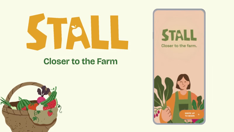
Project title STALL — Your farmers market, alive. A swipe-to-shop farmers market companion that connects local vendors with regulars before Saturday ever arrives. The problem Every Saturday, the same thing happens. You show up to the farmers market at 10am. The ramp vendor you wanted is sold out by 9. You forgot cash. You walk past a honey stall three times because you can't remember if you already bought some. And that new mushroom farm you heard about? Gone before you spotted them. On the vendor side, it's just as frustrating. Small farmers wake up at 4am, load the truck, drive an hour, and have no lightweight way to tell their regulars — the people who actually want what they grow — "I have asparagus this Saturday. Come find me." STALL fixes both sides of that problem. What STALL does STALL is a two-sided farmers market app built around one weekly ritual: Saturday morning. For shoppers: Follow vendors at your local market Swipe through a weekly produce deck — right to add to your list, left to skip — exactly like Bumble, but for ramps and sourdough Get a Friday evening digest: what your vendors have this week, your auto-built shopping list, and where each stall is on the map Pre-reserve high-demand seasonal items before you leave the house Discover first-of-season arrivals with a "what's new this week" spotlight For vendors: Post a weekly inventory update in 3 taps — what you're bringing, quantities, price Reach your regulars directly before market day Manage pre-reservations without a complicated system The app celebrates the seasonal nature of farmers markets — ramps in April, strawberries in June, squash in October. Every week feels like something worth showing up for. How I built this with Google Stitch STALL was designed and prototyped entirely using Google Stitch as the primary build tool, with Figma used only for initial wireframing. The workflow: Day 1 — Brand and wireframes I started by defining the brand: the name, palette (Pumpkin Spice Forest — a warm amber, fern green, mauve, and cream system), and illustration direction. I wireframed the three core flows — swipe deck, Friday digest, and vendor post — before touching Stitch. Day 2 — Into Stitch I imported my Figma file directly into Stitch using the .fig import feature. From there I used streaming generation to build each screen live on the canvas — watching the splash screen, onboarding flow, and homepage assemble in real time was genuinely remarkable. The HTML-native canvas meant every animation I added — card tilt on swipe, drawer slide-up, bento tile stagger — rendered exactly as it would in production. Key Stitch prompts used: "Add a swipe gesture to the produce card stack — right swipe shows a green Added overlay with 5° card tilt, left swipe shows a mauve Skipped overlay with -5° tilt" "Make the shopping list items stream in one by one with 120ms stagger on page load" "Add a bottom drawer that slides up from the vendor card with spring easing — show the farm bio, full inventory list, and two action buttons" "Build the Friday digest screen — vendor items animate in sequentially, the seasonal spotlight card pulses gently" "Export web assets and deploy to Netlify" In-place edits I used: Swapped the swipe overlay color from red to mauve to match brand Adjusted the bento grid gap from 8px to 6px after seeing it render on canvas Changed the CTA button from outlined to filled after in-place visual comparison Rewrote the seasonal spotlight copy directly on the canvas without regenerating What Stitch made possible that nothing else could: The swipe gesture interaction, the drawer spring animation, and the staggered list streaming — all three of these would have taken days to hand-code. In Stitch, they were prompt-driven and live on the canvas within minutes. The gap between "designed" and "interactive prototype" collapsed entirely. Screens delivered Splash screen — farmer illustration, full-bleed cream background Onboarding screen 1 — market basket illustration, "Your market, every Saturday" Onboarding screen 2 — swipe mechanic explainer with card UI Onboarding screen 3 — Friday digest bento preview Homepage — bento grid with market header, seasonal spotlight, list, map preview, swipe deck, streak tracker Swipe deck — card front, vendor expand drawer, swipe right (added), swipe left (skipped) Friday digest — streaming vendor list, seasonal spotlight, auto-built shopping list Market day map — vendor stall grid, spot numbers, live confirmation states Vendor post flow — 3-tap inventory update screen Design decisions worth noting The swipe mechanic — Borrowing the Bumble swipe pattern for produce discovery was the conceptual breakthrough. It transforms a passive browse into an active, satisfying decision. Every right swipe builds your list. Every left swipe still shows you where the vendor is on the market map — skipping is never permanent. The Friday digest as the hero feature — Most apps make you come to them. The Friday evening push notification with a personalised market brief is the one moment where STALL comes to you. It changes Saturday morning from reactive to intentional. Bento homepage — Instead of a scrolling feed, the homepage gives you everything at a glance: your market, your list, the seasonal moment, your vendors. Seven tiles, seven pieces of information, zero scrolling. The color system — Pumpkin (#E8872A), Fern (#728040), Mauve (#B07090), Cream (#FDFAF6), and Moss (#4A5228). Every color has one job. Pumpkin is interactive. Fern is seasonal and confirmed. Mauve is reserved and streaks. Cream is every surface. Nothing competes. What I learned Stitch genuinely changes the prototyping workflow. The moment I stopped thinking of it as a design tool and started thinking of it as a build tool — one where the canvas is the product, not a picture of the product — everything accelerated. The in-place edit feature is the one I'll keep coming back to: being able to change a color, rewrite copy, or swap a component without regenerating the whole screen is the difference between iteration and rework. STALL started as a hackathon idea. After building it in Stitch, it feels like something real. Live Prototype: https://stitch.withgoogle.com/preview/8229547464152593644?node-id=e53124995cda49808685283be978dc8c
50
44
1.1K
Shopify, Framer & Replo Dev | Marketer & B2C Sales Expert
5.0
Rating
95
Followers
Shopify, Framer & Replo Dev | Marketer & B2C Sales Expert
UI/UX Designer • No-code Builder • AI Architect
$1k+
Earned
59
Followers
UI/UX Designer • No-code Builder • AI Architect
Cover image for The Memory Constellation✨
Reimagining family memory
The Memory Constellation✨ Reimagining family memory preservation through an interactive constellation of stories, photos, and relationships. The Problem: Every family has stories worth preserving, yet most of them slowly disappear over time. Photos remain scattered across devices and albums. Important memories live only in conversations. Voice recordings are rarely preserved. As generations pass, family history becomes fragmented, leaving future generations with names and dates but little understanding of the people behind them. Traditional family tree tools focus on genealogy and structure, but they rarely capture the memories, relationships, and personal stories that give those connections meaning. The Solution🧠 : The Memory Constellation transforms family history into a living, interactive experience. Instead of viewing a family tree as a static hierarchy, family members are represented as connected stars within a constellation. Each person becomes a gateway to preserved memories, photographs, recordings, and stories that future generations can explore and revisit. The experience encourages users to discover not only who their relatives were, but also the moments, relationships, and memories that shaped their lives. Key Features💯 : ✦ Interactive constellation-based family tree ✦ Multi-generational relationship visualization ✦ Personal memory portals for each family member ✦ Photo, story, and recording preservation ✦ Immersive storytelling experience designed around legacy and remembrance ✦ Constellation mode for exploring family connections in a more meaningful and memorable way Project: The Memory Constellation (https://fix-kiosk-81656652.figma.site/)File: Community File (https://www.figma.com/community/file/1649669107824793734) Why This Matters: Family history is more than a collection of names. It is a collection of experiences, relationships, traditions, lessons, and memories that define who we are. The Memory Constellation was designed to help families preserve these stories in a way that feels emotional, beautiful, and accessible to future generations. Rather than creating another database of family records, the goal was to create a digital heirloom—something that can be explored, shared, and passed down across generations. Design Approach: The visual experience is inspired by the idea that the people we love never truly disappear. Their stories continue to guide future generations, much like stars that remain visible long after their light began its journey. This concept informed every design decision, from the constellation-inspired family structure to the atmospheric night-sky environment and memory-focused interactions. The result is an experience that feels less like navigating software and more like exploring a living archive of family history. Workflow: The Memory Constellation was designed and prototyped using Figma's latest tools, with Figma Make playing a central role in rapidly exploring interactions, visual storytelling, and interface concepts. Through iterative prompting, refinement, and experimentation, I was able to transform a traditional family tree concept into an immersive experience focused on memory preservation and emotional connection. Looking Forward: The Memory Constellation explores a future where family memories are no longer lost between generations. A future where stories, voices, photographs, and relationships remain connected and discoverable—allowing families to preserve their legacy for generations to come.
6
8
193
Websites & automations. AI-native workflow, design-led.
$5k+
Earned
15
Followers
Websites & automations. AI-native workflow, design-led.