Promo Emails for Owl Labs
Jacquelyn Conn
Verified
Promo Emails for Owl Labs
The Tasks
Owl Labs had already flushed out their designs for short-form emails, however, they had long-form email ideas that needed to be designed. That's where I came in.
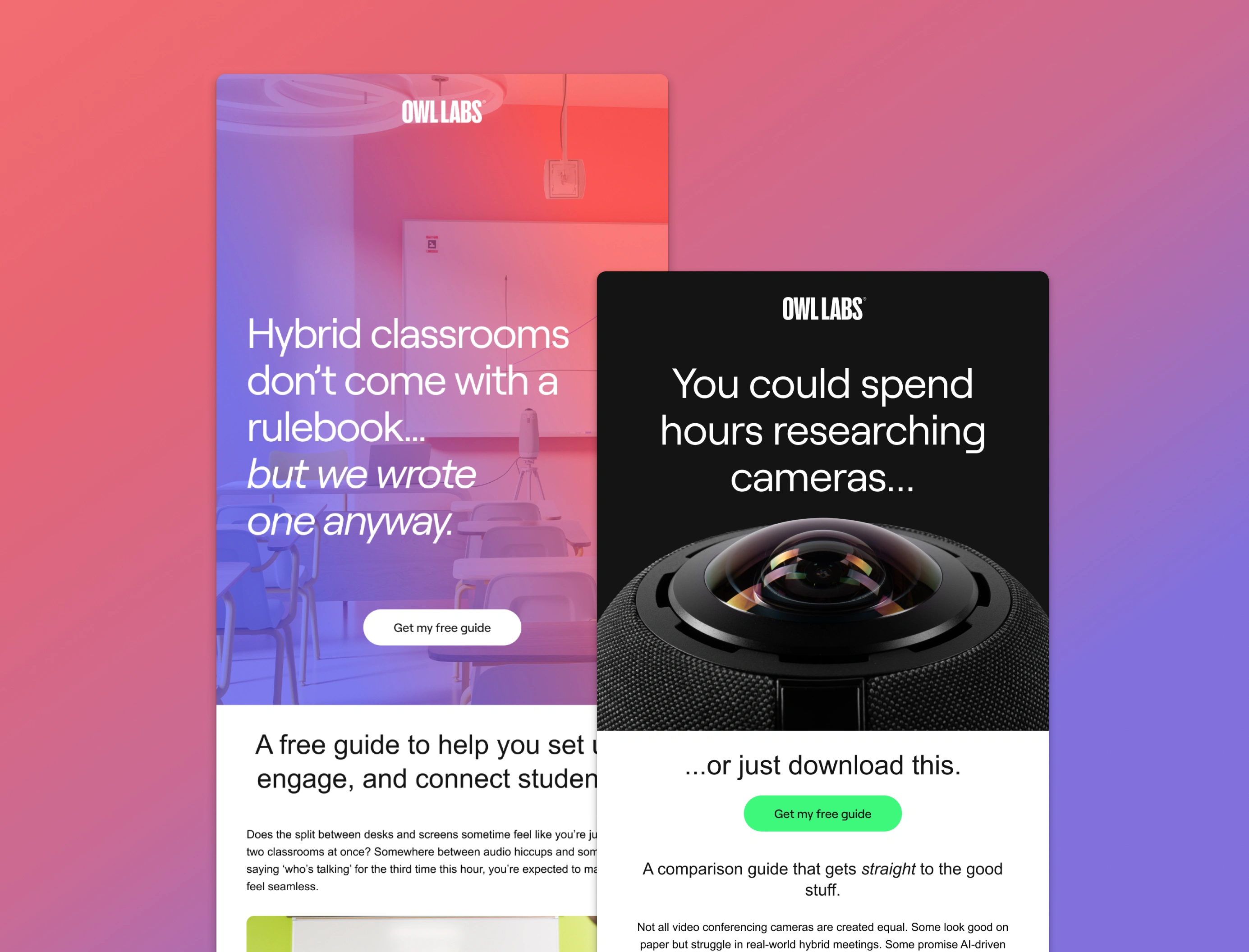
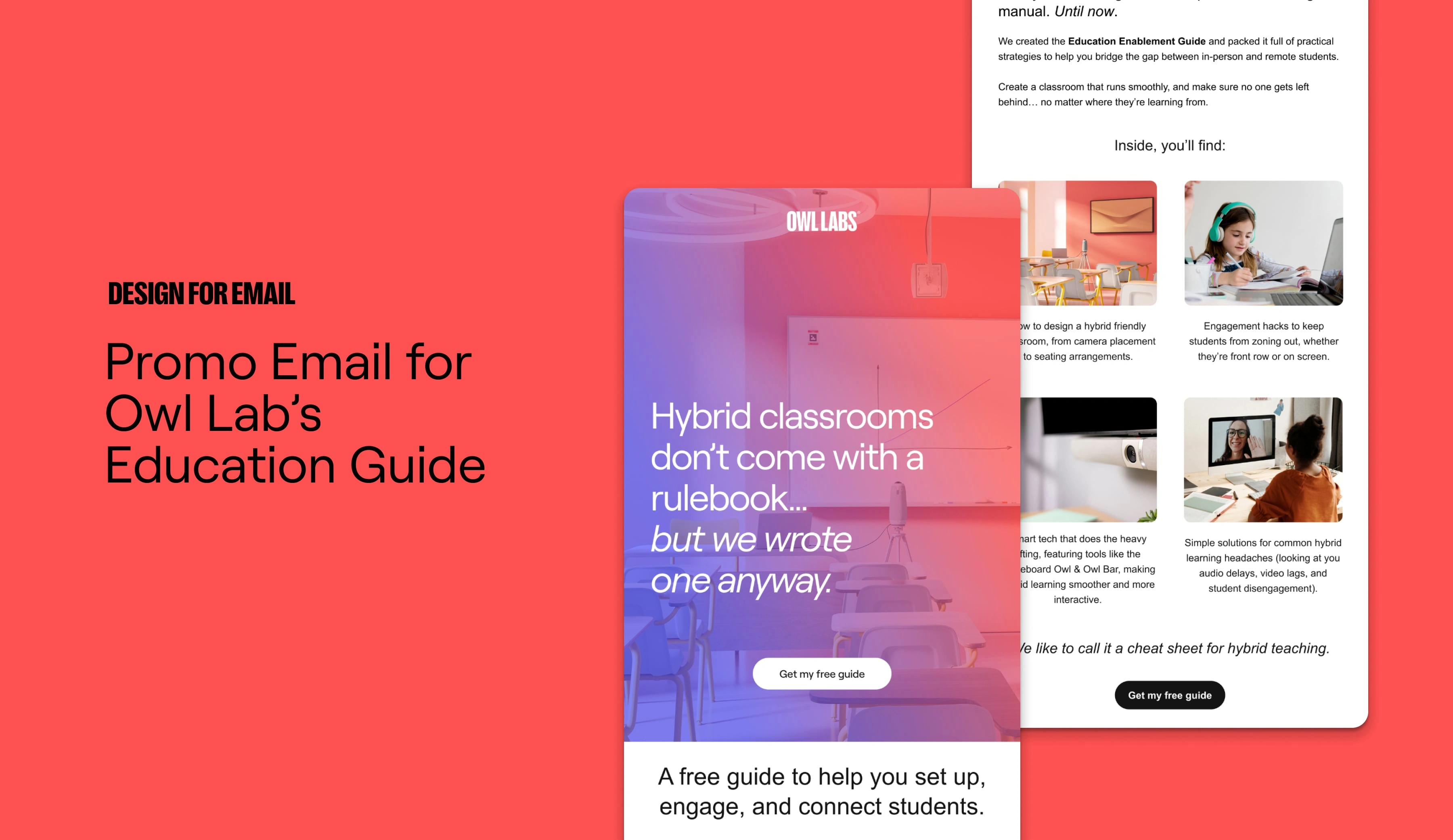
Task 1: Create a promotional email for Owl Lab’s Education guide using Owl Labs branding and lifestyle imagery. The goal of the promo email is to increase downloads of the Education Guide.
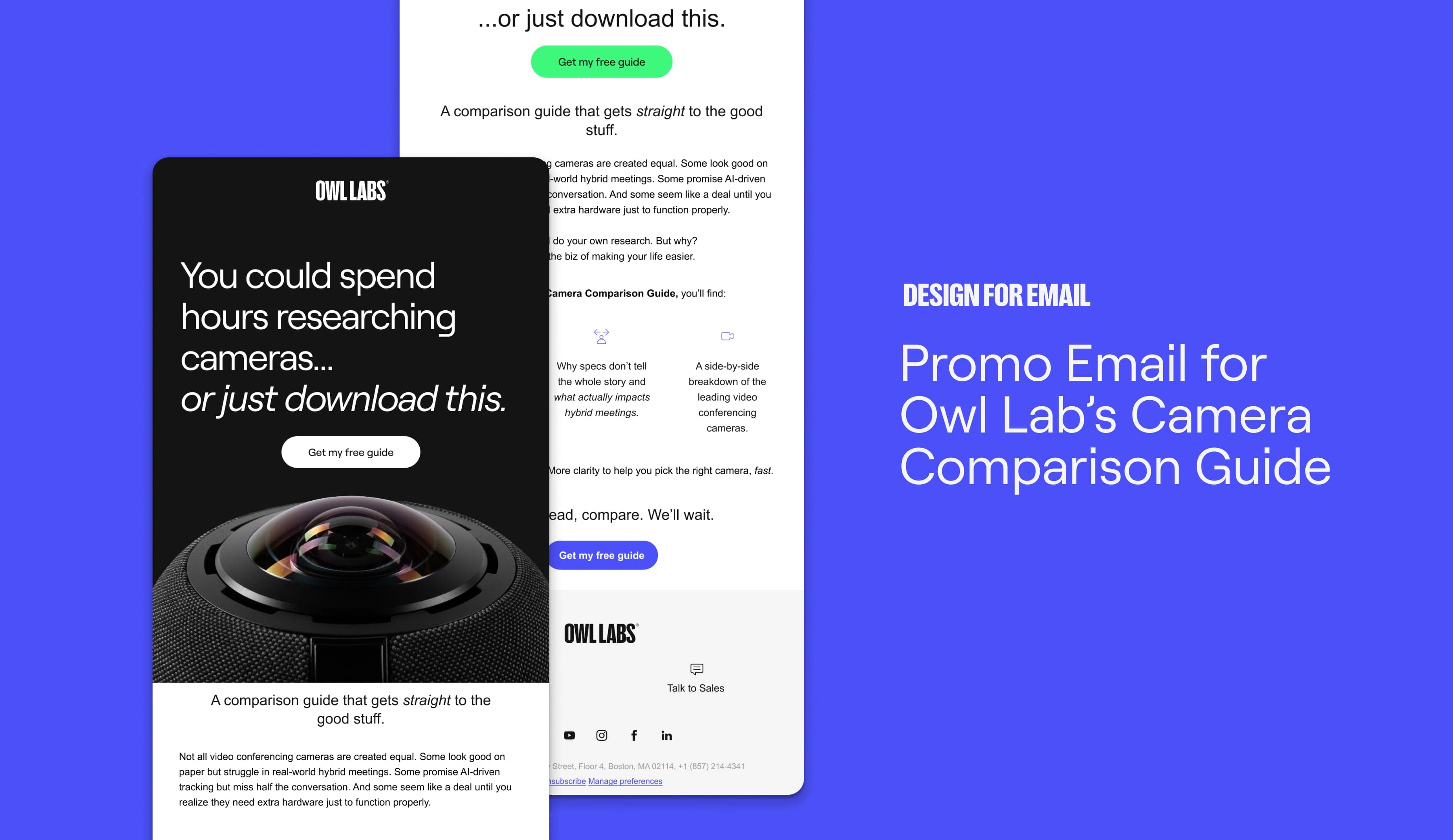
Task 2: Create an email for the promotion of Owl Lab’s Camera Comparison Guide using Owl Labs branding and lifestyle imagery to help increase downloads.
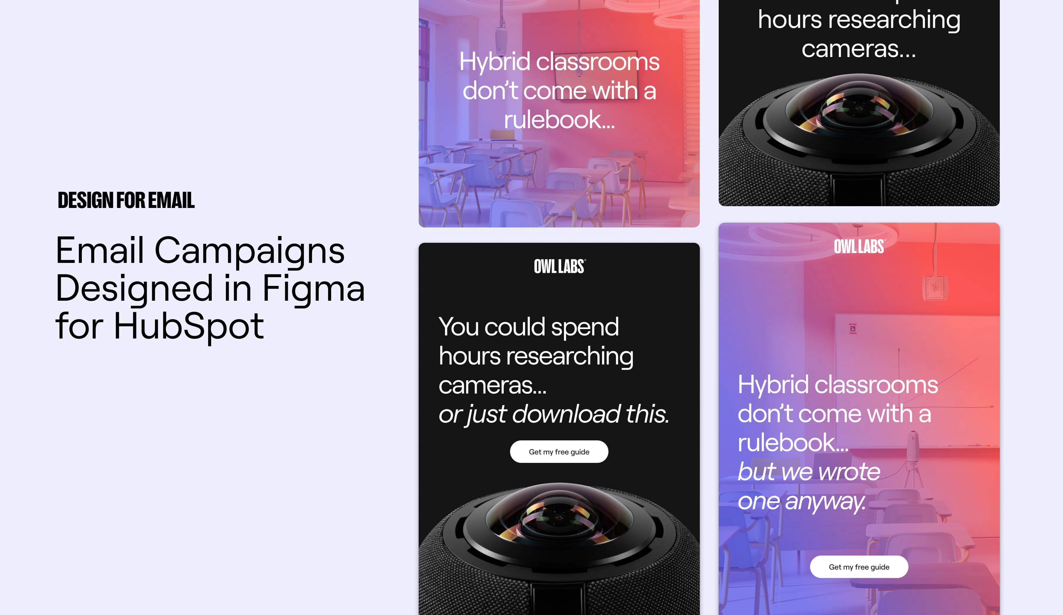
Both email designs will be recreated in Hubspot so pre-saved sections must be kept in mind.
Promo Email: EDU Guide
Two designs were created for an A/B test. One a more image heavy option, another more text and icon focused. Both were designed in Figma keeping the end-user in mind and carefully choosing imagery and icons that spoke to the content of the email.
Since Hubspot was the final destination, pre-saved sections were used and images with text were exported from Figma to be uploaded to Hubspot.
Promo Email: Camera Comparison Guide
The Camera Comparison Guide Promo Email followed a very similar layout to the EDU Guide Promo Email. I also crafted two design to be A/B tested for this email. Email A was once again more text and icon focused, where Email B was more image focused.
Since Hubspot was the final destination, pre-saved sections were used and images with text were exported from Figma to be uploaded to Hubspot.
Results
I approached this email design as if I was designing a landing page and it paid off. I got great feedback from the Owl Labs designer and the company was excited about the long-form email content I designed. I'm looking forward to hearing about the results of the A/B test.
Like this project
Posted May 19, 2025
Designed on-brand promo emails for Owl Labs using Figma for HubSpot to encourage users to download their guides.
Likes
3
Views
117
Timeline
Mar 4, 2025 - Ongoing
Clients
Owl Labs