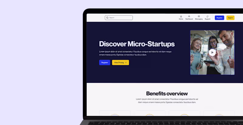
Brand and web design for startup at inflection points
Brand and web design for startup at inflection points


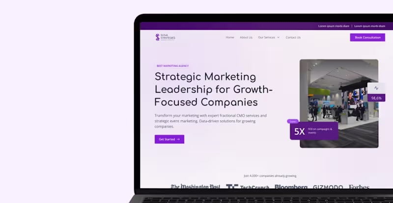
Expert in UX Design & Digital Marketing
Expert in UX Design & Digital Marketing

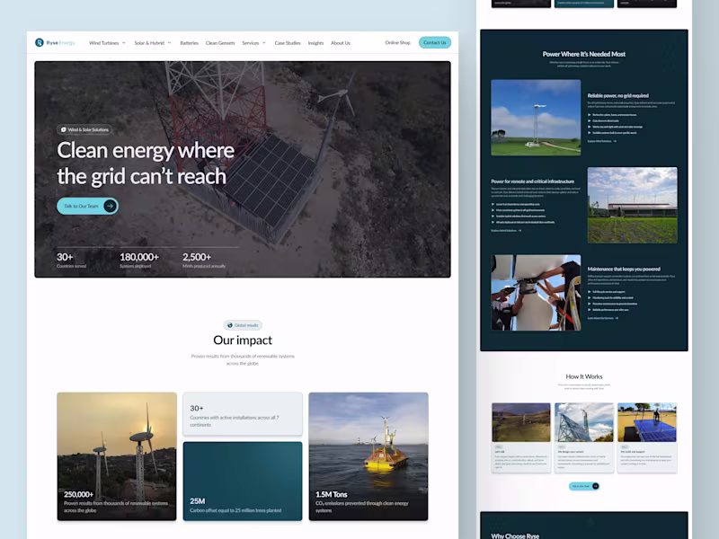
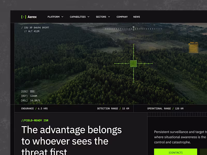
B2B Websites for Complex Industrial & Defense Companies
Top Tier Figma & Framer Expert