
pro
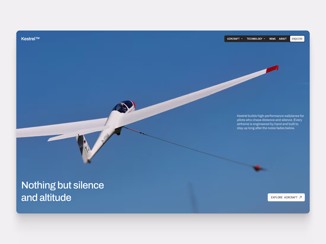
Boutique Sailplane Manufacturer Hero Concept
A study in restraint for a premium aerospace brand. One aircraft, one line, open sky. No clutter, no spec dumps, just the craft. Archivo and IBM Plex Mono doing the work.
0
20
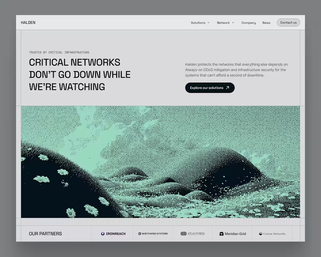
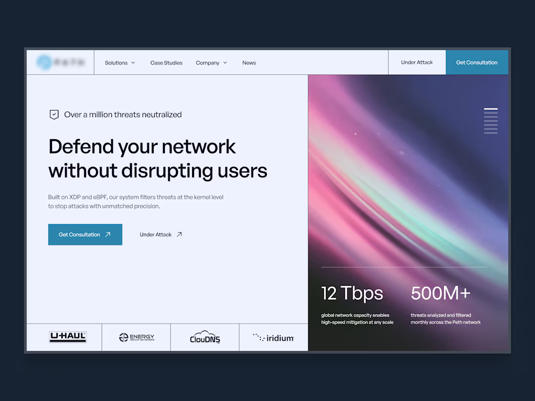
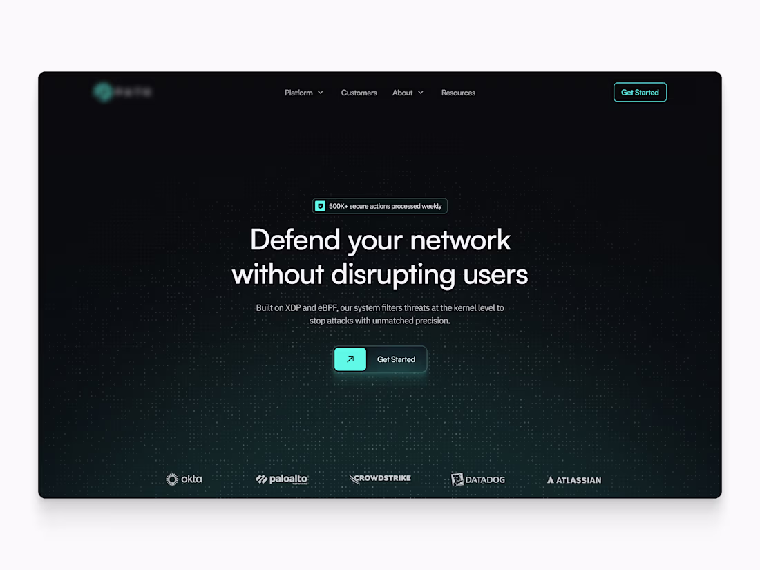
Hero concept for a fictional critical infrastructure and DDoS mitigation company, exploring how a security firm can look credible and modern when its website is the main thing buyers judge it on
2
5
73
Some details
3
47
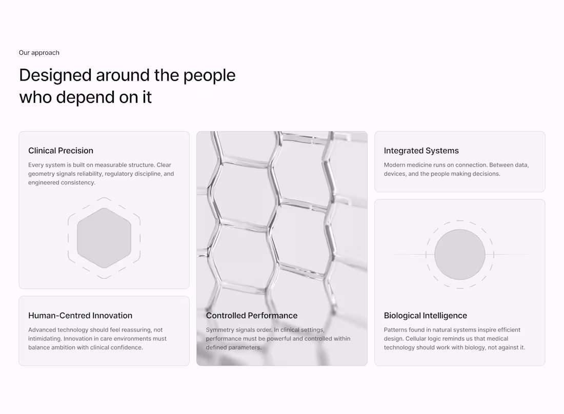
Medtech bento exploration
0
55
Few designs from last week
Which one's your favorite?
4
3
113
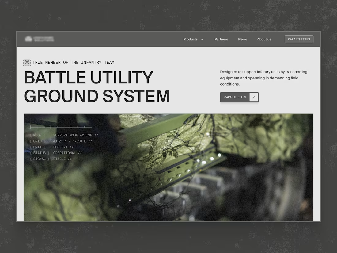
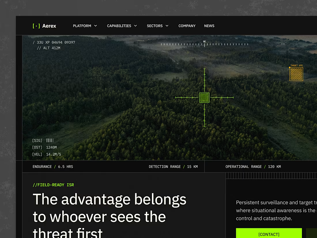
Unused hero for a defense company
0
66
Hero concept for a defence technology company
Loved working on this
2
3
112
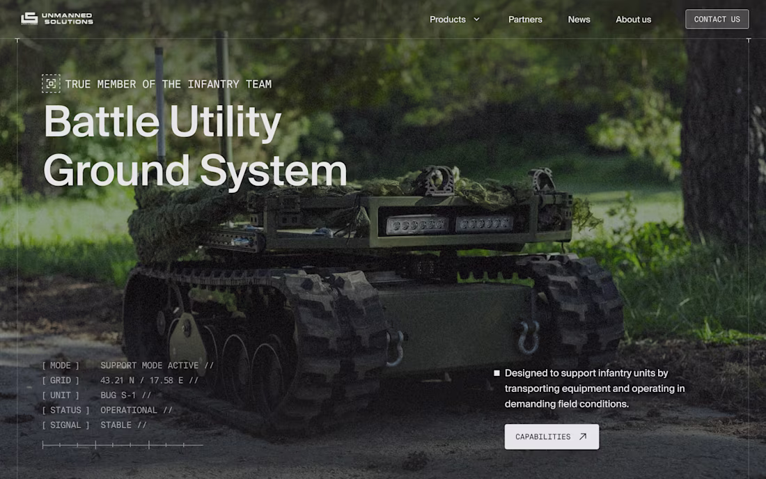
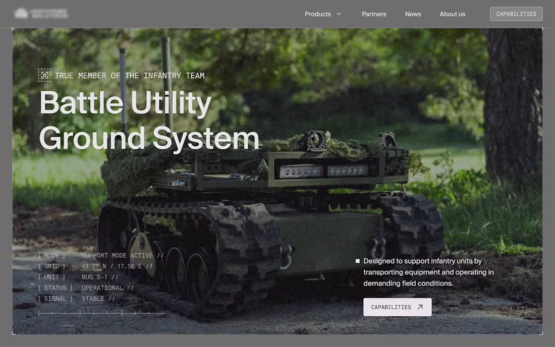
Design concept for Unmanned Solutions
Defense websites don’t have to look boring
0
68
Hero section redesign for Unmanned Solutions.
Defence products are often impressive, but their websites struggle with a few familiar problems: dated visuals, lack of credibility, and no obvious next step for partners or buyers.
I redesigned the hero to address those issues by:
– creating a more modern environment that holds up alongside other defence companies
– delivering an overall visual uplift without over-styling
– putting the product front and centre
– introducing clear paths forward, with capabilities highlighted in the hero and contact access made obvious in the navigation
Same product. Clearer focus. Stronger first impression.
1
41
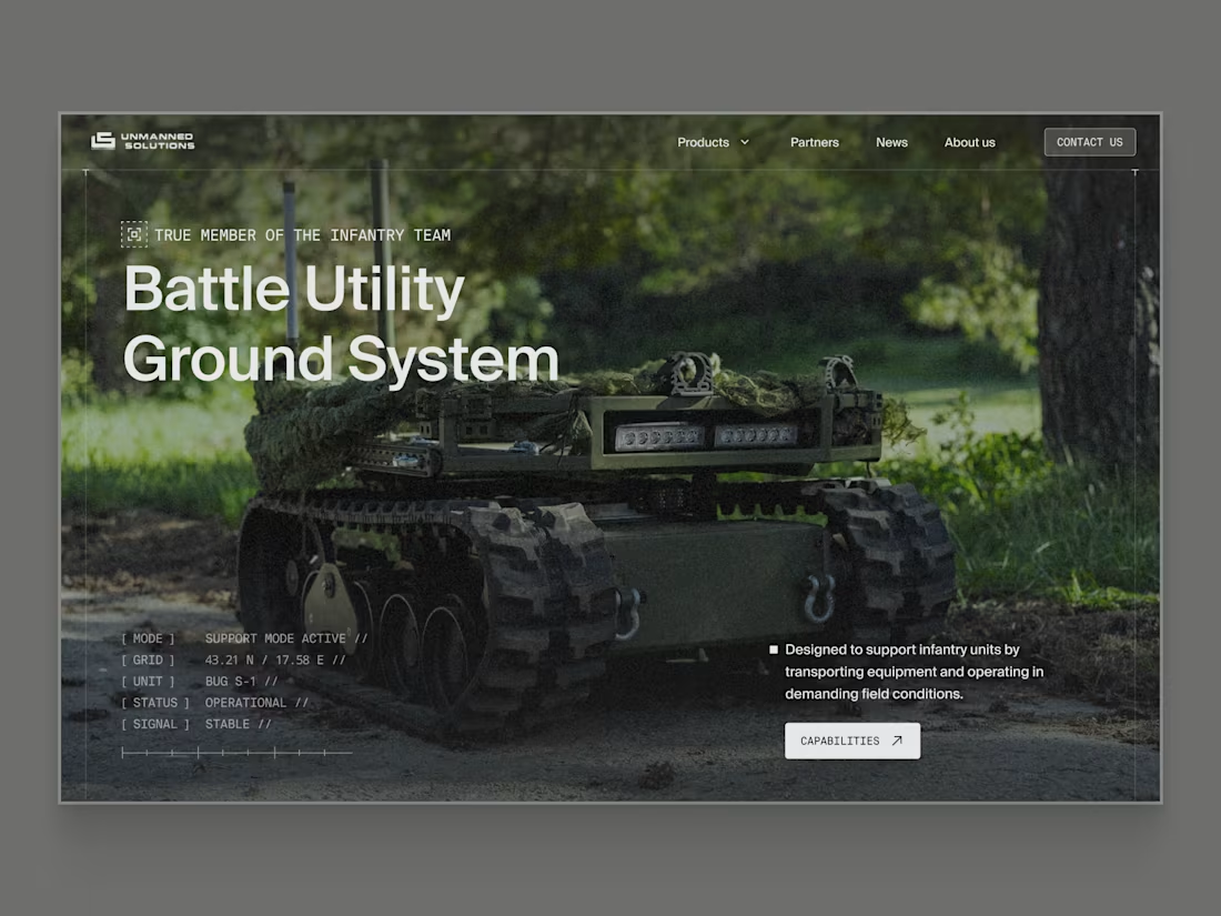
Space systems website visual exploration
This is a visual exploration for a space systems website, focused on how complex offerings are introduced and framed.
A common issue with sites like this is that everything is technically impressive, but it takes too long to understand what’s actually available, who it’s for, and what to do next. In real buying situations, people want to understand relevance quickly before committing time.
This block explores a simpler approach. Set the context, show readiness, surface key constraints, and guide the right visitors toward a clear next step, without overwhelming them with specs upfront.
The goal here was clarity first, with technical depth revealed progressively.
2
3
42
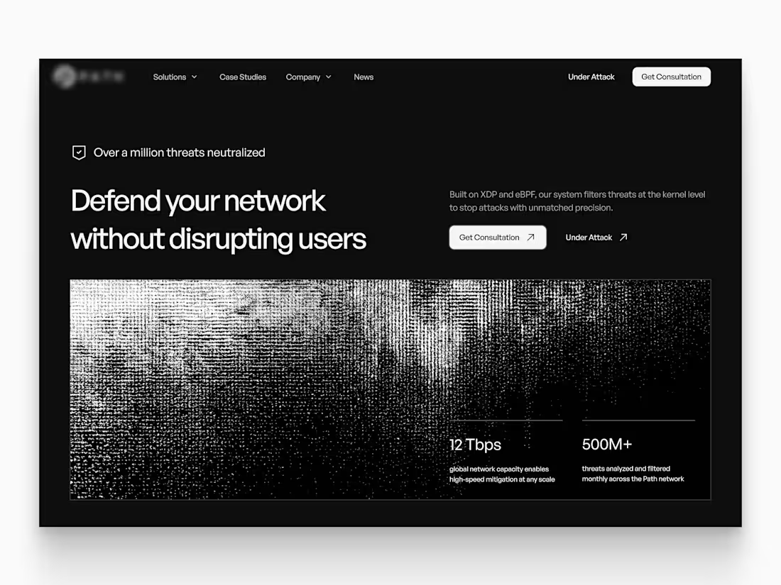
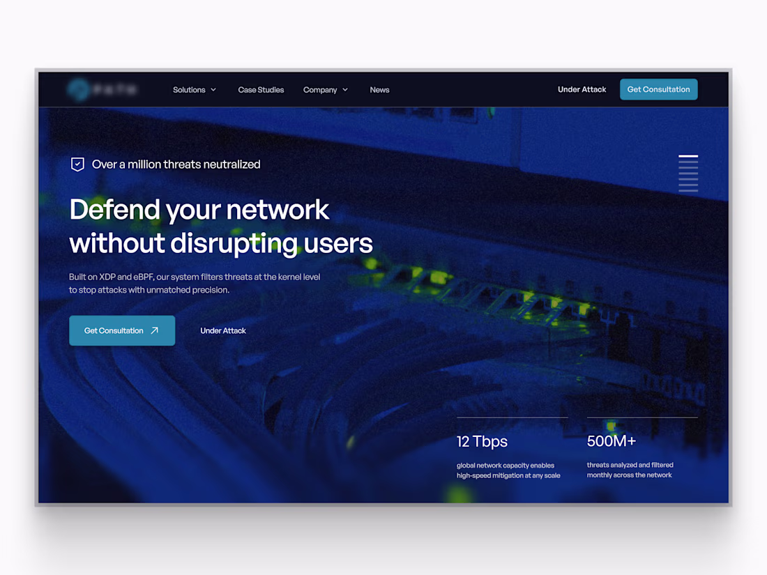
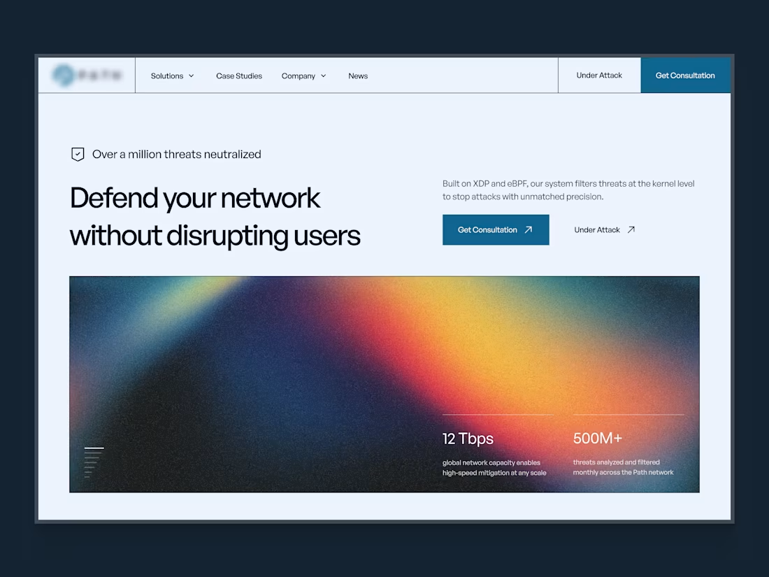
Cybersecurity website hero concept
This concept was designed to address clarity issues in the existing site. The product and its proprietary technology weren’t coming through clearly, which made it hard for visitors to understand what the platform actually does or why it’s different.
Another key challenge was visibility and conversion. Important information was missing, and there was no clear path for interested users to get in touch or take the next step.
The goal of this hero was to clearly explain the product, introduce technical depth gradually, surface credibility early, and guide the right users toward action.
6
50
Cybersecurity website hero concept
This concept was designed to address clarity issues in the existing site. The product and its proprietary technology weren’t coming through clearly, which made it hard for visitors to understand what the platform actually does or why it’s different.
Another key challenge was visibility and conversion. Important information was missing, and there was no clear path for interested users to get in touch or take the next step.
The goal of this hero was to clearly explain the product, introduce technical depth gradually, surface credibility early, and guide the right users toward action.
It didn’t ship in this form as we chose a different visual direction, but it reflects how we approach complex cybersecurity products: clarity first, depth second.
18
168
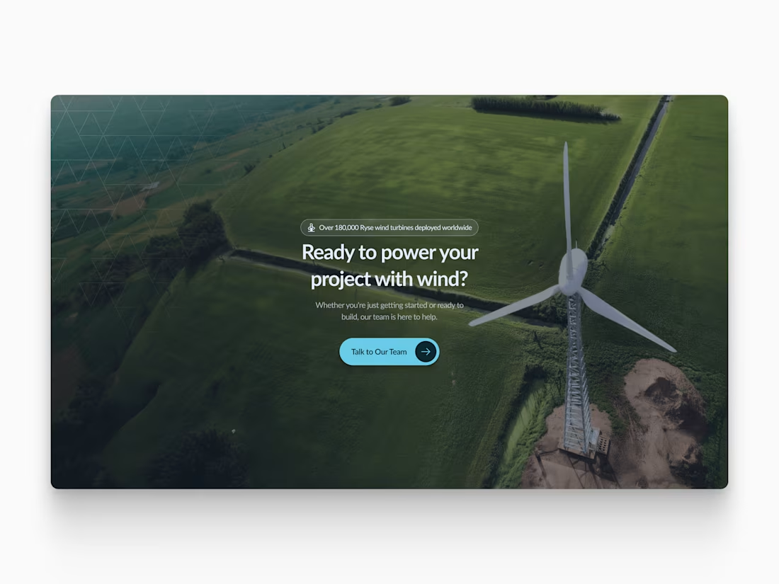
Clear beats clever.
This section sits near the end of the page to answer one simple question.
What happens next?
After explaining the product and use cases, the goal here is to give buyers a clear path to engage.
1
41
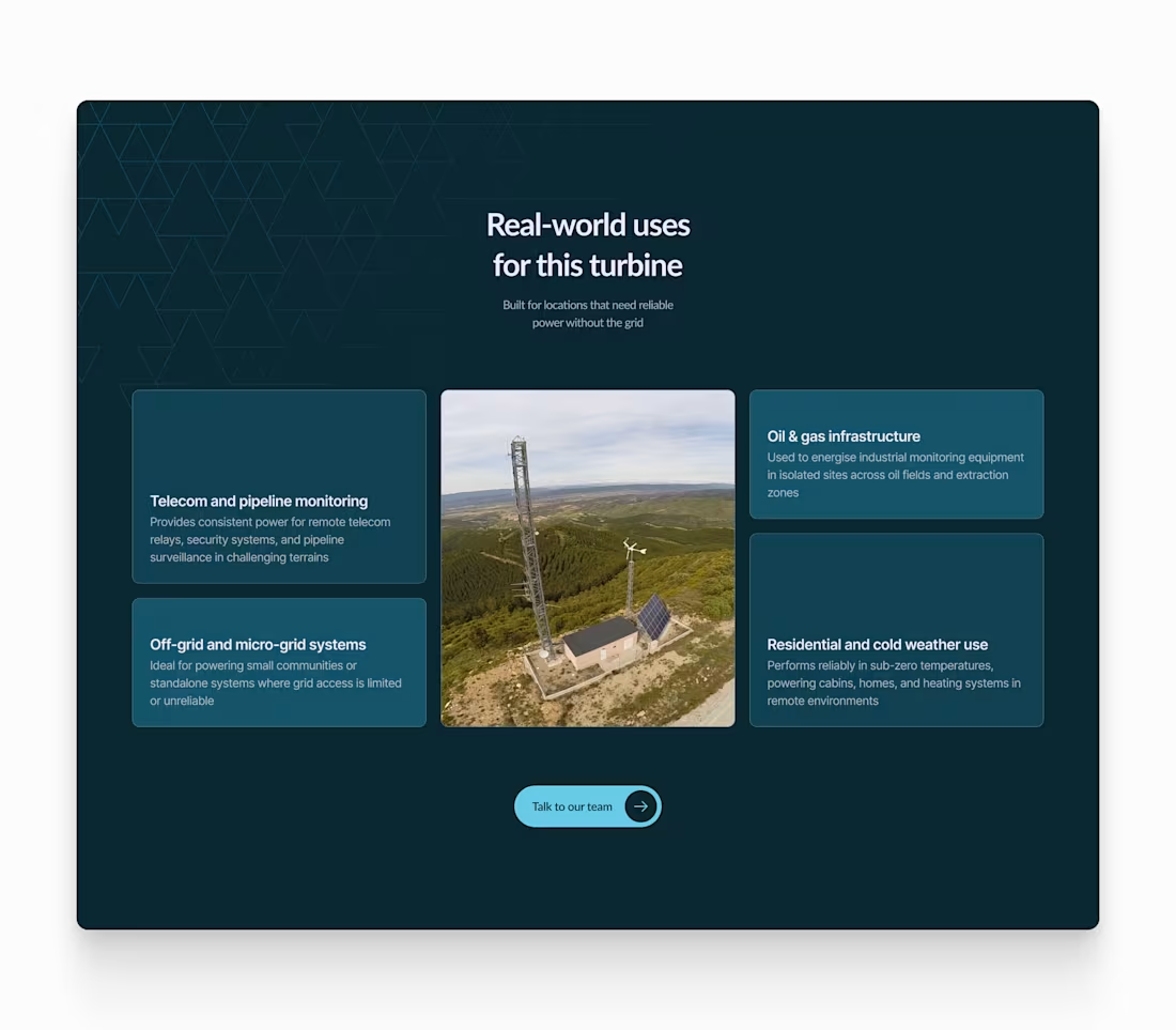
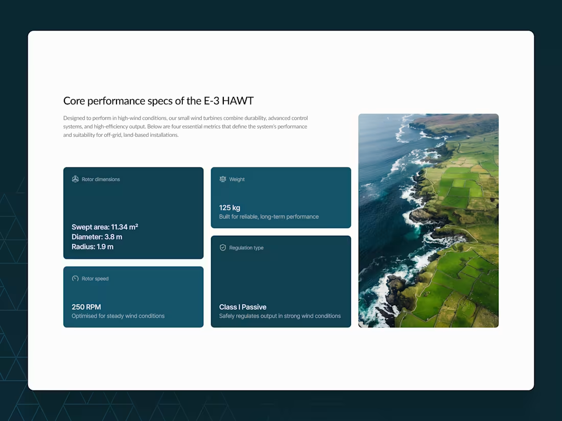
Use cases beat specs.
This block was designed to help buyers quickly understand where the turbine fits in the real world, not just how it performs on paper.
Instead of leading with technical data, we highlighted clear, practical applications so decision-makers can assess relevance and ROI.
23
190
Cybersecurity website hero concept
This concept was designed to address clarity issues in the existing site. The product and its proprietary technology weren’t coming through clearly, which made it hard for visitors to understand what the platform actually does or why it’s different.
Another key challenge was visibility and conversion. Important information was missing, and there was no clear path for interested users to get in touch or take the next step.
The goal of this hero was to clearly explain the product, introduce technical depth gradually, surface credibility early, and guide the right users toward action.
It didn’t ship in this form as we chose a different visual direction, but it reflects how we approach complex cybersecurity products: clarity first, depth second.
2
30
254

Cybersecurity website hero concept
This concept was designed to address clarity issues in the existing site. The product and its proprietary technology weren’t coming through clearly, which made it hard for visitors to understand what the platform actually does or why it’s different.
Another key challenge was visibility and conversion. Important information was missing, and there was no clear path for interested users to get in touch or take the next step.
The goal of this hero was to clearly explain the product, introduce technical depth gradually, surface credibility early, and guide the right users toward action.
It didn’t ship in this form as we chose a different visual direction, but it reflects how we approach complex cybersecurity products: clarity first, depth second.
22
196
Cybersecurity website hero concept
This concept was designed to address clarity issues in the existing site. The product and its proprietary technology weren’t coming through clearly, which made it hard for visitors to understand what the platform actually does or why it’s different.
Another key challenge was visibility and conversion. Important information was missing, and there was no clear path for interested users to get in touch or take the next step.
The goal of this hero was to clearly explain the product, introduce technical depth gradually, surface credibility early, and guide the right users toward action.
It didn’t ship in this form as we chose a different visual direction, but it reflects how we approach complex cybersecurity products: clarity first, depth second.
2
16
135
Bento grid for renewable energy manufacturer
Early stage researchers were lost on an unclear site with confusing flows. Ready to buy visitors couldn't see the value, and corporate buyers faced nothing but confusion.
We rebuilt the site from the ground up with planned structure, targeted flows for each user type, and a fresh modern aesthetic.
1
33
Ryse Energy Website Rebuild and Brand Refresh
0
3
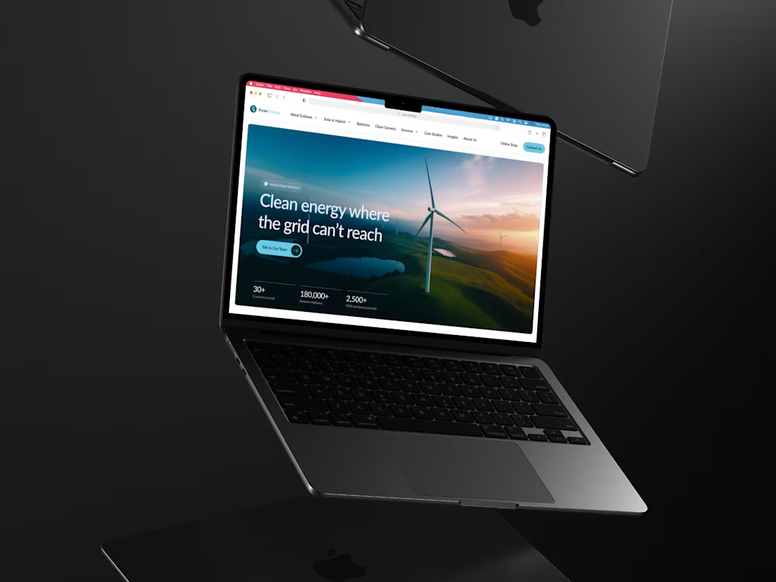
Hero animation for a renewable energy giant
We created a subtle animation that reinforces Ryse’s position as a global energy leader and delivers a clean, trustworthy first impression.
2
2
59
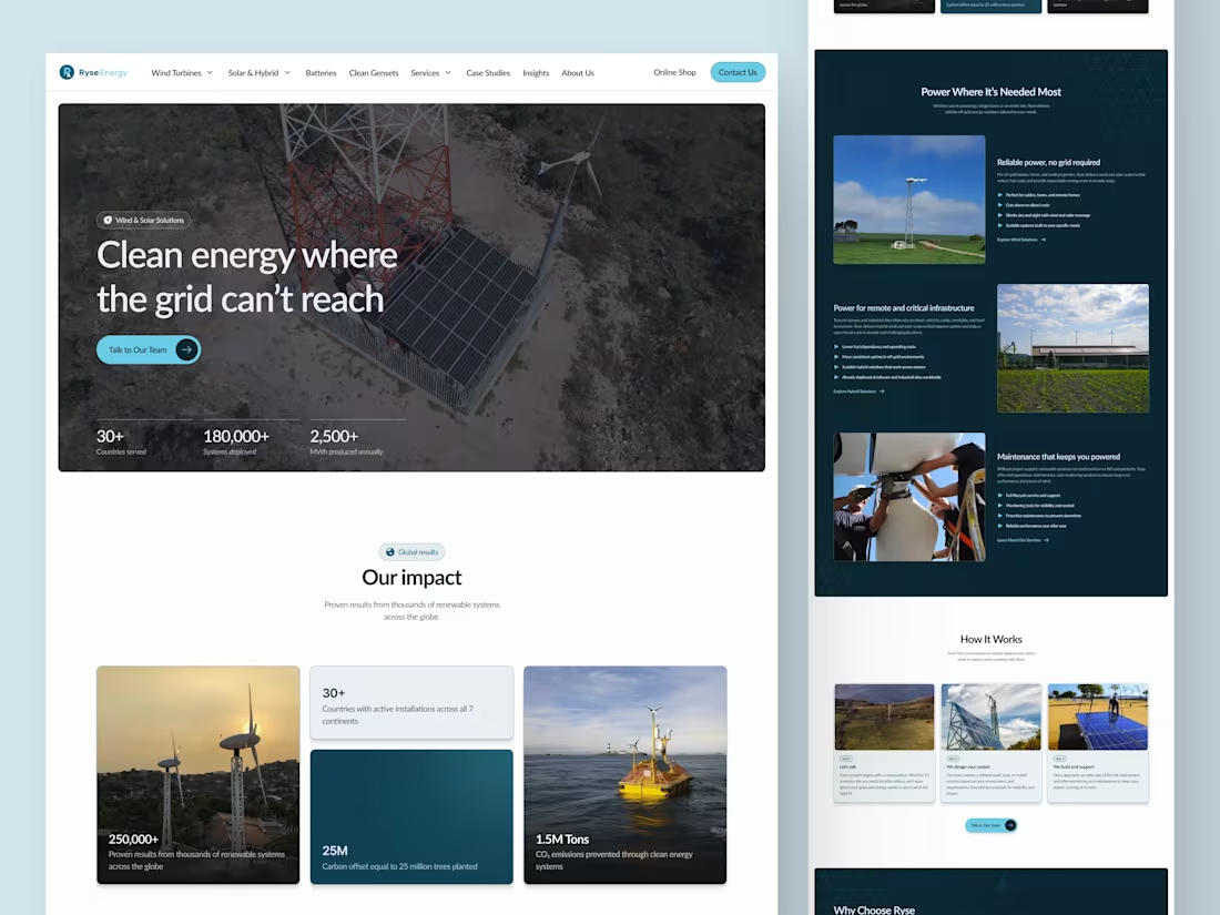
Most companies don’t realise how much a confusing website costs. Ryse Energy wanted to change that.
They’re a global renewable company, but their old site made it hard for visitors to understand what they do or where to go next.
What was not working:
• Outdated design
• Slow loading pages
• Confusing navigation
• No paths for different user types
• No guidance for early, planning, or ready-to-buy visitors
What we improved:
• Clear information architecture
• User journeys for every stage
• Navigation that guides, not overwhelms
• Scalable structure for all content
• A modern visual system that builds trust
The result?
A site that feels simple, credible, and easy to move through, no matter where you are in your decision-making journey.
Clarity drives conversions. And for complex products, it’s everything.
14
36
197
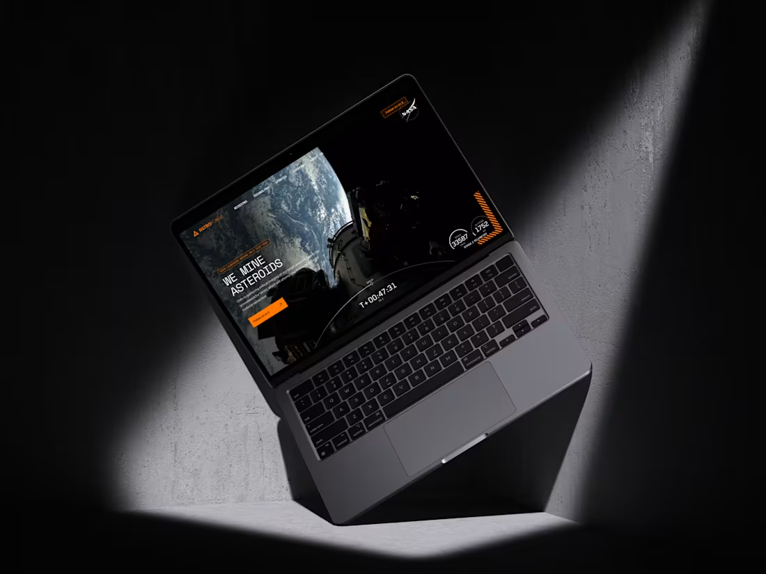
AstroForge Website Redesign for Investor and Talent Engagement
2
21

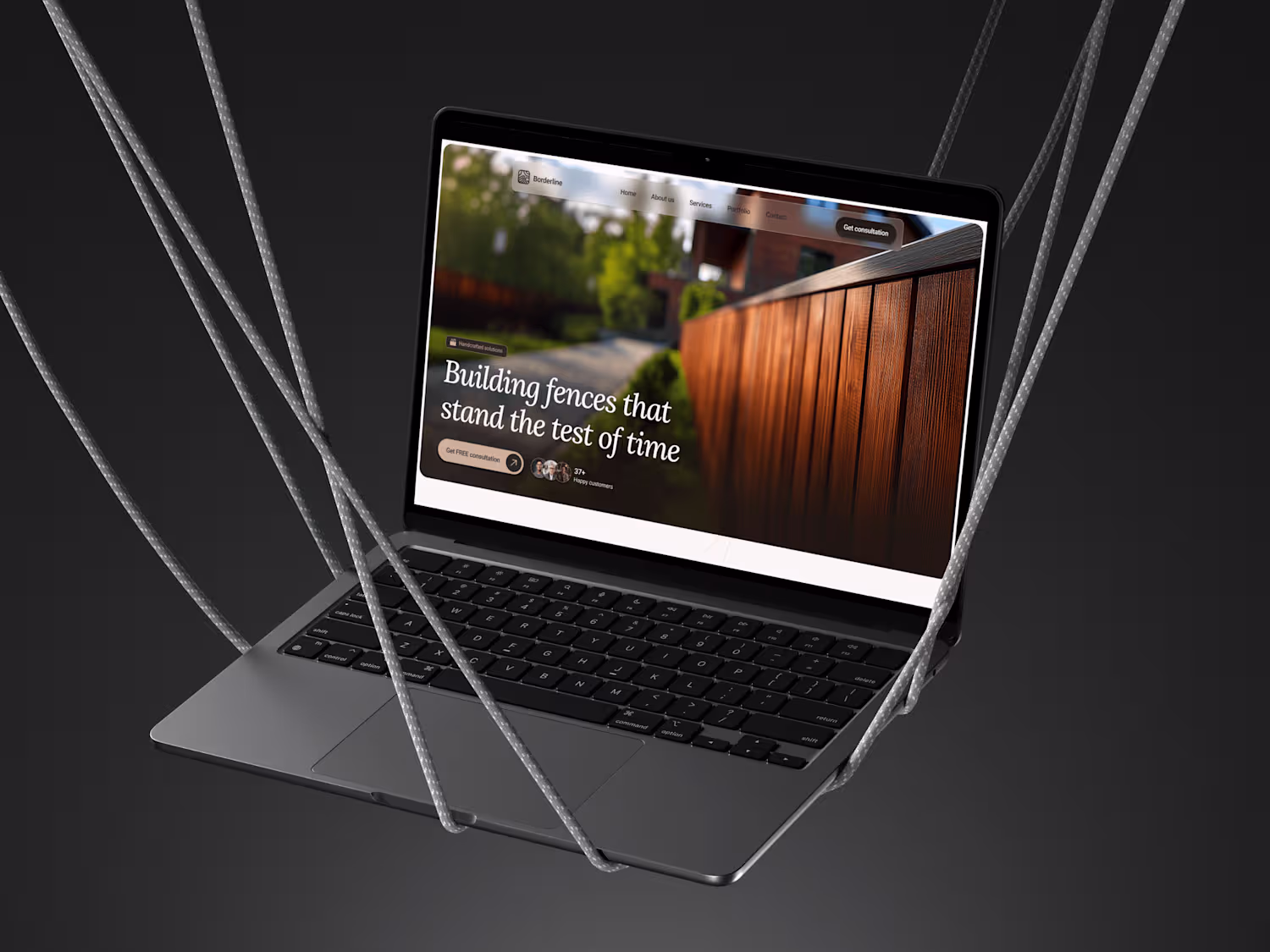
Building trust with a modern online presence for Borderline
0
13
Turning a cluttered website into a high-performing digital tool
0
18
Fueling excitement with a bold new website
0
13
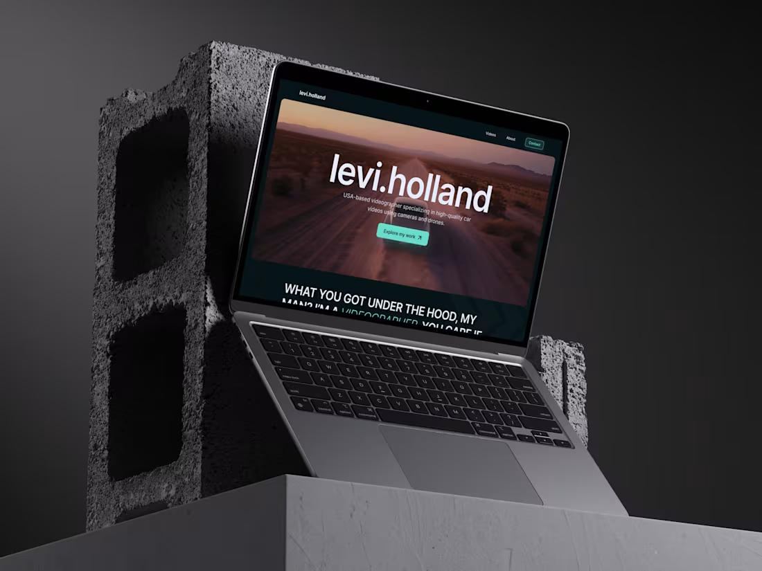
Showcasing Levi Holland’s skills with a new online presence
0
6

Dream online - reinventing virtual event experiences
0
10
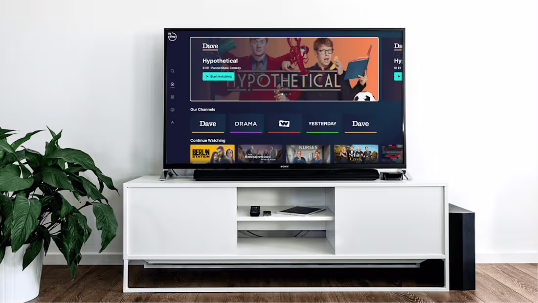
Redefining streaming UX for UKTV Play
0
9