Built with Framer
Ryse Energy Website Rebuild and Brand Refresh
Gary Szaszik
A website rebuild and brand refresh for renewable leader Ryse Energy
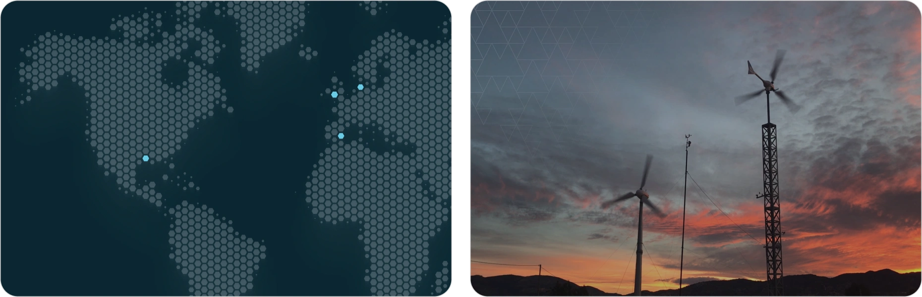
Ryse Energy is a global renewable company with over 180,000 installations across seven continents. They design and manufacture small wind turbines and hybrid renewable systems that power remote communities and industries worldwide.
They needed a website that matched their scale and innovation. The old site was dated and hard to navigate, failing to reflect their leadership in renewables. We rebuilt it into a modern, conversion-driven experience that clearly communicates their expertise and impact.
The challenges we needed to solve
Outdated design
Ryse Energy’s old site looked dated and didn’t reflect the scale or innovation of a global renewable leader. The visuals felt old-fashioned and didn’t communicate trust, expertise, or the advanced nature of their technology.
Confusing navigation
Users often struggled to find the information they needed. The structure encouraged rabbit holes, pages felt disconnected, and there was no clear guidance for domestic vs commercial visitors. This led to frustration, drop-offs, and early exits.
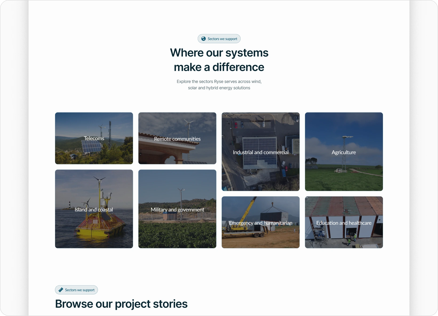
Missed user journeys
The site didn’t support different stages of the renewable energy journey. Early-stage researchers, serious buyers, and commercial teams all needed different content, but the old structure treated everyone the same. There were no prompts, no segmentation, and limited opportunities for engagement or lead capture.
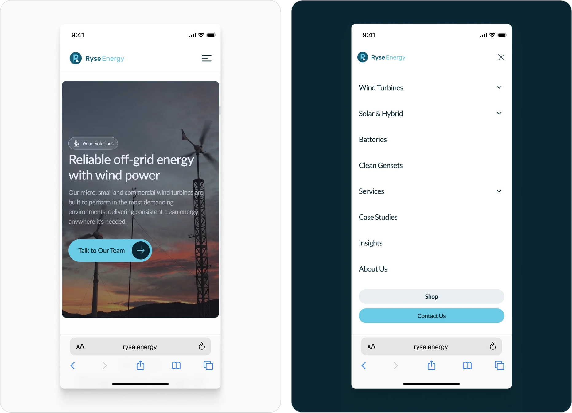
Slow performance
Pages, images, and videos were slow to load, especially on mobile. This created friction early in the journey and reinforced the perception that the site was outdated.
Strategic Foundation
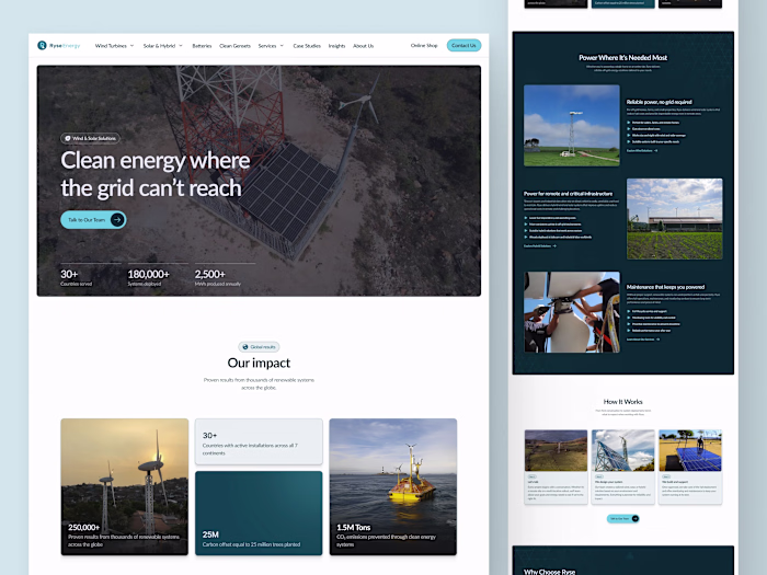
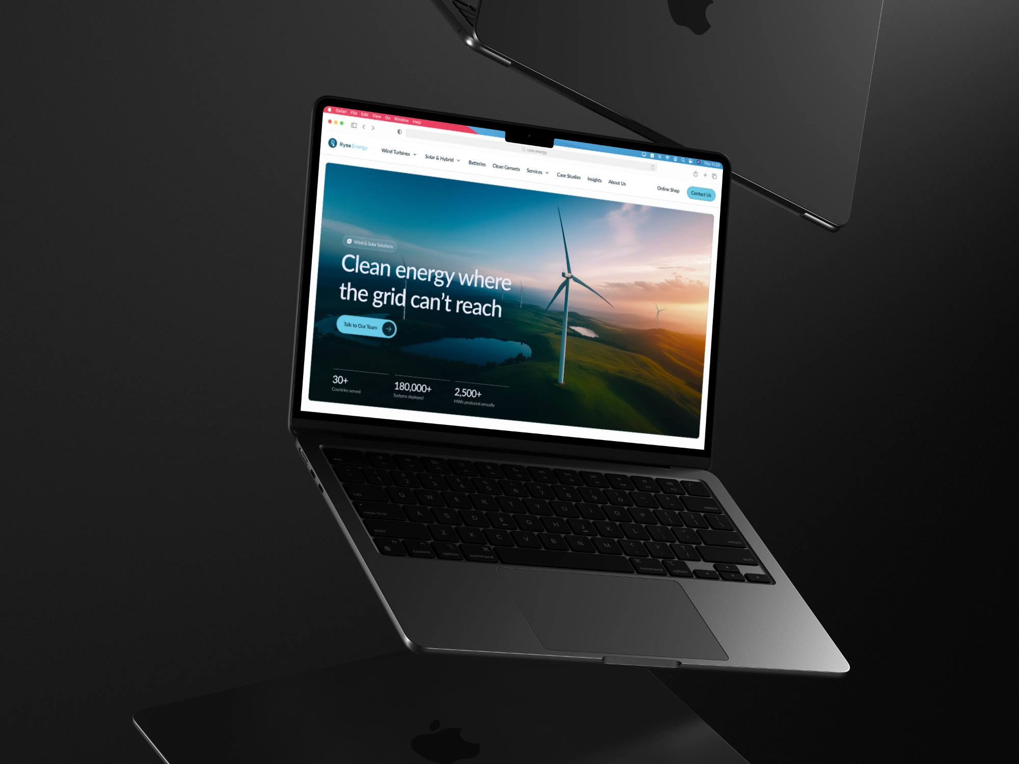
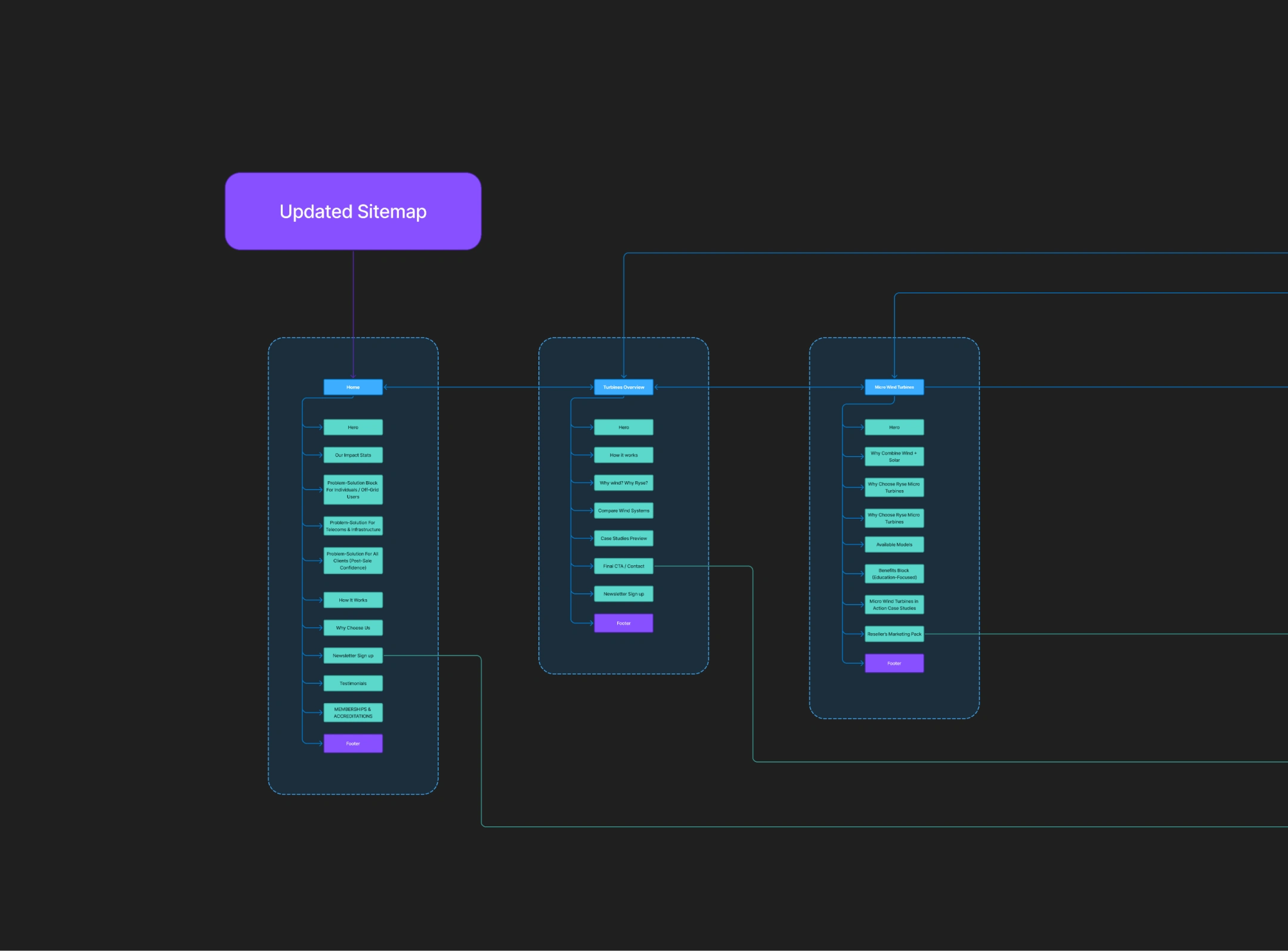
We rebuilt the site from the ground up to solve the core issues holding Ryse Energy back. The new structure makes information easy to find, supports both domestic and commercial visitors, and guides users based on where they are in their renewable energy journey.
By reorganising navigation, simplifying content paths, and planning clear segments for early-stage researchers, serious buyers, and commercial teams, the new foundation helps every visitor reach the right next step without getting lost or overwhelmed.
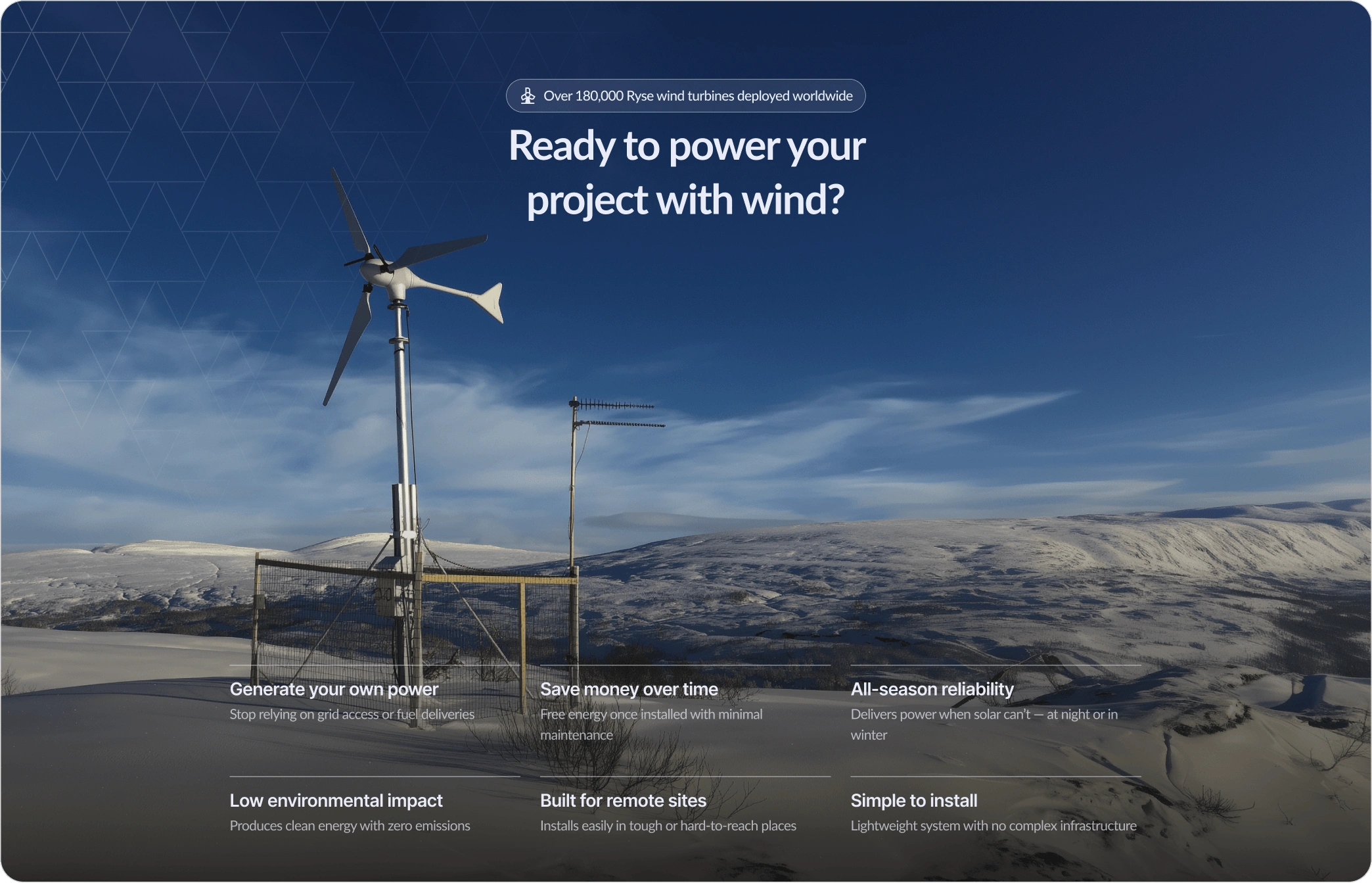
We modernised the visual identity
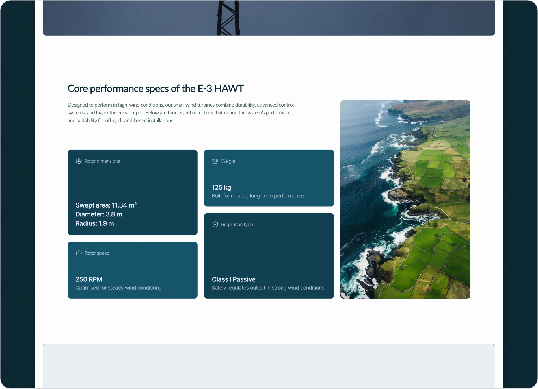
Ryse’s old design felt dated and didn’t reflect the scale of a global energy company. We updated their visual identity by refining their existing colours, introducing a natural palette, and creating a clear colour logic that makes the site feel consistent. We reworked their typography to improve readability, and built subtle animations that add polish without distracting users. The result is a modern, trustworthy look and feel that finally matches the quality of their technology.
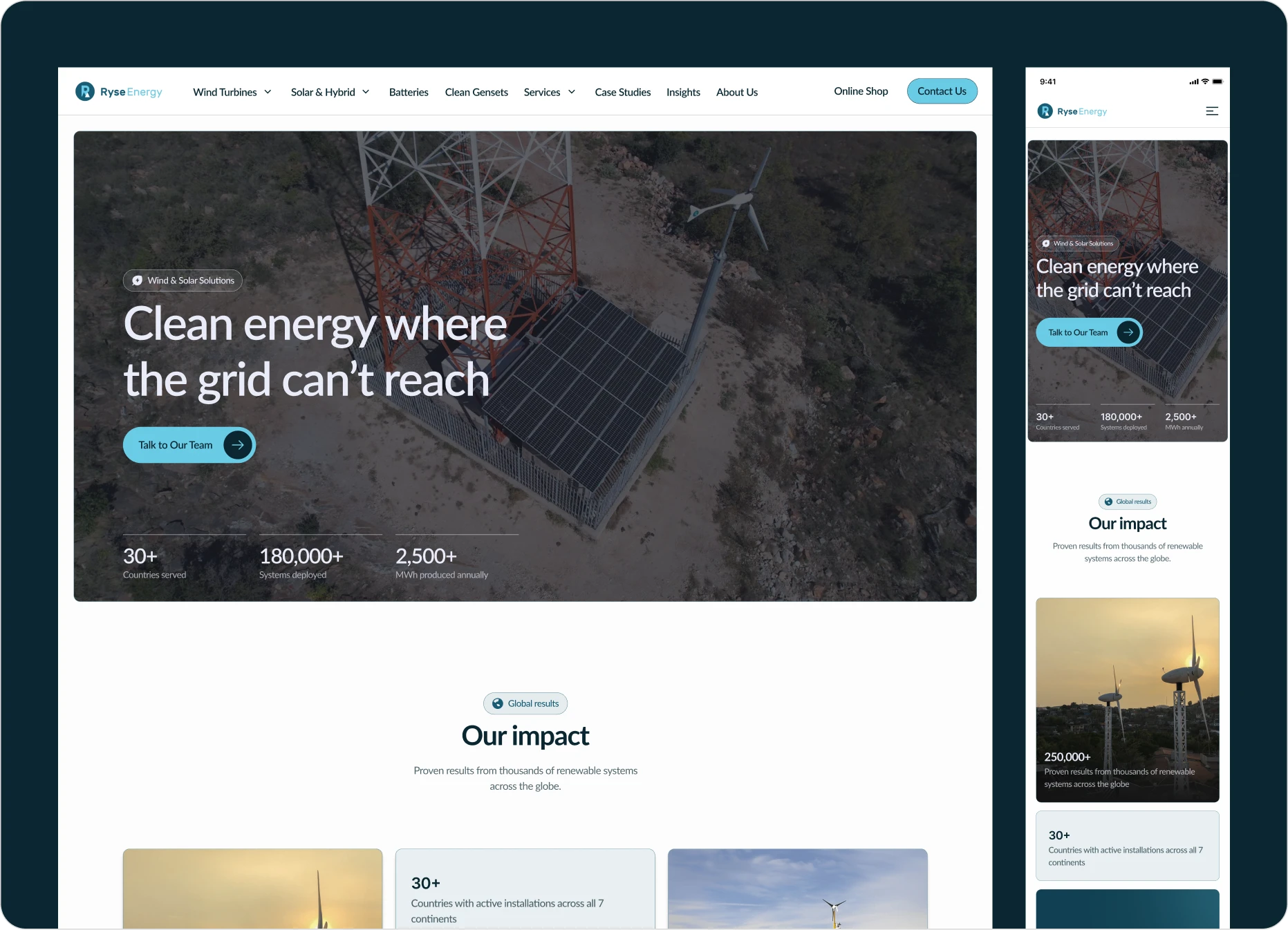
We focused on making the site feel modern and intentional, without overdoing it. The updated visuals and subtle motion help the brand feel more confident and established
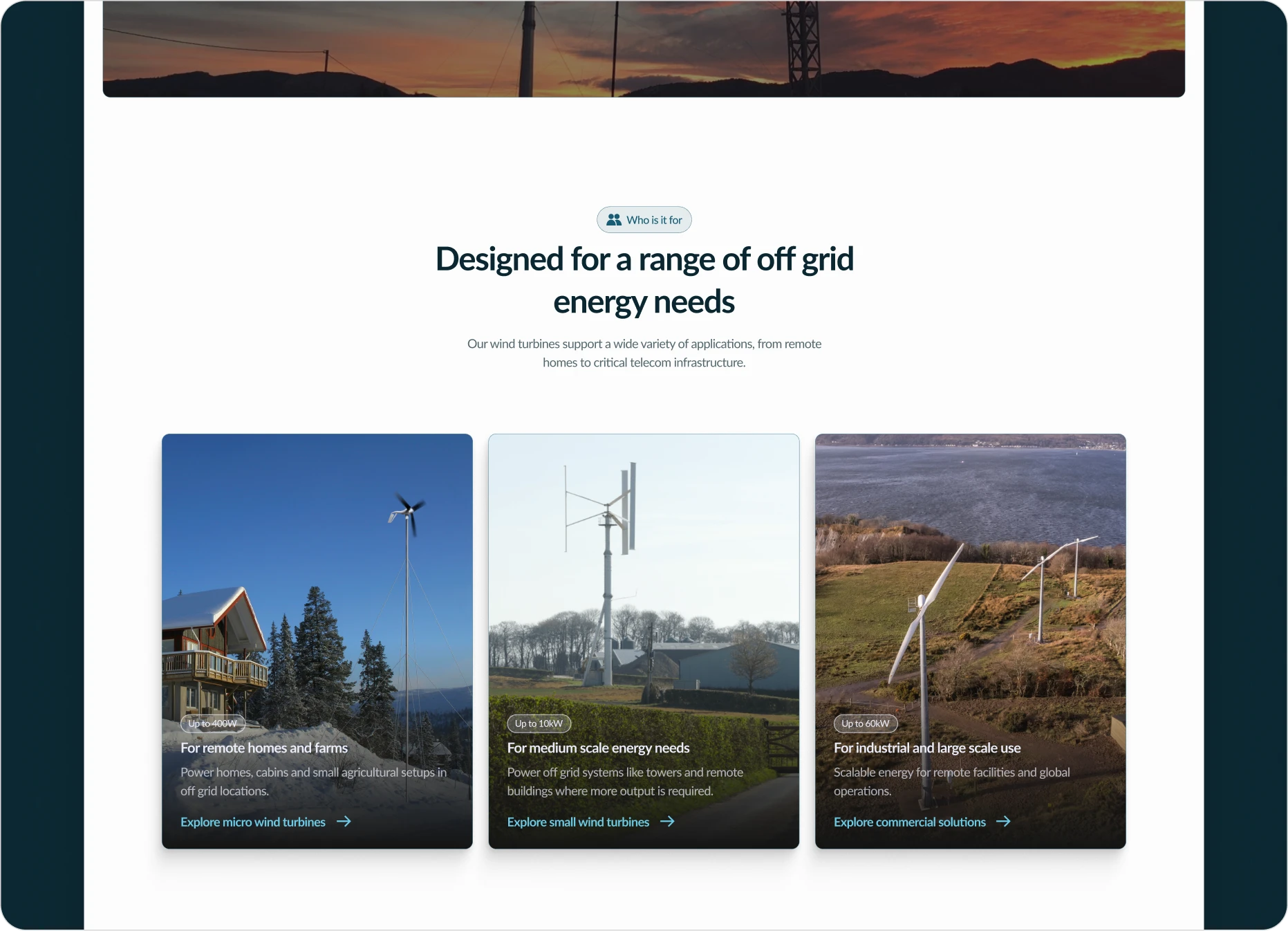
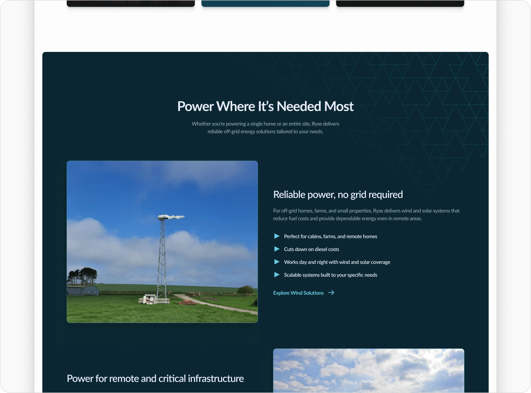
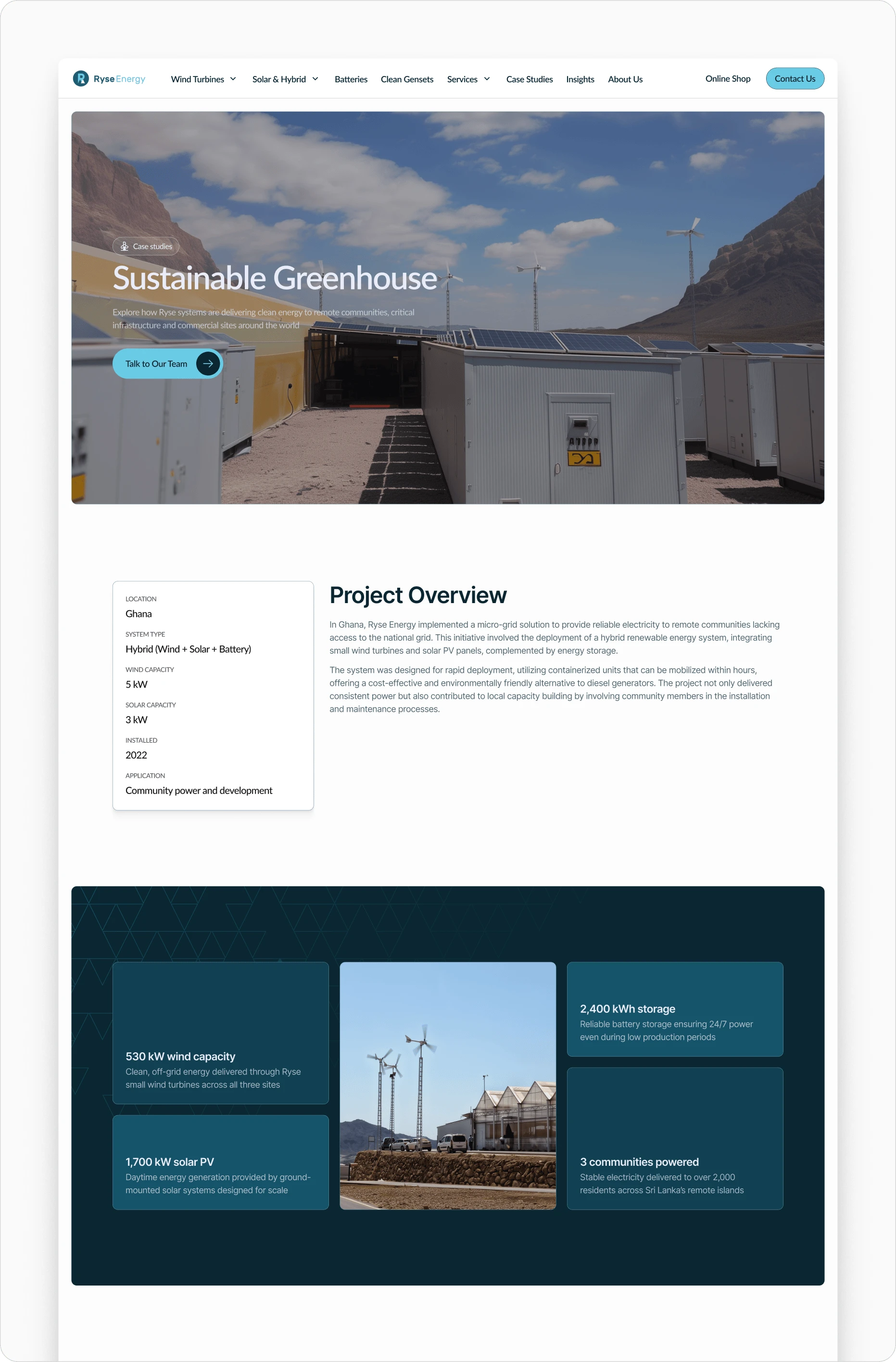
We simplified navigation and guided users to the right paths
Ryse Energy serves a wide range of users, from early-stage researchers to ready-to-buy customers and large commercial buyers. The old navigation treated everyone the same, which made it hard for people to find what they needed.
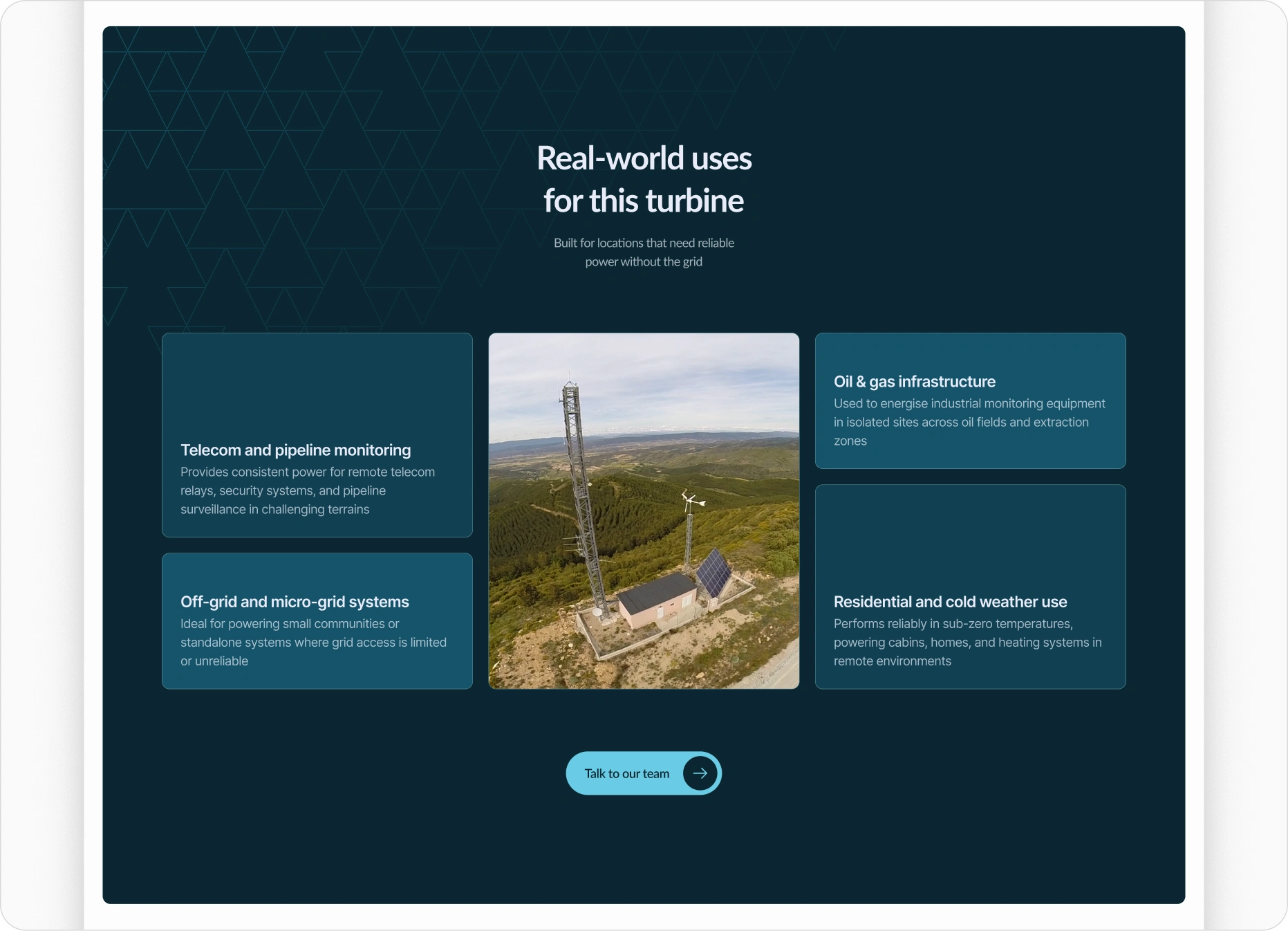
We restructured the navigation and page flows to guide users based on where they are in their renewable energy journey. This helped visitors quickly orient themselves, explore relevant content, and move toward the right next step without getting lost.
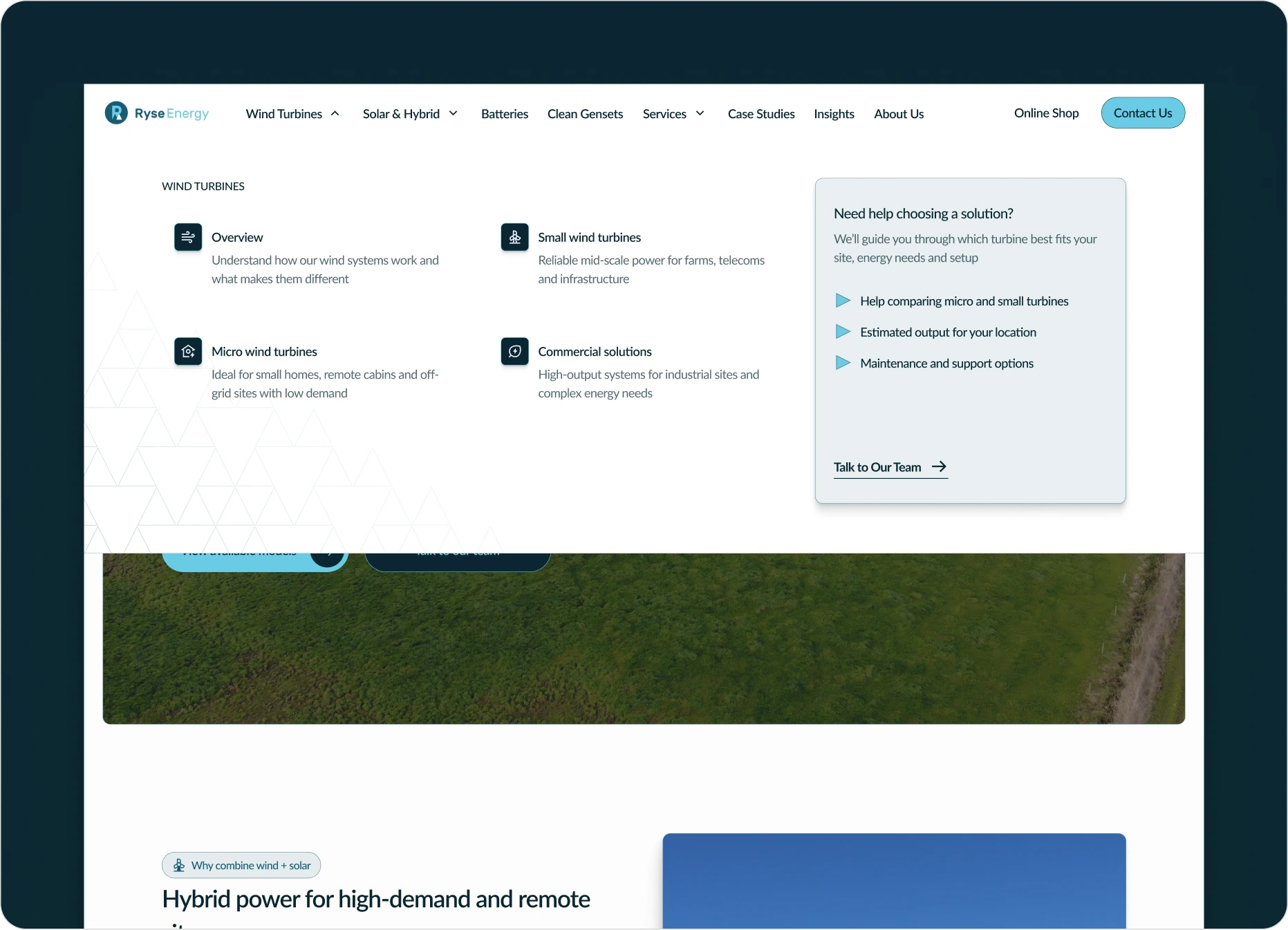
Clear, intent-based navigation helps users orient themselves quickly and move toward the right content with confidence.
We improved performance without sacrificing quality
Ryse Energy’s website is large and content-heavy, with complex pages, rich visuals, and motion. Performance was critical. We made careful decisions around assets, animations, and media to ensure the site loads quickly and feels responsive across devices. The result is a smooth experience that supports exploration without slowing users down.
Like this project
Posted Dec 31, 2025
A full redesign and build for a large renewable energy company, balancing multiple user types, complex content, and clear paths to conversion.