American Documentary • Information Architecture & Wireframes
Daniel G Bright
Verified
Project Background
American Documentary is a non-profit media organization dedicated to creating and distributing socially impactful documentary films. Their website serves as a platform for showcasing their extensive film catalog, connecting with filmmakers, and providing educational resources.
I was approached by Paper Tiger to lead the UX redesign of AmDoc’s website. The goal was to create a more structured, user-friendly experience that better serves the needs of filmmakers, educators, and general audiences.
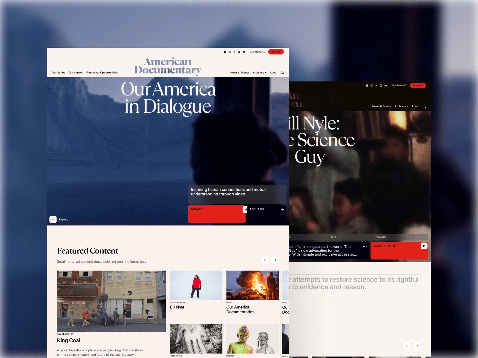
Homepage
Challenges & Objectives
Challenges:
The existing website had an outdated structure with unclear navigation.
Users struggled to find relevant content due to lack of filtering and categorization.
Filmmakers needed better visibility and a centralized hub for resources.
Educational materials were not easily accessible or well-organized.
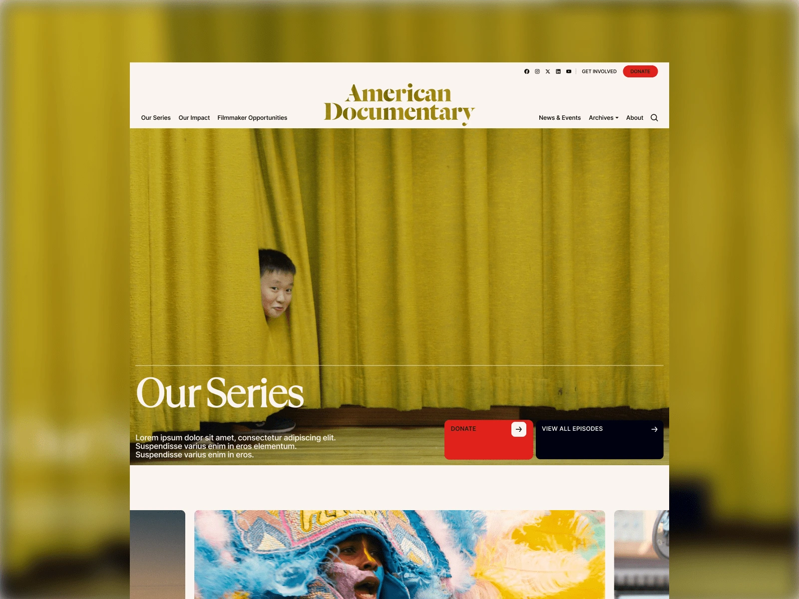
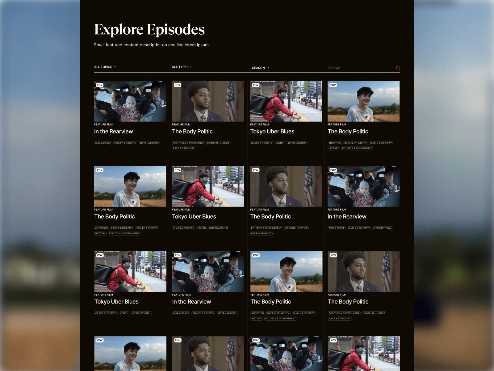
Our Series Page
Objectives:
Redesign the website architecture for a more intuitive user journey.
Implement clear navigation and filtering for films, filmmakers, and resources.
Improve discoverability of educational and funding opportunities.
Enhance storytelling and engagement through modern UX principles.
Our Series Page
UX Process
1. Research & Discovery
To ensure the redesign met user needs, I conducted:
Stakeholder Interviews – Understanding AmDoc’s goals and pain points.
User Research – Identifying key user personas: filmmakers, educators, and general audiences.
Competitive Analysis – Benchmarking against similar documentary and media platforms.
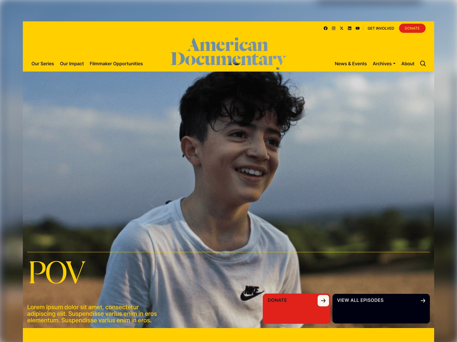
POV
2. Information Architecture & Wireframing
Created a complete site map, organizing content into clear sections.
Developed wireframes for each primary page, focusing on usability and clarity.
Ensured the new IA supported a seamless navigation experience.
POV
3. Prototyping & User Testing
Built interactive prototypes to validate the UX flow.
Conducted user testing sessions to gather feedback and refine the design.
Iterated based on insights, improving navigation and filtering mechanisms.
Key UX Solutions
1. Structured Navigation
Designed a clear menu system with distinct categories: Films, Filmmakers, Resources, and About.
Added filtering options for searching films by theme, genre, and filmmaker.
2. Filmmaker-Centric Pages
Created dedicated profiles for filmmakers, allowing them to showcase their work.
Included funding opportunities, residencies, and submission guidelines.
3. Enhanced Educational Resources
Implemented a centralized resource hub for educators and students.
Improved categorization of teaching materials, study guides, and learning modules.
4. Improved Visual Hierarchy
Used contrast and spacing to highlight important content.
Prioritized storytelling elements with better use of imagery and text balance.
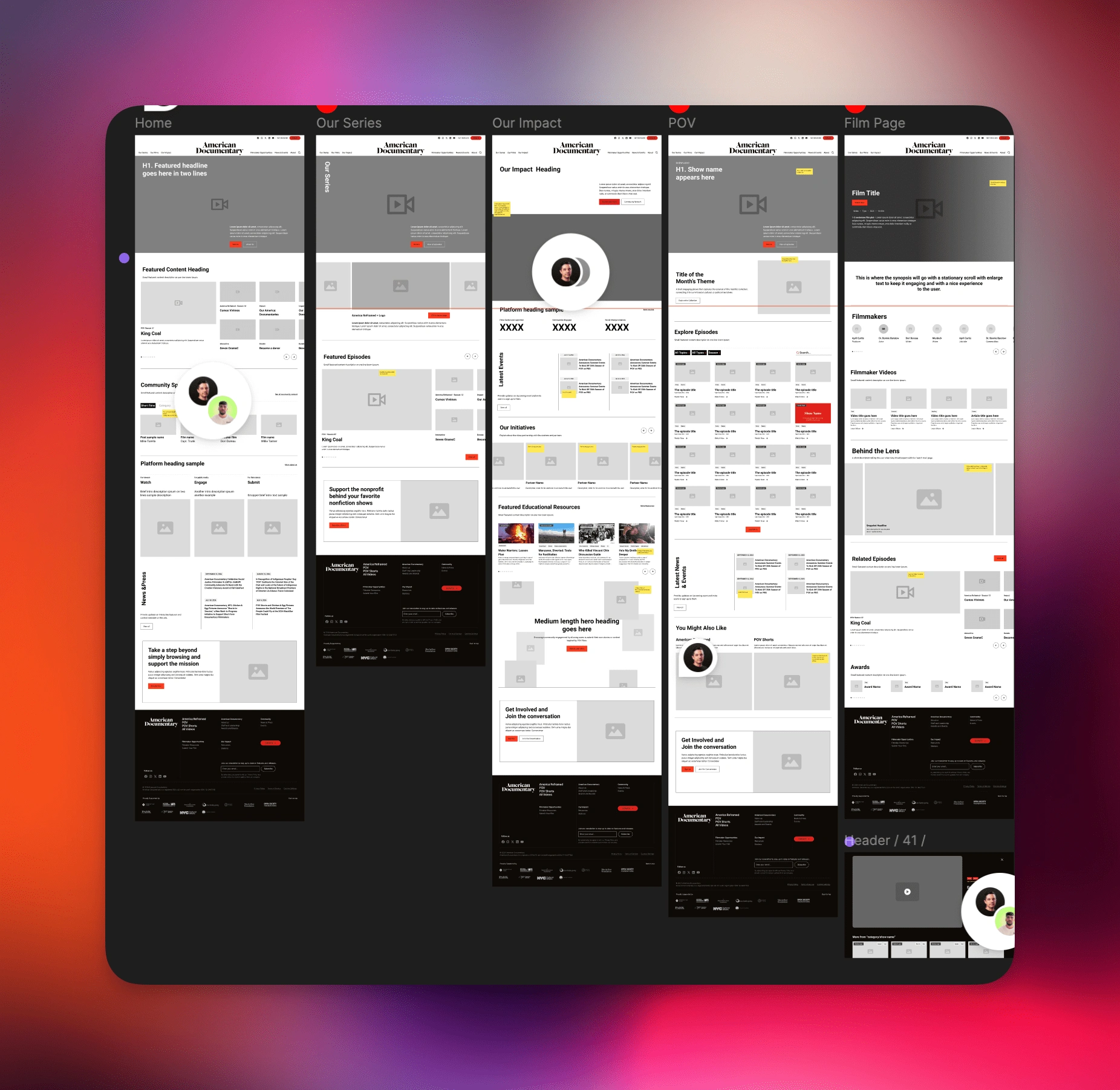
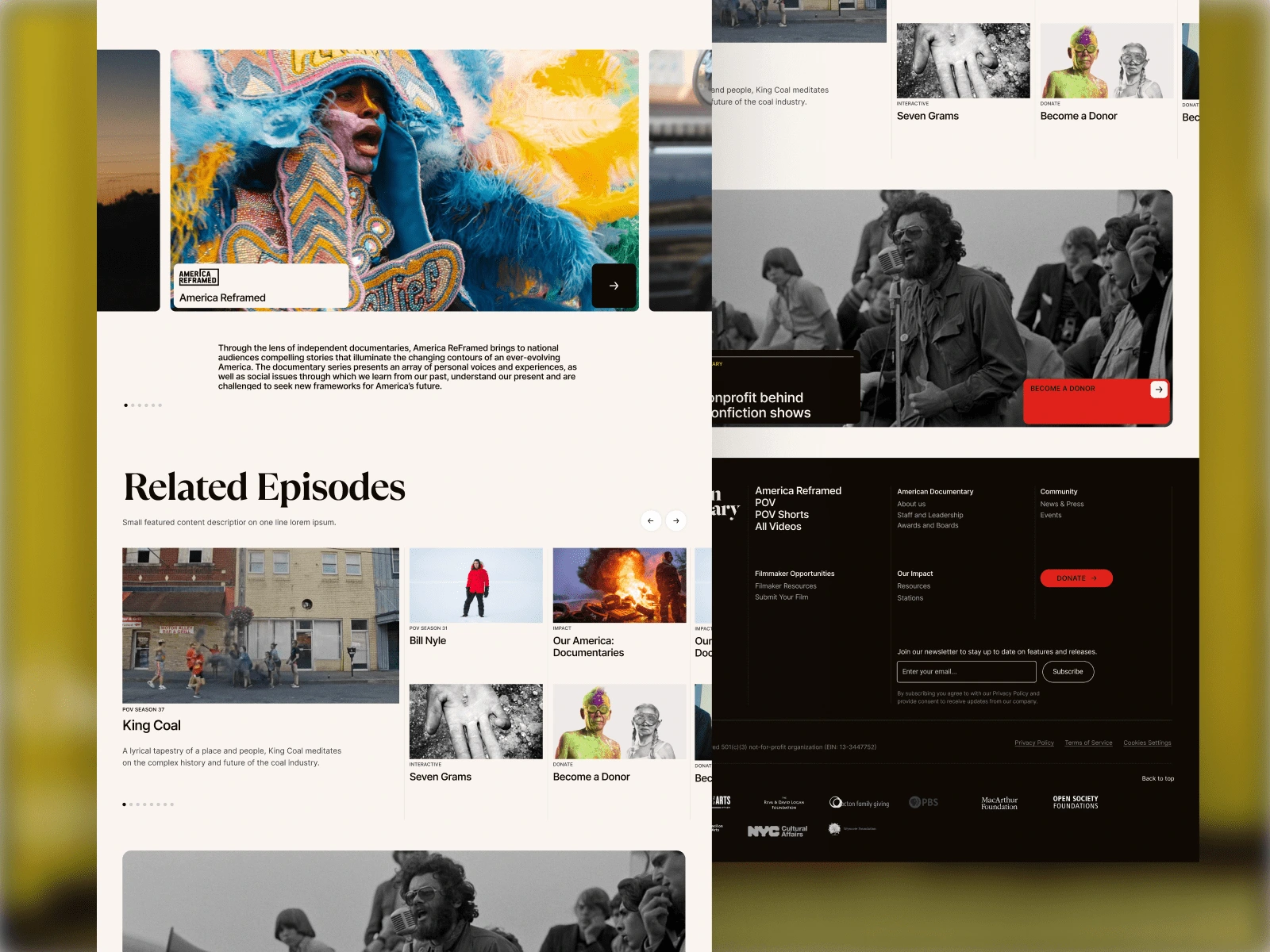
Wireframes
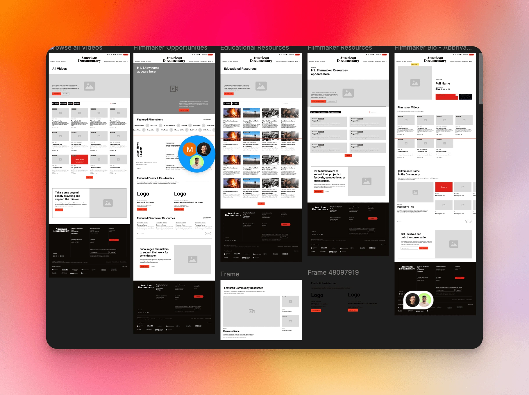
Wireframes
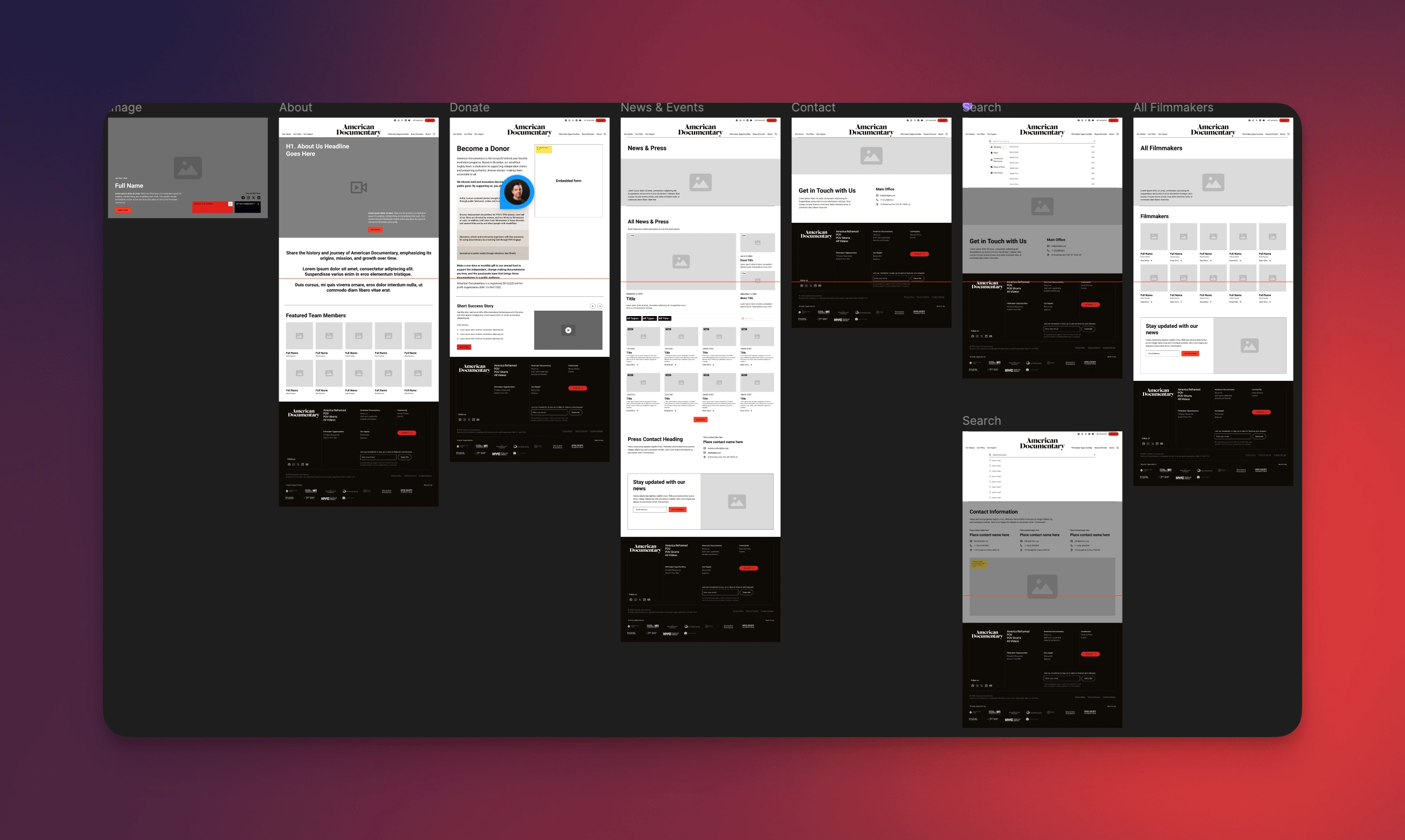
Wireframes
Final Outcome
Streamlined user journey – Navigation is now intuitive and user-friendly.
Enhanced discoverability – Users can easily find films, filmmakers, and resources.
Filmmaker engagement improved – A more structured and supportive platform.
Modern, clean UX – A fresh and engaging interface for AmDoc’s digital presence.
Conclusion
Leading the UX redesign for American Documentary was a rewarding challenge, aligning the site’s structure with user needs while ensuring a seamless browsing experience. The final design now effectively supports AmDoc’s mission of storytelling, education, and filmmaker advocacy.
Like this project
Posted Feb 18, 2025
Redesigned AmDoc’s website UX for better navigation, filmmaker engagement, and content discovery. Led the project after being approached by Paper Tiger.
Likes
2
Views
85
Timeline
Oct 1, 2024 - Nov 25, 2024
Clients
Paper Tiger