Contra - A professional network for the jobs and skills of the future
Discover
Sign Up
Post a job
Sign Up
Log In
Filters
Projects
People
Filters
Featured
Web developers
Content creators
Graphic designers
Product designers
AI developers
Motion designers
Social media marketers
Animators
Video editors
Projects we love
Projects we love
Standout projects making waves around the web
View more
Message
27
Alan Barba
pro
Livera - Branding, Packaging, & Website Design
1
27
487
Message
12
Daniella Gershon
pro
Fohr Instagram Rebrand and Content System
12
220
Message
16
Darya Batyr ✦
max
Tahcar: Building an Enterprise Brand for Modern Logistics
16
239
Message
29
Nadia Ariefdien
Step-by-Step Running Club – Branding & Merch Design
29
316
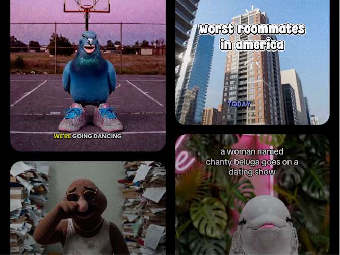
Join the $50k Cantina Challenge
Share your Cantina creation for a chance to win!
Learn more.
Enter the challenge
Enter the challenge
Enter the challenge
Enter the challenge
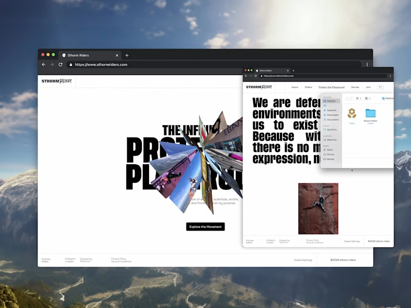
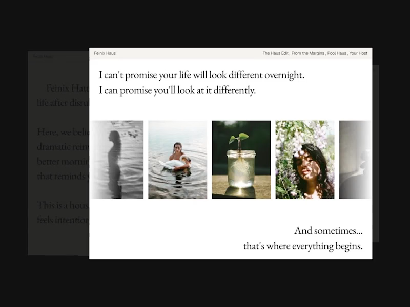
Web design projects using Framer
Framer
The best modern websites built on the leading web design tool, Framer
View more
Message
6
Bartek Krzesak
pro
BoomPop Visual Identity and Digital Presence
6
710
Framer is the leading tool for building websites, fast
Hire experts
Message
6
Goran Babarogic
max
Central — Brand Identity & Website
1
6
162
Message
39
Sana M.
pro
NEUTRON - BRANDING & WEBSITE
39
683
AI projects
AI
New projects from the best AI creators
View more
Message
8
Razvan Badea
pro
Alkera - Logo Design & Brand Identity
1
8
154
Message
8
Fernando Felix
Kacet | Building a Foundation for Global Expansion
1
8
157
Message
11
Denys Dod
pro
Nodus — Brand System and Framer Dev for a Global Edge Network
1
11
204
Message
5
Omar Nika
max
Liquid Glass x Anything
1
5
106
Brand design projects
Brand design
Bold visual identities and branding systems created by top independent designers

View more
Message
10
Flávia Jackeline
Visual Identity Design for Bruno XVisual Identity for DJ Bruno X
1
10
148
Message
9
Gabriela Polanco-Ferreyra
pro
Lydiob7 — Branding & Website for an Online Coding School
1
9
100
Message
11
Lucas Fields
pro
Nodus Logo & Visual Identity
11
131
Message
4
Jeihun Alizadeh
pro
Youfiliate — Brand & Product Design
4
87
Video editor projects
Video editing
Creative video edits made using today’s best editing tools
View more
Message
3
Mario Busto Studios™
max
Reflex Robotics Hero Video - YouTube
3
107
Message
3
Robin Holesinsky
pro
bsyde: Migraine Tracking App in Motion
3
44
Message
5
Alejandra Tello
max
Content Strategy and Content Creation for Marlo Health
5
84
Message
3
Sam B.
pro
Talking-Head Direct-Response Ads for Growth Edge
3
34
Standout projects
Standout projects
More projects we love that are making waves across the web

Message
1
Eugene Shkolnyi
pro
Supper Apps Animation
2
1
28
Message
12
Nilkanth Devani
pro
Nidex Design - Creative Agency Website
5
12
142
Message
7
Yevhen Chuhuievets
pro
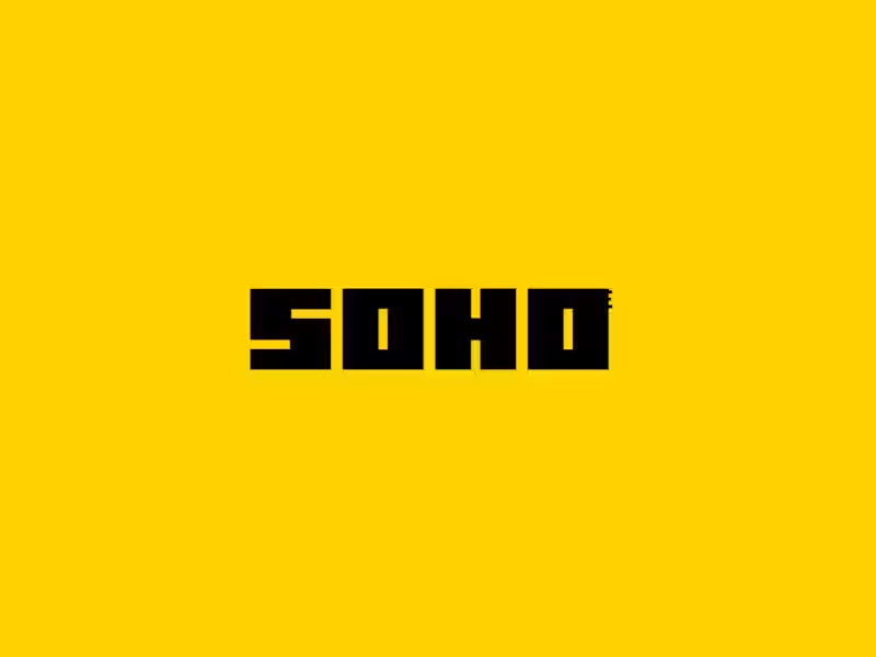
Client: "Can we start with a simple square and just see where it goes?" Me: Splits geometry into dynamic typography 🪄 Logo motion concept for SOHO—watching a single shape multiply and morph into the final brand mark. Let's make your brand identity move!
1
7
145
Message
14
Md Suman Ali
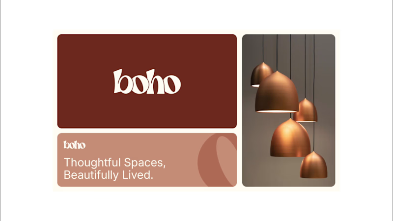
Boho logo & brand identity design We started with pencil and paper is now a complete brand identity. Warm. Organic. Full of character. Just like the spaces BOHO is designed to create. From rough lines to the final wordmark. Here’s how it all came together. What do you think of the final identity? #brandidentity #logodesign #branding #interiorbranding #visualidentity
3
14
89
Message
4
Omar Seyidli
TAMGA art / E-commerce The brand identity system developed for TAMGA was formed with the aim of transforming the brand’s spirit into a more contemporary and systematic visual language. The main goal of the project was to create a modern and memorable visual identity for the audience by combining symbolic elements specific to TAMGA. The identity system was inspired by the logotype, typographic approach, and product shape. In the visual direction, minimalism and ethnic references were balanced and the premium and artisanal character of the brand was brought to the fore. As a result, a more recognizable, flexible, easy-to-apply, and long-lasting visual system was formed for TAMGA that is easy to apply and enhances the product experience. The developed identity will allow the brand to establish more stable and aesthetic communication on carpets, decor, and other art objects. https://www.instagram.com/tamgha.art/
2
4
549
Message
14
Mark Zh.
kolo.xyz (http://Kolo.xyz) App Promotional Video
4
14
523
Message
6
Bearplus Fullstack Agency
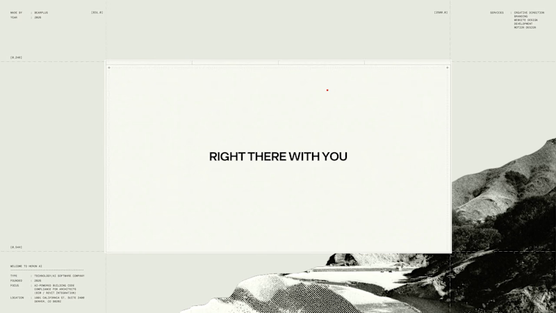
The 404 was treated as a proper page rather than a fallback state. The number is constructed as an architectural drawing. The 4 and the 0 are formed from walls at true thickness, with furniture laid out inside the resulting rooms and dimension strings running along both edges. It sits inside the same drafting system as the rest of the site rather than borrowing a display typeface. The error message then repeats. Instead of a single dialog, identical windows cascade back across the canvas, each one carrying the same 404 notice. It reads as a system throwing an unresolved warning over and over, which is the exact behaviour Heron is built to prevent inside a model. Error pages are never in the brief. They're a good measure of whether a team understood the product or just styled it.
4
6
78
Message
1
Ryan Sloss
My platform, Thrilla, which allowed viewers to get paid for watching short form adverts, with vertical scrolling.
1
1
29
Message
22
Enmanuel Jimenez Veloz
What if a space brand didn’t just look futuristic — but felt like it was already living in the future? For XPACE, the goal was to build a visual identity that could turn the idea of space exploration into a complete and immersive brand experience. The identity combines a bold typographic system, a high-contrast visual language, and electric blue accents against deep black to create a futuristic presence that feels precise, technological, and unmistakably XPACE. But the identity didn’t stop at the logo. The system was extended across digital interfaces, web design, favicon and UI icons, access cards, board passes, and branded applications — creating a consistent experience across every touchpoint. Every detail was designed to make XPACE feel less like a brand inspired by the future, and more like a brand built for it. XPACE — Visual Identity System. Looking to build a visual identity that goes beyond a logo? Let’s create something with a world of its own.
9
22
318
Message
22
AdamStav Branding Studio
Logo for Riptide Archive. They document underground surf culture through limited run apparel, photo zines and short films.
12
22
247
Message
47
Kris Anfalova
pro
Ledger — AI CFO Platform Ledger is an AI platform that acts as an always-on Chief Financial Officer for founders — connecting to accounts, learning cash rhythm, and surfacing risks before they become real problems. I designed the full landing page. My role: UI/UX Design Scope: Landing page Financial tools for founders usually feel either cold (dashboards) or intimidating (accounting software). For Ledger, we borrowed from old-world institutional finance instead — serif type, oil-painting textures, classical architecture — so an AI CFO feels like real authority, not another app.
17
47
999
Message
39
Ansh Jamdagni
pro
Spent the last few months rebuilding the digital presence for Shiva Group, a multi-brand automotive dealership group running JLR, Mahindra, Triumph, KTM, Bajaj, and MG Select showrooms across North India. New site architecture, cleaner model pages, a live outlet locator across 50+ locations built entirely on Framer. Genuinely happy with how it turned out, and it's already paying off for them too, with $1.2M+ in vehicle bookings coming through the site in the first month! Check it out (https://contra.com/p/Ekbr6eEZ-shiva-group-full-website-rebuild-across-10-automotive-brands)
11
39
693
Message
2
Julia Zahorodnia
pro
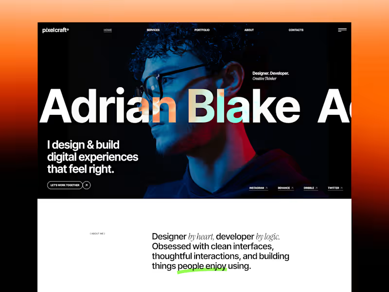
Something bright and bold today 🌈 Pixel Craft is a creative agency concept built around vibrant gradients, unconventional layouts, and huge typography. Here’s a quick look at some of my favorite sections in motion.
2
2
148
Message
54
Kris Anfalova
pro
Designed a dashboard concept for tracking net worth across every asset type — stocks, crypto, property, pensions, funds, cash, and liabilities — all in one place. Instead of the usual pie chart or bar graph, the centerpiece is a dial: a single, glanceable gauge showing where your wealth actually sits. Behind it, a quiet grid of every asset category fades in and out of visibility, reinforcing that everything's accounted for even when it's not the focus. Dark UI, a single confident green accent, and a lot of negative space — built to make a genuinely overwhelming task (seeing your entire financial picture at once) feel calm instead of cluttered.
17
54
1.3K
Message
16
Alina Fedorchenko
Concept design for perfumes with character, intended for special occasions 😁
2
16
483
Message
36
SUBHAN DESIGNS • Identity & Packaging
pro
More visuals from the rejected brand direction I shared earlier. Really good to see this direction resonating with so many of you. It was one of our favourite explorations to build, from the narrative behind it to the visual world that brought it to life. Great work doesn’t always make the final cut, and sometimes the reason has little to do with the quality of the direction. Curious why this one was rejected? I’ve shared the story in the first comment✨
17
36
880
Explore projects