Contra - A professional network for the jobs and skills of the future
Discover
Sign Up
Post a job
Sign Up
Log In
Filters
Projects
People
Filters
Featured
Web developers
Content creators
Graphic designers
Product designers
AI developers
Motion designers
Social media marketers
Animators
Video editors
Projects we love
Projects we love
Standout projects making waves around the web
View more
Message
5
Alan Barba
pro
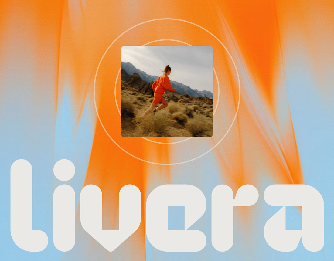
Livera - Branding, Packaging, & Website Design
1
5
101
Message
1
Daniella Gershon
pro
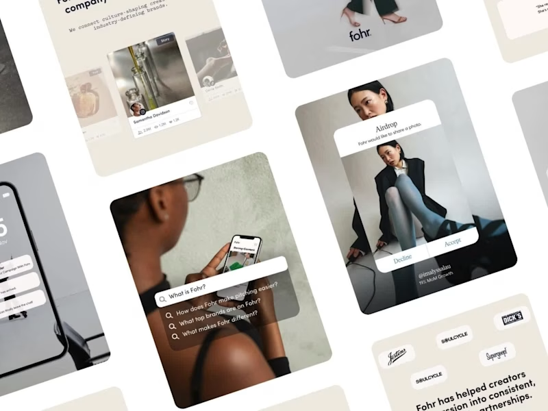
Fohr Instagram Rebrand and Content System
1
51
Message
2
Darya Batyr ✦
max
Tahcar: Building an Enterprise Brand for Modern Logistics
2
37
Message
19
Nadia Ariefdien
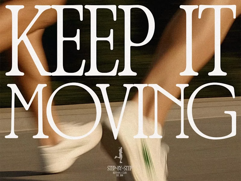
Step-by-Step Running Club – Branding & Merch Design
19
164
Web design projects using Framer
Framer
The best modern websites built on the leading web design tool, Framer
View more
Message
2
Bartek Krzesak
pro
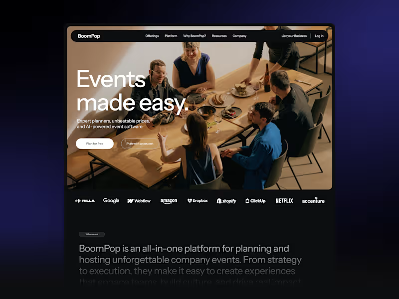
BoomPop Visual Identity and Digital Presence
2
119
Framer is the leading tool for building websites, fast
Hire experts
Message
4
Goran Babarogic
max
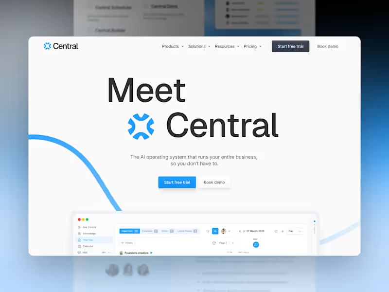
Central — Brand Identity & Website
1
4
44
Message
32
Sana M.
pro
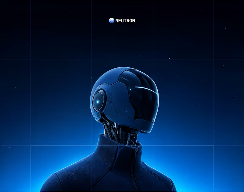
NEUTRON - BRANDING & WEBSITE
32
562
AI projects
AI
New projects from the best AI creators
View more
Message
3
Razvan Badea
pro
Alkera - Logo Design & Brand Identity
1
3
24
Message
3
Fernando Felix
Kacet | Building a Foundation for Global Expansion
1
3
79
Message
3
Denys Dod
pro
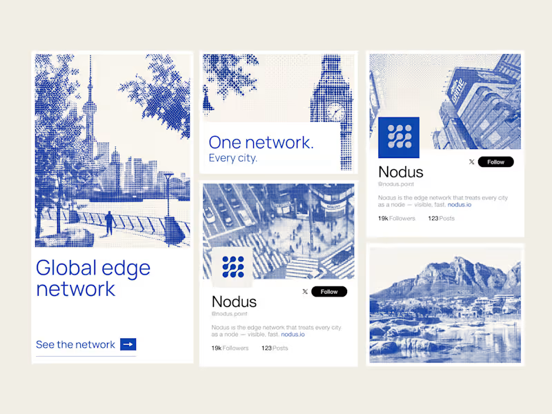
Nodus — Brand System and Framer Dev for a Global Edge Network
1
3
56
Message
1
Omar Nika
max
Liquid Glass x Anything
1
1
68
Brand design projects
Brand design
Bold visual identities and branding systems created by top independent designers
View more
Message
4
Flávia Jackeline
Visual Identity Design for Bruno XVisual Identity for DJ Bruno X
1
4
37
Message
2
Gabriela Polanco-Ferreyra
pro
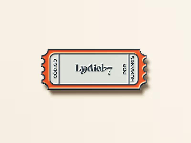
Lydiob7 — Branding & Website for an Online Coding School
1
2
26
Message
5
Lucas Fields
pro
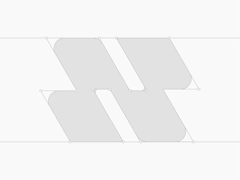
Nodus Logo & Visual Identity
5
68
Message
2
Jeihun Alizadeh
pro
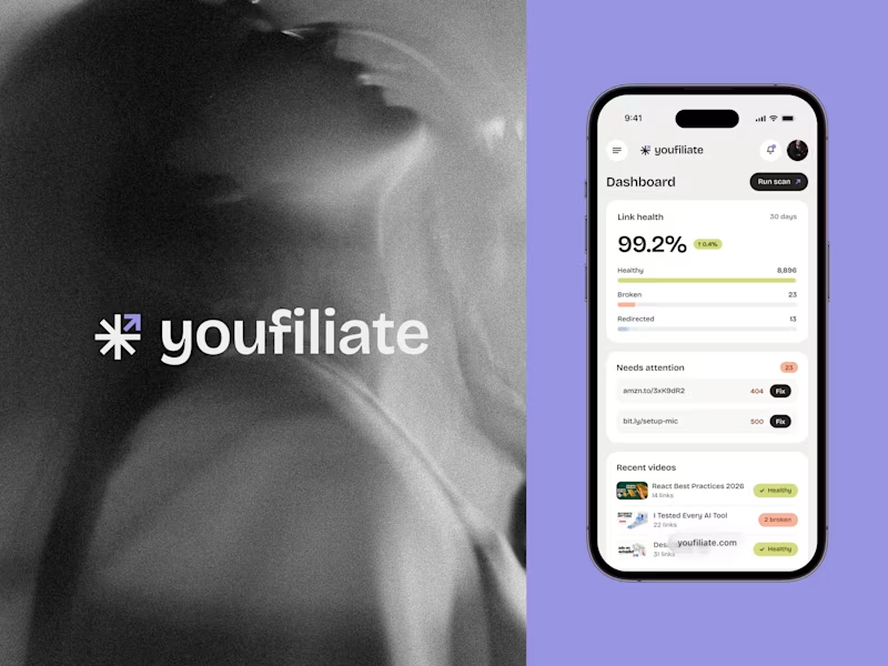
Youfiliate — Brand & Product Design
2
19
Video editor projects
Video editing
Creative video edits made using today’s best editing tools
View more
Message
2
Mario Busto Studios™
max
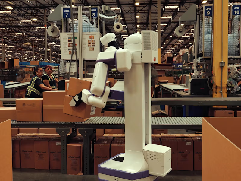
Reflex Robotics Hero Video - YouTube
2
40
Message
0
Robin Holesinsky
pro
bsyde: Migraine Tracking App in Motion
0
14
Message
2
Alejandra Tello
max
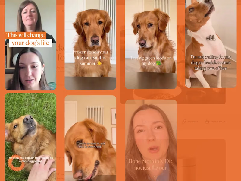
Content Strategy and Content Creation for Marlo Health
2
29
Message
1
Sam B.
pro
Talking-Head Direct-Response Ads for Growth Edge
1
7
Standout projects
Standout projects
More projects we love that are making waves across the web
Message
4
Markus W
MacBook was working overtime on this one
2
4
43
Message
9
Althea Nguyen
EARTHTURN is a ceramics brand I hope to open one day. I'm not a potter. So I used FLORA to help me build the whole branding, from physical product to brand identity mockup around the idea. FLORA was where I pushed the ideas and a strategy I already had in my head, and tested it until it held. So I'd have more time for the part that actually matters: the brand strategy. Here's what I kept reminding myself while making the visuals. You create images to sell a product, not just to look good. So every image should have a job. It might be a logo evolving: a turning wheel, then fire, then a vessel, resolving into the mark. I wanted the logo to show where it comes from, not just sit there finished. It might be the slow rotation effect for poster or social media posts, you can realise this effect when someone throws on a wheel, the movement the brand is named after. Not a trending effect that looks cool but says nothing about EARTHTURN. It might be the close-ups images: the material, the pattern, the piece from different angles. A customer buys what they can see clearly. Pretty from a distance doesn't sell, texture you can almost feel does. It might be the packaging shots that show the foam and wrapping: the piece protected, not a bare pot sitting alone in a cardboard box. You're not just selling a vase. You're selling care, and a product that arrives whole and unchipped. That's what making images for a brand really means, not grabbing whatever composition looks nice and calling it done. If you can't say why a visual serves the brand, it's decoration, not design.
3
9
64
Message
33
Nathaniel Dada
pro
I used to think the secret to better AI video was writing longer prompts. This project changed how I approach prompting. I took one of my actual Seedance 2.5 prompts and broke it apart. What looked like one detailed prompt was actually several different shots, camera movements, actions, and cinematic directions competing for the model's attention. So I started treating AI video prompts more like shot direction: SHOT → SUBJECT → ACTION → ENVIRONMENT → CAMERA → MOTION → LOOK → CONSTRAINTS In this walkthrough, I show the real process, including how I structure the prompt, generate the scene, identify what isn't working, and refine the instructions. The lesson is simple: Don't make the prompt longer. Make the instructions clearer. Think like a director, not a novelist. https://share.descript.com/view/iYh2ZNB0bt1 https://web.descript.com/3c176614-948b-4aad-81d8-392fd2c09c2d
15
33
913
Message
26
Braulio Cardenas
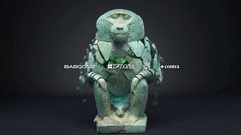
Baboonz® — Art Toy & Collectible System. Baboonz is a contemporary art toy inspired by the ancient Egyptian connection between the baboon and Thoth, the god of wisdom, knowledge, and writing. The project reinterprets this ancient symbolism through a contemporary collectible design language, positioning Baboonz between character design, contemporary art, fashion, and product design. The collection includes the sculpture, a premium satin-finish packaging system, and a TCG-inspired collectible card with metallic and holographic details, creating a cohesive physical identity and expanding the character’s lore. The goal was to make Baboonz feel museum-able — a modern collectible art object that connects ancient artifacts with the way we collect and experience objects today. Check the project here. (https://app.flora.ai/projects/ns77j6160yncy7mmp0erbh9xm58dm151) (App Flora Canvas) Check the original art (https://www.metmuseum.org/art/collection/search/545213) | Met Museum (Figure of Baboon)
15
26
746
Message
8
Dalibor Pajic
pro
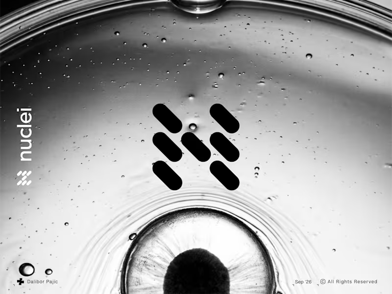
Nuclei | N Monogram Logo & Bio Tech Branding
1
8
142
Message
2
Juli Horvath - Levington
pro
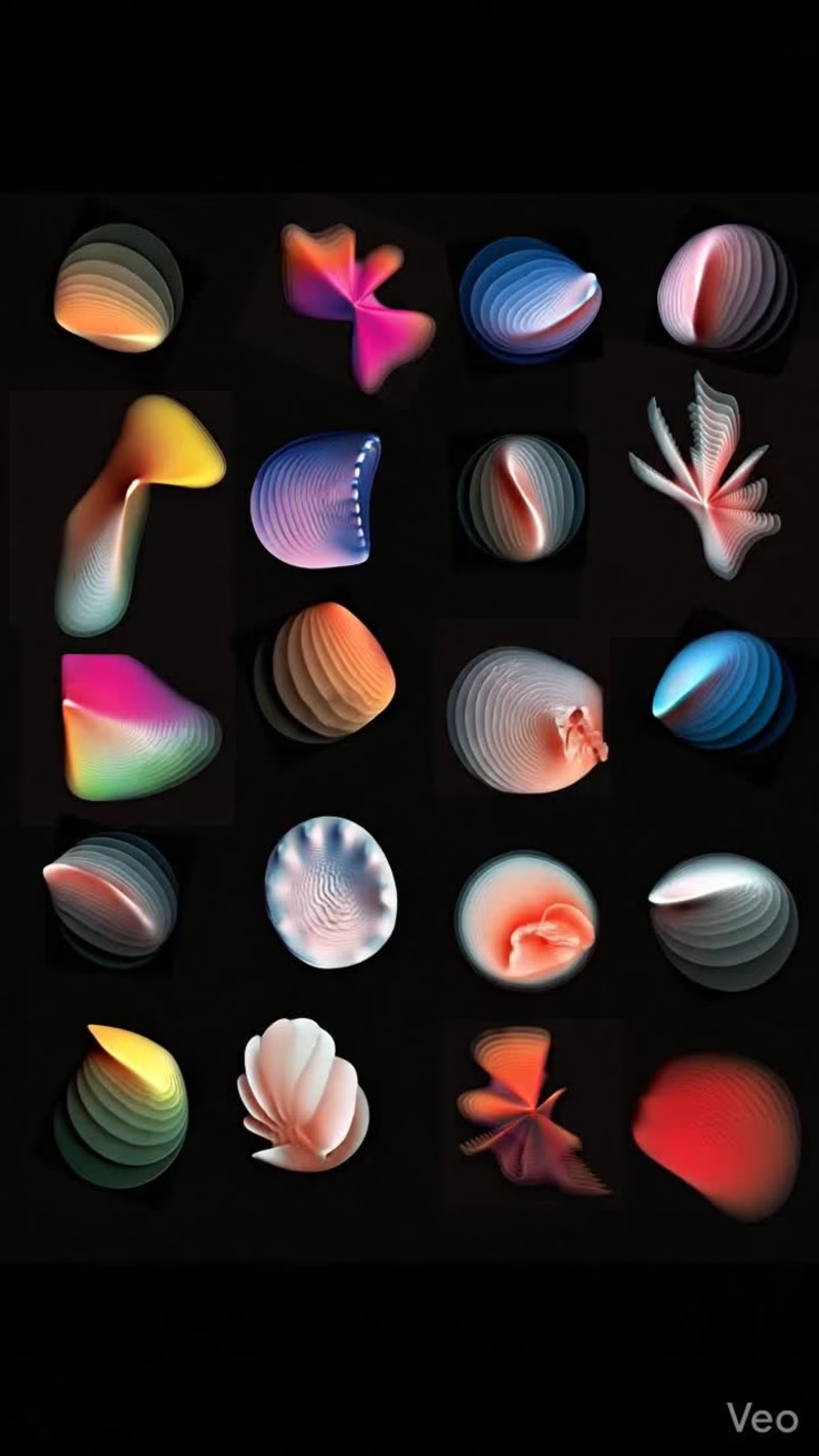
Biomic This was a proposal for the annual light festival that takes place in Pécs. The theme this year in honor of Victor Vasarely was "The living city". The concept behind this piece was to create these alien-esque deepsea creatures to represent this living colony of reef life, giving the sense of depth and movement. The idea was to have them projected onto the ancient Roman ruins to further give the impression of ancient, otherworldly life. The creatures were created in Affinity designer, while the animation was created using Gemini.
2
2
65
Message
9
Cameron Pagano
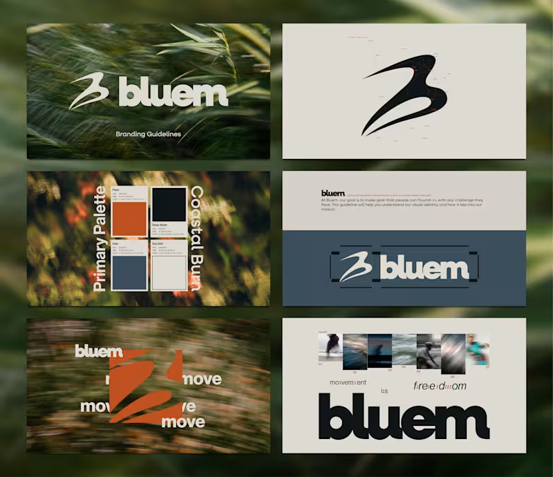
Recent Brand Sprint for Bluem, an activewear company. Extremely happy with the outcome, wish them best of luck with their launch! To work, contact me here on Contra, or email me at cam@polarcreativegroup.com
2
9
95
Message
19
Alice D.
pro
Kicking off September by working on a new website in Framer
11
19
382
Message
17
Studio Meva
pro
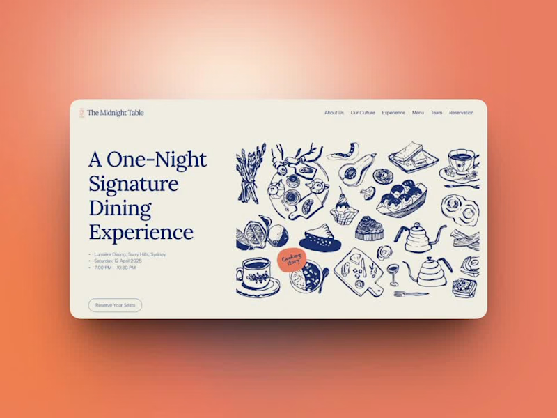
Day 7/30 of designing one hero section every day. First, some honesty: "every day" hasn't happened. I started this challenge 13 days ago, and this is post 7, real life kept turning it into every other day. I'd rather say that plainly than quietly hope nobody counts. From tomorrow, I'm aiming for daily again. But here's what I've learned already: showing up on an imperfect schedule beats abandoning a perfect one. Each of these seven has taught me something a tutorial couldn't. Today: The Midnight Table — a one-night-only signature dining experience. → My first hero with zero photography. Everything is hand-drawn ink illustration on cream — plates, kettles, pastries, a whole tabletop of them. (Credits: magnific) When every restaurant site reaches for moody food photos, illustration instantly reads as "this event is different." → Ink blue and cream, one coral accent. 7 down, 23 to go- at whatever honest pace it takes😊 #webdesign #uidesign #herosection #30daychallenge #illustration #typography #designchallenge
2
17
153
Message
19
Milan Bundalo
pro
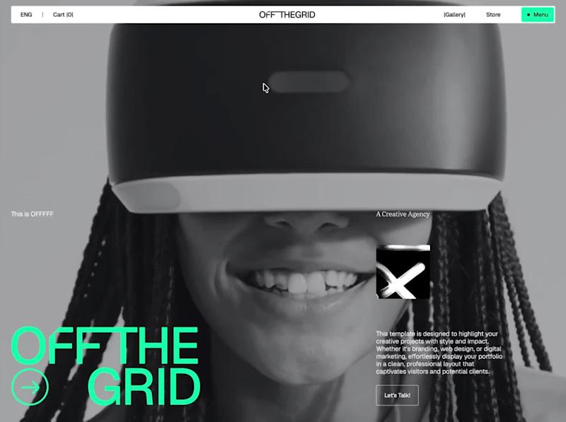
Off the Grid feels more like flipping through a design magazine than scrolling through an agency website. Every section has its own layout, but everything still feels like part of the same visual world.
14
19
406
Message
8
Matheus Brandão
pro
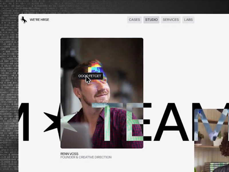
One detail I like in STUDIO HRSE: hover a team member's card and it tells you why they're worth knowing. It's a small interaction, but it's doing real work, it turns a static bio into something people actually stop and read. If you're building a team or about page on Framer, this is worth a look. It's free. Check it out: https://framer.link/kVzioCc
4
8
138
Message
11
Martina Solés
pro
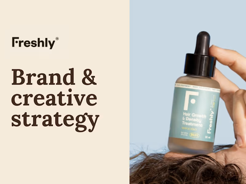
Just worked on an independent brand and creative strategy audit for Freshly Cosmetics, a Spanish clean beauty brand navigating a defining moment after a decade of growth, expansion, and correction. I mapped their full brand landscape, online and retail presence, visual identity, audience, and five direct competitors, to surface a core tension: what once set Freshly apart, science-backed formulas, is now table stakes across the category, while competitors are winning on brand presence and emotional storytelling. From that insight, I developed three strategic moves: turning Freshly's physical stores into living brand spaces with an in-store mini garden, rebranding the packaging to build stronger shelf presence and emotional attachment (especially in baby and kids), and shifting scientific credibility into deeper brand equity through retail experience, rather than pursuing another international expansion. Full presentation: https://canva.link/sgwmw9cklrpfvdr
2
11
322
Message
11
Germán Latasa
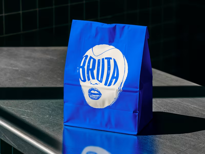
A visual identity designed to be as bold and unapologetic as Bruta’s approach to gastronomy.
1
1
11
397
Message
0
Florencia Ezcurra
pro
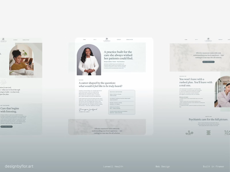
Lanwell Behavioral Health Brand and Website Development
0
10
Message
33
Jakaria Mahmud
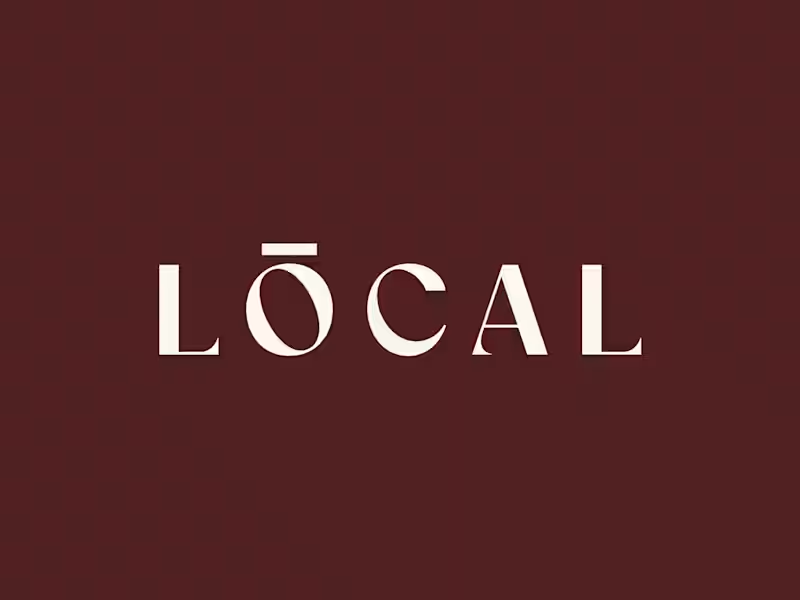
Built a coffee brand around the feeling of being local. ☕️ LOCAL is a modern café identity designed to feel warm, calm, premium, and familiar - without falling into the usual coffee-brand clichés. From the wordmark and earthy color palette to typography, packaging, uniforms, and real-world applications, every detail was created to make the brand feel like a natural part of everyday life. Brand Identity • Art Direction • Packaging • Visual System What do you think - would you stop by LOCAL for a coffee? 👀 #BrandIdentity #Branding #CoffeeBrand #CafeBranding #PackagingDesign #VisualIdentity #GraphicDesign #BrandDesigner #CreativeDirection #ContraDesigner
7
33
825
Message
20
Julia Arenzano
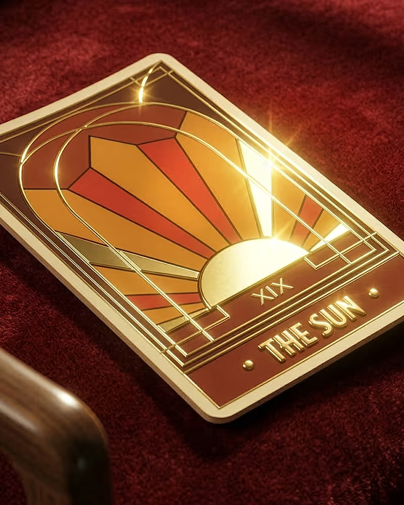
I’m not a particularly mystical person, but sometimes that world crosses my path. Not long ago, I had the opportunity to take a Design class where we were challenged to create our own version of a Major Arcana Tarot card, choosing both the card and a design style to represent it. The Sun has always held a significant place in my life—not just as a concept, but as a tangible physical presence—so the choice was easy. From there, I had no doubt about choosing Art Deco as the primary style, as it evokes the same feeling in me that the Sun does: absolute passion. My final design was built from an illustration created in Illustrator and refined in AI: a stained-glass window that captures the light passing through it and radiates it back out into the world.
8
20
233
Explore projects