
Contra - A professional network for the jobs and skills of the future
Discover
Sign Up
Post a job
Sign Up
Log In
Filters
Projects
People
Filters
Featured
Web developers
Content creators
Graphic designers
Product designers
AI developers
Motion designers
Social media marketers
Animators
Video editors
Projects we love
Projects we love
Standout projects making waves around the web
View more
Message
96
Andrea DiNardo
max
The Compression Company: Landing Page Copy + Narrative
96
3.6K
Message
81
Tiago Rosado
pro
Mostly Sunny | Framer Development
81
3.2K
Message
145
Stacy · Heed Collective
pro
Brand Identity · Specialty Coffee Cosmetics
1
145
4.1K
Message
33
Jon Howell
Lyft Pink
33
756
Join the $20k Squarespace Challenge
It’s time to make it real. Enter for a chance to win $20k in prizes.
Learn more.
Enter the challenge
Enter the challenge
Enter the challenge
Enter the challenge
Web design projects using Framer
Framer
The best modern websites built on the leading web design tool, Framer
View more
Message
25
Nico — Brand & Web Studio
max
Stickier — A Brand Built to Scale Everywhere
25
1.4K
Framer is the leading tool for building websites, fast
Hire experts
Message
20
Iñaki Palacios Añaños
pro
Artica Capital — High-Performance Private Equity Website
20
661
Message
16
Vítrea Studio
max
Tadaima Website Development Project
16
344
AI projects
AI
New projects from the best AI creators
View more
$2.5K+ earned
Message
35
Oleksii Strichyk ✽
max
Mindprint Platform Rebrand & AI Content Experience
35
1.7K
Message
39
Daniel G Bright
max
SUPAHUMANS — The AI brand that refused to look like one
39
1.7K
Message
33
Sian V.
pro
nome.art • Artist Portfolio Website
1
33
1.1K
Message
19
Cara Ellis
max
Guerilla Marketing Shirt Artworks and Design for Conduct AI
19
692
Brand design projects
Brand design
Bold visual identities and branding systems created by top independent designers

View more
Message
34
Afton & Sebastian • Branding & Web Design
max
Agape Match | Branding + Kajabi Website
1
34
1.4K
Message
28
Filip Panov
max
Ctrl+Shift Brand Identity Project
28
520
Message
22
Loreta Lazarova
pro
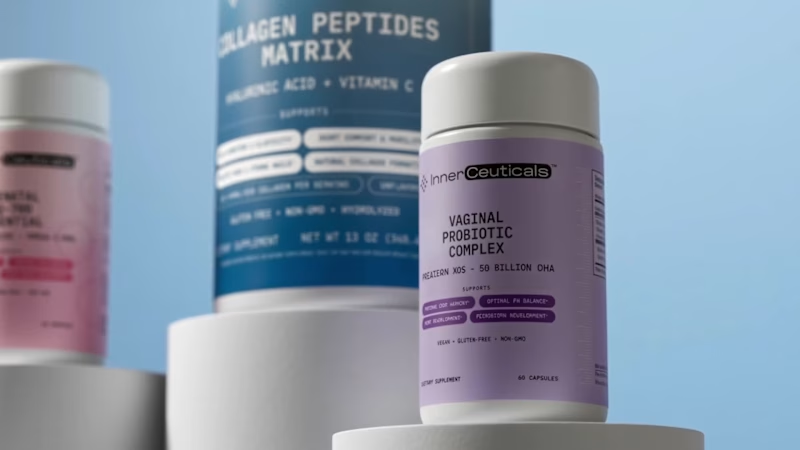
Everbloom / Packaging Design / Supplements
22
843
Message
22
Alec Minimalec
pro
Rebranding uBloom | Creative Agency
22
403
Video editor projects
Video editing
Creative video edits made using today’s best editing tools
View more
Message
23
Nikita Skopych
max
CatchBack Product Launch Explainer Video
23
1.3K
Message
21
Jen Lai
pro
Boop | TikTok Content and Strategy
21
726
Message
11
Diego Rotmistrovsky
max
Replit Summit Loop Video Project
11
263
Message
9
Janès Zabukovec
Video for neuroscientific research paper on Stereotypes
1
9
414
Standout projects
Standout projects
More projects we love that are making waves across the web
Message
10
Priya Verma
pro
What if the Krusty Krab hit the road? 🍔🛻 I reimagined the iconic Krusty Krab as a real-world food truck and brought the idea to life with Squarespace. From playful visuals and custom illustrations to an immersive scrolling experience, every section was designed to capture the charm and nostalgia of Bikini Bottom. I also used Finish Layer to add animations, hover interactions, layered visuals, and smooth transitions that make the experience feel more dynamic and engaging. 🔗 Website: https://cardioid-helicon-94jp.squarespace.com (https://cardioid-helicon-94jp.squarespace.com)🔒 Password: square
4
10
783
Message
32
Bryan Nakache
pro
MINITEL DU SUD — La légende se reconnecte 🖥️📞 The idea: what if France's heritage sportswear house revived the Minitel — the terminal that connected millions of French homes from 1982 to 2012 — the way a maison reissues an archive icon? Making it real: a numbered edition of 50, hand-restored in Marseille, with a full campaign world, a working storefront, and a soundtrack — built end-to-end on Squarespace 7.1 / Fluid Engine. How Finish Layer made it real: Font Uploads — a custom pixel typeface as the "machine voice": title, ticker, teletext annotations. No code injection. Block layering — the serif headline interrupted by the machine; the campaign broadcasting inside the terminal's screen, video layered under the frame. Pinned hero text — the composition holds through the scroll. Block Animations — hover reveals hide edition serials behind the campaign cards (N° 07/50 — RÉSERVÉ). Block Hiding (Mobile) — desktop gets the theater; mobile gets a streamlined vertical flow. Beyond the layout: a fully functional storefront built with real commerce settings — 50 units in inventory, limit 1 per order, so the scarcity story is enforced by the system, not just the copy. (Concept project: nothing ships, no payments are processed — the store demonstrates the commerce build.) Plus an original French-electronic track — the hold music of 1990, composed for the terminals — closing with a scroll-scaled banner: « MONTE LE SON. » Toolkit: Midjourney (campaign imagery, locked style refs) · Departure Mono by Helena Zhang (SIL OFL) · Suno (soundtrack) · SquareKicker (window reveal, horizontal scroll, scroll-scale banner) 🔗 minitel-contra.squarespace.com (http://minitel-contra.squarespace.com) — password: 3615 (the dial code, of course) Projet conceptuel — not affiliated with Orange S.A. Minitel is a trademark of its respective owner. #squarespacechallenge
8
32
1.1K
Message
6
Oleg Savchuk
andGather – Landing page
2
6
149
Message
9
Monodeep Samanta
pro
Retro Reel Timer — Minimal Cartoon UI A playful reinterpretation of a classic reel-to-reel timer, redesigned with a softer colour palette, simplified shapes and a clean cartoon-inspired visual style. The interface keeps the nostalgic character of analogue recording equipment while presenting the controls in a modern, friendly and easy-to-understand layout. The design focuses on strong visual hierarchy, balanced spacing and clear interaction states. Bold timer typography, rounded controls and subtle depth help the interface feel approachable without becoming visually cluttered, creating a distinctive concept suitable for a mobile timer, audio recorder or productivity application.
9
155
Message
13
Austyn McFadden
pro
This logo mark began with research into South African heritage. I kept returning to the country’s flag, especially the green Y-shaped form at its center. I isolated that shape, refined it, and rotated it around a central axis until each piece aligned into one balanced symbol. The result feels warm, natural, and rooted in heritage, while still giving the skincare brand a modern and distinctive identity.
6
13
135
Message
3
Nick Zoutendijk
pro
I've shared some 375ai work this week already, but there's one part of this project I keep coming back to: watching the same logomark hold up everywhere. When I was designing it, I was mostly worried about the small stuff, whether the mark would still read as an app icon or a favicon. Then a few months later it's 20 meters wide behind a speaker at an investors conference, and somehow it still feels like the same brand. The video shows how the mark is built, next to the actual lidar scans the product makes. That's where the dot pattern came from in the first place, so it never felt like decoration to me. Curious how other designers approach this: do you start from the smallest size a logo has to survive at, or design the big version first and scale down?
2
3
134
Message
56
Alec Minimalec
pro
My entry for the Envato × Contra Human by Design challenge. AI has changed the game and made almost anything possible. But just because you can make anything doesn’t mean you always know what to make. For this one, I took one simple piece of Envato’s identity, the logo, and pushed it as far as I could with one goal: make a pretty sick ad. From there, it was a lot of experimenting, prompting, failing, refining, and eventually bringing all those ideas to life using Envato’s AI tools. The result is my take on Human by Design. AI can give us endless possibilities, but someone still has to come up with the idea and decide where to take it. 100% created using Envato’s AI features.
29
56
1.9K
Message
22
Markus W
For this challenge, I wanted to create more than just a logo or a promotional asset. I wanted to build the foundation of a brand. Runner Community is a concept for a global community where runners can discover races, connect with local running communities, and find inspiration through events, training, and shared experiences. To bring the idea to life, I used Envato Elements as my primary creative toolkit, including: AI Image Generator AI Video Generator AI Mockups Website Templates Video Templates Music Sound Effects These resources helped me rapidly explore ideas and create professional visual assets. I refined the prompts, selected different visual styles, adjusted the color palette, rejected multiple AI-generated concepts, and curated only the assets that aligned with the brand I envisioned. I also chose the pacing, music, mockups, and final promotional sequence to create an energetic yet approachable identity. Breakdown provided in the comments.
7
22
721
Message
25
Sílvia Pinho
max
oof! finally able to share the final piece!! if you haven't been keeping up with my updates: ⭐ on day 1 I brainstormed alongside Gemini, merging my ideas with theirs and ending up with an outline of what I wanted to do for this challenge ⭐ day 2 I collected the raw footage I filmed and started putting together a folder with all my assets ⭐ day 3 I dove into Envato for the first time in years and found stock video, music and sfx, and used AI to alter both one of my own clips and a stock one ⭐ day 4 was for the final touches, where I recorded the voiceover and put all the other assets together into the video you can see below - my final submission! (I also attached a screenshot of what my final project folder looked like - organized by source of each asset) my biggest AI win was definitely the clip where I asked it to replace my water bottle with the coffee machine and it mimicked my rings and tattoos without me even asking my AI flop, where I decided to intervene because AI just didn't do it justice, was the voiceover - it just felt off and emotionless, and instead of trying to tweak it to perfection I decided to just pick up the mic and do it myself! I'm also gonna be sharing this final video on my Instagram @freelancingwithsilvia - feel free to follow me there for all the freelancing vibes 🤩
6
25
523
Message
10
Enmanuel Jimenez Veloz
MOONIQ — Visual Identity System Mooniq is a leading digital marketing agency specialized in social media, blockchain, and Web2 consulting. Its new identity reflects a bold and futuristic vision, inspired by exploration and constant innovation. A system built to express ambition, trust, and elegance, positioning Mooniq as a guide for brands reaching new heights. The brand required an identity that could embody its innovative spirit, strategic mindset, and futuristic vision. This visual identity was designed to capture Mooniq’s essence: a forward-thinking agency inspired by the concepts of exploration, technology, and limitless growth. Every element of the system —from the logo to the typographic and chromatic choices— was created to establish a sophisticated and aspirational brand presence. 2025© - Jv® Studio. — Enmanuel Jimenez V. All rights reserved. Featured project in Graphic Design / Branding by @behance (https://www.instagram.com/behance/)
7
10
171
Message
27
Kris Anfalova
pro
Terra — AI Environmental Risk Platform Designed the landing page and product UI for Terra — a platform that helps land developers and engineering teams see environmental risk (soil stability, tree canopy loss, water table depth) before breaking ground. The challenge: Development decisions are usually based on estimates, not real ground data — and by the time issues show up, it’s often too late to reverse them. The interface needed to make complex sensor/AI data feel immediate and trustworthy, without losing emotional weight. The solution: Raw, organic photography (wildflowers, grass, natural terrain) paired with clean glass-panel data cards — creating a visual tension between “nature” and “precision engineering.” Bold editorial typography carries the emotional message, while translucent metric cards surface real numbers: soil stability, canopy loss %, water table depth. A strong example of turning dense environmental data into something a non-technical stakeholder can understand in seconds.
10
27
562
Message
18
Domenico Amalfitano
Apocrypha: Human by Design For the EnvatoChallenge, I wanted to explore a different relationship between AI and creativity. I created Apocrypha, a collectible card universe where every artifact begins as an AI-assisted concept but only becomes part of the archive through human taste, creative direction, and design. Instead of asking AI to create finished pieces, I used Envato as the main creative toolkit throughout the entire project. I explored its stock image and video library to build moodboards, collect textures, study compositions, and define the visual language of the world. I also used Envato AI to generate concepts for characters, artifacts, and environments, then refined, combined, and reworked them into a cohesive universe. Some of the concepts were even manually painted over to push them beyond the original AI output. Alongside the cards, I designed ArchiveOS, a living creative bible where I organize collections, lore, references, prompts, and every creative decision behind the project. It became the place where the entire world of Apocrypha could grow consistently. The biggest creative decision wasn't generating images. It was deciding what deserved to exist. Knowing when an idea felt wrong, when an artwork needed more work, when a concept should evolve, or when it should be discarded completely. AI gave me possibilities, but every final artifact exists because of human judgment. I'd love to hear what you think about this approach to AI-assisted worldbuilding.
4
18
456
Message
18
Kristaps Reinfelds
pro
Website for LA:MURE, a creative video production studio. The goal was to create a modern digital presence that reflects the studio's cinematic approach while putting its work and storytelling at the center of the experience.
9
18
501
Message
65
Kris Anfalova
pro
XPlace — Crypto-Backed Visa Card Website design Designed the interface for XPlace — a platform that lets users borrow against their crypto holdings and spend through a Visa card, without selling assets or triggering taxable events. The challenge: Create a product that feels both trustworthy and premium — avoiding the typical "startup" look, and steering clear of the neon/gradient clichés so common in crypto design. The solution: A dark, cinematic mood built around a monochrome landscape backdrop, bold expressive typography, and a metallic Visa Platinum card as the central visual anchor. Minimal elements, maximum focus on one action: get the card. What's in the interface: — Full-bleed hero section with an atmospheric background — Large-scale headline that communicates value in seconds — 3D card render as a trust-building element — Transparent glass-effect header Built in Framer — this isn't just the landing page, there are several more screens and flows I'll share case study separately 👀
25
65
1.3K
Message
19
Razvan ANTALUCA
pro
Back from vacation and back to creating. ☀️ Summer is a great time to take a break from deadlines and try out new ideas. Lately, I’ve been playing around with Cinema 4D simulations. I’ve mixed cloth, inflation, and dynamics to turn a regular sneaker into something fun and eye-catching. I think personal projects are the best way to quickly grow technical skills. Each experiment is a chance to discover new workflows, improve problem-solving, and bring fresh ideas to future client work. Always learning. Always experimenting. I’m excited to keep making more product animations and motion design projects. #Cinema4D #MotionDesign #3DAnimation #CGI #ProductVisualization #Redshift #Simulation #CreativeProcess #ProductAnimation #3DArtist
19
19
352
Message
22
Nick Zoutendijk
pro
GenLayer is a brand for thinking machines. So the identity had to think too. Instead of a static pattern I built a fluid animation system: lines that continuously flow into one another, the way AI evolves through new thoughts and ideas. One system, endless moments, the same waves that breathe on the website also carry a conference wall or a product reveal. That's my bar for an AI-driven brand style: not "does it look techy," but "does it behave like the product." Curious how other designers handle this: when your identity is animated or generative, how do you keep it recognizable without freezing it into a template?
7
22
441
Explore projects