Contra - A professional network for the jobs and skills of the future
Discover
Sign Up
Post a job
Sign Up
Log In
Filters
Projects
People
Filters
Featured
Web developers
Content creators
Graphic designers
Product designers
AI developers
Motion designers
Social media marketers
Animators
Video editors
Projects we love
Projects we love
Standout projects making waves around the web
View more
Message
9
Anna Peredelskaia
pro
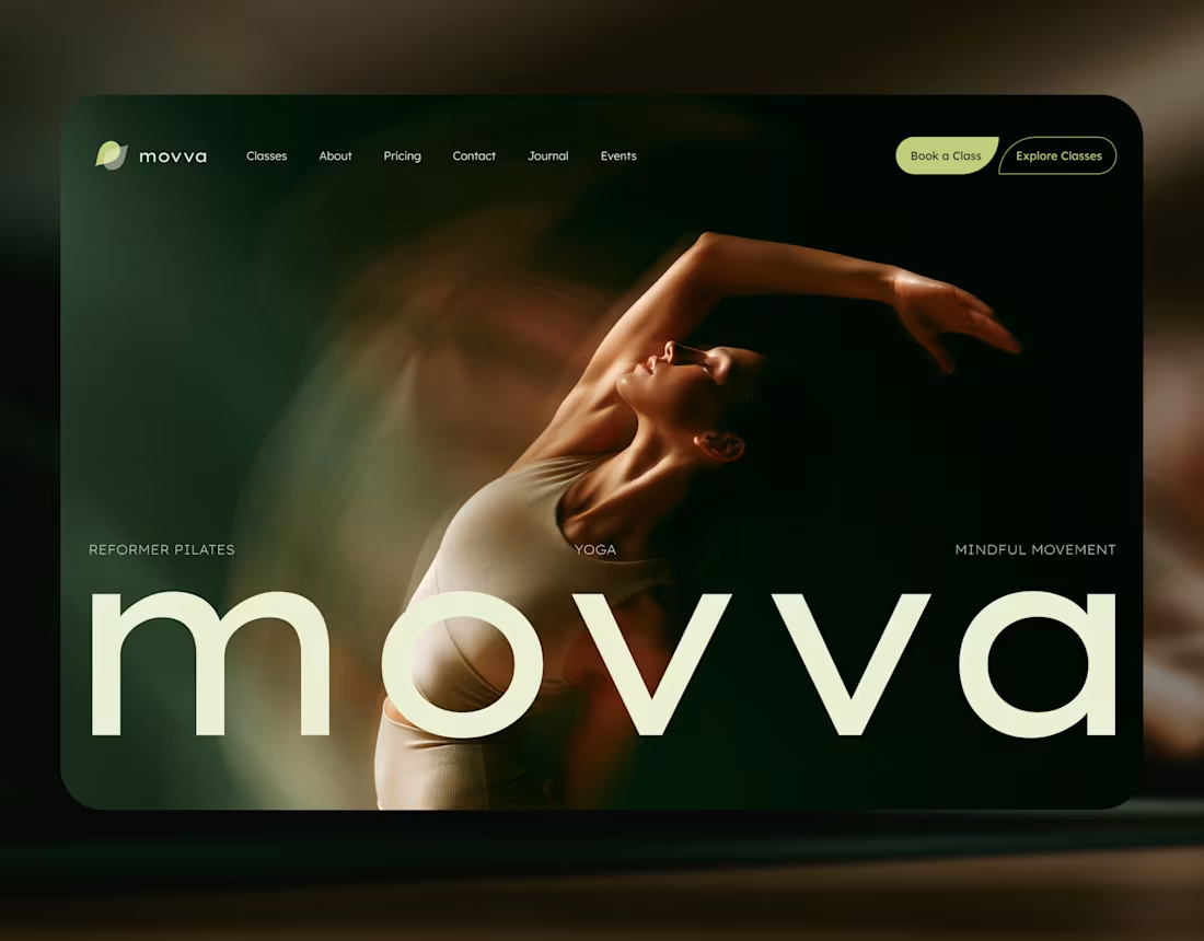
MOVVA — Yoga & Pilates Website Design and Webflow Development
1
9
102
Message
34
Maxim Zvarici
pro
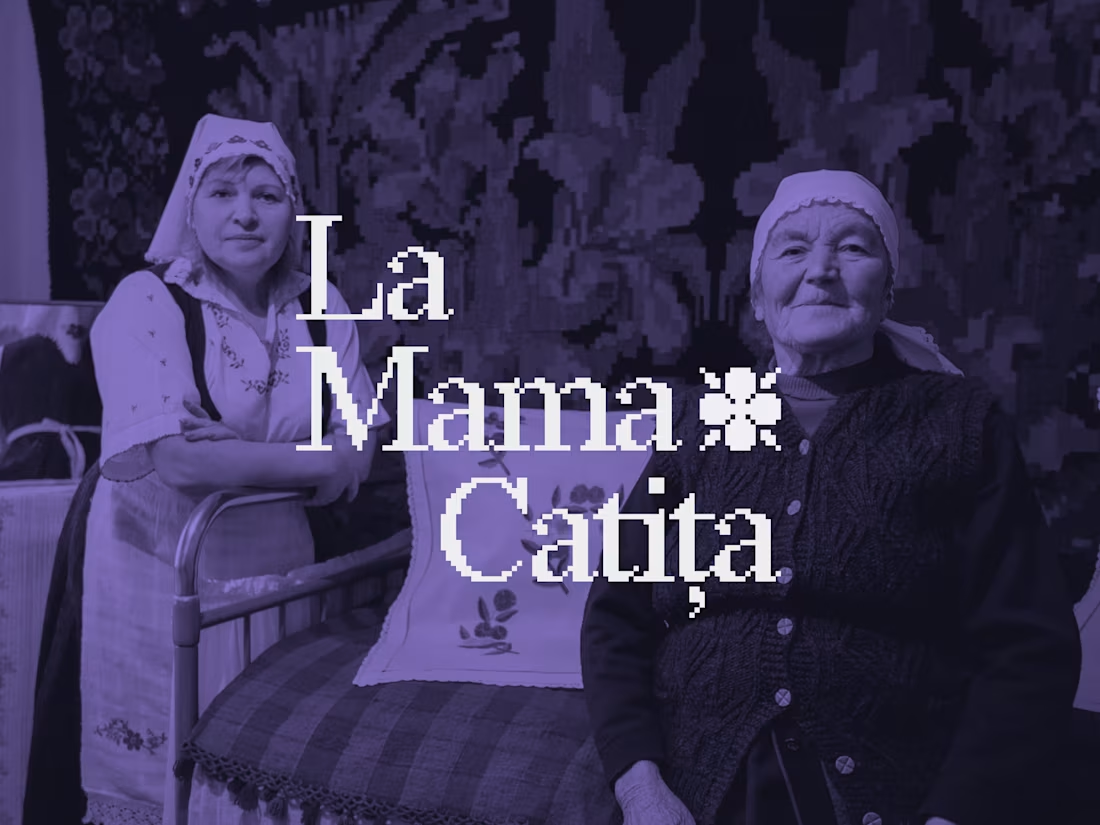
La Mama Catița Visual Identity Design
1
34
696
Message
17
Sasha Beglova
pro
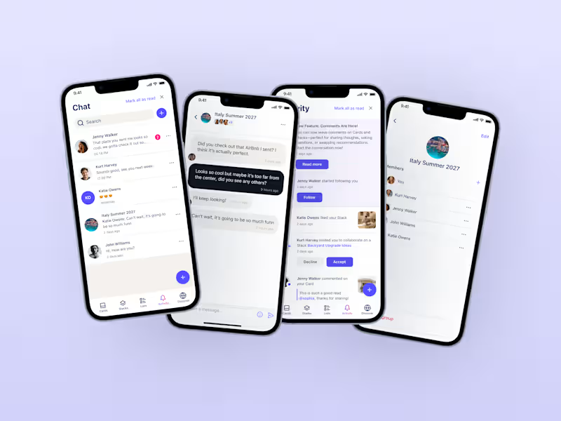
Stacklist | UI/UX & Graphic Design
17
450
Message
26
Flávia Jackeline
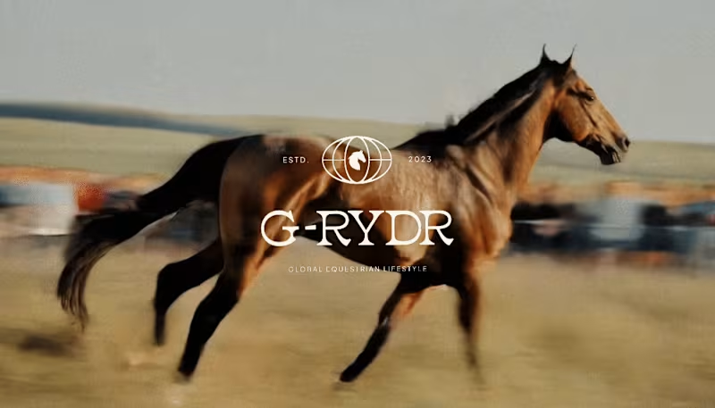
Visual Identity Design for G-RYDR — Equestrian Lifestyle
1
26
344
Web design projects using Framer
Framer
The best modern websites built on the leading web design tool, Framer
View more
Message
9
Kyle Panilan
max
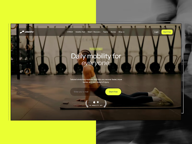
Framer Website for pliability: the #1 Mobility App in the World
1
9
656
Message
5
Domenico Griffo
pro
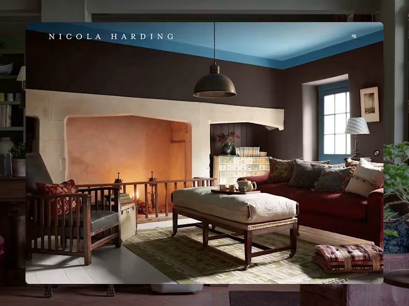
Nicola Harding & Co
5
121
Message
3
Rachel Cohen
pro
Starfish Studios Website Redesign
3
95
Message
14
Studio Ilker
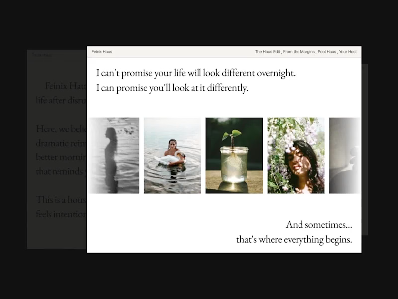
Feinix Haus Website
14
682
AI projects
AI
New projects from the best AI creators
View more
Message
10
Lisa Demchenko
max
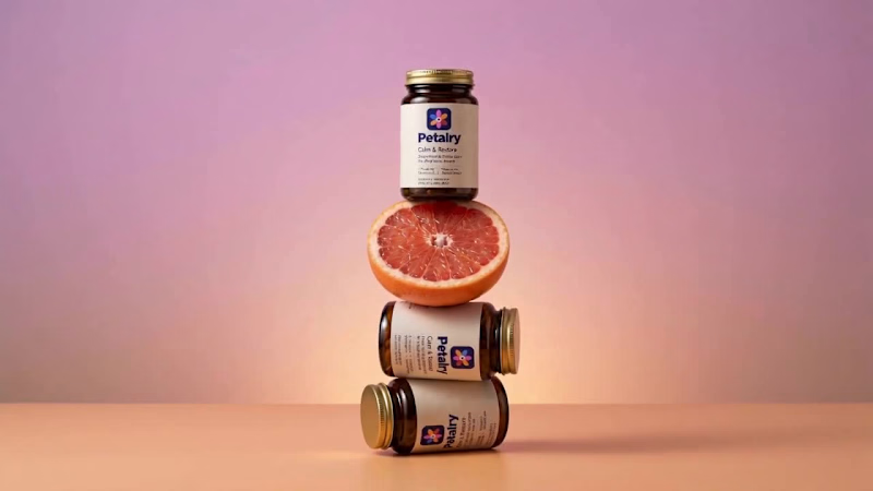
Petalry Brand Identity Development - Kittl exploration
10
334
Message
4
Alexandru Köllo
max
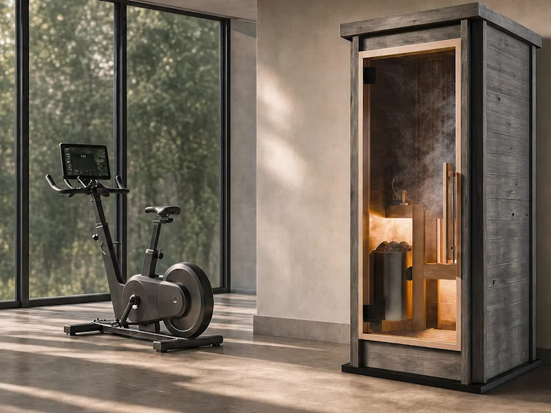
AI Product Visuals: Luxury Sauna Collection
4
136
Message
14
Darya Batyr ✦
max
Kotoba: Giving Voice AI a Human Visual Identity
14
289
Message
1
Viktor Gavrilovic
pro
MatchPro: Building soccer tournament schedules in seconds
1
96
Brand design projects
Brand design
Bold visual identities and branding systems created by top independent designers
View more
Message
7
Chantal Jemmott
pro
Label Redesign
7
177
Message
10
Olga & Joyd Branding ✦ Web Design
pro
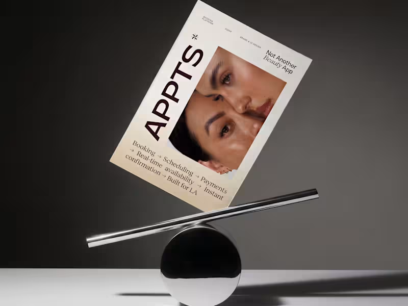
APPTS — Brand Identity & Mobile App Design
10
130
Message
8
Dane Kowachek
pro
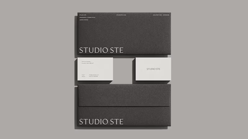
Brand Identity Development for Studio STE
8
76
Message
24
Daniel G Bright
max
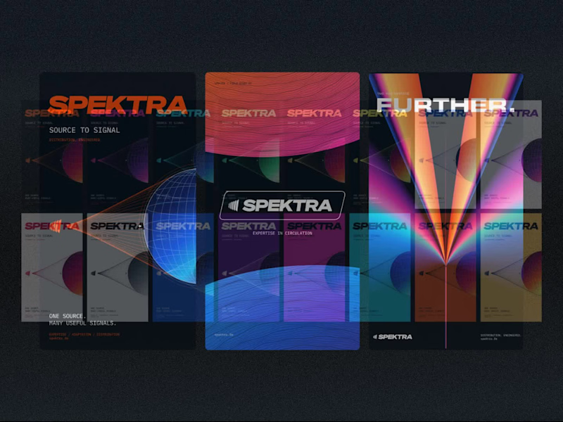
Spektra Visual Identity Development
24
417
Video editor projects
Video editing
Creative video edits made using today’s best editing tools
View more
Message
13
Jen Lai
pro
Gritzy | Social Media + OOH Animations
13
226
Message
11
Mykola Malyhin
pro
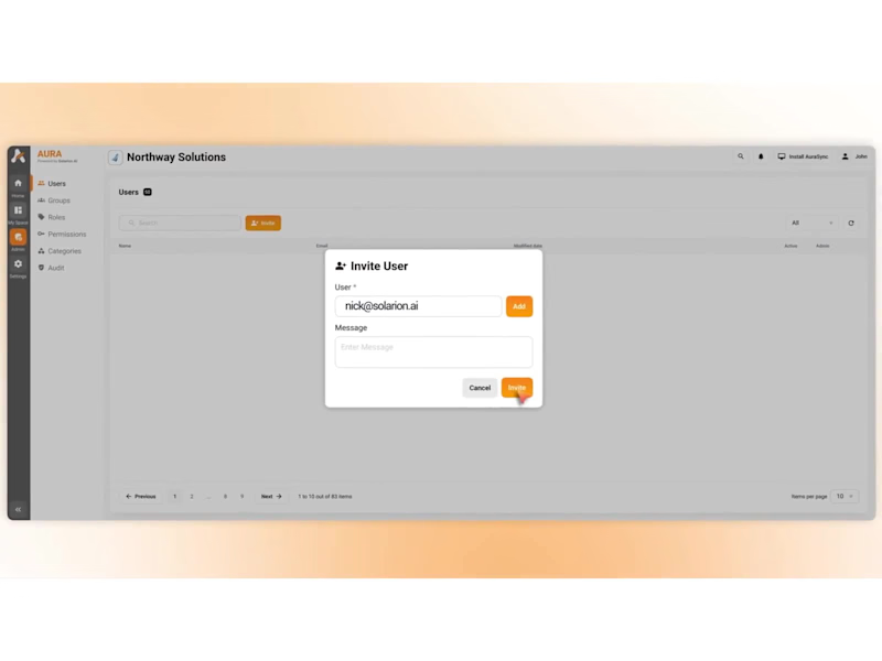
Aura | AI SaaS Explainer Video & Real UI Product Demo
11
95
Message
9
Bohdan Serdiuk
pro
Bolt New Slides V2 launch video
9
109
Message
9
Blahomyr Popok
max
Explainer video for PerformancePay - a motion design explainer
9
167
Standout projects
Standout projects
More projects we love that are making waves across the web
Message
18
Artem Prokhorov
Hourfield is a 16-second 16:9 launch film for products that organise people's time: calendars, schedulers, booking and reservation apps, planners. Retype a few short lines, drop in your logo and rename the calendar's days and tiles (meetings, table bookings, classes, shifts): the week re-plans itself on screen and the film lands on your logo lockup. Our second version, Maréva, a fictional table-booking app, turns the working week into an evening of reservations on the same animation and timing. Built end-to-end through the SVGator MCP server. The calendar that re-plans its own week, the orbit that swirls into a single dot and the lines centred by their real letter shapes (fonts measured, not eyeballed) were computed in Python and written straight into a live SVGator project as 780 editable keyframes; I directed every note and finished it in the canvas. Maréva was made the same way, on the same timeline. Everything stays a real layer: 50 live text layers, named elements (headline, logo, product-name, tagline) and one logo image animated in two moments. Yes, there is a lot to edit: every line of the story, a whole week of calendar tiles, a palette in nine roles. A full rebrand takes longer than five minutes, and that is the honest trade: it shows how much a single SVGator file can carry, and how MCP makes a detailed, story-driven film practical to re-make, not just to watch. Links: ▶ Template (SVGator) (https://app.svgator.com/editor#/38f06481b7ee4d7987f669dd4fcf9857)▶ Demo video, A → B (https://app.svgator.com/editor#/820156ed754342629978b29ce194eaa2)
8
18
1.3K
Message
34
Om Shukla
📰 FRONT PAGE A launch-day ad that puts your product on the front page. Tuesday, October 14. Late City Edition. A blood orange soda came back. Shelves cleared in eleven minutes. Officials urged the public to remain calm. Friday morning, a phone outlived the news cycle. Its charger was reported missing, presumed retired. Saturday, 12:01 a.m. Cold brew hit the shelves. Nobody went home. None of it happened. All of it made the front page. 🗞️ Every launch wants to be news. Most of them get a banner. I couldn't find a single newspaper in SVGator's template gallery. So I built one. The Bellbird Times. The Kestrel Herald. The Nightjar Post. Three papers. One template. Zero redraws. Retype the headline, swap the photo and the logo. Every word is live text. Every layer has a name. The motion never changes. So what's your headline? The press never stops. ✨ 🛠️ Built in SVGator with the MCP. 1,038 named layers, 8,440 keyframes.
30
34
3.2K
Message
22
Alex Romanenko
pro
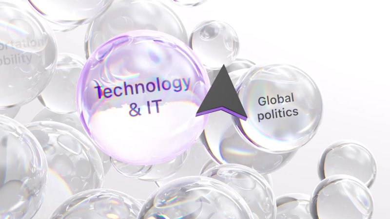
The brief was simple. Show a new personalized news feature. The obvious solution was to show a few clicks in the UI as you choose your topics. Clear, but not very interesting. So I pulled that moment out of the interface first and turned it into a cloud of topics. You get the idea before you even see the product, then the video drops you back into the real UI and shows where it lives. I really like these tiny decisions. The feature stays the same, but it feels easier to get and a lot more fun to watch.
1
9
22
361
Message
9
Maëlie Lusson
more about Figr!
1
9
116
Message
11
Maëlie Lusson
Figr rebranding, with Office Commun!
6
11
120
Message
9
Samuel MILARD
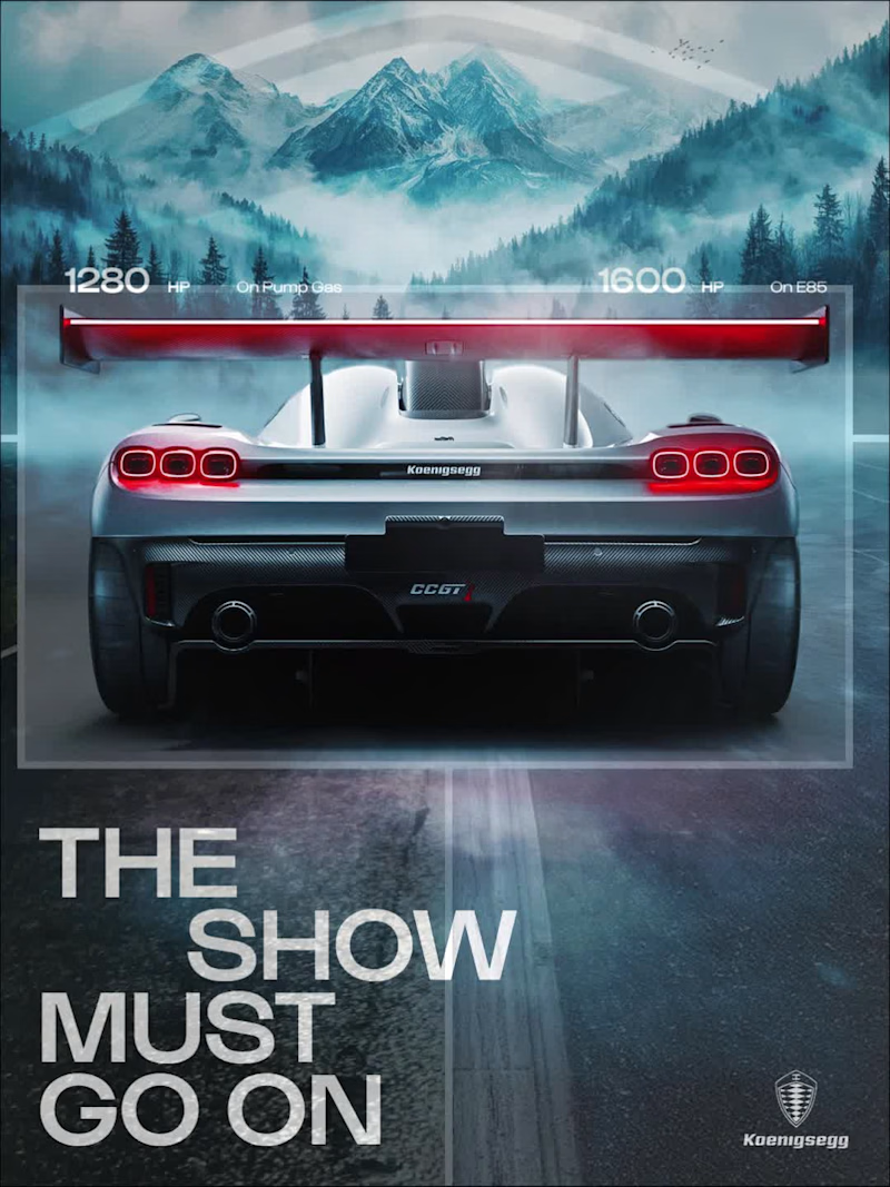
Designed this concept poster for the Koenigsegg CCGT1. Art direction, layout, grade: all mine.
4
9
95
Message
2
Konstantina Gkiouleka
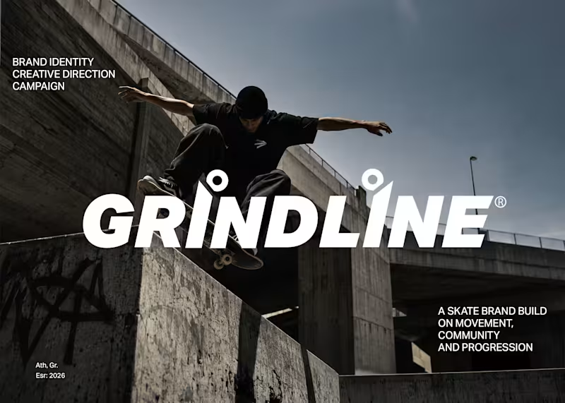
A skate brand needs more than a logo to stand out. Grindline needed a visual identity that could carry across its products, apparel, and packaging without losing its character. I developed the brand from the ground up, creating a cohesive identity and the supporting graphics needed to bring it to life across every touchpoint.
2
2
71
Message
16
Robert Kostrzewa
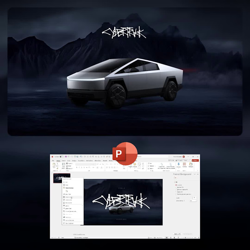
The presentation on top. The process below. ⚡ A behind-the-scenes look at my Tesla Cybertruck presentation, with the finished animation playing alongside a sped-up view of how I built it in PowerPoint. From arranging each slide to fine-tuning the Morph transitions, here’s the work behind the final result.
6
16
557
Message
31
Artis Lutkovskis
pro
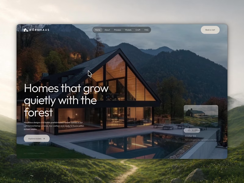
🌲 Nordhaus | Prefab Timber Homes Website (Framer) Homes that grow quietly with the forest, now on the web. 🏡 Nordhaus is a website for a Latvian builder of prefabricated timber homes, created in Figma and built in Framer as a responsive site for desktop, tablet and mobile. It brings the brand's calm Nordic character through full-screen photography, a scroll-driven process story, a horizontal model gallery and interactive testimonials. ✨ Template coming soon to Framer.
16
31
490
Message
14
Melina Chinni
pro
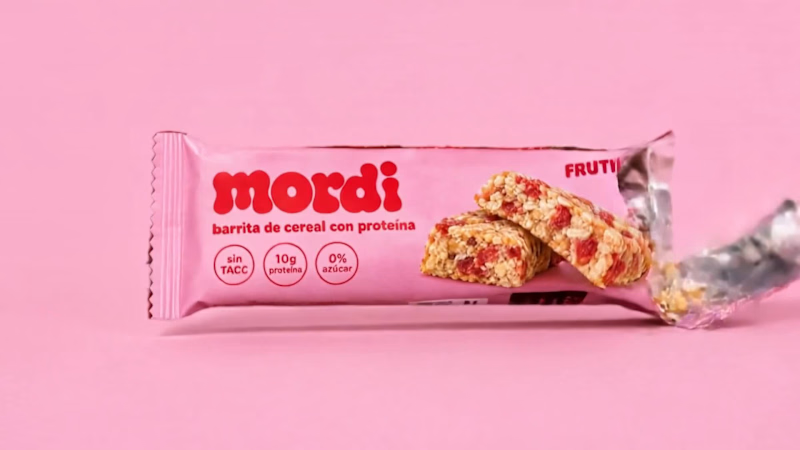
Brand New project🍓🍎🍒🫐 A colorful protein cereal bar brand for active young women. I designed the naming, logo, color system, packaging for five flavors, brandbook, social media posts and AI-generated product photography and video. The packaging was used as a reference in every image so the product looks exactly as designed.
12
14
210
Message
15
Kris Anfalova
pro
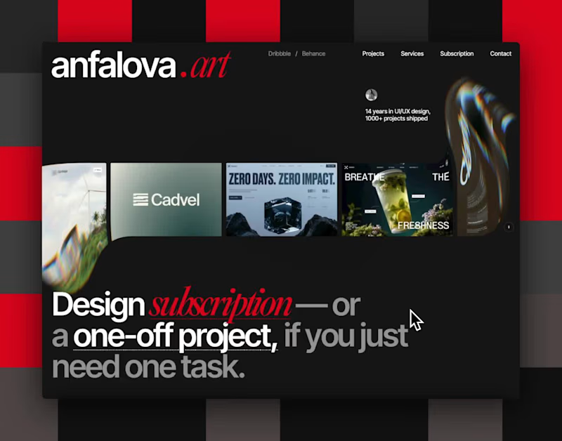
I built my site like it’s 2005 and I regret nothing. There’s a snake game on the 404 page that actually moves. A terminal that types itself out. And somewhere underneath all that — 14 years of UI/UX work and a design subscription, if you’re into that sort of thing. Vibe-coded, made with love. anfalova.art (http://anfalova.art). Go press buttons.
6
15
720
Message
18
Alex Romanenko
pro
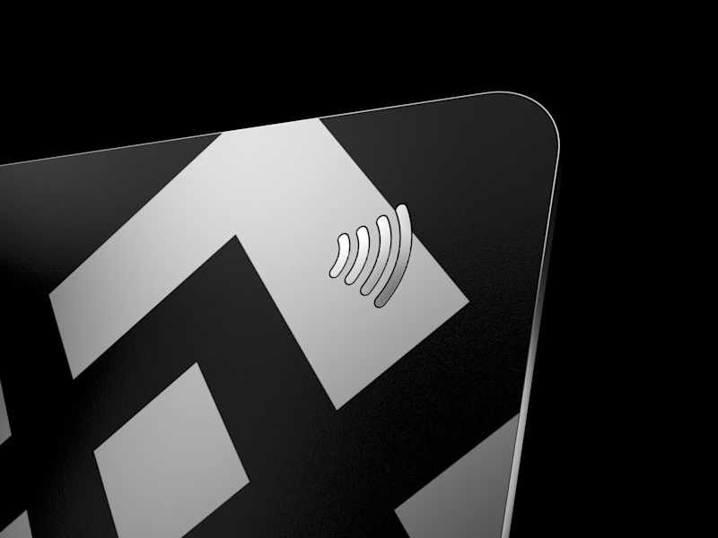
Public animation for Binance. What do you think guys?
1
11
18
414
Message
18
Saleha Younus
pro
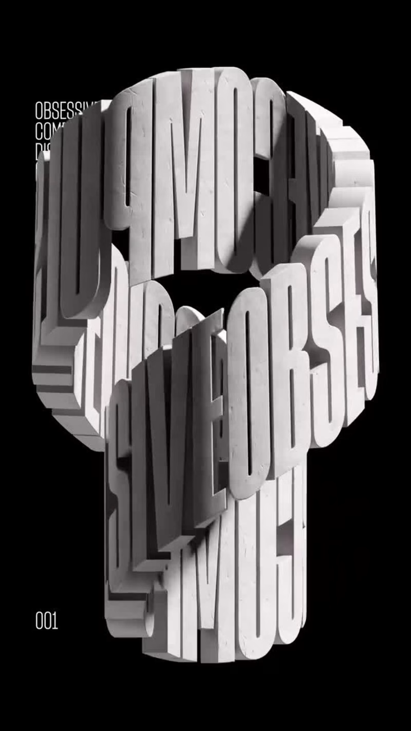
When Typography Breaks the Rules. 🖤 Bold 3D lettering, dramatic shadows, and twisted perspectives turn typography into an experience you can’t ignore. Would you call this art or an obsession?
13
18
442
Message
16
Austyn McFadden
pro
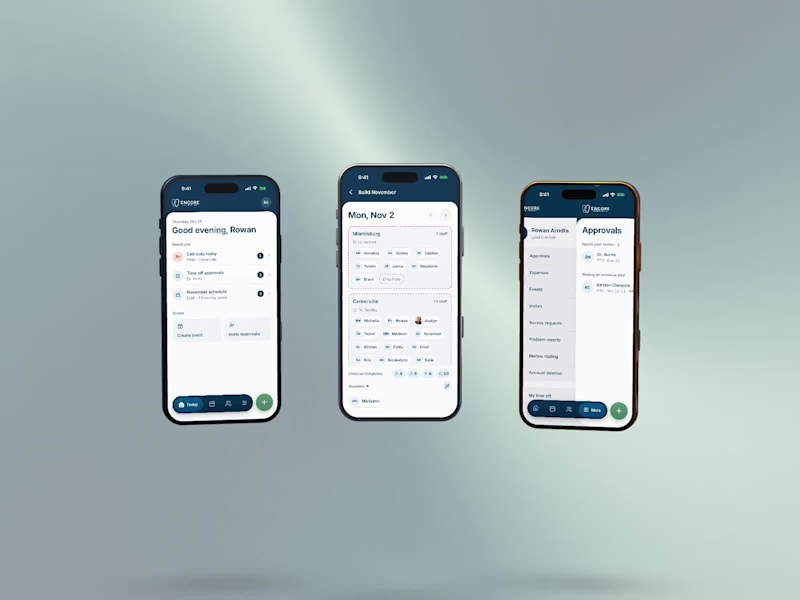
I designed and built Encore, a scheduling app for a three-office orthodontic practice, then made its launch film the same way I made the app: from the real thing. Every screen in the film is the live app, recorded on an iPhone 17 Pro simulator. I built the phones as 3D models in Rive, mapped the recordings onto their displays, and choreographed the camera, a three-phone orbit, and a closing wall of twenty screens on a single Rive timeline. No mockups, no After Effects. Swap a screen or retime a move and the film re-renders.
6
16
339
Message
16
Sana Yaqoob
pro
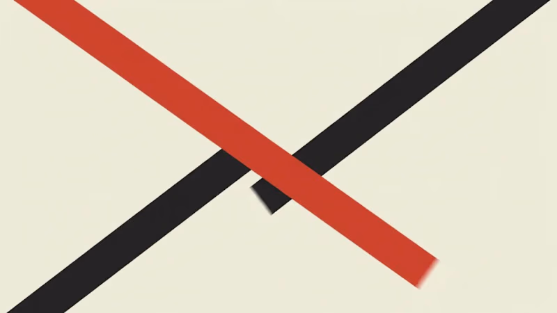
1286 CRAFT | Design in Motion From bold typography and experimental print textures to organic paper-cut compositions, this motion showcase explores how static graphic design transforms through movement. Each animation brings a different visual language to life while preserving its original creative identity. Three visual styles. One creative vision. #1286CRAFT #MotionDesign #GraphicDesign #KineticTypography #VisualStorytelling #CreativeDirection
6
16
852
Message
25
Kelsey Laurel Creative Studio
pro
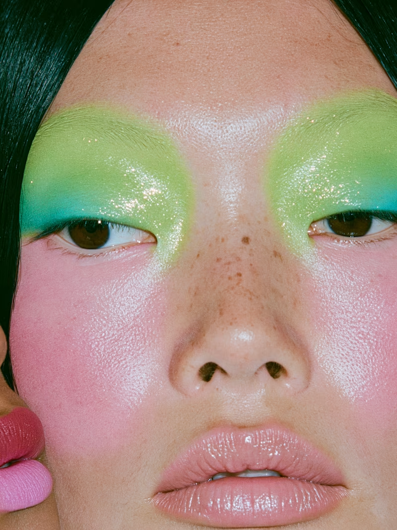
Chlorophyll: an 18-frame color story that moves from pastel to full saturation. Many models, many designers, held together by a single palette, built to read like an editorial where the images carry the story. Original artwork and visual storytelling by Kelsey Laurel Creative Studio.
8
25
376