Contra - A professional network for the jobs and skills of the future
Discover
Sign Up
Post a job
Sign Up
Log In
Filters
Projects
People
Filters
Featured
Web developers
Content creators
Graphic designers
Product designers
AI developers
Motion designers
Social media marketers
Animators
Video editors
Projects we love
Projects we love
Standout projects making waves around the web
View more
Message
13
Maxim Zvarici
pro
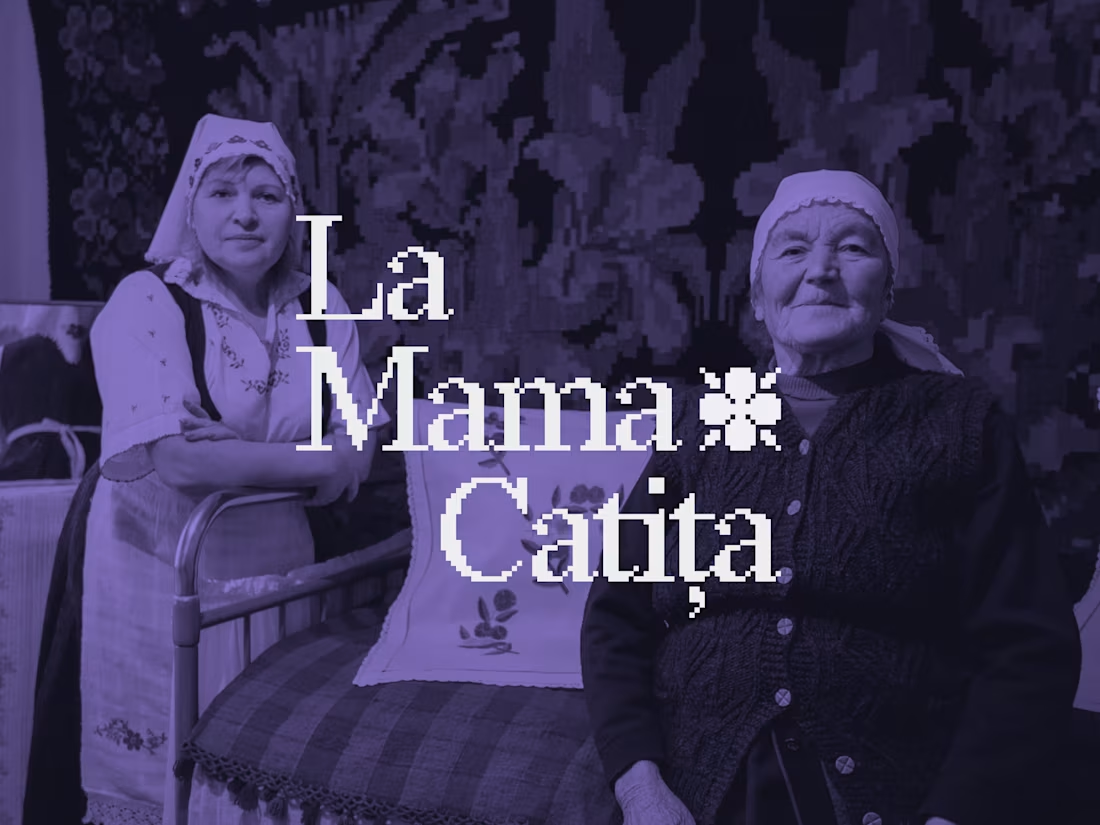
La Mama Catița Visual Identity Design
1
13
238
Message
7
Sasha Beglova
pro
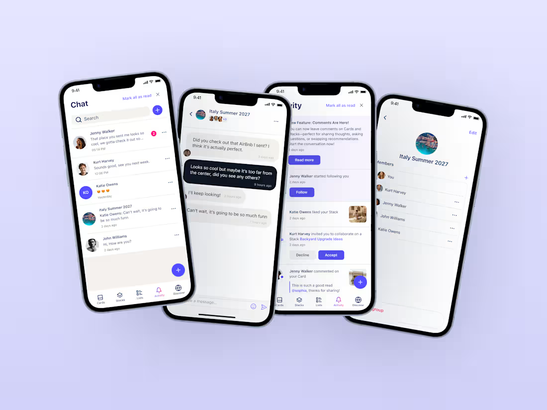
Stacklist | UI/UX & Graphic Design
7
145
Message
11
Flávia Jackeline
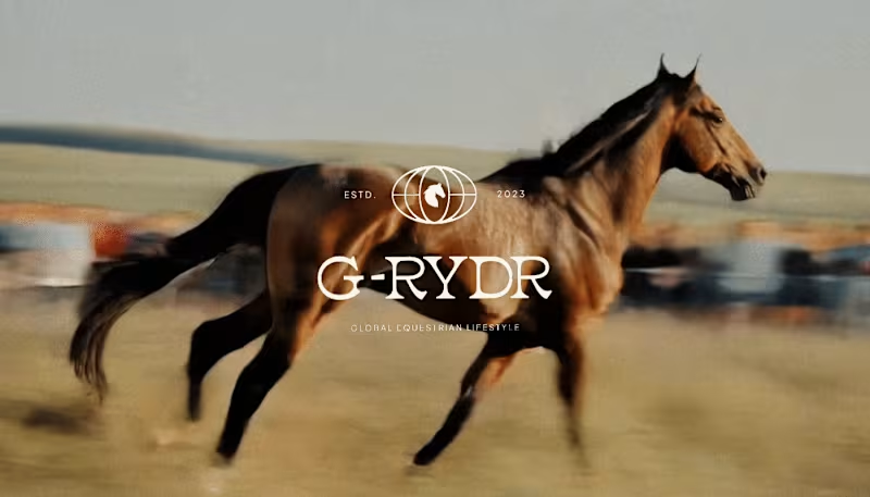
Visual Identity Design for G-RYDR — Equestrian Lifestyle
1
11
128
Message
13
Kris Anfalova
pro
Cadvel Brand Identity Design
13
117
Web design projects using Framer
Framer
The best modern websites built on the leading web design tool, Framer
View more
Message
3
Kyle Panilan
max
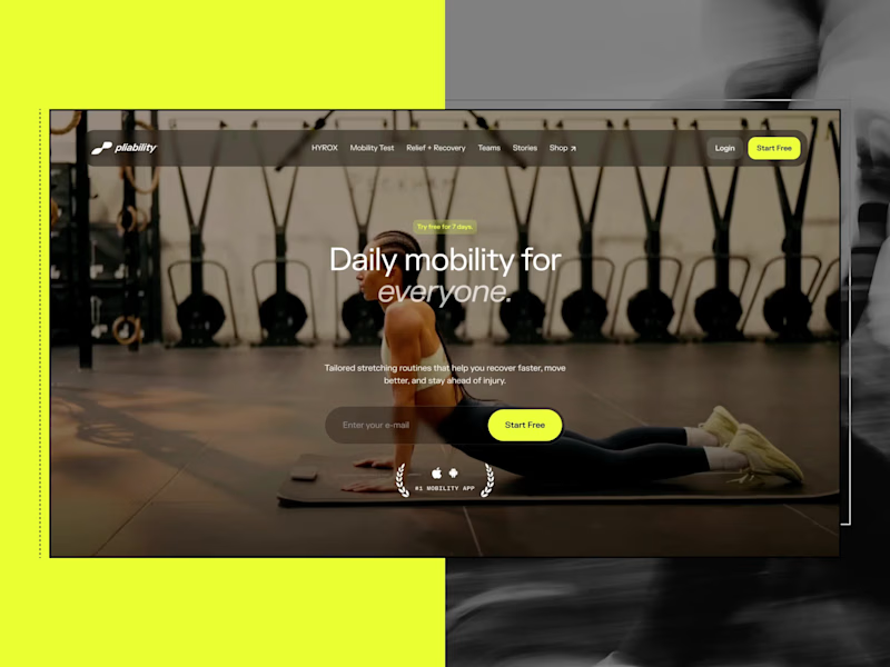
Framer Website for pliability: the #1 Mobility App in the World
1
3
270
Framer is the leading tool for building websites, fast
Hire experts
Message
2
Domenico Griffo
pro
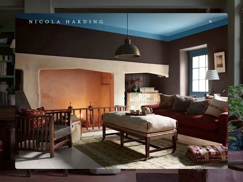
Nicola Harding & Co
2
38
Message
0
Rachel Cohen
pro
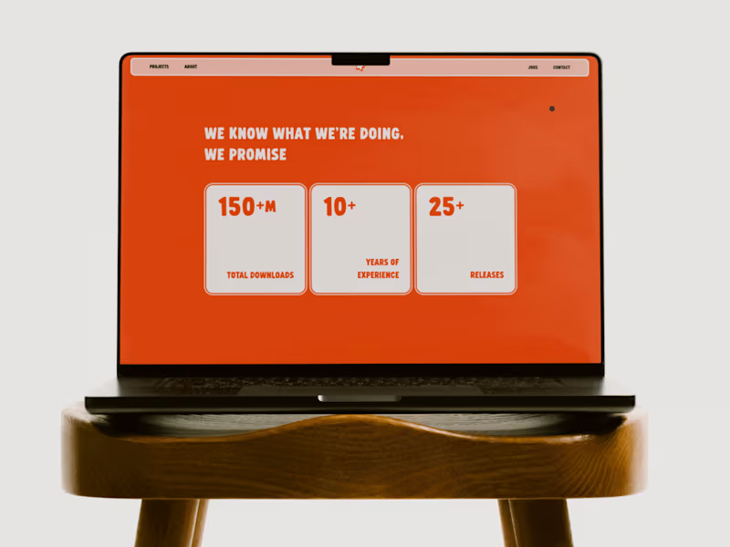
Starfish Studios Website Redesign
0
23
AI projects
AI
New projects from the best AI creators
View more
Message
4
Lisa Demchenko
max
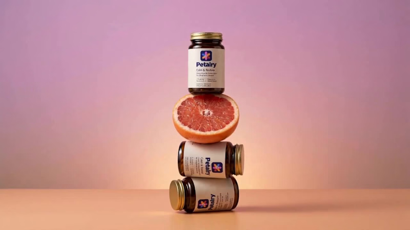
Petalry Brand Identity Development - Kittl exploration
4
113
Message
2
Alexandru Köllo
max
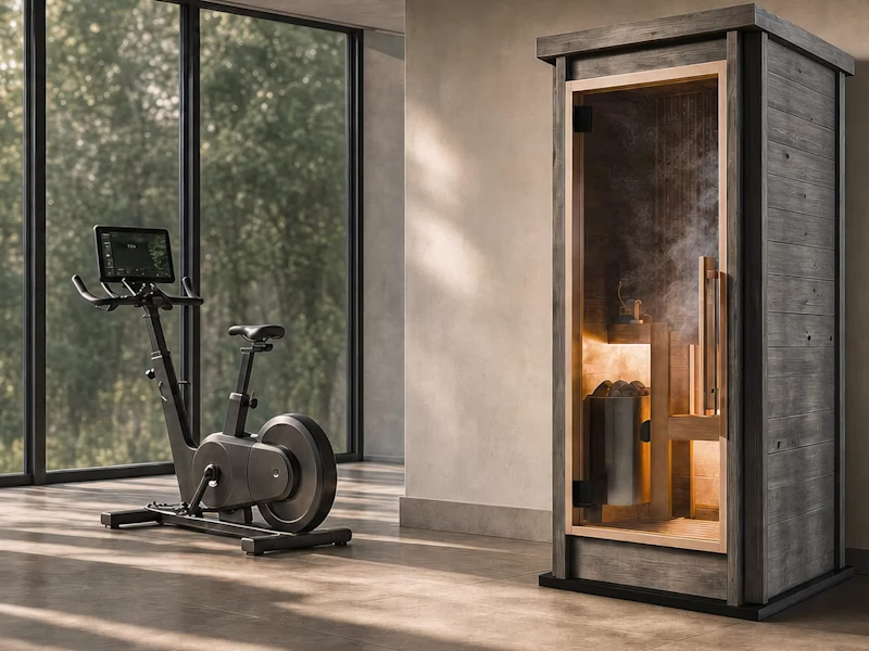
AI Product Visuals: Luxury Sauna Collection
2
43
Message
4
Darya Batyr ✦
max
Kotoba: Giving Voice AI a Human Visual Identity
4
118
Message
0
Viktor Gavrilovic
pro
MatchPro: Building soccer tournament schedules in seconds
0
32
Brand design projects
Brand design
Bold visual identities and branding systems created by top independent designers
View more
Message
1
Chantal Jemmott
pro
Label Redesign
1
64
Message
3
Olga & Joyd Branding ✦ Web Design
pro
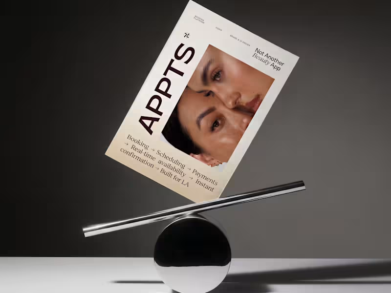
APPTS — Brand Identity & Mobile App Design
3
55
Message
3
Dane Kowachek
pro
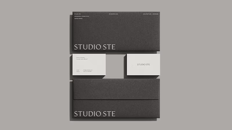
Brand Identity Development for Studio STE
3
34
Message
9
Daniel G Bright
max
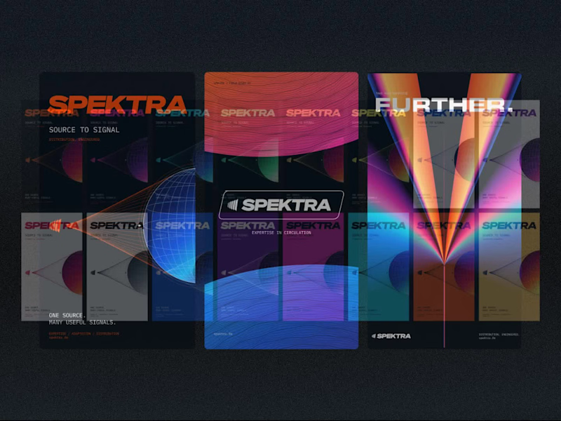
Spektra Visual Identity Development
9
187
Video editor projects
Video editing
Creative video edits made using today’s best editing tools
View more
Message
4
Jen Lai
pro
Gritzy | Social Media + OOH Animations
4
92
Message
7
Mykola Malyhin
pro
Aura | AI SaaS Explainer Video & Real UI Product Demo
7
34
Message
1
Bohdan Serdiuk
pro
Bolt New Slides V2 launch video
1
37
Message
3
Blahomyr Popok
max
Explainer video for PerformancePay - a motion design explainer
3
59
Standout projects
Standout projects
More projects we love that are making waves across the web
Message
9
Pavlo Tymoshenko
pro
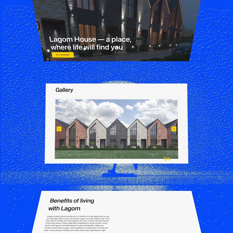
added to my portfolio. https://lagom.pash.website/
6
9
140
Message
22
Kota Studio
max
For me personally, an intro/loading screen is a must for every website I make. Same with a subtle blur when opening a modal. Just blur, no dark overlay. It makes the site feel more premium imo. Wdyt? What's your favorite detail on your own sites?
9
22
669
Message
1
Great.co — Brand & Web Design Studio
max
Brand + web page design
1
1
39
Message
8
Gabriel Obholz
pro
Dropdown Animation
2
8
96
Message
7
Noel Dario Andres
pro
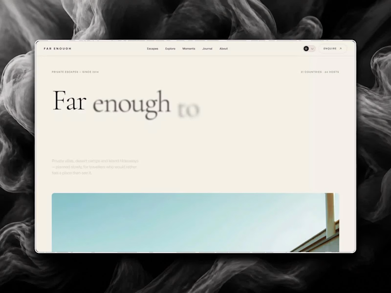
I just released FAR ENOUGH, a free Framer template for luxury travel. 🌴 Minimal on the surface, a lot of motion underneath: → an endless drag-to-explore masonry grid → a 3D Instagram carousel → a scroll-driven curtain gallery → an image trail that follows your cursor → light and dark mode with one click 10 pages, 4 CMS collections, fully responsive, with a reduced-motion fallback. Every animation is editable in the properties panel, no code needed. Made for travel studios, villas, retreats and anyone who wants a site that feels far away in the best way. Free on the Framer Marketplace: https://www.framer.com/marketplace/templates/far-enough/ Live preview: https://farenough.framer.website #Framer #FramerTemplate #WebDesign #FreeTemplate
6
7
115
Message
1
Huehaus Studio
pro
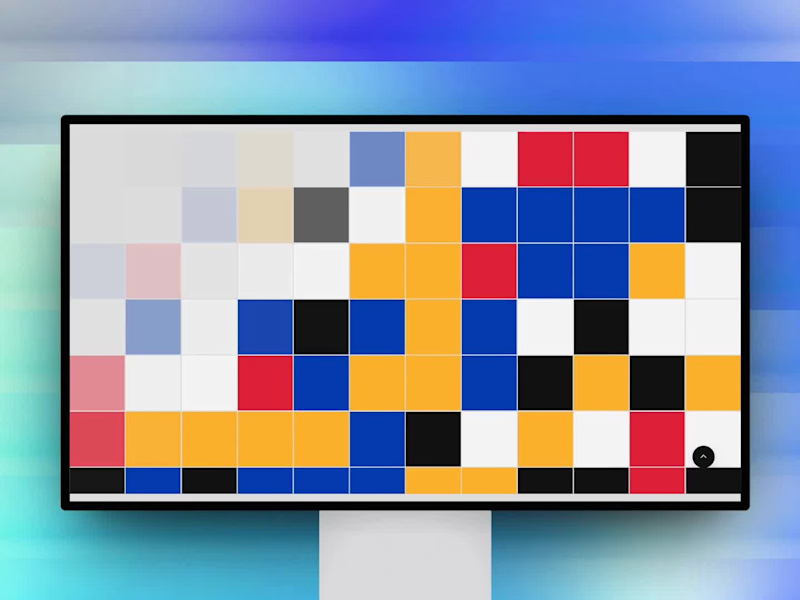
Mosaic: Curated Web Design Gallery Mosaic is an internal Huehaus project: a gallery that features one standout website a day. We built it because we spend a lot of time looking for good references and wanted a place that only showed work we'd actually recommend. Every site is picked by hand. The site is built in Framer. The layout is a simple grid that stays out of the way, with filters for 18 categories like Agency, Bold Type, Editorial, Minimal, and Dark Mode, so you can get from browsing to a specific reference quickly. Outcome: Mosaic is live and updated daily. It gives designers a reliable place to find references and gives Huehaus a presence in the design community, while showing what we can build in Framer. It's one of the original 128 sites featured in Framer Gallery.
1
1
19
Message
23
Kris Anfalova
pro
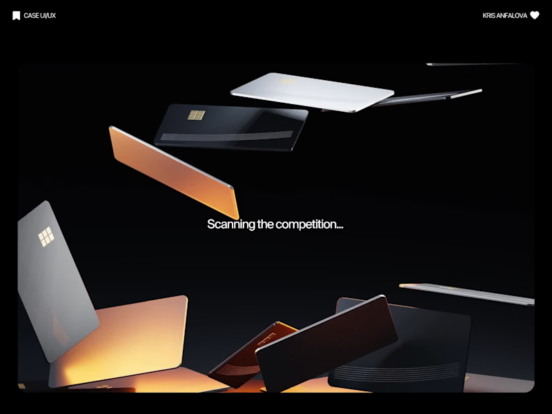
Credit card landing page design for a fintech startup — an interactive 3D claw machine that turns the offer into the hero instead of another floating card at 15 degrees. Every card brand ships the same hero: a card hovering over a gradient. Clawd sells one card, not a marketplace, and the entire pitch is "stop comparing — we already did the comparing". So the landing page had to make a single-product offer read as a win rather than a shortage of options, and pull early-access sign-ups from people who are deliberate about money: the ones who actually track spending and read the APR line. The metaphor does the positioning work. A claw machine that never misses, plus "we already picked the best one", means the visual is the argument and the headline doesn't have to explain itself. I built the scene in Blender as an interactive element rather than a still render — the claw follows the cursor, the card tilts in the grip, and the pile underneath reacts, so a visitor plays with the product's core idea for a few seconds instead of scrolling past it. Hero plus full page structure, desktop and mobile designed separately, the Blender scene with web-ready exports, interaction notes, and a developer-ready Figma file.
9
23
412
Message
10
Arda Kilic
pro
Doppel — Threat Graph Making complex cybersecurity concepts clear through motion. For the Doppel Threat Graph product film, I contributed to the visual development and animation. The product connects digital threats across multiple channels, revealing how individual signals form part of a coordinated attack campaign. The challenge was to translate this technical functionality into a clear visual narrative—showing why the connections between threats matter and how they help reveal the bigger picture. My work covered storyboard and motion exploration, animation, and scene refinement throughout the feedback process. The focus was on introducing information progressively and guiding attention toward the relationships central to the product’s value. The result is an animated product film that introduces Doppel Threat Graph and makes its core functionality easier to understand. The project demonstrates how motion design can bring clarity to a complex software product. Services: Storyboard Exploration · Motion · Animation
3
10
193
Message
9
Ticiana Lascano
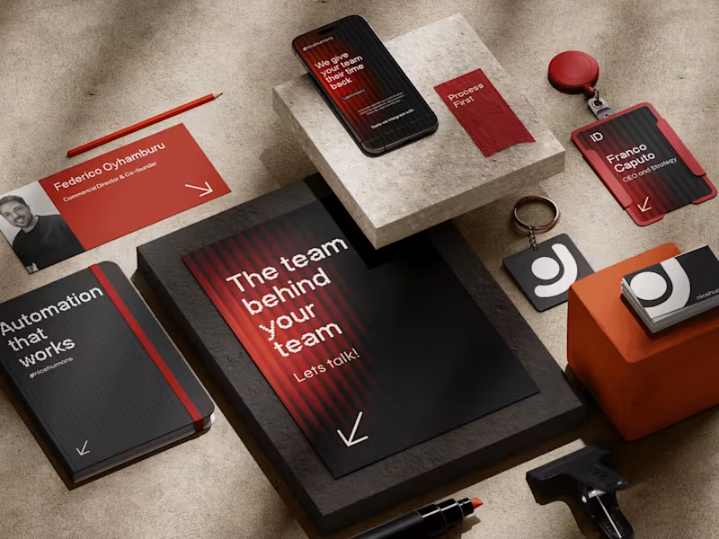
NICE HUMANS Making automation feel human. Context Nice Humans is a growing automation studio that helps teams streamline how they work. As they scaled, their brand no longer reflected the expertise or the people behind it. The challenge The automation market speaks in efficiency, systems and scale, and it often sounds interchangeable. Nice Humans needed to claim leadership in that space while standing for something competitors overlook: automation is ultimately about people. The approach Rather than starting with a logo, we started with a positioning: a team that builds for other teams. From there we developed a complete brand strategy, including archetype, tone of voice, verbal identity and a visual language. Each one was designed to balance technical authority with human warmth. The outcome A cohesive brand system that sets Nice Humans apart in a crowded category and gives them a clear, consistent voice to grow with.
6
9
101
Message
1
Huehaus Studio
pro
Miina Foundation: Website Design & Development Miina Foundation is a Canadian nonprofit based in Ontario. For 24 years, it has brought together volunteers, donors, and local entrepreneurs to support community projects in food security, housing, and education. Its work is built on relationships, and the website needed to reflect that. The concept we are going with is the hug and helping hands, the act of reaching out to give or receive support. It felt true to Miina's mission of bringing people together, building connection, and supporting community causes. Huehaus designed and developed the site in Framer. The structure follows the questions a visitor is likely to ask: what Miina does, what it has achieved, who it has helped, and how to take part.
1
32
Message
1
Huehaus Studio
pro
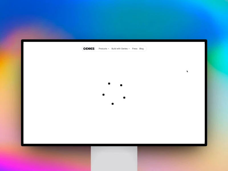
Genies: Website Design & Development Genies Inc. is an LA-based AI avatar company building the visual and embodiment layer for AI: characters that look, think, behave, and talk like living identities. Its audience is split between consumers who want to create and chat with their own characters, and developers and enterprises who want to put an AI persona inside their product. The website had to serve both without making either feel like an afterthought. Huehaus designed and built the site in Framer. We opened with a clear positioning line, "The character layer for any product," then gave each audience its own path: a creator route into Genies Chat and Studio, and a platform route into the SDKs and developer documentation. Outcome: A site that explains a technically complex product in plain terms and moves each visitor toward the right next step, whether that is chatting with a Genie, creating one, or integrating the platform.
1
1
34
Message
12
Aleksandar Coric
pro
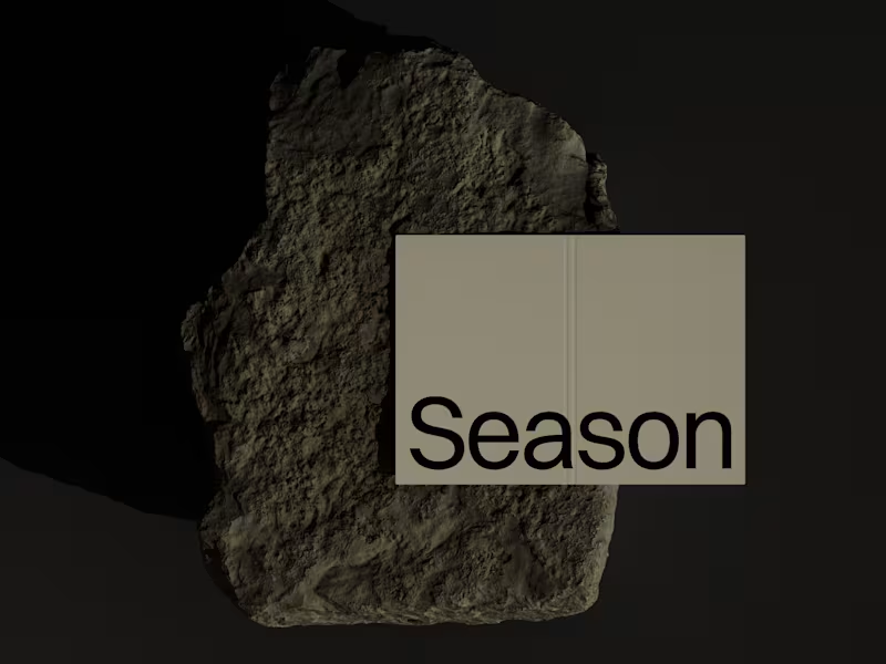
The Rebranding Challenge - Season Investments One of the key challenges was deciding what to change and what was worth preserving. Rather than starting from scratch, the new identity retains a visual connection to Season Investments’ heritage, but reframes it for a more contemporary and flexible brand system. A major improvement was creating a symbol that can work independently from the wordmark. This gives the brand a stronger presence across investment platforms, digital interfaces, profile images, and other compact applications where the previous identity was difficult to use. The result is a more adaptable system that moves the brand forward without losing its familiarity.
6
12
198
Message
14
Supreet S
pro
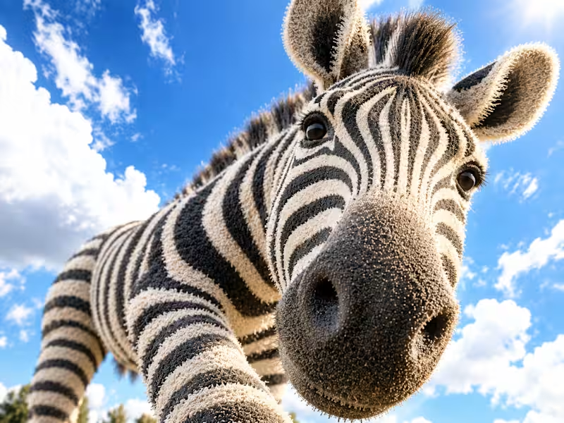
Working on something that genuinely cares for animals feels pretty special. Sharing a few early visuals from an upcoming case study I’ve been working on. More to come soon.
4
14
736
Message
58
Bella Brillantes
pro
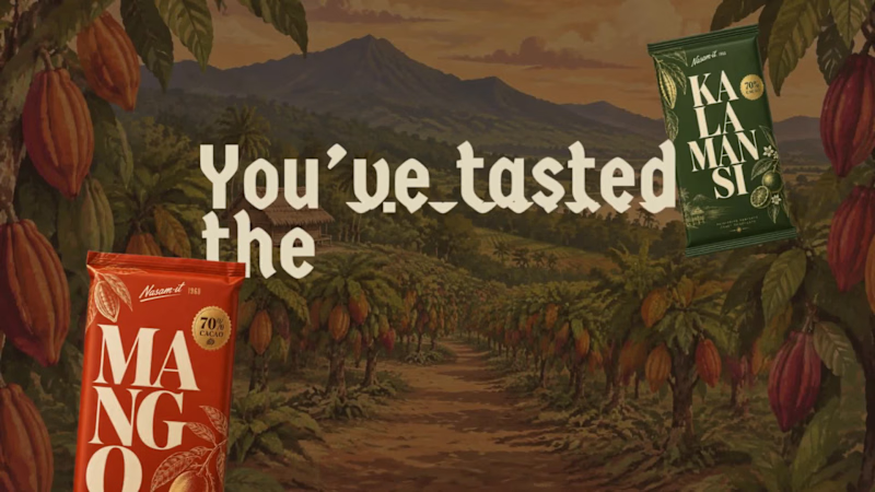
You've tasted the chocolate. Now, you want to see where it grows 🌳 Meet Nasam-it Farm, a family cacao farm in the Philippines, planted in 1960 by a grandfather who was told tobacco would pay better. His granddaughter brought the grove back as a bean-to-bar brand. Nasam-it is Ilocano for "sweet." The problem: Mimi spends her days fermenting, drying, and roasting, not on her phone 24/7, so inquiries go unanswered. Every missed message is a lost visit, and lost income for the farmers who tend the farm. So I designed and built a booking experience in that answers for her. Guests explore the farm in 3D, see what's happening this season, and choose a farm tour, a bean-to-bar workshop, or a volunteer day. The price updates as the group grows, a 30% deposit holds the date, and they're confirmed without a single message. By the time Mimi is back from the grove, the bookings are already waiting. I started with her, not the screens: her schedule, her signal, the quirks of a real farm (harvest-only volunteer days, group sizes, deposits to stop no-shows). The look comes from the farm itself, with cacao-pod maroon, banana-leaf green, and copy that sounds like a place rather than a platform. Check it out: https://nasam-itfarm.lovable.app/ (https://nasam-itfarm.lovable.app/)Booking made sweet! 🍫 #lovablechallenge
13
58
1.8K
Message
19
Kreativa Studio
pro
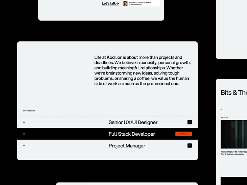
A few parts of the Kodilion website we worked on recently. Have a look at the whole shebang at https://kodilion.hr/
2
19
363
Message
55
Klym Yevtushenko
pro
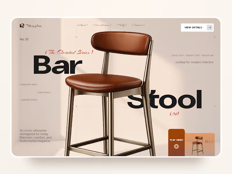
Mary Jane — Bar Stool Product Landing Page 🪑✨ A refined product landing page concept for a modern furniture brand, built around one statement piece The design combines warm neutral tones, oversized typography, and editorial layouts to give the bar stool a premium, design-focused feel Special attention was given to: • Product-first composition • Clean editorial typography • Warm premium aesthetic • Product details and features • Video and 3D presentation • Responsive mobile layout The result is a simple, elegant experience that keeps the product at the center while giving the brand a distinctive visual character 🤎
23
55
2K
Explore projects