Contra - A professional network for the jobs and skills of the future
Discover
Sign Up
Post a job
Sign Up
Log In
Filters
Projects
People
Filters
Featured
Web developers
Content creators
Graphic designers
Product designers
AI developers
Motion designers
Social media marketers
Animators
Video editors
Projects we love
Projects we love
Standout projects making waves around the web
View more
Message
10
Anna Peredelskaia
pro
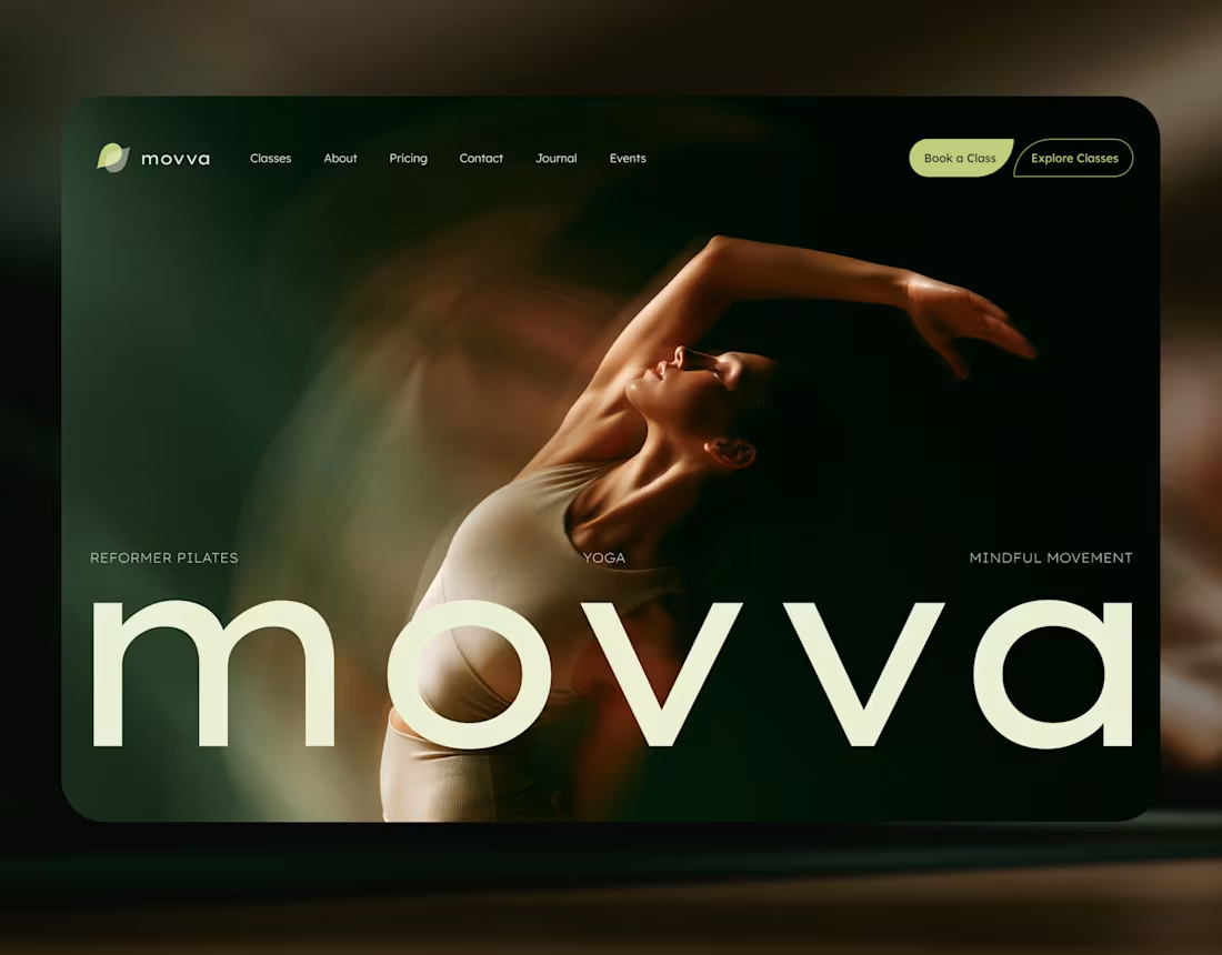
MOVVA — Yoga & Pilates Website Design and Webflow Development
1
10
137
Message
34
Maxim Zvarici
pro
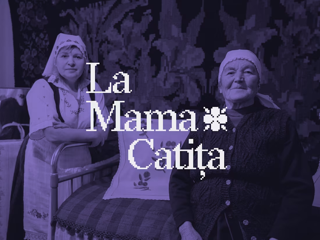
La Mama Catița Visual Identity Design
1
34
703
Message
17
Sasha Beglova
pro
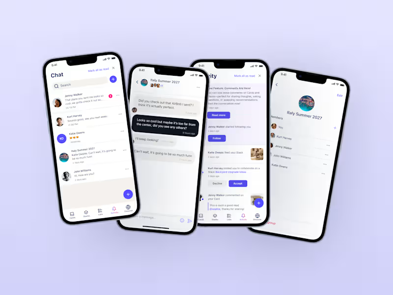
Stacklist | UI/UX & Graphic Design
17
463
Message
27
Flávia Jackeline
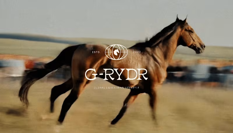
Visual Identity Design for G-RYDR — Equestrian Lifestyle
1
27
345
Web design projects using Framer
Framer
The best modern websites built on the leading web design tool, Framer
View more
Message
10
Kyle Panilan
max
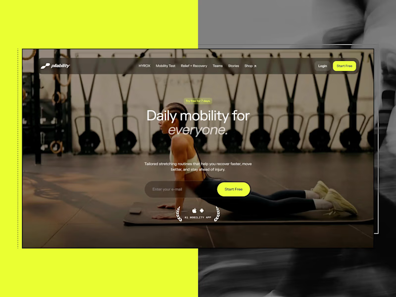
Framer Website for pliability: the #1 Mobility App in the World
1
10
668
Message
5
Domenico Griffo
pro
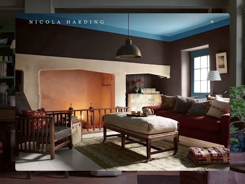
Nicola Harding & Co
5
126
Message
3
Rachel Cohen
pro
Starfish Studios Website Redesign
3
97
Message
14
Studio Ilker
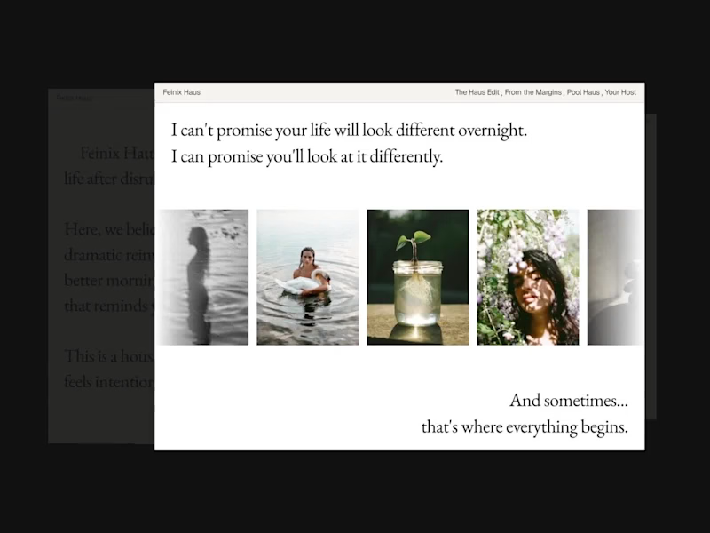
Feinix Haus Website
14
683
AI projects
AI
New projects from the best AI creators
View more
Message
10
Lisa Demchenko
max
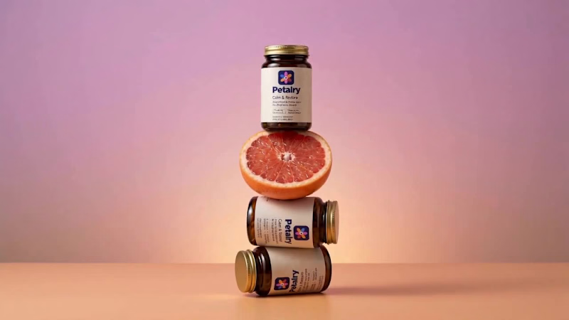
Petalry Brand Identity Development - Kittl exploration
10
343
Message
4
Alexandru Köllo
max
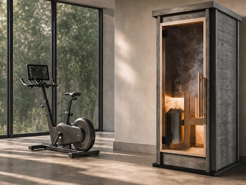
AI Product Visuals: Luxury Sauna Collection
4
142
Message
15
Darya Batyr ✦
max
Kotoba: Giving Voice AI a Human Visual Identity
15
296
Message
2
Viktor Gavrilovic
pro
MatchPro: Building soccer tournament schedules in seconds
2
103
Brand design projects
Brand design
Bold visual identities and branding systems created by top independent designers
View more
Message
8
Chantal Jemmott
pro
Label Redesign
8
181
Message
10
Olga & Joyd Branding ✦ Web Design
pro
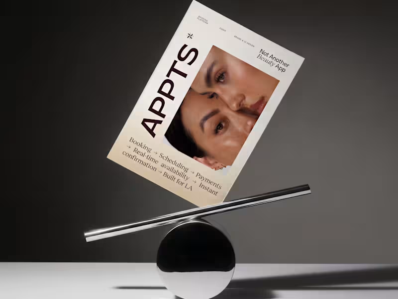
APPTS — Brand Identity & Mobile App Design
10
133
Message
8
Dane Kowachek
pro
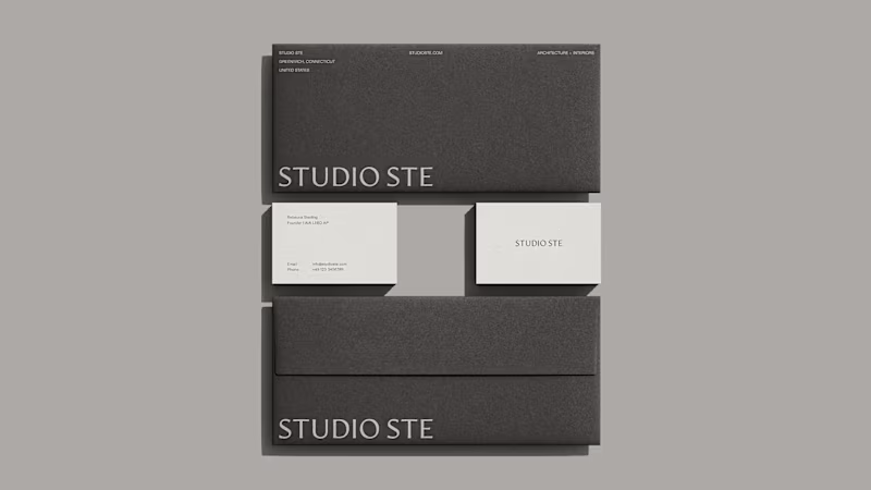
Brand Identity Development for Studio STE
8
80
Message
25
Daniel G Bright
max
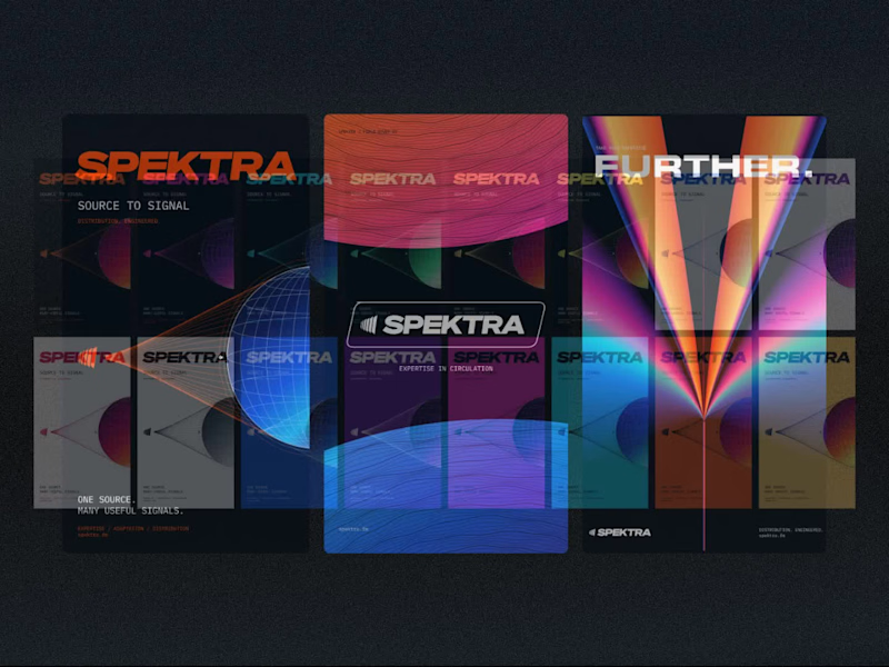
Spektra Visual Identity Development
25
425
Video editor projects
Video editing
Creative video edits made using today’s best editing tools
View more
Message
13
Jen Lai
pro
Gritzy | Social Media + OOH Animations
13
233
Message
11
Mykola Malyhin
pro
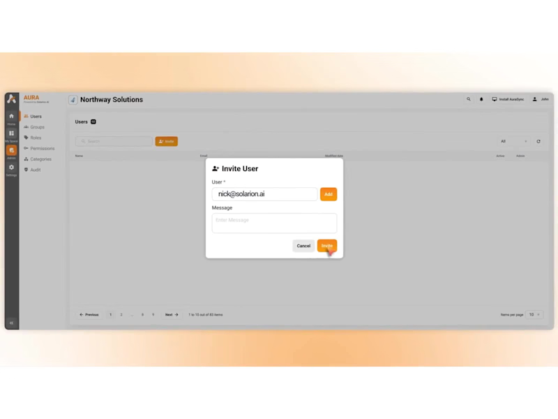
Aura | AI SaaS Explainer Video & Real UI Product Demo
11
105
Message
9
Bohdan Serdiuk
pro
Bolt New Slides V2 launch video
9
111
Message
9
Blahomyr Popok
max
Explainer video for PerformancePay - a motion design explainer
9
171
Standout projects
Standout projects
More projects we love that are making waves across the web
Message
7
Tanjim G
max
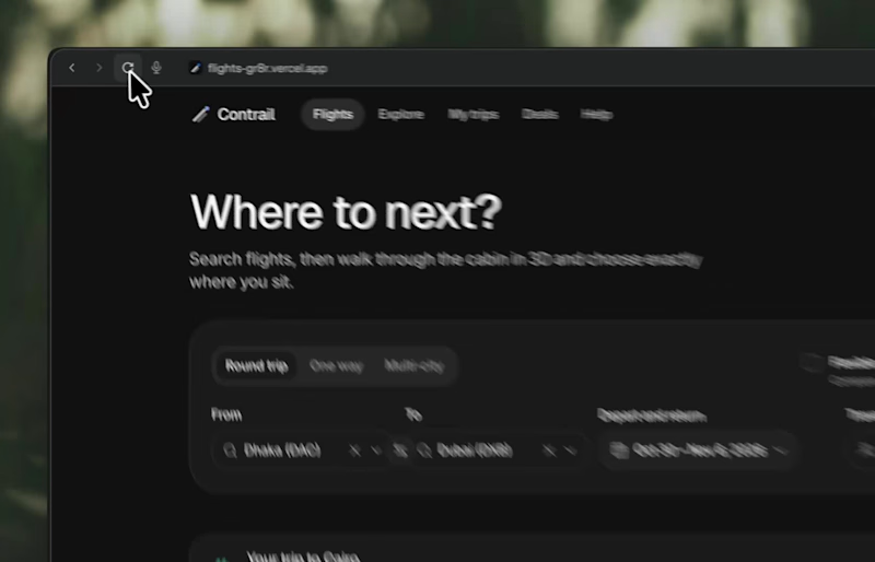
Imagining you book your flight while experiencing Meet Contrail. Complex data into beautiful visuals in 3d. Demo: https://flights-gr8r.vercel.app
2
7
154
Message
11
Anja Schumacher
pro
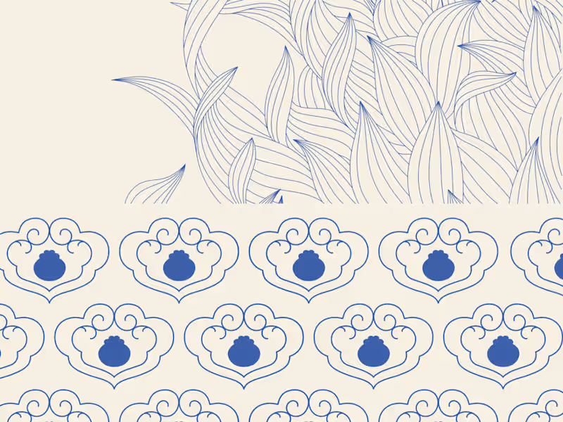
A closer look at The Art of Dining, a collection of original illustrations, decorative patterns, and product designs inspired by traditional Chinese dining culture
6
11
139
Message
10
Anna Podrez
pro
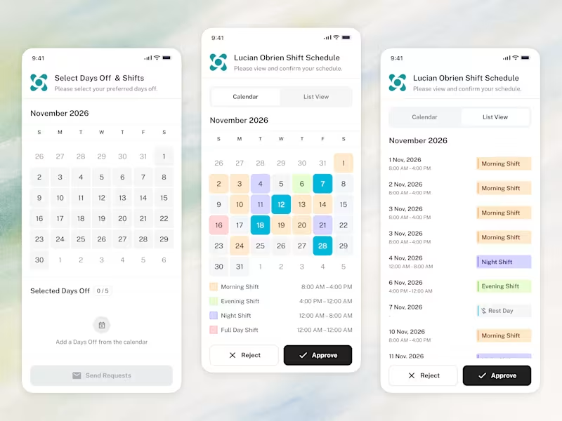
📱 The whole employee experience, right on the phone. Scheduling that goes wherever the team goes.
3
10
154
Message
12
Sasha from Zajno
pro
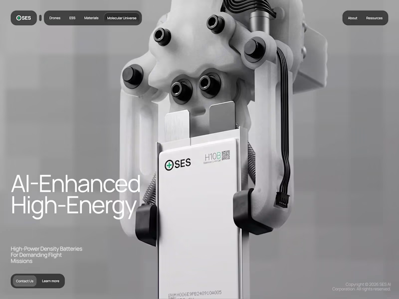
SES AI is a battery technology company accelerating the energy transition through AI-powered material discovery, battery development, manufacturing, and management. SES AI approached us with a website redesign driven by its new “All-in on AI” strategy. As AI became central to the company’s work across safety, manufacturing, and science, the existing website still focused primarily on its battery-hardware side. We redesigned the experience to clearly communicate the three AI pillars, while making the website simpler, more direct, and easier to navigate.
7
12
128
Message
12
Piotr Jarkowski
pro
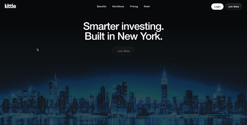
Early concept for a fintech homepage.
4
12
173
Message
13
Paweł Łuczak
pro
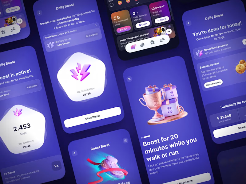
Sweatcoin LiveOps | Gamified Fitness App UI/UX
11
13
218
Message
1
Aleksei Maslenkin
pro
3D logo Animation
1
1
23
Message
29
Klym Yevtushenko
pro
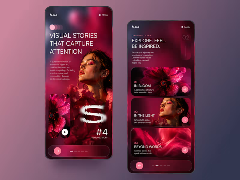
FOCUS — Creative Portfolio & Digital Art Website 🌸✨ A visually expressive website concept for a creative portfolio, built around digital art, bold imagery, and visual storytelling The design combines vibrant pink tones, soft gradients, experimental typography, and immersive photography to create a distinctive editorial experience Special attention was given to: • Bold editorial hero composition • Vibrant pink and dark color palette • Experimental typography and visual details • Immersive photography and digital artwork • Creative project gallery and navigation • Responsive mobile experience • Clean layouts with a strong visual identity The result is an expressive digital experience that puts creativity, emotion, and visual storytelling at the center of every screen 💗 Looking to create a standout portfolio or website for a creative brand? Let’s connect 🚀
11
29
422
Message
46
NexUX Lab
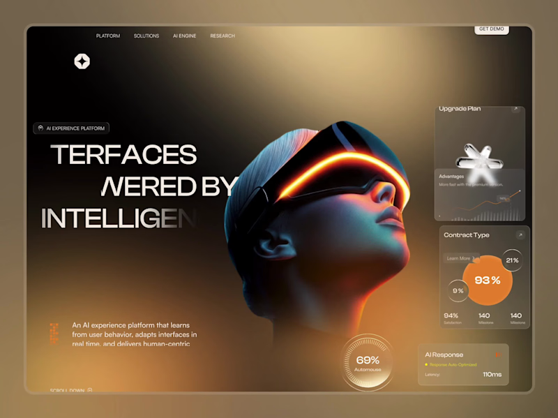
AI Agent Website
33
46
2.9K
Message
18
Sujon Hossain
pro
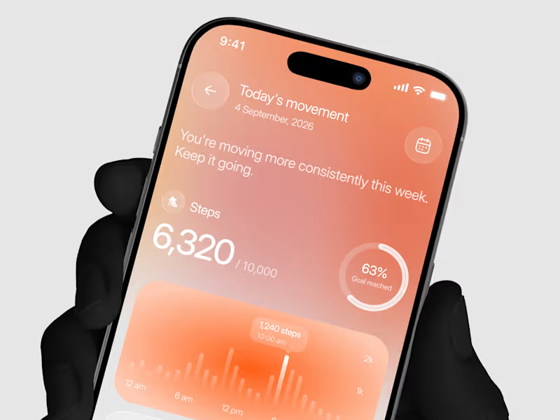
Designed a step tracking screen where you can see your daily progress and weekly trend in one glance. Same screen, two shots. Which one would stop your scroll? 👀
7
18
409
Message
20
Artem Prokhorov
Hourfield is a 16-second 16:9 launch film for products that organise people's time: calendars, schedulers, booking and reservation apps, planners. Retype a few short lines, drop in your logo and rename the calendar's days and tiles (meetings, table bookings, classes, shifts): the week re-plans itself on screen and the film lands on your logo lockup. Our second version, Maréva, a fictional table-booking app, turns the working week into an evening of reservations on the same animation and timing. Built end-to-end through the SVGator MCP server. The calendar that re-plans its own week, the orbit that swirls into a single dot and the lines centred by their real letter shapes (fonts measured, not eyeballed) were computed in Python and written straight into a live SVGator project as 780 editable keyframes; I directed every note and finished it in the canvas. Maréva was made the same way, on the same timeline. Everything stays a real layer: 50 live text layers, named elements (headline, logo, product-name, tagline) and one logo image animated in two moments. Yes, there is a lot to edit: every line of the story, a whole week of calendar tiles, a palette in nine roles. A full rebrand takes longer than five minutes, and that is the honest trade: it shows how much a single SVGator file can carry, and how MCP makes a detailed, story-driven film practical to re-make, not just to watch. Links: ▶ Template (SVGator) (https://app.svgator.com/editor#/38f06481b7ee4d7987f669dd4fcf9857)▶ Demo video, A → B (https://app.svgator.com/editor#/820156ed754342629978b29ce194eaa2)
8
20
1.6K
Message
46
Om Shukla
📰 FRONT PAGE A launch-day ad that puts your product on the front page. Tuesday, October 14. Late City Edition. A blood orange soda came back. Shelves cleared in eleven minutes. Officials urged the public to remain calm. Friday morning, a phone outlived the news cycle. Its charger was reported missing, presumed retired. Saturday, 12:01 a.m. Cold brew hit the shelves. Nobody went home. None of it happened. All of it made the front page. 🗞️ Every launch wants to be news. Most of them get a banner. I couldn't find a single newspaper in SVGator's template gallery. So I built one. The Bellbird Times. The Kestrel Herald. The Nightjar Post. Three papers. One template. Zero redraws. Retype the headline, swap the photo and the logo. Every word is live text. Every layer has a name. The motion never changes. So what's your headline? The press never stops. ✨ 🛠️ Built in SVGator with the MCP. 1,038 named layers, 8,440 keyframes.
38
46
4.9K
Message
25
Alex Romanenko
pro
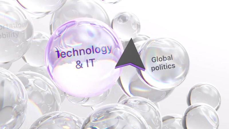
The brief was simple. Show a new personalized news feature. The obvious solution was to show a few clicks in the UI as you choose your topics. Clear, but not very interesting. So I pulled that moment out of the interface first and turned it into a cloud of topics. You get the idea before you even see the product, then the video drops you back into the real UI and shows where it lives. I really like these tiny decisions. The feature stays the same, but it feels easier to get and a lot more fun to watch.
1
10
25
473
Message
14
Maëlie Lusson
more about Figr!
2
14
205
Message
15
Maëlie Lusson
Figr rebranding, with Office Commun!
9
15
160
Message
11
Samuel MILARD
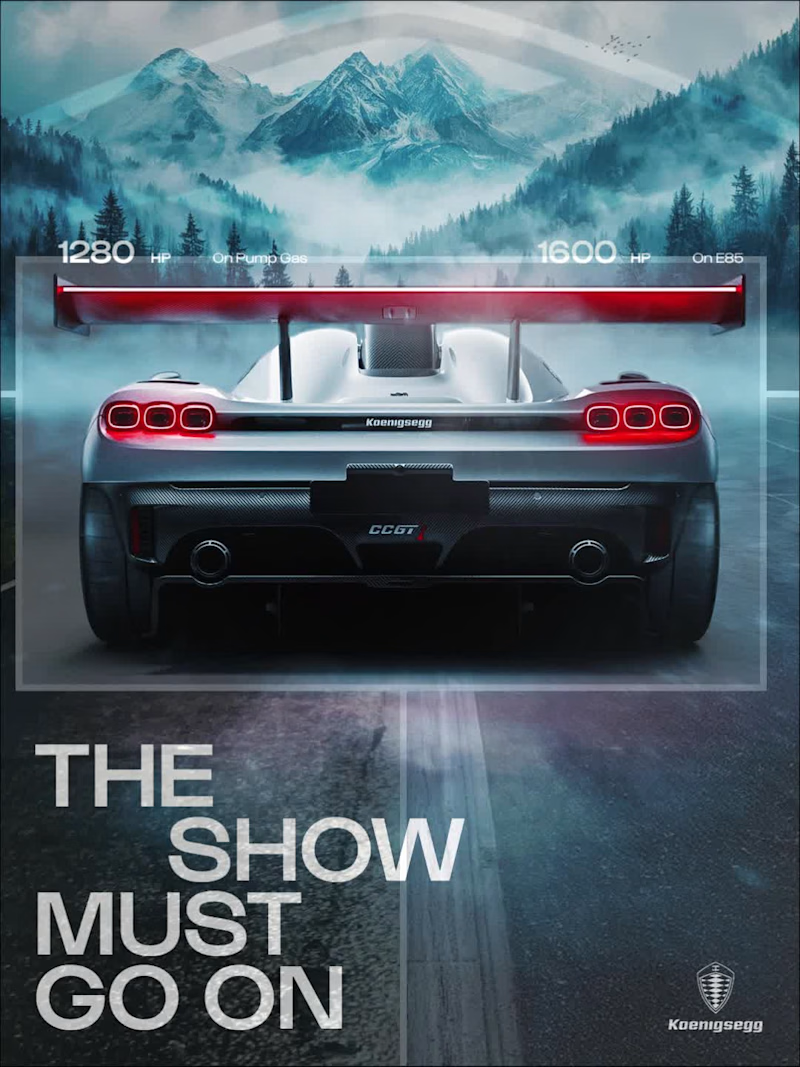
Designed this concept poster for the Koenigsegg CCGT1. Art direction, layout, grade: all mine.
5
11
126