Freelancers using Adobe InDesign in Western Cape
Sign Up
Post a job
Sign Up
Log In
Filters
2
Projects
People
Gideon Phillip
pro
Cape Town, South Africa
I help Architecture firms with premium brands.
$1k+
Earned
5.0
Rating
18
Followers
Follow
Message
I help Architecture firms with premium brands.
0
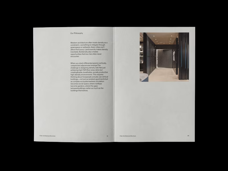
Chen Architecture is a Singapore-based architecture firm specializing in high-density design for the rapidly evolving cities of Southeast and East Asia. Founded by Eleanor Chen in 2019, the studio operates at the intersection of Asian spatial intelligence and contemporary architectural practice—rejecting both Western mimicry and nostalgic traditionalism.
0
113
0
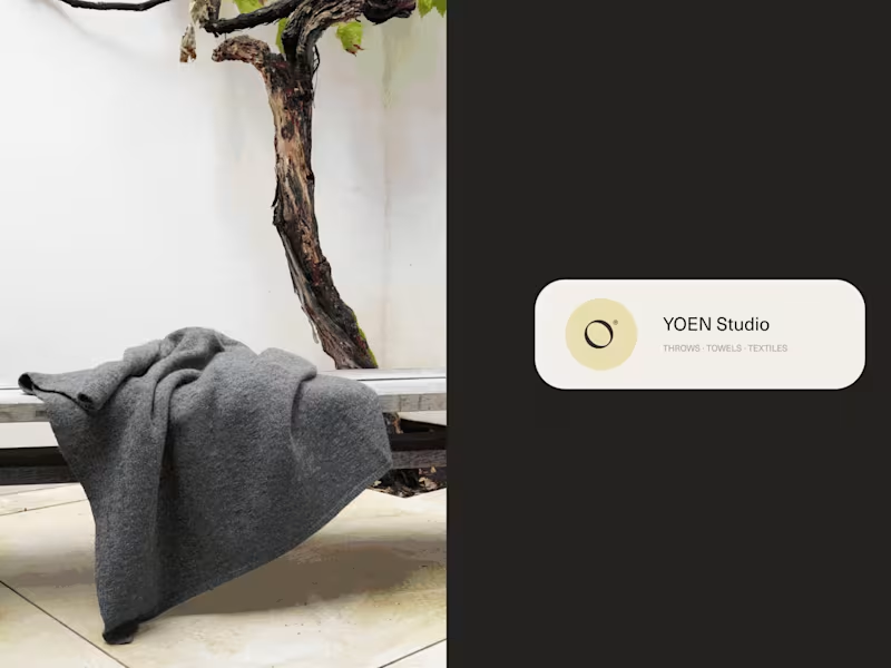
YOEN® is a luxury textile house dedicated to the art of considered making. Founded on the belief that the objects closest to our bodies deserve the same rigour applied to architecture — every thread chosen, every weight calibrated, every texture a dialogue between material and maker. We work in cashmere, merino, alpaca and their rarest blends. Our throws, towels and textiles are not decorative objects — they are tactile experiences, designed to hold warmth, absorb light and endure. YOEN® pieces belong to rooms that breathe: minimalist interiors, thoughtful homes, places where stillness is a form of luxury. Yoen's mission remains the same: To create textiles of genuine permanence — pieces that are felt before they are seen, that outlast trends, and that reward daily use with deepening softness and quiet beauty. Such a wonderful experience to finally see this work done!
0
129
0
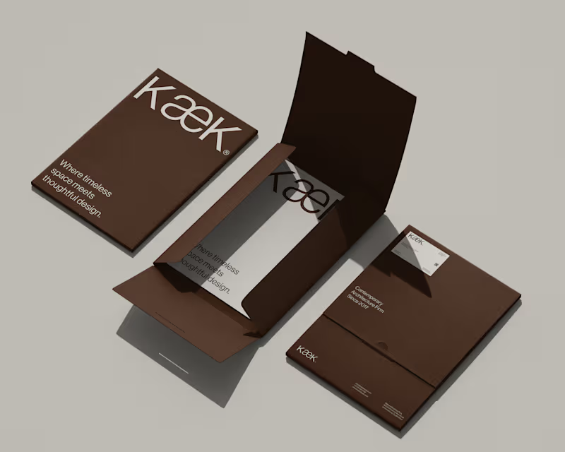
KæK / Brand Identity
0
7
1
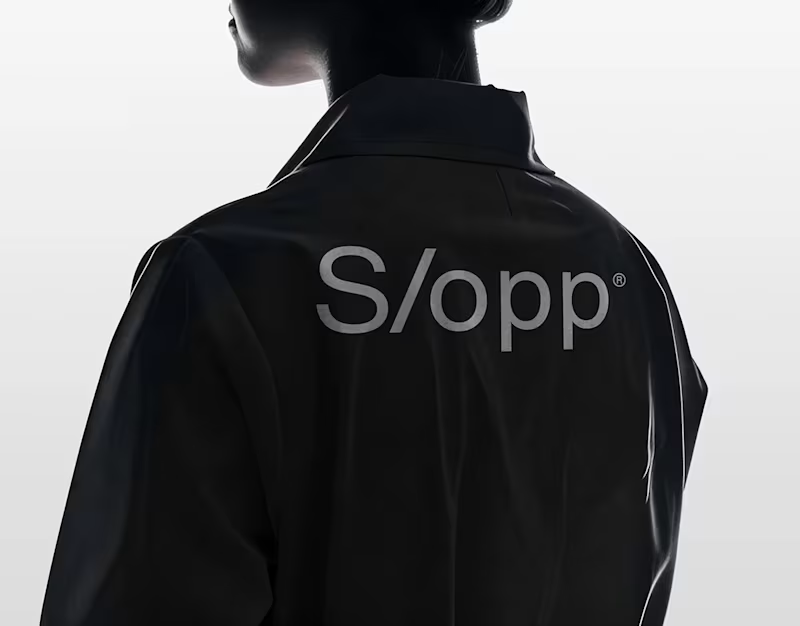
S/opp® / Brand Identity
1
4
Adobe InDesign
(7)
Follow
Message
Rebecca Hayter
Cape Town, South Africa
Creative Director/Creative All-Rounder
5.0
Rating
4
Followers
Follow
Message
Creative Director/Creative All-Rounder
0
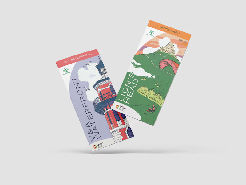
Go That Way Brochures
0
23
0
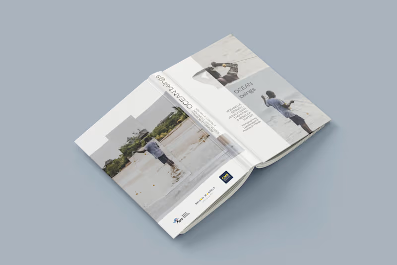
Ocean Beings
0
16
1
PS 150 NYC Public School Rebrand and Web Design
1
11
0
Conscious Kids
0
11
Adobe InDesign
(4)
Follow
Message
Ludwig Breedt
pro
Cape Town, South Africa
Brand designer partnering with founders & entrepreneurs.
New to Contra
Follow
Message
Brand designer partnering with founders & entrepreneurs.
0
Visual Identity Design for AIO
0
0
0
Visual Identity Design for AKEY
0
1
0
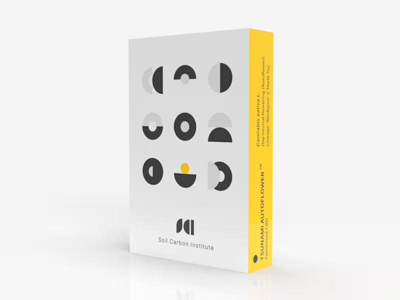
SCI Pod Visual Identity & Packaging Design
0
0
0
Atlas Visual Identity & Website Design
0
2
Adobe InDesign
(5)
Follow
Message
Belinda Broszeit
Cape Town, South Africa
Professional Reports, Brochures, White Papers and More
5.0
Rating
1
Followers
Follow
Message
Professional Reports, Brochures, White Papers and More
0
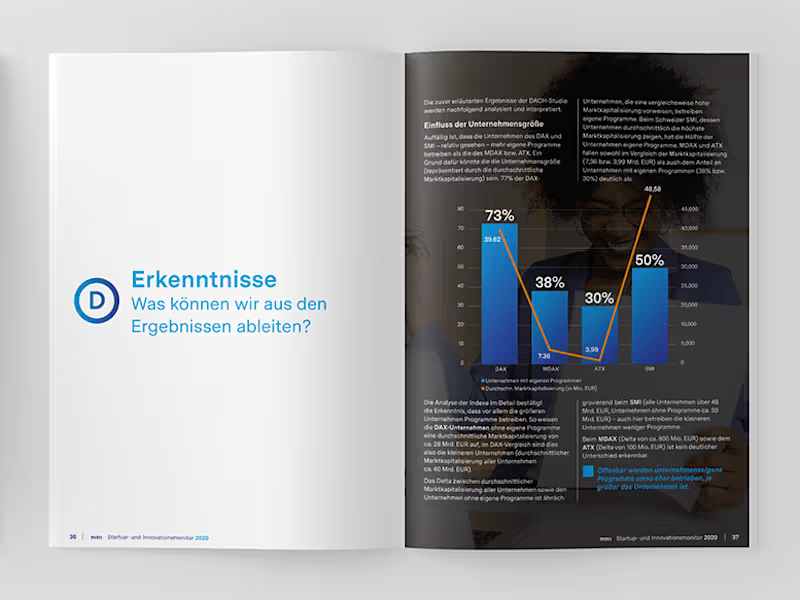
White Paper
0
8
0
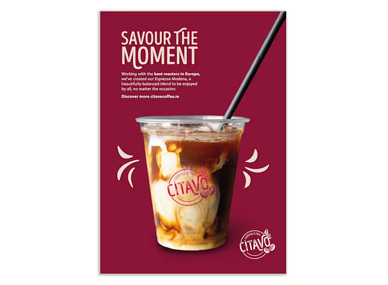
"Savour the Moment" Launch
0
5
0
Logo, brand guides, signage, flyers and social media
0
8
0
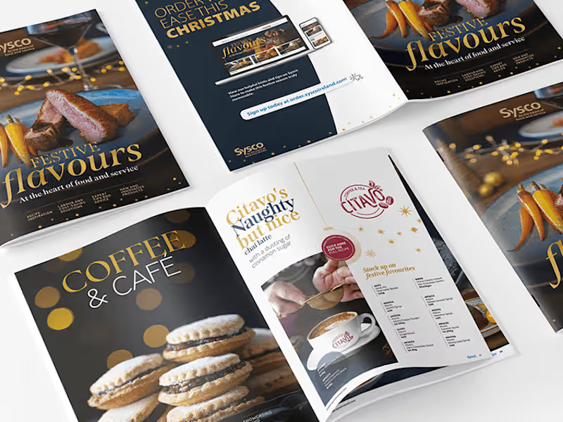
Christmas Brochure
0
9
Adobe InDesign
(7)
Follow
Message
Jenna McKenzie
Cape Town, South Africa
Innovative Graphic, Brand & Editorial Design Aficionado
Follow
Message
Innovative Graphic, Brand & Editorial Design Aficionado
0
The Tiro Bar Menu
0
12
0
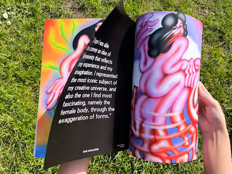
Rise Magazine
0
4
0
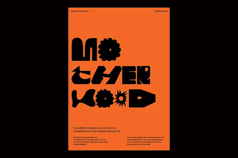
More than Maternal
0
9
View more →
Adobe InDesign
(3)
Follow
Message
Dubani creatives
Cape Town, South Africa
Crafting Unique Brands with Passion & Precision
Follow
Message
Crafting Unique Brands with Passion & Precision
0
Brochures :: Behance
0
2
0
Ubuntu Farming :: Behance
0
2
0
Simphiwe Construction :: Behance
0
3
0
More Digital Posters :: Behance
0
4
Adobe InDesign
(3)
Follow
Message
Clint Jurgens
Cape Town, South Africa
Branding & Layout Specialist
Follow
Message
Branding & Layout Specialist
0
Playcharm
0
20
0
Earth Roots Construction
0
13
0
OPAL Wind Management
0
13
0
Premium Brand Identity
0
15
Adobe InDesign
(5)
Follow
Message
Nimi Pretorius
pro
Cape Town, South Africa
Building brands people feel something for
New to Contra
Follow
Message
Building brands people feel something for
0
HOLLARD INSURANCE The Book of Brand Bravery: rewriting what an insurance brand sounds like CI guide concept, creative direction, and copywriting for one of South Africa's most distinctive and fearless financial services brands. THE STORY Insurance brands are not, historically, known for their bravery. They tend to sound cautious, careful, slightly nervous about saying anything too interesting in case someone holds them to it. Which makes a kind of sense. Except that Hollard, one of South Africa's largest and most innovative insurance groups, had always been different, and they knew it. They just needed someone to help them say so out loud. The brief was to create a CI guide. What I made instead was a book. I called it The Book of Brand Bravery, and from the opening line, it made clear that this was not going to be another corporate identity document that lived in a shared drive and was never opened again. The guide defined Hollard's personality as lionhearted, challenging, and inventive. Warm without being soft. Bold without being arrogant. Genuinely funny in places where most financial brands would never dare to go. Every section was written to be read, not just referenced. Because a brand guide only works if people actually want to open it. I murdered a lot of darlings getting this one right. Every line that was slightly too clever, slightly too safe, slightly too much like something another brand might say got cut. What was left was something that only Hollard could have said. That's always the goal. WHAT IT TAUGHT ME That the most powerful thing you can do for a brand is give the people inside it something to believe in. The CI guide is where that belief either lives or dies.
0
158
0
V&A WATERFRONT Giving an icon its voice: the V&A Waterfront rebrand Full rebrand including brand platform, CI guide, manifesto, campaigns, digital, UX, outdoor and editorial for one of Africa's most visited destinations. The work I'm proudest of in 20 years. THE STORY The V&A Waterfront is Cape Town's iconic harbour precinct. A working harbour, a world-class art museum, a celebrated food market, luxury hotels, and one of the most visited destinations on the African continent, all occupying the same few remarkable hectares on the edge of the Atlantic Ocean, with Table Mountain watching over everything. It's a place with extraordinary energy. But a great location and a great brand are two very different things. The Waterfront needed to find its voice. Something that went beyond tourism brochure warmth or retail centre cheerfulness. Something rooted in Cape Town, in Africa, in the genuine complexity of a neighbourhood that contains multitudes. A place that holds the city's history and its future at the same time, and needed language that could hold both too. That became my job. Over several years of ongoing creative partnership, I led the concept, creative direction and copywriting across the entire rebrand and everything that grew from it. I developed the brand platform "African Alchemy," wrote the foundation CI guide "The Book of Brand Magic," concepted and wrote multiple campaigns across every channel, directed the tone of voice across every sub-brand within the precinct, and wrote everything from manifesto copy to UX microcopy to outdoor headlines to video scripts. I also rebranded two sub-destinations within the precinct: the Watershed, a design hub celebrating African makers and craftspeople, where I wrote "Meet Cape Town's Design Story," and Solve, an innovation hub focused on sustainable futures, where I developed the brand, the manifesto and the full website. Each needed to feel like itself while still belonging to the larger world of the Waterfront. Getting that balance right is harder than it sounds. The hardest part was also the most important: making everything feel like it came from the same place. Same warmth. Same curiosity. Same pride in this particular city at this particular moment in its history. This is the work I'm most proud of. Not because of the scale, though the scale was significant. Because it asked me to find the soul of a place and put it into words. And I think we got it right. WHAT IT TAUGHT ME That the best brand writing doesn't describe a place or a product. It describes a feeling that was already there, waiting for someone to finally name it.
0
138
0
SOUTH AFRICAN AIRWAYS A catalyst for African growth: the SAA corporate identity guide Strategic planning, creative direction and copywriting for the corporate identity guide of a national airline and a national symbol. THE STORY There are brands that carry weight in the literal sense. And then there are brands that carry weight in every other sense. South African Airways is both. As the national carrier of South Africa and one of the continent's longest-running airlines, SAA represents something beyond its routes and its fleet. It represents a country, a continent, an idea of what Africa is becoming and what it deserves to be. When I took this brief I understood that the stakes were not just creative. They were cultural. The CI guide I developed for SAA had to hold all of that without buckling under it. It needed to give every person who touched the brand, from cabin crew to marketing managers to external agencies across the world, a clear and inspiring sense of what SAA stood for and how that should show up in everything they did. The platform we built was "A Catalyst for African Growth." Vibrant, cosmopolitan, contemporary. A carrier that didn't just fly people to destinations but believed in the destinations themselves. The guide covered brand assets, tone of voice, photographic style, colour, typography and the full brand narrative. Every word was written to inspire as much as to instruct. The simplest line in the whole document took the longest to write. It always does. WHAT IT TAUGHT ME That the most important reader of a brand guide is not the designer. It's the person who has never thought about brand before and needs to understand, in plain and beautiful language, why any of this matters at all.
0
101
0
CALIBRE LIFE SCIENCE Creating immunity for Africa, from Africa: brand strategy, creative direction and copywriting for a life science engineering firm Brand strategy, manifesto, creative direction, content strategy and ongoing copywriting for a pharmaceutical and biotech facility engineering company. THE STORY There are industries where the stakes are abstract. And then there are industries where the stakes are people's lives. Calibre Life Science designs, builds and validates the facilities where medicine is made. Sterile pharmaceutical environments, biosafety laboratories, large-scale production facilities across the continent. The work is technical, precise, and unforgiving in ways most people never see. The challenge wasn't understanding what they did. It was finding language that could carry the weight of it without collapsing under the gravity. The platform I built centres on a single idea: the line. Every facility begins with a line of intention. A line that has to hold through design, through build, through validation, all the way to the moment production comes online and the system either proves itself or it doesn't. Design. Build. Validate. Not three separate phases. One continuous commitment. The manifesto came first and set the temperature for everything that followed. The content strategy extended the voice across thirteen LinkedIn posts in the first calendar, each anchored to a pillar and written to sound like people who knew exactly what they were doing and felt no need to shout about it. Precise. Direct. Quietly certain. Writing for this industry taught me something I didn't expect. The engineers building these facilities will never meet the patients whose medicine is made inside them. But they think about them anyway. That's what the writing had to hold. WHAT IT TAUGHT ME That gravity is a gift. When the work genuinely matters, you don't have to manufacture meaning. You just have to get out of the way and let it speak.
0
124
Adobe InDesign
(2)
Follow
Message
Explore people