The network for creativity
Join 1.25M professional creatives like you
Connect with clients, get discovered, and run your business 100% commission-free
Creatives on Contra have earned over $150M and we are just getting started
Back to feedPost

SIGMA ADVISORY
When less is the whole point: brand development for Sigma Advisory
Brand direction, visual identity and creative positioning for a private wealth advisory firm.
THE STORY
Financial advisory is a category where everyone says the same things. Trust. Expertise. Partnership. The words have been borrowed so many times they've stopped meaning anything.
Sigma Advisory is a firm that helps growth-minded businesses replace operational chaos with clear systems and capable leadership. The work is serious and the clients are serious. What they needed wasn't a louder way to say the usual things.
They needed a brand that could hold the same quiet authority they hold in a room.
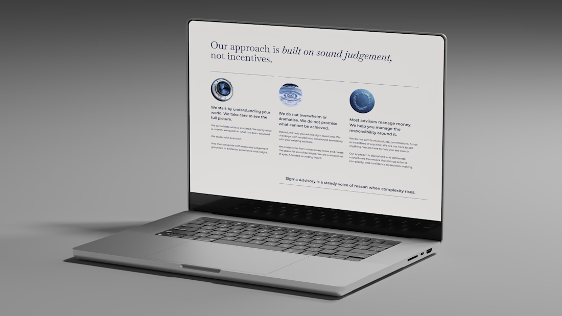
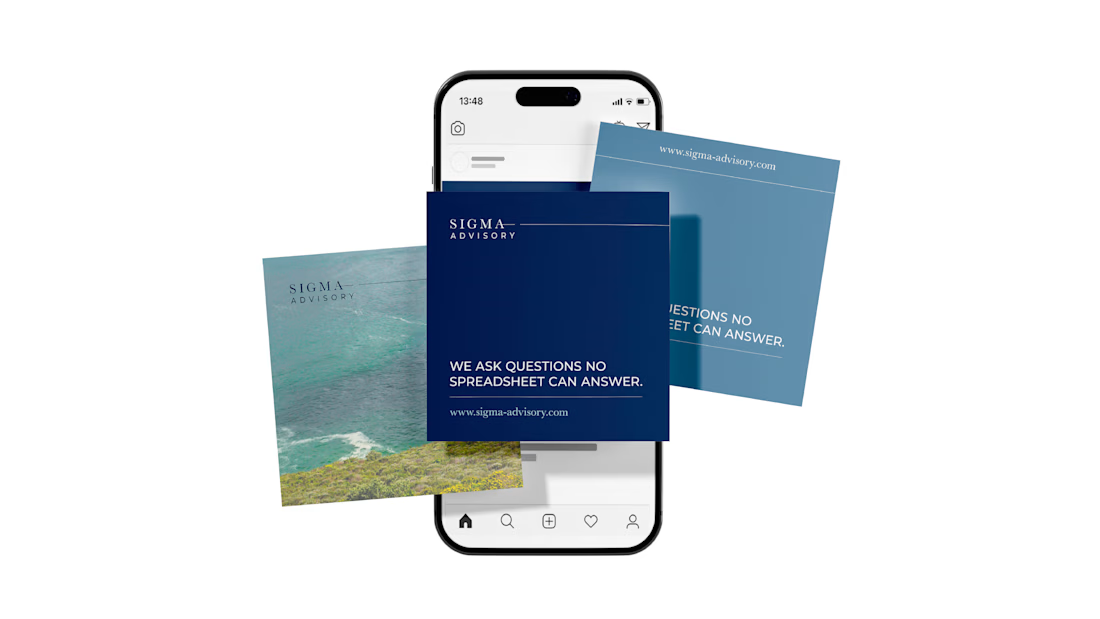
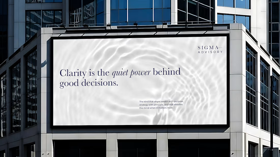
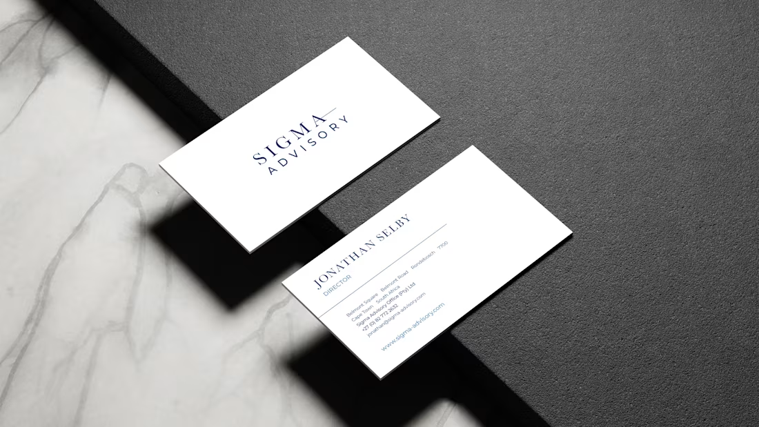
Deep navy. Clean serif. A horizontal rule that separates the name into two parts without breaking it. Nothing decorative. Nothing that reaches. The identity doesn't announce itself. It assumes its own credibility, which is exactly how the firm operates.
The voice followed the same logic. Clarity as confidence, not performance.
WHAT IT TAUGHT ME
Restraint is a decision that has to be made repeatedly. Every element you leave out is a choice. The discipline is in knowing what the brand can carry without being said.


The network for creativity
Join 1.25M professional creatives like you
Connect with clients, get discovered, and run your business 100% commission-free
Creatives on Contra have earned over $150M and we are just getting started





Related posts

Winder is a bold brand identity built around a geometric W-inspired symbol, combining sharp angles and forward movement to represent progress, speed, and direction.
The identity uses a striking red and deep burgundy palette, supported by clean typography and a consistent visual system across brand guidelines, digital applications, and product mockups.
Progress in Motion.



Great logo it feels it really has an identity 🎉🎉

Very well looking composition, good sinergy

Safe or bold, which one actually makes you stop scrolling? 🤔
Sans: the serif, tight tracking, one accent color playbook every skincare brand is running right now.
Bold: the same idea, redesigned with attitude. 💅
25 voted
32%
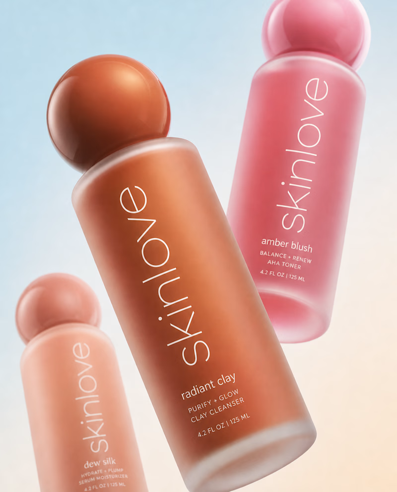
53 voted
68%
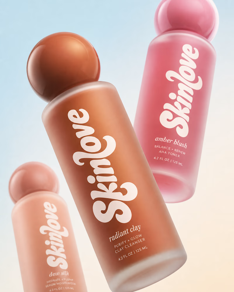
78 votes
Closed

Somehow, every time autumn in Berlin rolls around, I'm astonished - the colours seem like they couldn't get any brighter.
I live between the city and a wonderful forest called Wuhlheide, where I often walk during long lunch breaks to get away from the screen.
The forest is a place where I can process my thoughts, generate creative ideas and submerge myself in the changing seasons.
Since that magical first autumn in Berlin, this underrated season has earned a special place in my heart.
What's your favourite season and how do you feed your creativity?
(This is an animation I made for fun, drawn in Photoshop and animated in After Effects).

That's great motion graphics congrats it's funny 🎉🎉🔥🔥