PS 150 NYC Public School Rebrand and Web Design
Rebecca Hayter

The Insight
While PS 150 is a hub of high-quality learning in New York City, its online presence wasn’t reflecting this. Parents and students deserved a website that spoke to the school’s community values—diversity, respect, and excellence. The old website, despite the strong logo, had no cohesive visual identity or clear thought for the user experience.
We saw an opportunity to take the existing brand elements, modernize and add character to them, and craft an experience that highlights the energy and spirit of the PS 150 community.
The Idea
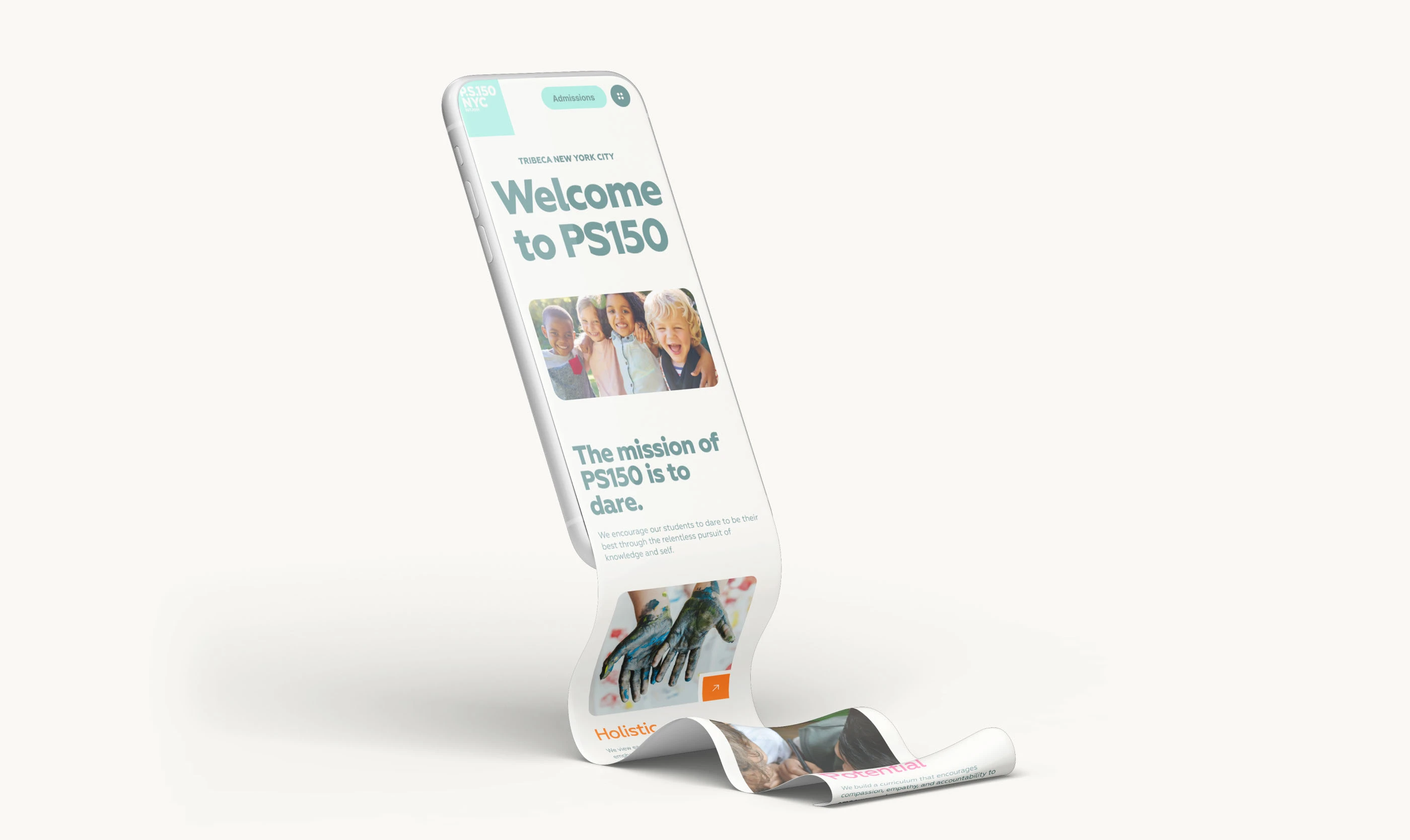
"Creating a Launchpad for Learning."
PS 150 strives to be more than a school but rather a place where young minds take off and discover potential, grow, and connect. Because of this instrumental role of the school, we wanted to create a full digital experience. Starting with the website, we aimed to create a virtual ‘launchpad’ that welcomed everyone and matched PS 150’s goals and values.
“We had a strong logo to start with, but the website needed to do more. We wanted to create a space that reflected the school’s values—diversity, respect, and excellence—but also felt fun and approachable. Every element of the design, from typography to illustrations, speaks to the vibrant spirit of the community.”
– Rebecca, Creative Director
The Execution
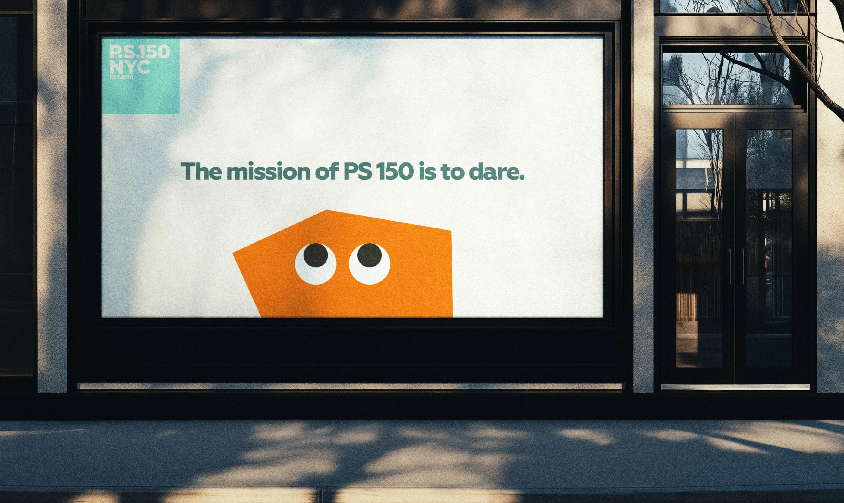
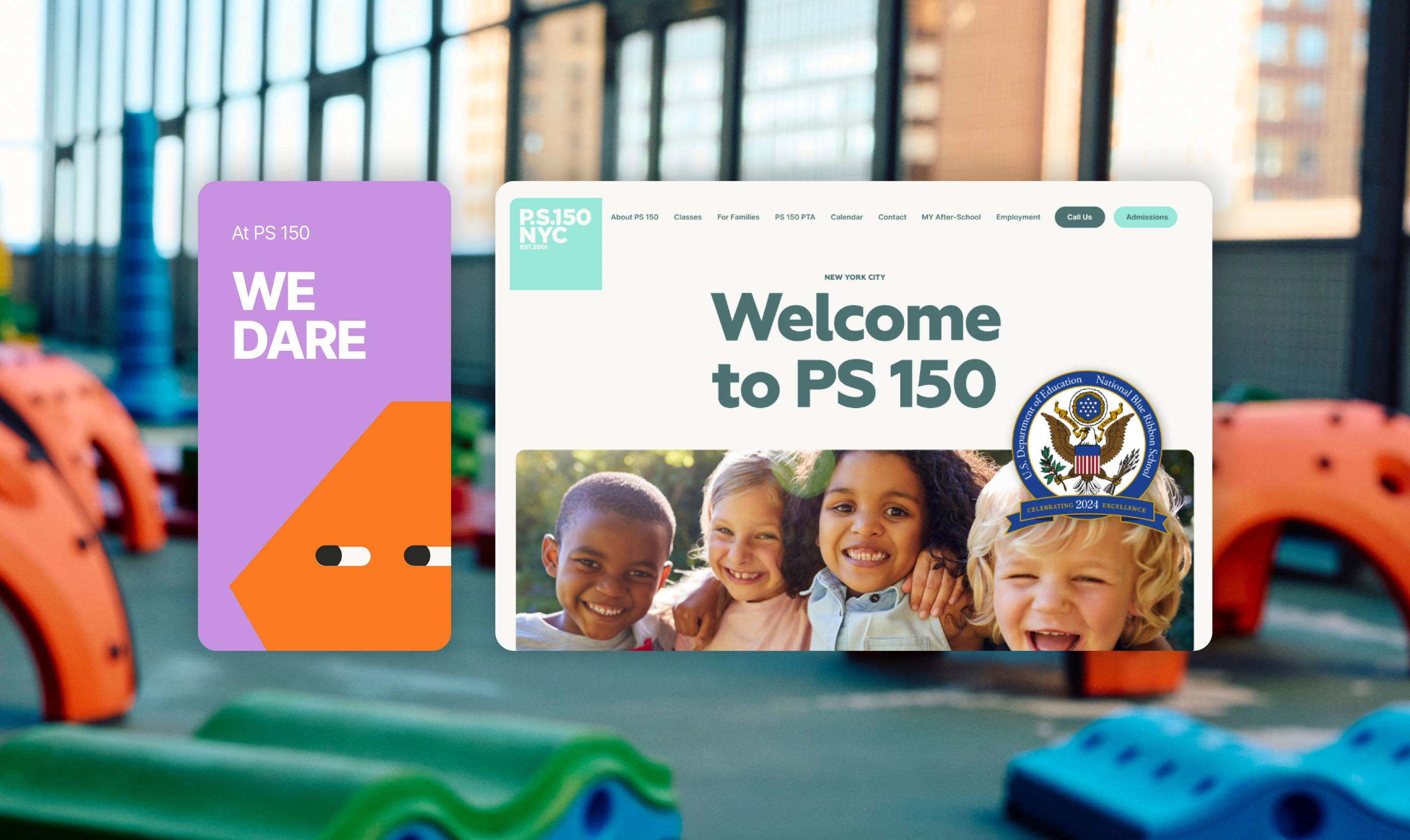
To reimagine PS 150’s visual identity, we mapped a professional and playful online space that was welcoming, bright, and user-centric, like the school itself. The bold and clean lines of the logo became the starting point of the brand identity, but we enhanced the visual elements overall.
We modernized the website with a minimalist, mobile-friendly design and intuitive navigation. The home page prioritizes crucial information like events, schedules, and volunteer opportunities through visually prominent callouts. Modern typography and a color scheme of Robin Egg Blue, Myrtle Green, and Baby Powder create an attractive, clean aesthetic with ample white space across the web pages.
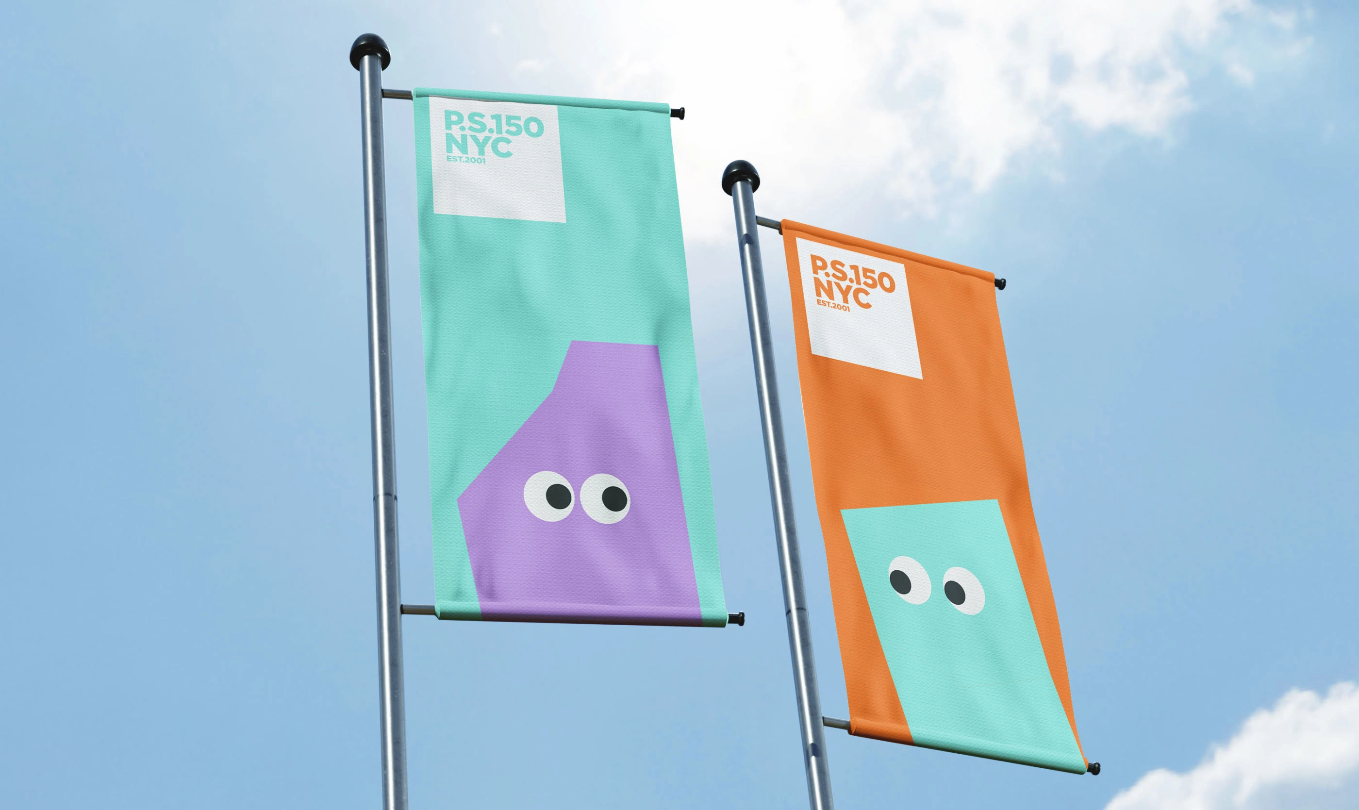
Updated and authentic photography of students and teachers in action showcases the school's diverse, compassionate community. Our illustrative designs, including cornered shapes with whimsical eyes, guide users while reflecting the school's creative spirit and nurturing curiosity.
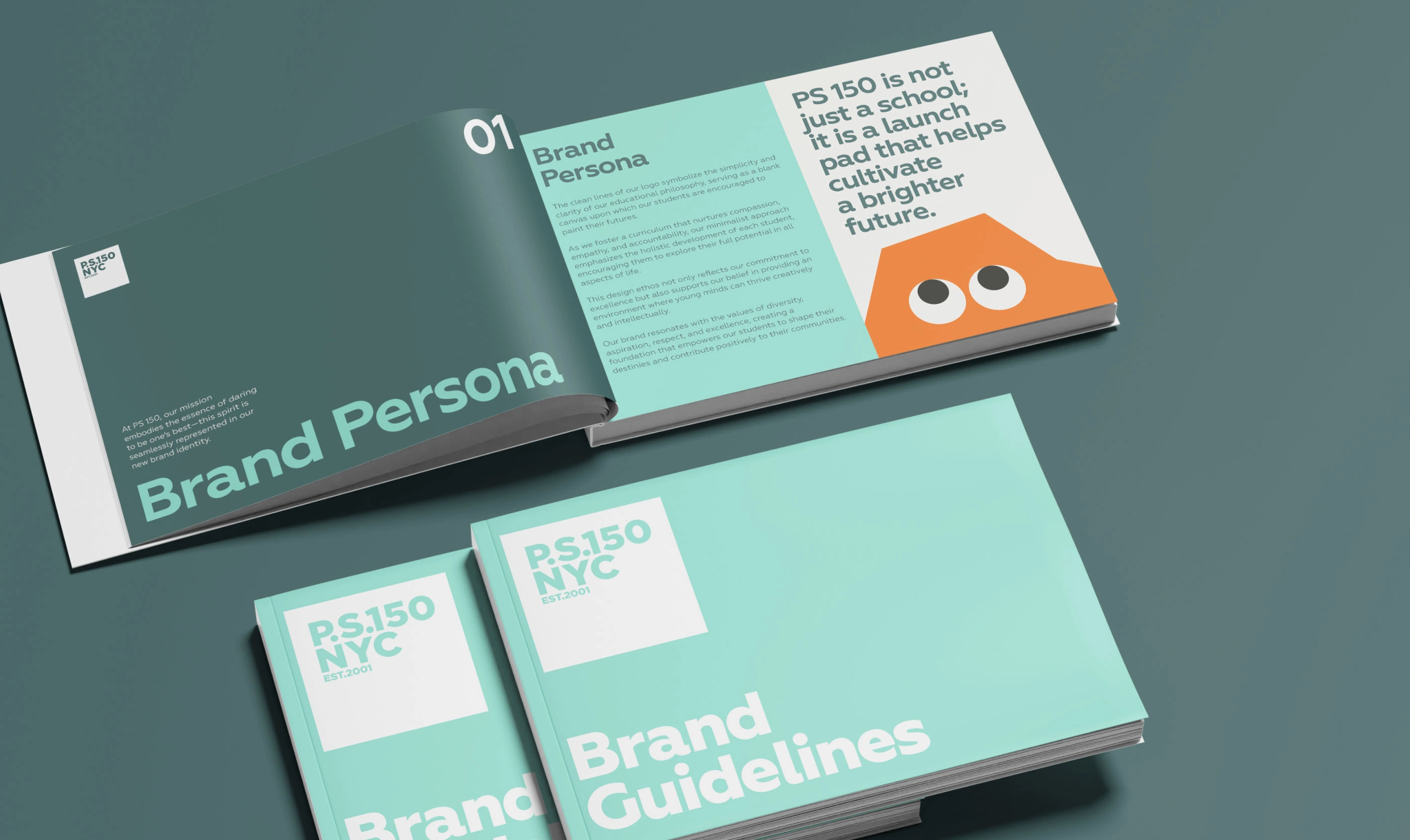
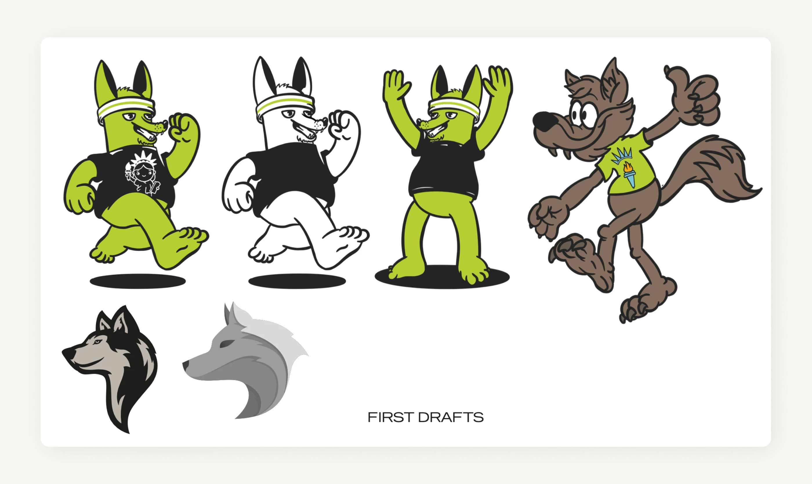
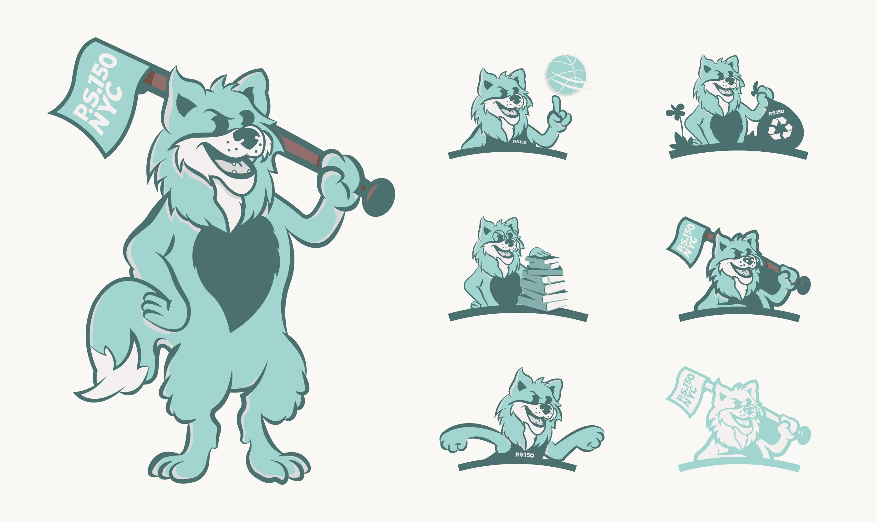
Online visual branding aside, we also designed a dynamic mascot—Woolfie—that appears in multiple variations: a full-body version carrying the school flag for events and a simplified icon for the website, social media, and merchandise. The wolf's various personas, from athlete to environmentalist, create a versatile brand symbol that brings PS 150's values to life.


The Result
PS 150's new website seamlessly enhances the school's identity, offering a trustworthy platform for parents to connect and a comprehensive experience for students to learn. Following the rebrand, PS 150 received the National Blue Ribbon School certificate, for its academic excellence and commitment to fostering a high-quality, inclusive, and engaging educational environment for all students. The dynamic online presence now matches the school's mission of providing an inclusive, supportive educational launchpad that prepares students for the future.
Like this project
Posted Jan 21, 2025
Art Direction, Branding, Mascot Illustration and Website Design for one of the top public schools in New York City.