

Full-stack design & dev studio for AI and tech startups


Full-stack design & dev studio for AI and tech startups


crafting engaging designs that speak human 🇺🇦

crafting engaging designs that speak human 🇺🇦



Launch Videos for funded AI Startups | Creative Director

Launch Videos for funded AI Startups | Creative Director


Premium UI/UX & Web Design for Fintech, SaaS & Web3 | Framer
Premium UI/UX & Web Design for Fintech, SaaS & Web3 | Framer
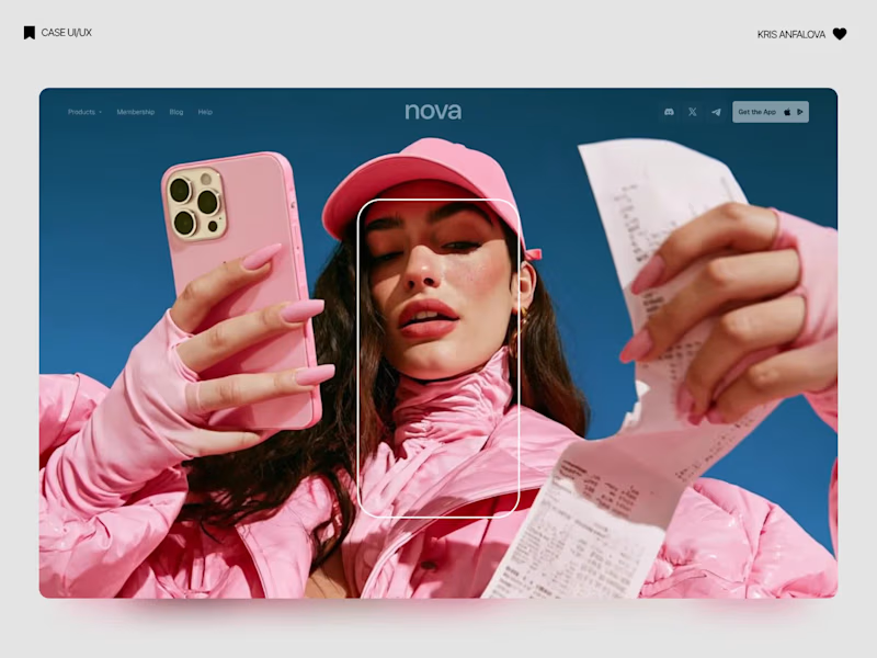
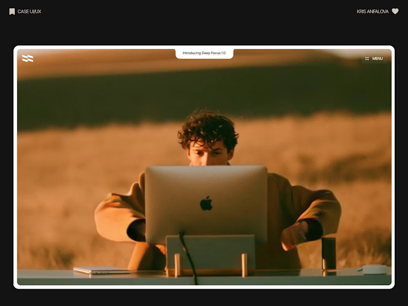
Deep Focus is a fictional macOS app that silences notifications so people can do deep work. The catch is the audience: people who need a productivity app are already tired of apps. Every competitor promises more features, so this page had to promise relief and turn it into a download within seconds.
What I did
I started from the pain, not the product. The second screen lists what a normal day looks like: push notifications, endless pings, 142 unread emails, context switching. I styled those chips like the four benefit chips in the hero, only white instead of frosted, so the visitor reads before and after without a line of explanation.
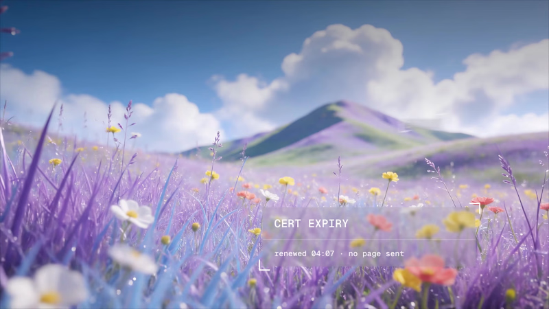
The hero section design shows no interface on purpose. This product is about absence, and a screenshot would add noise, so a person alone in a field does the proving. The headline “Deep focus. Anywhere.” is a high-contrast serif because every tool in this category speaks in a grotesque, and a serif sounds calm and human.
I kept one action, Download for macOS, with no pricing and no form. The first job of this landing page design is a download, and everything else can wait until after it.
Would you keep the serif for the headline, or switch to a grotesque so it feels more like software?
27
69
1.9K
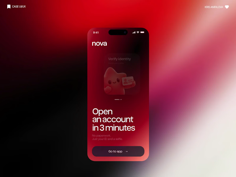
What if sending money felt a little more like giving a gift?
For Nova, I explored a banking app that brings payments, cards, and a bit of personality together. You can check your balance, browse recent transactions, send or request money, top up, and pay bills.
My favorite part is the digital postcard feature. Before sending a transfer, you can add a little illustrated card—a heart, a birthday greeting, or a playful character. A simple way to make birthday money or a thank-you feel more personal.
I carried that same 3D character into onboarding, pairing it with bold red gradients and large, clear payment details. There’s room for play, while the recipient and amount stay easy to check.
Would you add a postcard to a transfer? I’d love to know what occasion you’d use it for.
35
92
5.9K
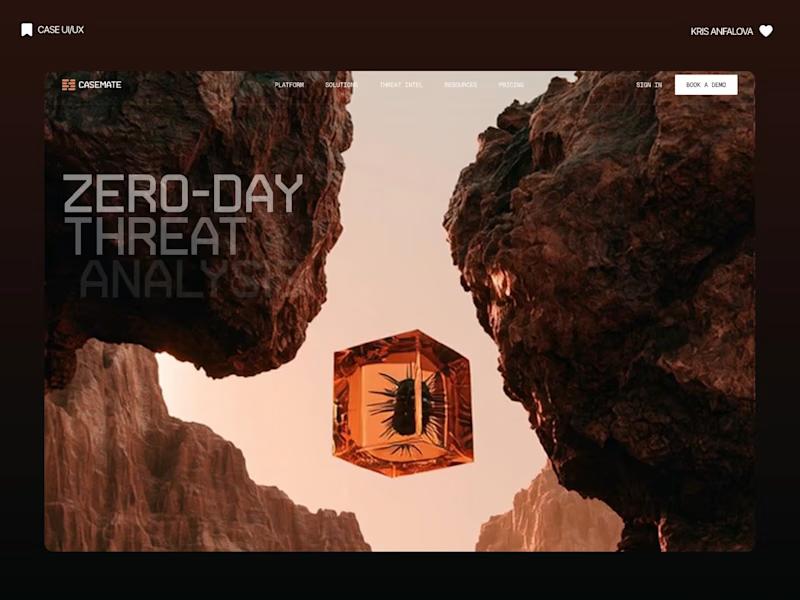
Casemate: making malware analysis feel calm instead of scary
Cybersecurity websites usually look the same: black background, green code, a hooded guy. I wanted to try the opposite for Casemate, a concept for a malware analysis tool.
The idea is simple: the product keeps a suspicious file in a sealed chamber and watches what it does. So I put a bug frozen in amber in the middle of a canyon. It’s dangerous and under control at the same time, and you get it without reading a word.
Then I made sure the page still works for a security lead who wants facts. The stats sit right next to the headline: threats isolated, latency, endpoints covered.
The hardest part was keeping it warm without losing trust. I stayed with one terracotta colour, wide capitals and mono labels, so it reads like a serious tool and not a poster.
I’m taking on new projects for SaaS and tech teams. If you have a product that’s hard to explain in one glance, send me a message.
What do you think, would you trust a security product with a canyon on the homepage?
30
91
3.3K

Designer for your SaaS, app, deck and brand.

Designer for your SaaS, app, deck and brand.


SaaS Product Designer | UI/UX, Webflow & B2B Websites
- $1k+
- Earned
- 4x
- Hired
- 5.0
- Rating
- 437
- Followers
SaaS Product Designer | UI/UX, Webflow & B2B Websites
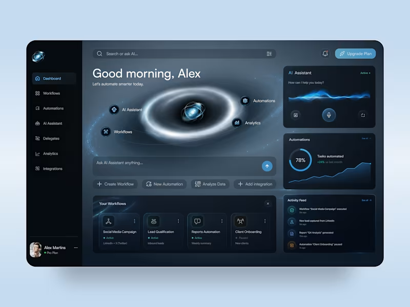
AI Automation Platform — SaaS Dashboard & Mobile App UI Design
✨ Smarter Workflows, Powered by AI
A futuristic AI automation platform concept that brings workflows, intelligent assistance, and performance analytics into one digital workspace. The design combines a deep navy interface, electric blue accents, and immersive orbital visuals to make complex automation tools feel intuitive and accessible.
Special attention was given to:
• Immersive dashboard composition with glowing orbital graphics and futuristic visual elements
• AI assistant interface featuring voice interaction controls, animated-inspired waveforms, and quick actions
• Organized workflow cards, automation management, and real-time activity feeds
• Clear analytics widgets with progress indicators, performance charts, and automation status controls
• Responsive desktop and mobile layouts with consistent dark-mode styling and streamlined navigation
The result is a modern SaaS experience that balances futuristic aesthetics with practical usability, giving users a clear view of their workflows, AI tools, and automation performance.
4
10
283
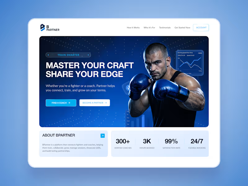
BPartner — Sports Coaching Platform & SaaS Dashboard Design
A modern sports coaching platform concept that brings fighters and coaches together in one digital space. BPartner combines a bold, performance-driven landing page with a clean SaaS dashboard designed around training schedules, client management, and everyday coaching activities.
Special attention was given to:
• Bold hero section with powerful athlete imagery, blue gradients, and clear calls to action
• Structured dashboard UI featuring training sessions, client activity, analytics, and calendar management
• Clean navigation and organized information cards for quick access to essential tools
• Responsive desktop and mobile layouts with consistent typography and visual hierarchy
• Dedicated sections for fighters and coaches, highlighting their individual needs and platform features
The result is a cohesive digital experience that balances the energy of combat sports with the clarity of a practical management platform. From discovering a coach to organizing training sessions, every screen keeps the experience focused and easy to navigate.
2
5
181
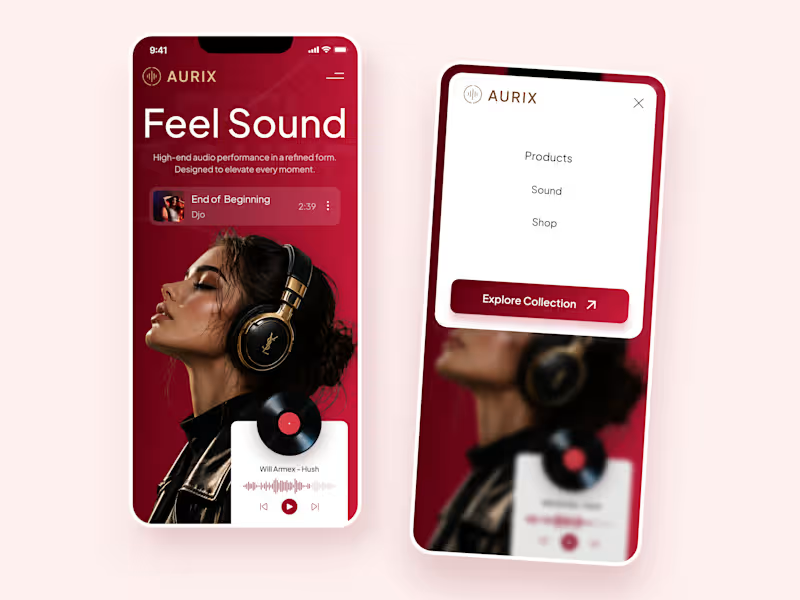
AURIX — Premium Headphones Landing Page 🎧❤️
A bold landing page concept for a premium audio brand, combining luxury headphones, music, and a strong lifestyle aesthetic
The design brings together deep red tones, elegant black and gold details, oversized typography, and immersive lifestyle imagery to create a modern, fashion-inspired experience
Special attention was given to:
• Bold lifestyle-focused hero composition
• Rich red and gold color palette
• Clean, oversized typography
• Music player and suggested tracks
• Premium product presentation
• Responsive mobile experience
• Minimal navigation and clear CTA
The result is a stylish, immersive landing page that connects premium audio with fashion, music, and everyday lifestyle ✨
44
111
4.8K
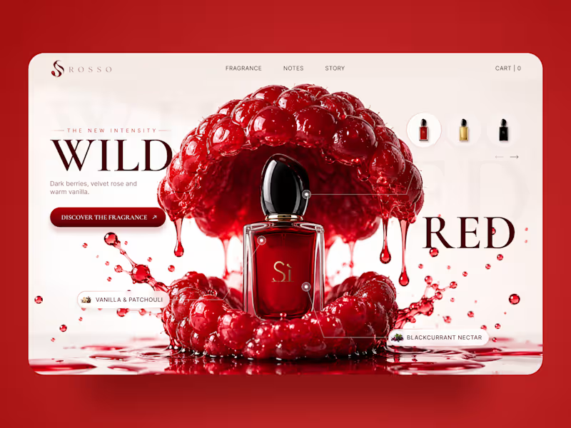
ROSSO — Wild Red Perfume Landing Page 🍒❤️
A bold fragrance landing page concept inspired by rich red berries, sensual notes, and luxury perfume aesthetics
The design combines deep red tones, oversized editorial typography, glossy fruit visuals, and elegant product presentation to create a rich and memorable experience
Special attention was given to:
• Bold product-first composition
• Rich red color palette
• Elegant editorial typography
• Fragrance notes and ingredient highlights
• Product variations and navigation
• Responsive mobile experience
The result is a vibrant, luxurious landing page that brings the fragrance to life through color, texture, and strong visual storytelling ✨
Looking to create a standout website for a beauty, fragrance, or luxury brand? Let’s connect
7
12
1K

Crafting effective product design for web and mobile apps.
- $•••••
- Earned
- 1x
- Hired
- 5.0
- Rating
- 75
- Followers
Crafting effective product design for web and mobile apps.


Product Designer, Framer & Jitter Expert
Product Designer, Framer & Jitter Expert


