
Crafting effective product design for web and mobile apps.
- $•••••
- Earned
- 1x
- Hired
- 5.0
- Rating
- 78
- Followers
Crafting effective product design for web and mobile apps.


Brand designer
Brand designer
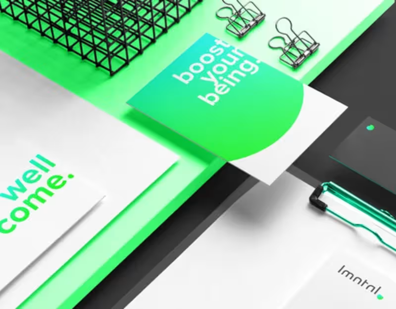
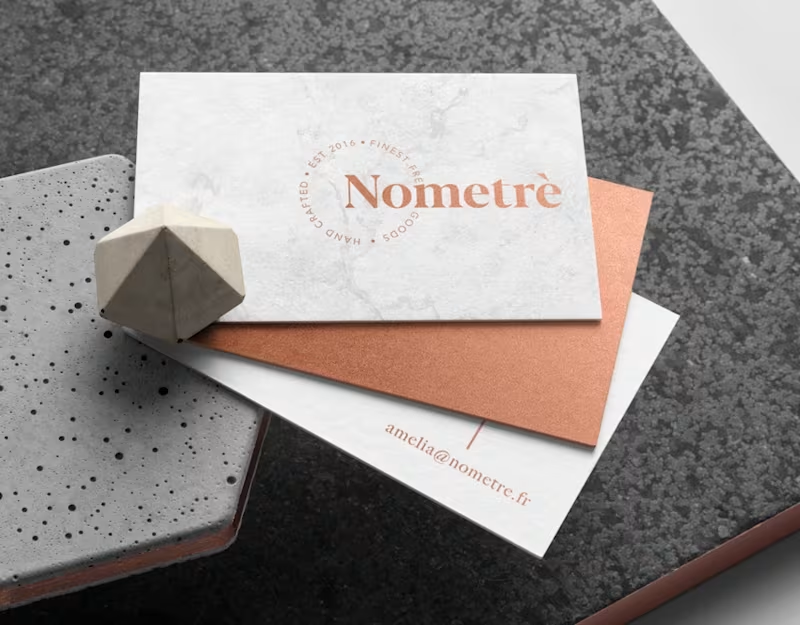


Art Director & Branding/Packaging/ Graphic desinger
- $1k+
- Earned
- 1x
- Hired
- 5.0
- Rating
- 6
- Followers
Art Director & Branding/Packaging/ Graphic desinger


Webflow/Framer Expert & UXUI Designer for growing businesses
- $1k+
- Earned
- 2x
- Hired
- 4.6
- Rating
- 61
- Followers
Webflow/Framer Expert & UXUI Designer for growing businesses
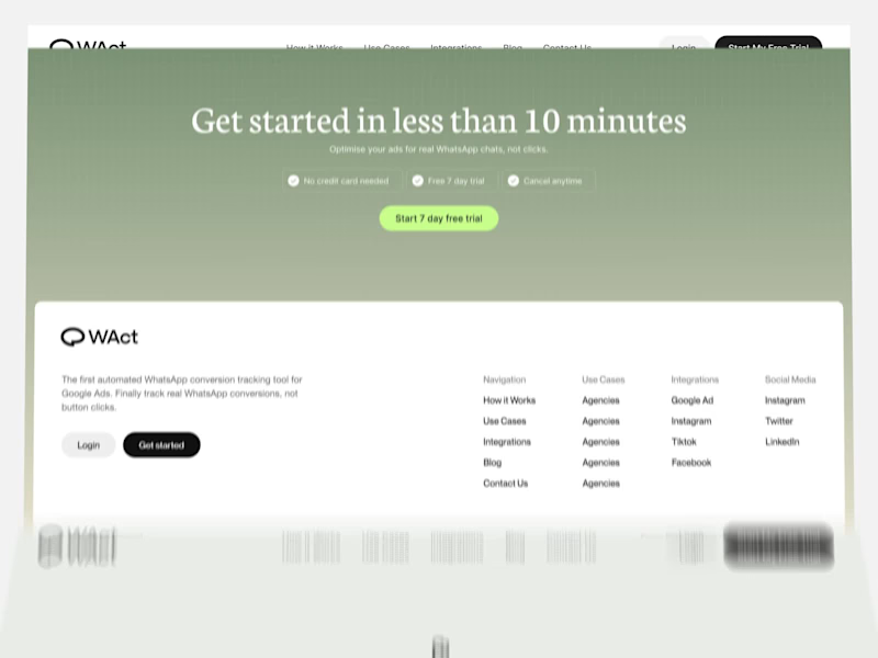
A quick look through the landing page layout for WAct 👀
🔗 Explore the full case study on Behance: WAct on Behance
(https://www.behance.net/gallery/253815513/WACT)I believe most founders know the frustration of running paid ads that bring plenty of clicks, but zero qualified leads. The WAct team needed more than just a visually appealing layout, they needed a site that immediately explains how their platform connects ad spend to actual WhatsApp conversations.
What I focused on here:
Clear hero section: Addresses the pain point right away by showing how ad budget converts directly into real customer chats.
Logical flow: Guides the reader step-by-step from the main problem to key analytics, integrations, and the contact form without any fluff.
Approachable visual style: Combines warm editorial tones and sharp typography so complex B2B data feels straightforward and easy to digest.
For me, combining UI architecture with clean technical implementation is what transforms a site from a static showcase into a high-converting product tool.
I'm currently open to new project opportunities and collaborations. DM me if you have a project in mind!
3
313
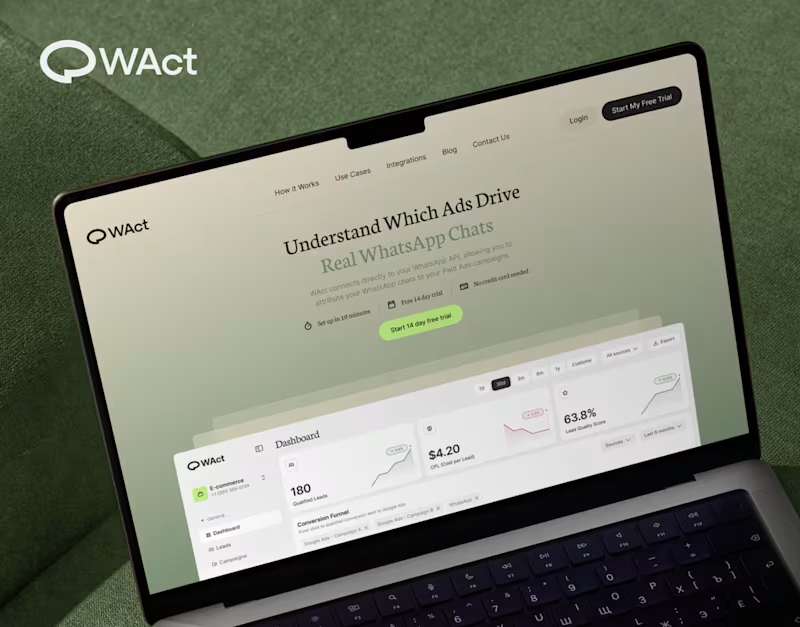
When designing WAct, the main challenge was to make complex analytics feel calm, approachable, and actionable.
Marketing tech platforms often suffer from visual noise: endless charts, aggressive contrast, and buried data.
For WAct, I took an editorial SaaS approach:
Visual Hierarchy: Kept the primary metric cards (CPL, Lead Quality Score) instantly readable at a glance.
Warm Aesthetic: Used a soft, olive-green gradient backdrop paired with editorial typography to make the brand stand out from generic blue dashboard templates.
Dashboard Logic: Structured the flow so users can track multi-channel ad conversions straight into WhatsApp chats without getting overwhelmed.
Building a complex B2B platform or analytics tool? Let’s connect and create a seamless UI/UX for your product.
🔗 Explore the full case study on Behance:
Check out WAct on Behance (https://www.behance.net/gallery/253815513/WACT)
7
22
723

When selling a premium service, mentorship, or high-value framework, a generic template fails to convey the true depth of your offer. The challenge I solved here was translating a multi-stage methodology into an intuitive, high-converting digital experience, built natively on Webflow.
By combining an editorial landscape aesthetic with modern, scroll-triggered interactions, I turned an abstract concept into a seamless visual journey.
Methodology Visualized: I designed custom interactive nodes (Relaxation → Attention → Motivation) that walk users step-by-step through the core process.
Webflow Build: I developed the full site on Webflow with clean HTML/CSS architecture, fluid animations, and fast load speeds.
Editorial Identity: I paired a warm color palette and subtle grid architecture with vintage illustration elements to build immediate authority.
Flexibility: I set up a clean Webflow CMS structure so you can easily update content without touching code.
Need a custom site that clearly communicates the value of your framework and converts visitors into clients? Send me a message and let’s discuss your project!
23
53
2.6K