Manowa: Art-Driven Skincare Branding & Packaging Design
Marta
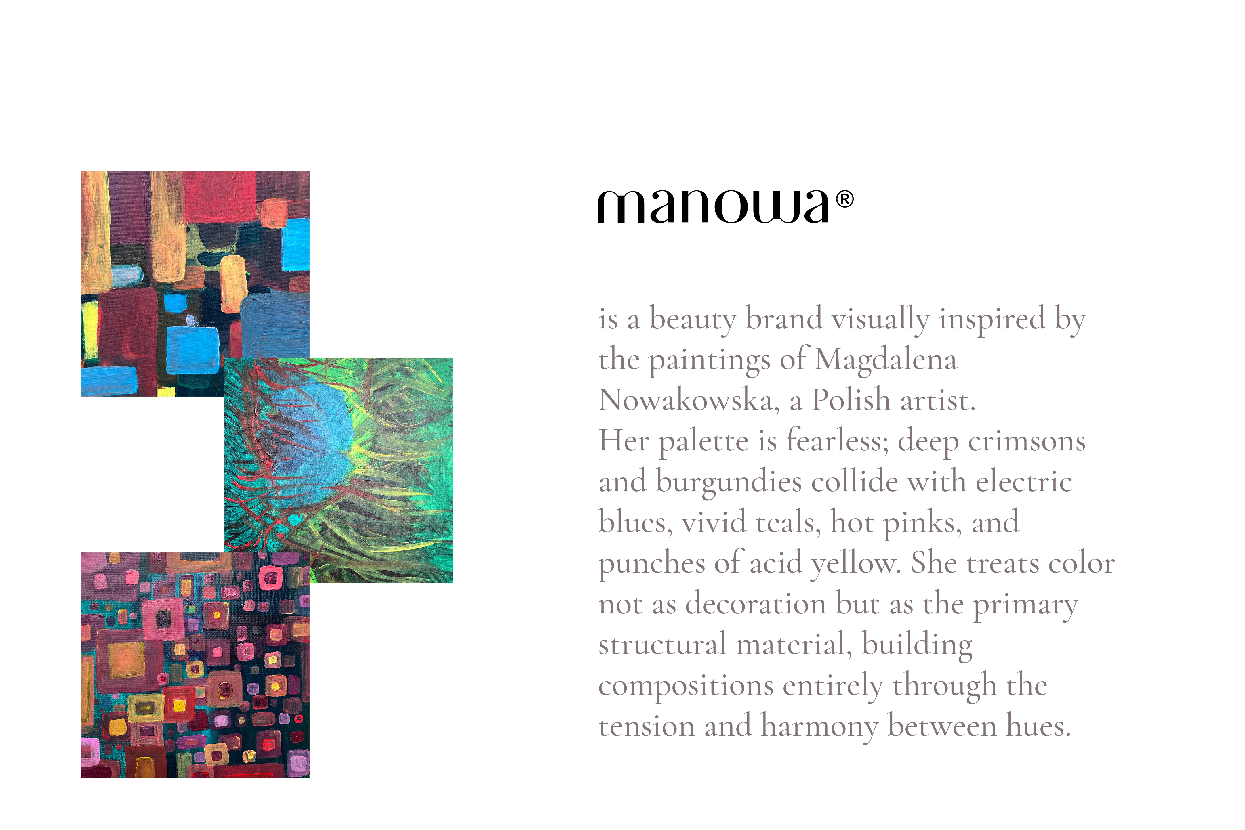
I believe packaging should do more than protect and label. It should move you. The best packaging doesn't just signal what's inside - it expands your sense of self, the way art does when it catches you off guard in a gallery. It makes the everyday a little more beautiful, a little more worth noticing. Manowa is a skincare line built on that conviction.
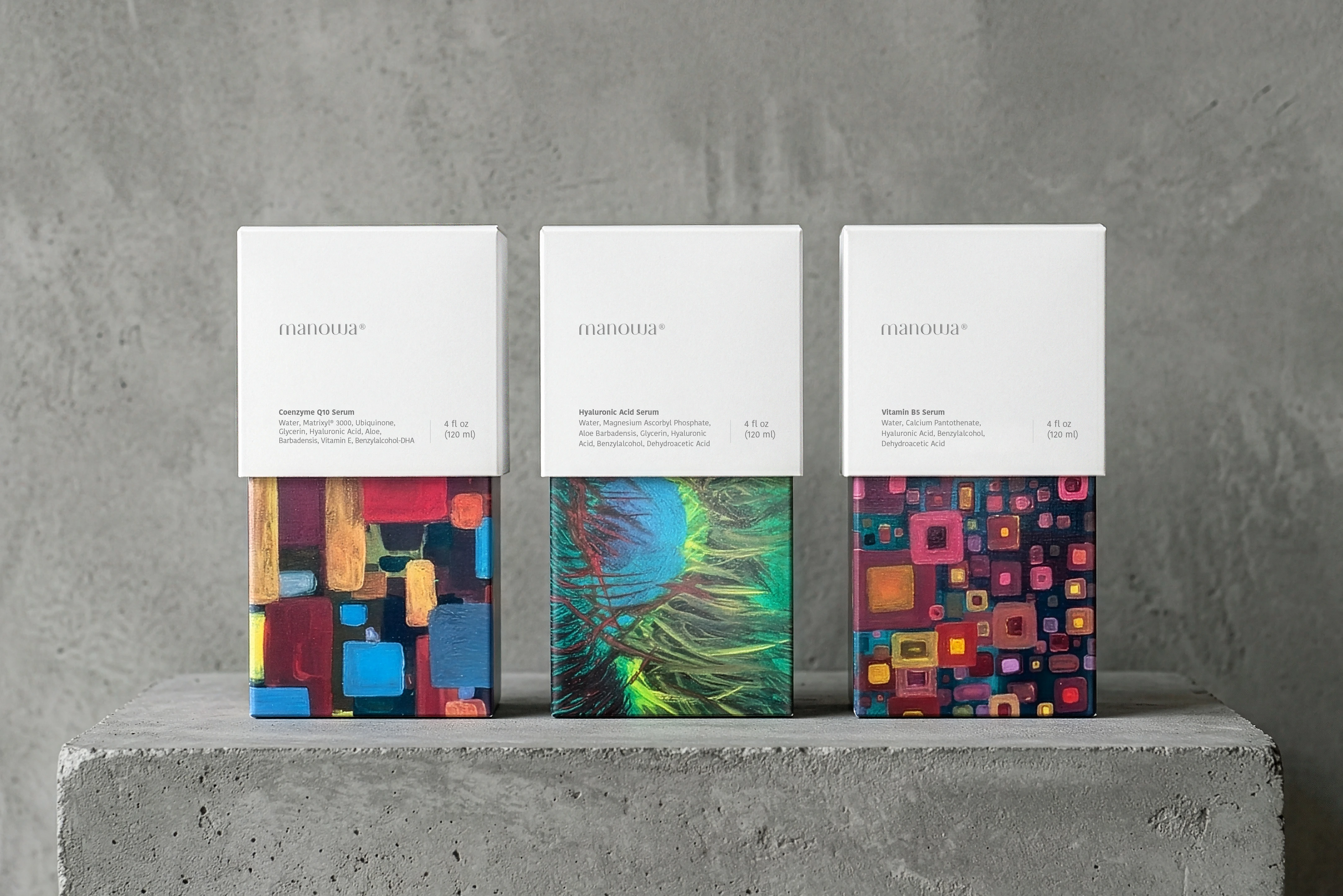
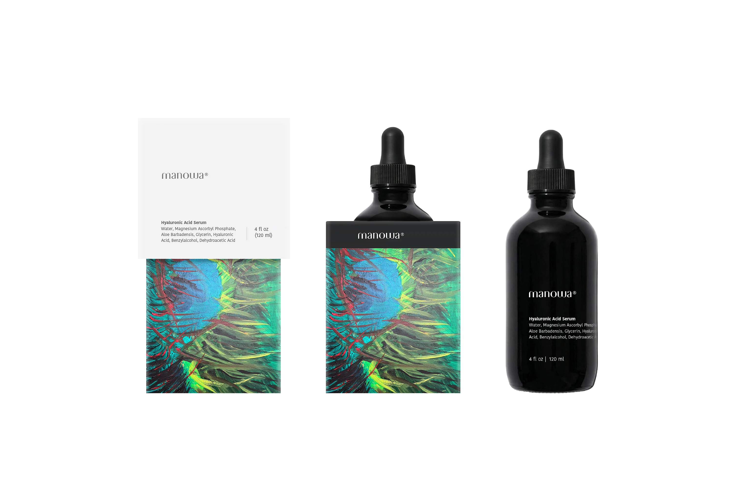
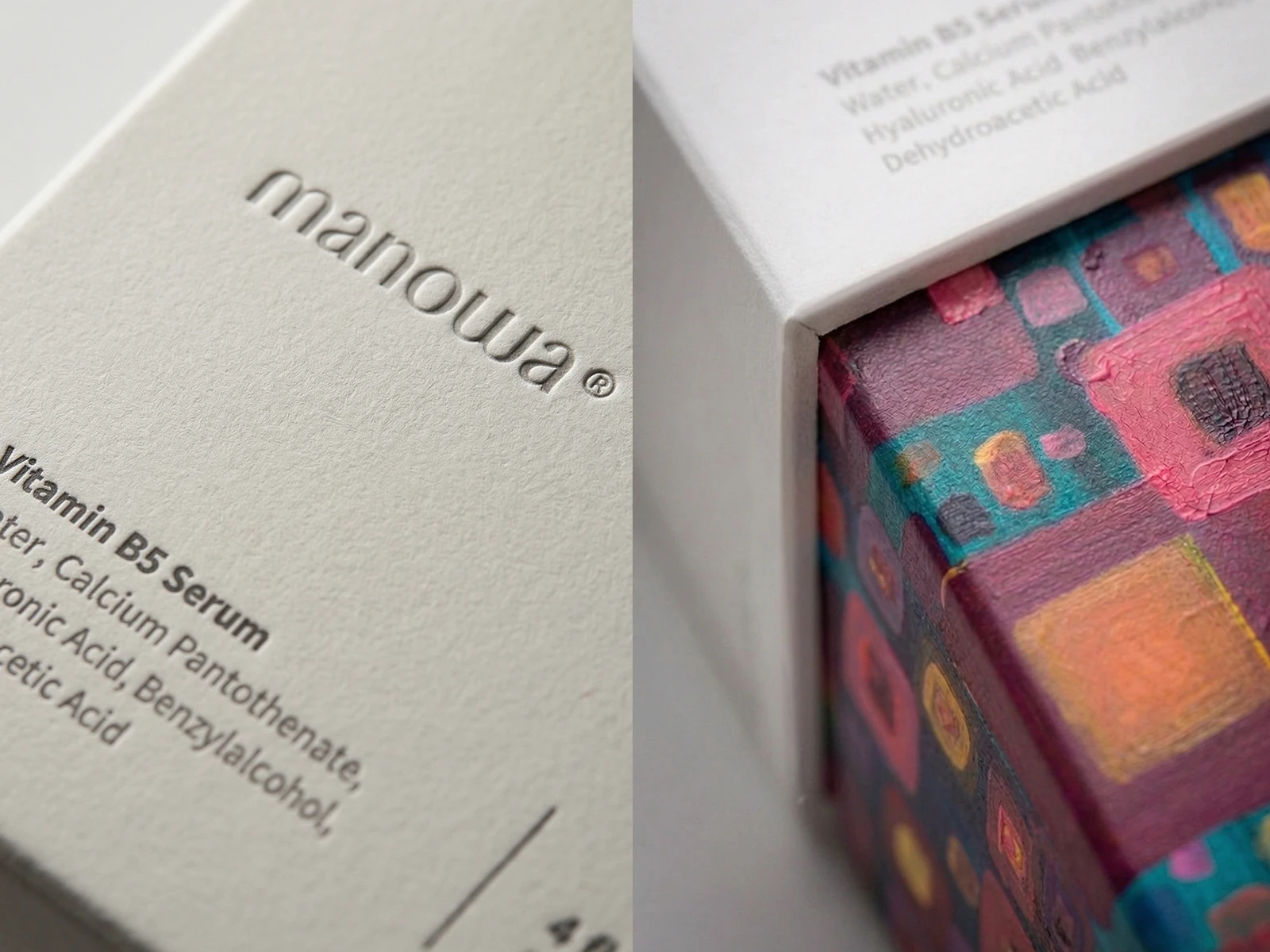
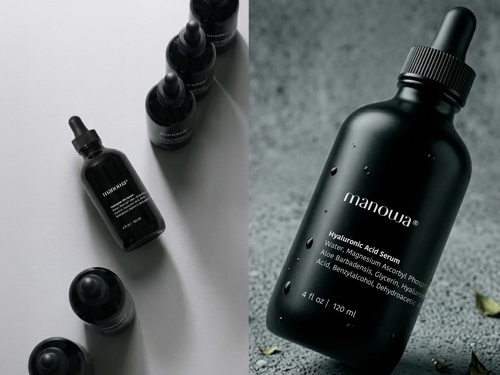
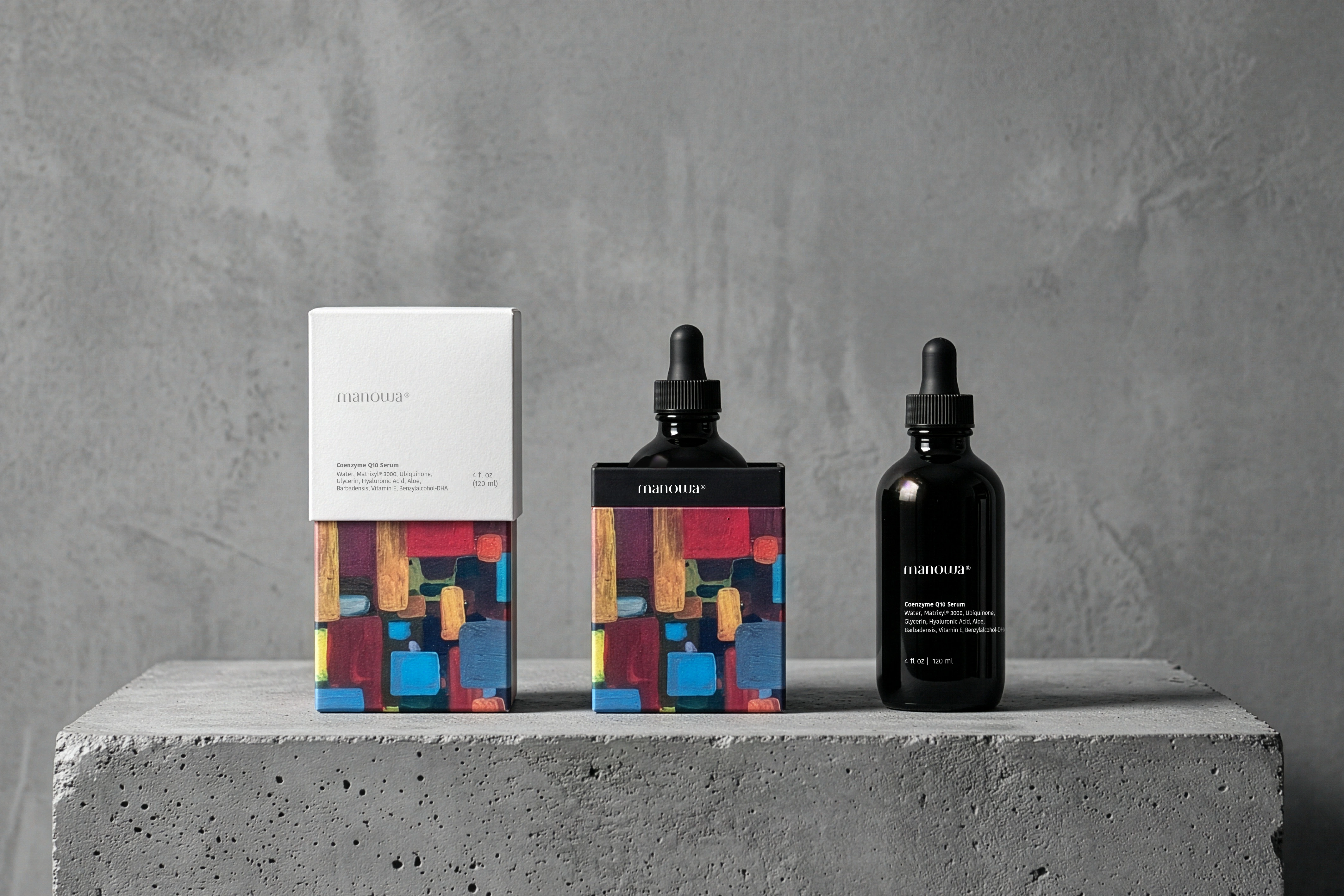
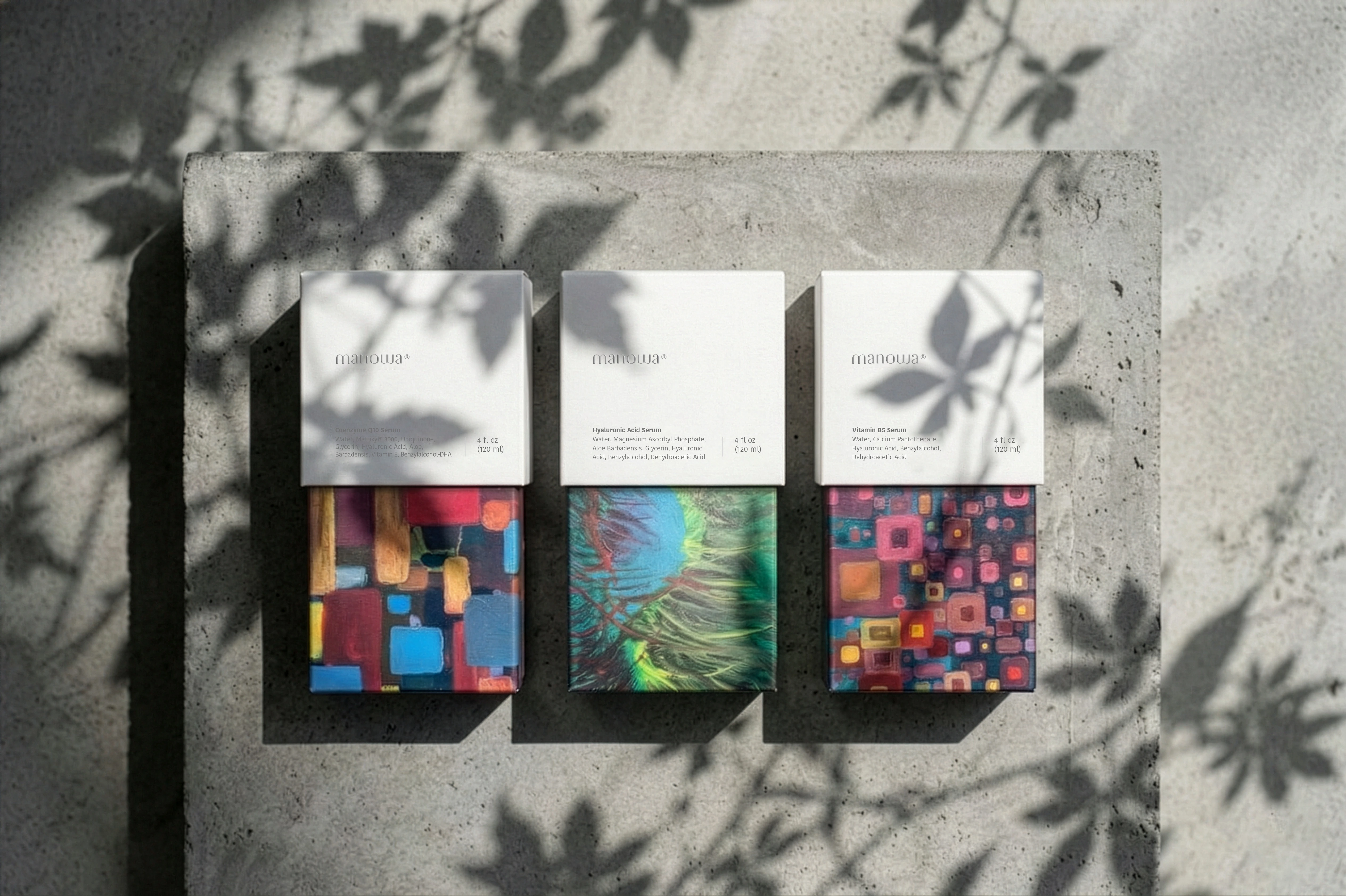
The packaging plays Nowakowska's paintings against radical restraint. The upper half of each box is clean white - debossed logo, minimal typography, quiet product information. The lower half erupts in color: a different Nowakowska painting for each serum in the line. The contrast is deliberate. White space gives the art room to breathe. The art gives the white space something to frame. The bottles follow the same logic - matte black glass with understated labeling, designed to let the packaging do the talking and the product do the work.
The Philosophy od Packaging
We think of packaging as a point of contact between a brand and the world. When that contact carries the energy of an original artwork - the texture of real brushstrokes, the tension of colors chosen by a human hand - it doesn't just add value to a product. It adds something to the room it sits in, to the shelf, to the moment of unboxing. It makes the ordinary world a little more charged with beauty and curiosity.
Manowa is our case for packaging that refuses to be disposable. Every box is a small exhibition.
Like this project
Posted Jun 3, 2026
Art-driven packaging design for Manowa, a skincare line featuring original abstract paintings by Magdalena Nowakowska.
Likes
0
Views
2
Timeline
Jun 3, 2026 - Jun 3, 2026