
Premium UI/UX & Web Design for Fintech, SaaS & Web3 | Framer


Premium UI/UX & Web Design for Fintech, SaaS & Web3 | Framer
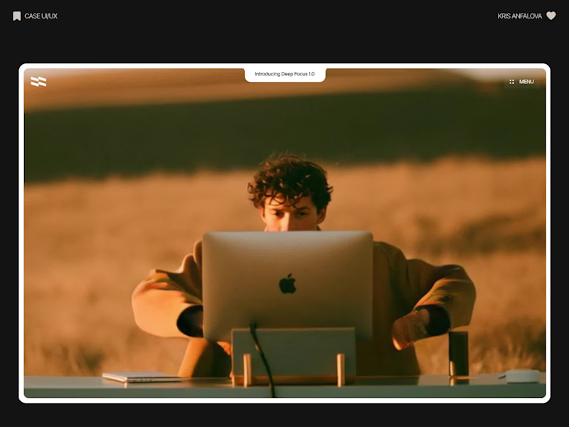
Deep Focus is a fictional macOS app that silences notifications so people can do deep work. The catch is the audience: people who need a productivity app are already tired of apps. Every competitor promises more features, so this page had to promise relief and turn it into a download within seconds.
What I did
I started from the pain, not the product. The second screen lists what a normal day looks like: push notifications, endless pings, 142 unread emails, context switching. I styled those chips like the four benefit chips in the hero, only white instead of frosted, so the visitor reads before and after without a line of explanation.
The hero section design shows no interface on purpose. This product is about absence, and a screenshot would add noise, so a person alone in a field does the proving. The headline “Deep focus. Anywhere.” is a high-contrast serif because every tool in this category speaks in a grotesque, and a serif sounds calm and human.
I kept one action, Download for macOS, with no pricing and no form. The first job of this landing page design is a download, and everything else can wait until after it.
Would you keep the serif for the headline, or switch to a grotesque so it feels more like software?
34
115
4.9K

Designer for your SaaS, app, deck and brand.

Designer for your SaaS, app, deck and brand.

SaaS Product Designer | UI/UX, Webflow & B2B Websites
- $1k+
- Earned
- 4x
- Hired
- 5.0
- Rating
- 455
- Followers
SaaS Product Designer | UI/UX, Webflow & B2B Websites
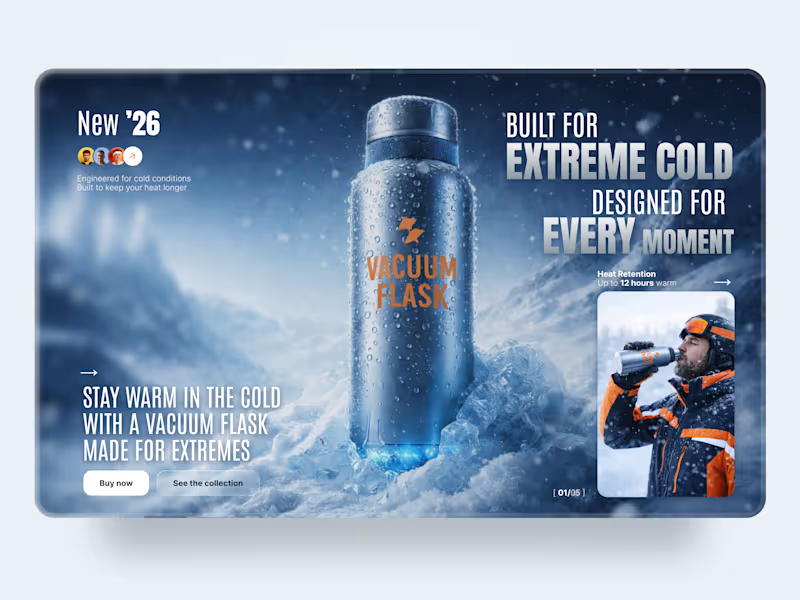
Vacuum Flask is an outdoor product landing page concept built around durability, cold-weather performance, and adventure.
The goal was to make the product feel engineered for extreme conditions while keeping the experience bold, focused, and product-first. The visual direction combines an icy environment, strong typography, deep blue tones, and small orange accents for contrast.
Special attention was given to:
• a cinematic hero composition that immediately puts the product at the center
• oversized typography that reinforces the extreme outdoor positioning
• cold blue tones and snow textures that communicate the product environment
• orange accents that connect the product branding with the explorer imagery
• clear performance messaging around heat retention
• strong Buy Now and collection CTAs without competing with the main visual
• lifestyle imagery that shows the product in a real-use context
• depth, blur, snow, and lighting effects that make the presentation feel immersive
The result is a bold product experience where the environment itself communicates durability, performance, and adventure.
Looking to create a high-impact landing page for your outdoor, sports, or consumer product? Let’s make the product impossible to ignore ❄️
4
8
1.8K
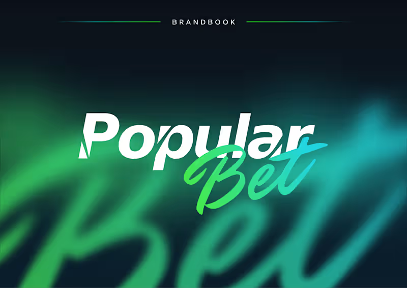
Popular Bet — Bold Brand Identity for an iGaming Platform 🎯⚡
Popular Bet is a dynamic brand identity concept created for a modern betting and entertainment platform built around speed, energy, and instant recognition.
The visual direction combines sharp typography, expressive script lettering, and a vivid green-to-cyan gradient to create a brand that feels competitive, digital-first, and highly memorable. The identity was designed to stand out across fast-moving environments while remaining clear and consistent across different formats.
Special attention was given to:
• a distinctive wordmark combining bold sans-serif typography with expressive handwritten lettering;
• a vibrant gradient palette that communicates energy, motion, and digital innovation 🎨;
• flexible logo versions for light, dark, monochrome, and complex backgrounds;
• clear-space and usage guidelines that protect readability and visual consistency;
• a scalable identity system suitable for digital platforms, social media, campaigns, and promotional materials;
• a high-impact visual language inspired by competition, momentum, and modern entertainment.
The result is a confident and adaptable brand system that helps Popular Bet feel recognizable, energetic, and ready to compete in a crowded digital market 🚀
Looking to build a bold identity for your iGaming, entertainment, sports, or digital platform? Let’s create a brand people remember ✨
1
16
982
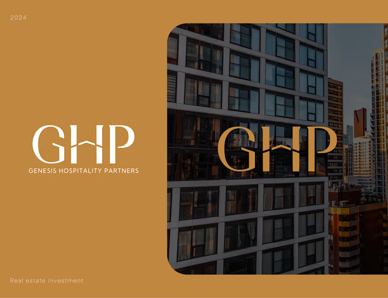
Genesis Hospitality Partners — Luxury Real Estate Brand Identity 🏙️✨
We designed a premium visual identity for Genesis Hospitality Partners 🏢 — a real estate investment brand focused on creating trust, sophistication, and long-term value perception from the very first interaction.
The challenge was to develop a brand system that feels timeless and refined while standing confidently within the highly competitive real estate and hospitality investment space. Through elegant typography, architectural references, and a restrained premium palette, we created an identity that communicates stability, credibility, and ambition.
Special attention was given to:
• a distinctive monogram logo inspired by architectural forms and premium property aesthetics;
• elegant typography designed to balance luxury positioning with corporate professionalism;
• a sophisticated color palette combining warm gold tones with deep neutrals to reinforce exclusivity and trust;
• scalable branding assets optimized for presentations, investment materials, digital platforms, and print applications;
• visual language inspired by modern urban architecture and high-end hospitality developments;
• a timeless identity system built to support long-term brand growth and market recognition.
The result is a refined brand experience that helps communicate confidence, premium positioning, and investment credibility — creating a strong foundation for future growth in the hospitality and real estate sectors.
Looking to create a premium brand identity for your real estate, investment, hospitality, or professional services business? Let's build something memorable together 🤝
1
19
996

Winner of the 2025 Framer Award & Official Framer Expert
Winner of the 2025 Framer Award & Official Framer Expert


Webflow/Framer Expert & UXUI Designer for growing businesses
- $1k+
- Earned
- 2x
- Hired
- 4.6
- Rating
- 61
- Followers
Webflow/Framer Expert & UXUI Designer for growing businesses


Expert Web Design, Branding & Marketing


Responsive Web design, UI/UX Design, App Design
Responsive Web design, UI/UX Design, App Design


Brand & Website Designer


