
Brand + websites that close B2B deals | designwithclarity.co

Brand + websites that close B2B deals | designwithclarity.co
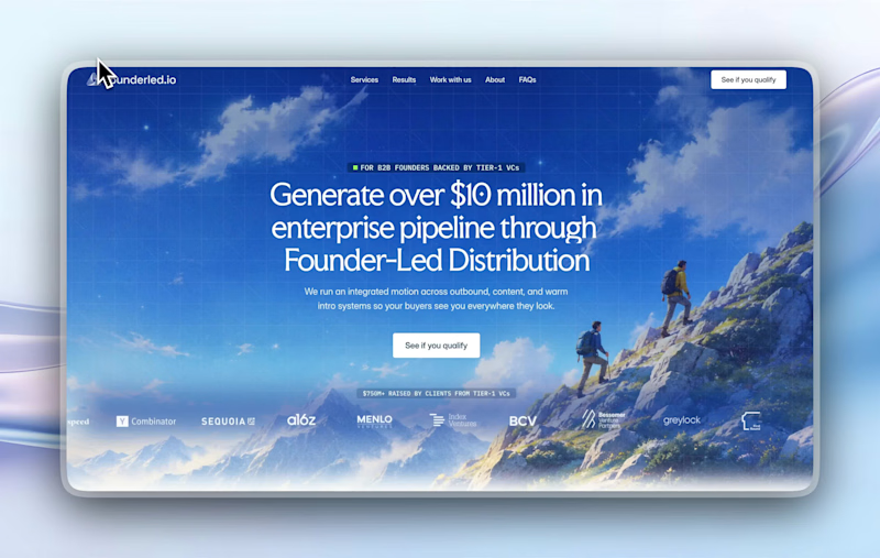
recent website revamp for Founderled (https://founderled.io).
Founderled is the the trusted GTM partner behind 25+ founders who've raised over $750M from Tier-1 VCs like YC, Sequoia, a16z.
cooking as usual @ clarity design studio
(https://designwithclarity.co)https://cal.com/clarity-design-studio/discovery-call
16
56
2.5K
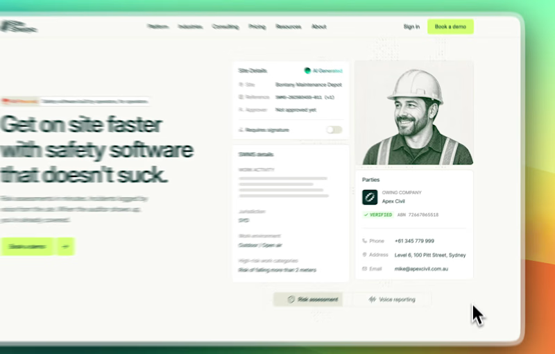
POV: you're a SaaS (SiteSherpa (sitesherpa.co)) going AI-native in an industry full of legacy players (WHS management)
you need a new homepage and clean animations that clearly explains your value.
who do you turn to? clarity design studio (designwithclarity.co) 😎
https://cal.com/clarity-design-studio/discovery-call
1
113
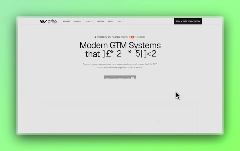
website redesign for Wahoo - a Fractional GTM partner trusted by YC-backed founders that has generated £10,000,000+ in pipeline.
we delivered the following:
- website design and dev
- brand refresh
👉 we're taking on website and brand sprints for founders going up-market in Q4:
https://cal.com/clarity-design-studio/discovery-call
1
1
122


5★ Rated Top 1 Web & Brand Designer Framer, WordPress, UI/UX
5★ Rated Top 1 Web & Brand Designer Framer, WordPress, UI/UX


Product (UI/UX) Designer

Product (UI/UX) Designer


Web & Brand Designer | Webflow, Framer, Shopify, WordPress
- $1k+
- Earned
- 6x
- Hired
- 5.0
- Rating
- 51
- Followers
Web & Brand Designer | Webflow, Framer, Shopify, WordPress




Crafting Websites that Convert


Crafting Websites that Convert


View more →

UI/UX Designer + Webflow developer
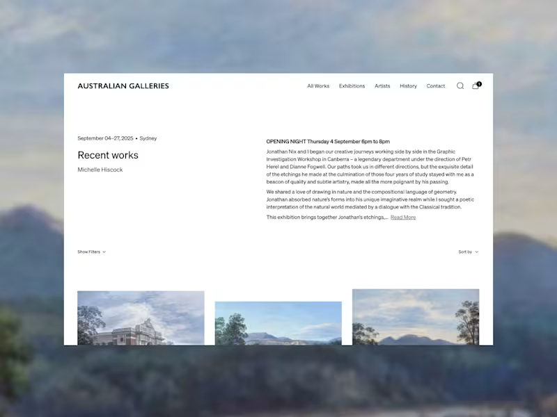
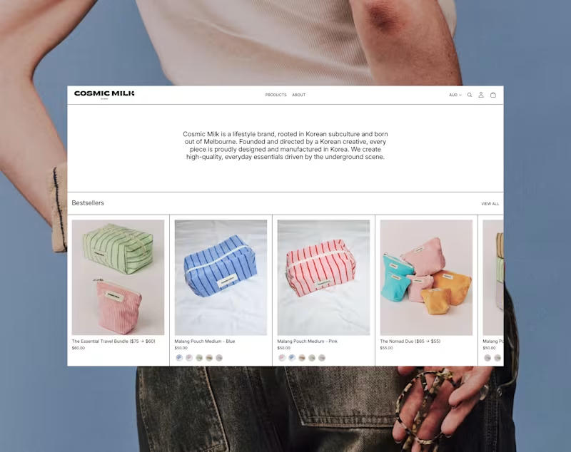
UI design and Shopify dev for Cosmic Milk, a lifestyle brand rooted in Korean subculture and born out of Melbourne.
1
57
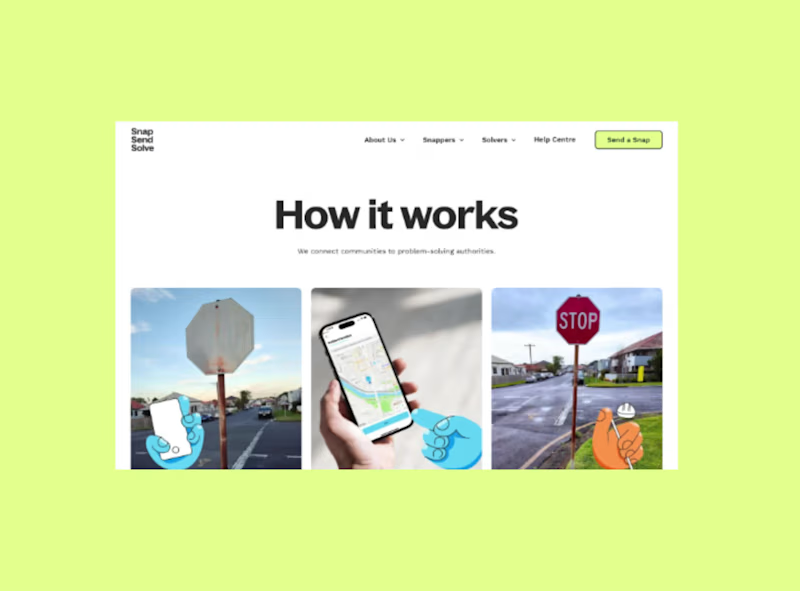
I designed and built a new website for Snap Send Solve, an app used by over 1 million people to report local issues like potholes and dumped rubbish to more than 850 coI designed and built a new website for Snap Send Solve, an app used by over 1 million people to report local issues like potholes and dumped rubbish to more than 850 councils, utilities and organisations across Australia and New Zealand.
The site needed to speak to two very different audiences: everyday "Snappers" using the free app, and the councils and organisations who subscribe to the platform.uncils, utilities and organisations across Australia and New Zealand. The site needed to speak to two very different audiences: everyday "Snappers" using the free app, and the councils and organisations who subscribe to the platform.
0
101


Strategic websites for purpose-led brands
Strategic websites for purpose-led brands


Visual Systems Designer for Scaling Brands & Products
- 5.0
- Rating
- 82
- Followers
Visual Systems Designer for Scaling Brands & Products

My senior once gave me a brief: pick one subject and design a poster every day for 100 days. I made it to 51.
Not because I ran out of ideas, but because by poster 51, the exercise had already taught me what it was supposed to.
What changed between Car 01 and Car 51 wasn't just better design skills. It was much more specific.
→ Coming up with ideas became faster. On day one, I'd spend hours trying to find a direction. A few weeks later, I could explore multiple concepts, reject the weak ones, and move on without overthinking.
→ My layouts became more intentional. The early posters were mostly a car placed in the centre with a background. Later, I started experimenting with depth, layering, asymmetry, and negative space because repeating the same layout wasn't interesting anymore.
→ I got bored, and that turned out to be the best part. Somewhere after the halfway mark, I stopped opening Illustrator first and started sketching with a pen. Many of the later posters began on paper instead of a screen. Boredom pushed me to think differently instead of just decorating.
→ I stopped chasing perfect. Some of the posters I spent the most time on were honestly weaker than the ones I finished quickly. I realised perfectionism was slowing me down more than it was improving the work.
The biggest lesson wasn't about vintage cars.
It was about having someone who gives you the right challenge. A good mentor doesn't just teach software or techniques. They give you a constraint that forces you to make decisions, stay consistent, and keep creating even when the excitement wears off.
If you're early in your design career, find someone who'll give you that kind of brief. It will teach you more than any course ever could.
#designthinking #creativeprocess #visualdesign #mentorship
#designcareer #creativeleadership #designcommunity #creativegrowth
2
4
203

I recently designed logo for Kalava Ties, a wedding brand.
So, the idea started from something simple - a tie.
Not just visually, but what it means.
Two people. Two families. Things coming together.
The monogram is built around this idea of a tie that never really ends. The form flows, loops, and reconnects.
In many Indian traditions, a kalava is tied as a mark of protection, intention, and continuity.
A simple thread, but it carries meaning
There’s more than one way to read this mark.
What stands out to you first?
2
107

Designed a complete brand experience for this project, from identity to social media.
Every visual element was crafted to reflect the space’s character while maintaining consistency across digital touchpoints.
From storytelling-led posts to performance-driven creatives, this work translated into campaigns that not only looked refined but also supported real engagement and ad performance.
Campaign visuals used across social media and paid ads.
2
247
