Logo Designs

Maham Vohra


Throughline — Developing a Complete Visual Identity System
✨ Project Type: Brand Identity & Logo Design
🎨 Services: Logo Design, Branding, Visual Identity, Typography, Color System
🏢 Industry: Audit & Assurance
💻 Focus: Brand Identity Presentation
🌟 Project Overview
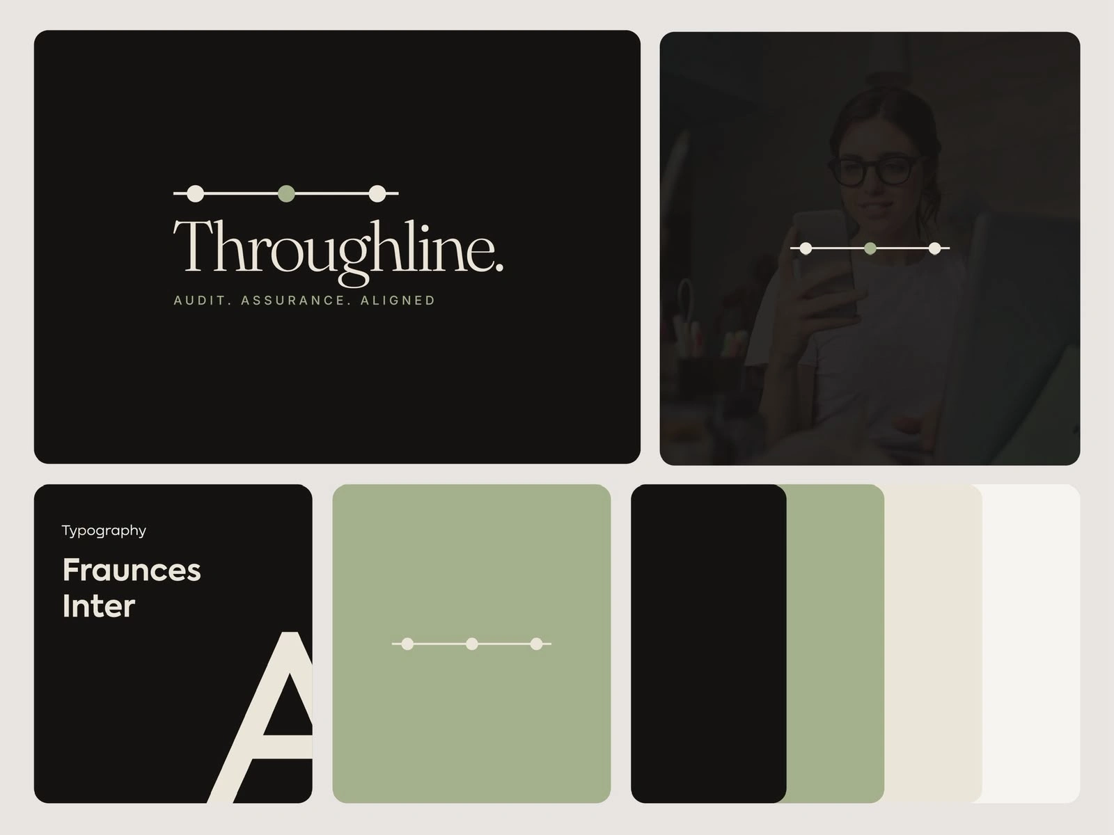
This second image showcases the broader visual identity system for Throughline, taking the logo beyond a standalone mark and exploring how the brand can establish a consistent visual language.
The objective was to build an identity that feels calm, sophisticated, trustworthy, and contemporary, while giving the brand enough flexibility to communicate across different visual environments.
Rather than treating the logo as an isolated graphic, I explored the relationship between:
Logo + Typography + Color + Photography + Layout + Graphic Elements
This approach creates a much stronger and more cohesive branding system.
🧠 From Logo to Visual Language
A successful brand identity needs to communicate consistently even when the logo isn't the primary element.
For Throughline, the linear motif becomes a recurring visual element throughout the system.
The three-point structure creates a recognizable graphic language that can be scaled, repositioned, and integrated into different layouts.
This creates continuity between the logo and the rest of the brand experience.
The visual idea becomes more than just a logo — it becomes a brand asset.
🎨 Color Palette
The color palette is intentionally restrained.
The combination of:
🖤 Deep charcoal
🌿 Muted sage green
🤍 Warm off-white
creates a sophisticated and premium visual environment.
The dark charcoal provides depth and authority.
The warm off-white introduces softness and readability.
The muted green creates a subtle point of differentiation.
The result is a palette that feels professional without looking generic.
✍️ Typography System
Typography was treated as one of the primary components of the brand identity.
The elegant serif direction used for the Throughline wordmark creates a feeling of credibility and sophistication.
Supporting typography provides contrast and improves hierarchy across different applications.
This combination allows the brand to communicate both experience and modernity.
The typography system can therefore support everything from large brand statements to smaller supporting information.
📸 Photography Direction
The identity presentation also explores how photography can live within the brand system.
Rather than using bright or overly saturated imagery, the photographs are treated with darker tonal values so they integrate naturally with the overall visual language.
This helps maintain consistency even when photography becomes a major component of a design.
The result is a visual environment that feels professional, calm, and premium.
🧩 Building a Flexible Brand System
The modular presentation demonstrates how different elements can work together.
The logo can appear prominently.
The linear symbol can work independently.
The color palette can create backgrounds.
Typography can establish hierarchy.
Photography can introduce human context.
Together, these elements create a cohesive system that can expand as the brand grows.
📐 Why Simplicity Matters
For a professional services brand, visual communication needs to inspire confidence.
Overly complex branding can sometimes make a company appear less established or less focused.
The Throughline identity takes the opposite approach.
It uses simplicity as a strategic advantage.
Clean layouts, generous spacing, restrained colors, and intentional typography allow the brand to feel confident without needing to visually shout.
🚀 Applications & Scalability
This identity system can be translated into a wide range of brand touchpoints:
📊 Corporate presentations
📑 Audit reports
🌐 Website design
📱 Social media graphics
📄 Documents
📇 Stationery
🎥 Digital content
📈 Marketing materials
The system is flexible enough to support both formal business communication and modern digital experiences.
✨ Final Outcome
The result is a complete visual direction that gives Throughline more than just a logo.
It gives the brand a recognizable visual language.
The linear motif creates consistency, the typography establishes authority, the muted palette creates sophistication, and the photography direction adds depth.
💭 Design Takeaway
Great branding isn't only about designing a beautiful logo.
It's about creating a system that can continue communicating the same message everywhere the brand appears.
This Throughline identity was designed with exactly that philosophy in mind. 🎯
Keywords: Brand Identity Design, Logo Design, Visual Identity, Corporate Branding, Audit & Assurance Branding, Professional Services Branding, Typography, Color Palette, Brand Guidelines, Minimal Branding, Modern Corporate Identity.
Throughline concept 3
Throughline — Designing a Distinctive Geometric Monogram Logo
✨ Project Type: Logo Design
🎨 Services: Logo Design, Monogram Design, Brand Identity, Visual Identity
🏢 Industry: Audit & Assurance / Professional Services
💻 Concept: Geometric “T” Monogram
🚀 Project Overview
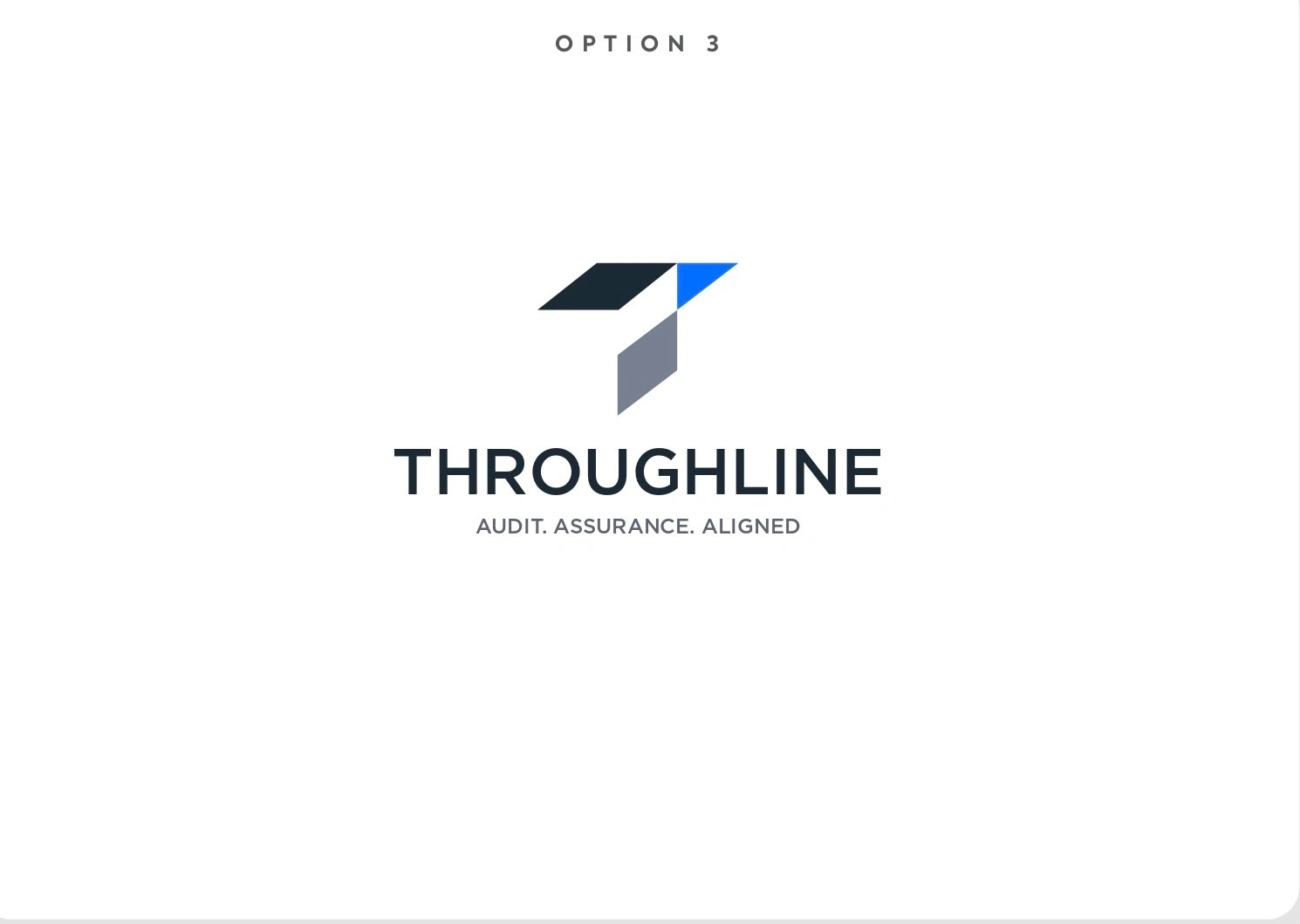
The fourth image presents Option 3 for the Throughline logo exploration.
This direction takes a more geometric and symbolic approach, transforming the letter T into a standalone visual mark.
The objective was to create a logo that could immediately communicate the identity of Throughline even without relying on the full company name.
This is particularly valuable for modern brands because a strong symbol can eventually become one of the most recognizable assets in the entire identity system.
🔷 Building the Monogram
The logo is constructed using several geometric forms that work together to create an abstract T.
Instead of drawing the letter in a conventional way, the mark breaks the form into separate components.
This creates a sense of movement and dimensionality while keeping the overall silhouette recognizable.
The geometric structure gives the logo a feeling of:
Precision → Structure → Alignment → Direction → Progress
These qualities naturally support the positioning of an audit and assurance brand.
🎯 The Meaning Behind the Geometry
The individual components of the mark can be interpreted as different parts coming together to create one unified structure.
That idea connects directly with the name Throughline.
A throughline is essentially the connecting idea or structure that runs through different points.
The geometric construction visually reinforces this idea by creating a single recognizable symbol from multiple components.
This gives the logo a subtle conceptual layer rather than making it purely decorative.
💙 Color Strategy
The logo uses a combination of deep navy, bright blue, and cool gray.
Each color has a specific visual role.
The deep navy establishes professionalism and authority.
The bright blue introduces energy and modernity.
The gray provides balance and neutrality.
Together, these colors create a visual identity that feels established but not traditional.
It positions the brand closer to a modern professional services company rather than a conventional corporate firm.
✍️ Wordmark & Tagline
The geometric symbol is paired with a clean uppercase wordmark:
THROUGHLINE
This creates a strong contrast between the abstract icon and the highly readable company name.
The tagline:
AUDIT. ASSURANCE. ALIGNED
sits beneath the wordmark and clearly communicates the brand's core positioning.
The tagline is intentionally smaller so that it supports rather than competes with the primary identity.
📐 Scalability
One of the major advantages of this direction is the standalone symbol.
The full lockup works beautifully for:
📄 Corporate documents
🌐 Website headers
📊 Presentations
💼 Business materials
But the symbol itself can potentially be used independently for:
📱 Social media avatars
🌐 Favicons
💻 Digital interfaces
📲 Mobile applications
🎥 Motion graphics
🎯 Marketing campaigns
This creates a much more flexible branding system.
🧠 Why a Monogram Works
Monogram logos are particularly useful when a brand wants a strong visual shorthand.
The full name may be required when introducing the company, but once the audience becomes familiar with the symbol, the mark can communicate the brand much faster.
For Throughline, the geometric T becomes a potential visual signature.
The goal is not simply to make a letter look interesting.
The goal is to create a symbol that becomes associated with the brand over time.
✨ Final Outcome
Option 3 provides a more bold, structured, modern, and scalable interpretation of the Throughline identity.
The geometric monogram gives the brand a recognizable symbol, while the clean typography and restrained color palette keep the overall identity professional.
It is a strong direction for a company looking to establish a visual identity that can work across both traditional professional services and modern digital platforms.
💭 Final Design Takeaway
The strongest logos often have two layers:
What you see: A simple, memorable geometric symbol.
What you understand: A visual representation of the brand's positioning.
With this Throughline concept, the geometric T becomes more than a letter. It becomes a visual representation of alignment, structure, connection, and forward movement. 🔷
Keywords: Logo Design Case Study, Monogram Logo, Geometric Logo Design, T Logo, Brand Identity, Corporate Branding, Professional Services Branding, Audit Logo, Assurance Logo, Modern Logo Design, Minimal Logo Design, Visual Identity, Brand Strategy.
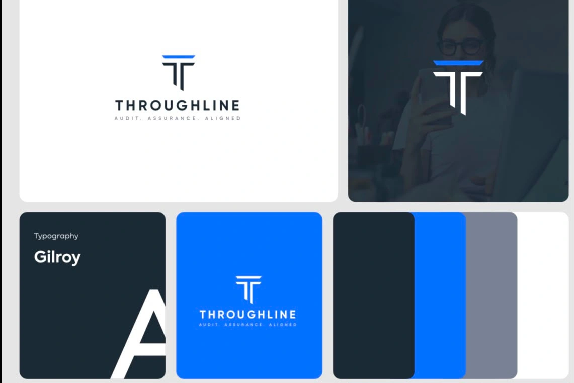
Throughline — Exploring a Modern, Confident Corporate Identity
✨ Project Type: Logo Design & Brand Identity
🎨 Services: Logo Design, Brand Strategy, Visual Identity, Color Exploration
🏢 Industry: Audit & Assurance
💻 Concept: Modern Corporate Branding
🔵 Project Overview
This image presents another visual direction explored for Throughline, shifting the identity toward a more confident, corporate, and digitally focused aesthetic.
The goal was to explore how the same brand concept could evolve when introduced to a stronger color palette and a more contemporary visual treatment.
The result is a visual identity that feels more energetic while still maintaining the trust and professionalism expected from a brand operating within audit and assurance.
🧠 Exploring Multiple Brand Directions
Strong identity design often requires exploration before reaching the final direction.
Instead of immediately locking the brand into one visual style, I explored different approaches to understand how Throughline could position itself visually.
This direction demonstrates how the identity can move from a sophisticated editorial aesthetic into something that feels more corporate, modern, and technology-friendly.
The underlying brand idea remains consistent while the visual personality changes.
🔷 The Symbol
The symbol is constructed from geometric shapes that create an abstract interpretation of the T in Throughline.
The mark uses angular forms and negative space to create a distinctive visual signature.
The geometry communicates:
📐 Structure
🎯 Precision
🔗 Alignment
📈 Progress
🧩 Connection
The simplicity of the construction makes it suitable for both large-scale branding and smaller digital applications.
💙 Introducing Blue
The introduction of a vibrant blue dramatically changes the personality of the identity.
Blue is widely associated with qualities such as:
Trust • Confidence • Stability • Technology • Professionalism
For an audit and assurance-focused brand, these associations make the color direction particularly relevant.
The brighter blue also gives the identity more energy than the darker monochromatic direction.
This makes it especially suitable for a brand that wants to feel established while also appearing modern and digitally capable.
🖋️ Typography & Hierarchy
The typography in this direction is more straightforward and corporate.
The uppercase THROUGHLINE wordmark creates a strong visual presence and improves readability across digital and professional applications.
The supporting tagline sits underneath with smaller typography and increased spacing, creating a clear hierarchy:
Brand Name → Supporting Statement → Brand Positioning
This creates a clean and highly usable lockup.
📱 Digital-First Thinking
One of the key considerations behind this direction was how the identity would behave in modern digital environments.
The simplified symbol could potentially work as:
🌐 Website favicon
📱 Social media profile image
💻 App icon
📊 Presentation mark
📧 Email signature
🎨 Marketing graphic
This gives the brand an advantage in environments where a complete wordmark may not always fit.
🧩 Consistency Across the System
The blue, dark navy, gray, and white palette creates multiple opportunities for brand applications.
The identity can appear on a white background for formal communication.
It can use blue when the brand needs stronger visual impact.
It can use dark navy for more premium or corporate applications.
This creates a flexible visual system rather than a single fixed logo treatment.
✨ Final Result
This direction gives Throughline a more confident, contemporary, and digitally oriented identity.
The geometric logo symbol provides recognition, while the blue accent creates energy and trust.
The result feels appropriate for a modern professional services company that wants to communicate expertise without appearing outdated.
💭 Design Takeaway
This concept demonstrates an important part of brand identity design: the same strategic idea can be expressed through completely different visual personalities.
Throughline can feel sophisticated and editorial in one direction or confident and corporate in another — while maintaining the same underlying positioning.
That flexibility is what makes the identity system valuable. 🚀
Keywords: Logo Design, Corporate Logo Design, Brand Identity, Blue Branding, Professional Services Logo, Audit Branding, Assurance Branding, Modern Corporate Identity, Geometric Logo, Minimal Logo, Visual Branding.
Like this project
Posted Aug 24, 2026
Modern logo designs blending strategy, typography, and distinctive symbols to create memorable, professional, and scalable brand identities for growing brands.