Freelance Packaging Designers in Tacoma
Sign Up
Post a job
Sign Up
Log In
Filters
2
Projects
People
Bryan Danknich
pro
Seattle, USA
Creative Director | Sr. Brand Designer | Brand Systems
7
Followers
Follow
Message
Creative Director | Sr. Brand Designer | Brand Systems
15
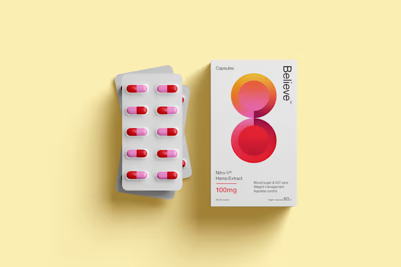
Brand and packing design for Believe, a body-positive, hemp-derived weight management supplement
4
15
238
0
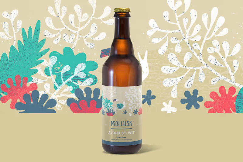
Mollusk
0
5
0
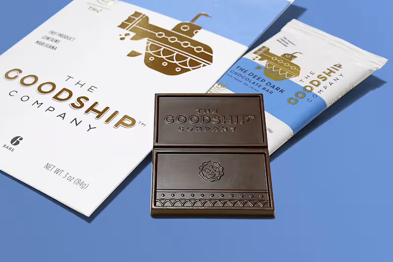
The Goodship Company
0
0
1
Highside Distilling
1
1
Packaging Designer
(4)
Follow
Message
Kindra Smith
pro
Seattle, USA
Designing with heart for heart-driven brands
Follow
Message
Designing with heart for heart-driven brands
0
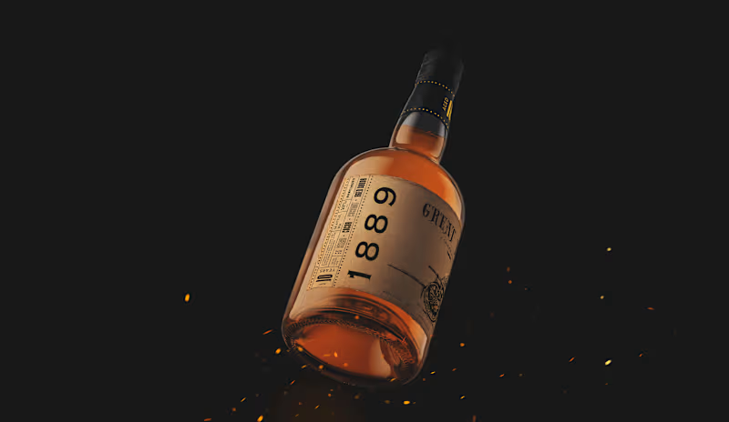
Greta Fire Rum
0
6
0
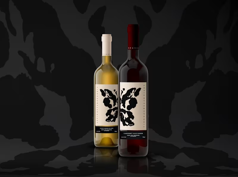
Lepidopterophobia
0
6
0
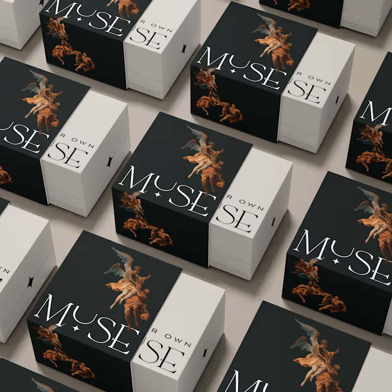
Muse
0
4
0
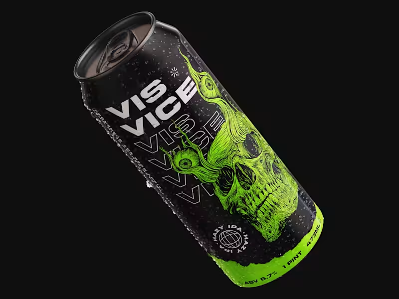
Vis Vice
0
15
Packaging Designer
(4)
Follow
Message
Elexia Johnson
Seattle, USA
Helping Businesses Stand Out Through Strategy & Design
22
Followers
Follow
Message
Helping Businesses Stand Out Through Strategy & Design
28
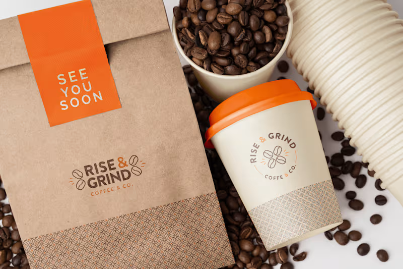
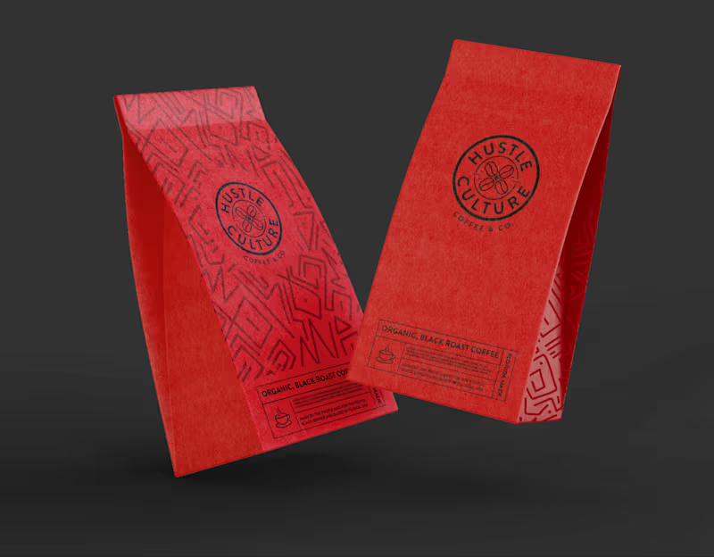
Some of my favorite work never sees the shelves. These were alternate brand concepts for Rise & Grind Coffee, a Black-owned online coffee brand I helped shape. The client went in another direction, but I'm still obessed with the red and black concept. Honestly? I'd still drink this version of the brand. Which concept would you grab off the shelf? #BrandDesign #PackagingConcepts #CreativeProcess
5
28
207
80
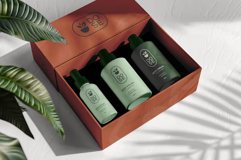
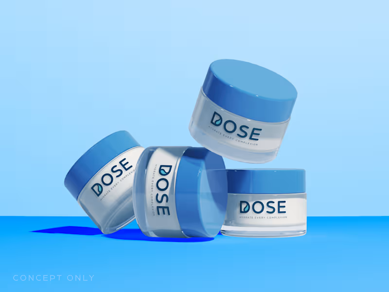
Every concept tells a story — even the ones that never leave your artboard. When I was developing the packaging system for Dr. O’Neal’s Skincare Essentials (DOSE), I explored how texture, tone, and light could shift the same brand essence into completely different experiences. One direction whispered ritual. Another radiated science. A third captured that serene middle ground between the two. These concepts might never reach production, but they represent something important — possibility. They remind me that design isn’t only about the final product; it’s about exploring the range of what a brand could become. It made me wonder — what do you do with your unchosen concepts? Archive them? Rework them later? Or let them rest as part of your evolution? #PackagingDesign #BrandIdentity #SkincareBranding
14
80
365
0
Rise & Grind Coffee Brand Identity
0
2
0
Saanj Winery - Brand Identity
0
4
Packaging Designer
(3)
Follow
Message
Maddie Wilcox
Seattle, USA
Graphic designer
Follow
Message
Graphic designer
0
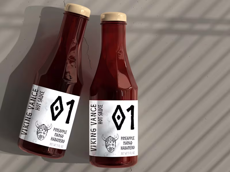
Hot Sauce Logo and Packaging
0
10
0
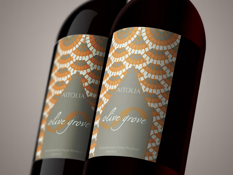
Olive Oil Labels-Aitolia
0
4
0
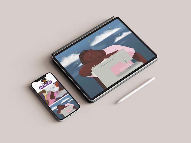
Illustration Marketing Materials
0
17
0
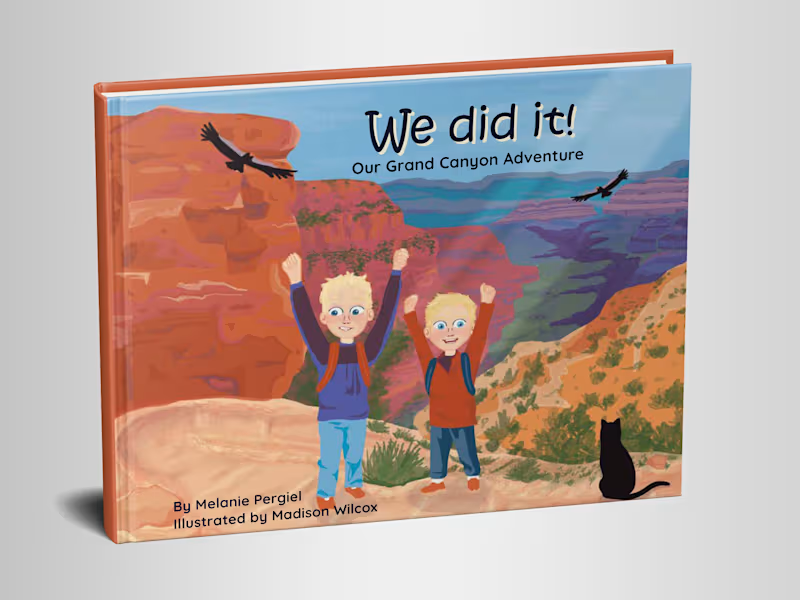
Children's Book Illustrations
0
11
Packaging Designer
(2)
Follow
Message
Ali Showkati
Seattle, USA
Designer specialized in brand growth
Follow
Message
Designer specialized in brand growth
1
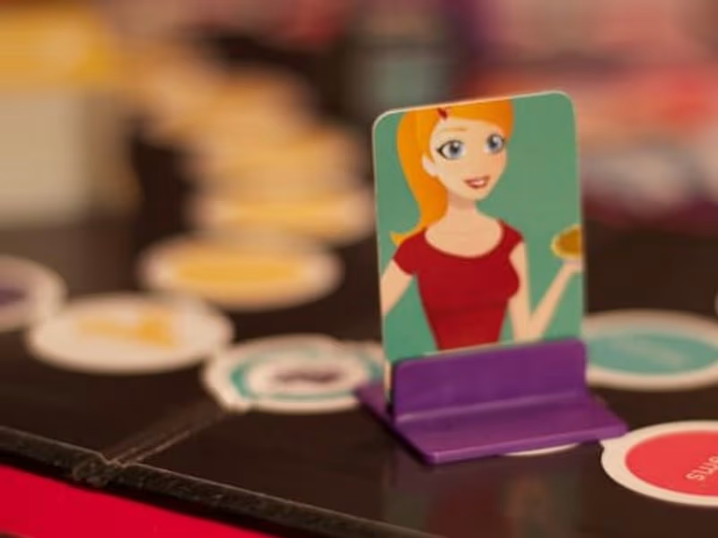
Sugar & Spice Cooking Board Game
1
11
1
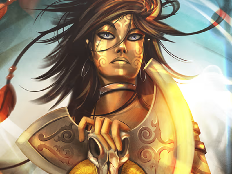
Destined Legends RPG Card Game
1
8
0
Nerd On! Press Kit
0
5
View more →
Packaging Designer
(2)
Follow
Message
Jonathan Swanson
Seattle, USA
Brand Identity & Logo Designer for Bold Brands
$1k+
Earned
3x
Hired
5.0
Rating
117
Followers
Partner
Follow
Message
Brand Identity & Logo Designer for Bold Brands
14
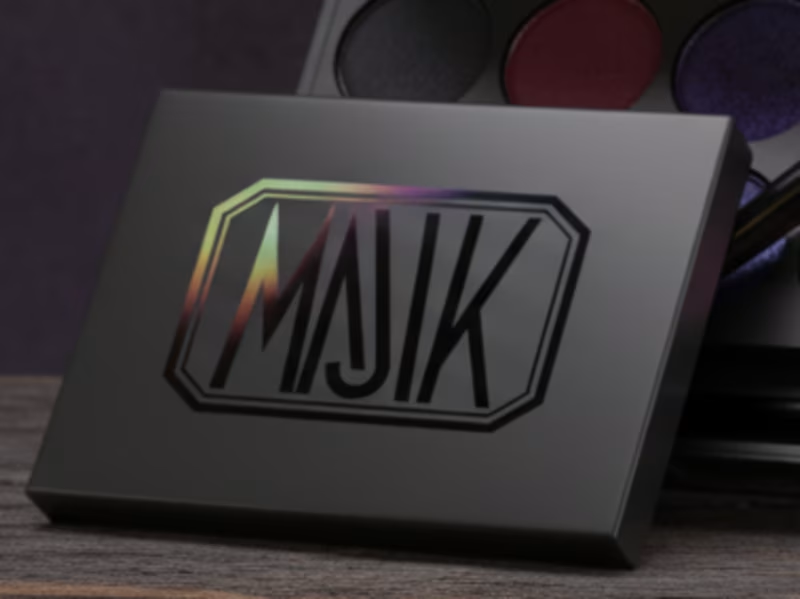
MAJIK is luxury makeup for the Gothic, shadowed, and arcane. It channels inner darkness with obsidian blacks, bruised purples, and blood-rich reds that seep into skin. Not for daylight; this is pigment for rituals and midnight. The packaging I designed is meant to feel like something otherworldly, an ancient tome. The exterior is matte black, soft and absorbing. At the center sits my original MAJIK logo mark, glossed into the surface and sealed with a thin iridescent film. The mark itself is reflective, but the film bends the light, flashing a range of color, providing a MAJIK look, depending on how it catches the light.
1
14
352
0
Quinto Games Brand Identity Redesign
0
2
0
Intriguing YouTube Thumbnail Design for Breakfast Myth Video
0
7
0
"This is a DOG" — AI-Directed Comedy Poster
0
2
Packaging Designer
(1)
Follow
Message
Healing Hawk Studios
Seattle, USA
Crafting High-Conversion UI/UX for Wellness & AI Platforms
New to Contra
Follow
Message
Crafting High-Conversion UI/UX for Wellness & AI Platforms
0
Healing Hawk's avatar Healing Hawk Studios • 1d At Healing Hawk Studios, we specialize in translating brand potential into premium physical presences. Led by Founder and Lead Visionary Joe Ancheta, our studio partnered with Belmas to design a high-end, editorial packaging system for their imported Belgian chocolate lines, specifically tailored for B2B pastry chefs and luxury GCC retailers. 🎨 Dynamic Design Decisions: • Luxury Palette: Selected a deep, sophisticated dark-teal texture paired with high-contrast gold foil accents to immediately establish premium shelf-presence. • Structural Hierarchy: Engineered spacious, clean typography to make dense professional ingredient lists and product weights easily legible on active kitchen floors and retail shelves. • Strategic Branding: Balanced a modern, clinical grid system with classical editorial elegance to capture executive buyer trust and project a multi-million-dollar established identity. By bypassing platform boundaries, Healing Hawk Studios collaborated directly with the client to customize layouts, adjust dimensions, and deliver production-ready vector dielines with zero friction.Healing Hawk's avatar Healing Hawk Studios
0
39
0
DeVine Wines — Luxury Brand Identity & Digital Experience Description: "A premium sommelier-inspired rebrand featuring bespoke physical packaging, high-end hospitality collateral, and a cohesive dark-mode digital storefront."
0
14
0
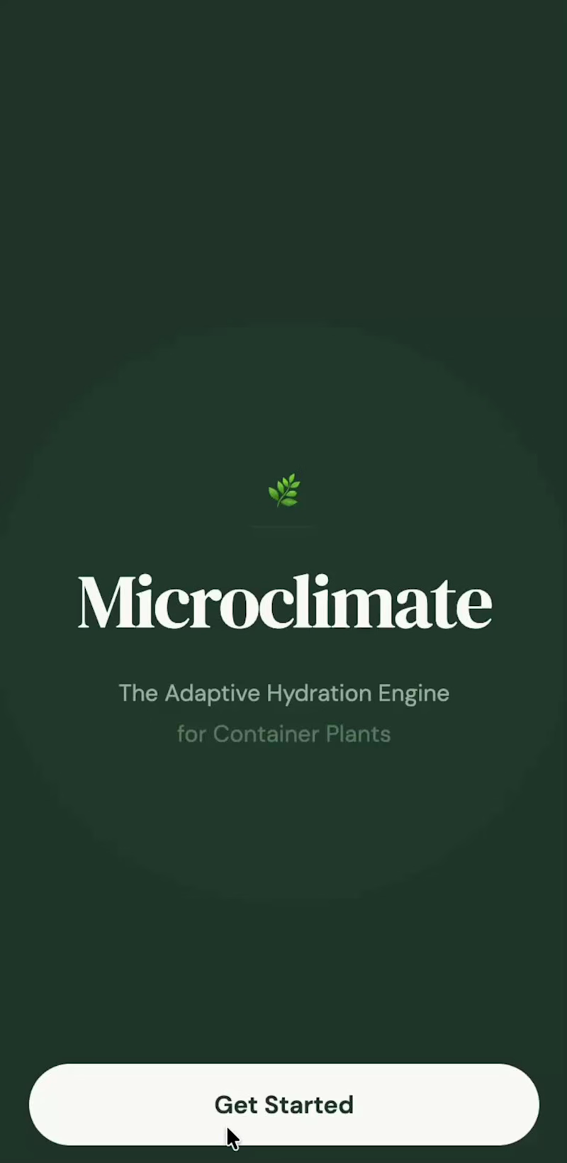
The Nova Journey — Luxury Concierge Fertility Onboarding "How do you design a digital entry point for clinical coaching that feels deeply reassuring, elite, and completely supportive?" Designed for Courtney's high-end fertility clinic, The Nova Journey is a bespoke three-step interactive onboarding timeline. Built through a lens of quiet luxury, it translates a complex patient clinical path into a calm, highly readable editorial experience across all devices. 🎨 The Design Architecture: Dual-Theme Serenity To accommodate patient preferences and state of mind, the layout supports both a calming, warm-cream light aesthetic and a deeply private, low-stimulation dark mode. By eliminating the chaotic, sterile grids of typical healthcare portals, this design uses: High-End Editorial Serif Typography (utilizing premium classic serif styling) to command clinical authority, trust, and timeless warmth. A Harmonious Color Palette of earthy sage greens and grounding charcoal accents, keeping cognitive stimulation to an absolute minimum. A Visual Chronology (Step 1, 2, and 3) that anchors the user and removes the anxiety of "what comes next." 🛠️ Core UI & UX Features Built 1. Elegant Sequential Timeline (Step-by-Step) The Problem: Traditional clinical onboarding feels cold, mechanical, and overwhelming for patients navigating sensitive fertility paths. The Solution: A beautifully spaced horizontal timeline ($◯ \text{---} ◯ \text{---} ◯$) that serves as a visual guide. As patients progress or tap through, the active step is highlighted with soft organic sage green tones. 2. Detailed Deliverable Modules The Content: Explicitly outlines Targeted Diagnostics, The Root-Cause Blueprint, and Elite Daily Coaching. The Layout: Clean card components with modern, rounded corners. Features structured lists for high-contrast "What to Expect" content blocks paired with explicit, reassuring bulleted deliverables. 3. Seamless Responsive Behavior The Execution: Perfectly adapts from a spacious, multi-column desktop layout into a vertical, single-column mobile-first flow that retains all of its luxurious editorial proportions and spatial breathing room. 💻 The Tech Stack Framework: React / Next.js Styling: Tailwind CSS (configured for custom tracking, spacing, and fluid typography) Prototyping Environment: v0 by Vercel
0
13
0
LP Grid — Immersive Private Markets Lattice (Interactive Concept) "How do you visualize the complex, high-friction web of global private equity without overwhelming the user?" This interactive web prototype is a cinematic, dark-mode experience designed for LP Grid (a private markets intelligence platform). Built through the lens of Somatic UX, it translates dense institutional datasets—such as investor discovery, relationship mapping, and advanced capital filtering—into a calm, low-stimulation, and highly engaging interactive system. 🎥 The Hero: Live Interaction Walkthrough 🎨 The Design Philosophy: "Enterprise Calm" Standard fintech and private equity dashboards are notoriously cluttered with chaotic data tables, aggressive red/green tickers, and overwhelming information hierarchies. For LP Grid, I architected a Digital Sanctuary for allocators. By utilizing a deep, immersive space-navy backdrop (#050b14), ultra-thin gridlines, and strict spatial layout rules, the interface feels deeply secure, premium, and authoritative. Crucial data points are highlighted not with loud warnings, but with a highly intentional, luminous dual-color ecosystem: Neural Blue (#00d2ff) for GP network paths, interactive system inputs, and synchronizations. Cyber Emerald (#00ff87) for active LP nodes, successful data flows, and primary call-to-actions. 🛠️ Key Interface Features Built 1. The Interactive Relationship Lattice (Section 01) The Problem: Traditional relationship lists fail to capture the multi-dimensional connections between investors. The Solution: A live-rendered visual network mapping out Limited Partners (LPs) and General Partners (GPs). Users can visually map out connected funds (e.g., Sequoia Capital, Endowment Forge, Sovereign Wealth Alpha) with glowing connection vectors that pulse dynamically on selection. 2. Aerospace-Grade Capital Filtering Cockpit (Section 02) The Problem: Complex financial database queries feel tedious and technical. The Solution: An elegant control panel mimicking a luxury cockpit. I built custom tactile slider states for filtering huge financial ranges—such as AUM Targets (up to $1,000B), targeted VC sleeve weightings, and liquidity horizons—giving the user physical, visual feedback as they narrow their search. 3. High-Contrast "Initialization Gate" (Section 03) The Goal: Drive conversions securely. The Solution: A high-conversion sign-up gate featuring clean, high-contrast typography and a prominent glowing primary CTA button, anchored by clear security, SOC 2 compliance, and encryption metrics. 💻 The Tech Stack To achieve this extreme level of aesthetic precision, responsiveness, and performance: Framework: React / Next.js Styling: Tailwind CSS (for the high-end spatial utility system) Prototyping Environment: Base44 Typography: Playfair Display (Luxury Editorial Serif) paired with Inter (Clean, Geometric Sans-Serif for interface metrics).
0
20
Packaging Designer
(1)
Follow
Message
Xenia Capcan
Seattle, USA
Visual Designer & Brand Storyteller
1x
Hired
5
Followers
Follow
Message
Visual Designer & Brand Storyteller
0
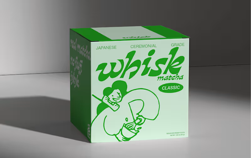
Whisk Matcha — Illustration + Packaging Design
0
18
0
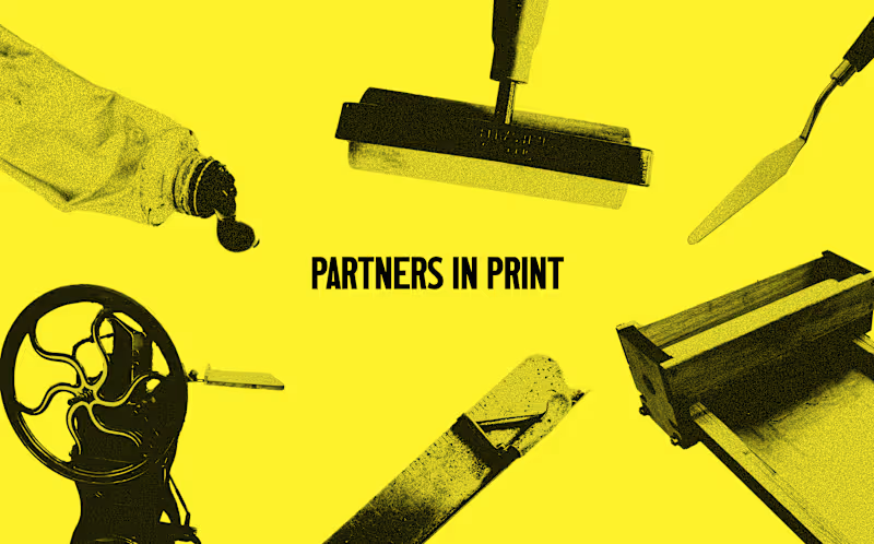
'Partners in Print' Exhibition & Re-branding
0
11
3
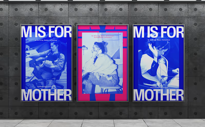
'M is for Mother' Conference Brand Identity
3
33
0
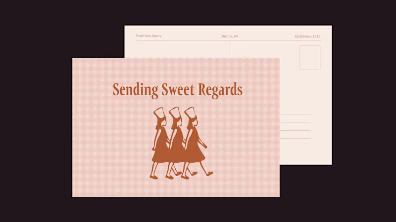
Three Girls Bakery — Logo + Brand Identity
0
14
Packaging Designer
(1)
Follow
Message
Explore people