Hot Sauce Logo and Packaging
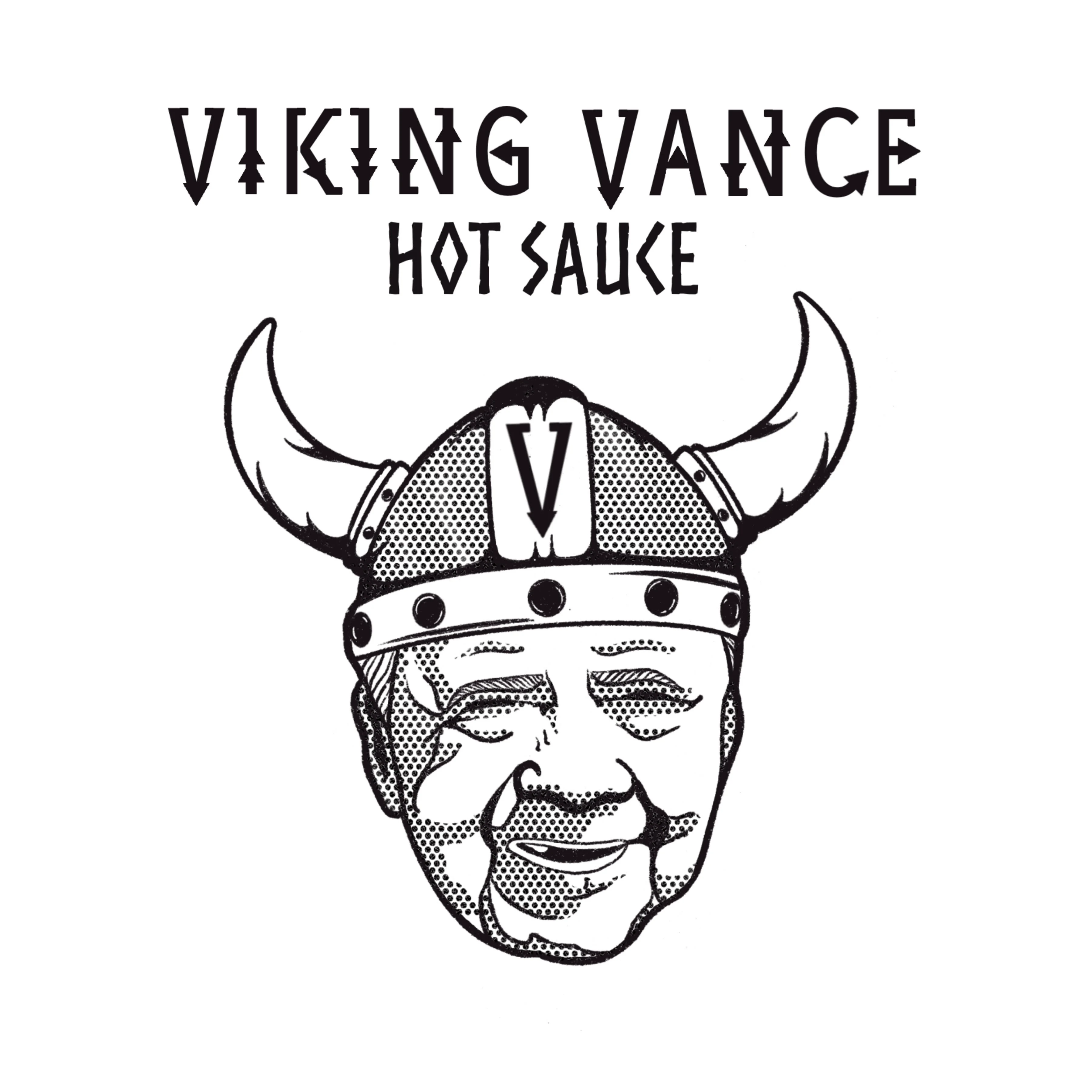
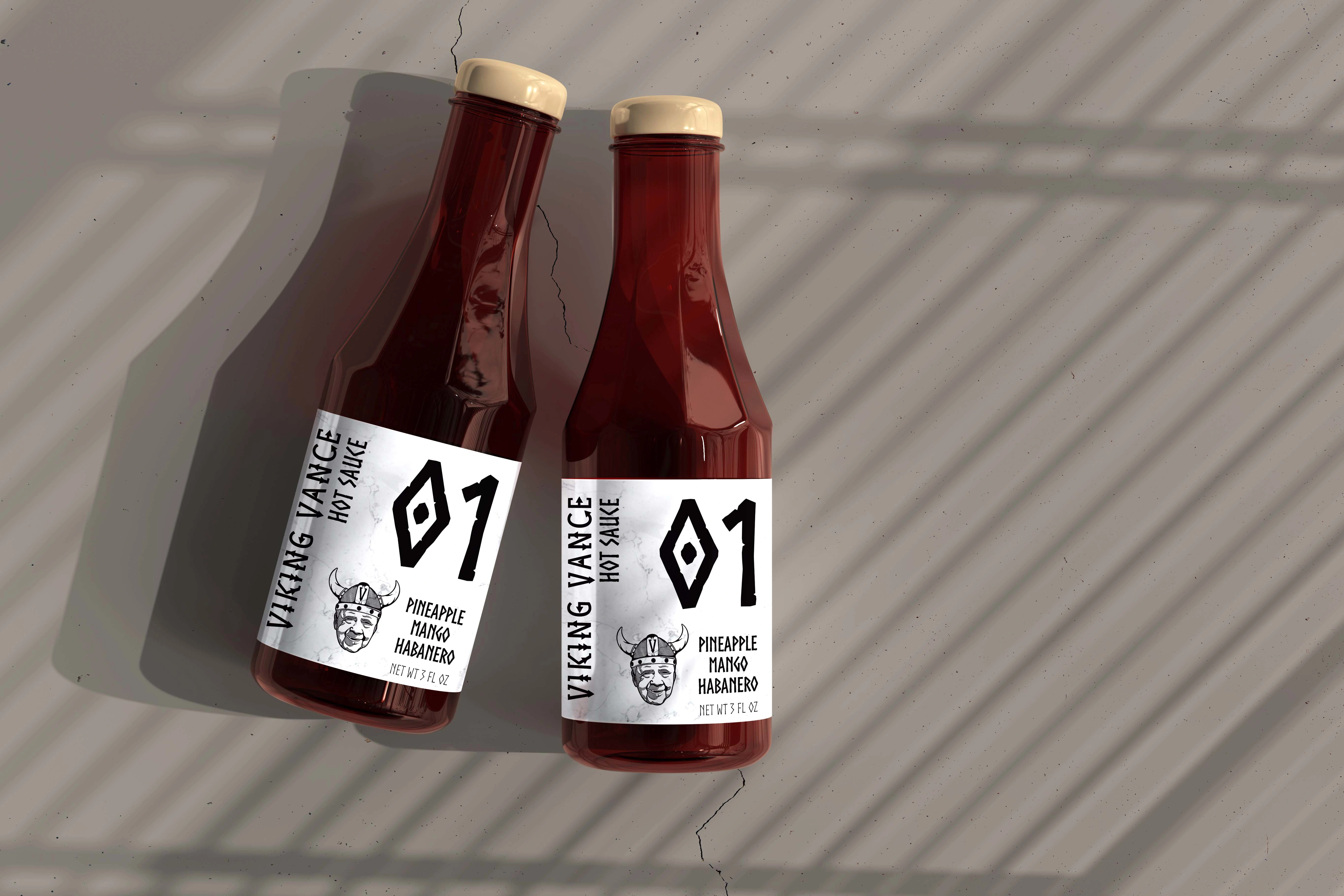
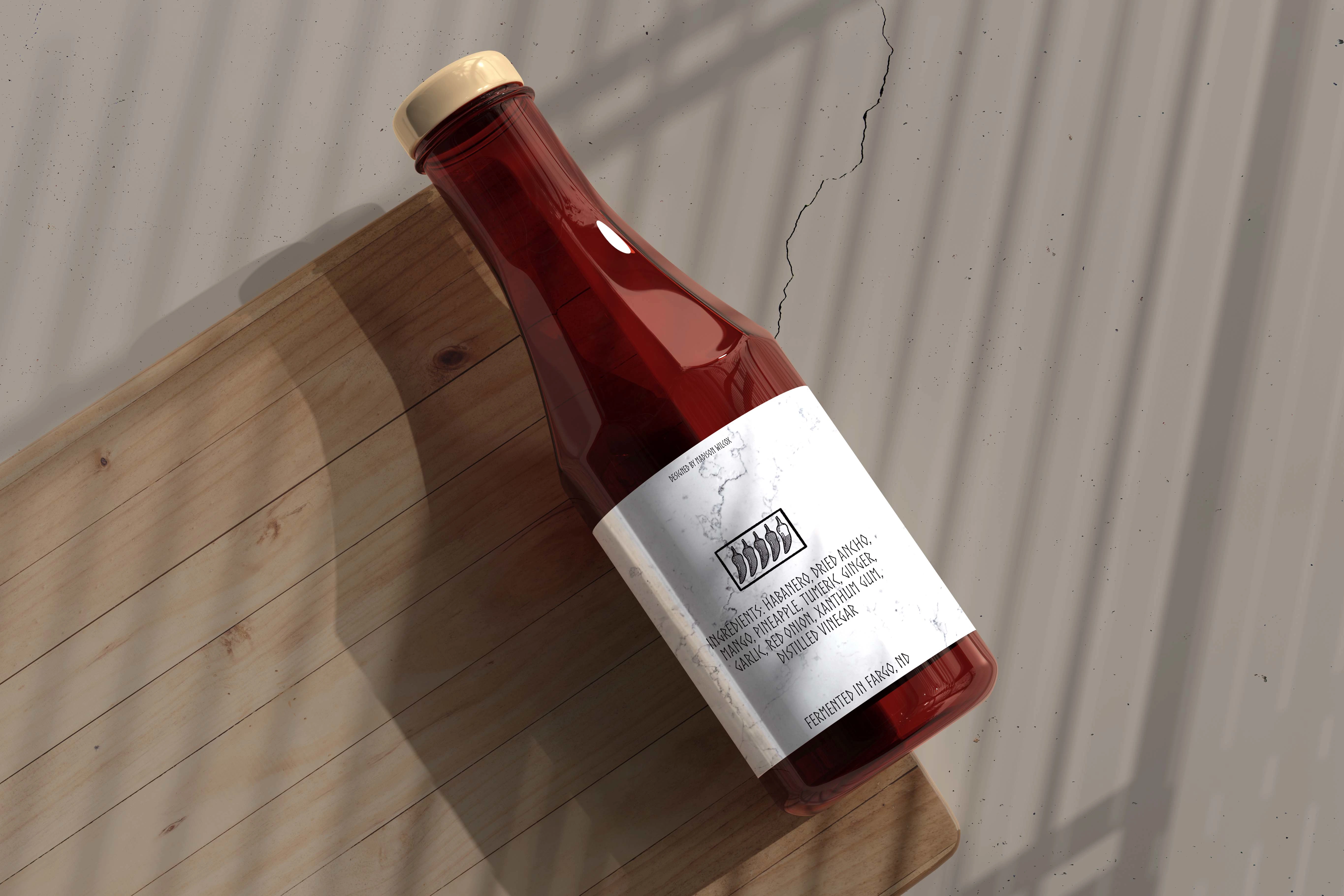
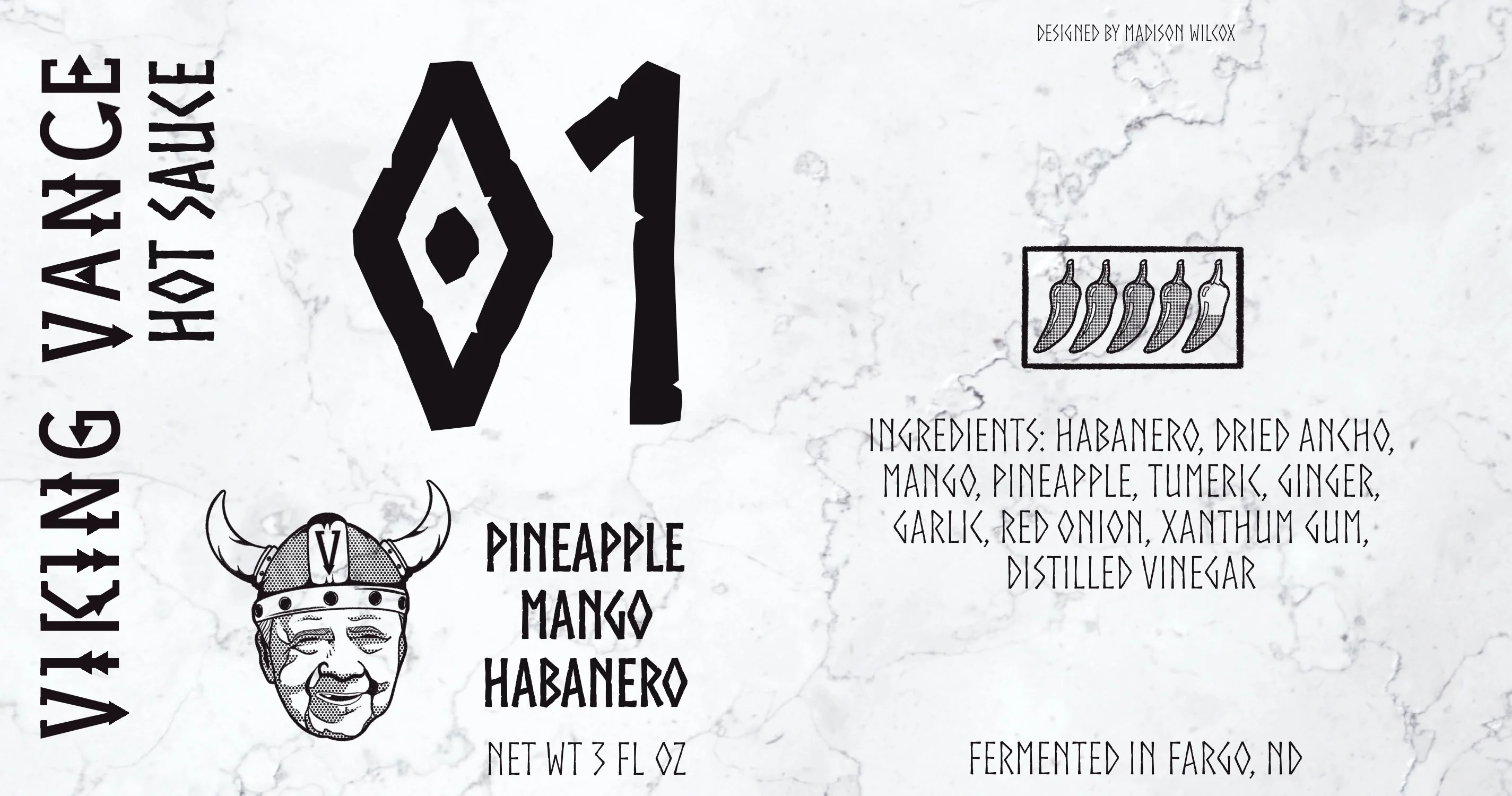
Sticking to a traditional black and white design, my client needed a logo and label design for his new fermented hot sauce business.
Being a Minnesotan, he wanted to incorporate a tribute to his state as well as his late grandfather Vance; hence the name Viking Vance. He was very attracted to Nordic, embellished looking typefaces so I (partially) invented my own, seen in the Viking Vance portion. I wanted a thicker outline to be somewhat stamp looking, while still achieving a detailed and rougher look to the entire logomark. I chose a brush with lots of texture in it and decided to use a halftone as shading to make the overall image a little less flat.
Like this project
Posted Feb 19, 2022
Sticking to a traditional black and white design, my client needed a logo and label design for his new fermented hot sauce business.

