Bluem Studios Brand Guidelines

Cameron Pagano

Bluem Studios Brand Guidelines
Full rebrand and guidelines for Bluem.
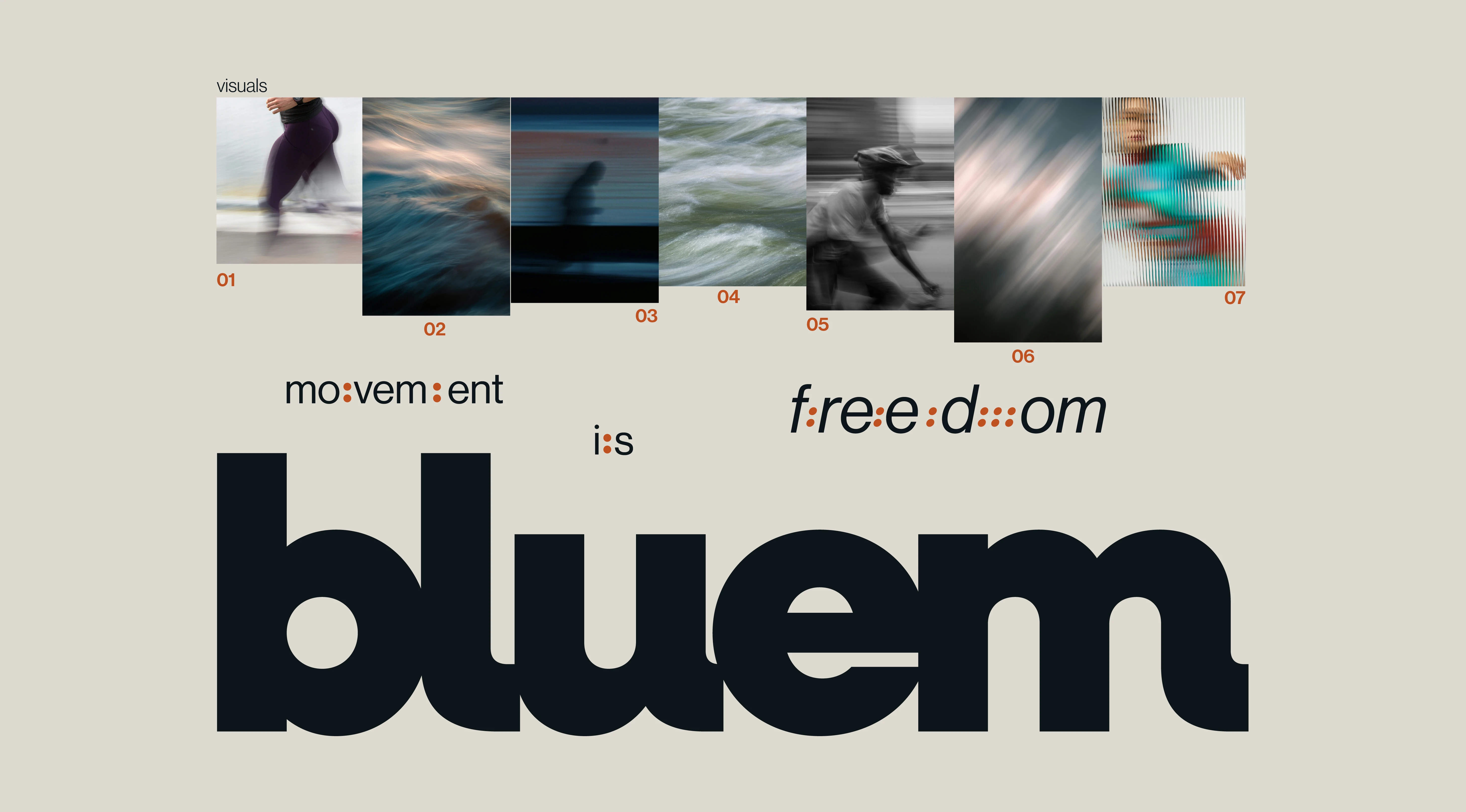
Movement is the backbone to humanity.
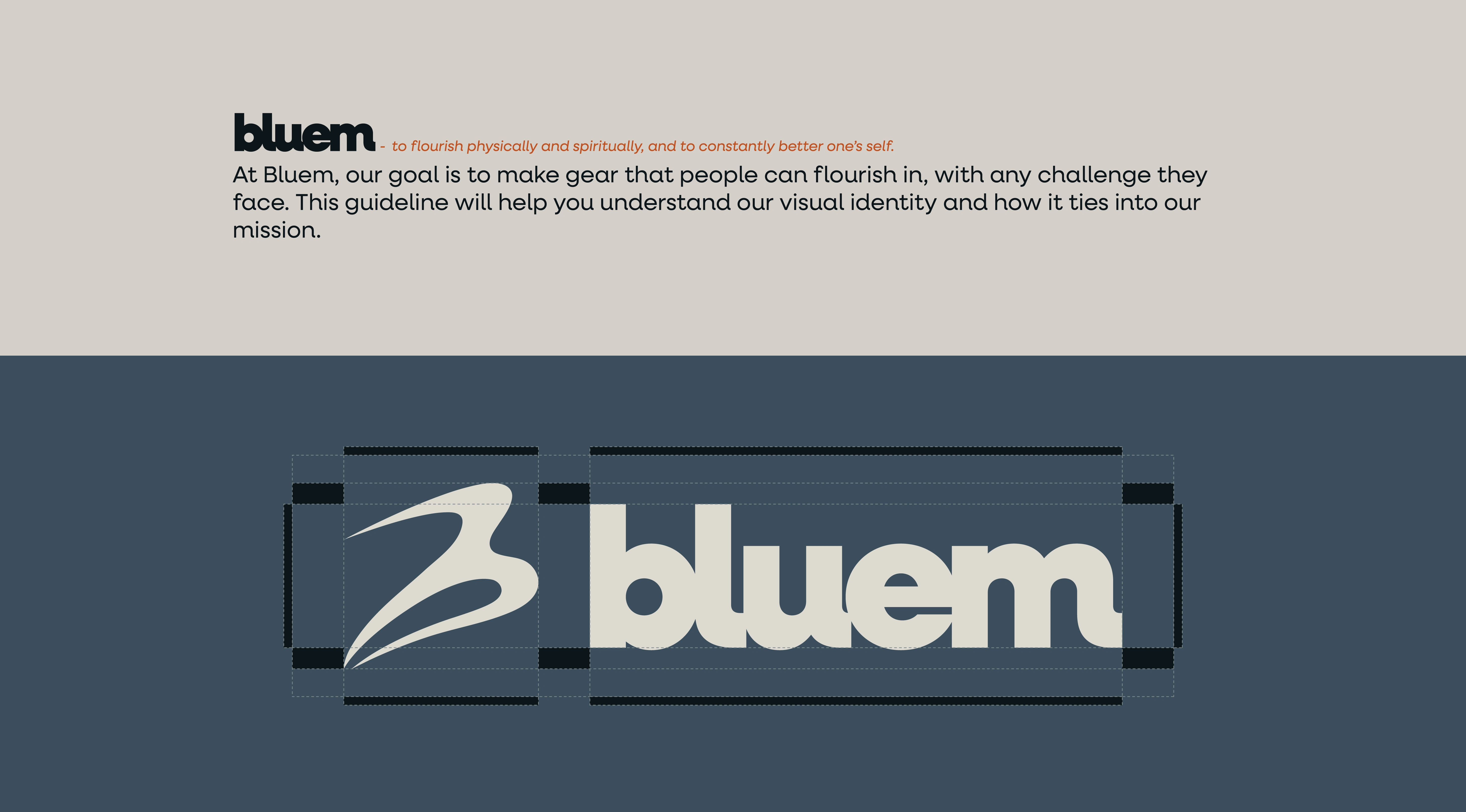
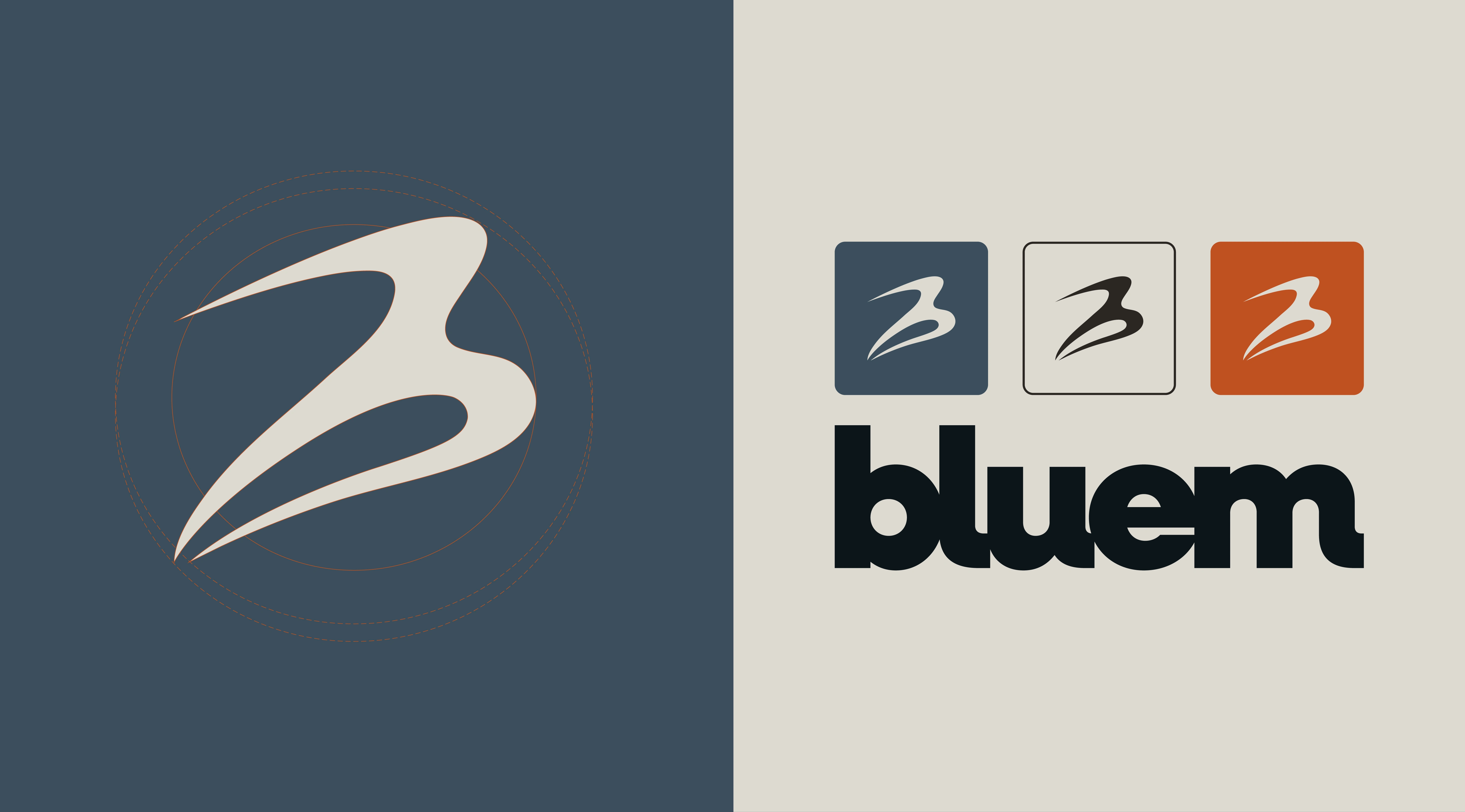
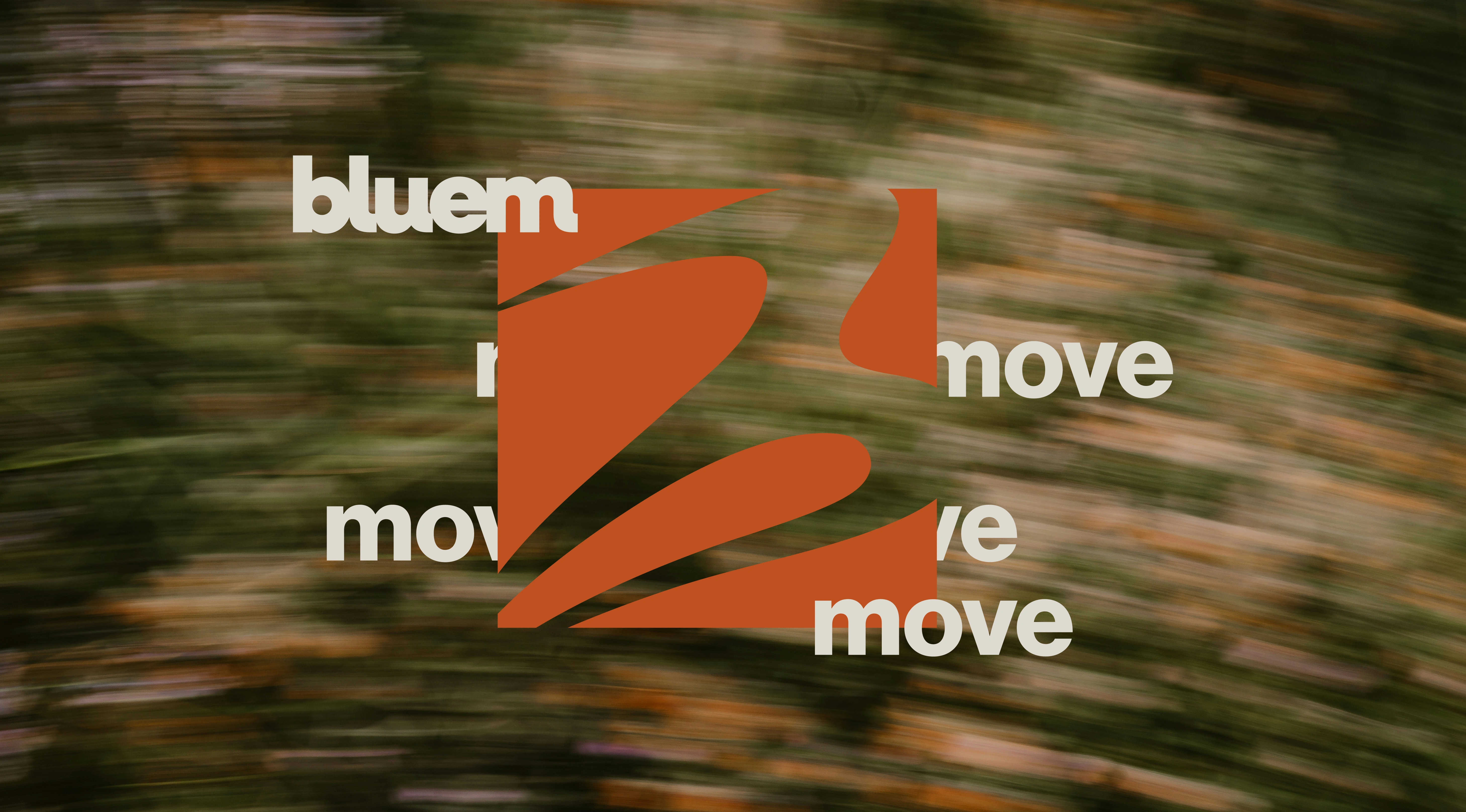
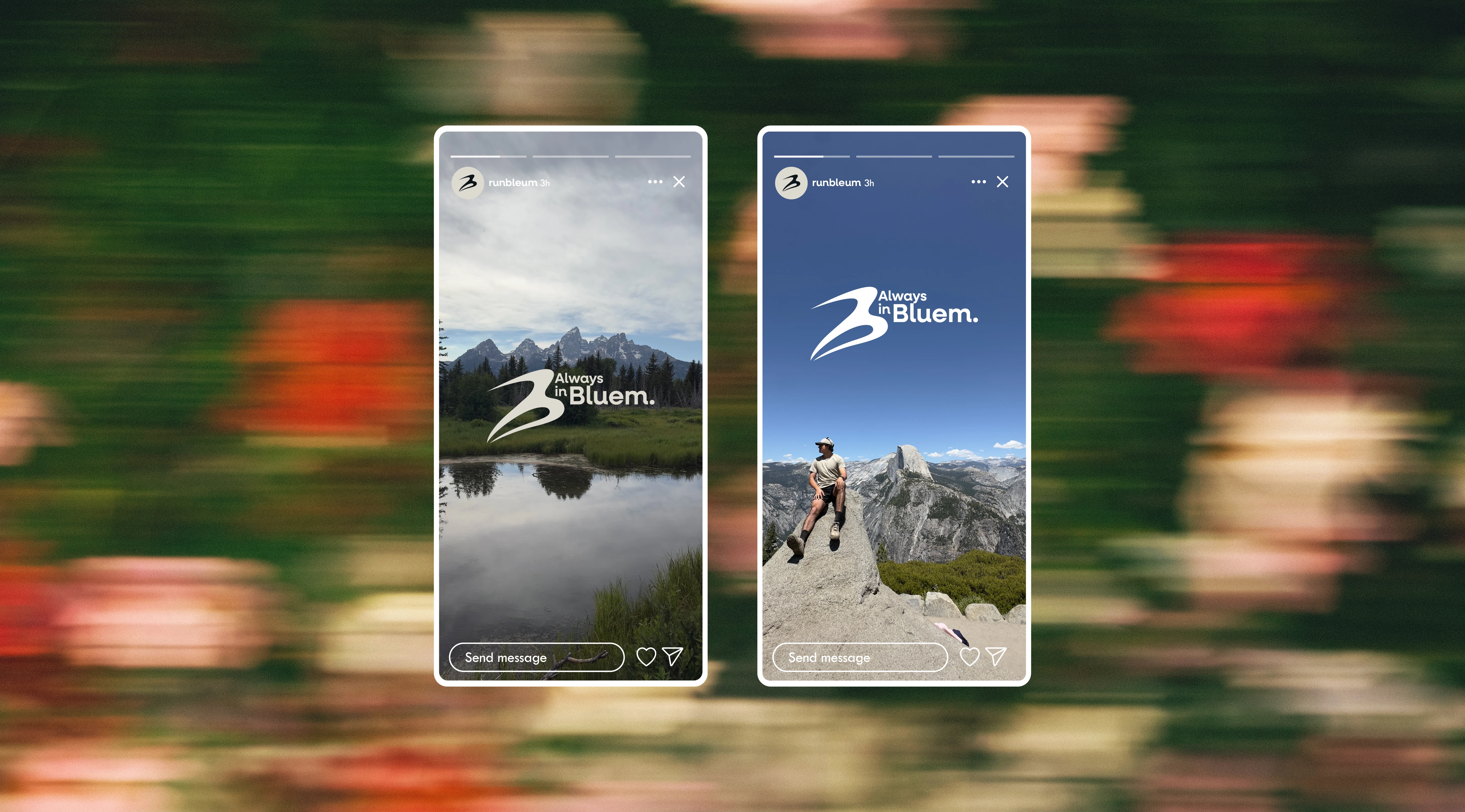
Bluem approached me with the need for a rebrand. Transitioning from streetwear to activewear isn't easy, but this branding is going to help them a lot.
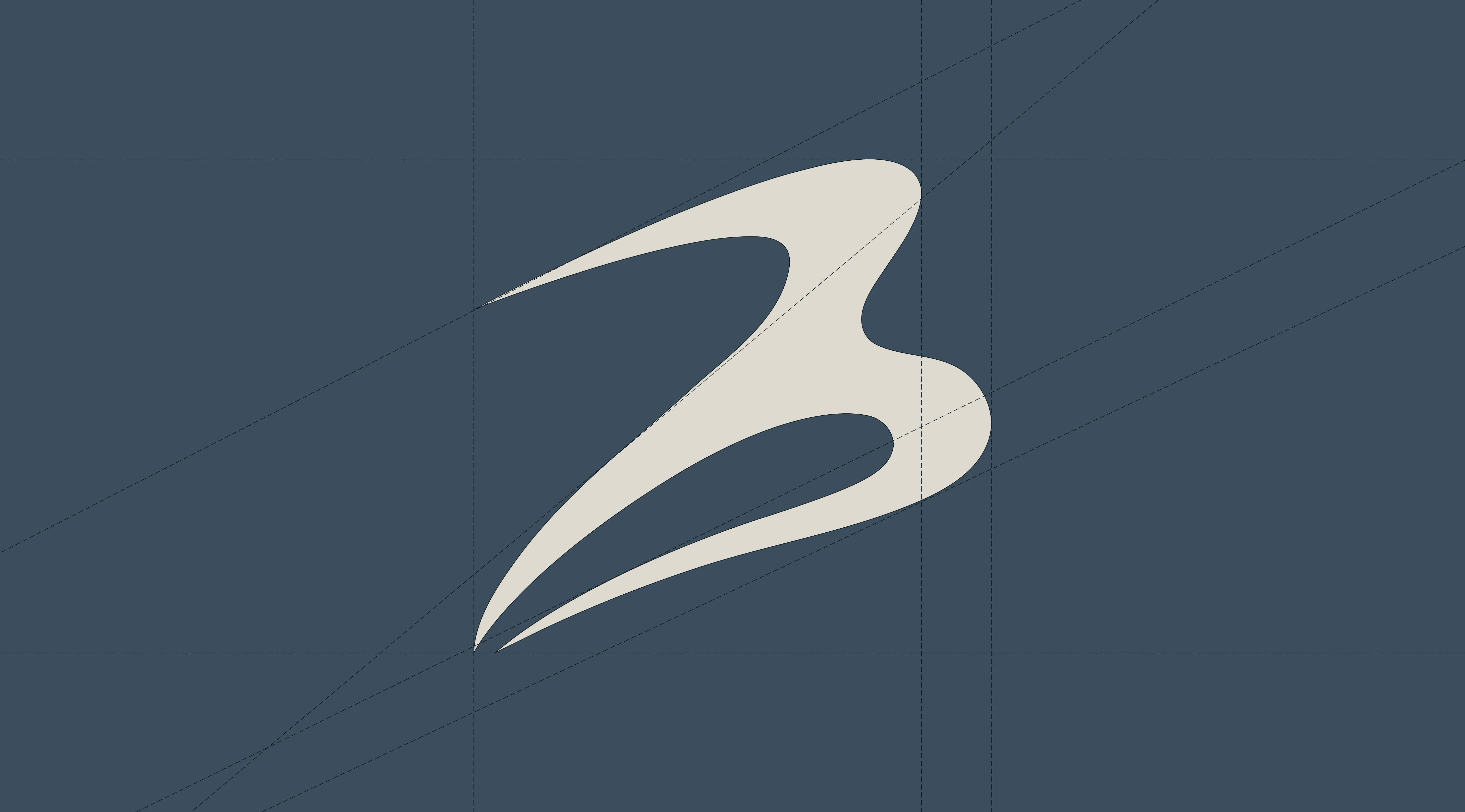
Logo diagonal technical grid.
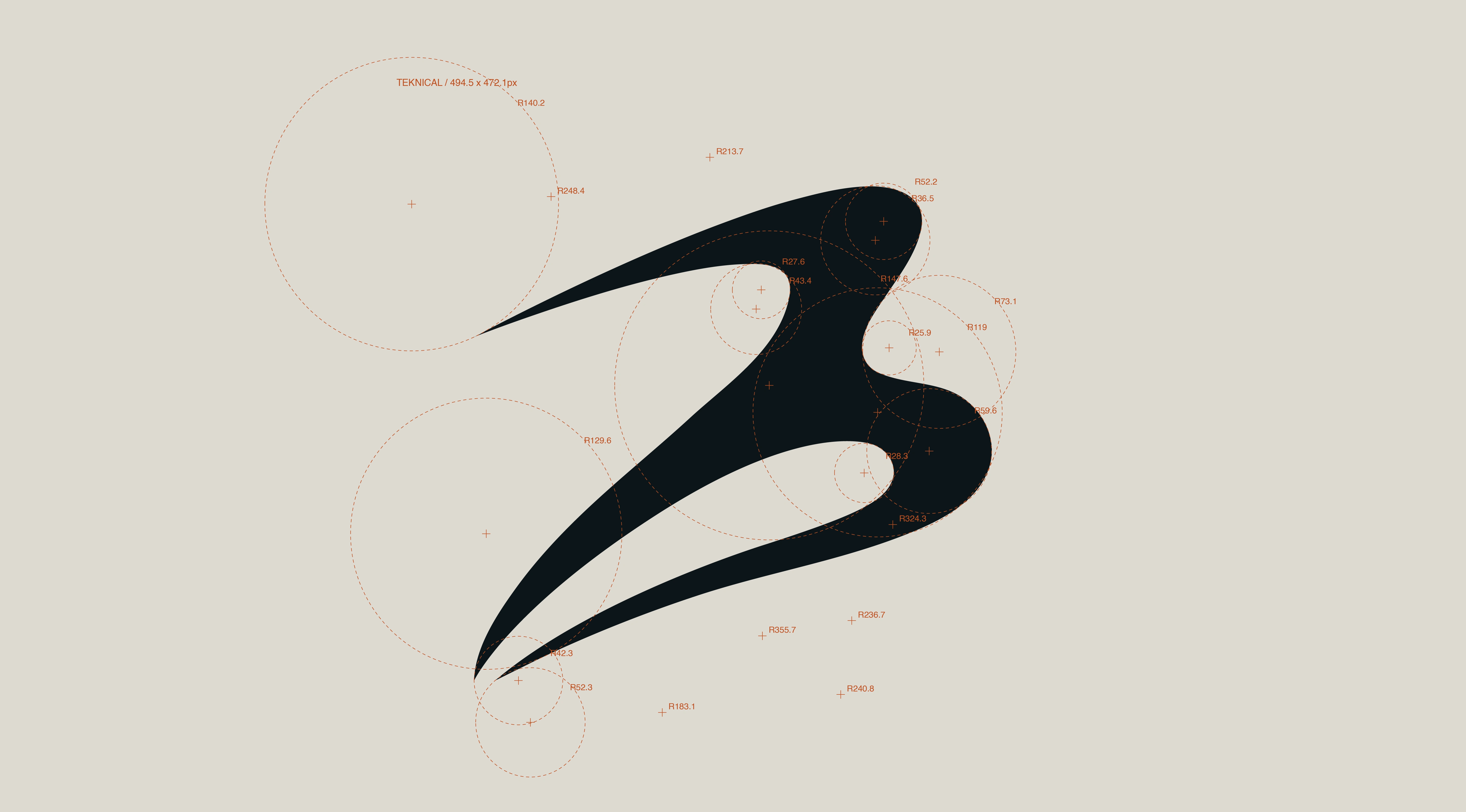
Logo circular technical grid.
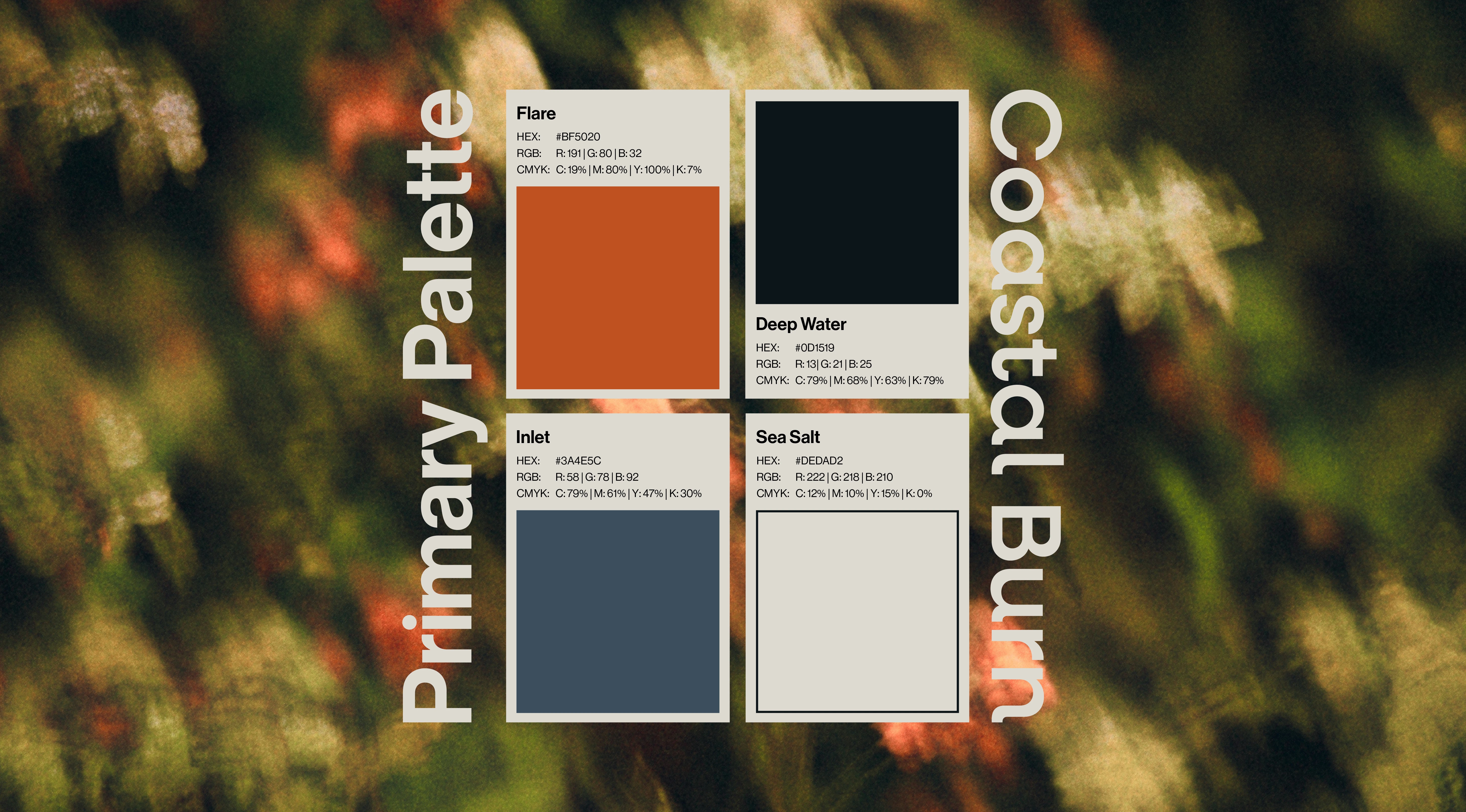
Bluem provided colors they wanted to follow, and I used my website Colorify to build a strong, and natural primary palette around the chosen accents.
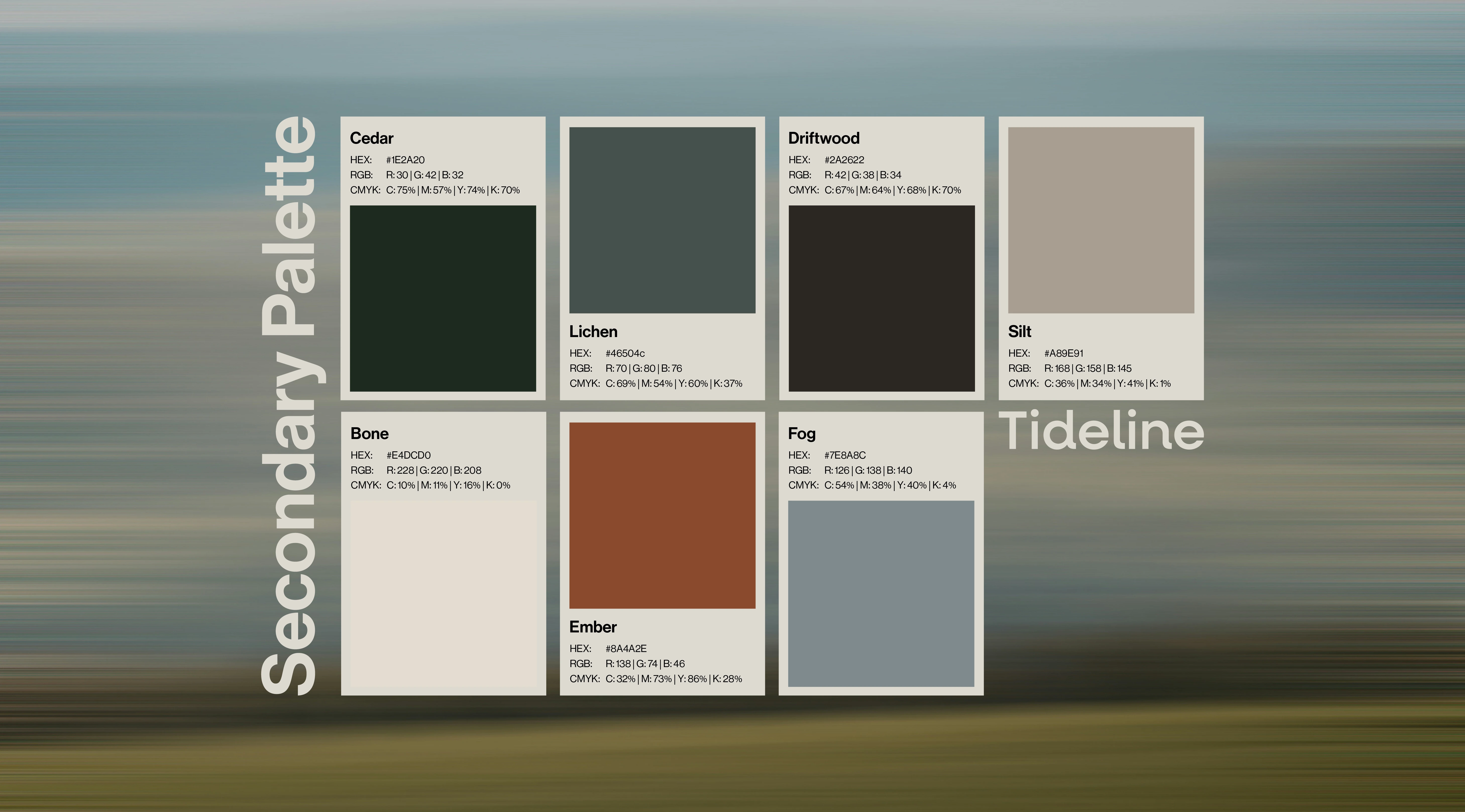
A lot of people may think a seconary palette is overkill. In my opinion, having as many colors as possible that feel on brand makes the visual language a lot easier to speak.
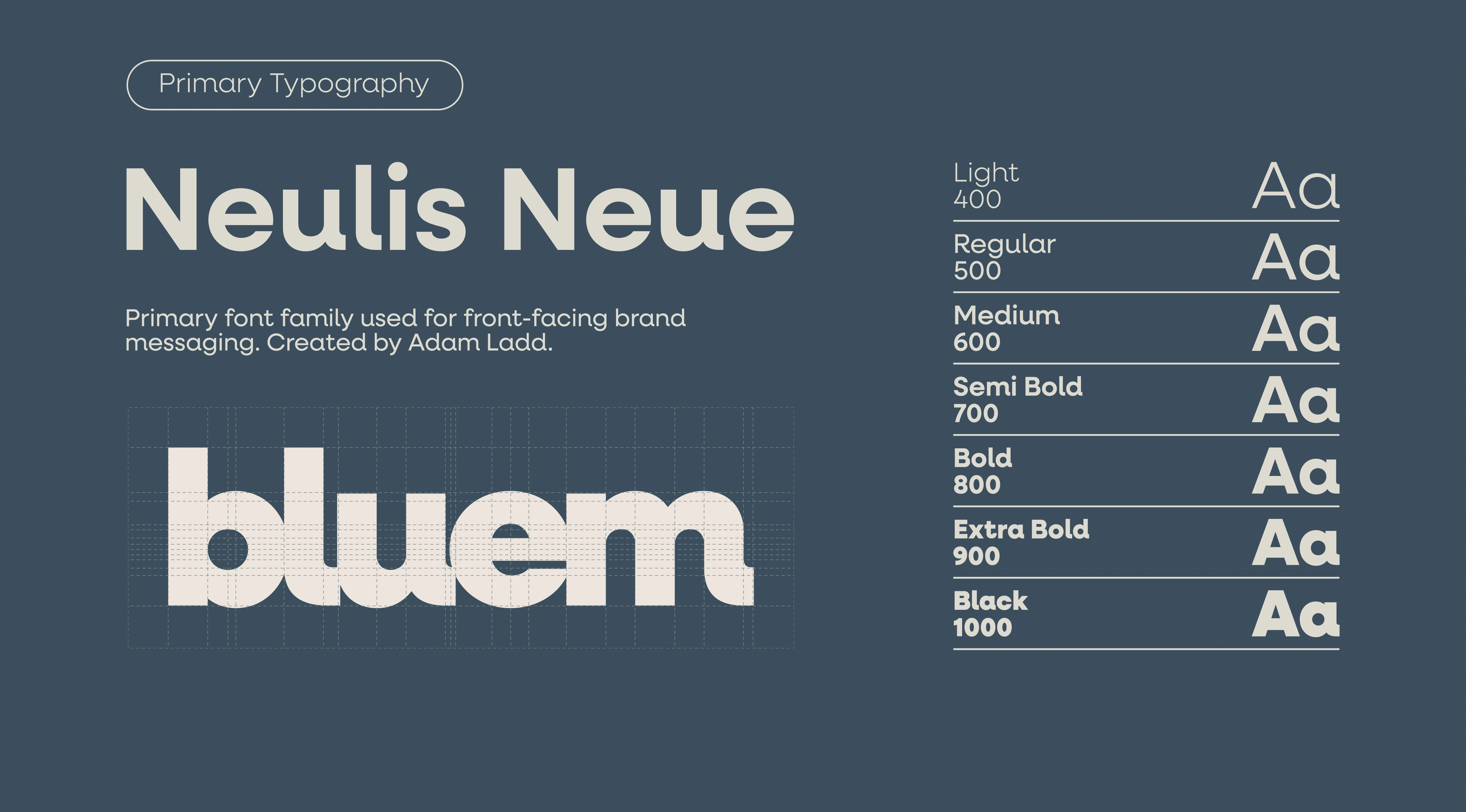
I chose Neulis Neue because it feels natural, professional, and bold. It reminds me of Helvetica, if Helvetica touched grass more.
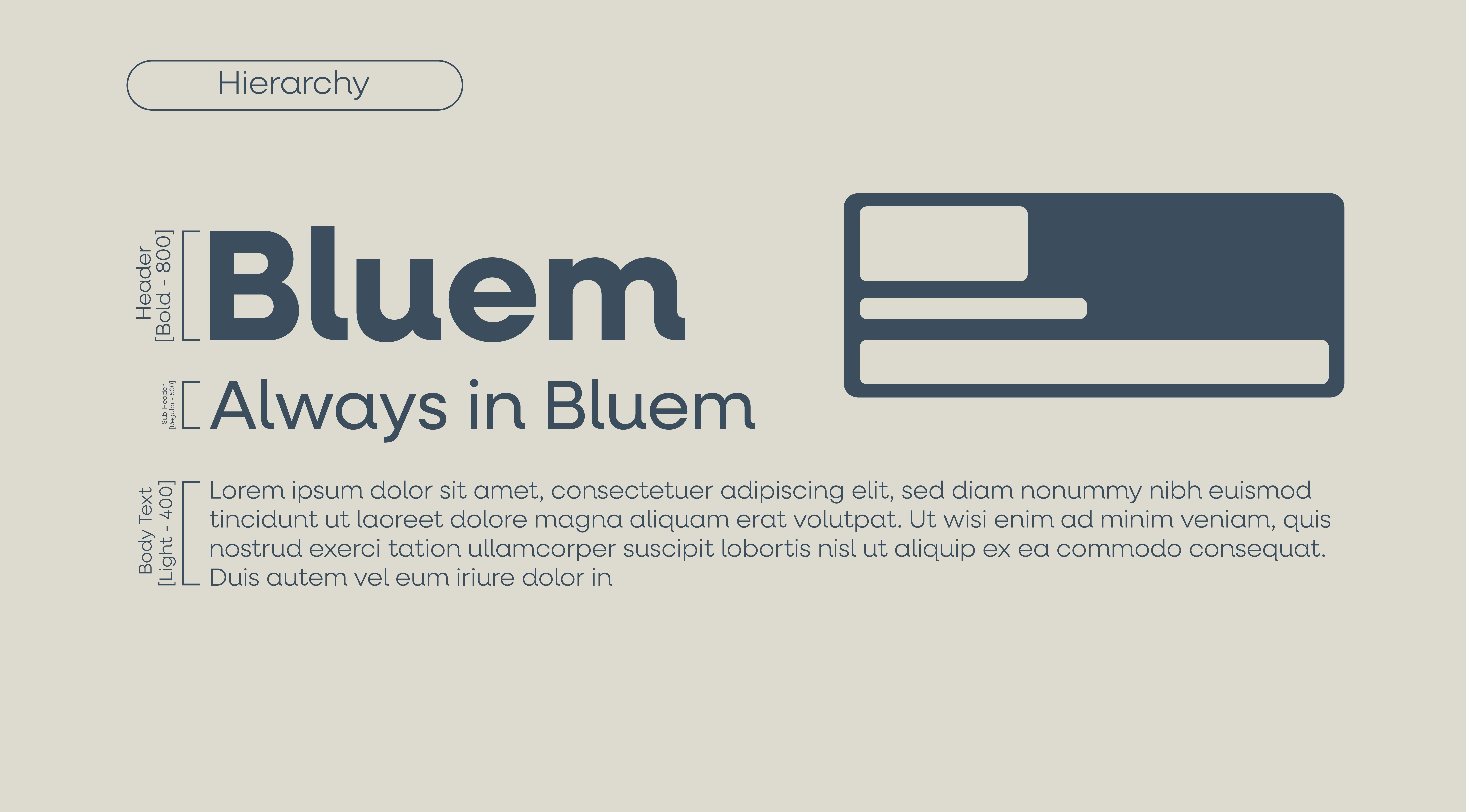
Thank you to Mikael for bringing this project to me, and good luck to Bluem with the rebrand and launch!
Like this project
Posted Sep 26, 2026
Bluem approached me needing a rebrand. We were able to achieve a strong branding towards their new activewear direction.
Likes
0
Views
4