

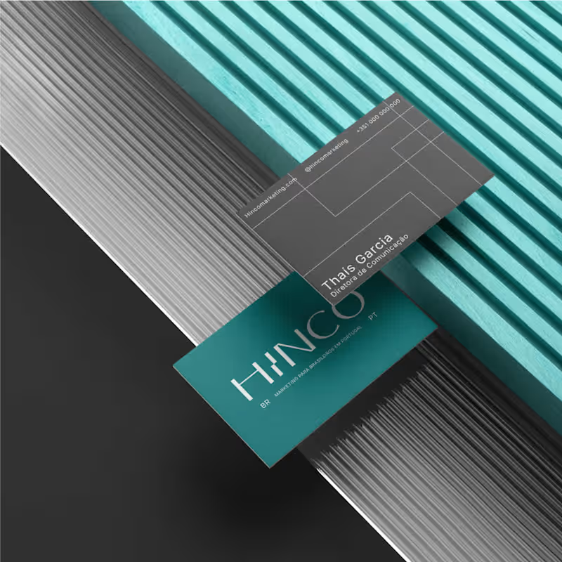

Hot take: aesthetics and clinical results should walk hand in hand.
Most brands in this space lean into cold, sterile whites or aggressive dark tones. It reads functional, but it also feels like something you'd hide in a medicine cabinet, not display on your vanity.
For this rebrand, we anchored the identity in classical beauty and organic sophistication. By combining warm earthy tones, botanical cues, and timeless iconography, we moved away from the "pharmacy product" feel into true high-end personal care.
It was a deliberate shift: positioning the brand not for someone who feels like they are treating a flaw, but for someone investing in a premium daily ritual.
Would a piece like this deserve a spot on your display shelf?
53
86
6.2K
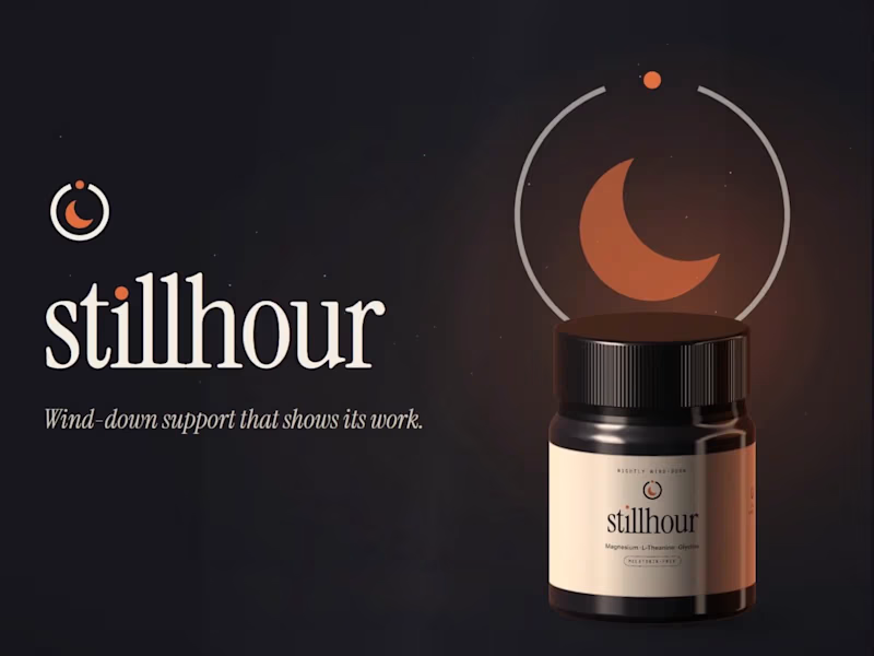
Stillhour: Supplement Brand Identity (Concept)
Stillhour is a self-initiated brand identity concept. The brand is fictional and there was no client. It imagines a melatonin-free drink you stir into warm water before bed to support your wind-down routine.
The strategy started with one problem. Independent lab studies keep finding melatonin products that don't match their labels, so careful buyers have stopped trusting the category. Stillhour's answer is to show its work: every dose printed in full, and a lab report for every lot, linked from the jar.
The mark is a dial that stops at the right hour, with a crescent for stillness. Warm ember on deep night replaces the usual purple sky.
Included: a one-page strategy, logo suite, type and color system, jar and refill packaging with a full side panel, web hero, three social templates, a guidelines page, and an animated logo with custom sound.
1
194
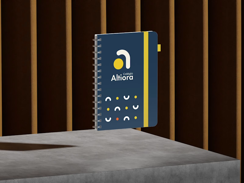
Torna-te quem tu és. Become who you are.
That is the motto of Colégio Altiora, and the whole identity starts from it. Altiora is Latin for "higher things", so the symbol is a small "a" built from two pieces, an arch that rises and a yellow ball.
From those two pieces came everything else. The patterns, the brand elements, the icons for the school app, the classroom signs and the uniform all share the same arch and the same ball.
A school for those who always reach higher.
17
23
1.1K


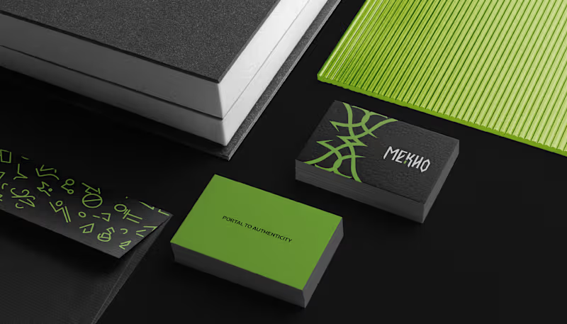
Language can be a portal, where each word opens a passage to new worlds. Yet in the language school market, many brands still communicate in similar ways.
With MEKHO, the goal was to move away from traditional academic imagery without losing credibility or structure. The challenge was to translate depth and authenticity into a consistent visual system for digital environments.
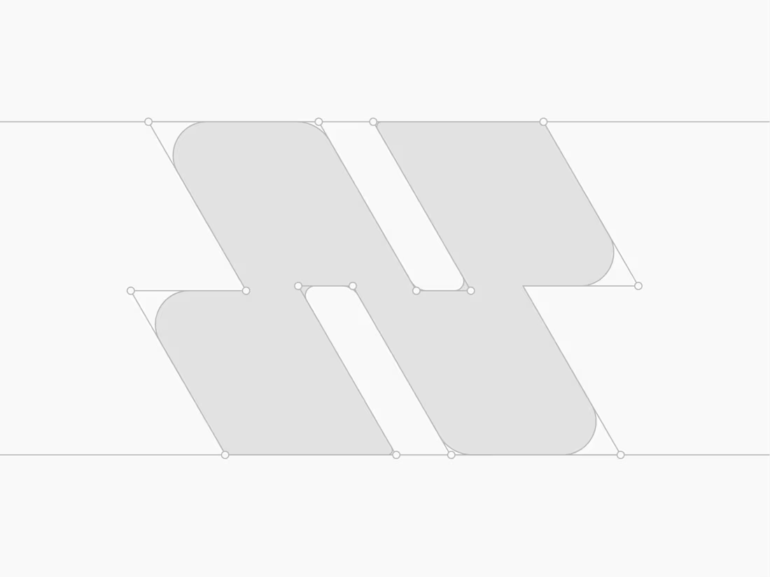
The logotype features angular strokes to convey precision. The symbol combines stylized bat wings, representing guidance, with a form that suggests a coded sign, reinforcing language as a system to be deciphered. The palette builds authority through dark tones, while green acts as a calculated contrast, signaling sophistication and direction.
The result is an identity that positions MEKHO as an immersive brand focused on real communication.
5
10
141