
Brand Identity Design & Packaging Systems for Premium brands
- 35
- Followers
Brand Identity Design & Packaging Systems for Premium brands
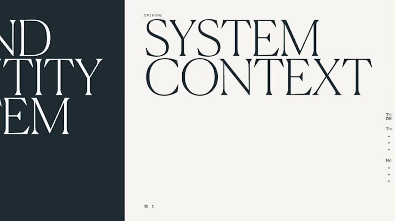
Inside a 50+ page brand identity system created for Dr. Emily Wheeler.
Guess the best part. She can actually use it herself.
The system gives her enough structure to create her own social content while keeping the brand consistent and recognisable without needing a designer for every single post.
That is what good brand guidelines should do: turn the identity into something the client can actually operate.
I don’t publish full client guidelines publicly. The complete system, rules and implementation logic remain part of the client’s IP.
Also, notice how many "logo mockups" can be seen. ;)
2
380
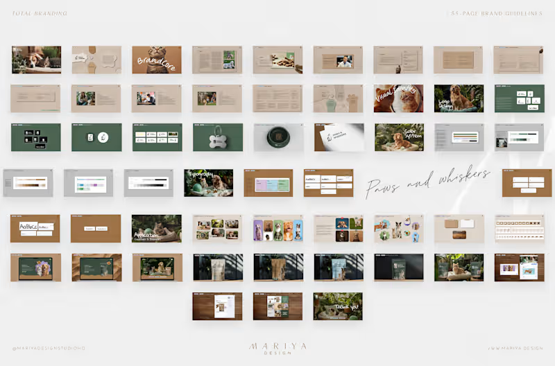
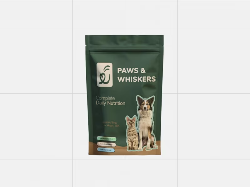
Something tells me to share my 2024 work for Paws & Whiskers.
This was a pre-launch brand entering a crowded category where visual cues often swing between playful pet branding and clinical supplement language. Paws & Whiskers needed a more adult wellness position: warm enough to feel caring, structured enough to support premium pricing, and scalable enough to accommodate future products without rebuilding the identity after launch.
Result:
A complete identity system was prepared for launch planning.
The brand had a clearer premium position for a crowded pet wellness category.
Conceptual packaging logic created a foundation for future SKU expansion.
The founder and future partners had a 55-page guideline for identity, imagery, typography, color, and application rules.
1
3
521

AI Director | Ads · Music Videos · Branding · Web & Apps
- $•••••
- Earned
- 1x
- Hired
- 15
- Followers
AI Director | Ads · Music Videos · Branding · Web & Apps

FROM MIST TO CUP. 🍃
A cinematic AI commercial concept inspired by the quiet ritual and craftsmanship behind premium Japanese tea.
The goal was to create something that feels less like a traditional product ad and more like a sensory brand film — moving from mist-covered tea fields and freshly picked leaves to the precision of a Japanese tea ritual and the final pour.
I focused on atmosphere, tactile details, natural movement, soft light, and restrained luxury to make every frame feel calm, intentional, and premium.
Creative Direction · AI Visual Production · Cinematic Advertising · Product Storytelling
14
40
1.3K
GIN HAS NO CURFEW — Spec Campaign
A cinematic spec campaign for a fictional premium gin brand, built around one simple idea: great nights don’t come with an age limit.
The film follows a sharply styled elderly woman who begins the evening completely unimpressed at a Havana-inspired bar window. One unexpected Cuban rhythm changes the mood — she takes her gin, steps into the street, and becomes the magnetic center of the night.
The creative direction deliberately avoids sentimental or stereotypical portrayals of age. Instead, the character is confident, stylish, sensual and genuinely cool, with real movement, personality and presence.
The visual language combines intimate macro product photography with energetic handheld cinematography, whip pans, low-angle dance shots, natural foreground transitions and warm Caribbean light. Every element — from the cocktail details and live musicians to the street movement and final product shot — was designed to feel tactile, cinematic and culturally alive.
I developed the campaign concept, creative direction, visual storytelling, shot design, character direction, product styling and overall cinematic language.
Campaign line: GIN HAS NO CURFEW.
1
209
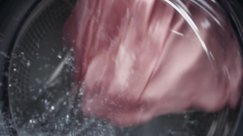
VELORA — “Built for the Storm”
A cinematic spec campaign created for VELORA, a fictional premium fabric-care brand.
The concept transforms an ordinary washing cycle into a visceral visual metaphor: to us, it’s laundry — to delicate fabric, it feels like surviving a storm. The film moves between the interior of a washing machine and a full-scale ocean environment, using seamless match cuts, macro textile photography, dynamic camera movement, and physically grounded water simulations to connect both worlds.
The creative direction focused on making the surreal premise feel completely real — from centrifugal movement and wet fabric behavior to the transition between a washing-machine wave and the open ocean.
I developed the campaign concept, visual direction, shot design, cinematic language, product styling, and final advertising narrative.
Campaign line: Built for the Storm. Made for What You Love.
0
160

THE ROOM REMEMBERS HER.
A hyperrealistic AI commercial concept for a luxury fashion / fragrance campaign.
This piece was developed as an editorial world built around presence, architecture, and atmosphere — following one elegant woman as she moves through a series of ornate thresholds, subtly transforming each space she enters.
The visual direction focused on monumental red wagasa umbrella imagery, dark carved interiors, motion-blur figures, cinematic depth, and a restrained luxury aesthetic designed to feel like a true international campaign rather than a typical AI film.
I wanted the film to feel controlled, mysterious, architectural, and emotionally charged — with the heroine as the only stable force in a constantly shifting world.
Creative Direction · AI Visual Production · Luxury Campaign Concept · Cinematic Advertising · Fashion / Fragrance Storytelling
Created as a concept campaign for portfolio purposes.
2
18
642

E-commerce Savvy Brand & Logo Designer
E-commerce Savvy Brand & Logo Designer


World-class 🌎 branding and packaging for startups 🚀
World-class 🌎 branding and packaging for startups 🚀


Senior Brand Designer, Strategist & Mentor

Glimpse into the rebrand of Sharlopov Hotels — Bulgaria’s first private hotel chain with over 25 years of history — redefining its identity and digital presence.
At the core of this transformation lies a new endorsed brand architecture, uniting five unique hotels under the Sharlopov master brand while preserving their individuality.
Over six months, we at Kickflip developed six distinctive brand identities and interactive websites built in Webflow, blending authentic Bulgarian heritage with modern luxury.
From strategy and branding to web, implementation, and print materials, every detail was crafted to create a cohesive brand experience across all touchpoints.
✨ The full case study is coming soon.
3
301

Hey everyone 👋
Excited to join Contra!
I’m Marietta, brand designer & strategist at Kickflip — a design & AI innovation studio I co-lead with Martin Bonov. From rebrands to product launches, we craft experiences that fuel long-term success.
With over a decade of experience, I’ve worked on brand strategies, visual identities, print materials, and digital experiences for startups and companies worldwide. My focus is on building brands that last — systems that feel human, consistent, and adaptable as they grow.
Here to connect with creatives, founders, and teams who believe in thoughtful design and real impact.
I’m open to new branding and creative collaborations.
🎥 This reel showcases some of our work at Kickflip — a glimpse into the brands and experiences we’ve crafted across industries.
5
3
258

Hi! 👋
New here on Contra and excited to share some of my work — and join the #ShowYourWork challenge!
Monoyer — a brand strategy, identity, and packaging design project for a contact lens startup, reframing vision care from medical necessity to lifestyle choice.
Built around clarity, comfort, and confidence — turning a functional product into an everyday experience.
Check out the full project:
Check it out (https://contra.com/p/3XcW7EeF-monoyer-contact-lenses-branding-and-packaging)
2
25
261

Brand design that looks premium and converts



Social Media Manager & Content Strategist


Breath Practitioner — Feed Mockup
A self-initiated concept project for a breathwork and somatic practitioner based in Lisbon. Built to show what a full month of intentional Instagram content looks like in practice - not just pretty graphics, but a feed with actual logic behind it.
The 9-post grid covers three content pillars: slow living, nervous system education, and healing journeys. Each post has a format rationale: lifestyle photos, educational carousels, client stories, a lead magnet, or a service spotlight. The visual identity is built around a custom color palette inspired by Lisbon: warm linen, teal, dusty pink, and deep violet.
The copy is written in the brand's voice. The grid is designed to attract, educate, and convert - in that order.
2
221


Graphic Designer combining creativity with mindfulness
Graphic Designer combining creativity with mindfulness



View more →