Leanzy Brand Identity

Miglena Spasova



Leanzy operates within a crowded digital fitness market, serving as an all-in-one ecosystem for Gen Z consumers seeking a blend of sustainable habits and high-performance guidance across nutrition, coaching, training programs, equipment, and apparel.
The primary challenge was not a lack of content, but a positioning tension: existing fitness platforms often lean too heavily into either sterile, clinical utility or superficial aesthetic trends. To scale, Leanzy required a brand architecture that bridged the gap between high-performance athletic authority and the approachable, community-driven nature of modern lifestyle brands.
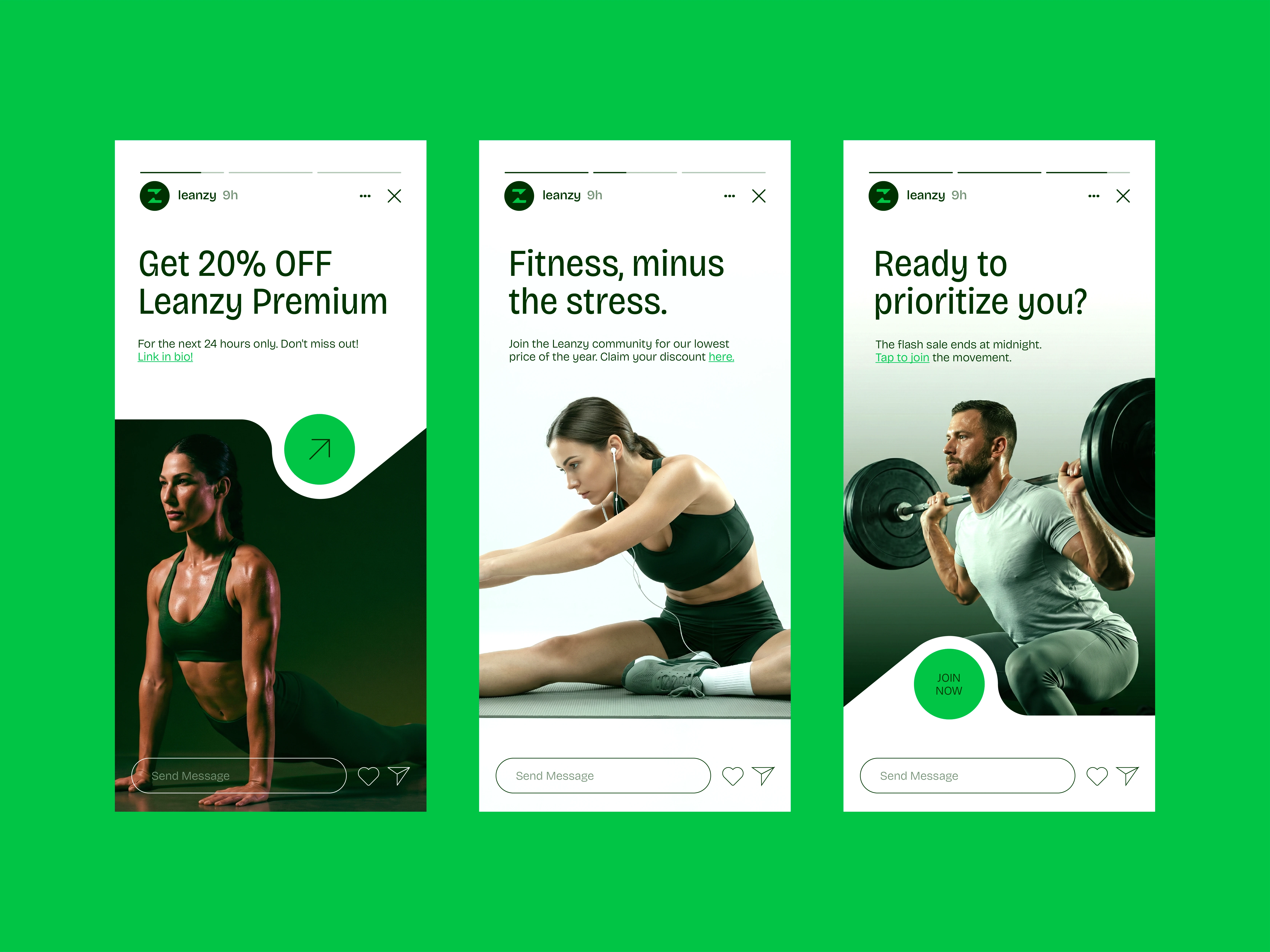
The strategy was to establish a visual language that feels inherently premium yet accessible, moving away from generic fitness tropes toward a cohesive identity that functions seamlessly from high-fidelity mobile app interfaces to tangible, high-quality merchandise.
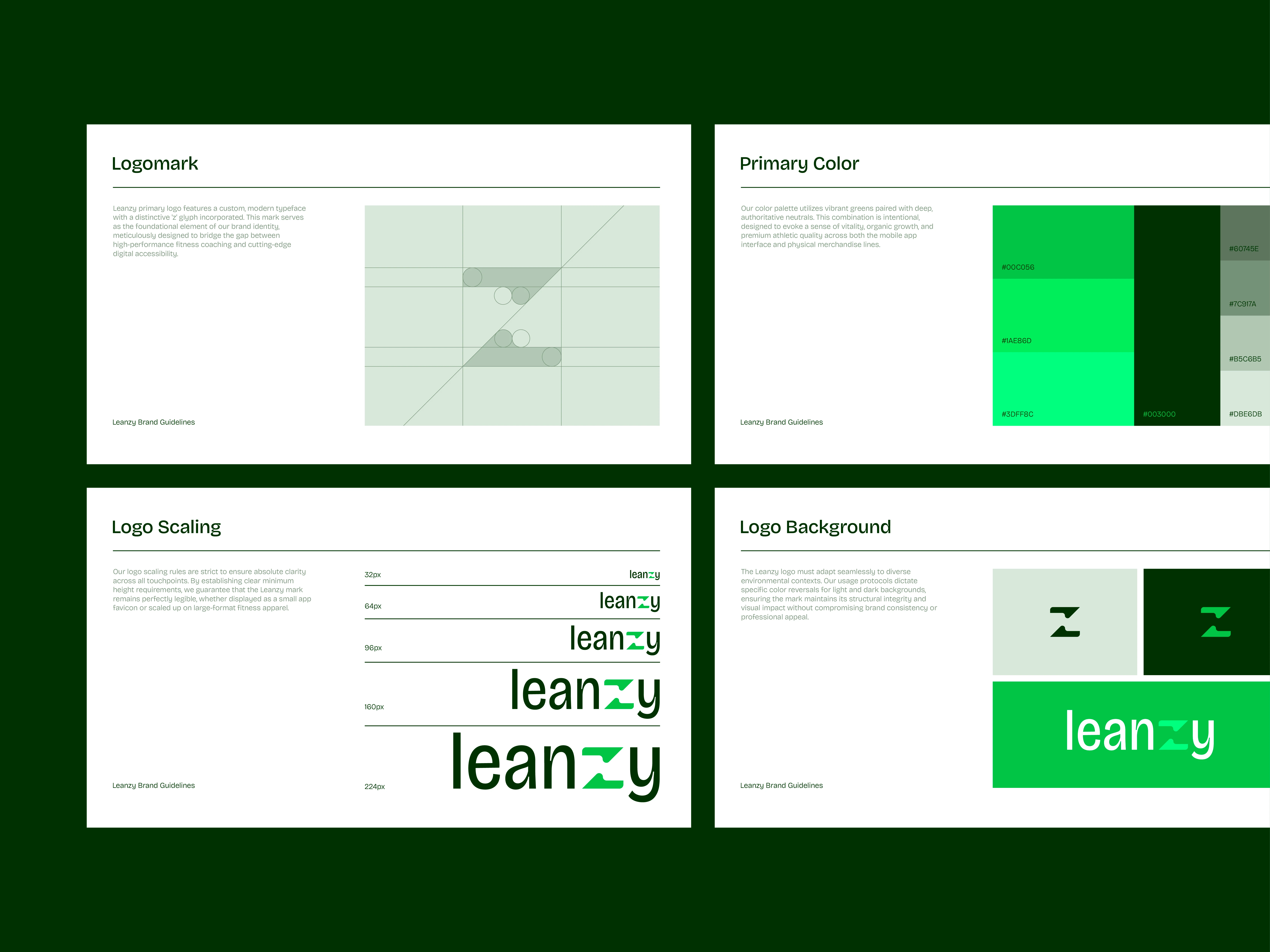
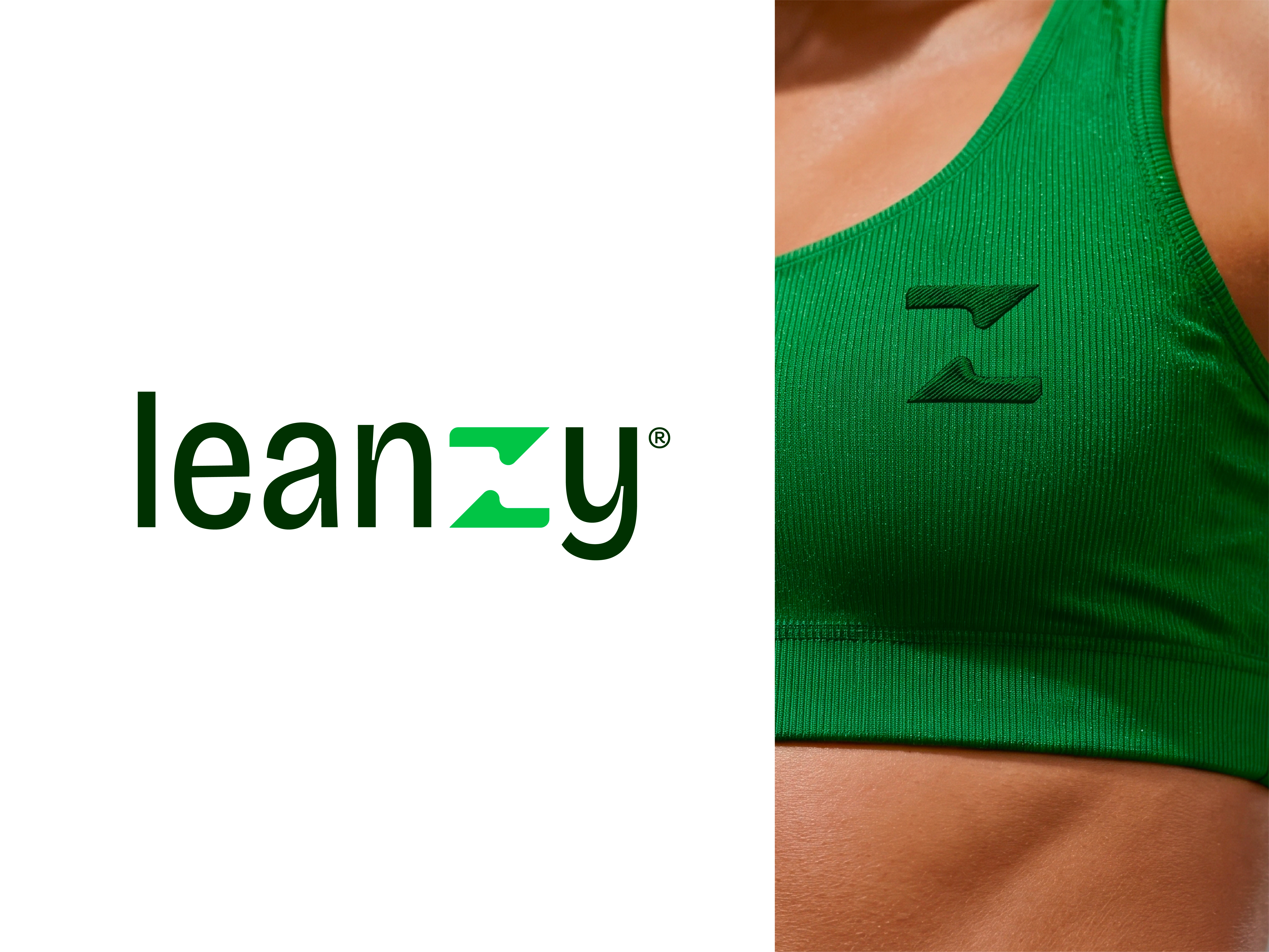
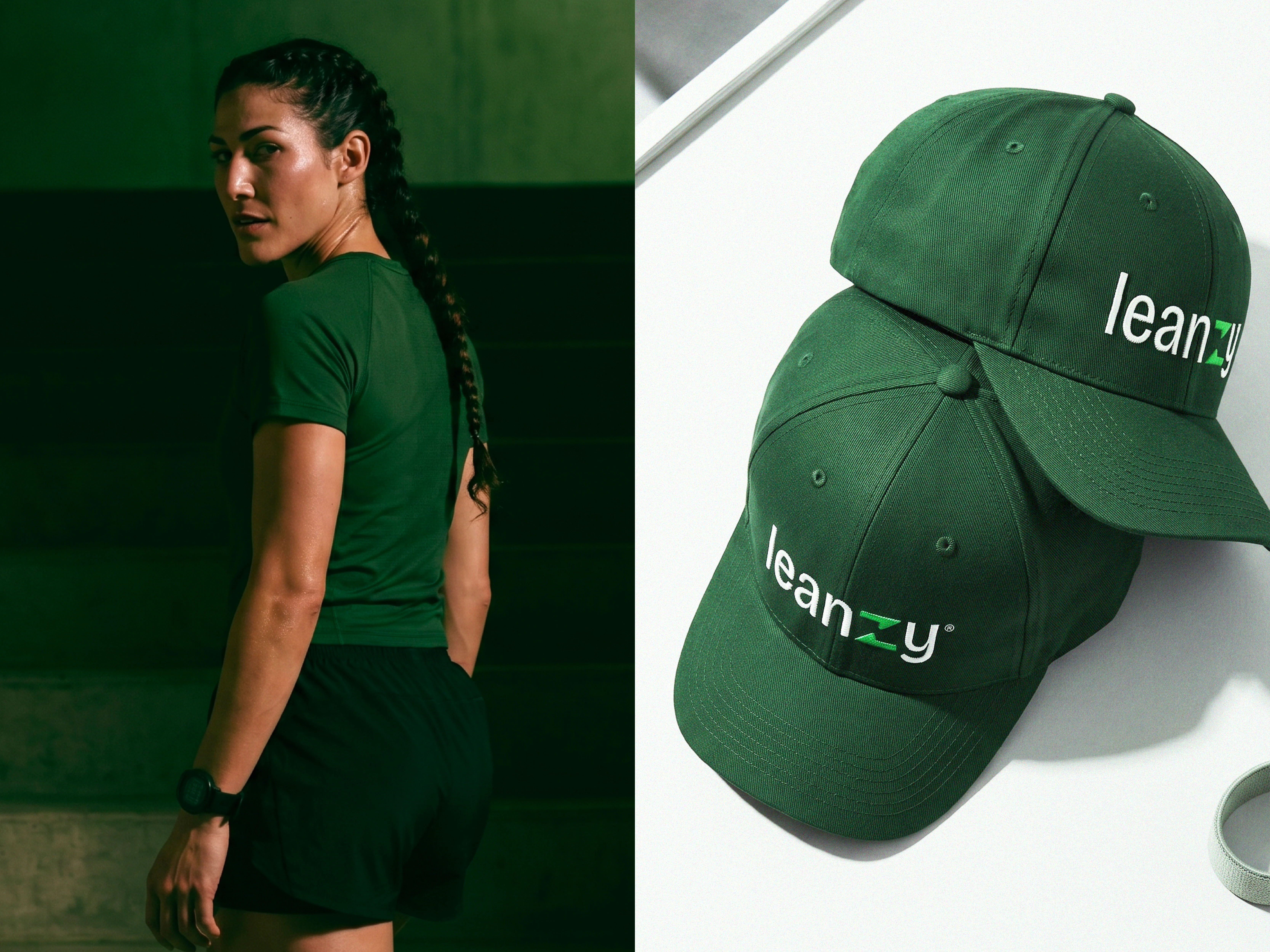
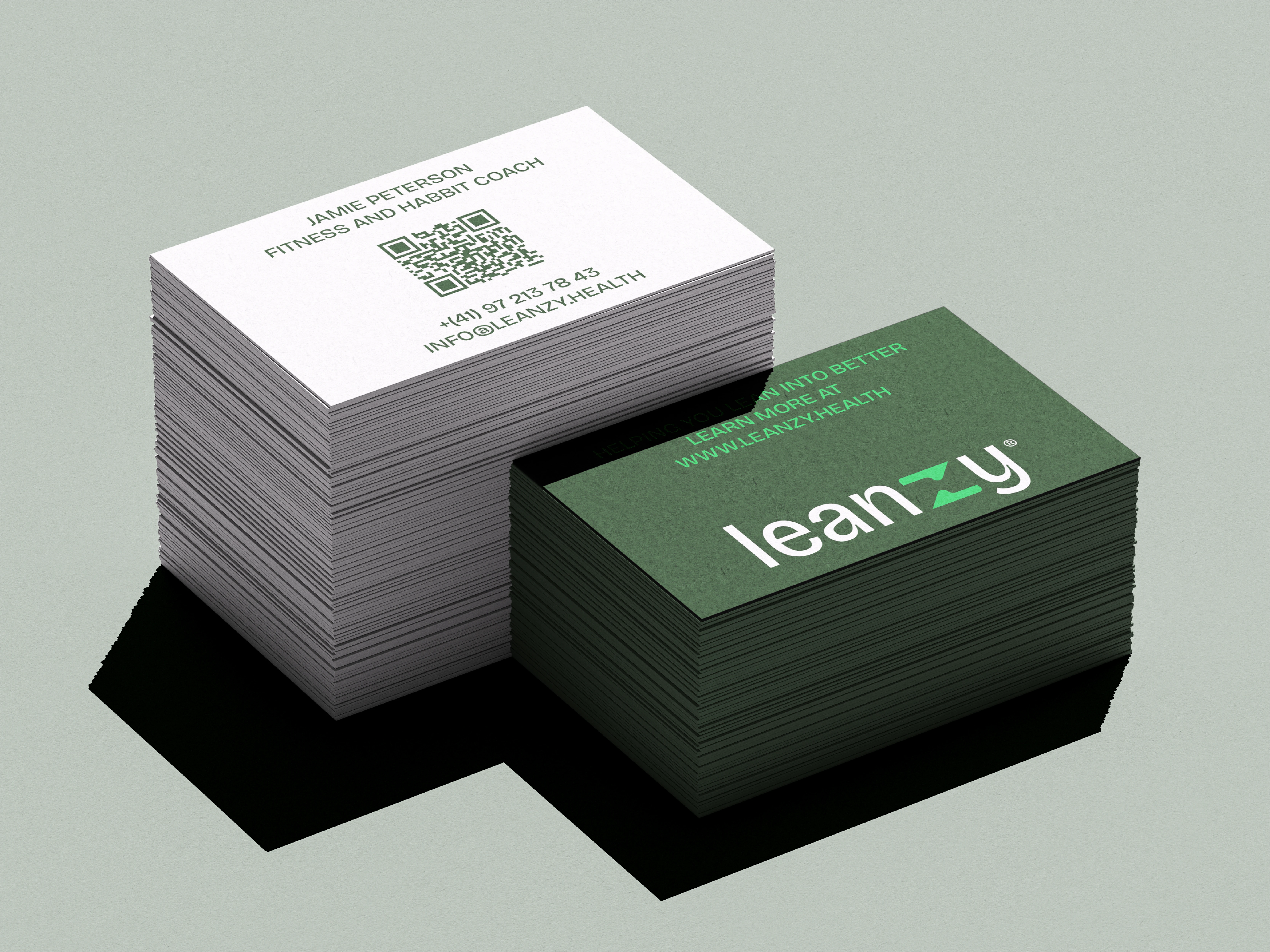
The execution prioritizes functional clarity and consistent visual recall. A bespoke logomark featuring a custom ‘Z’ glyph serves as the foundational anchor, designed for immediate recognition across varied touchpoints, from small-scale app icons to large-format physical applications like equipment and merch.

The color palette, anchored by vibrant, high-energy greens paired with deep, authoritative neutrals, was selected to communicate both organic growth and athletic performance, ensuring the brand retains its impact in both digital and physical environments.

By standardizing these visual elements, we established a scalable design system that transforms Leanzy from a collection of services into a singular, credible lifestyle brand, successfully differentiating the platform within a saturated market and aligning it with the values of a generation that demands both authenticity and efficacy.






Like this project
Posted Jun 26, 2026
A bold visual identity for Leanzy, combining logo design, creative direction, and polished mockups for a cohesive digital presence.