
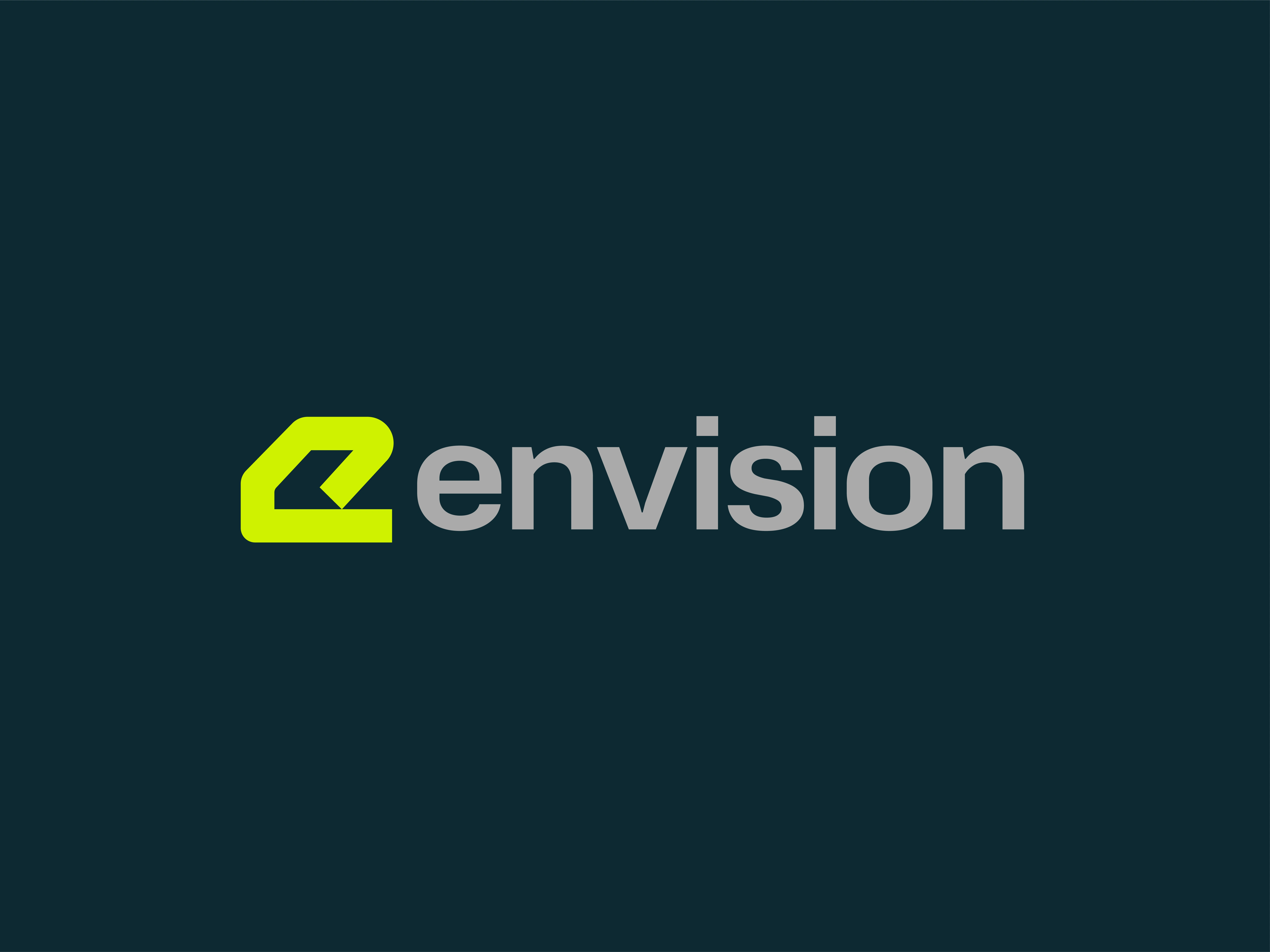
Envision provides organizations with AI-powered business intelligence and strategic planning tools that distill complex data into clear, actionable direction. In a crowded market, the challenge was overcoming the perception of the platform as just another data tool. The brand required a positioning shift: moving from a technical utility to a strategic partner that empowers leaders to act with confidence.
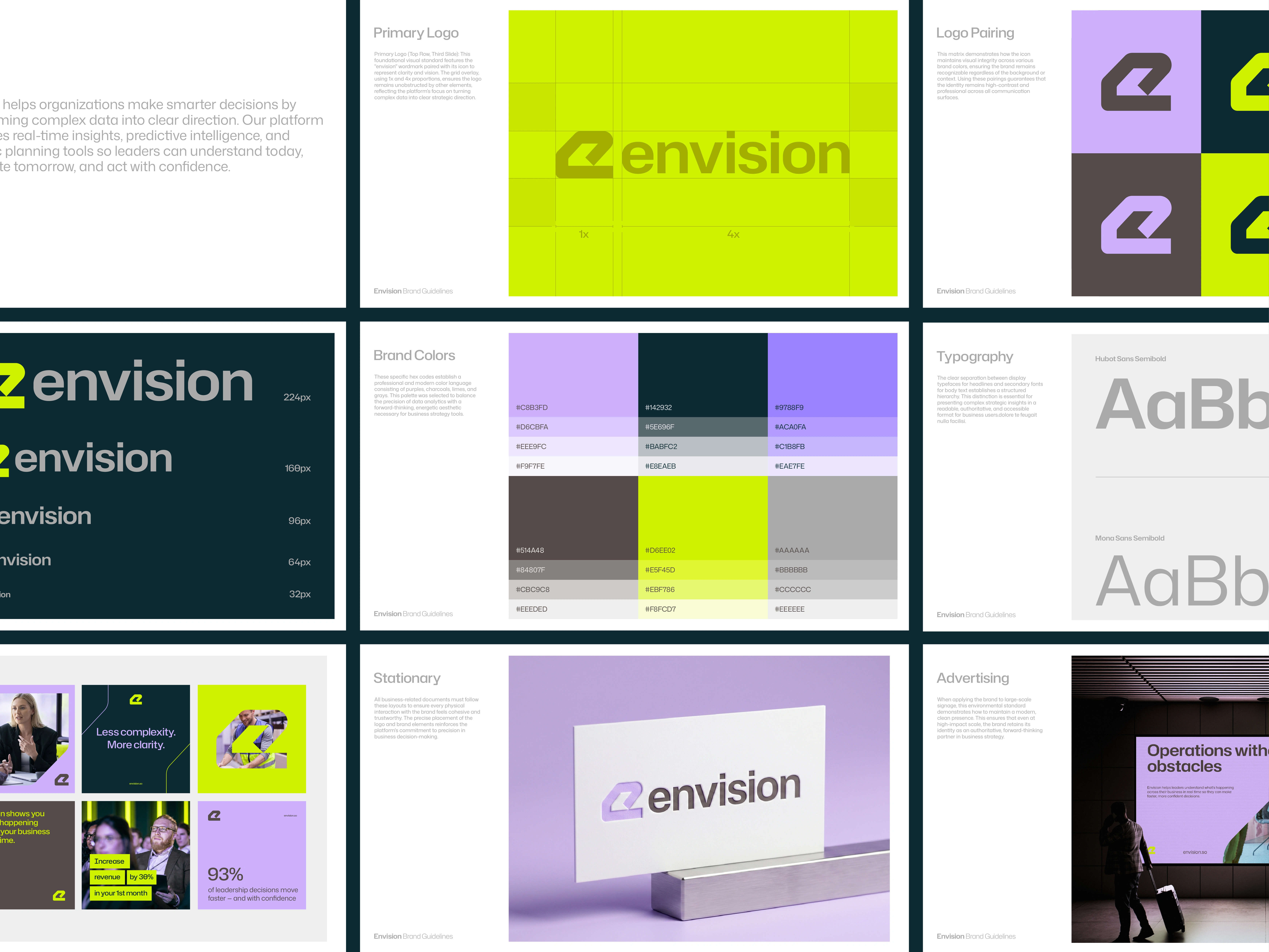
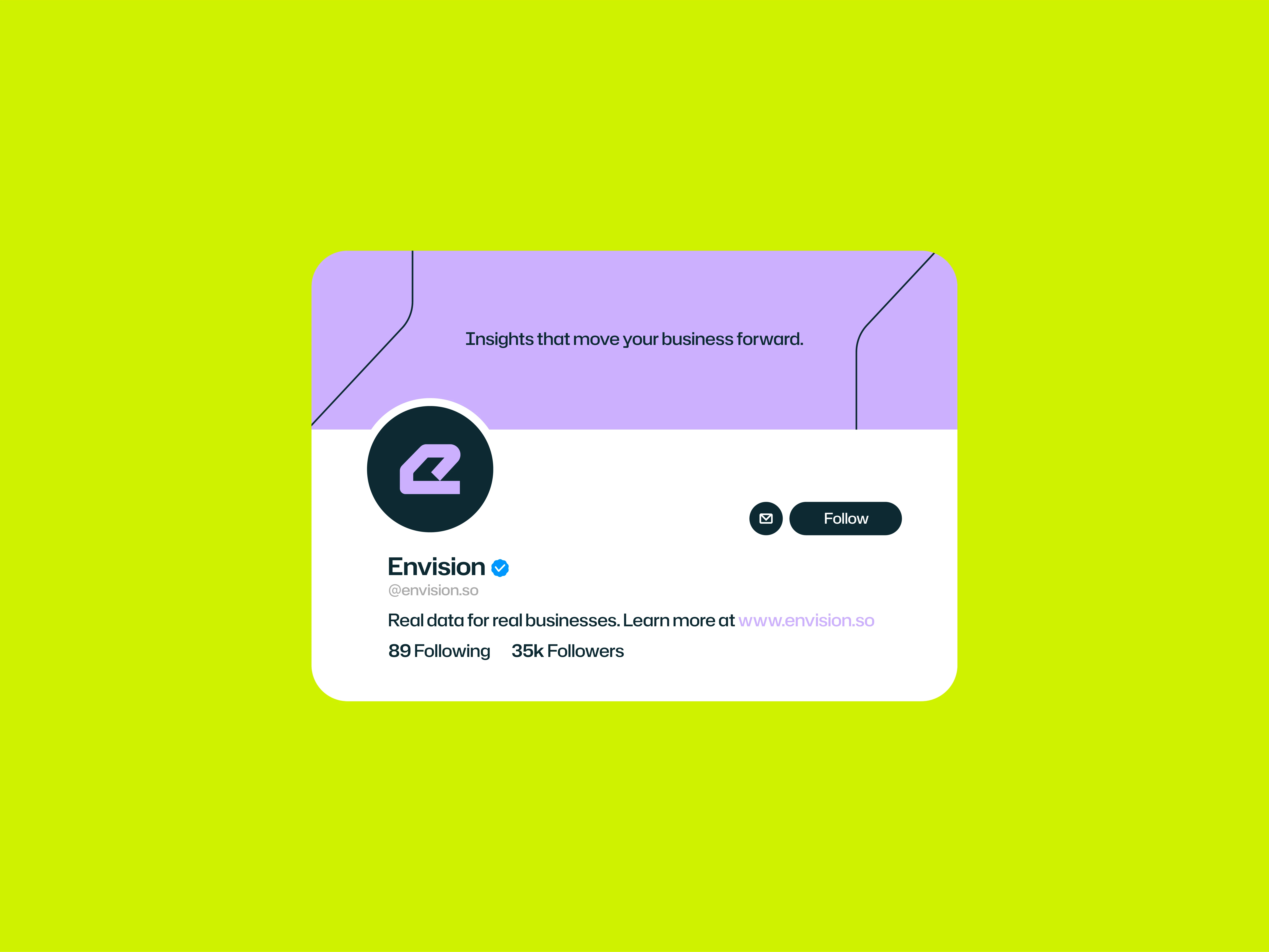
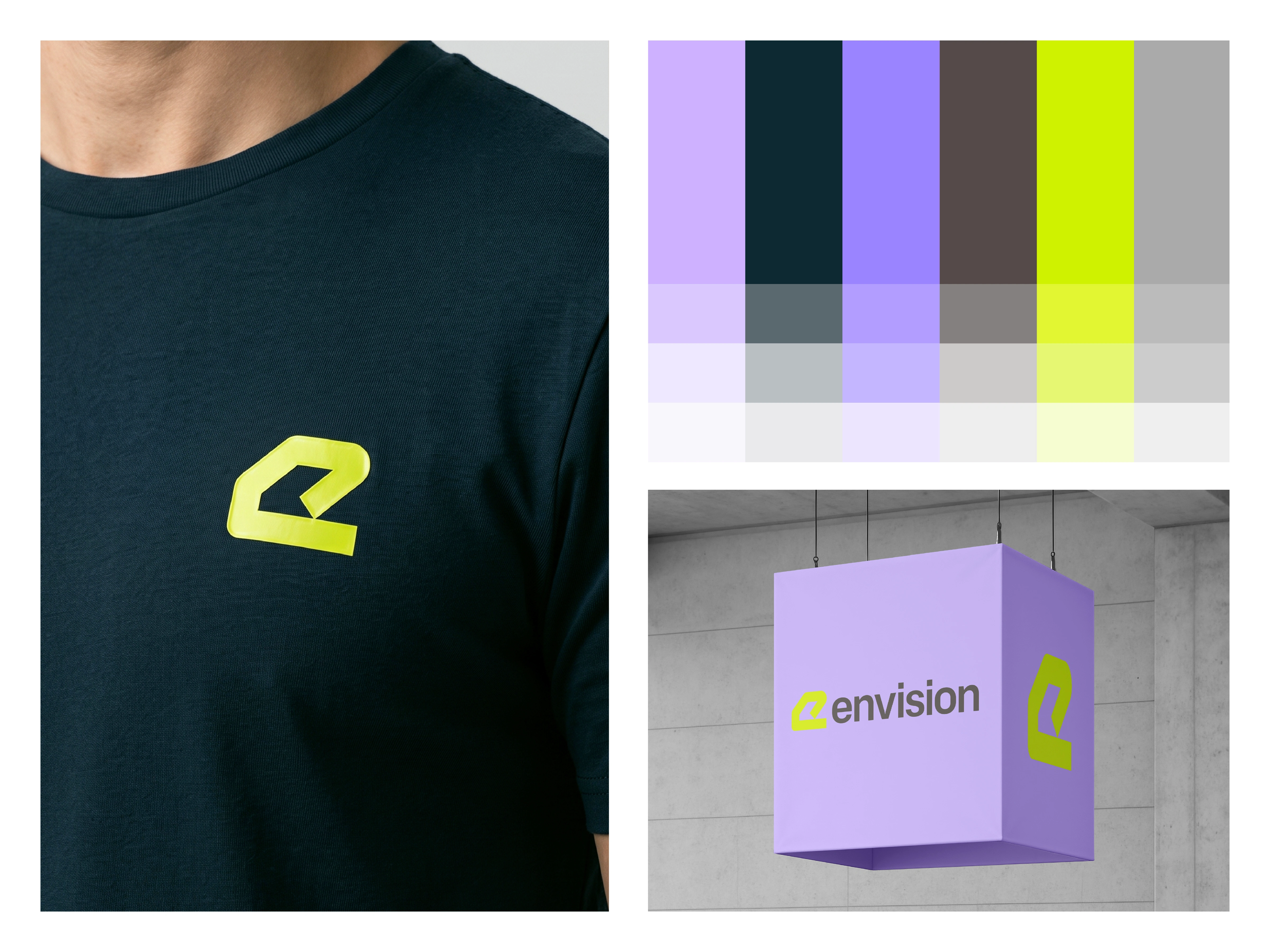
To achieve this, we developed a visual identity rooted in precision and clarity. The primary logo was designed with balanced proportions to communicate institutional stability, while a refined, high-contrast color palette of deep grays, vibrant lime, and balanced purples was implemented to distinguish Envision in a professional B2B landscape.
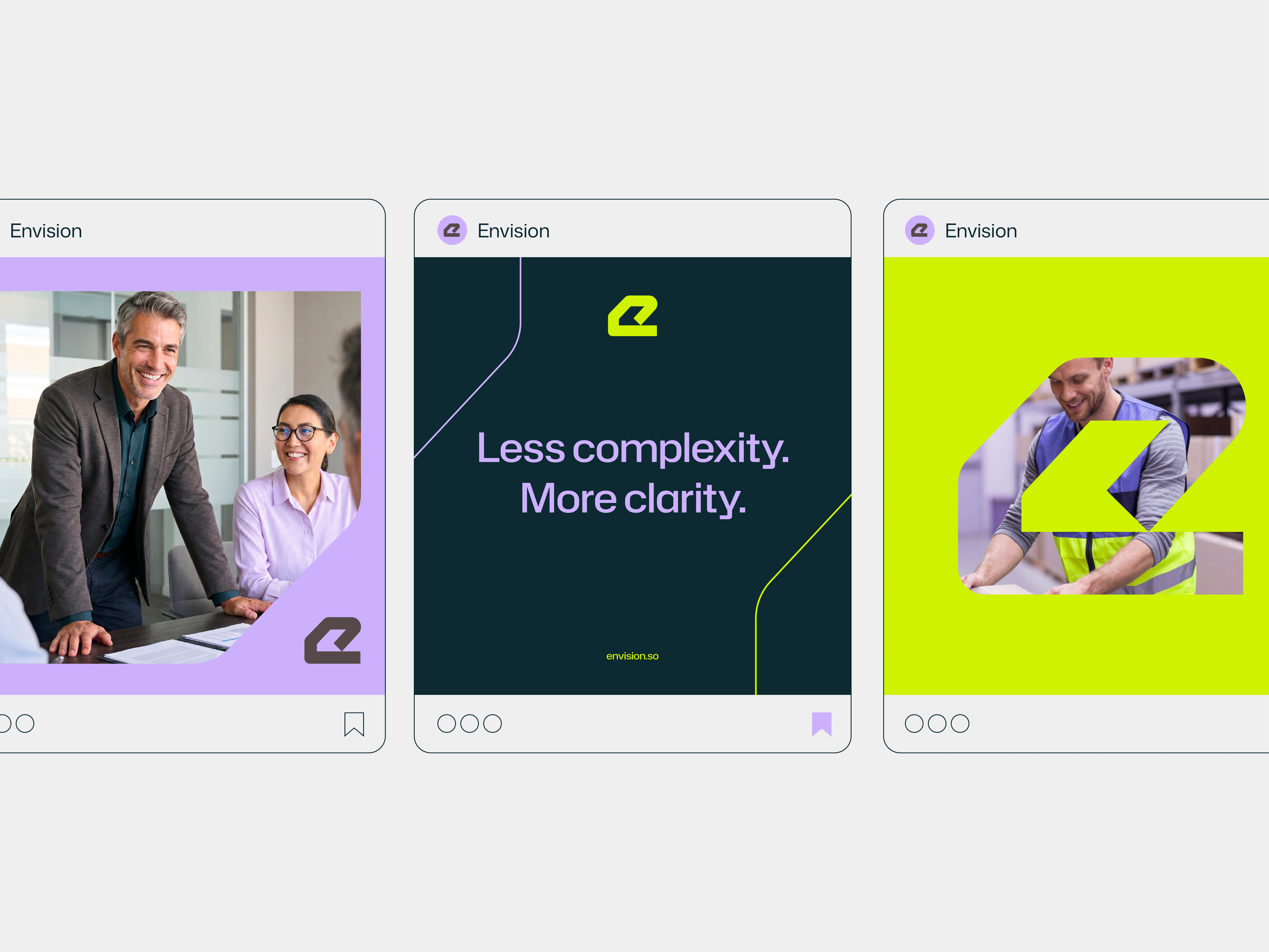
This strategic use of color and typography ensures that the brand remains legible and authoritative across all touchpoints, from digital interfaces to large-scale environmental signage. Ultimately, this identity strengthens Envision’s market positioning by shifting the focus from raw data complexity to the clarity and executive confidence their platform delivers.






0 likes · 20 views · Jul 6, 2026
Envision turns complex data into clear strategy, so the brand design prioritized precision to position the brand as an essential executive partner.

