Belly Balance Packaging & Brand Identity Design

Miglena Spasova


MotherFood — Belly Balance Seed Blend
Packaging Design • Brand Identity • CPG
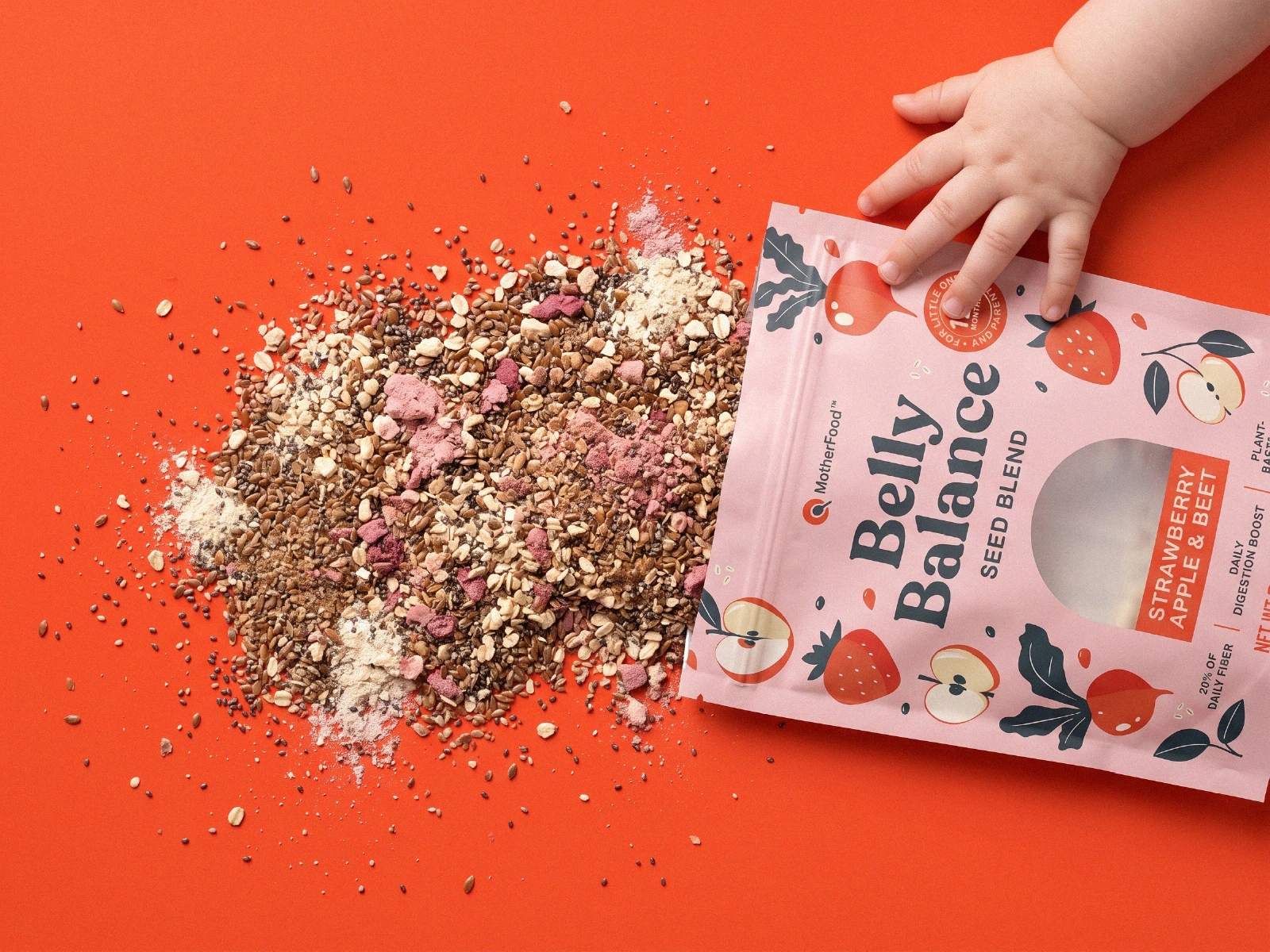
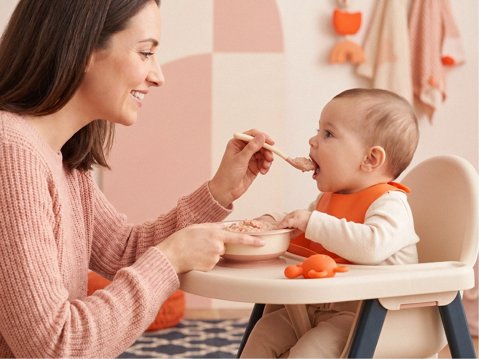
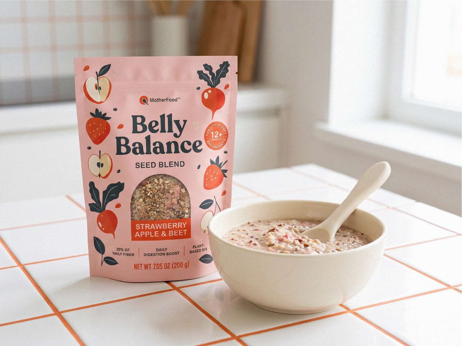
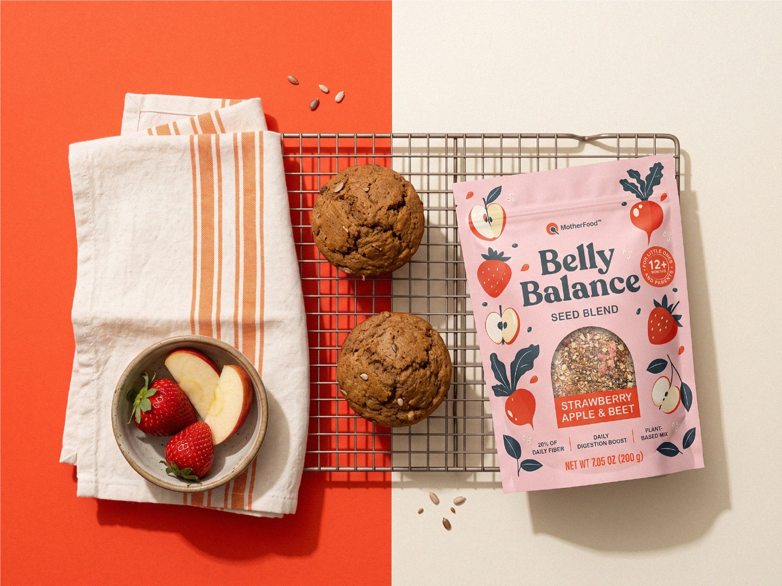
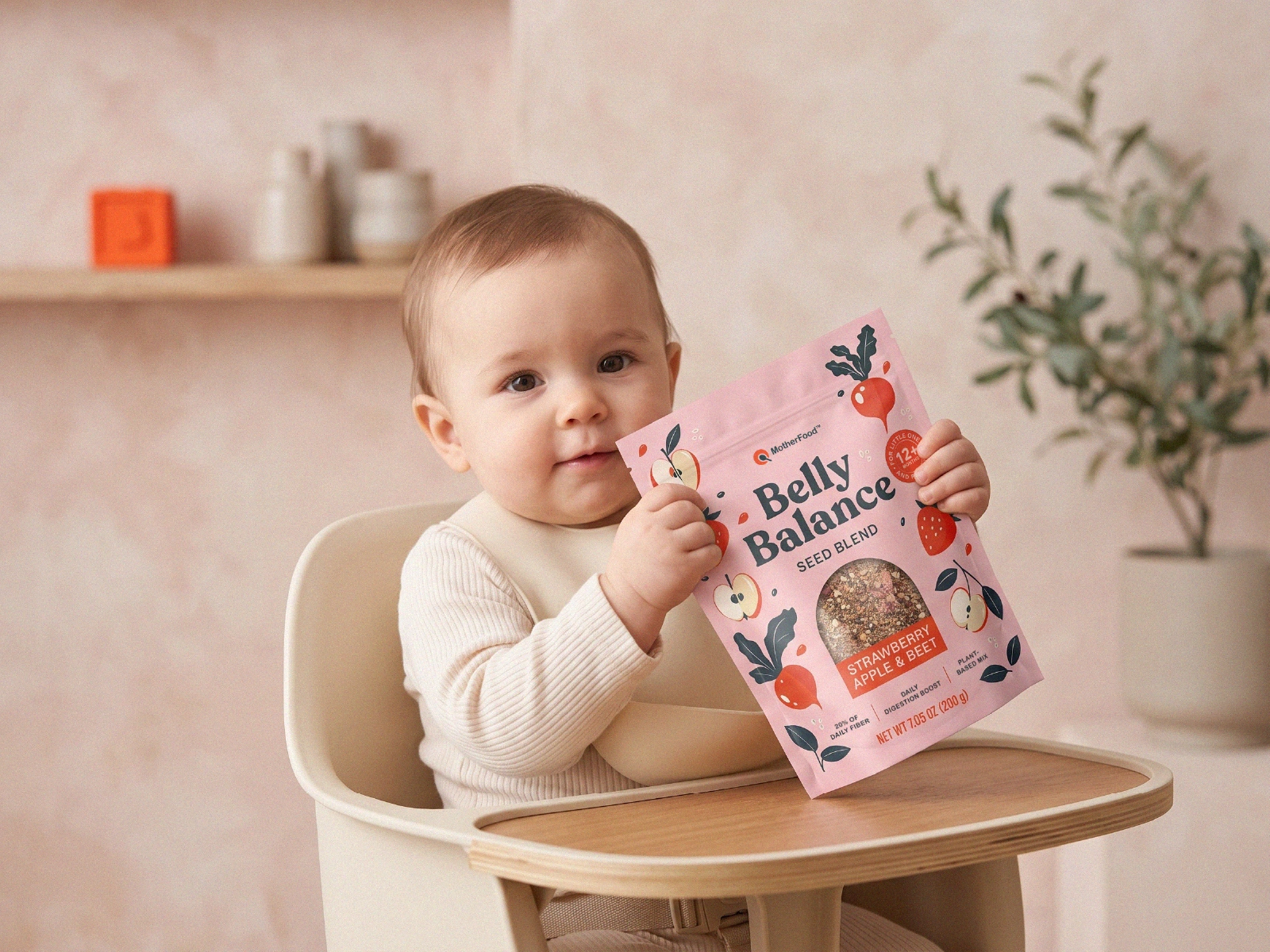
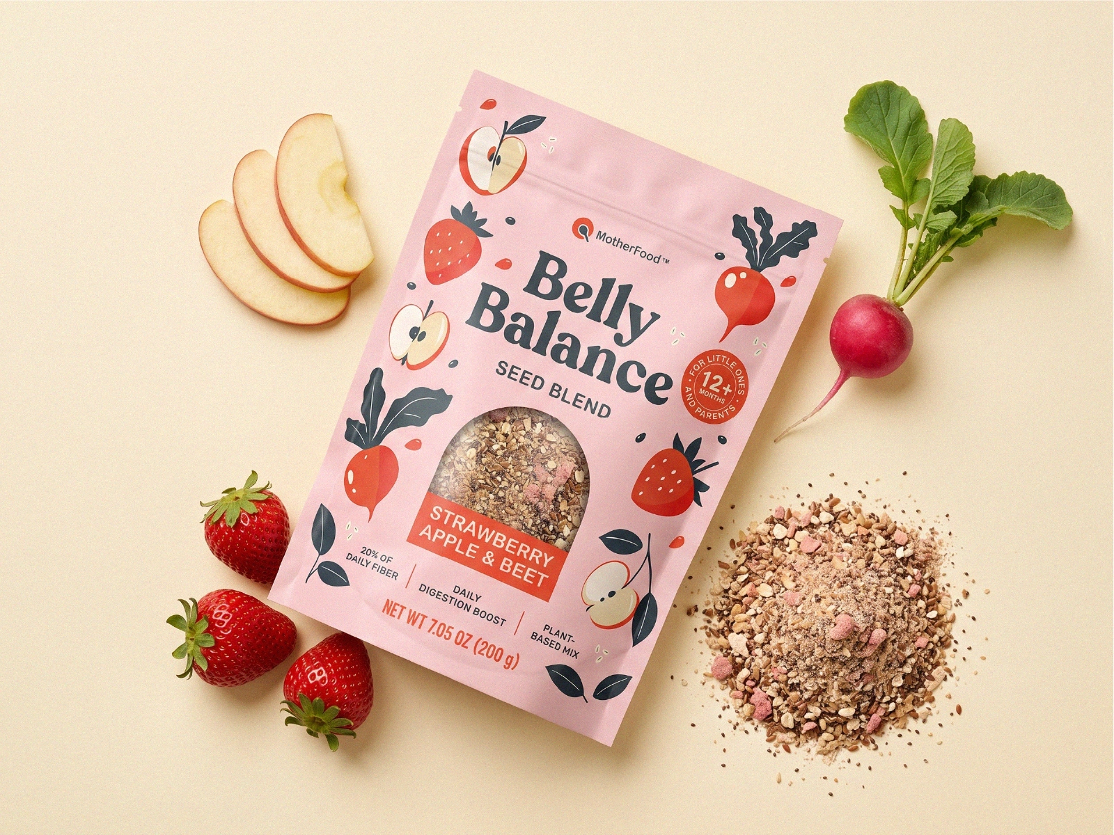
MotherFood needed packaging for the launch of its Belly Balance Seed Blend, a daily fiber mix designed to support digestive health for babies and toddlers. The challenge was to create a brand identity that felt natural, modern, and approachable while clearly communicating the product's purpose to parents.
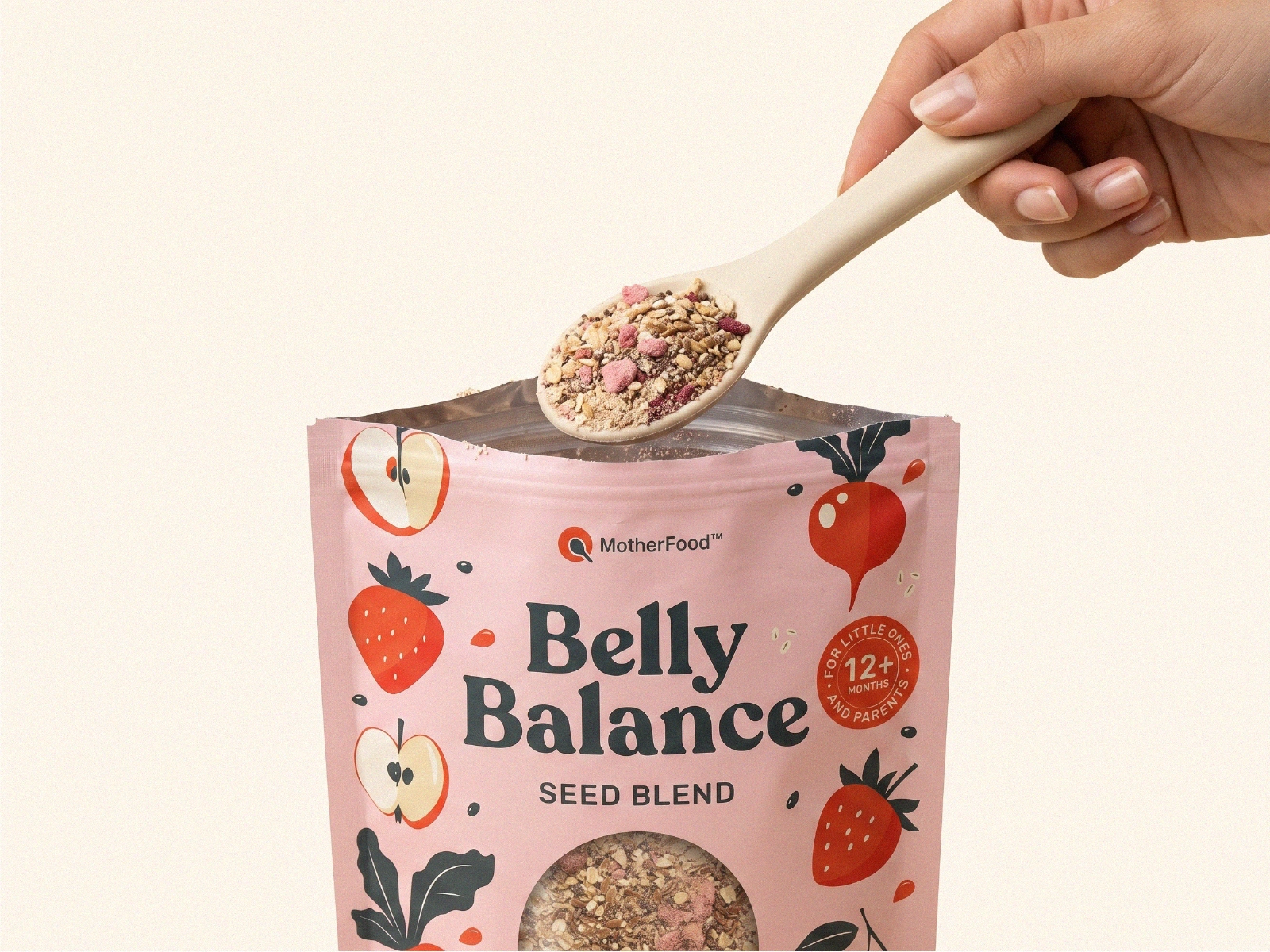
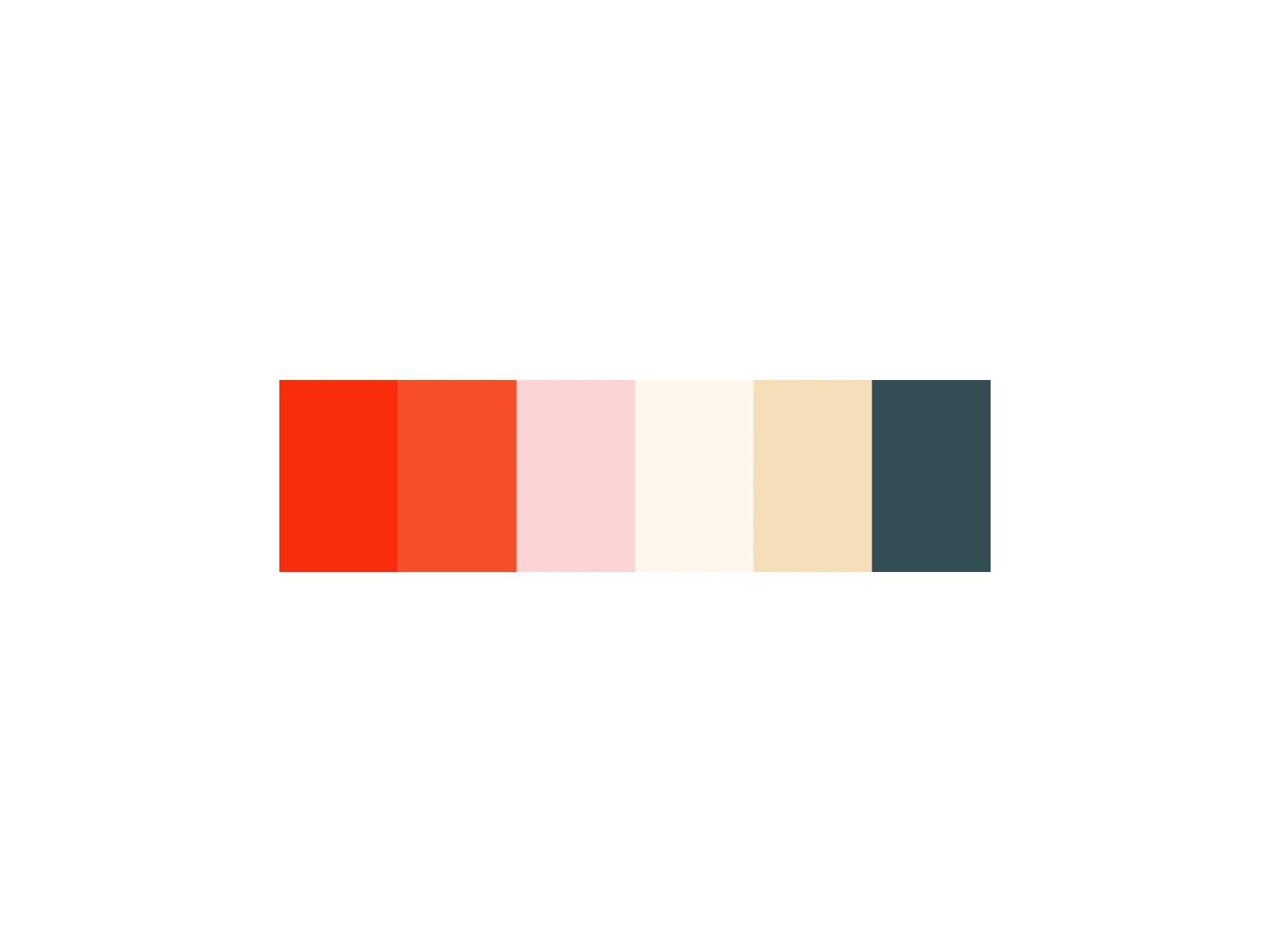
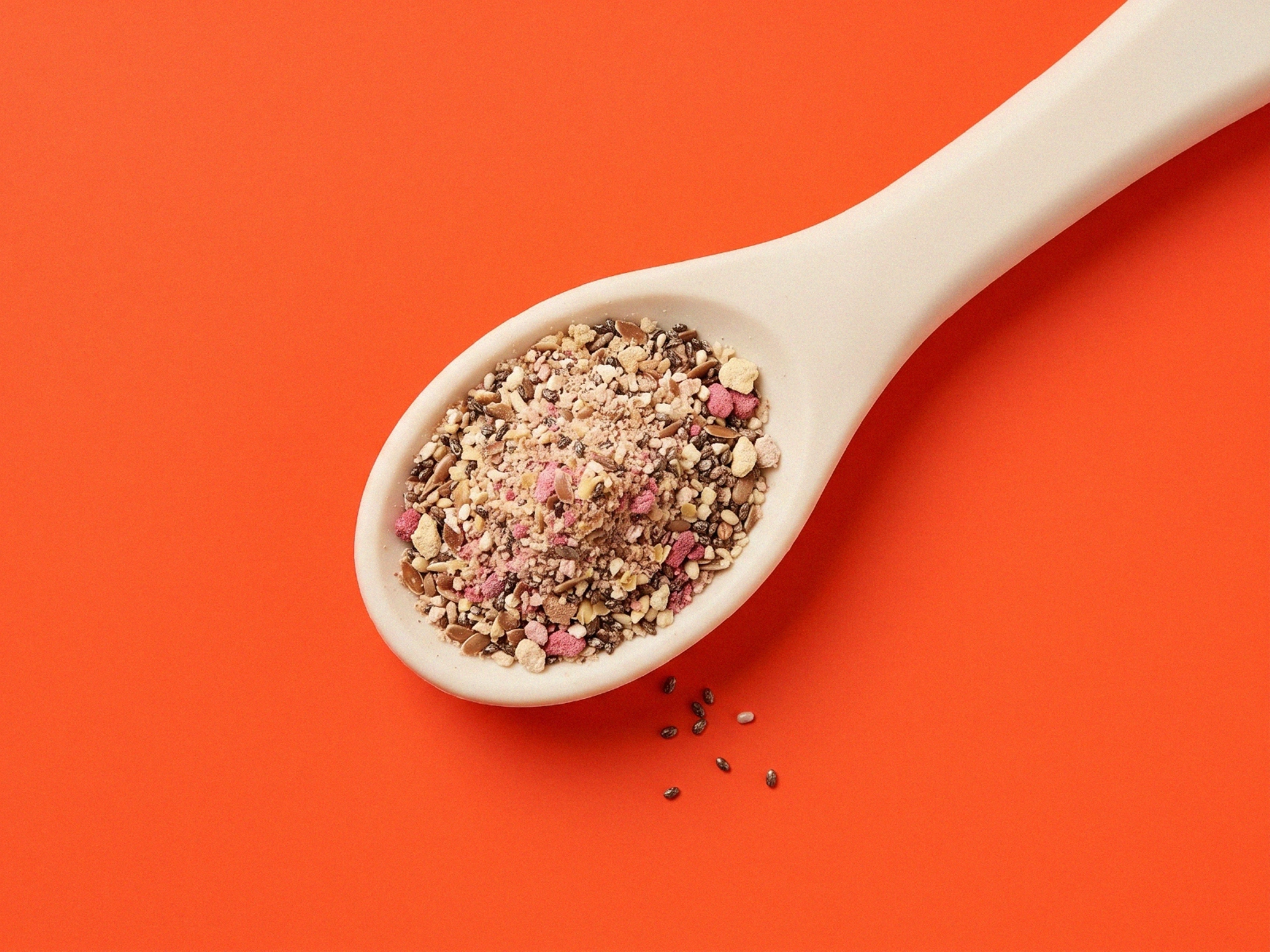
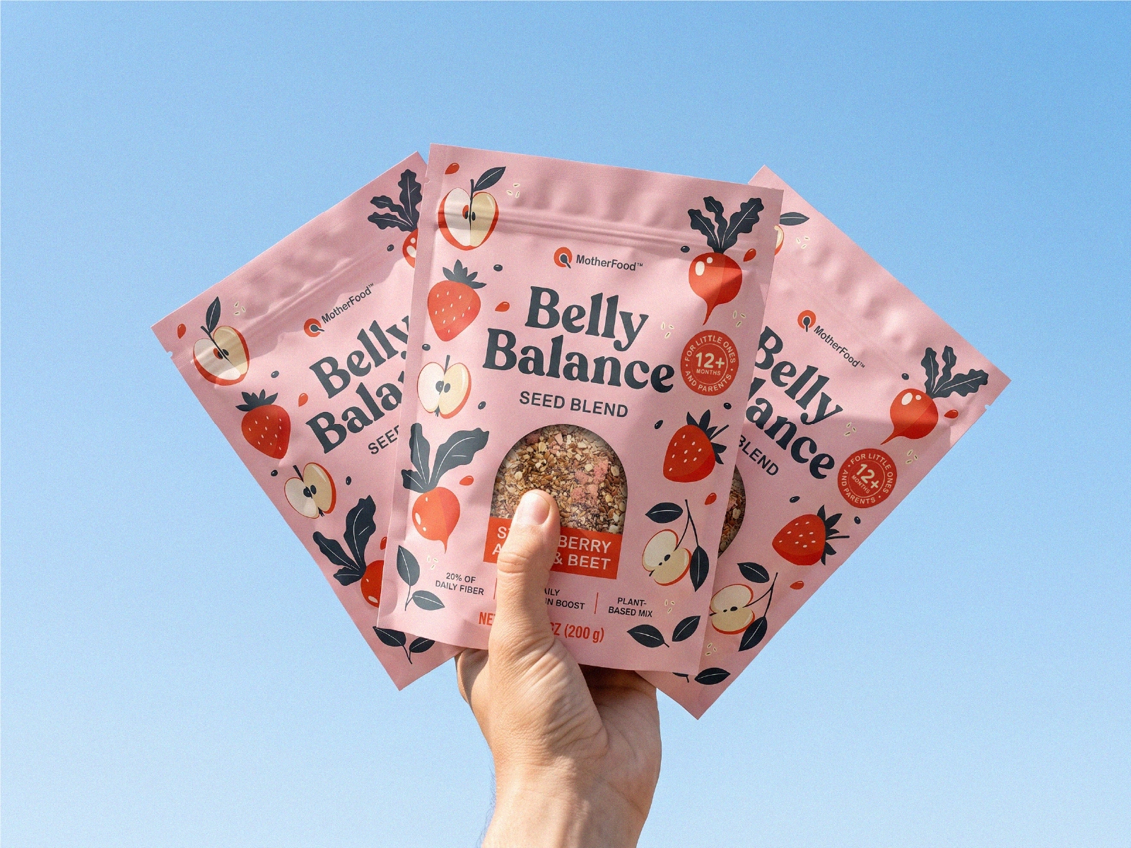
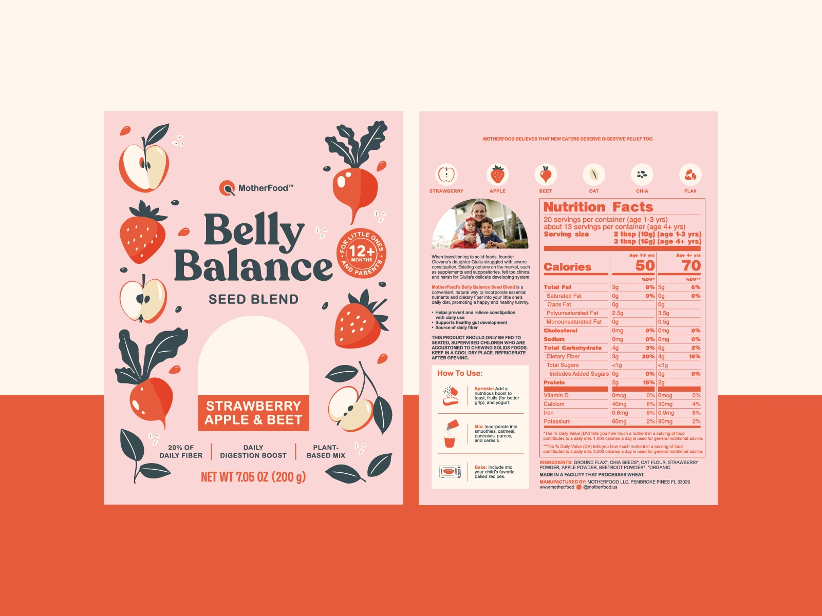
The design pairs a soft pink palette with playful illustrated ingredients and generous white space to create a fresh, welcoming shelf presence. A large product window showcases the blend itself, reinforcing the use of whole ingredients, while a clear visual hierarchy makes the product name, flavor, and key benefits easy to scan. The resulting packaging system feels cohesive, distinctive, and easily adaptable for future flavors and product extensions.
Like this project
Posted Jul 6, 2026
Created a fresh, shelf-ready identity for MotherFood’s Belly Balance Seed Blend, making digestive health feel approachable, playful, and parent-friendly.